Business Automation Agency Website Design

Akil Ashraful


Marketing Automation Agency Website Design
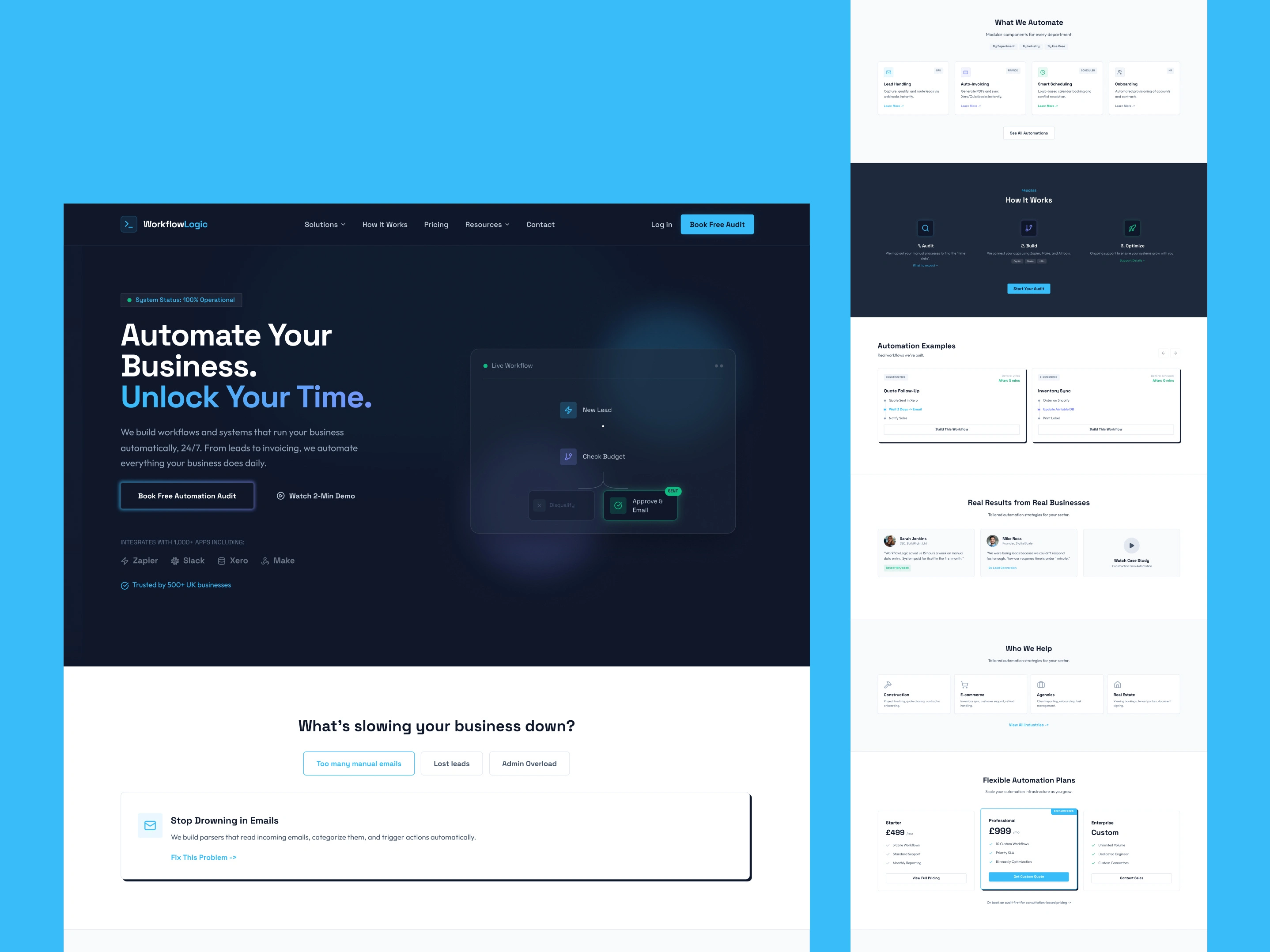
This automation agency website interface prioritizes clarity and conversion through a dark-to-light gradient approach that guides users from problem identification to solution adoption. The hero section's navy gradient establishes trust while highlighting the core value proposition: automating business processes to unlock time for growth.

The interface features several key elements:
✔ Modular automation cards present Lead Handling, Auto-Invoicing, Smart Scheduling, and Onboarding as scannable self-contained units, reducing cognitive overload.
✔ Interactive workflow builder in the hero section visualizes live automations, making an abstract service immediately tangible within the first scroll.
✔ Named client testimonials with specific outcomes like "15 hours saved" and "response under 1 minute" replace vague claims with credible, human-centered proof.
✔ Tabbed service breakdown by department and industry lets every visitor type find relevant automation examples without unnecessary scrolling.
✔ Three-tier pricing with a "Recommended" badge and size contrast on the Professional plan applies pricing psychology to guide users toward the highest-value option.
✔ Inline calendar scheduling eliminates redirect friction by embedding the booking tool directly on the page.

The design balances information density with breathing room, using strategic white space and progressive disclosure through expandable FAQ sections. Strong CTAs like "Book Free Automation Audit" reduce friction in the conversion funnel while building confidence through the zero-commitment approach.
Marketing Automation Agency Website Design
Business Automation Agency
Landing Page Design
Automation UI Design
Workflow Management Website Design
Automation Website Design
Automation Service Website UI
AI Automation Agency
Lead Automation
Like this project