NIP. | Brand Identity & Packaging

Naledi Sibisi


THE OBSERVATION
Plans have become smaller, faster and more spontaneous — and what we carry has followed. Tiny bags, last-minute drinks, pre-games, dinners that become nights out. But a good cocktail still tends to assume a bar, a bartender or a full-size bottle.
THE OPPORTUNITY
What if a proper cocktail could fit the way people actually go out now?
Something between the convenience of a canned drink and the experience of ordering a real cocktail: small enough to carry, strong enough to count and designed to feel like an object you actually want to pull out of your bag.
THE IDEA
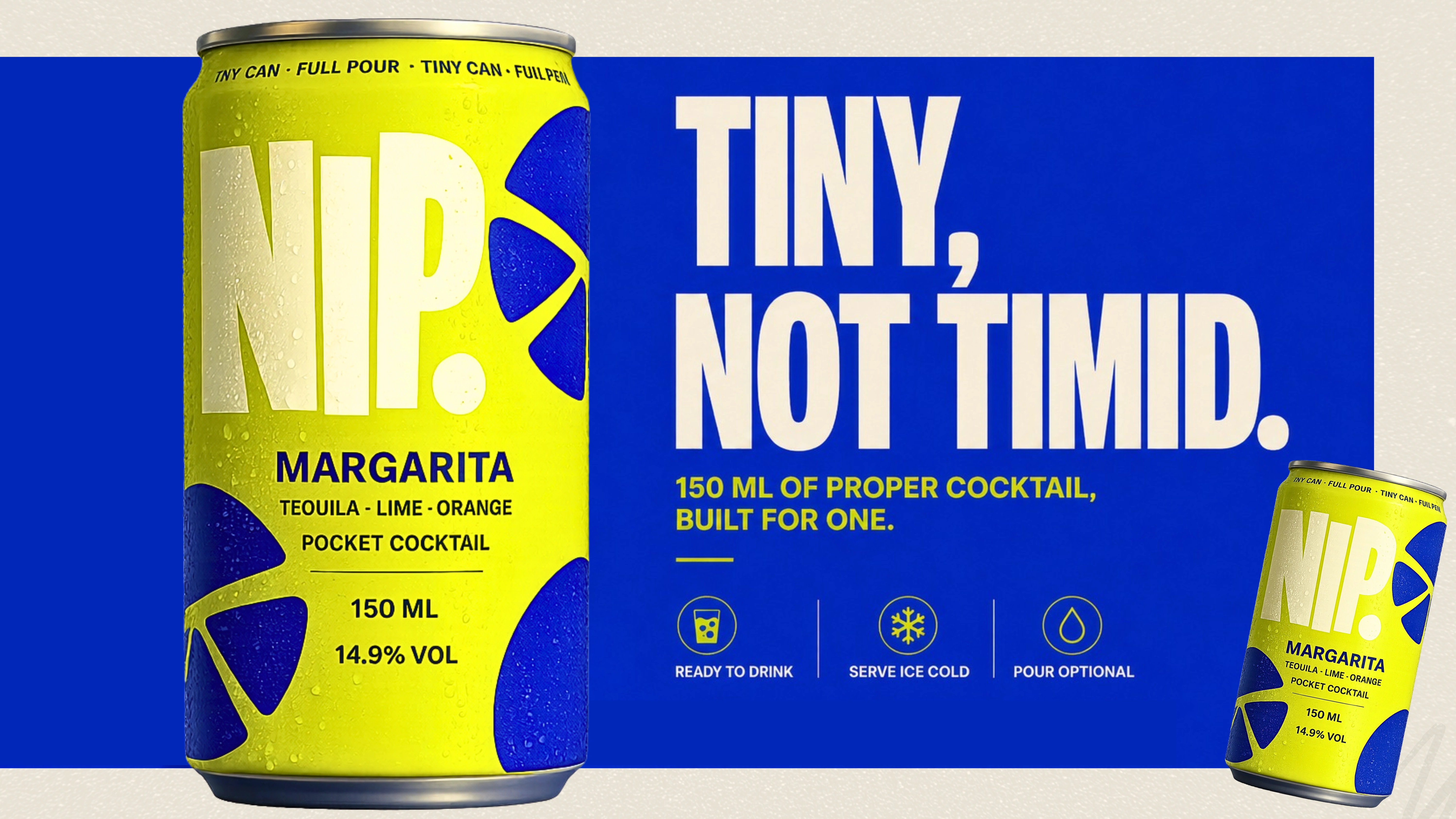
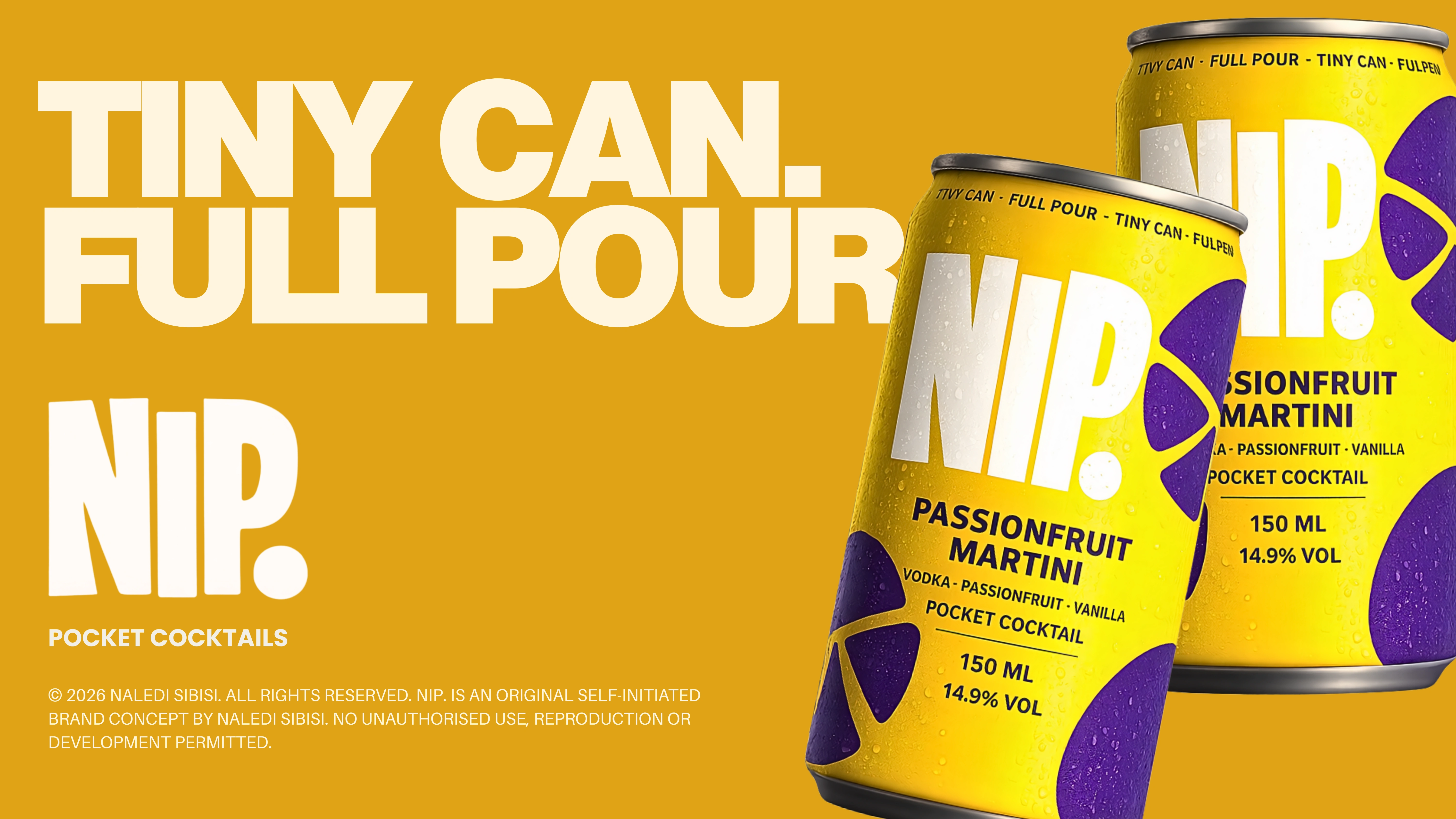
NIP. is a self-initiated concept for 150ml, bar-strength, single-serve pocket cocktails.
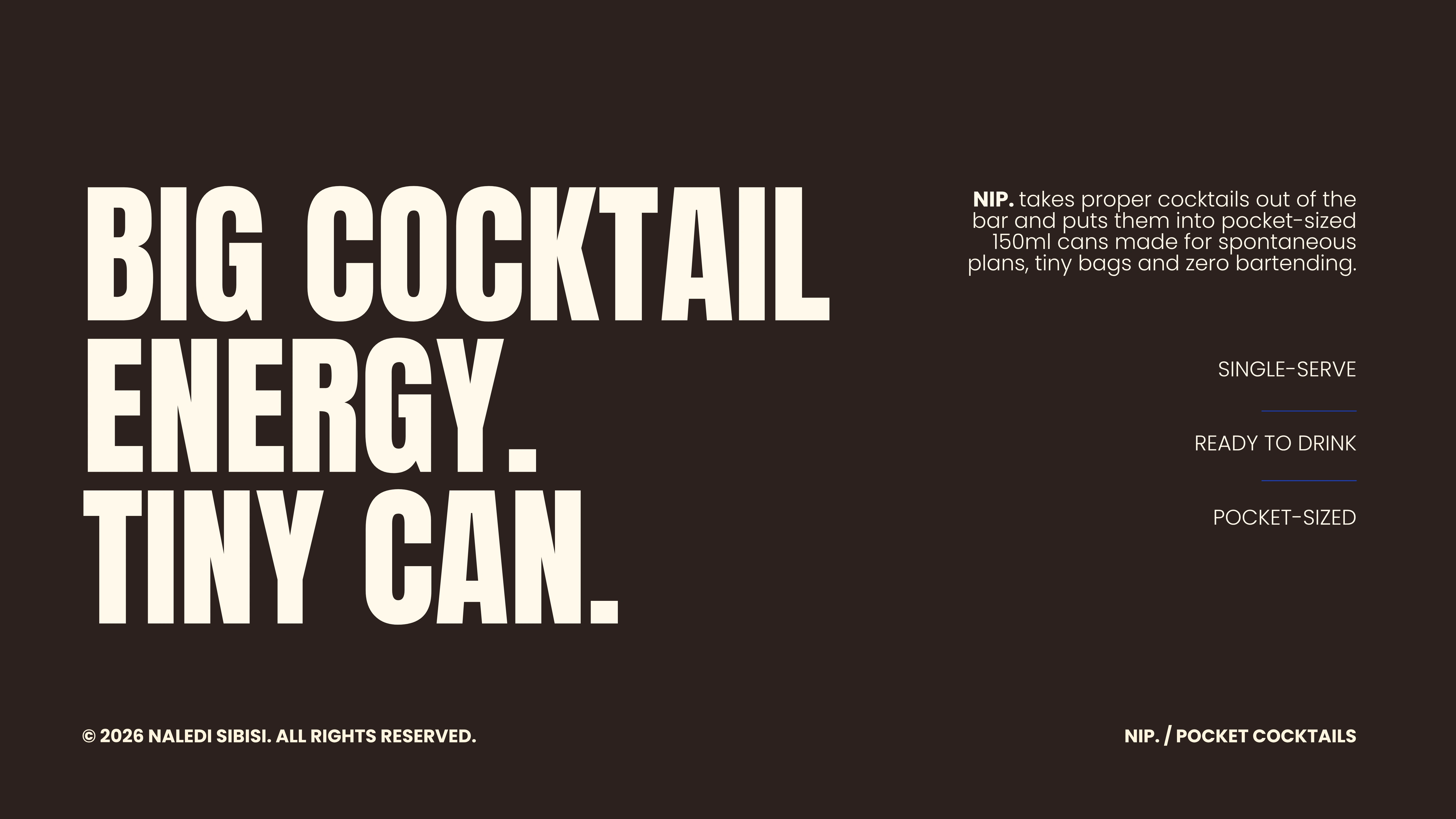
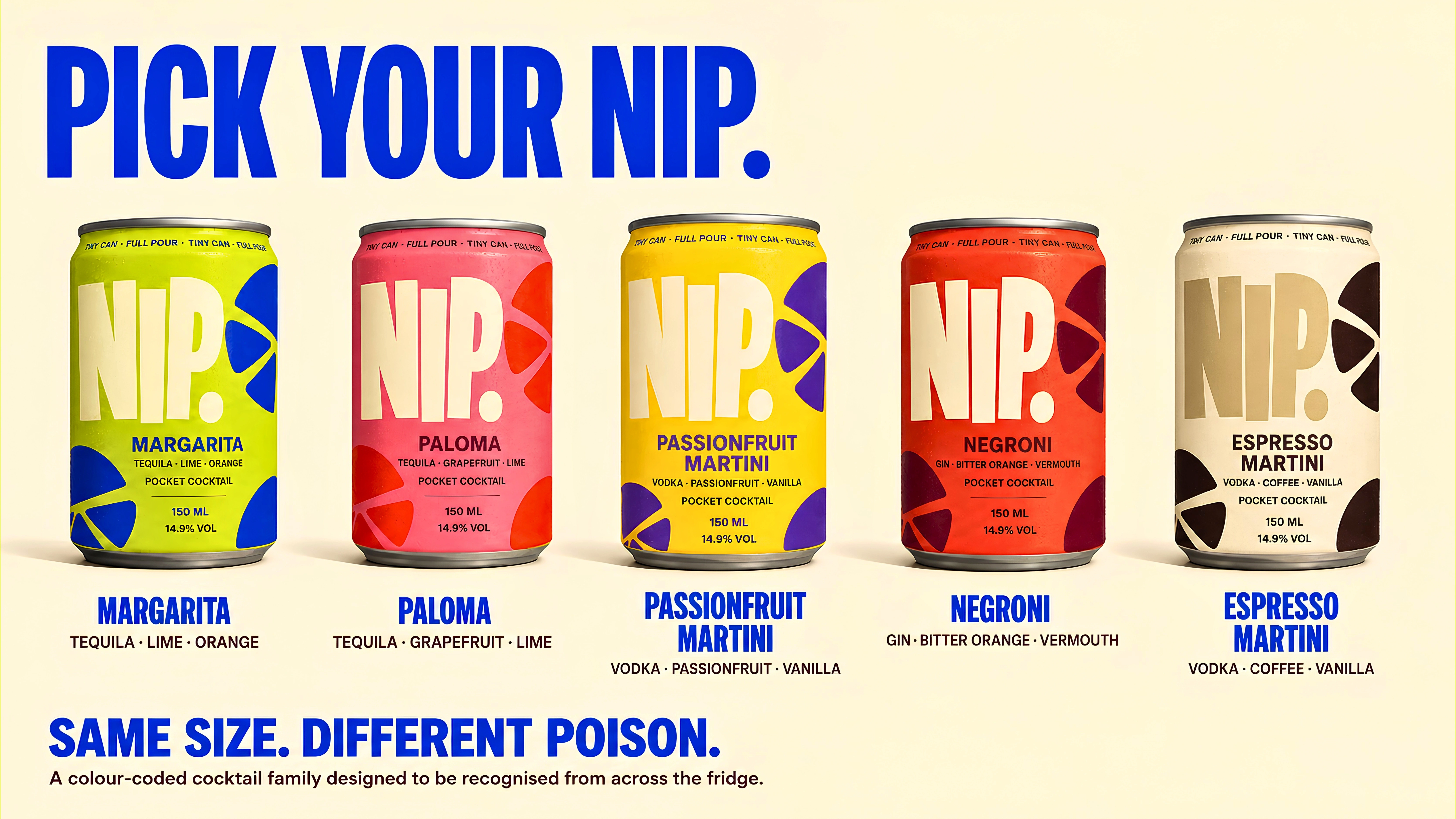
Proper cocktails in tiny cans.
TINY CAN. FULL POUR.
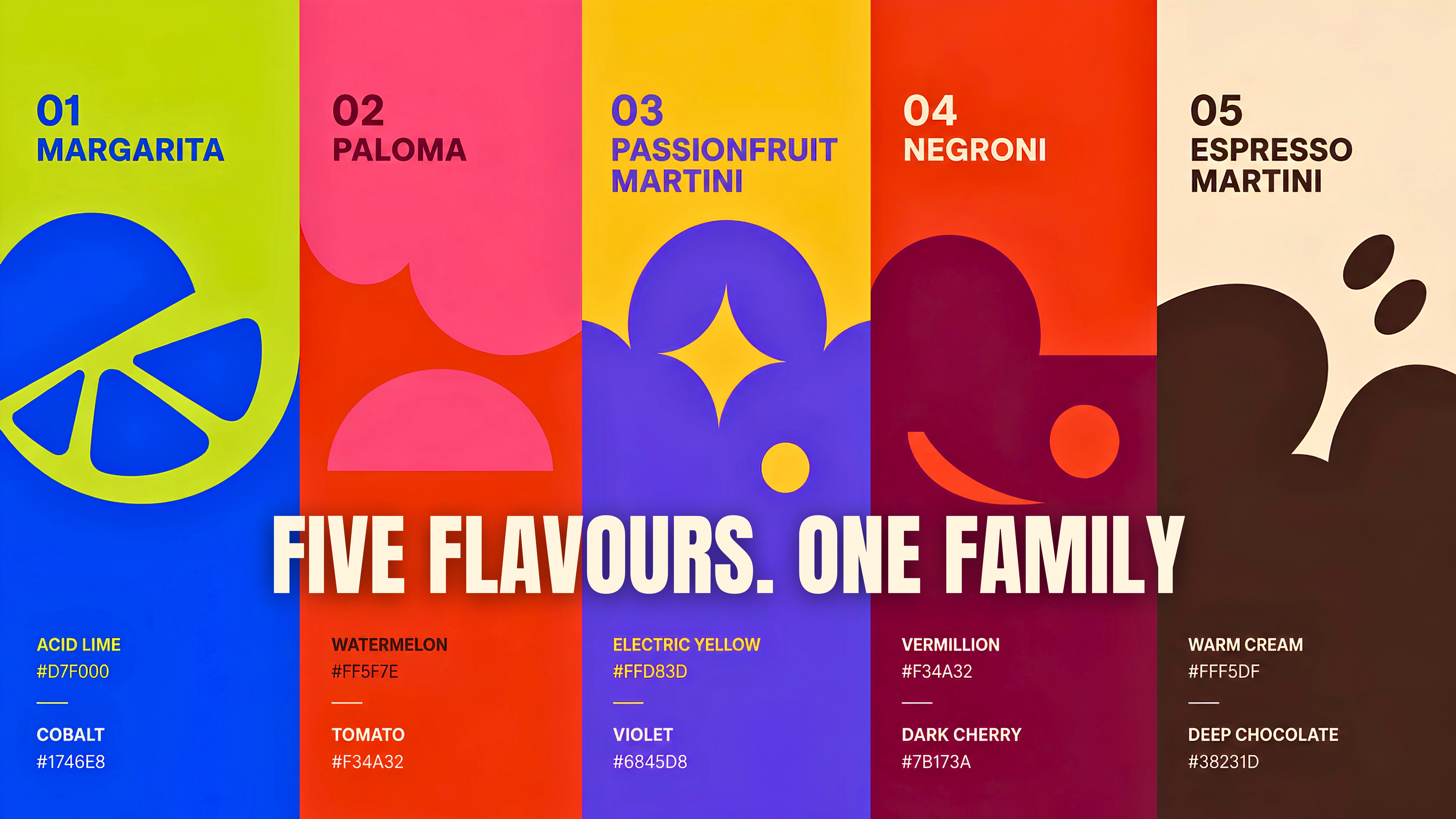
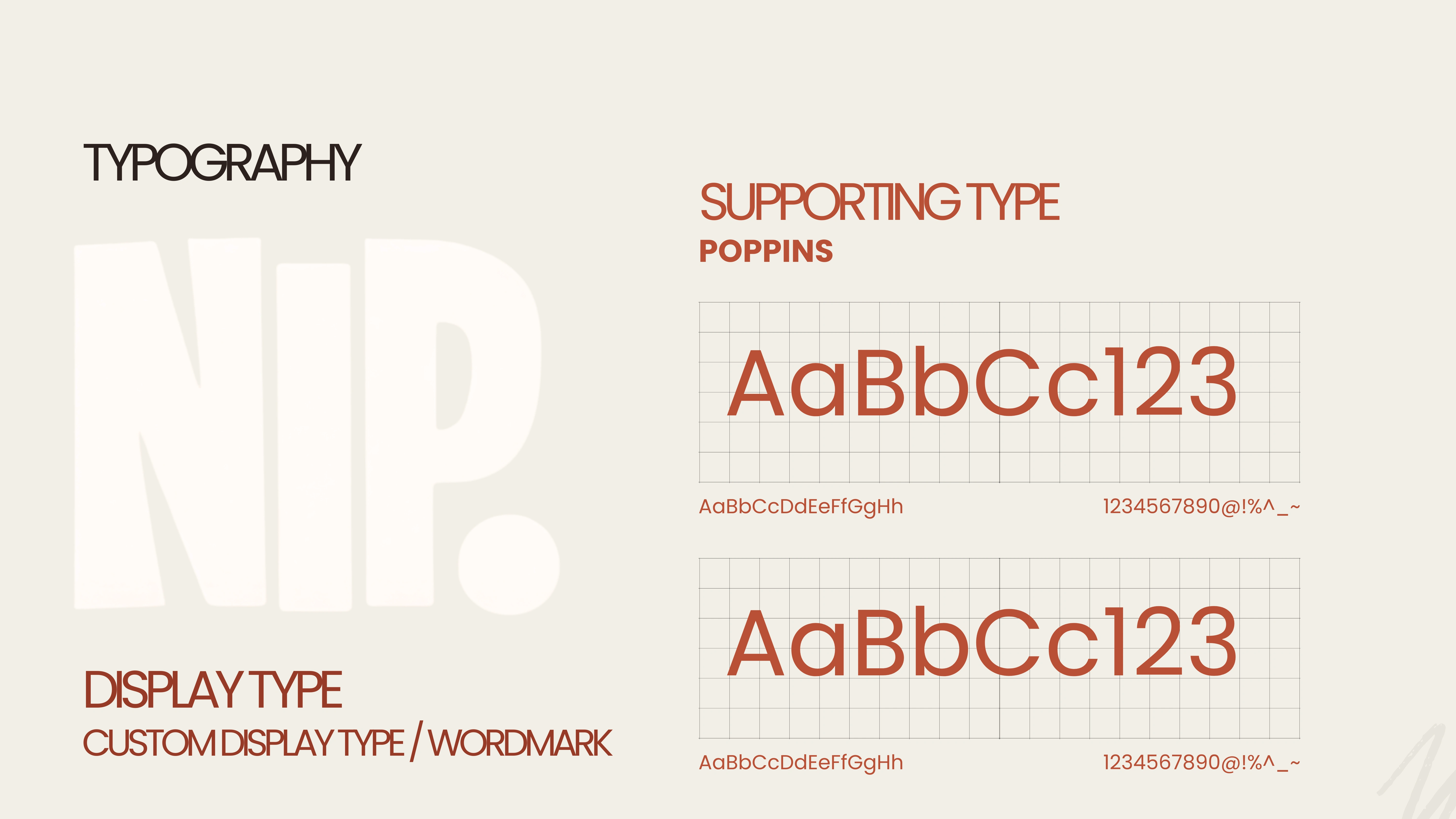
NIP. was built as a compact brand world around the contradiction at its centre: small format, full experience.
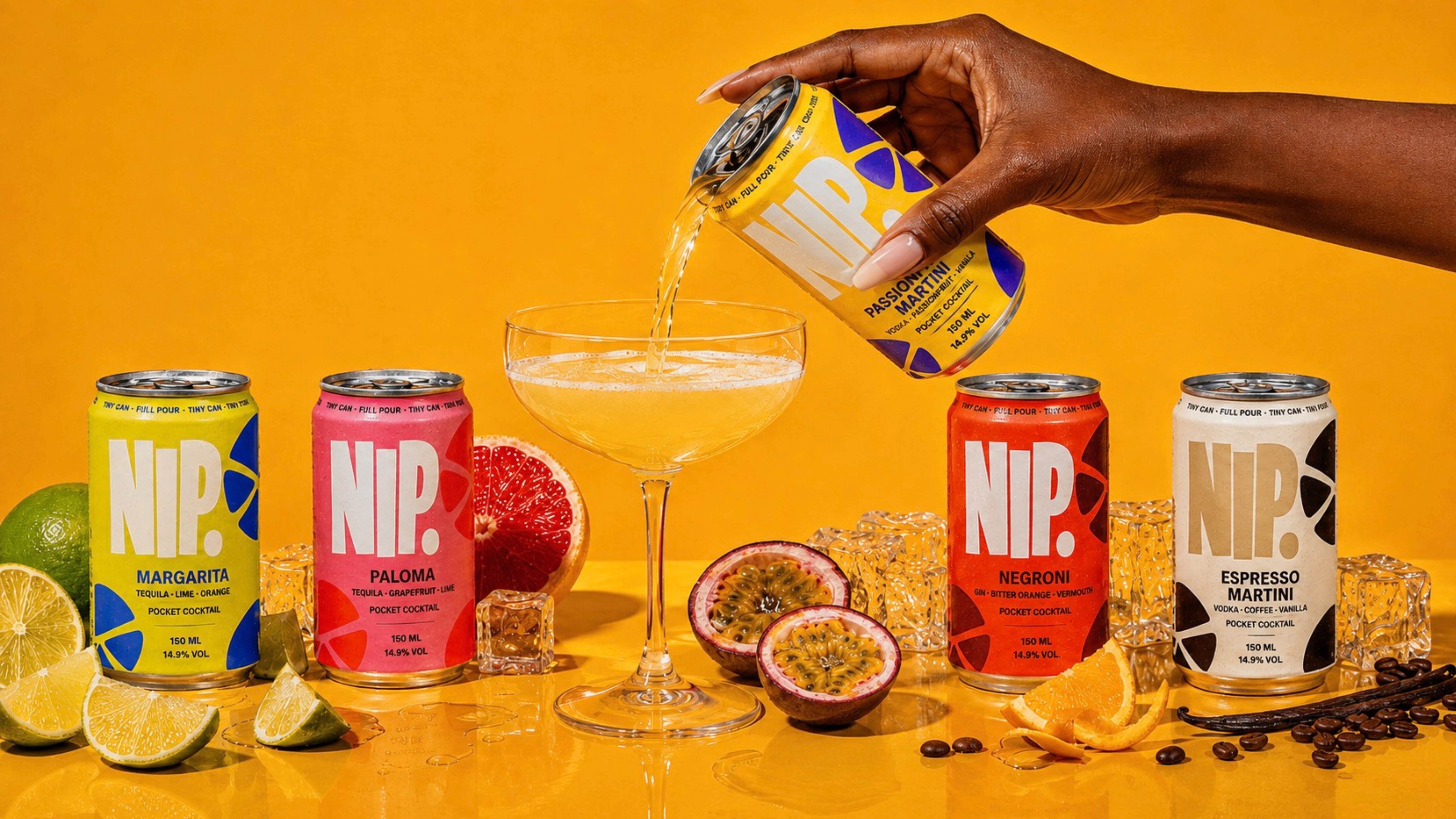
Oversized typography gives the tiny cans attitude. Saturated two-colour flavour systems make each serve immediately recognisable, while abstract citrus and garnish forms borrow from cocktail culture without becoming literal.
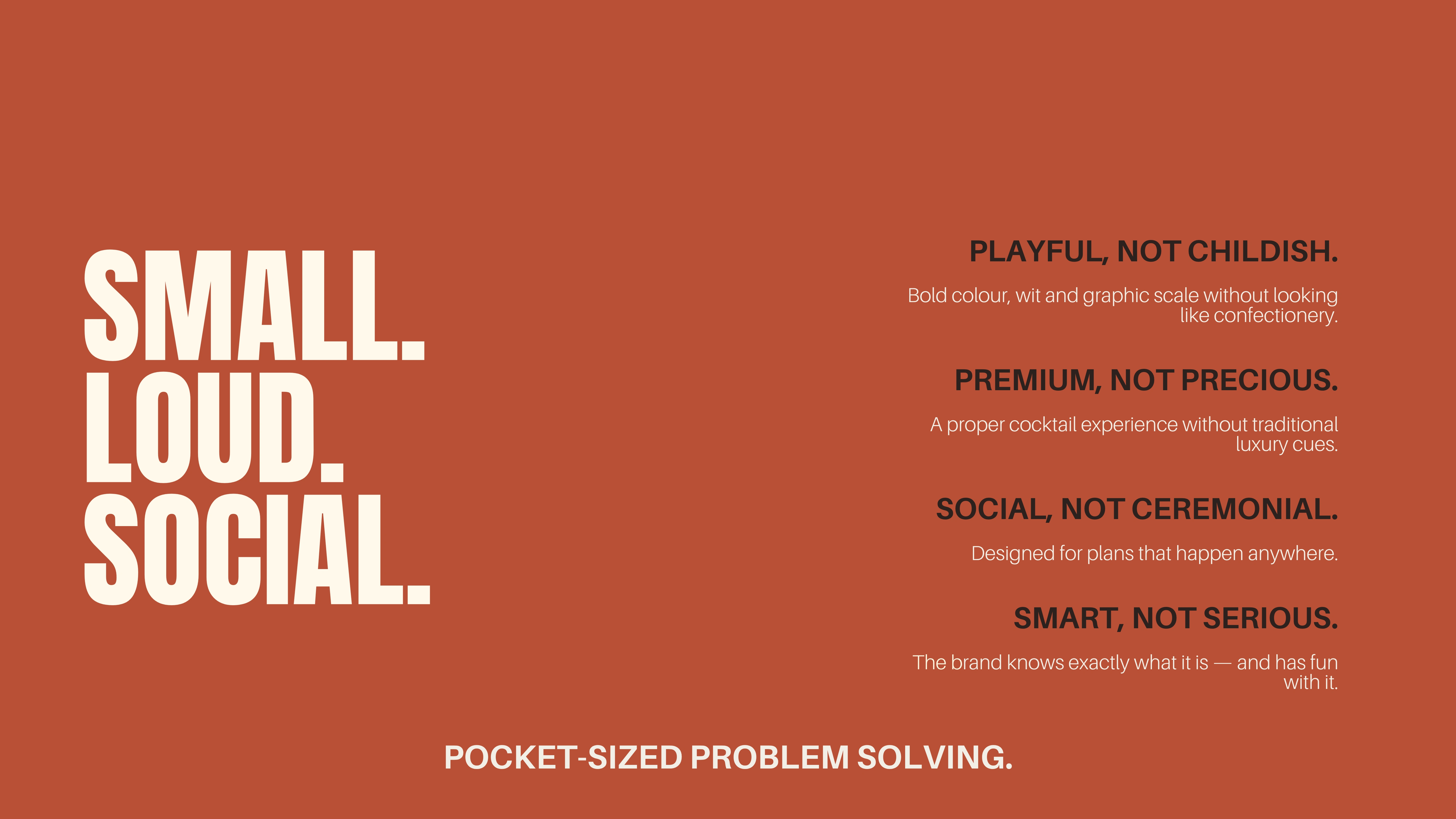
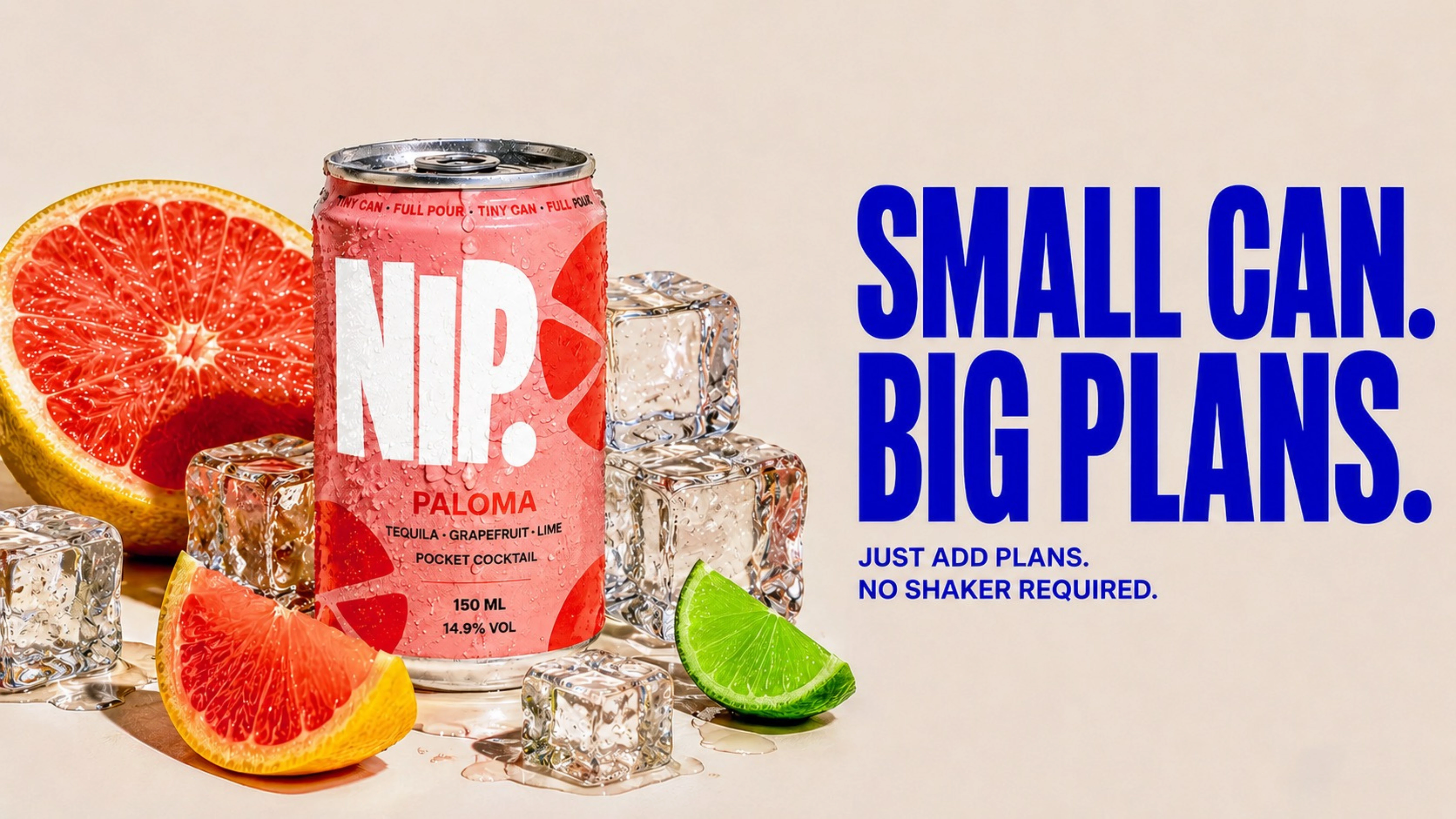
The language follows the same logic — short, confident and playful. SMALL CAN. BIG PLANS.
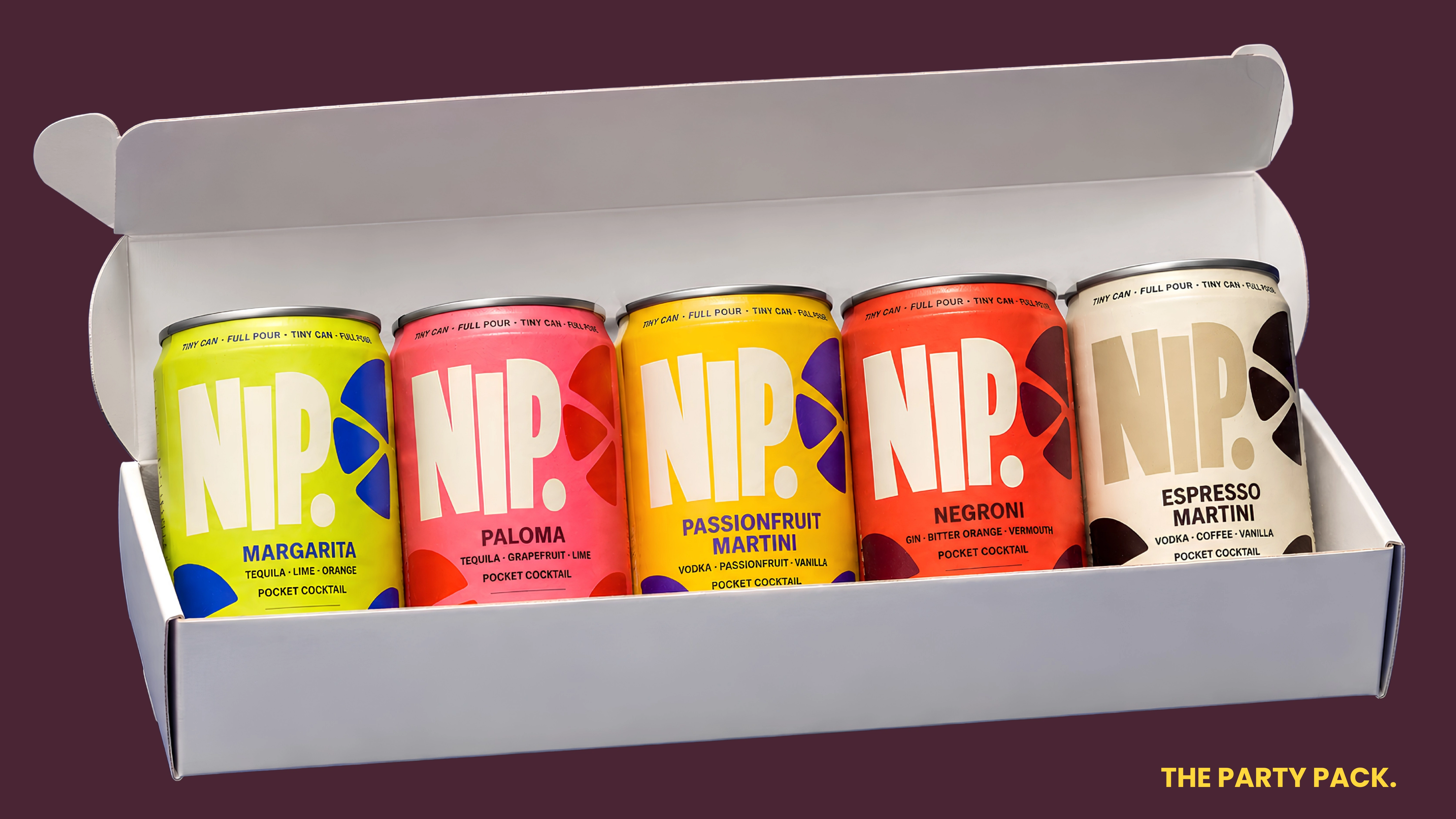
NIP. was imagined beyond the shelf. The format lends itself naturally to nightlife, hospitality, fashion and cultural partnerships — from limited-edition flavour drops and event serves to hotel minibars, festivals, gifting and collaborations.
Its small format also gives the brand a recognisable physical behaviour of its own: something carried, shared, collected and brought into the night.
THE RESPONSE
When I shared NIP. publicly, one response came up repeatedly: “I wish this was real.”
For a speculative concept, that became the most interesting validation of the idea. People weren't only responding to how it looked — they were responding to the proposition itself.
Like this project
Posted Aug 9, 2026
Creative direction, brand identity and packaging concept for NIP., a bold pocket-sized cocktail brand built around the idea: tiny can, full pour.