The Gorgeous Spice Company

Joel Derksen


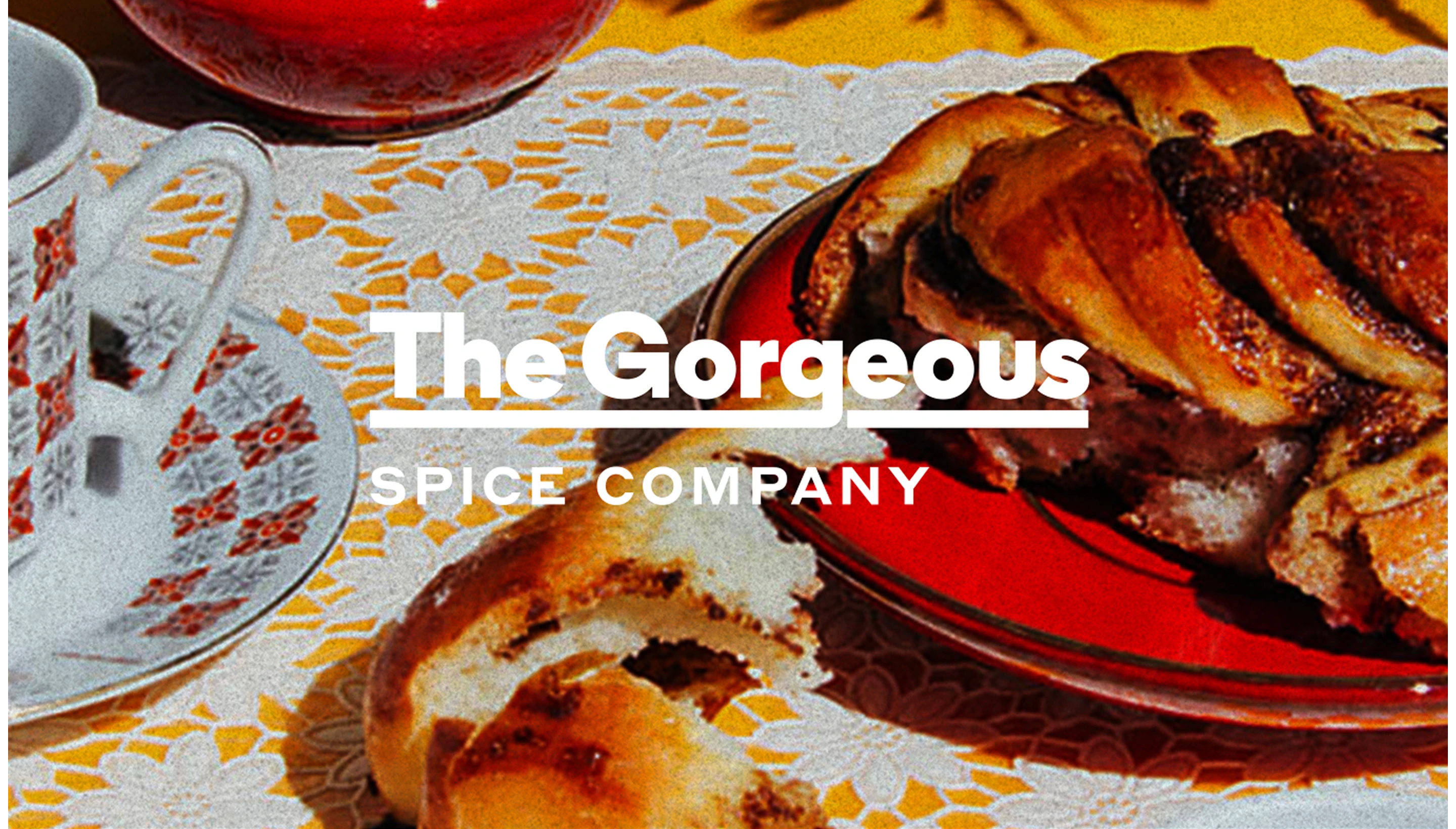
Cohesion doesn’t mean sameness. Savour difference.
A longtime client with a deep background in advertising and creative strategy came to Otherness for help building a subscription spice brand where every month’s signature blend would arrive with a narrative that was alive and tangible. It’s no fun for ongoing customers if there’s no surprise. Each blend would need to have its own clear identity, but still feel like it came from the same source, whether somebody picked it up in their mailbox or in one of the carefully curated list of regional retail outlets in which they can be found.
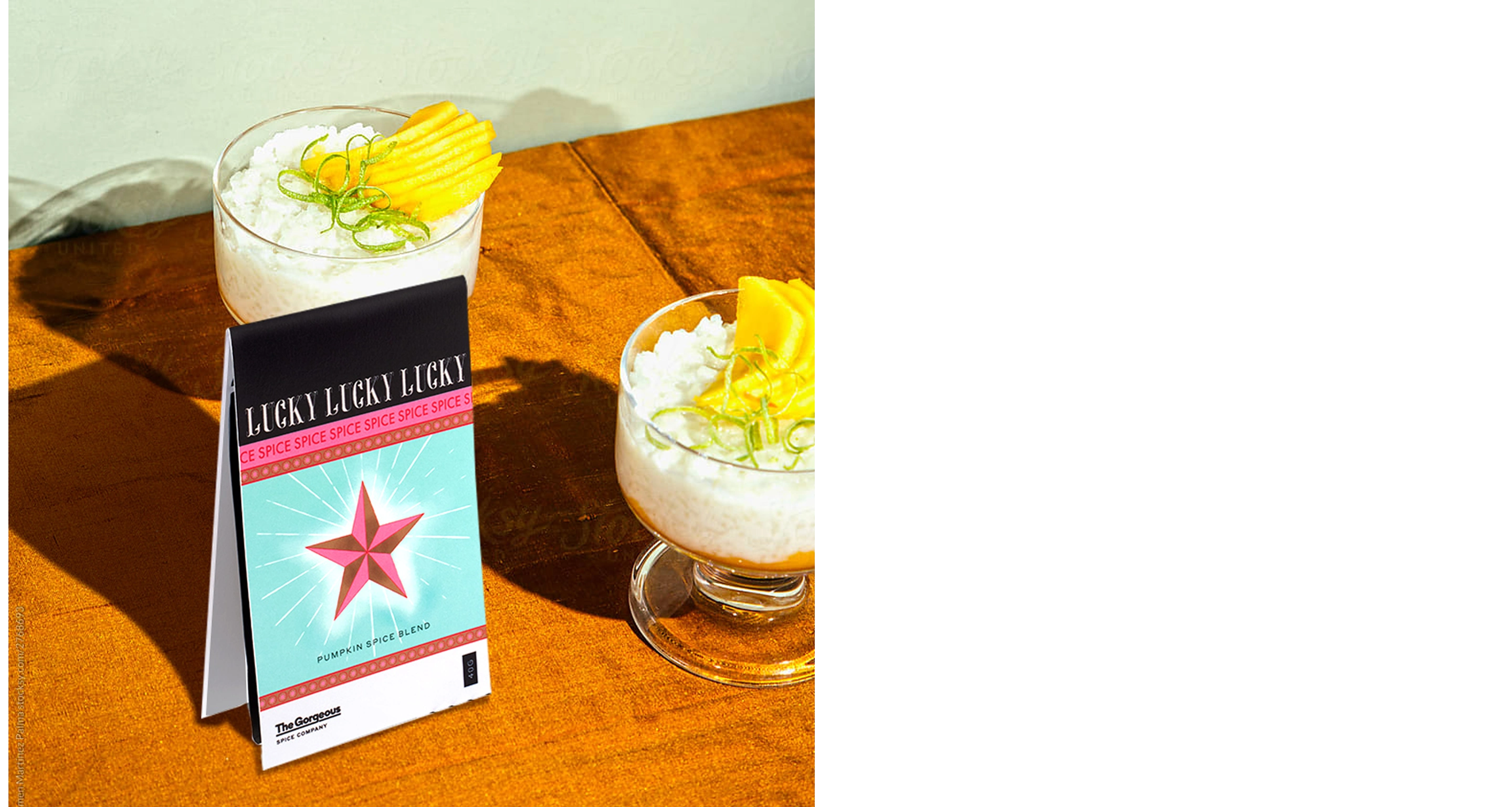
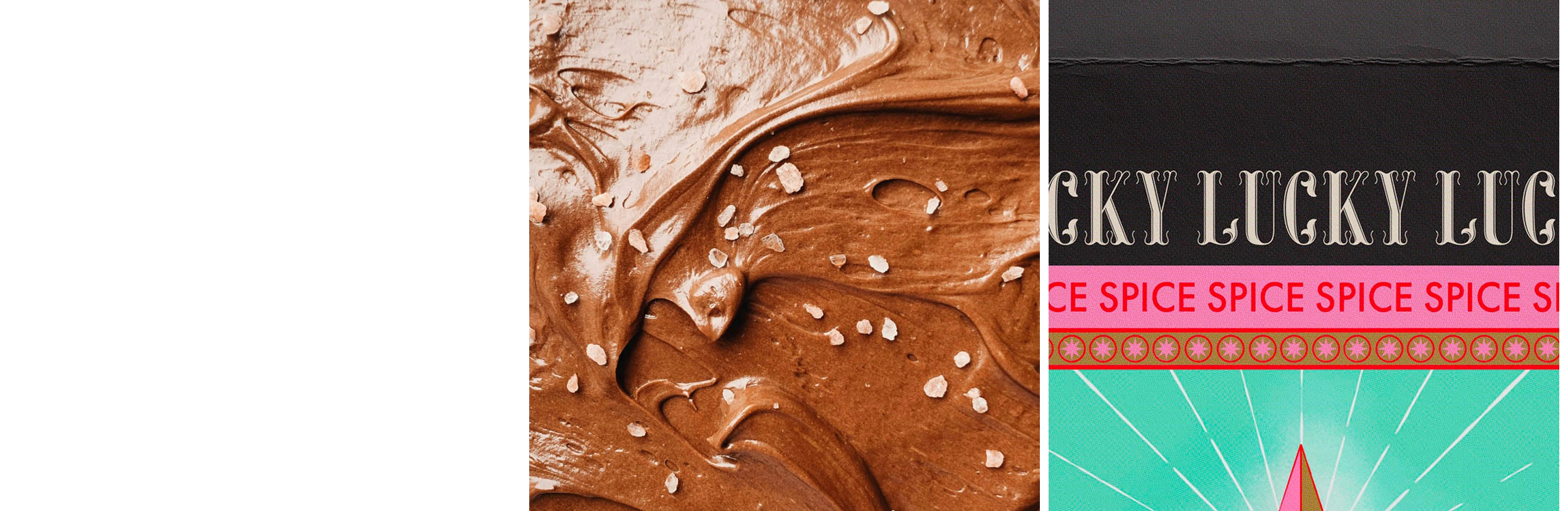
The Gorgeous identity — irreverent, flexible, deceptively chaotive — is based in a playful pastiche of pop cultural touchstones, from astrology through to tiki, from film noir, to westerns. Think of Gorgeous as an adventurous record label, with a market of fans ready to trust in their offbeat choices, excited for each new release. The blends are packaged with recipes, kitchen playlists, and product recommendations. Despite the individual identity and typography for each blend, a subtle brand system emerges through cues such as a repetition of core colours.
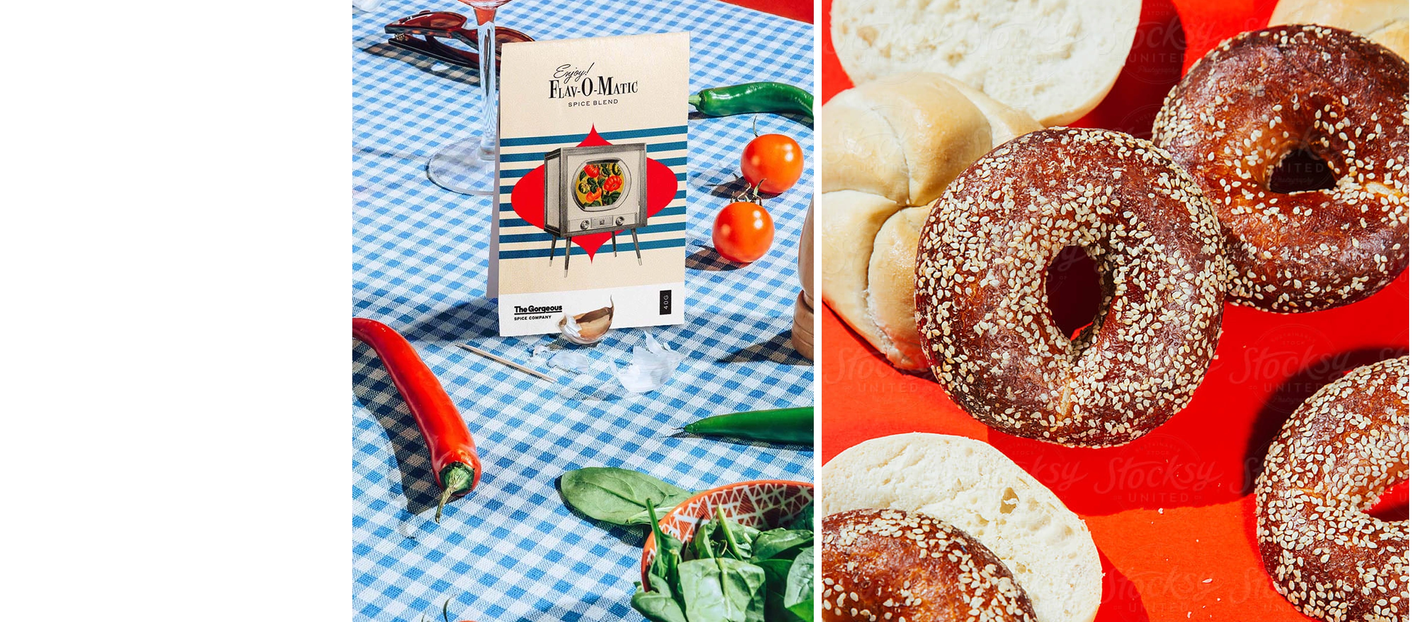
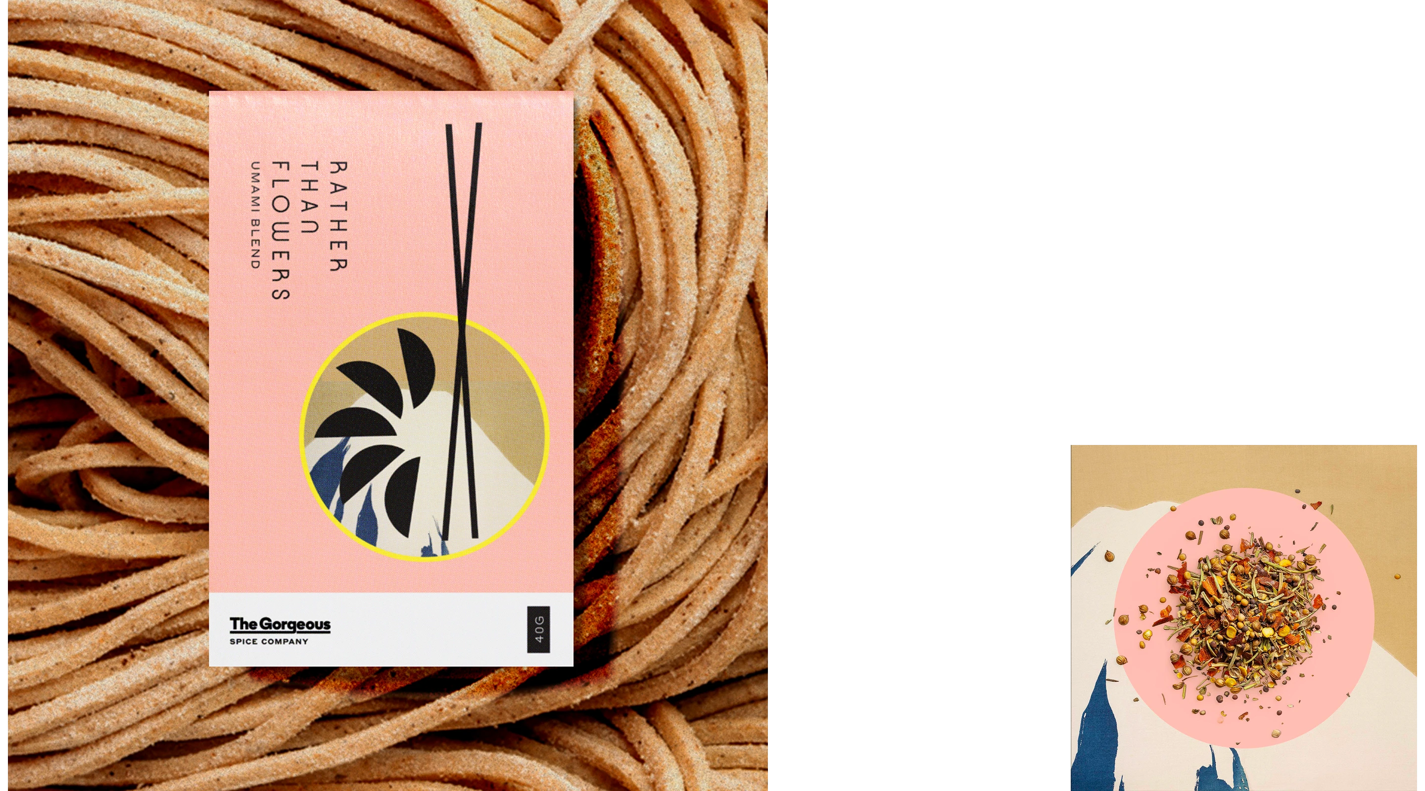
Every story is a blend.
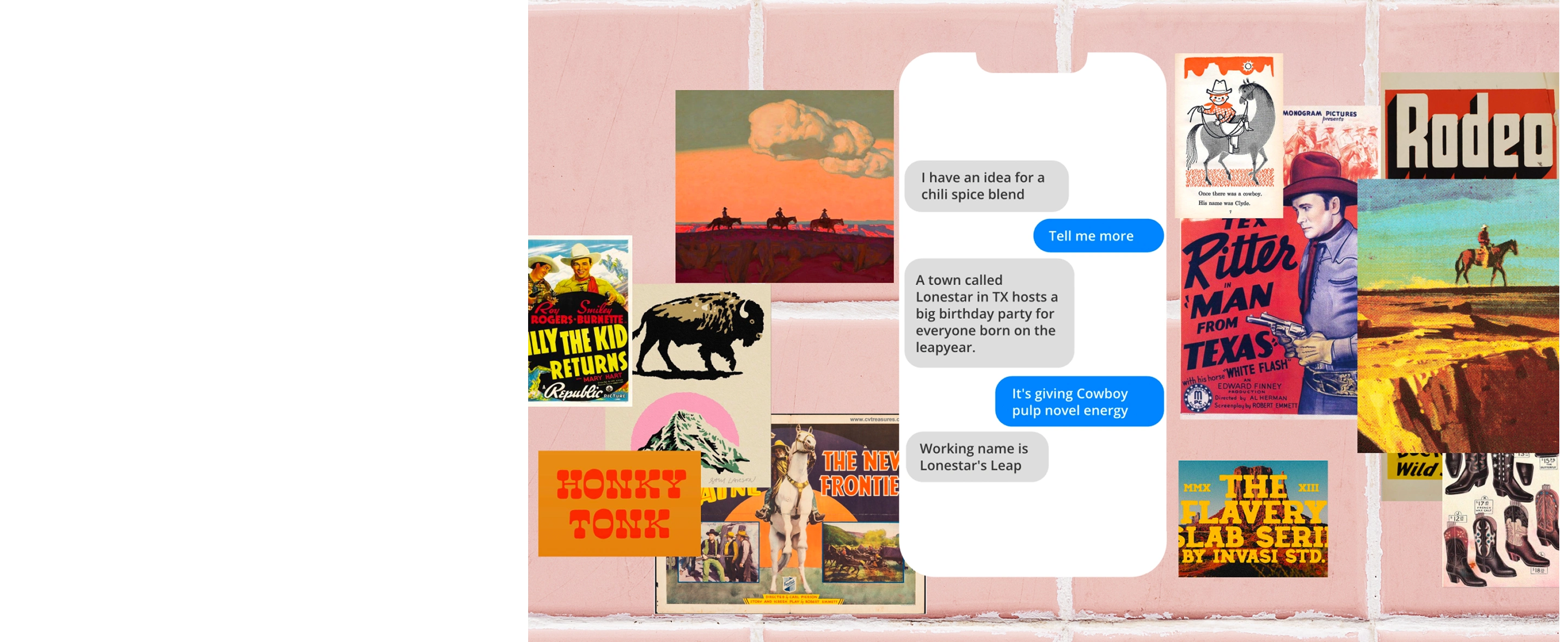
With each month’s blend, Gorgeous would come to Otherness with an underlying plan for their blend. From that, Otherness and the client would dive into deep ongoing generative conversations and shared historical and cultural research. The resulting ideas come from the sparks of these conversations, as Otherness and the client would continue to surprise each other and build on references to arrive at unexpected but just-right-seeming references for each blend.
Practicality is a gorgeous trait.
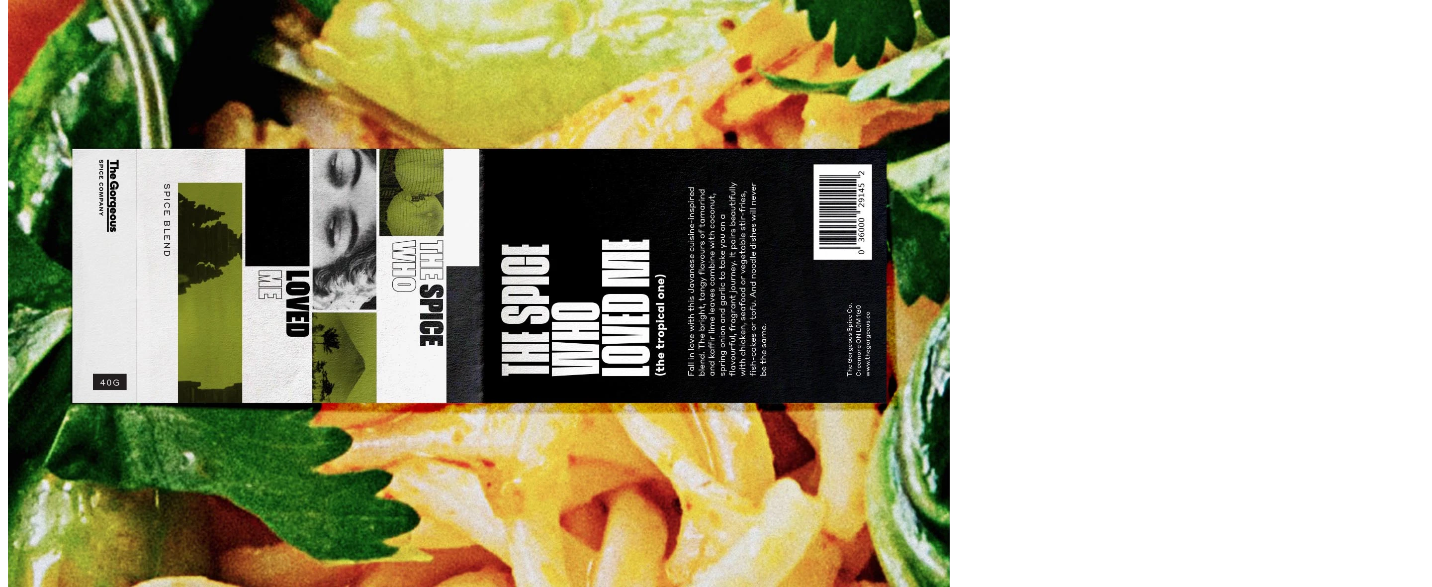
As maximalist as the designs may appear, the packaging is optimized for business and distribution logic. With art on the front and recipes in the back, The zip packages for the spice blends were designed to fit flat through a standard mail slot. The adhesive labels on the actual spice packages are peel-and-repeal, meaning that customers can take them off and put them on their own spice jars.



Like this project