Redesign of auau.io App for Improved User Experience

Ivan Wong

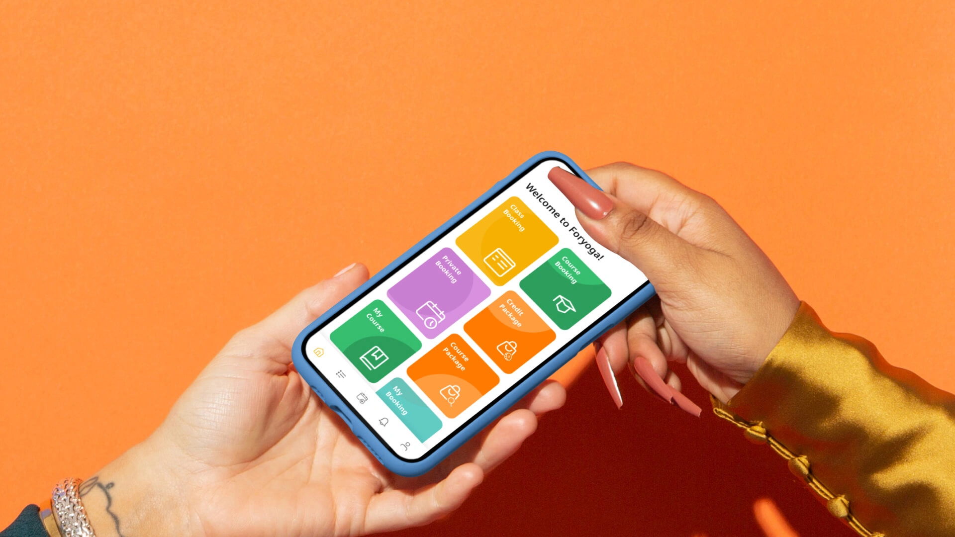
From analyzing the auau.io, new app design concepts, and collaborating with developers.
The Problem
AUAU was redesigned in 2022; however, the mobile experience lacks user-centered design and intuitive interaction, resembling only a web view on a phone, which is a major issue.
The goal
is to preserve the features of the original design without making significant changes that might confuse current users. Make interactions more user-friendly and human-centered by redesigning them to meet end users’ actual needs.

The Problem
The absence of user-centered design, intuitive interactions, and a contemporary user interface were issues for the second generation of auau.io. These problems affected user involvement and made it clear that a more efficient, aesthetically pleasing, and user-friendly experience was required. The following are some of the main concerns:
Home Screen For Studio
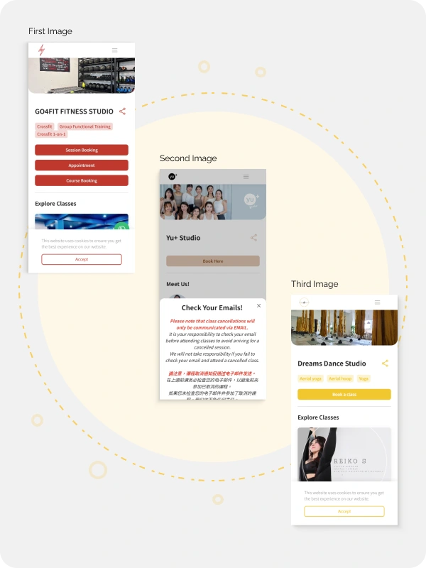
First Image:
The hierarchy between text and tag is somewhat inconsistent. The three buttons/tags (“Session Booking,” “Appointment,” “Course Booking”) are the same color, size, and style, spacing, which can make it hard for users to differentiate between them. Using different button styles or clearer labels could help improve clarity and guide users. What will happen if there are more than three tags?
Second Image:
The “Check Your Emails!” pop-up alert is too text-heavy and doesn’t indicate priority information at first glance. Users might feel overwhelmed or skip reading it. Reducing the amount of text or breaking it down into bullet points could improve readability. The location of the pop-up is wrong and should be the center of the screen.
Third Image:
It seems like they were also the same after the banners were displayed. There is a big gap in spacing, which not sure why will have a big gap?
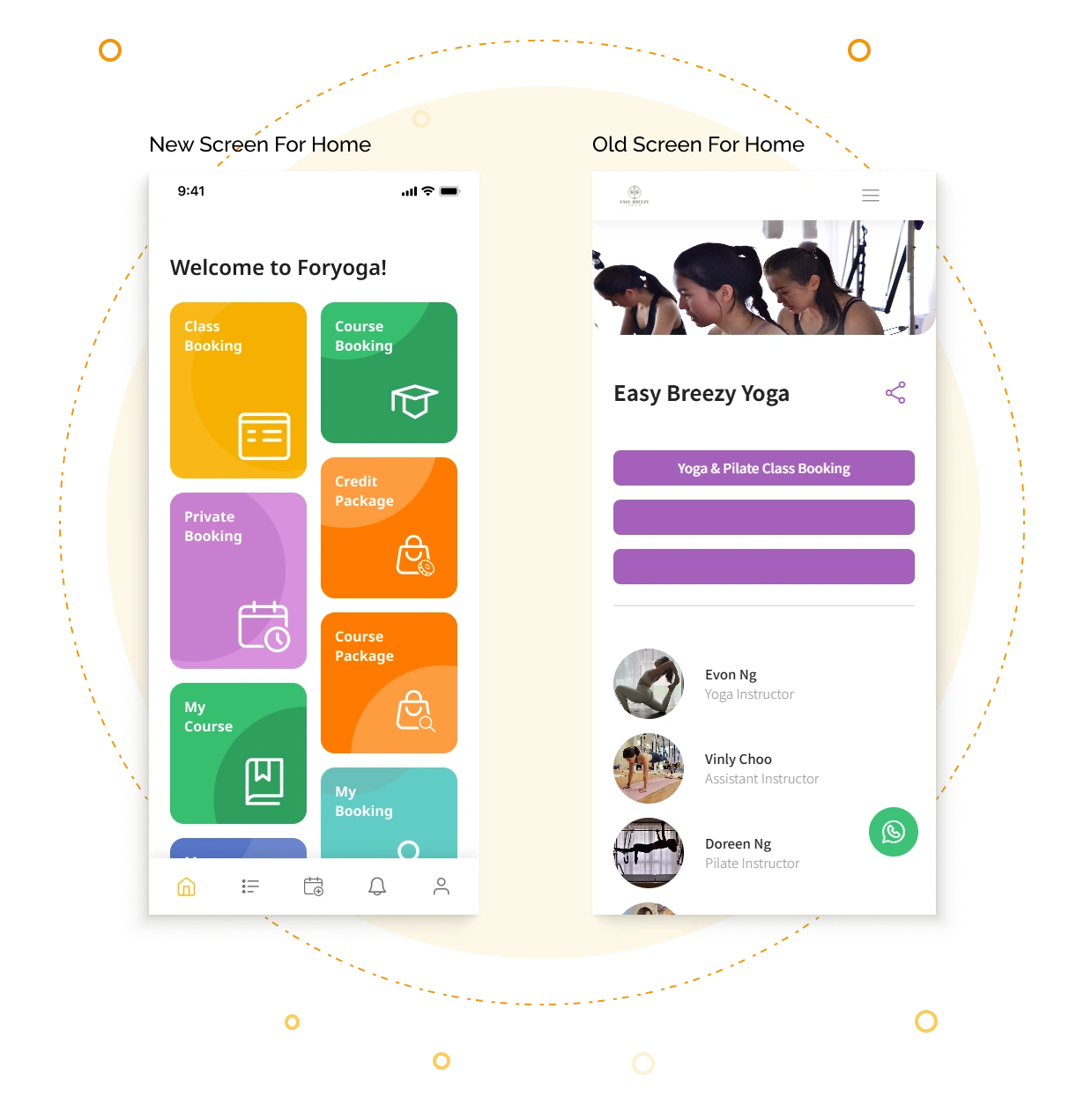
New Screen & Old Screen
Easy Navigate: Straightforward, very easy to go through.
Color and Accessibility: Ensure contrast ratios meet accessibility standards, especially for buttons and text on colored backgrounds.
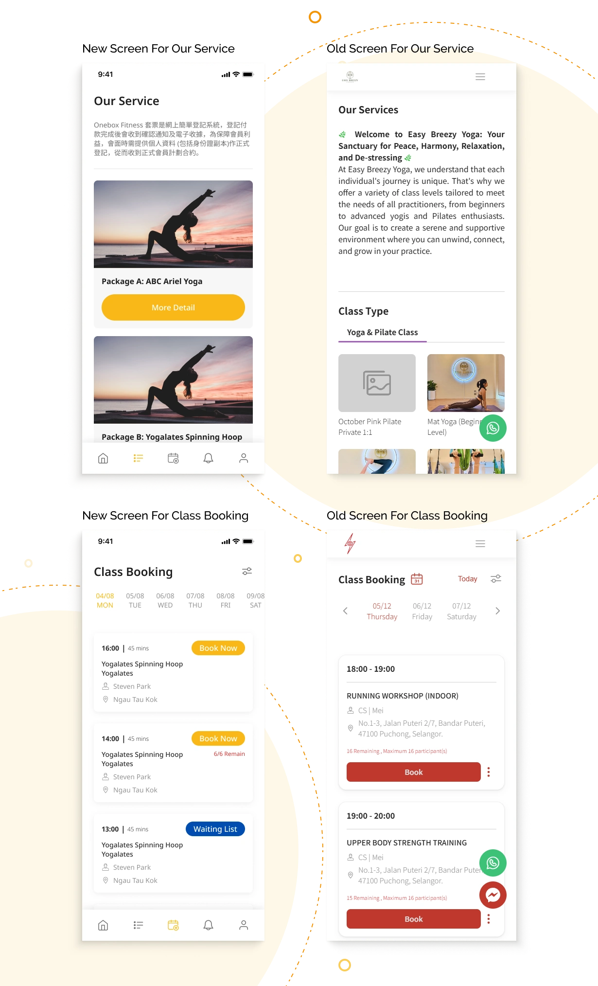
Component
Design components are modular, reusable building blocks in UI/UX design. We designed over 100+ components for this project.
Mocking up final screens
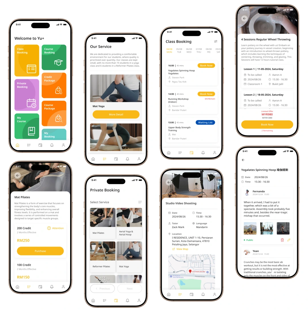
I redesigned the UI system from the website(mobile view) to the auau app into a more user-friendly, modernized design– to feel clean, energetic, and healthy, with notes for students, applicable to equip different sports instructors’ content.
Let's try it!
Thanks For Watching!
Share your challenge with me and I will help you to create revolution product for your business.
Like this project
Posted Sep 1, 2026
Redesigned auau.io app for improved user experience and engagement.
Likes
0
Views
4
Timeline
Jan 1, 2023 - Dec 31, 2023