Revamping a Dating Violence Prevention Toolkit (Case Study)
Thao Nguyen
The Project
Dating Matters Toolkit is a website designed to inform community leaders, educators, and parents on the scientifically-backed Dating Matters program and how to implement it in their respective communities. Dating Matters is the name of the program funded by the CDC's Department of Violence Prevention to prevent dating violence early by giving community members tools to educate children on how to have healthy relationships.
The Problem
The Dating Matters Toolkit relied heavily on downloadable PDFs to disseminate large amounts of information. This posed issues in a variety of ways. Those who were using the website on mobile would have to download and zoom in and out on PDFs on their phone. The navigation heavily favored users who were experienced and already a part of the program rather than those who were interested in implementing the program in their communities.
The Solution
The redesign was meant to take away a lot of the "fluff" that was present in the previous version. Important common information was put to the front of the site so that users would not have to shift through PDFs to find the information they were looking for. The PDFs took a secondary role where its presence was more for those seeking additional information about the program. Navigation was also improved so that users could easily jump through pages.
The Limitations
While this was a government website under a branch of the Center for Disease Control, it did not have to utilize the CDC WCMS website building system. However, it did have to undergo heavy clearance review which meant a lot of complex UI elements had to be avoided in order for the product to go through clearance smoothly. Transitions were also up to the developer to handle so the development of the product were within the parameters of the developer's abilities to build the website.
The Role
The Dating Matters redesign team consisted of eight people who various roles of researcher, writers, designers, and project managers. I was the lead designer for this project and was supported by another fellow designer throughout the process.
The Research
The user research was already conducted when I was brought onto the team. Due to contract obligations, I cannot upload the full document pertaining to the user research analysis to the portfolio. However, I highlighted and outlined the key findings from the research below. After taking the time to read the multi-page research document, here are the key findings that determined the path of the project. A lot of the issues lied within the presentation of information. Deleting documents and information was not possible for this project but helping users navigate it became a top priority.
Users liked the village image but they rarely ever utilized it. The navigation was only helpful for those who already knew what they were looking for.
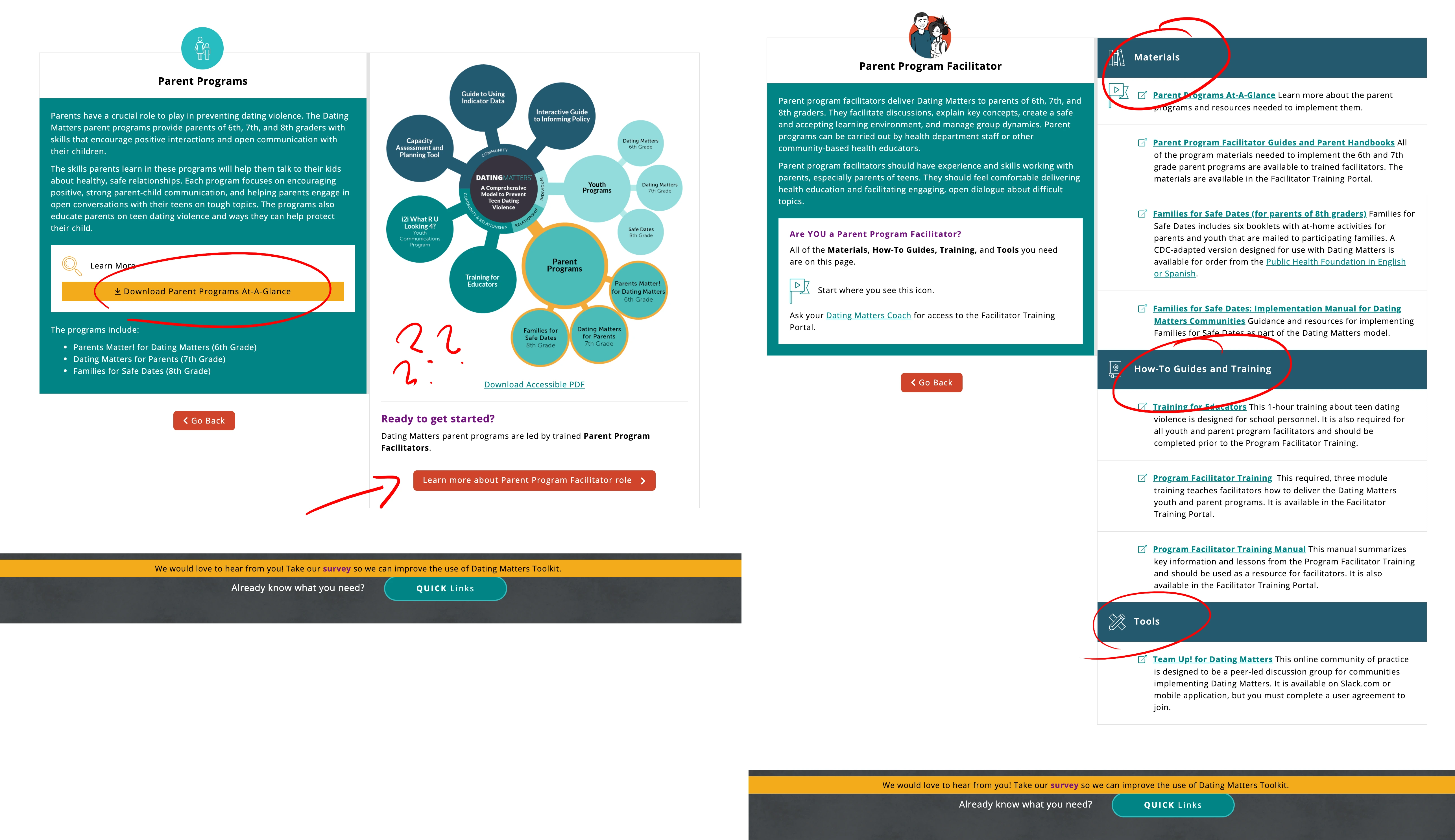
A lot of important information for the programs required a PDF download which was not convenient for those viewing it via mobile. The bubble chart was considered too confusing and the program page failed to specify that each program required different roles to be successful.
Users were often confused by the "roles" and "component" pages; those without any prior knowledge did not understand the differences.
The number one thing users were looking for was the cost of implementing a program within their communities.
Users did not use the village map on the home page very often; the village ended up not serving much of a purpose besides looking nice.
Users were frustrated with having to go back to the homepage in order to go to a different page; this was especially frustrating because of the number of pages.
Users did not completely understand the bubble graphic that outlined the various Dating Matters Program
Users did not understand how or when to take the necessary trainings.
Ideation
Through the research, we found that there were two different types of users who utilized the website. New users were those interested in using the website to create proposals in order to secure funding to implement the program(s). Current users were those already implementing the program but was looking to take the training to prepare themselves to implement the program. We found ourselves asking the following questions.
What are people looking for when first entering the website?
How can we make it easier for users to sort and navigate through such a large amount of information?
How can we provide understanding of complex ideas to the users?
How can we make training courses easier to access?
I had thoughtful discussion with my team and with the client team to determine the wants and needs that has to go into this project. I put all the suggestions and notes into a feature prioritization matrix to organize each important feature based on urgency. These were the four key features of the toolkit that we landed on. We prioritized these features over everything else continuing on with the project.
Key Feature 1
The toolkit lacked a dedicated navigation menu which forced users to have to go to the homepage to visit a different page on the website.
Key Feature 2
The website lacked context and seemed like it was more for users who already knew of the program rather than users who stumbled across the program.
Key Feature 3
The toolkit lacked a dedicated navigation menu which forced users to have to go to the homepage to visit a different page on the website.
Key Feature 4
Important information was put to the forefront and PDFs were made to be secondary to the webpage. Users should be able to find applicable information without having to shift through PDF downloads.
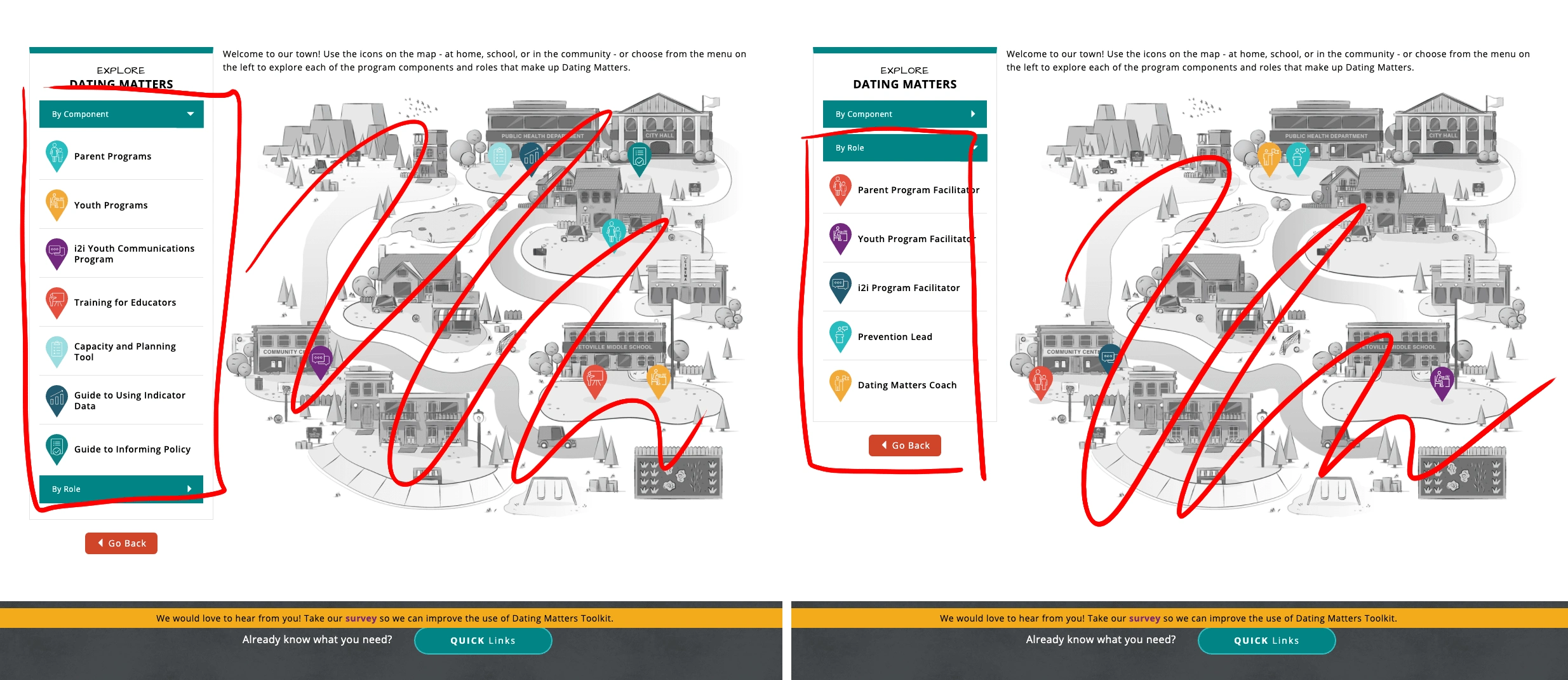
Sitemap
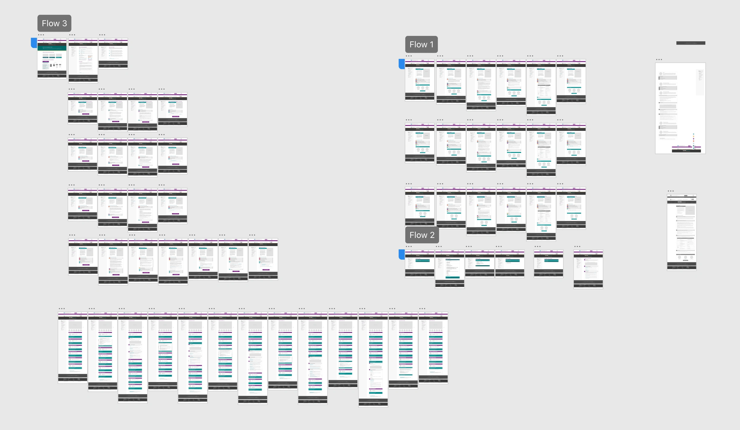
Before prototyping and wireframing, I went through and indexed all the files and pages on the original toolkit. This gave me a better look at what type of information I was working with and how to organize the information based on importance. It also gave me a change to sort out any broken links and outdated information. Saying that it was an incredibly large haul is an understatement.
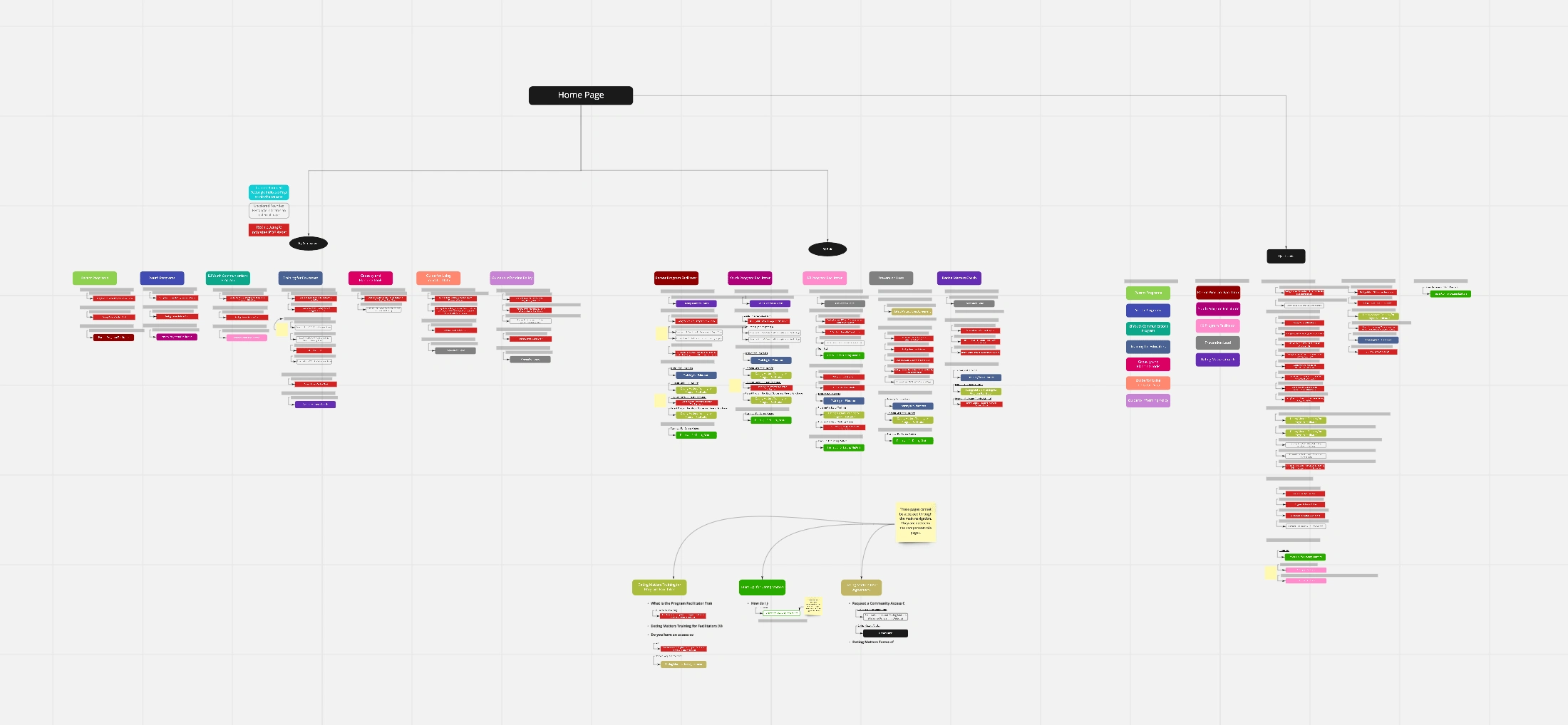
Sitemapping documents and pages
Sitemap of Program pages
Sitemap of Role Pages
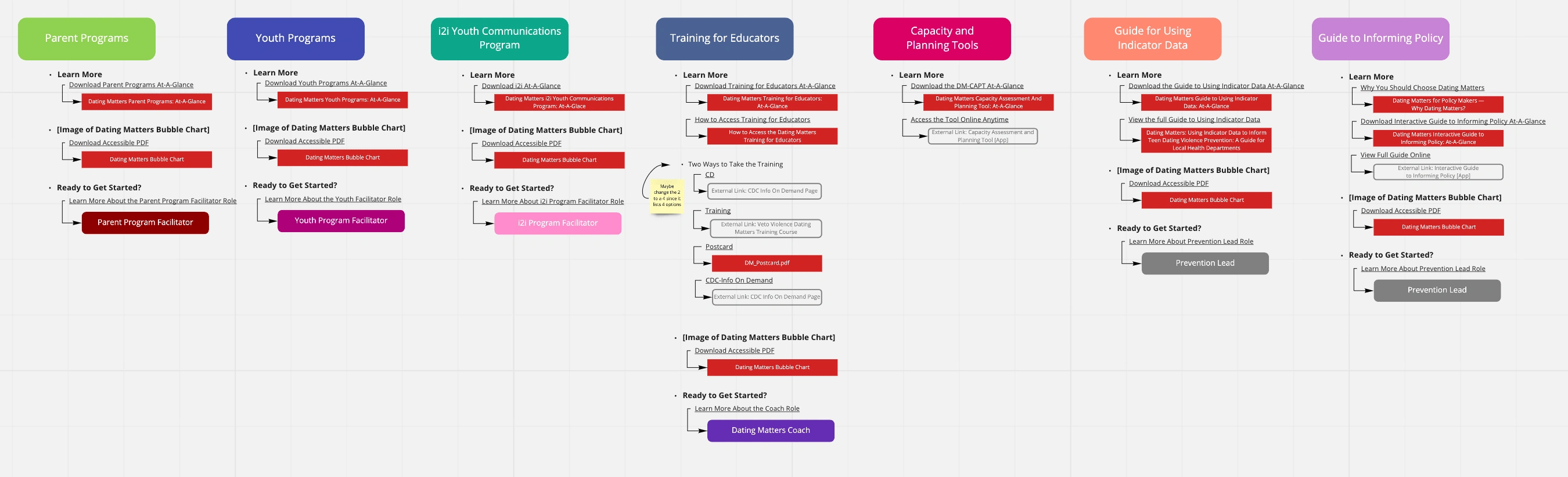
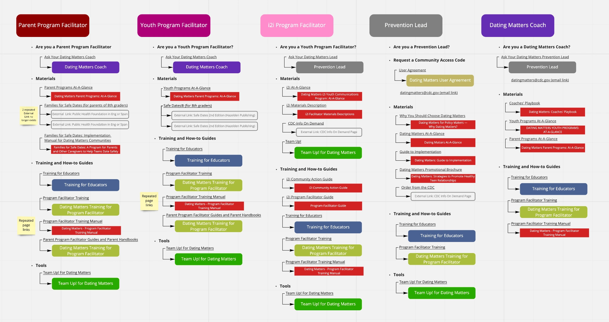
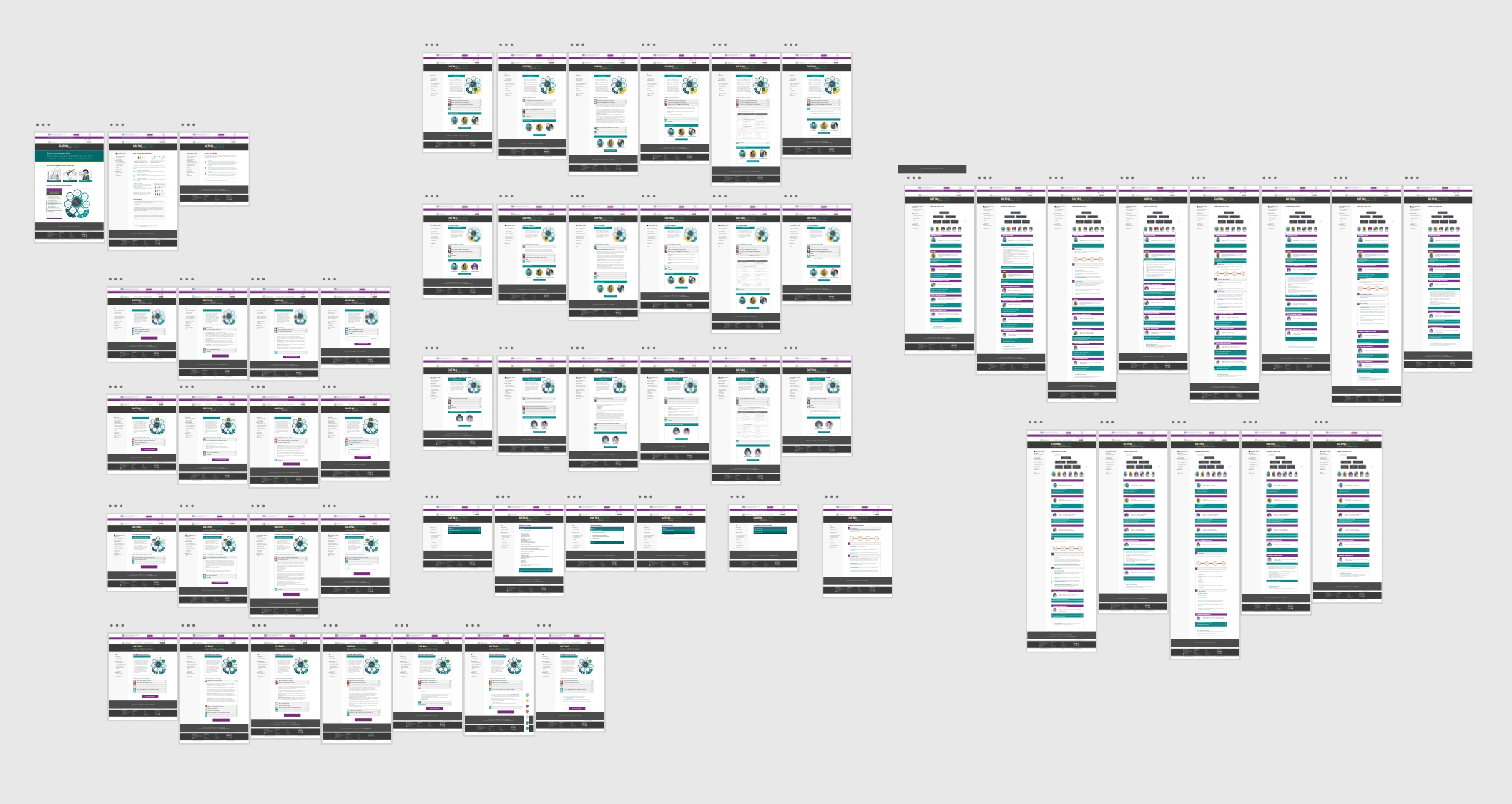
I could not get rid of any of the documents unless it was outdated. However, I took note of patterns and repeated links and started to develop a new sitemap. For an example, the Team Up! for Dating Matters link was on every single page of all the roles. The pages also linked out to other roles which sometimes caused confusion when users didn't know how each role relates to each other. It was decided that both there would be three sections in the toolkit: Getting Started, Components, Roles, and Resources. Below is the initial sitemap (for simplicity of client review, we didn't include the PDF downloads and links but they were on a different document for clients to reference).
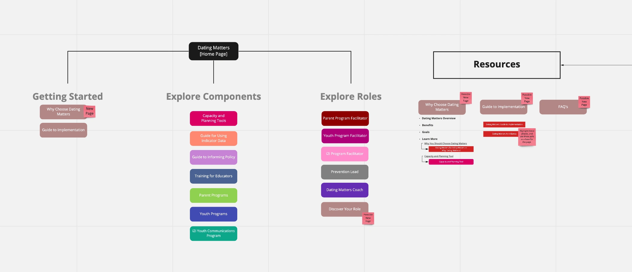
First Iteration of New Sitemap
Wireframing
Initially we wanted to do something similar to the original village graphic on the old toolkit. A left-hand navigation menu was added. The resources category which seemed to be the most important was at the top while the roles were at the bottom. We kept roles on each individual page and hoped to reorganize the information in a different way to help ease information to the user.
First Wireframe Draft
Unfortunately, this iteration didn't hit the mark quite yet. It was then that we decide to revisit the sitemap and make some adjustments. Because a lot of the information for the different roles were very repetitive, it was decided that all the roles should be on one page instead of multiple pages. The roles were also moved into a new category, "Getting Started," and the "Resources" category was pushed down to the bottom. The wireframe was also updated accordingly.
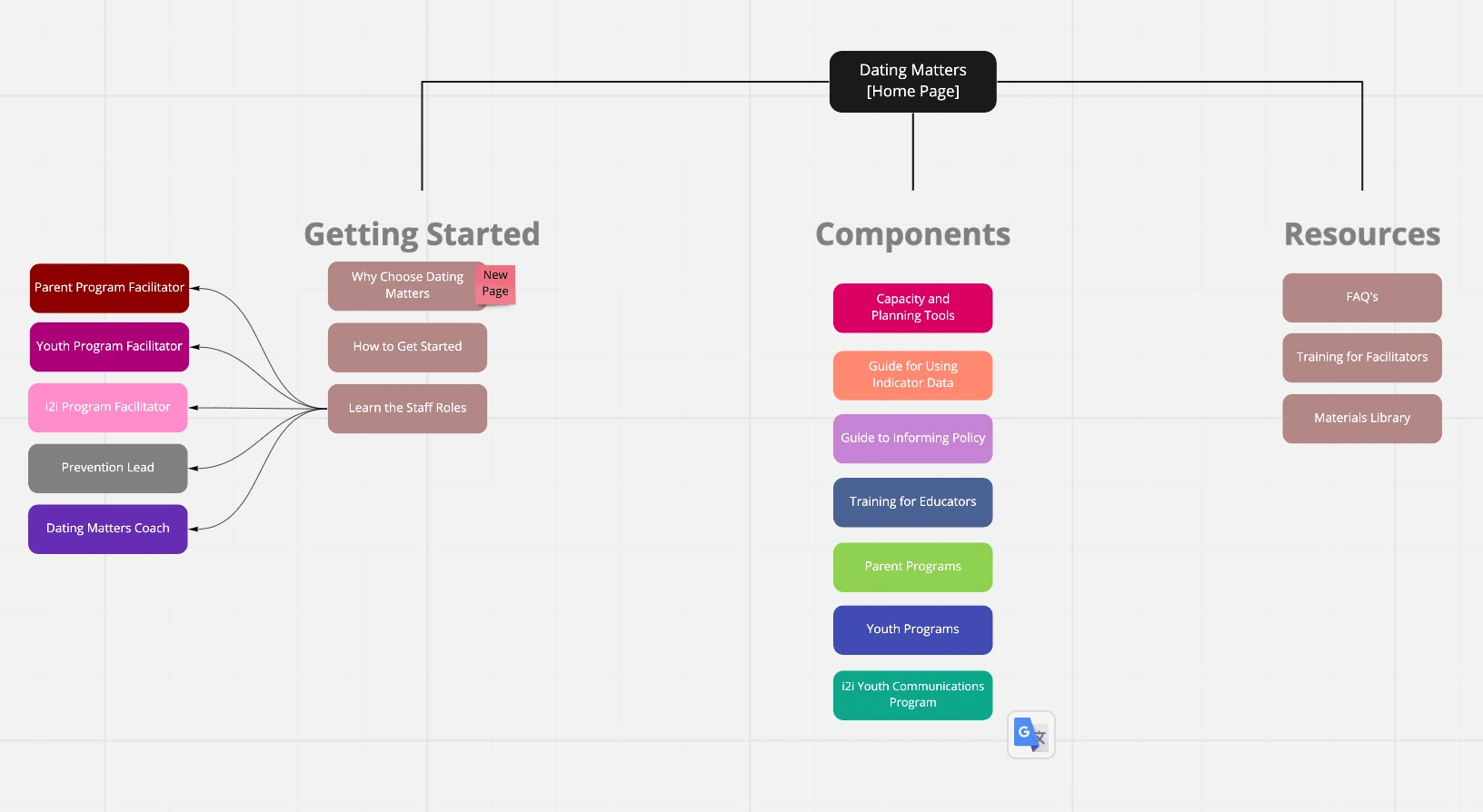
Second Iteration of New Sitemap
Updated Wireframe
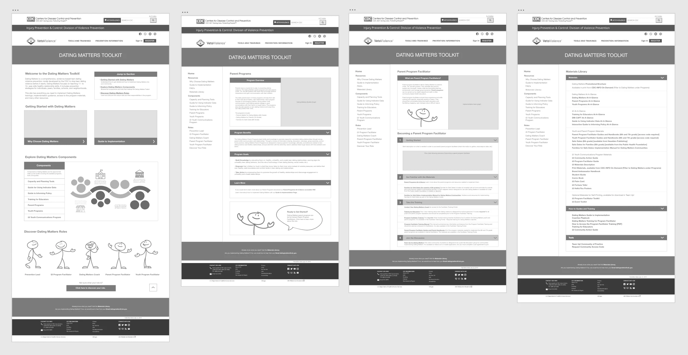
Prototype I
After the approval of our wireframe, I was asked to start making a mid-fi prototype. The scope of the project only allowed for 2 user tests. The first was the initial user test of the original toolkit, the second would be for the hi-fi prototype. Because of this limitation, there was no user test or prototype for the wireframe and no user testing for the mid-fi prototype. The development of the mid-fi prototype did include a couple of more changes (not with the navigation but rather with the elements on the webpage).
Prototype II
Prototype I was looked over by the client and some adjustments were made for Prototype II. The main issue with the prototype was the homepage. It still had the issue in which users were confused by the components. My solution for Prototype II was to remake the bubble graph. Prototype II was then sent to user testing.
User Testing
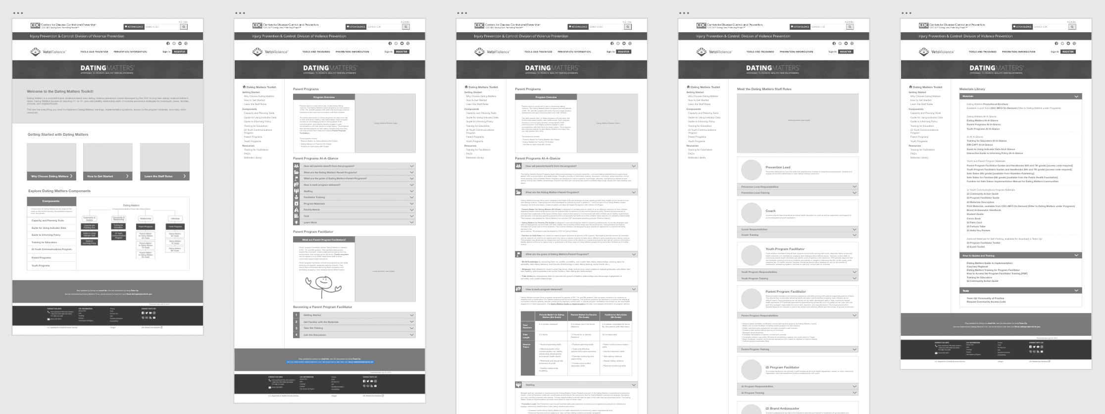
The prototype was sent out for user testing which lasted a month. The details of the user experience was not based on navigation but rather based in properly naming different structures of the toolkit. By adding more context to the content, it helped alleviate the responsibility off the user to know everything. This was especially important for users who were unfamiliar with the program. Most of the suggested edits were extremely doable and we didn't have to prioritize one over the other, however, we did land on the problem of the homepage yet again. In general, the bubble graphic was not sufficient enough in providing information to the users. Evolution of Home Page
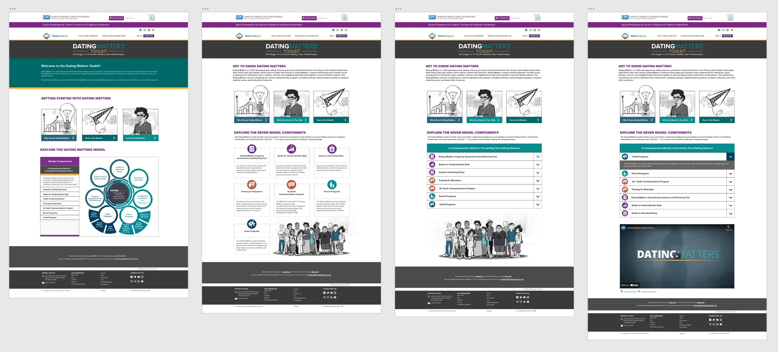
The homepage was worked on in several iterations. The end result was a menu that both acted as a drop down and also a navigation. The bottom of the page had a last minute request by the client to add a promotional video. After client approval, the prototype was prepared for developer hand off and went through 508 compliancy check and CDC clearance.
Final Thoughts
This was one of the longest running projects I had to do. It took over a year to complete but the client was immensely happy with how it turned out. Out of all the projects I was given this one gave me the best learning experience. All too often, modern UI design relies heavily on aesthetics that cannot work within a website with a massive information library. I was corrected many times throughout the project about accessible design. With this project I started thinking accessibility first. I now make accessibility design a habit rather than a feature. While the website doesn't contain any type of fancy features like amazing animation, parallax, or transitions it is accessible to many people and it put new and curious users first.
While this was a big project, it did had limited dedicated funding. As such, user testing couldn't be performed every step of the way. Instead user testing was prioritized more towards phase III of the project. Ideally, I would liked user input closer to every step but in all projects we have to deal with limitations of the scope.
One feature I would love to implement in the future but would require a very heavy lift is creating a cost calculator rather than using a cost chart. I understand that the cost can't be super precise due to different community funds varying but being able to give a rough low end to high end estimate using pulled data will make it easier for people creating proposals to implement this program within their schools and communities.
On an off note, for some reason the client wanted really large font. I would have preferred something smaller, but you can't convince everyone.
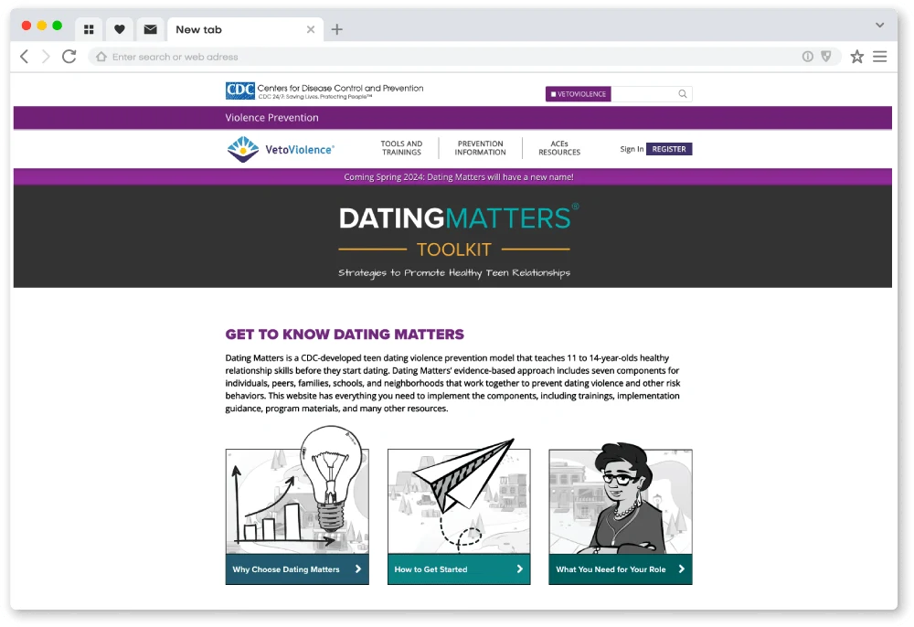
You can view both the current and previous version of the toolkit below.
Like this project
Posted Feb 19, 2024
This is a redesign of the Department of Violence Prevention's Dating Matters Toolkit meant to educate children on developing healthy relationships.
Likes
0
Views
3
Clients
National Institute for Occupational Safety and Health