Ai Product Scanner App Screenshots
crew 7™ studio
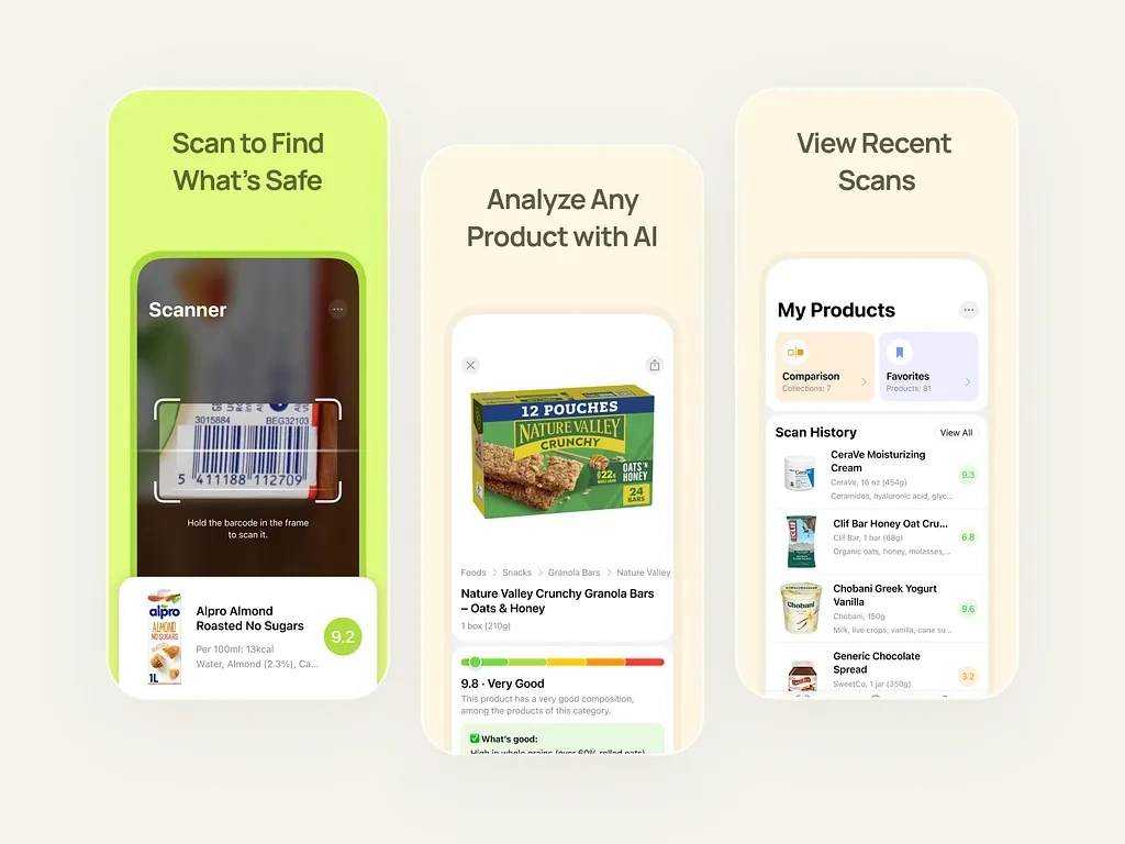
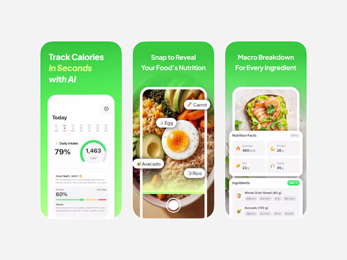
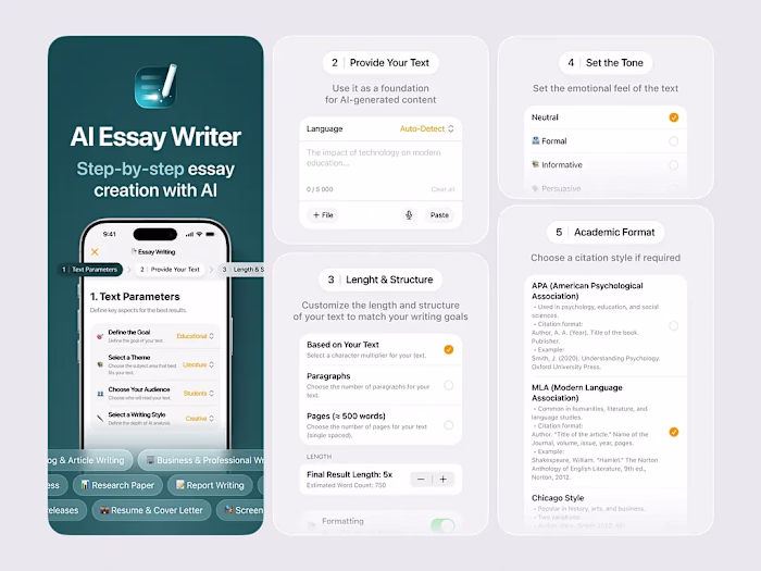
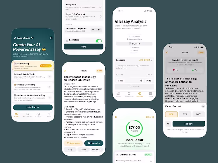
These screenshots were designed for our AI Product Scanner app project. Each picture has a clear, focused headline that immediately tells users what they can do. The warm, neutral color palette with pops of green keeps everything approachable, while the layout prioritizes clarity.
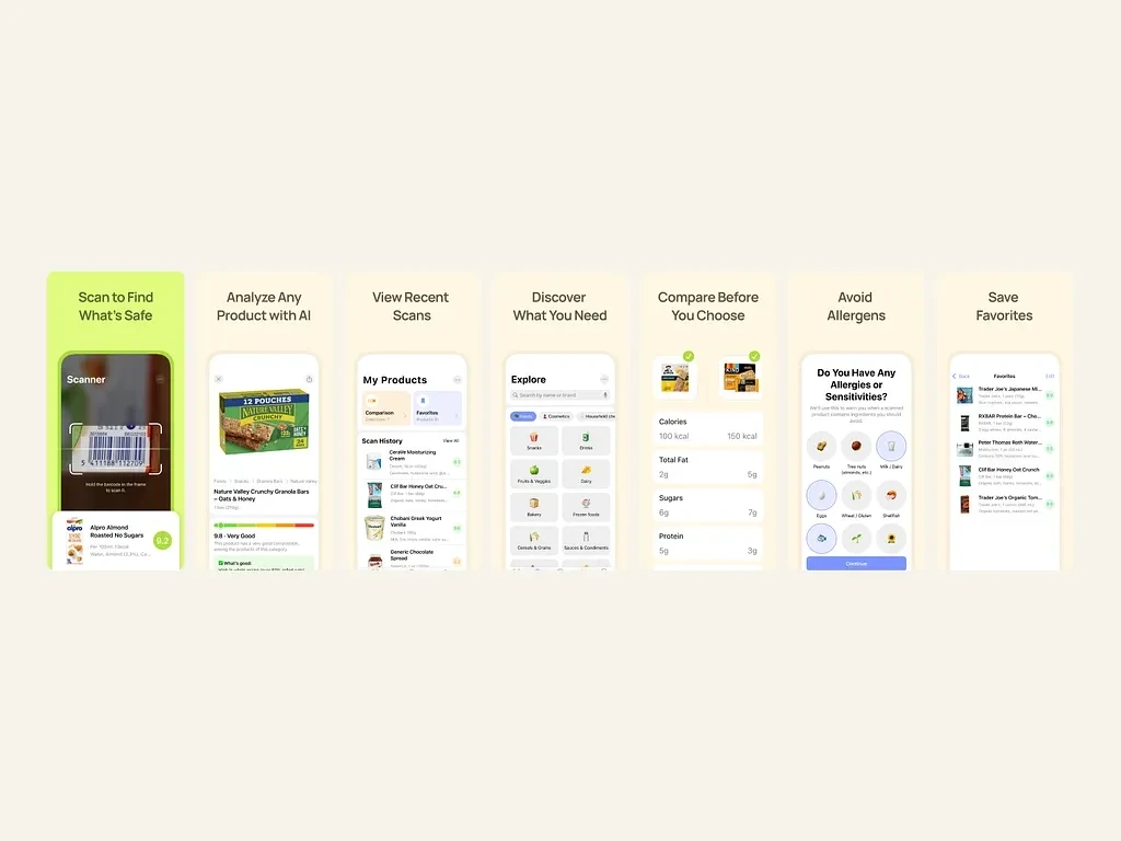
We structured each screen to answer a specific user question: Can I trust this product? How does it compare? What about my allergies? This intentional flow guides potential users through the app's value. The clean design and straightforward messaging work together to increase conversion.
Like this project
Posted Dec 22, 2025
These screenshots were designed for our AI Product Scanner app project. Each picture has a clear, focused headline that immediately tells users what they can do