Visual Identity System for YAGAN DEPOT
Enmanuel Jimenez Veloz
YAGAN DEPOT — Visual Identity System
Complete branding system for YAGAN DEPOT, a Chilean company specialized in importing and distributing industrial and workwear clothing. The goal of this project was to develop a robust and functional visual identity that reflects the brand's commitment to structure, resilience, and operational precision.
YAGAN DEPOT Brand Introduction
Brand Overview
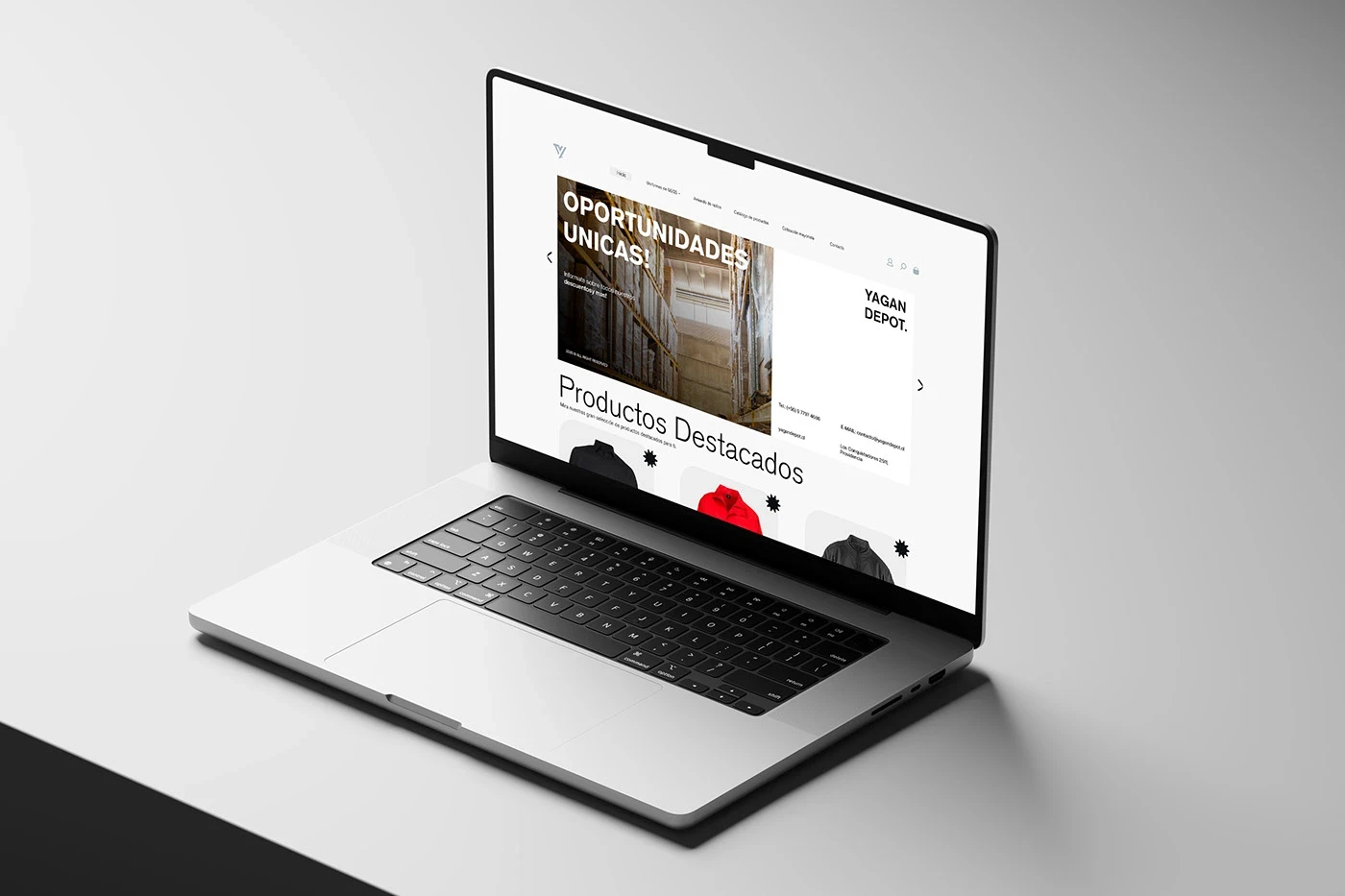
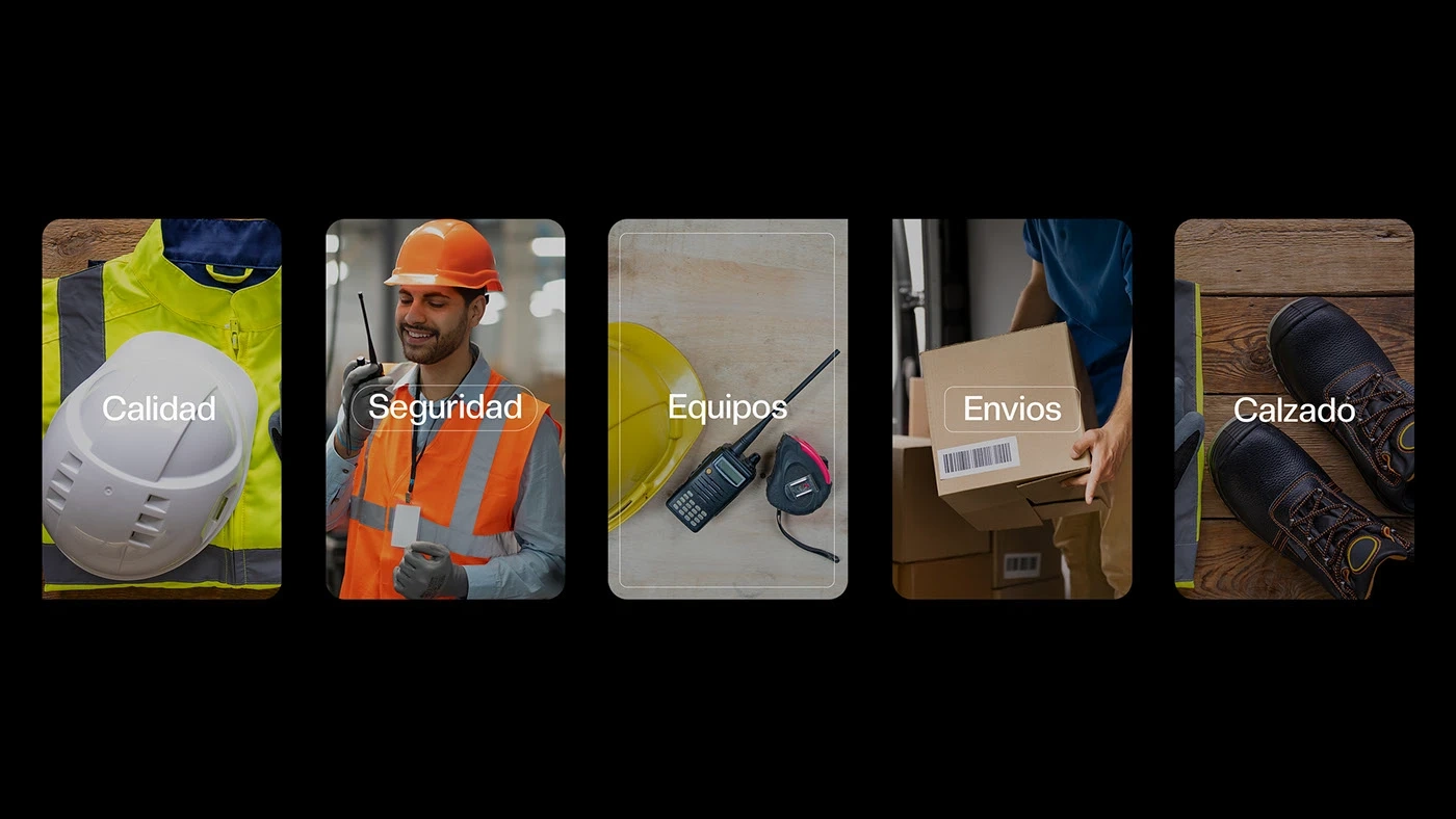
The identity system was designed to be highly adaptable across physical and digital environments, with a clear industrial tone that blends modern typography, a neutral yet bold color palette, and practical applications that reinforce trust and professionalism.
Visual Identity System
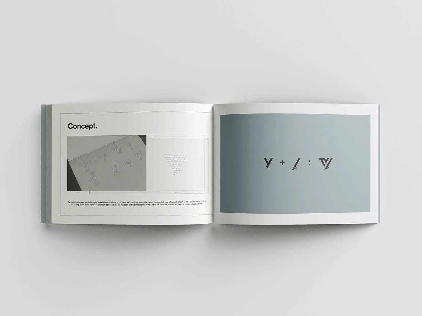
Symbol Construction
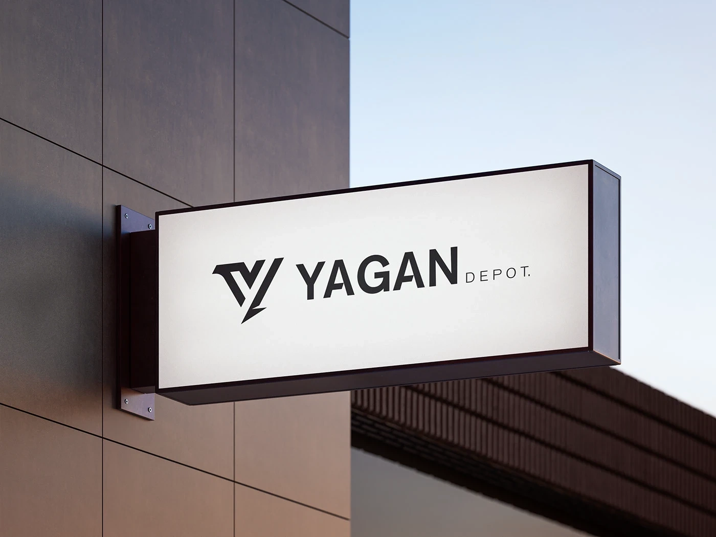
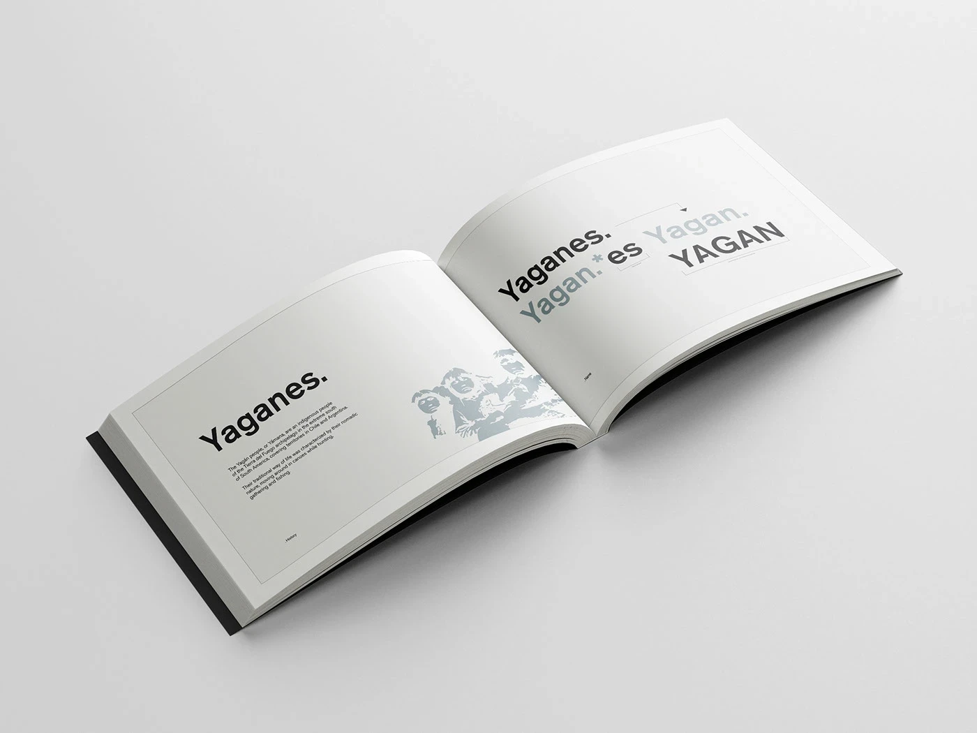
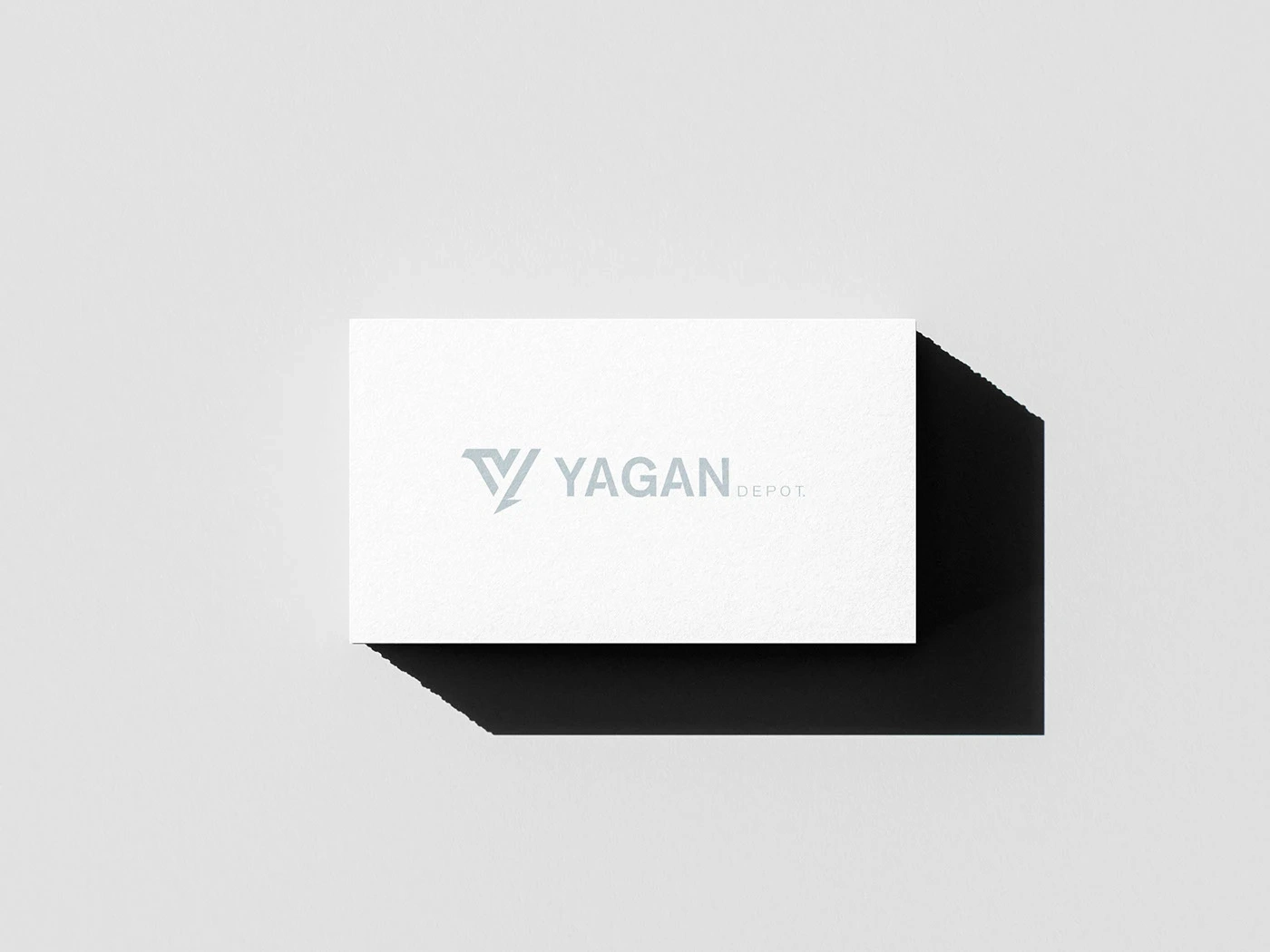
The YAGAN DEPOT symbol is born from the initial "Y" and draws inspiration from the Yagan people, an indigenous community from the southernmost region of Chile, known for their resilience, territorial wisdom, and deep connection with the environment.
The symbol subtly incorporates the shape of an arrow, referencing the hunting tools used by the Yagans — a direct metaphor for precision, focus, and survival, values that also define the company's industrial and logistical efficiency.
Symbol Construction and Grid

Logo Variations

Brand Mark Applications
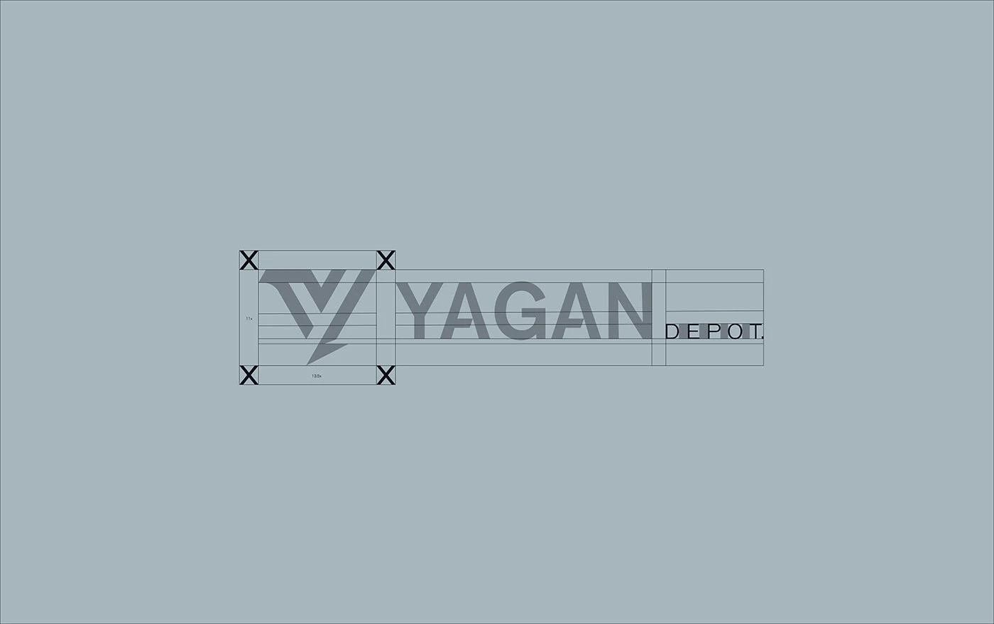
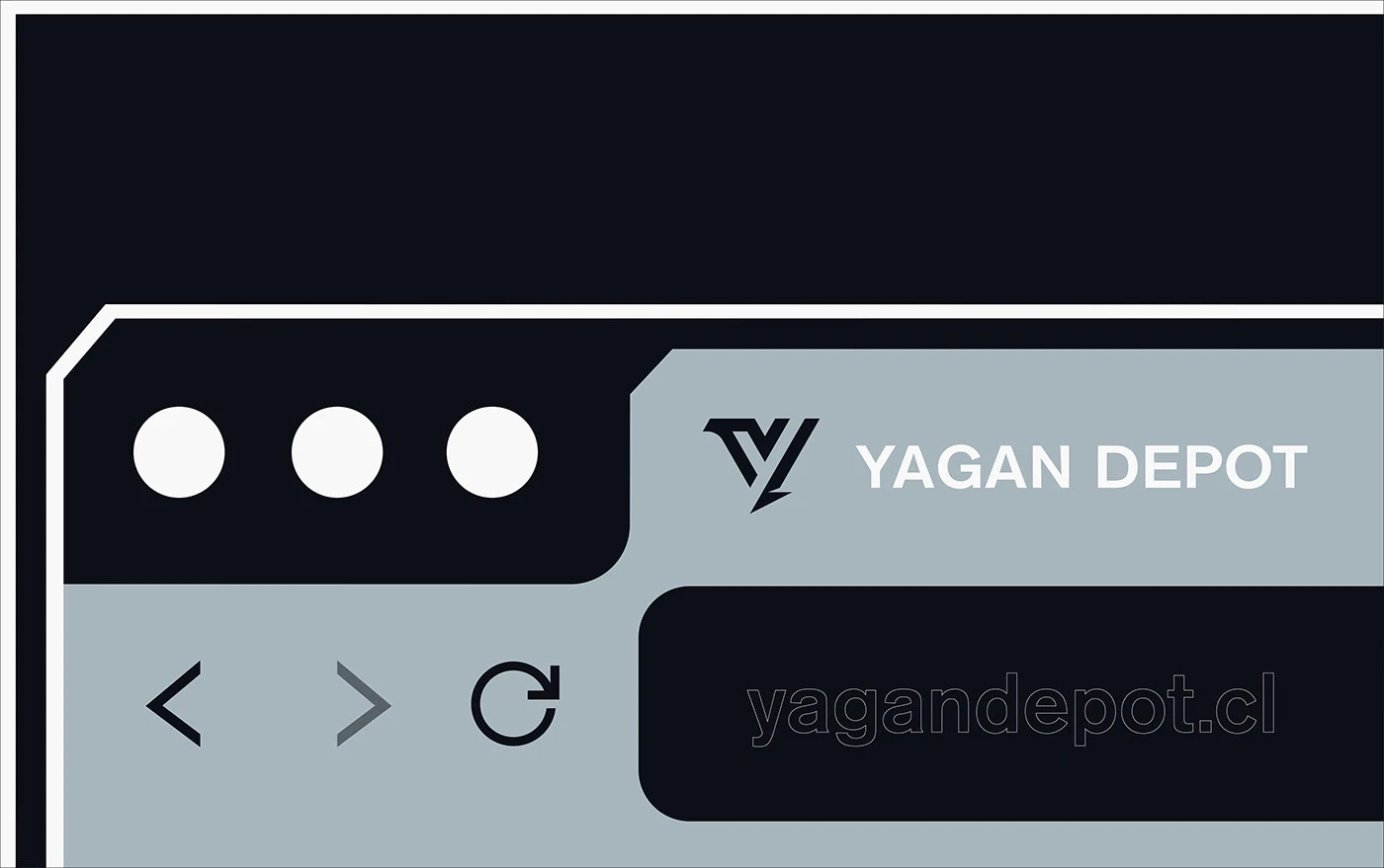
Logo System
Color Palette & Typography
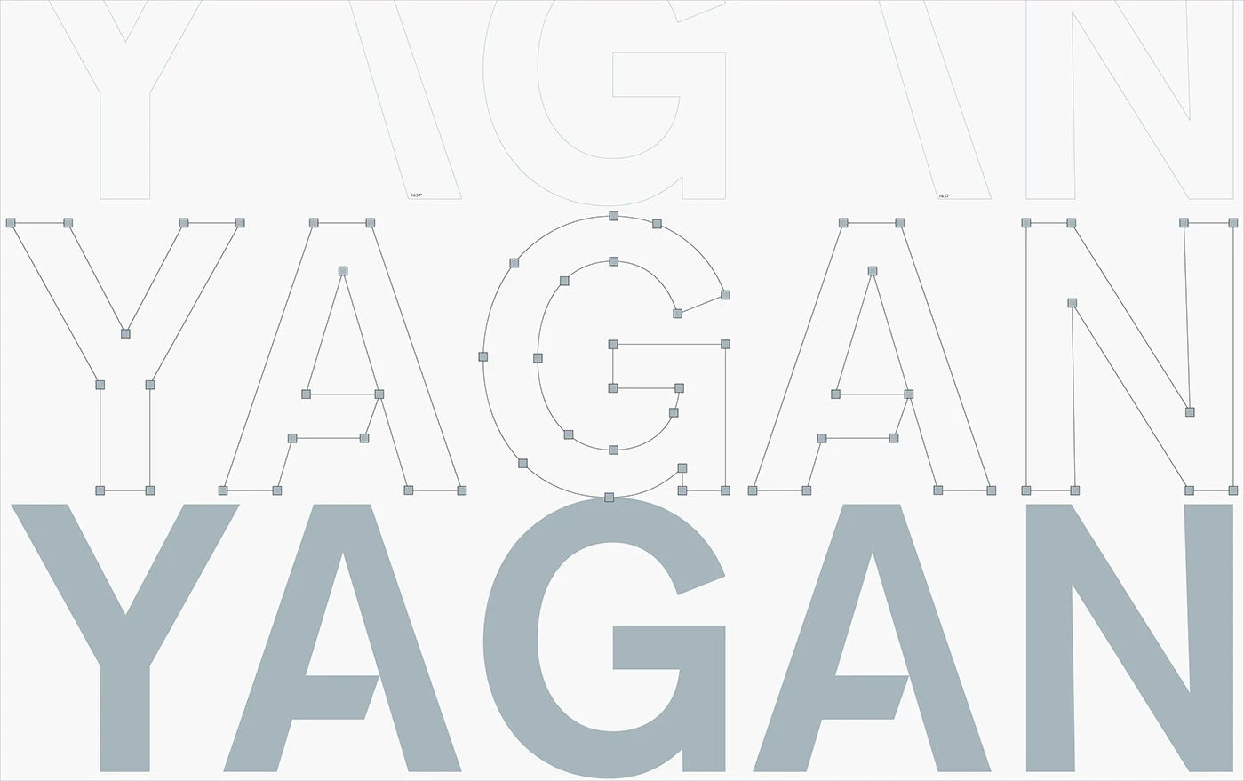
To complement the visual identity, we selected a grotesque-style industrial typeface that brings neutrality, strength, and excellent legibility across all platforms. Its sturdy design aligns with the solid construction of the symbol, reinforcing a reliable and professional image.
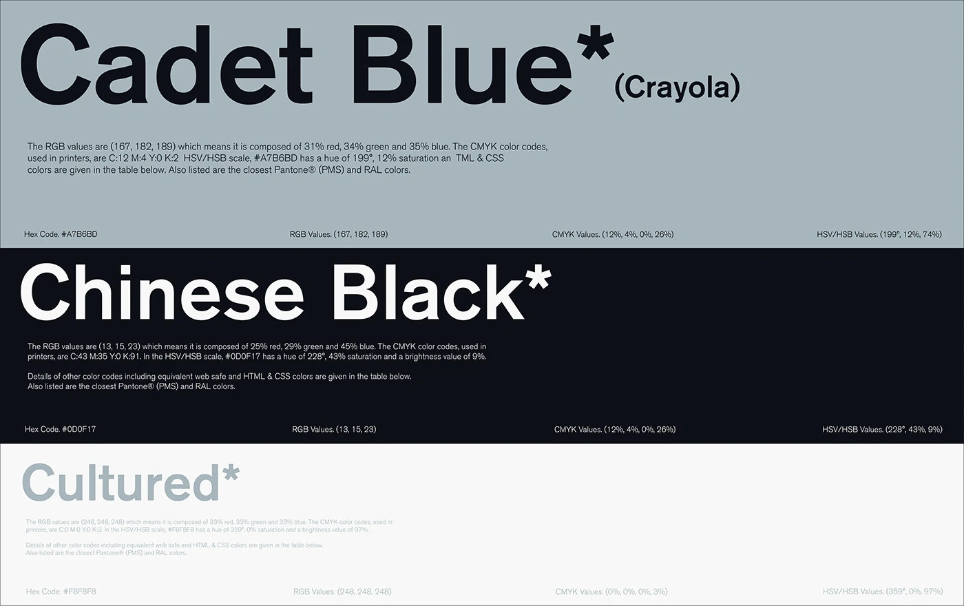
The color palette combines shades like Cadet Blue and Cement Gray, evoking industrial environments, metal surfaces, and workwear. This selection communicates order and technical precision while adapting smoothly to printed materials, clothing, and digital interfaces.
Color Palette
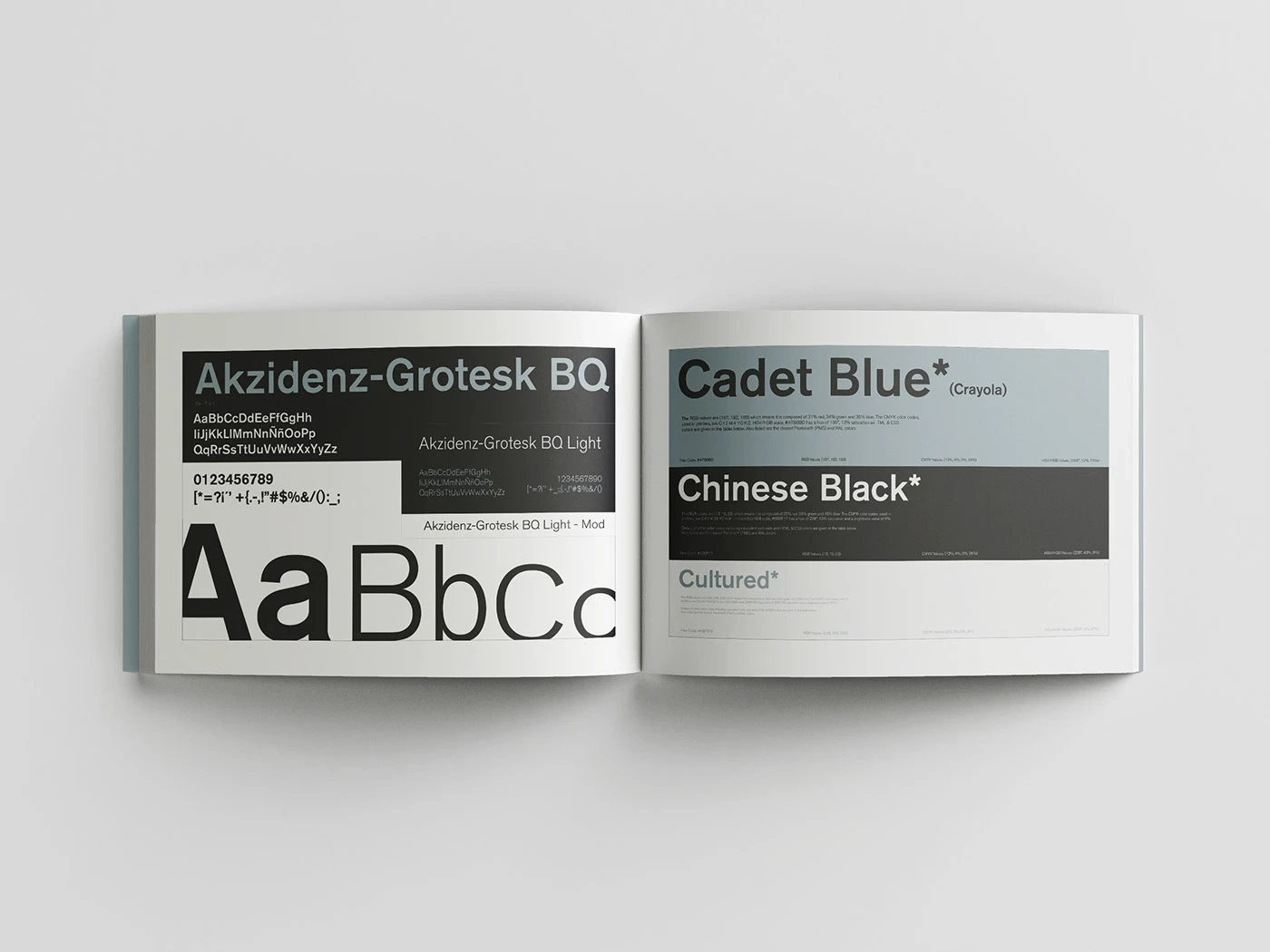
Typography System
Color and Type Applications
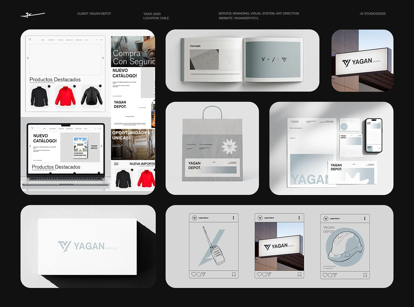
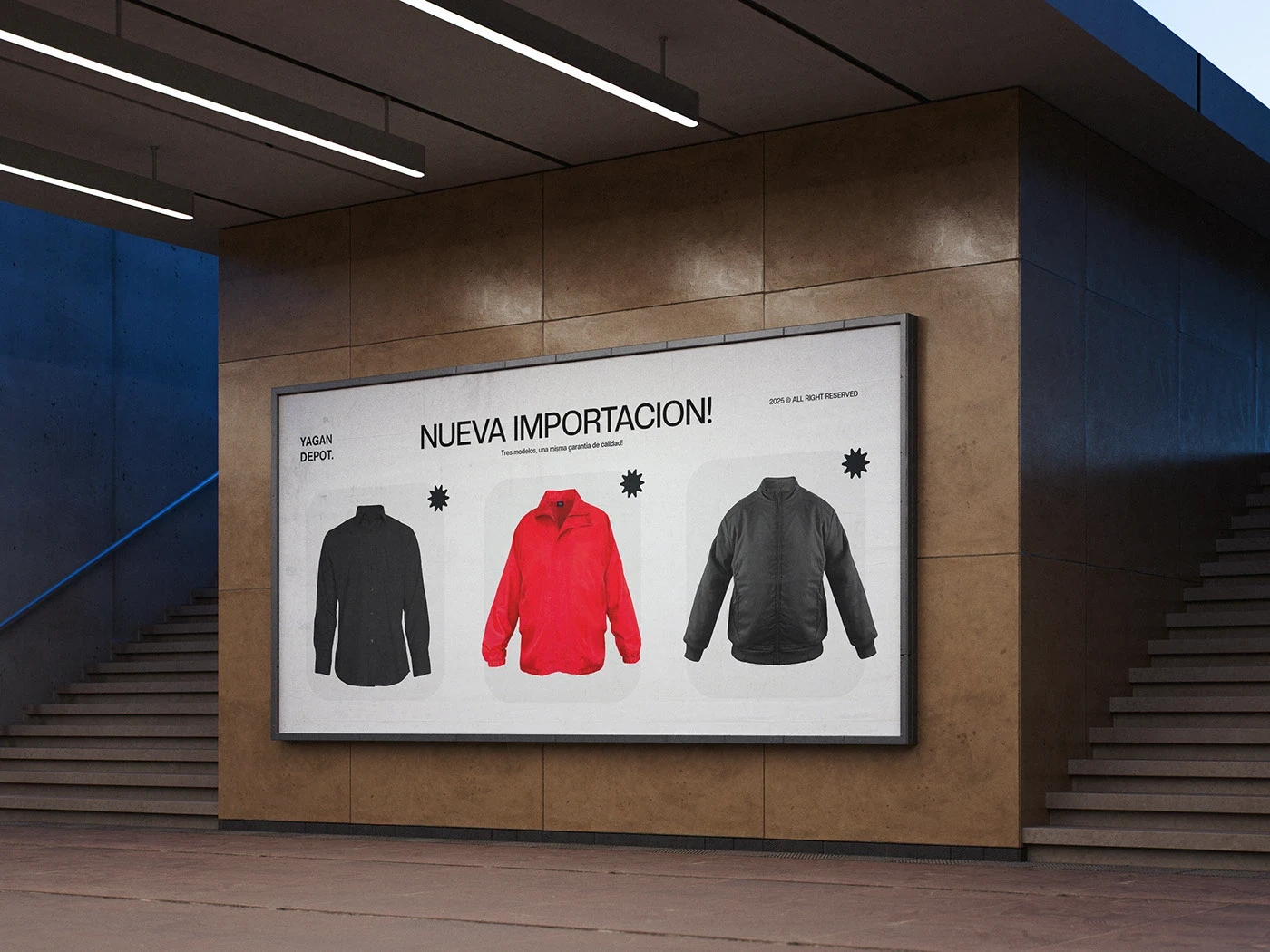
Applications
This project was an opportunity to connect a modern business identity with the cultural roots of its territory. The synthesis between functionality, symbolism, and real-world application guided every step of the creative process.
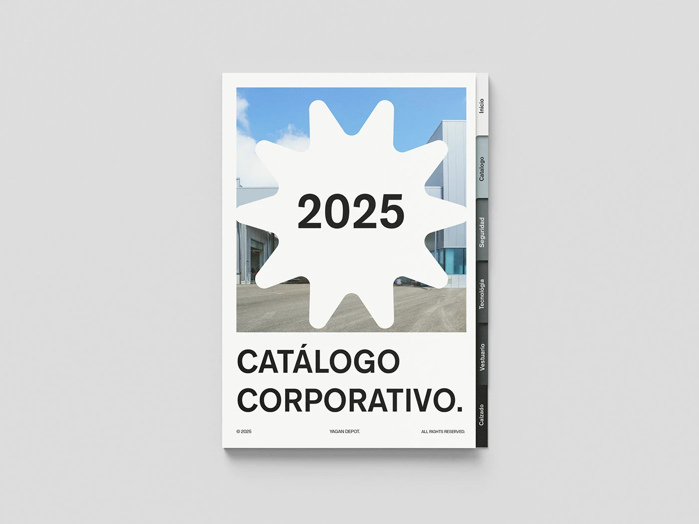
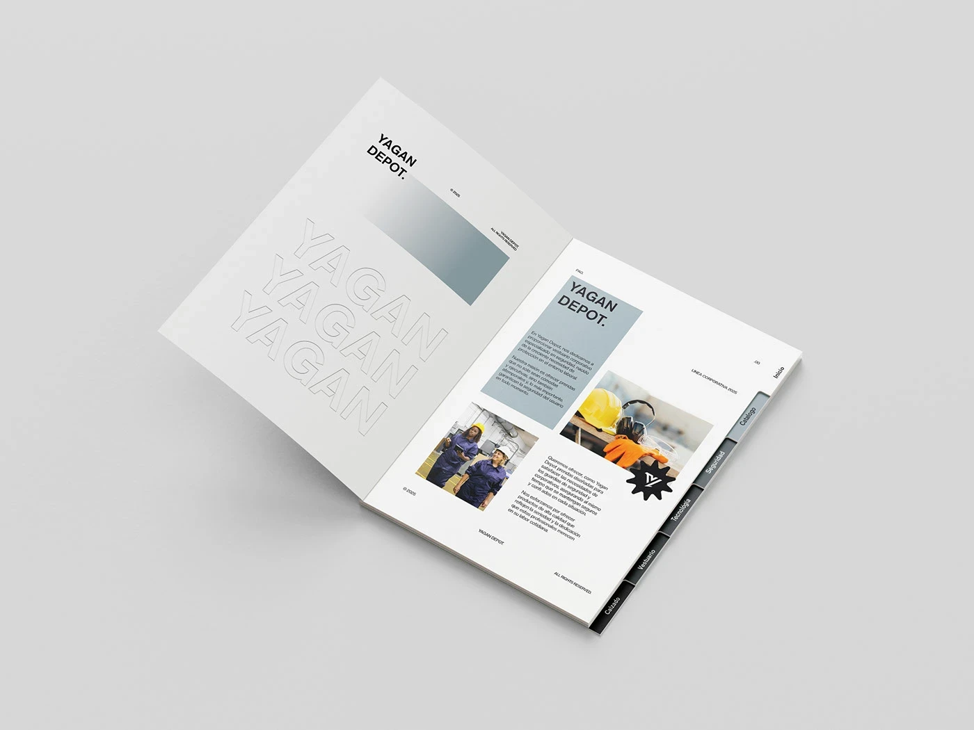
Stationery and Print
Brand Collateral
Packaging and Labels
Workwear Applications
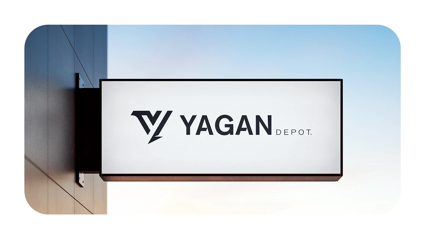
Signage and Environmental
Vehicle Branding
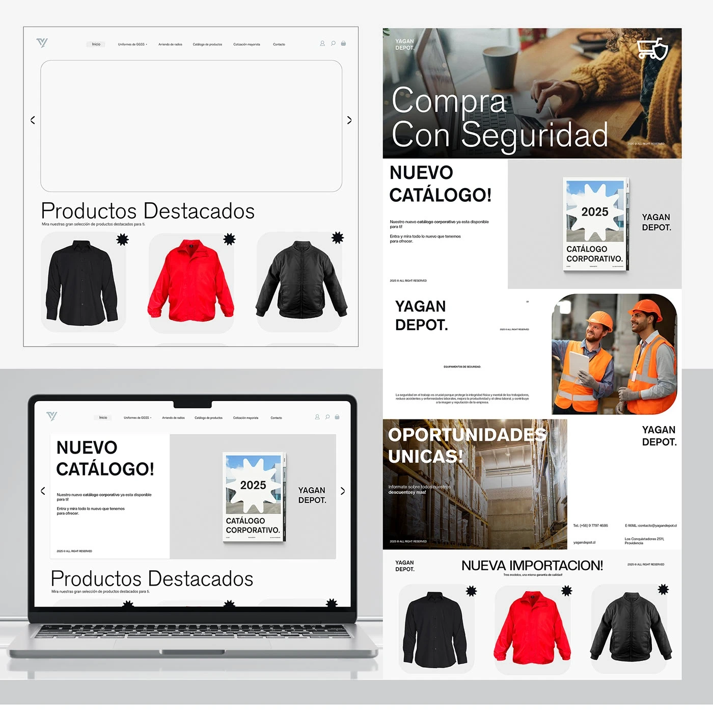
Digital Applications
Merchandise and Product
Final Brand Presentation
Like this project
Posted May 19, 2026
Complete branding system for a Chilean industrial workwear company. Visual identity rooted in cultural symbolism, built for physical and digital environments.
Likes
1
Views
3
Timeline
Jan 1, 2023 - May 27, 2025
Clients
YAGAN DEPOT