Skala Studio — Swiss Grid Web Design Exploration
Neil Ryan Manalo
Overview
This is a design exploration, not a client project. I gave myself a brief, processed it the way I would for a real client, and designed a full marketing site from strategy to final page.
The brief: a Copenhagen architecture firm specializing in new builds, interior architecture, and feasibility consulting. Marketing site only. No ecommerce. Conversion goal is a single qualified inquiry.
The constraint: Swiss grid discipline throughout. One typeface. Photography as the only color. No decoration that cannot be justified against the brief.
The Brief
Skala Studio is a fictional 14-person Copenhagen architecture practice founded in 2009. They work across residential, commercial, and cultural typologies. Their differentiator is involvement. They get in before the brief is fixed through feasibility consulting and stay through final handover. Most architecture firms do neither.
The site needed to answer three questions for a visitor in under two minutes:
Does Skala do what I need?
Have they done it before?
How do I talk to them?
Strategy
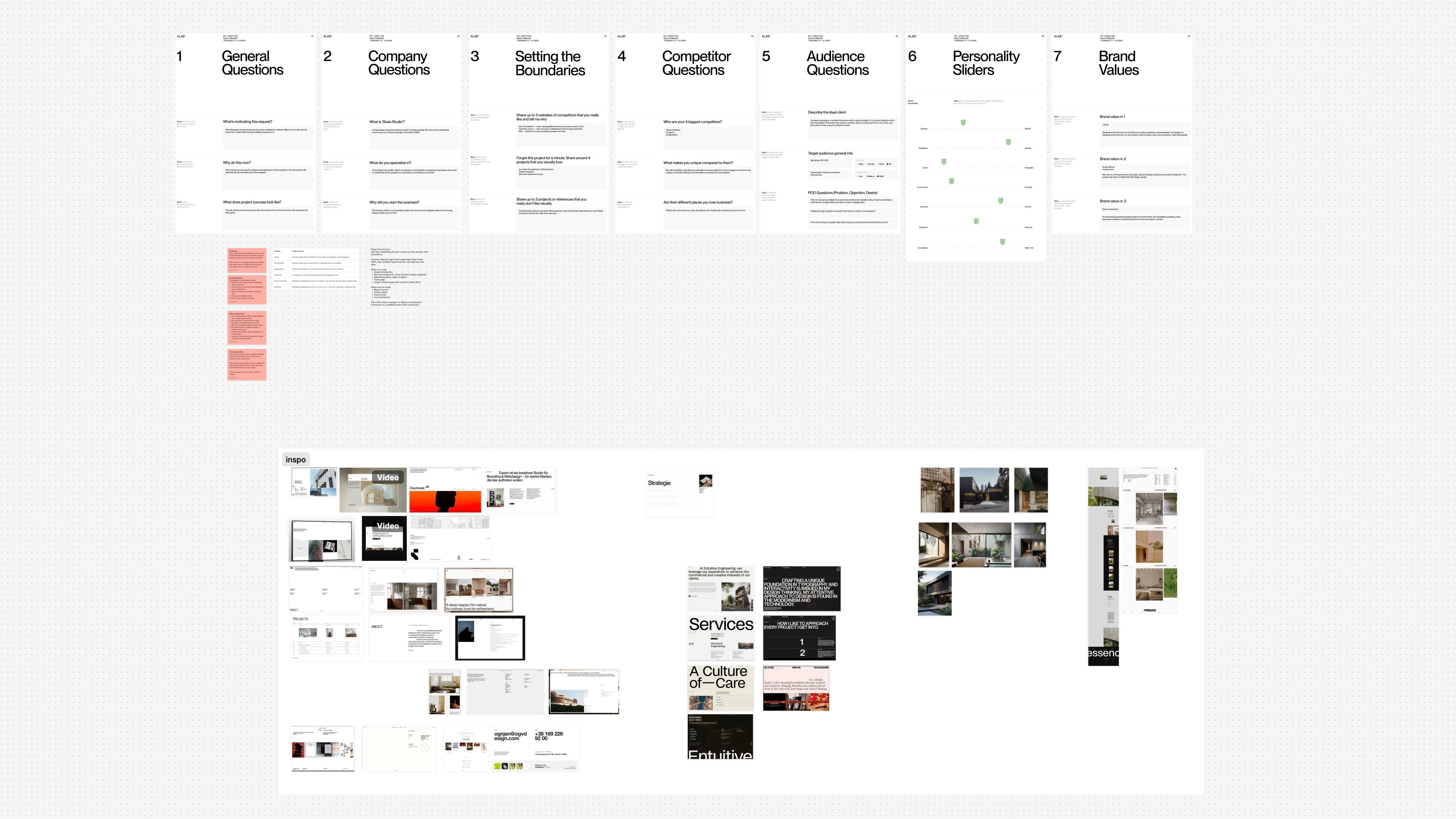
Before opening Figma I processed the brief into a strategy wall. Six sticky notes covering positioning, keyword to decision mapping, content hierarchy, what the site is not, audience filter, and typeface rationale.
The positioning one-liner: A Copenhagen architecture studio that makes it easy to understand what they do, who they do it for, and how to hire them.
The keyword to decision table drove every visual choice:
Clarity meant the services section had to be findable within one click. No buried navigation.
Scandinavian meant generous white space, natural tones, photography of inhabited buildings not empty renders.
Structured meant a strict 12-column grid with defined gutters before a single element was placed.
Formal meant uppercase tracked labels throughout. No rounded corners. No friendly micro-interactions.
Introvert meant no CTA button in the hero. The contact section ends with a sentence, not a component.
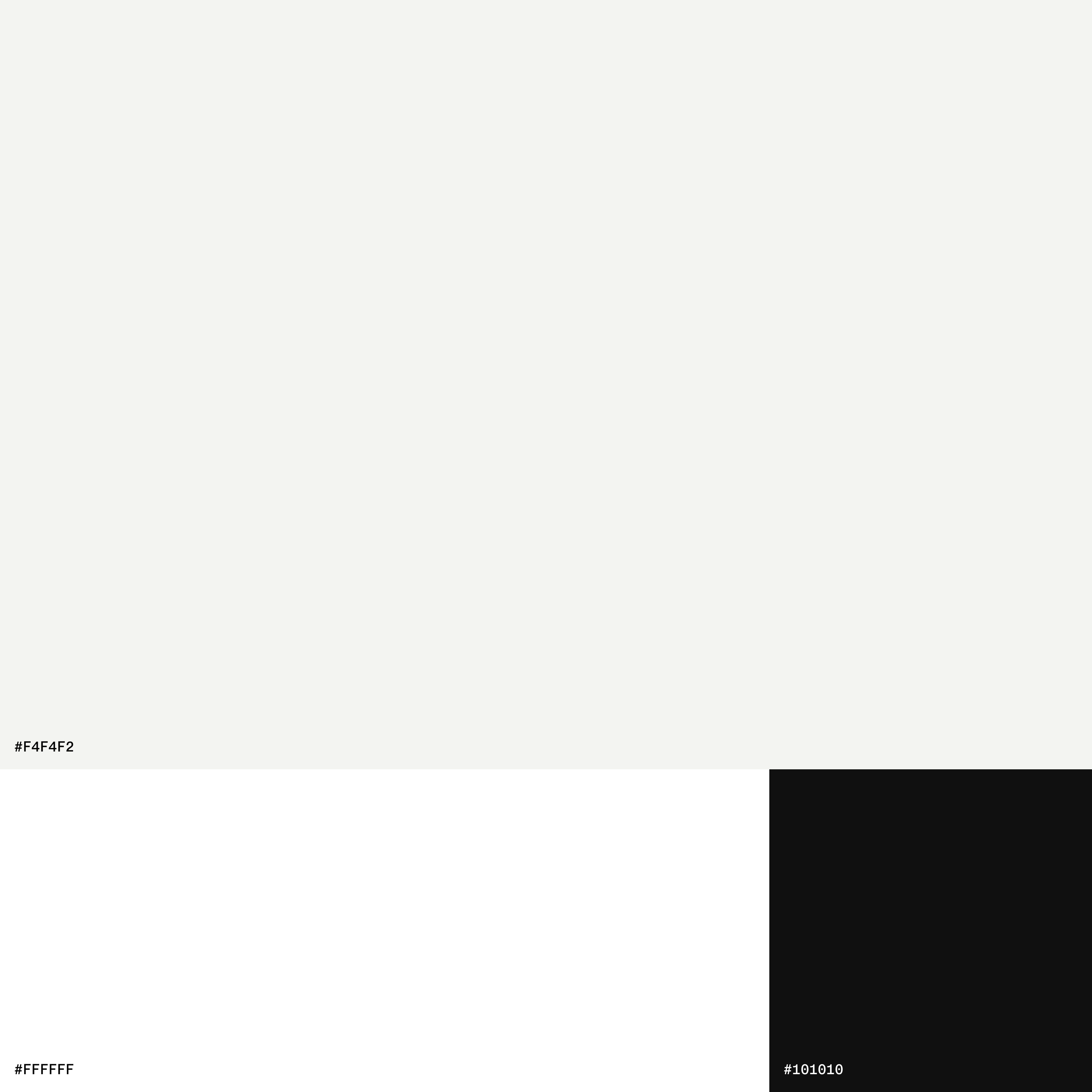
Color
Three values. No accent color.
#F4F4F2 — warm off-white primary background
#FFFFFF — secondary surface for content areas
#101010 — near black foregroundPhotography is the only color on the site. That decision was made deliberately. The architecture images carry the warmth and visual relief between text sections. Every image placement is a color decision.
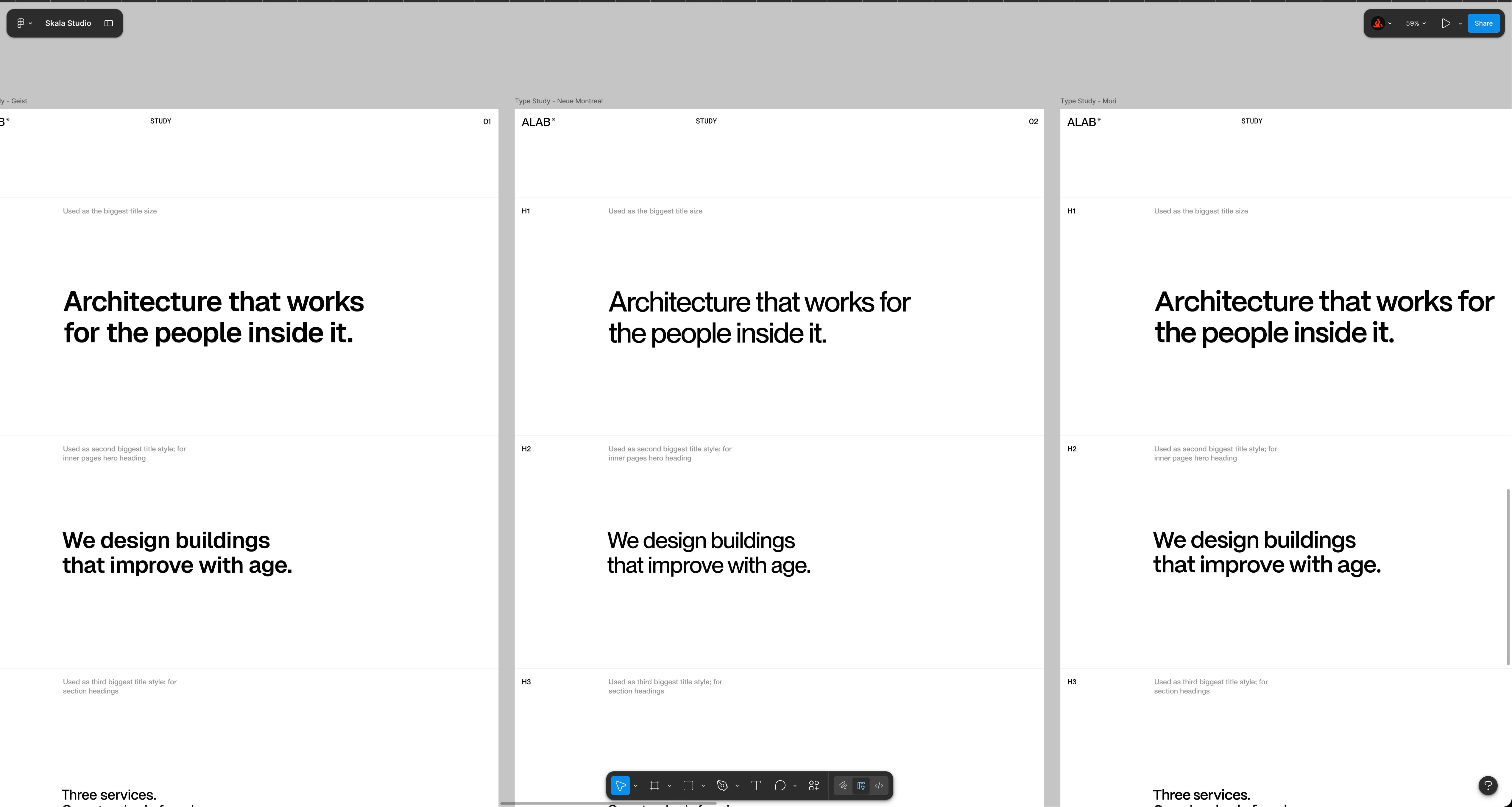
Type Scale
Major Third ratio, 1.250.
H1: 80px Bold
H2: 64px Bold
H3: 40px Medium
Body: 18px Regular
Label: 12px Medium Uppercase Tracked +2
The label treatment was the most important level in the scale. It carries the Swiss feel across every project card, section marker, navigation item, and metadata block throughout the site.
Page Sections
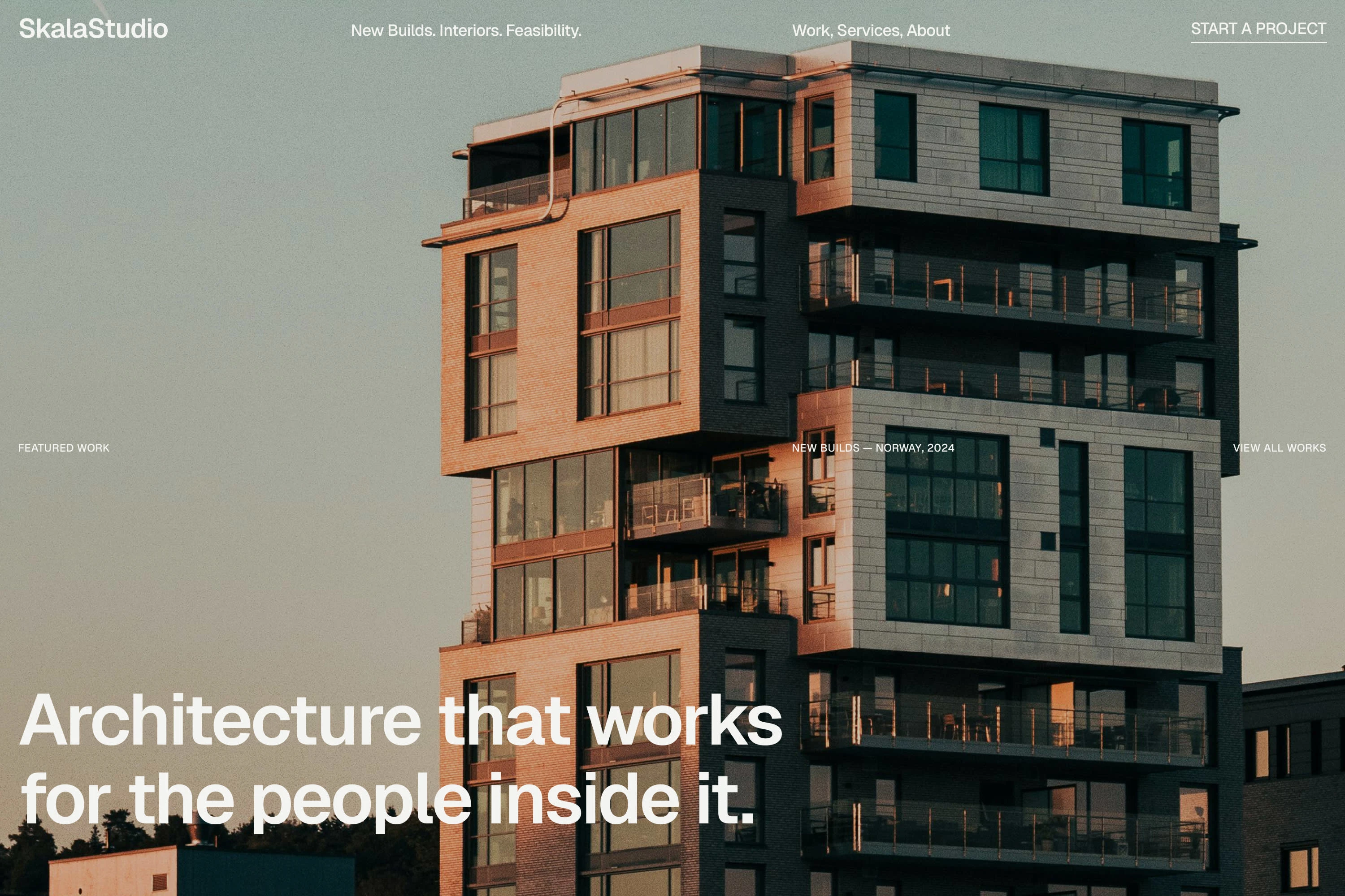
Hero
Full bleed real architecture photography. White headline anchored bottom left at H1 scale. Label bar at the image midpoint: typology and year left, VIEW ALL WORKS right. Navigation: logo left, tagline center, nav links center-right, CTA right.
The tagline in the navigation bar reads: New Builds. Interiors. Feasibility. Three words per service. A visitor knows what the firm does before they read a single line of body copy.
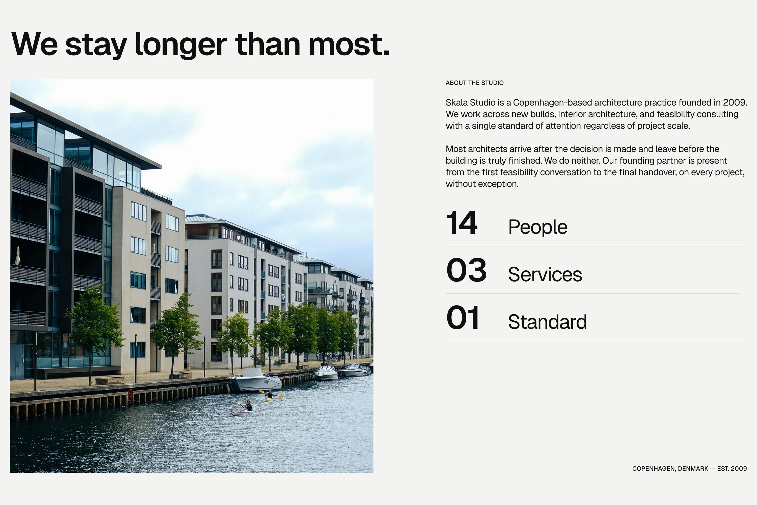
About
Two column layout. Left column is a real Copenhagen waterfront image. Right column is the studio introduction, three short paragraphs, and a stat block.
The stat block was the strongest typographic decision in this section. 14 People. 03 Services. 01 Standard. Large semibold numerals, horizontal rules between rows, labels beside each number. It visualizes the closing line of the body copy, Fourteen people. Three services. One standard of work, rather than just repeating it.
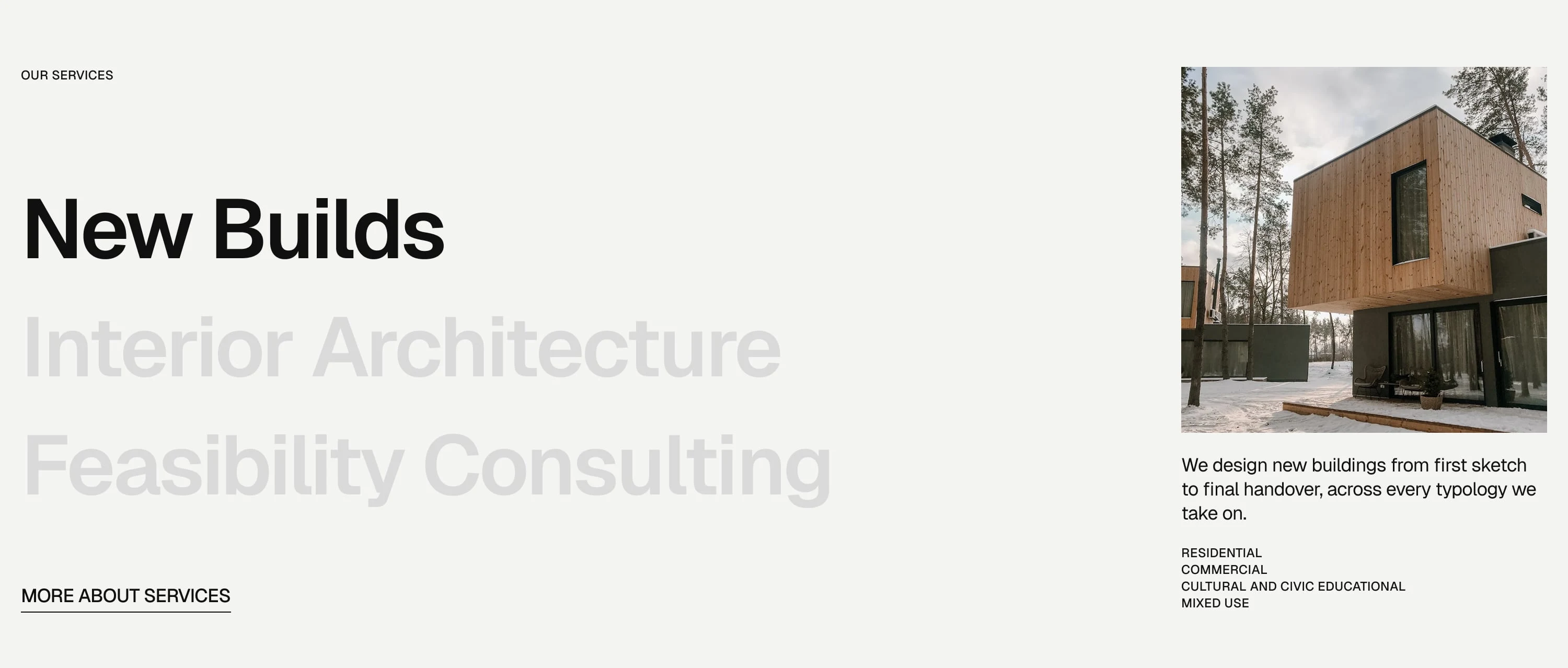
Services
Hover-driven interaction. Three service names stacked. Active service is full opacity, others ghost to low opacity. Right column updates per hover: a service-specific image, one-line description, and a sub-item list.
The ghost and active treatment uses opacity not weight to create the distinction. One weight throughout. The system stays consistent.
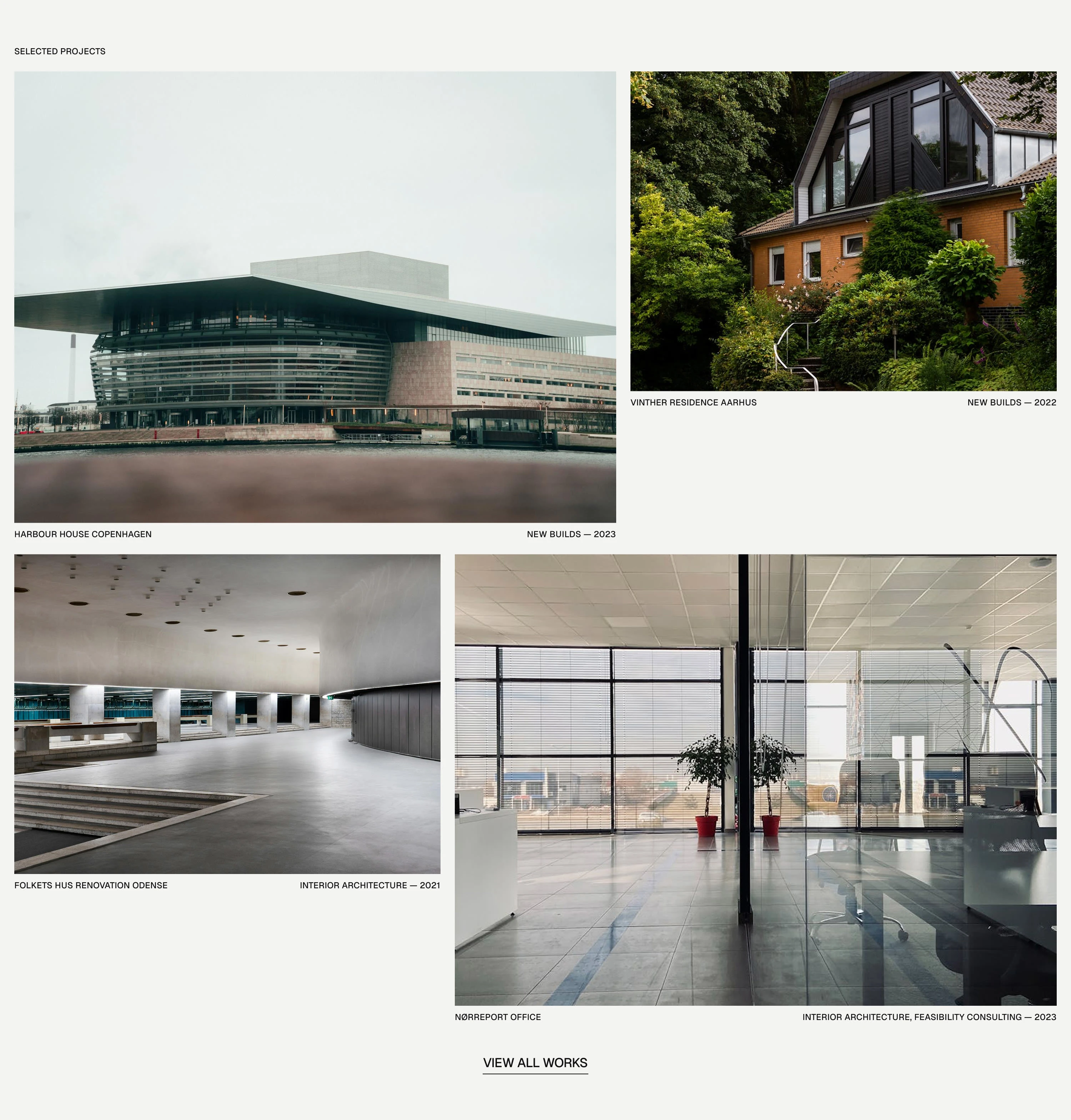
Projects
Asymmetric grid. One large featured card spanning the left half, two smaller cards stacked right, two equal cards in the bottom row. Diagonal asymmetry from top-left tall to bottom-right tall.
Metadata below each card in label style: project name left, service and year right. No description on the cards. The image and the metadata tell the visitor enough to decide if they want to click through.
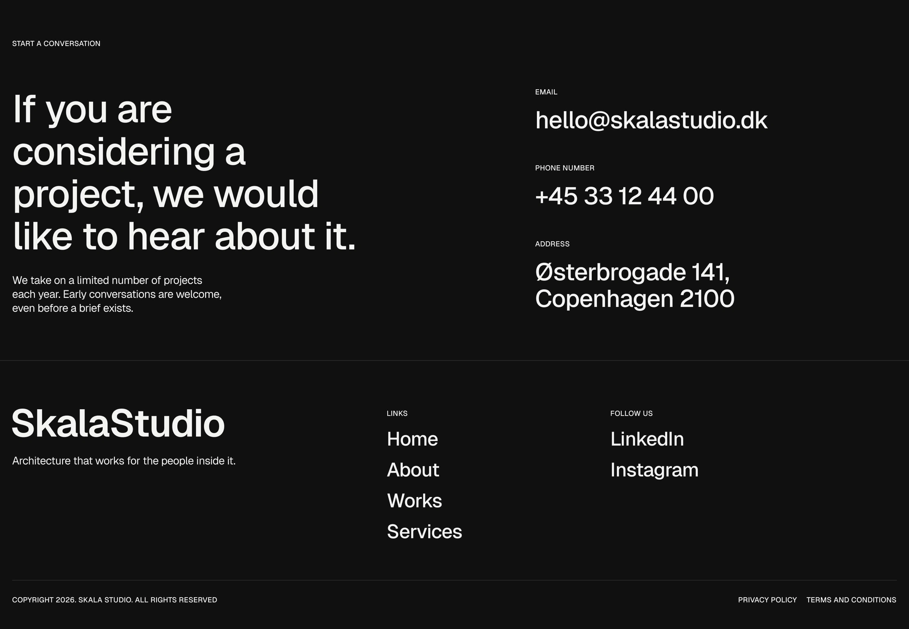
Contact
Dark background section,
#101010. White type. Two column layout: statement left, contact details right.Headline: If you are considering a project, we would like to hear about it.
Sub-statement: We take on a limited number of projects each year. Early conversations are welcome, even before a brief exists.
The CTA is not a button. It is a sentence. Conversion is a qualified email, not a form submission.
Footer
Logo and positioning statement left. Navigation links and social channels center and right. Copyright bar at the bottom. LinkedIn and Instagram only. No Twitter or Facebook.
What I learned
The keyword to decision table was the most valuable tool in the entire process. Every time I added something to the canvas I ran it against the table. If an element could not be justified by a keyword it was removed. That constraint produced better work than any stylistic preference I brought to the brief.
The single typeface constraint was also more instructive than I expected. When you remove weight contrast as a differentiation tool, size and tracking have to do all the hierarchy work. That forced me to think more carefully about scale relationships than I ever do when I have two typefaces to work with.
The most common temptation was adding decoration when a section felt flat. The correct response was always to fix the spacing or the copy, not to add an element.
Tools
Figma — design and documentation
Unsplash — photography
Typeface: Geist by Vercel
Duration: Self-initiated, 2 Days
Like this project
Posted Apr 29, 2026
A self-initiated design brief exploring Swiss typographic discipline applied to a Copenhagen architecture firm's marketing site.
Likes
0
Views
4