Brasil Trips: helping a small travel company to recover from th…
This article is a translation of the original study in Portuguese. Click here to see the original post.
My roles in this project
This was the first UX study I ever did. I was involved in every step of the study but focused on UI design and prototyping. I did user interviews and tests, identified personas and their journeys, and collaborated in the prioritization of the ideas.
The Challenge
During the UX Unicórnio course, ministered by Leandro Rezende, the group accepted the challenge to help a small/medium travel agency to recover from the COVID crisis and bring more safety for their customers so they can travel again.
How can we bring more safety for travelers so they can travel again and the company can recover?
The current scenario
Everyone knows that the pandemic brought fear and insecurity to everyone and, especially, for those that planned to travel. The increasing contamination rate obligated big tourist attractions to close, countries to block tourists, flights and events to be canceled and local businesses to go bankrupt.
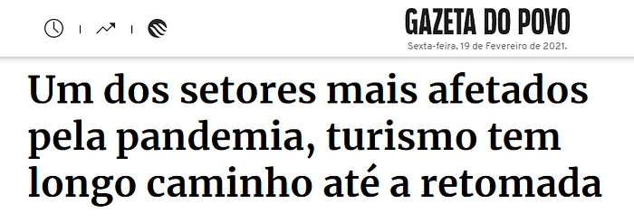
In Brazil, tourism is responsible for 3,7% of the GDP (Gross Domestic Product), and, when the country needed to adopt social distancing and avoid agglomerations, this sector was severely affected.
According to BRASTOA (Associação Brasileira das Operadoras de Turismo), only during the first semester of 2020, the travel agencies stopped earning about R$4,5 billion (about US$880 million, US$1 = R$5,08) because of COVID-19. Besides that, many people that already had a trip planned, decided to cancel, so the refund amount is already surpassing half a billion reais (R$) yet during the first semester of 2020.
Our fictitious client is a small/medium travel agency that sells guided tours, bus travel packages and, during the pandemic, lost most of its customers and almost went bankrupt. Our main worry is to help the client keep current customers, recover the ones they lost and get new ones.
Goal
Create an online platform to help the agency to double the number of customers they have, bringing more safety for travelers, until the end of August 2021.
Personas
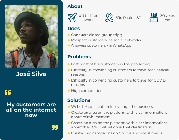
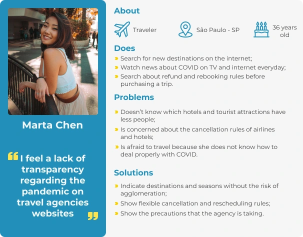
According to the information we had until this moment, we created what we imagined as our users, with their pains and possible solutions. After our user research, we validated this persona.
User Journey
We described what the users do when they want to travel using the user journey map, so we could understand the situation and the profile of the user. We also created a journey map for our client, so we could understand his problems and how to solve them.
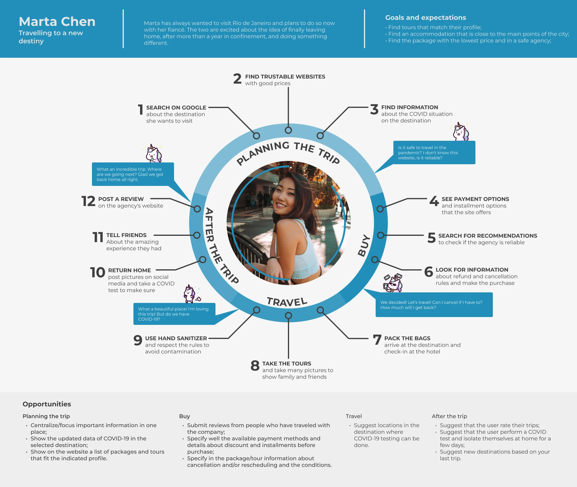
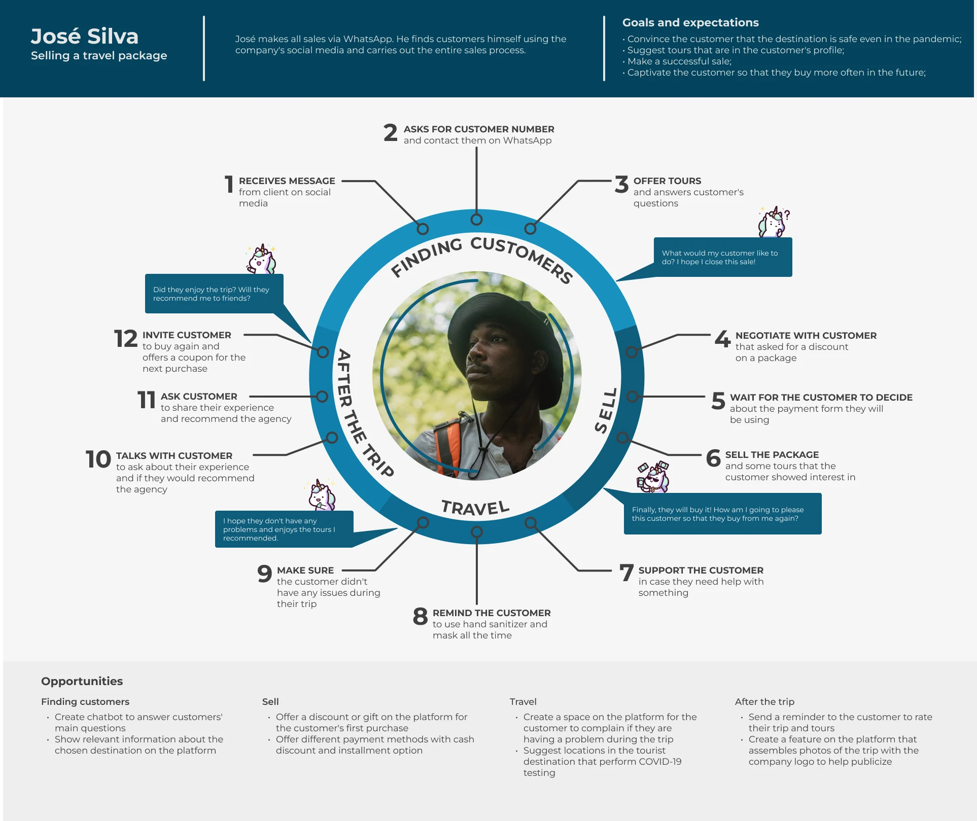
To make it easier to understand, we used the Pixar Storytelling format to make the map information simpler:
Marta’s Journey — Traveler
Once upon a time, there was a journalist called Marta, 36 y.o., content creator for websites, TV, and podcasts. She loves to travel, meet new people and places.
Every day she would search on the internet for information about new places she would like to visit. Although she loves to travel, because of the pandemic, she was forced to stop her adventures. She was afraid of the virus and didn’t know how to deal with it.
One day she saw a post in a blog about this travel agency that brings all the most important details about the destination and, especially, about the COVID situation.
Because of that, she was excited to travel again with her fiance.
Because of that, they decided together that they were going to visit Rio de Janeiro during the summer.
Until finally they packed their bags. They felt secure enough with all the information they got from the website.
José’s Journey — Owner of Brasil Trips
Once upon a time, there was a travel agency owner called José. He was 30 y.o., married, and had two kids. Because of the pandemic, he lost most of his customers.
Every day José would spend hours on Instagram and Facebook trying to bring more customers, but it was very hard. When finally someone showed some interest, José would spend even more time answering questions and trying to convince the person, but most of them were afraid of COVID-19.
One day he decided to hire a UX/UI Design team to plan a new platform that would help his business.
Because of that, the platform is created. It shows all of his services and all the most important information about the COVID situation in each destination, attracting more customers.
Until finally José can recover and start to earn money again. He now has his online platform, that shows all of his services and answers most of the customer’s questions.
Time to validate!
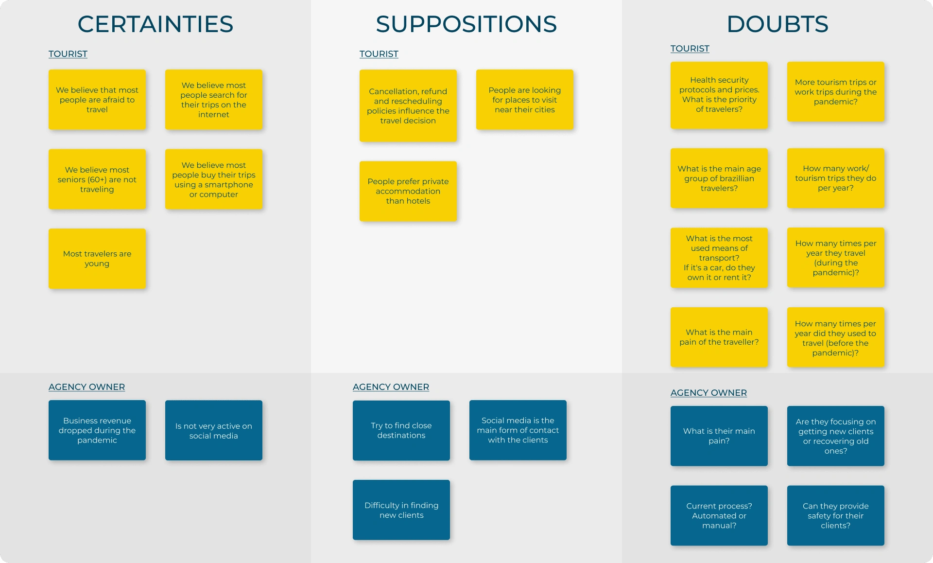
After we defined who our persona is, we wrote down our certainties, suppositions, and doubts about our users and the business. Some of the most important points were:
We believe that most people are afraid of traveling;
We believe most of the travelers are young;
We believe most travelers buy their trips using websites or apps;
We believe that cancellation, refund, and rescheduling policies influence travel decisions;
We believe that most of the travelers prefer private accommodations to hotels;
Sanitary security protocols or prices: what is travelers' priority?
Quantitative research
To validate (or invalidate) our assumptions, we did a research and received 217 answers from Brazillian travelers and 10 from travel agency owners. We obtained the following data:
After this research, we got to know better our personas and we had new insights for our solution, like focusing on the development of a website instead of an app, because of the number of people who prefer to buy their trips from websites.

Qualitative research
The next step was qualitative research. We elaborated the questions based on the doubts that we were unable to answer in the quantitative and those that arose during our analysis of the form’s result.
We talked with 6 tourists and 3 travel agency owners. We concluded that:
Travelers are preferring to travel to closer places during the pandemic;
Travelers are preferring to travel by car;
Most travelers don’t buy through travel agencies;
Agency owners are struggling to sell in the pandemic;
Agency owners are concerned about their presence on the internet.
Hypothesis and learnings
We analyzed the results from our first research and created a relation between the hypothesis we had, the questions generated from them, and the learnings.
Hypothesis 1
We believe that most people are afraid of traveling.
Questions generated by this Hypothesis
How many times per year did you use to travel before the pandemic?
Results
94,9% used to travel at least once a year before the pandemic. 47,5% didn’t travel since the beginning of the pandemic.
Learnings
We identified a big drop in the number of travelers. This information helped us to validate the goal defined by the group.
Hypothesis 2
We believe that most of the travelers are young.
Question generated by this hypothesis
How old are you?
Results
After we segmented the data, we identified that just 39,4% of the travelers over 60 y.o. had traveled during the pandemic.
Learnings
Comparing the number of travelers over 60 y.o. traveling before the pandemic (97%) and during the pandemic (39,4%) has helped us to make decisions like the brand voice tone, and focus our solution on people under 60 y.o.
Hypothesis 3
We believe most travelers buy their trips using websites or phone apps.
Question generated by this hypothesis
How do you buy your trips?
Results
58,1% prefer to buy their trips using websites
Learnings
Using this data we decided that the best option was to develop a responsive website, in order to reach the greatest number of users.
We are still developing the article about all of the other hypotheses.
Benchmark research
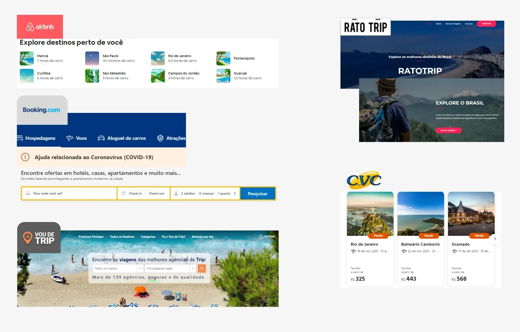
Based on research and analysis of what would best fit our case, we defined the sites below as our biggest competitors. With the analysis done, we were able to make the best choices about what would be Brasil Trips’ differential.
From the analysis of the Airbnb website, we found the tab “Explore destinations near you” interesting, and we had the idea of putting the section “destinations to escape the pandemic”. Thumbnail images were also something we incorporated on our website.
From Booking.com, we took the idea of “help related to Coronavirus” and also the text from the search bar.
From Vou de Trip, we liked the search bar to search by month or destiny, since our agency carries out group trips with pre-defined dates. We also liked the idea of an “upcoming holidays” section to make it easier for the user to search.
The background image and also the style of the website were inspired by Vou de Trip and RatoTrip.
On CVC, we were inspired by how the information is displayed, as well as the COVID info section.
Solution alternatives
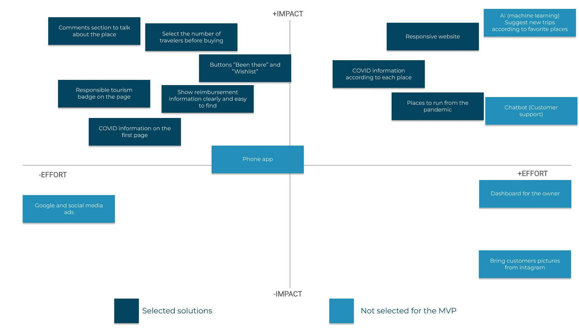
According to the information collected, we had a few ideas of solutions and we distributed them in the Impact x Effort Matrix to help us decide what would be done.
We chose the options that were in the “less effort, more impact” quadrant, but we also chose some that required more effort, because we considered it was important for our project based on our research.
Some ideas were not selected for this first prototype, but they were not discarded. We believe that they are interesting, but not essential for this first MVP.
Pencils before pixels
We decided to make a brainstorm session using the method Crazy 8’s, which consists of drawing 8 screens in 8 minutes. This step helped us to see our project from various angles. Thinking as a group, we felt more confident to move on to the next step.

Low fidelity prototype
We put our ideas together to create the first prototype, made on paper.

First usability test
We did our first usability test in two ways:
Observing people using our prototype through Marvel;
We automate using Maze and shared the link on our social media.
The mission given was: book a trip to Capitólio, Minas Gerais, on the 24th and 25th of April, 2021.
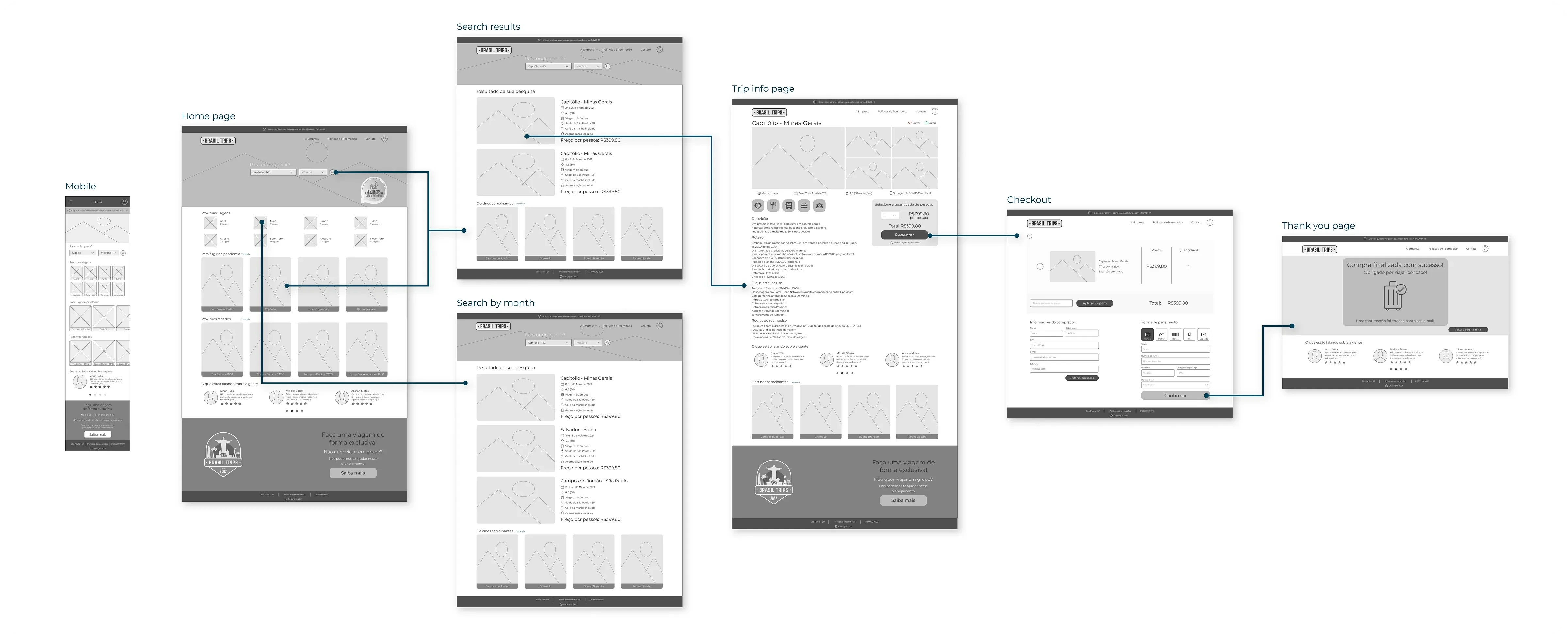
Medium fidelity prototype and user flow
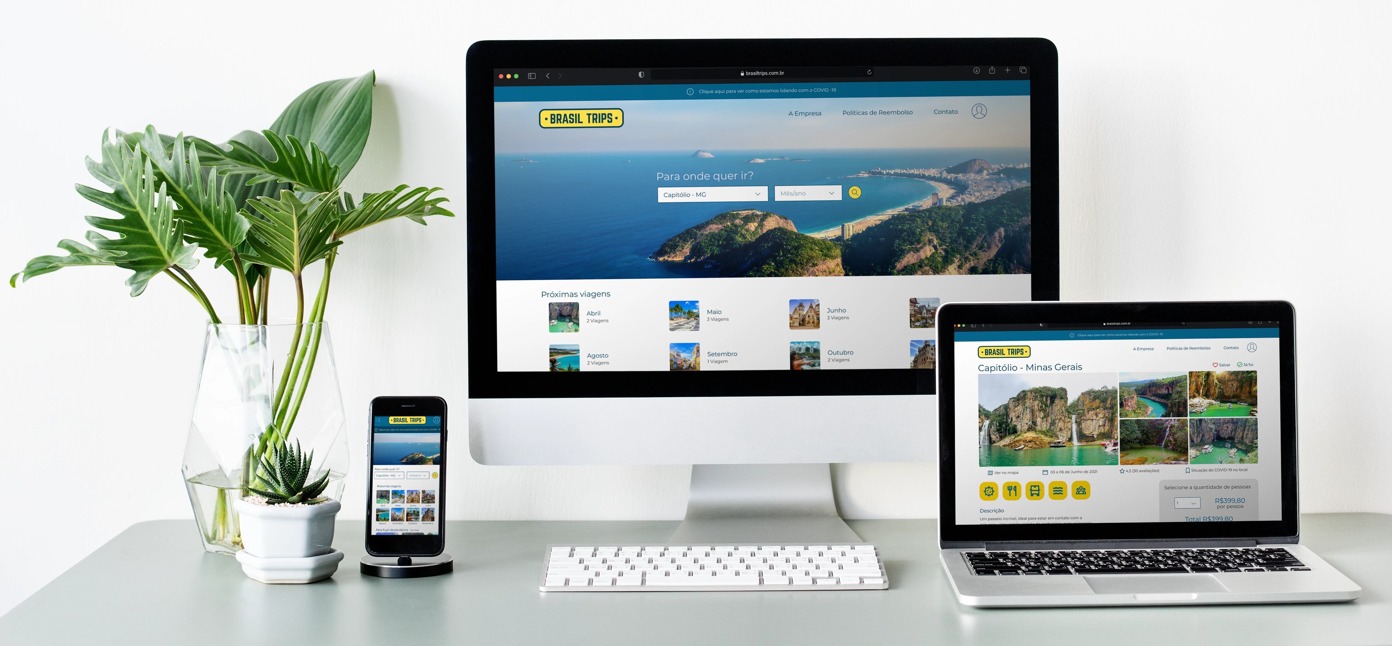
Following the principle of Mobile First, we created the mobile wireframe first and then the desktop website. We focused on the desktop website because of the results of our first research. We did some changes that were necessary.
We changed the text from the button “Quero ir” (I want to go) to “Salvar” (Save) because it was causing some confusion during the test;
We added a section on the home page so the user can filter the trips by month because that's a nice feature we saw on our benchmark;
We didn’t have any other significative change.
We decided to not test the wireframe, so we started working on the high fidelity.
Style guide
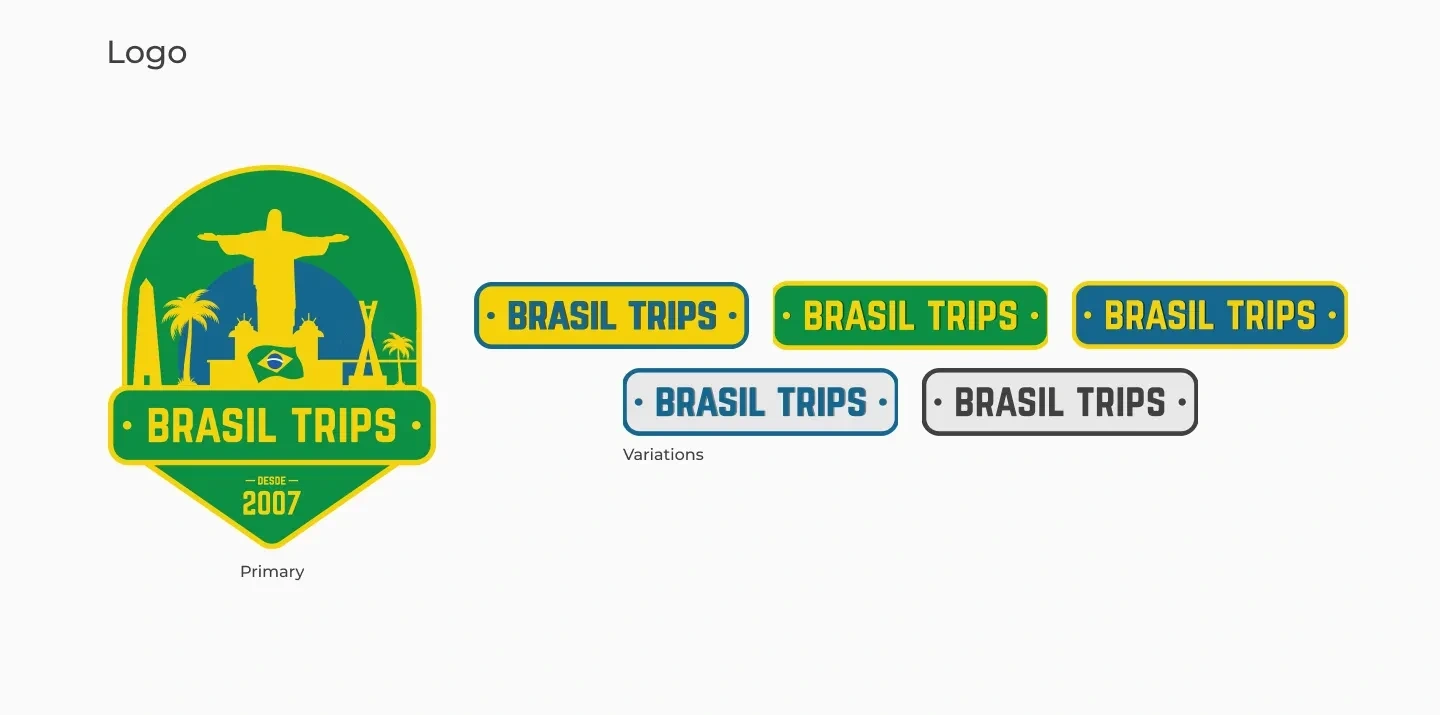
We decided that our agency name is Brasil Trips and, based on that, we created our logo and its variations.
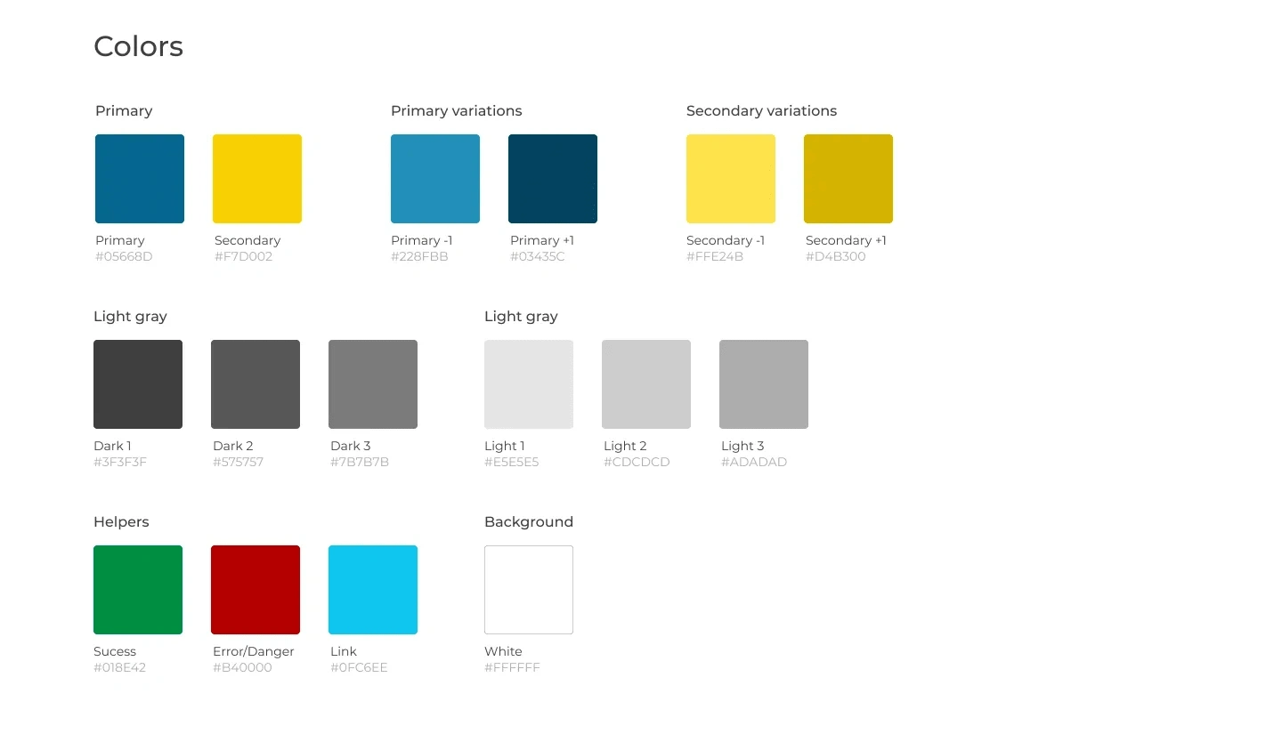
The colors we choose were blue and yellow tones, because:
Blue and yellow are colors present in the Brazilian flag;
Blue also represents responsibility and reliability, very important for our project, because we want the travelers to feel comfortable traveling with us;
Yellow reminds us of joy, energy, happiness, what we feel when we’re traveling.
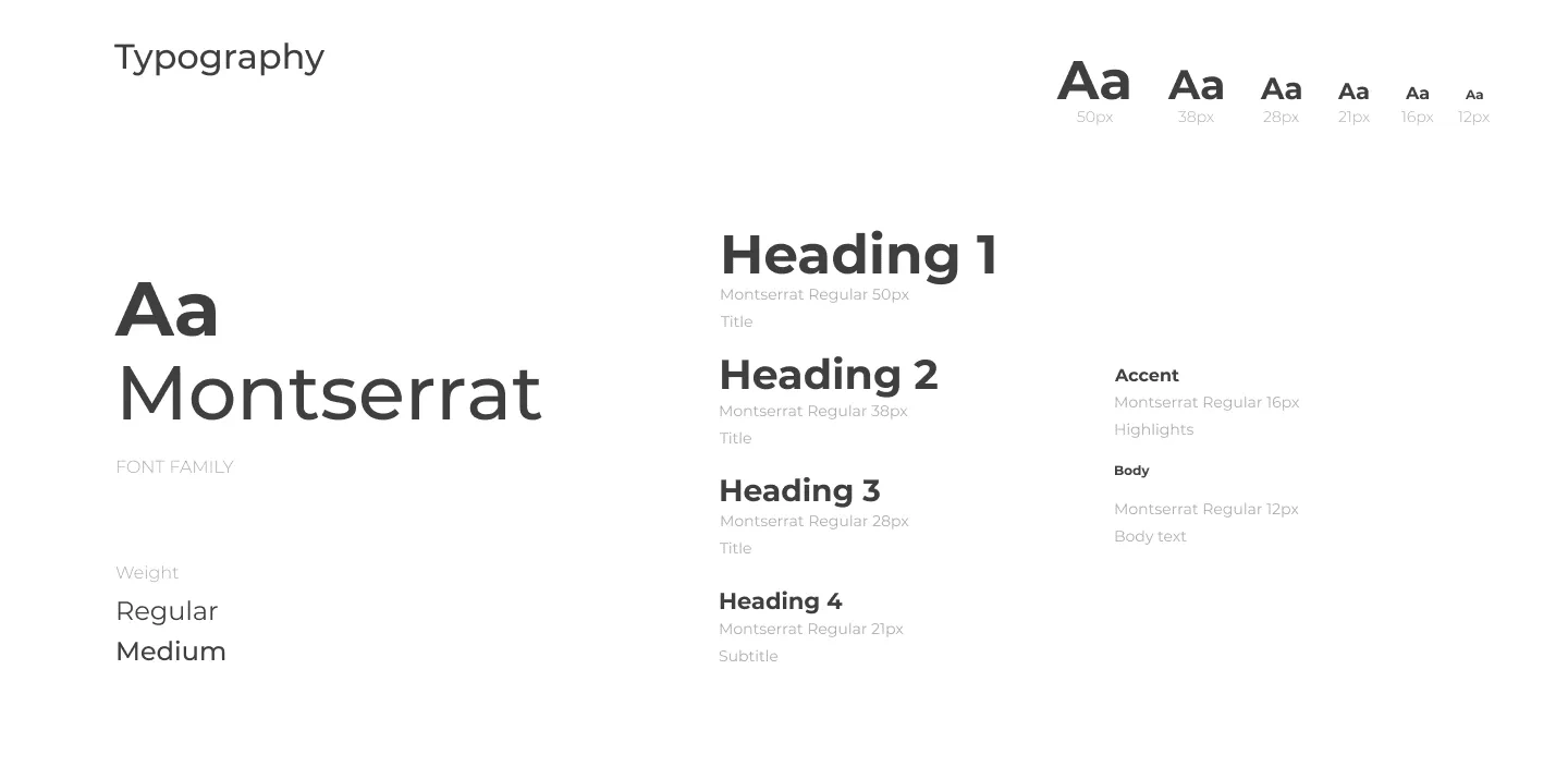
About the typography, we choose Montserrat, because it’s a Google font, which means probably the user will have it on cache already when they enter our website, increasing the website’s performance. Besides that, it has a lot of different styles and it’s easy to read.
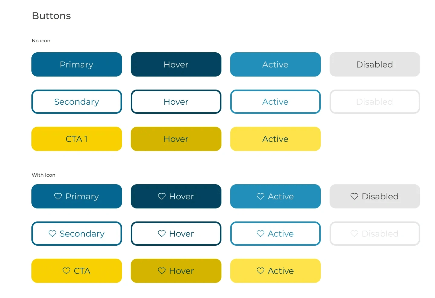
As for the buttons, they were made based on the color and typography choices made earlier. We made the ghost button as our secondary button and used yellow to be our CTA as it’s the most prominent color within our palette.
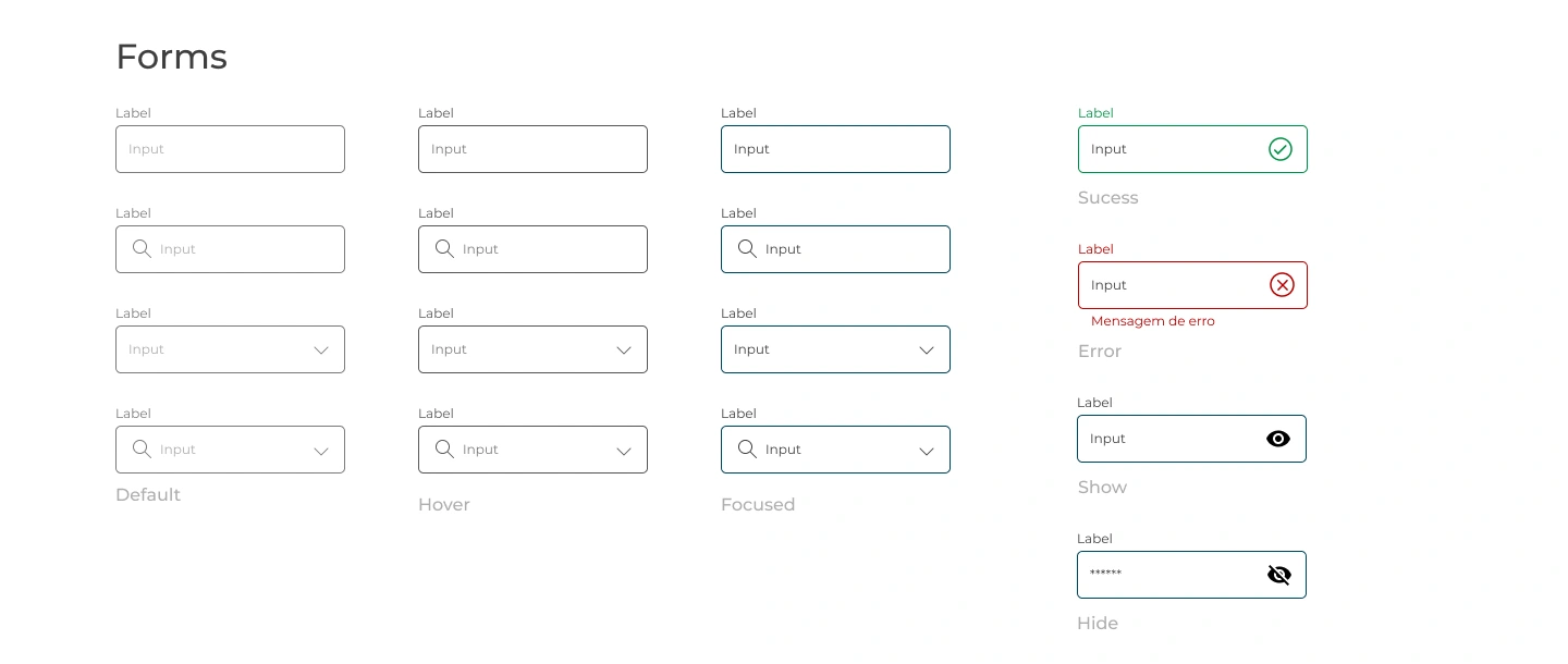
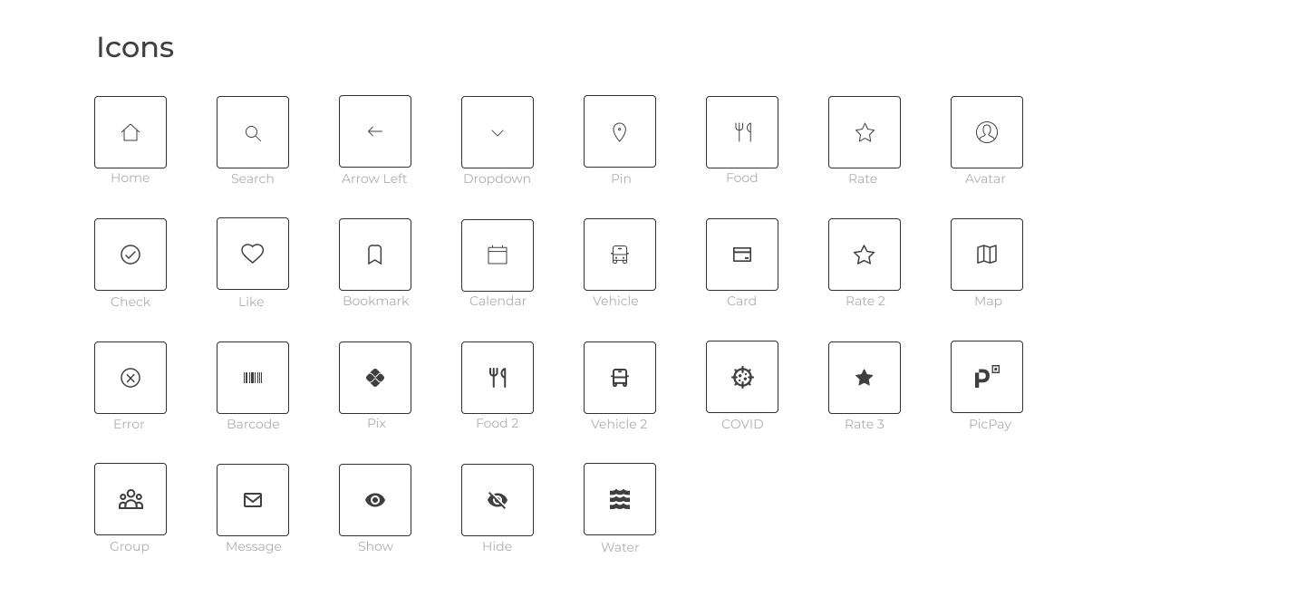
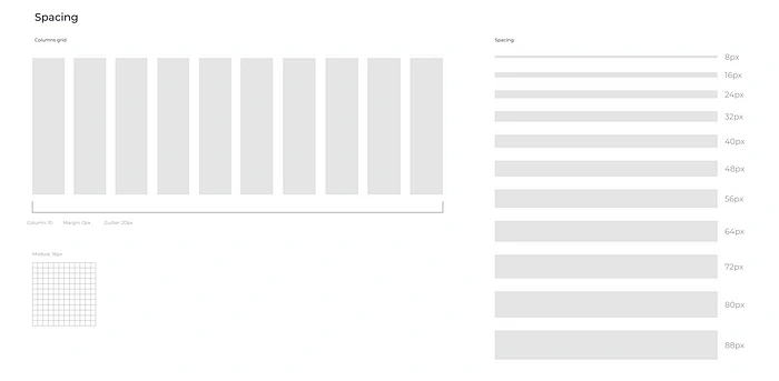
In addition, we also made the forms and their respective versions, we defined the icons that would be used, the column grid, and the spacing between elements.
High fidelity prototype
We applied the style guide to the wireframe and finished the high-fidelity prototype.
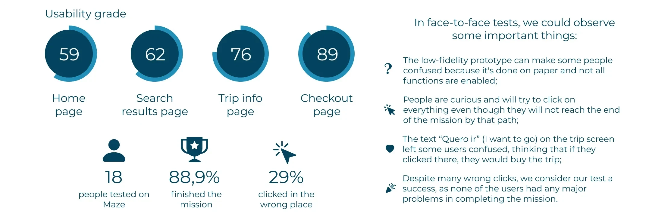
Second usability test
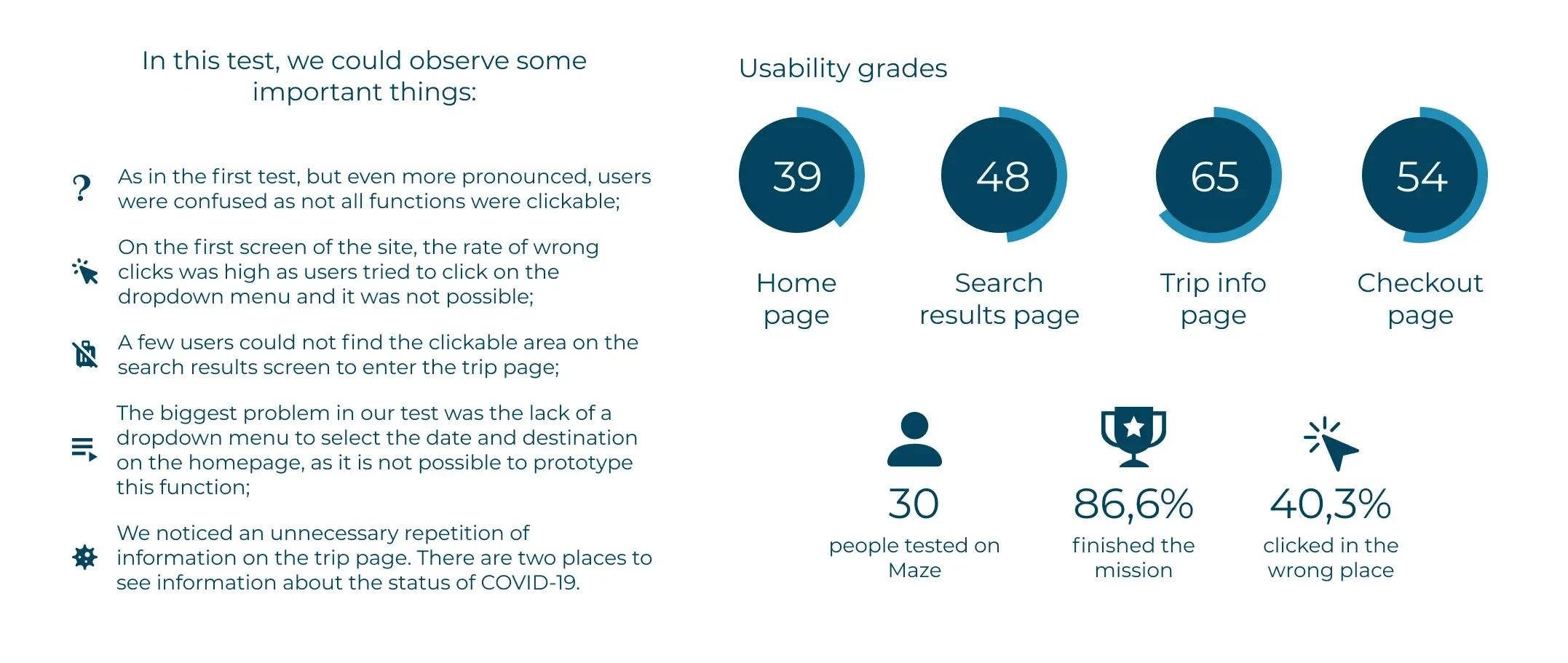
After finishing the prototype, we did another test using Maze. Again, we observed some people in person and also shared the link of the test on social media.
The mission given was: book a trip for Capitólio, Minas Gerais, from June 3rd to 6th, 2021.
With the test, we identified the following improvements:
Add a background on the search result screen to highlight the trip when the user hovers over because some users had difficulty in seeing where they could click;
Change the COVID icon for a mask icon and show the precautions the company is taking regarding the pandemic because there was a repetition of information on this screen.
Next steps
Following what we learned from the test, our next steps in order to keep improving our solutions would be:
Do some A/B tests to identify improvements on the interface;
Create a chatbot to answer the main questions of the users;
Create a dashboard to help the owner to manage the business;
Develop a mobile app;
Implement machine learning to offer better suggestions of trips based on trips they already made and the “Salvar” (save) button;
Suggest the creation of ads for social media and Google;
Create a feature that allows travelers to create a photo mural with the agency logo to share on social media.
And finally…
We would like to thank our teacher, Leandro Rezende, for this amazing course and all the support team, Traini, Jessyca, and Frota, for being always available to answer our questions.
Like this project
Posted Sep 27, 2023
How we applied UX/UI Design to help a travel company to recover from the economic crisis created by the pandemic.
Likes
0
Views
4
