Creating an all-in-one coaching platform

0
Visual Designer
Web Designer
UX Designer

Figma
Deliverables
Discovery & Research
UX/UI Design
Rebranding
Introduction
Bravely, an on-demand coaching platform needed to scale their product offerings and expand their user base. The coaching and wellness market saw a boom and was growing at a rapid pace, so Bravely wanted to ride that momentum.
The challenge
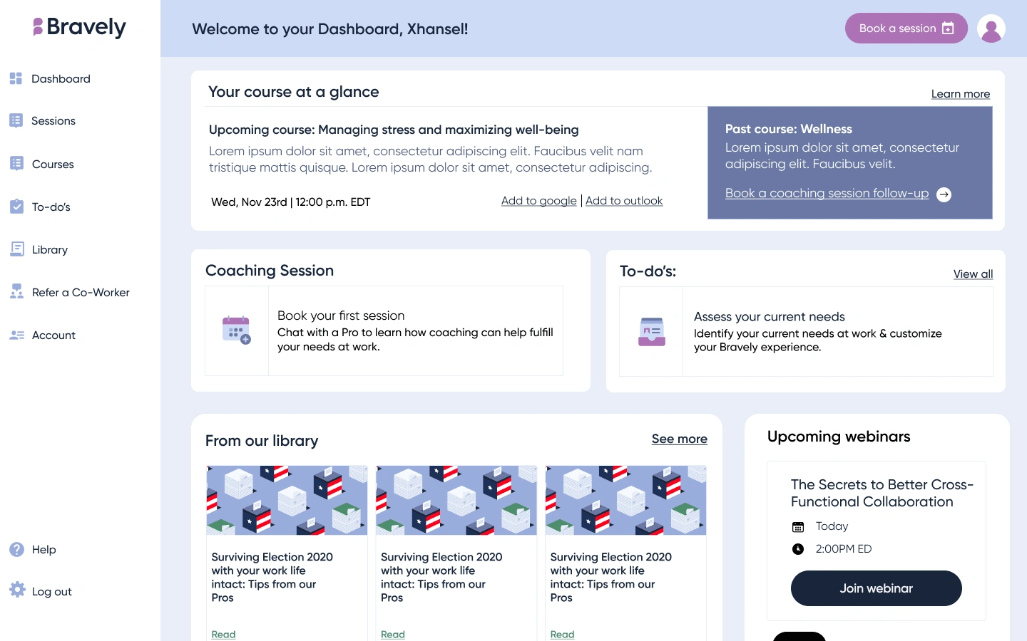
Bravely aimed to evolve beyond just booking on-demand coaching sessions by integrating its existing features into a more comprehensive learning and dashboard experience. This expansion was crucial to support a growing user base and align with the company’s broader product vision, enhancing usability and engagement.
The outcome and impact
Three months after launching the new dashboard, the impact was clear. Three existing customers expanded their contracts to include Learning features, while two new clients signed on for the full Learning + Coaching package.

Building on research
We leveraged existing employee personas and marketing research, supplementing it with secondary research on coaching platforms like Placement and Boldly, as well as e-learning sites like Coursera. This helped us identify common UI patterns that create a cohesive experience across features, which informed our approach.
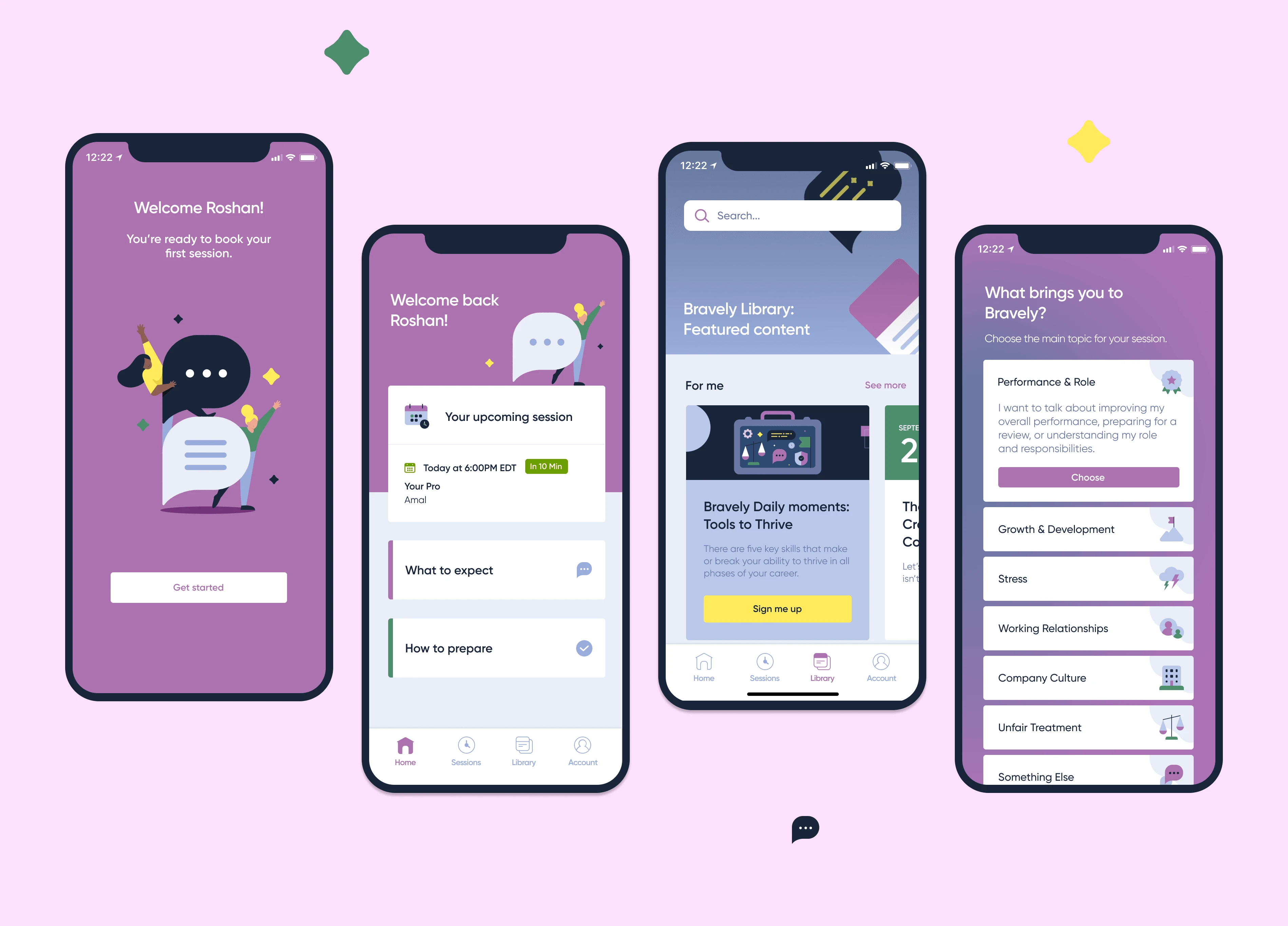
Redefining the User Journey
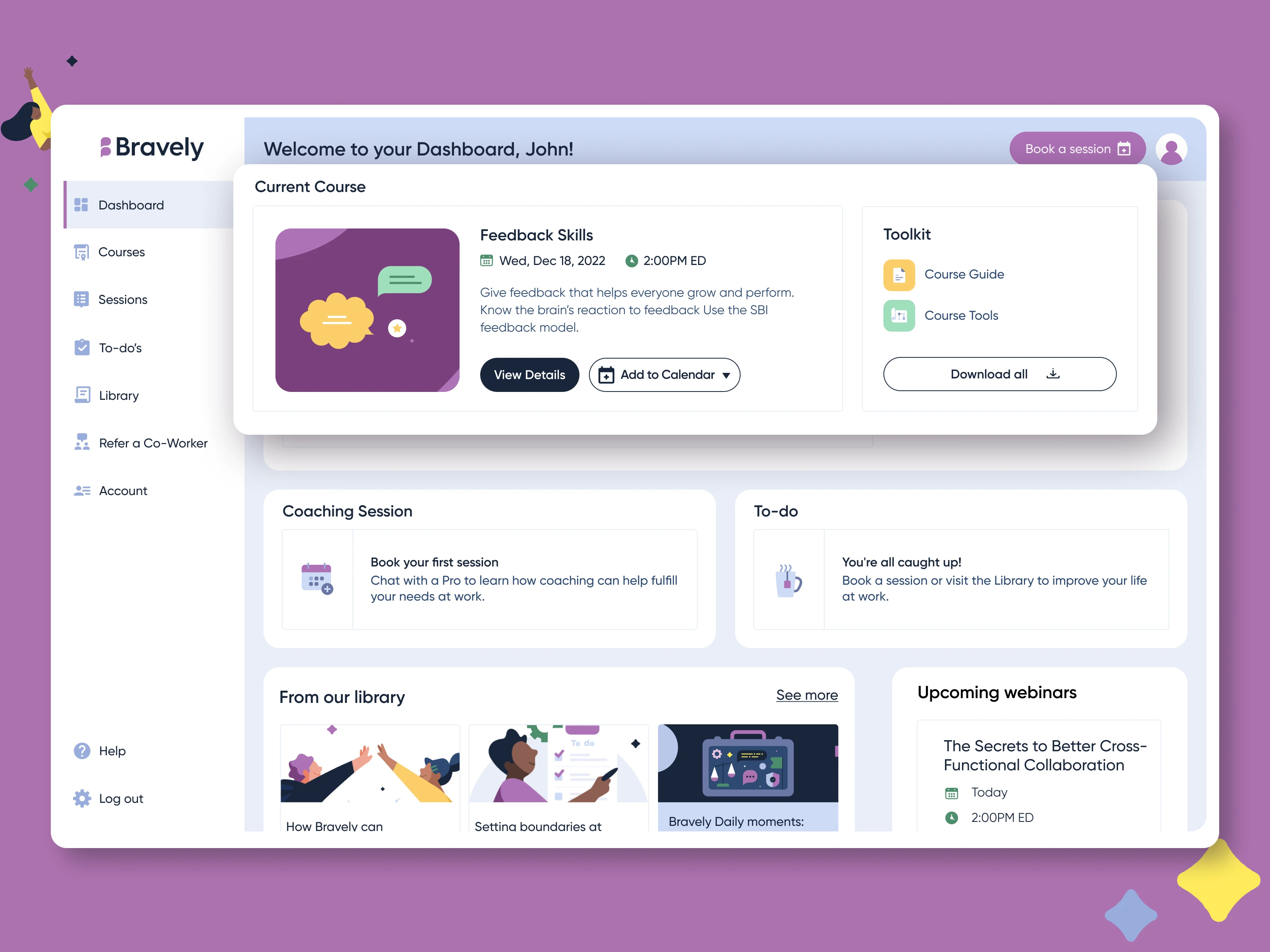
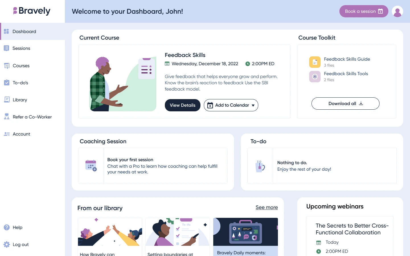
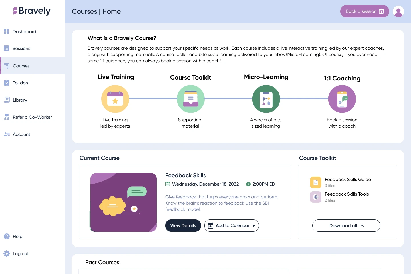
With Bravely shifting from a content-based website to a feature-driven web app, our priority was integrating coaching tools with a new Learning feature. This allowed users to browse, attend, and enroll in developmental courses, making these two core features the foundation of the new dashboard experience.
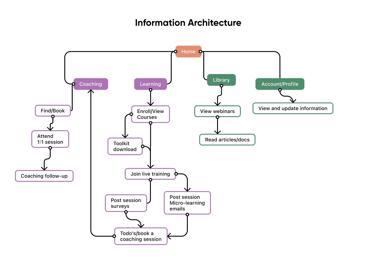
Sketches and wireframes
We mapped out the new user flow and refined it through multiple sketches before creating a low-fidelity prototype. After quick iterations with our product manager, we moved into usability testing, bringing in real users to validate our approach.
Usability testing & insights
We conducted five moderated Zoom sessions (45 minutes each) with current users. While they found navigation intuitive, the Courses section felt overwhelming and too text-heavy. Users also struggled to see how different learning formats—live training, micro-learning, and toolkits—connected as part of a single experience.
Refining the design
To improve clarity and engagement, we:
Enhanced the dashboard with more visuals and clear CTAs for a better user experience.
Introduced an infographic in the course overview to visually map out the learning journey.
Added sharing options and duration indicators to courses while refining branding to unify learning features.
The results
The redesigned dashboard made it effortless for users to navigate between sessions and courses, track progress, and engage with curated content, transforming fragmented experiences into a cohesive growth journey. By enhancing accessibility and usability, we not only increased adoption but positioned Bravely as a more valuable and scalable solution for organizations investing in employee development.
Like this project
0
Posted Nov 30, 2024
Re-designed Bravely’s existing website and features into a unified dashboard experience for on-demand & personalized coaching.
Likes
0
Views
6
Clients
Bravely
Tags
Visual Designer
Web Designer
UX Designer
Figma


Responsive gallery website

Data Visualization Dashboard