Data Visualization Dashboard

0
Data Visualizer
Visual Designer
UX Designer
Deliverables
Discovery & Research
UX/UI Design
Performance Testing
Introduction
2023 was a year of significant transition for Curinos data analytics business. Combining two entities is not easy, especially when vast, proprietary data is on the line. This is a story of how we helped them revamp a product suite to leverage their industry leading insights and release a new product for an emerging opportunity.
The challenge
Curinos faced the challenge of merging two data-rich entities while modernizing an outdated product suite. We helped streamline their platform, unlock industry-leading insights, and launch a new dashboard experience.
The outcome and impact
Our MVP dashboard saw strong engagement, with weekly logins driving early success. By Q4 2024, they achieved their main long-term revenue goals.
Our approach
To better understand our ideal users, we conducted discovery calls with five clients in our target market. These conversations helped us refine our understanding of how customers perceive retail deposits, validate the need for better analysis tools, and gather ideas to enhance our solutions.
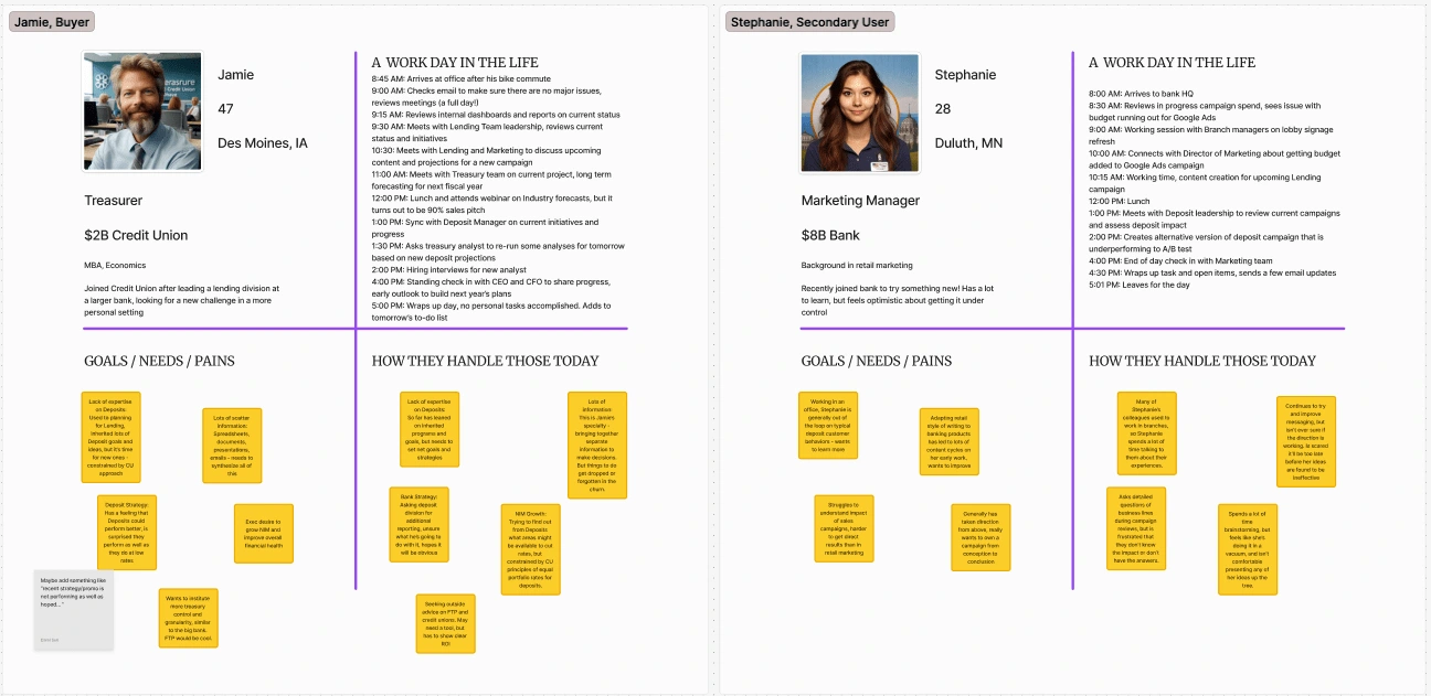
Key Findings
Executives struggled with three core challenges: tracking deposit goals and knowing when to adjust, quickly assessing the health of their deposit portfolio, and comparing rates and products with industry peers. Recognizing that most users were time-constrained, we focused on delivering high-level, actionable insights in an easy-to-digest format.
Building the Framework
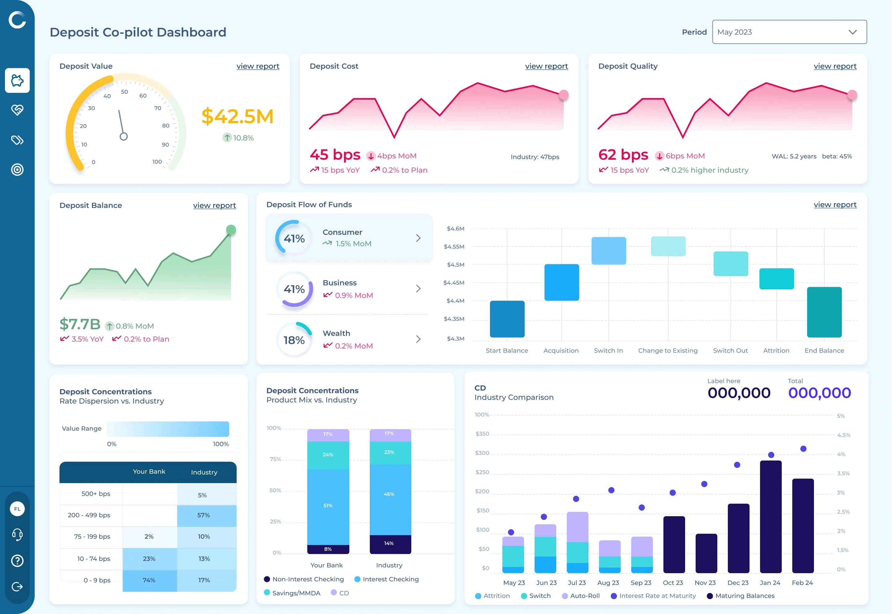
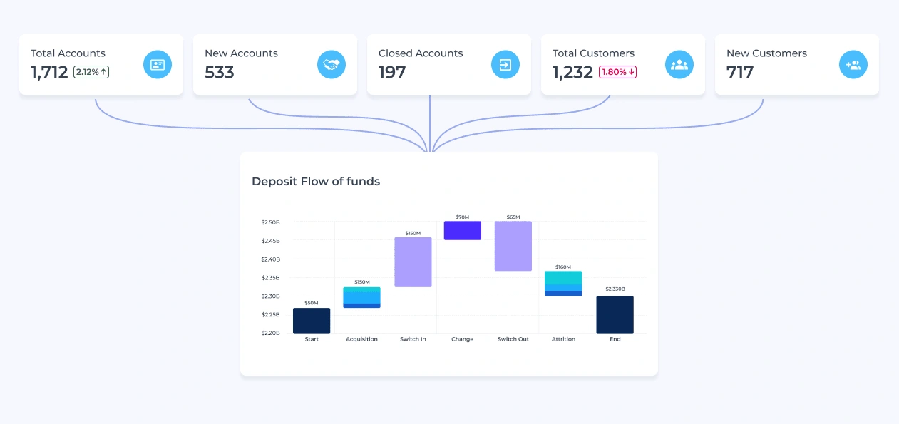
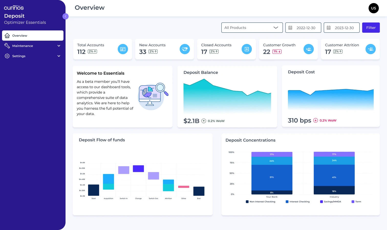
To streamline the experience, we prioritized a clean, intuitive dashboard that presented key metrics at a glance. Our initial concept included 4-6 widgets designed to surface actionable data. We collaborated closely with our product and engineering teams to refine widget layouts, ensuring they provided relevant insights while remaining feasible within existing tech constraints.
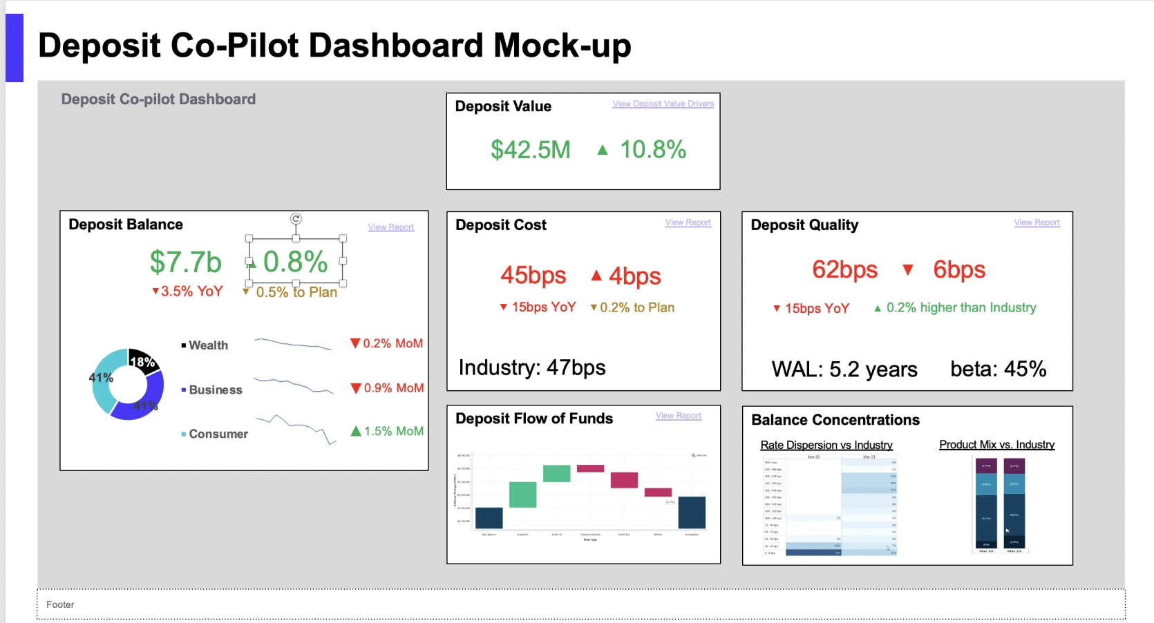
Early wireframe
Version 1
Adapting to Challenges
Engineering reviews revealed that some critical data pipelines weren’t ready, limiting our ability to support multiple widgets as planned. Instead of delaying the project, we pivoted by leveraging an existing pipeline to create summary tiles, maintaining the dashboard’s effectiveness without overburdening development. Design consistency was another key focus—adjusting color schemes to align with brand standards while ensuring a calm, user-friendly interface.
Beta testing & iteration
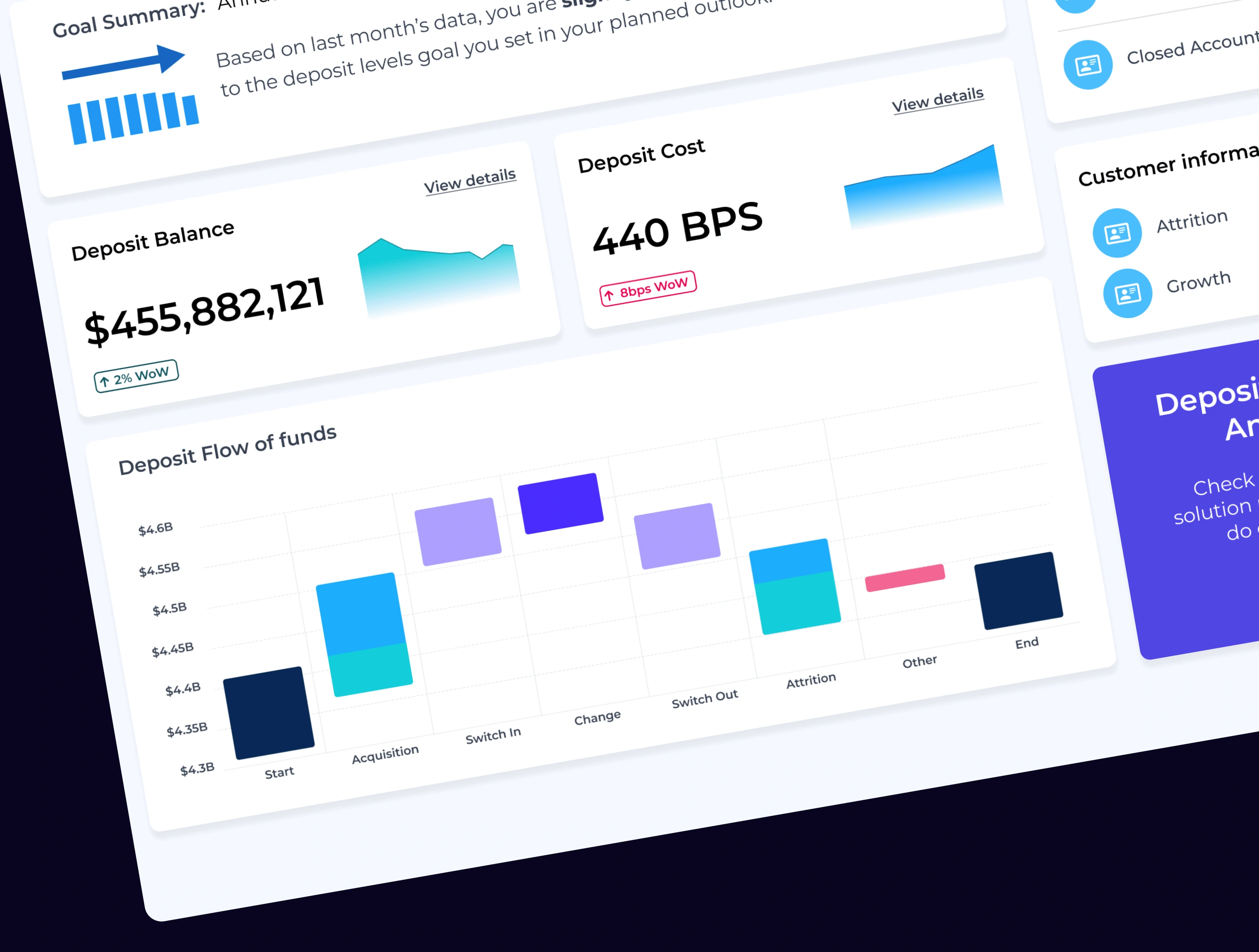
To validate our approach, we launched a beta program alongside the MVP release, offering early access to two key clients. Their feedback led to critical refinements, including a new "Switch Details" view for tracking money movement trends and a redesigned dashboard layout using the F-pattern. This structure helped guide users through their most important data points in a logical flow, making insights clearer and easier to act on.
Version 2
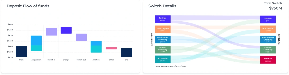
New Widget
The results
By focusing on clarity and usability, we transformed a static dashboard into an intuitive decision-making tool. Executives now have a streamlined way to monitor deposits, compare market trends, and adjust strategies with confidence.

Like this project
0
Posted Nov 30, 2024
A simplified, affordable analytics and data management SaaS tool. Helping users set goals, review data, and compare performance metrics.
Likes
0
Views
4
Tags
Data Visualizer
Visual Designer
UX Designer


Creating an all-in-one coaching platform

Responsive gallery website