App Audit
Cynthia Cui

As someone who's spent nearly three years self-studying Japanese, I've become intimately familiar with the digital language learning landscape. Bunpo was an early favourite of mine.
Recently, Bunpo rolled out three new features: Dialogues, Leagues, and Monthly Challenges. I tested them and provided actionable feedback for the team.
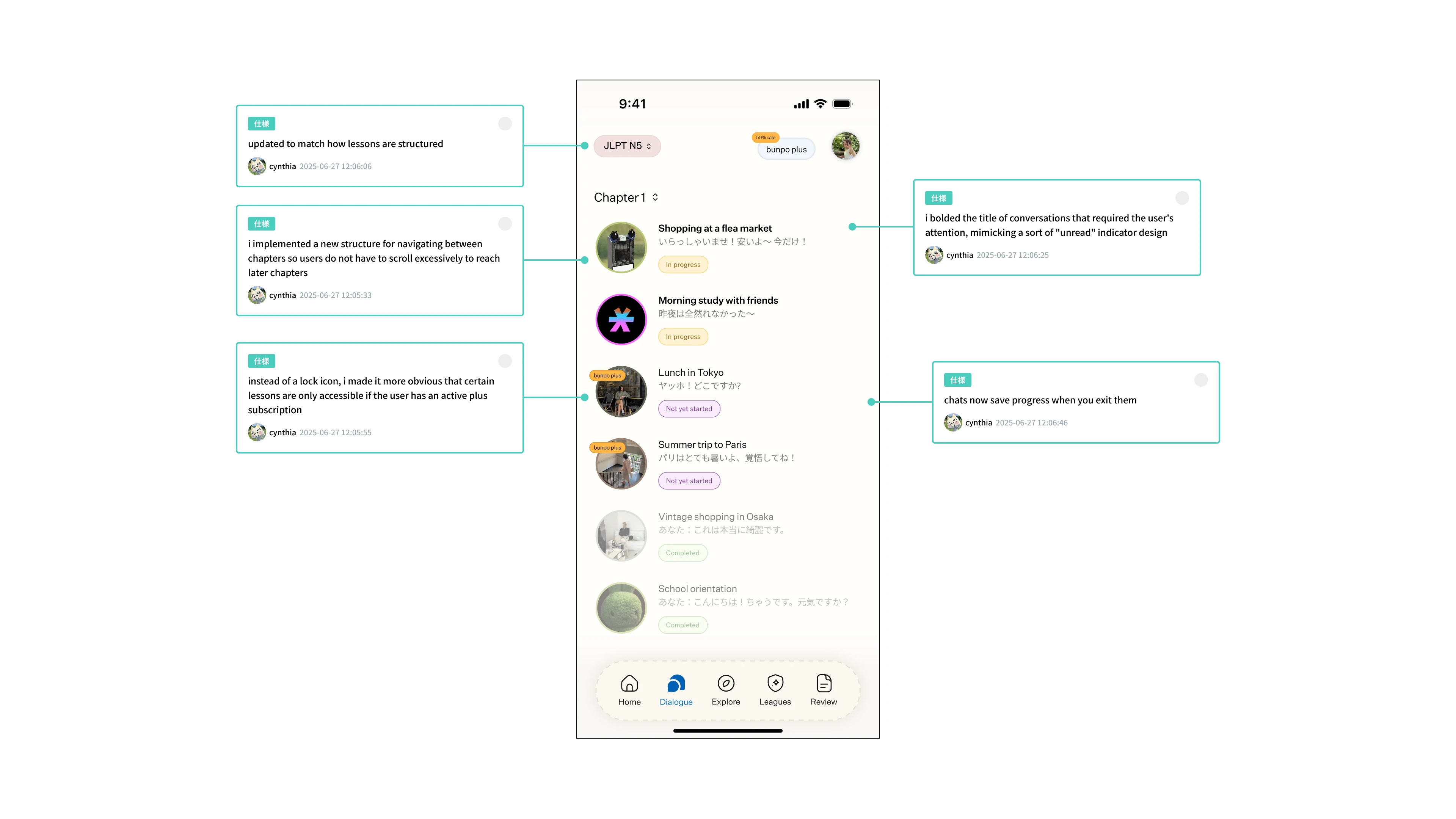
Dialogues
Dialogues were something that I was looking forward to testing when I started this project. During my 2+ years of self-studying, I haven't been able to find many opportunities to practice speaking or texting. Currently at a N5~N4 level, dialogues is an easy way for me to practice using the grammar concepts I've been learning so diligently.
Current State
Dialogues are designed to help users practice conversational Japanese. However, the home screen's layout mirrors a lesson overview rather than a chat interface, missing an opportunity to drive engagement.
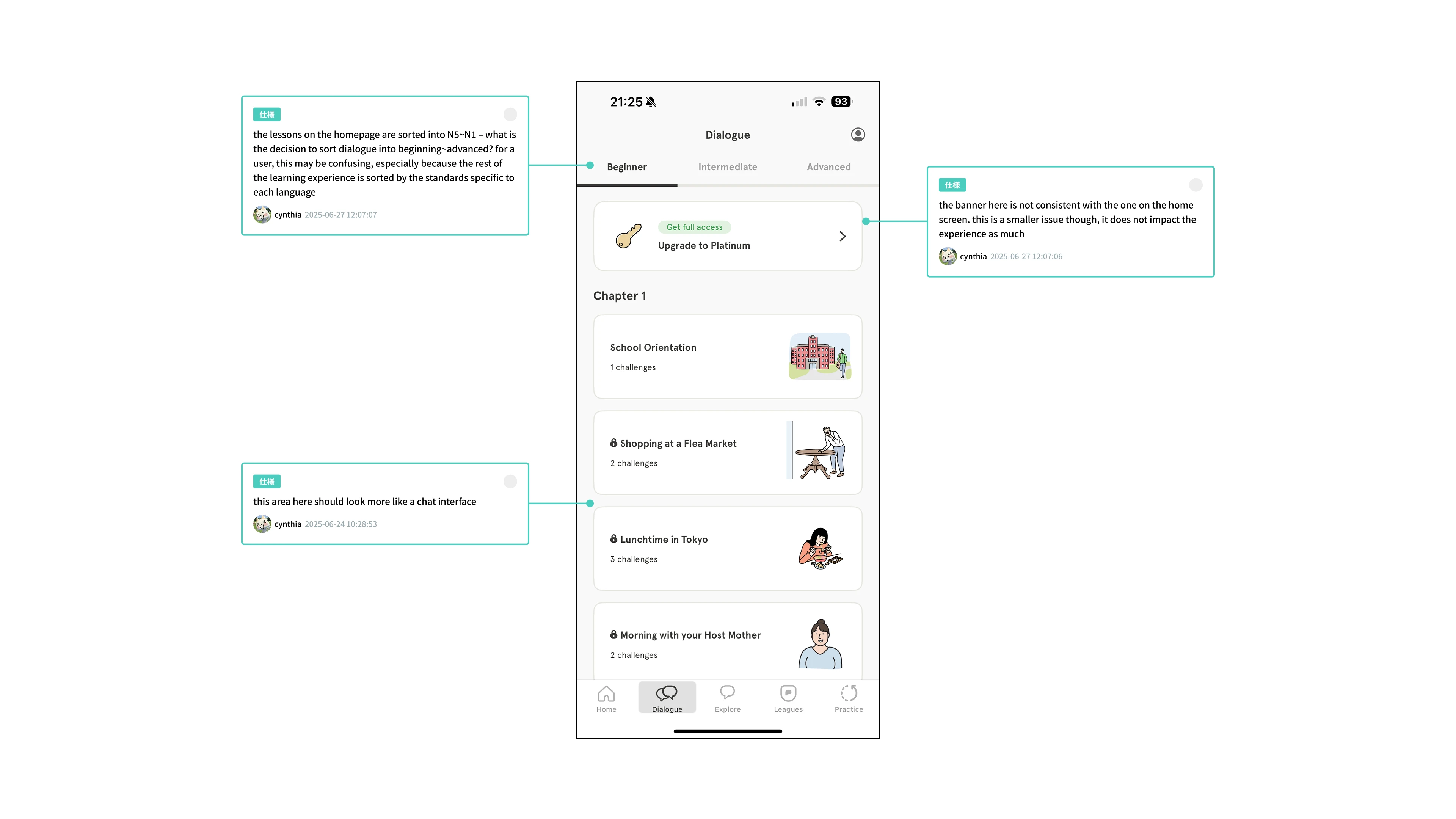
Pain Point: The interface doesn't evoke a chat experience, reducing motivation to practice.
Solution: Chat-like interface inspired by iMessage, X DMs, and WeChat.
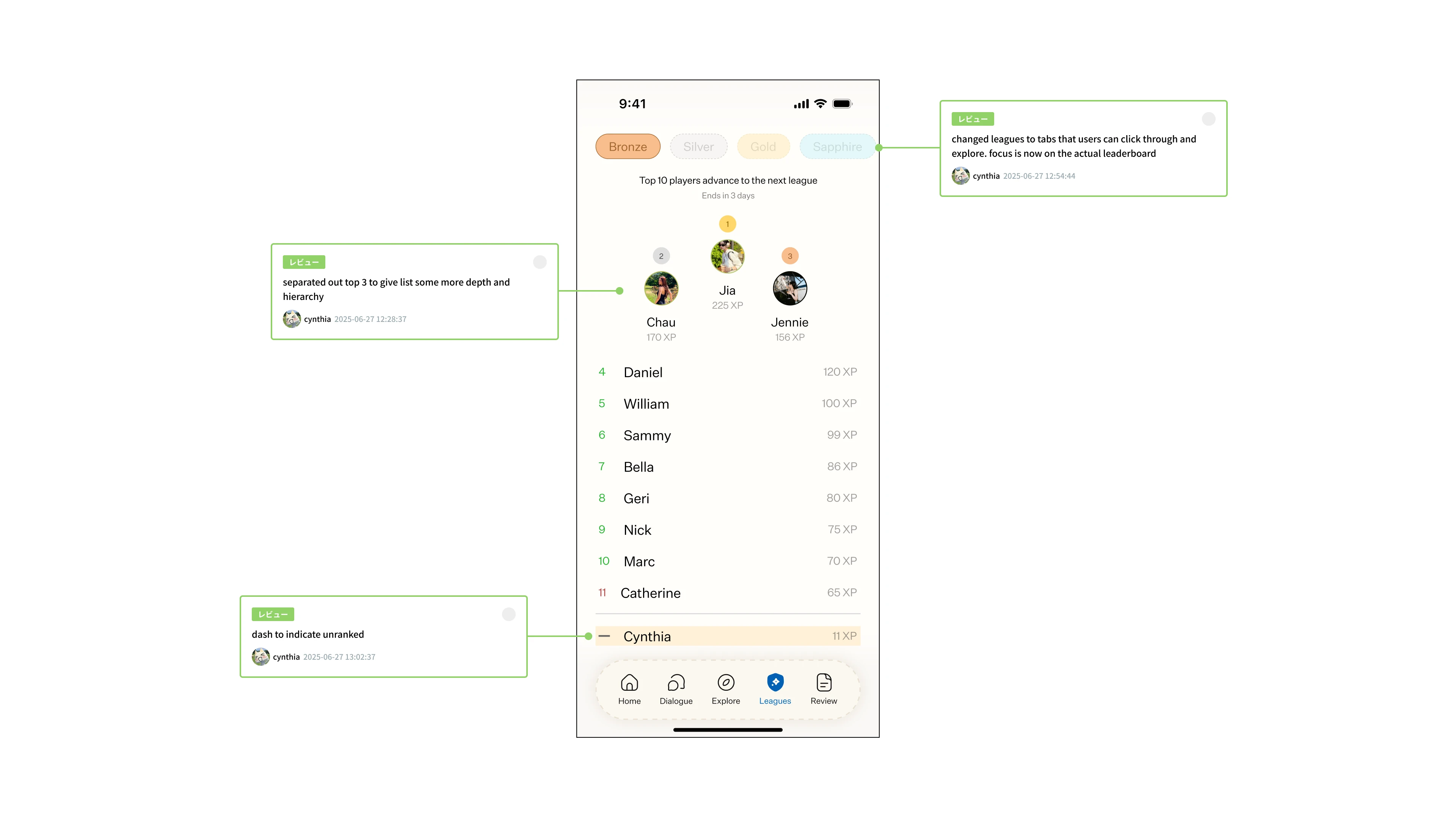
Leagues
Current State
Leagues, inspired by Duolingo's leaderboard, gamifies progress but initially lock users out, requiring activities for access.
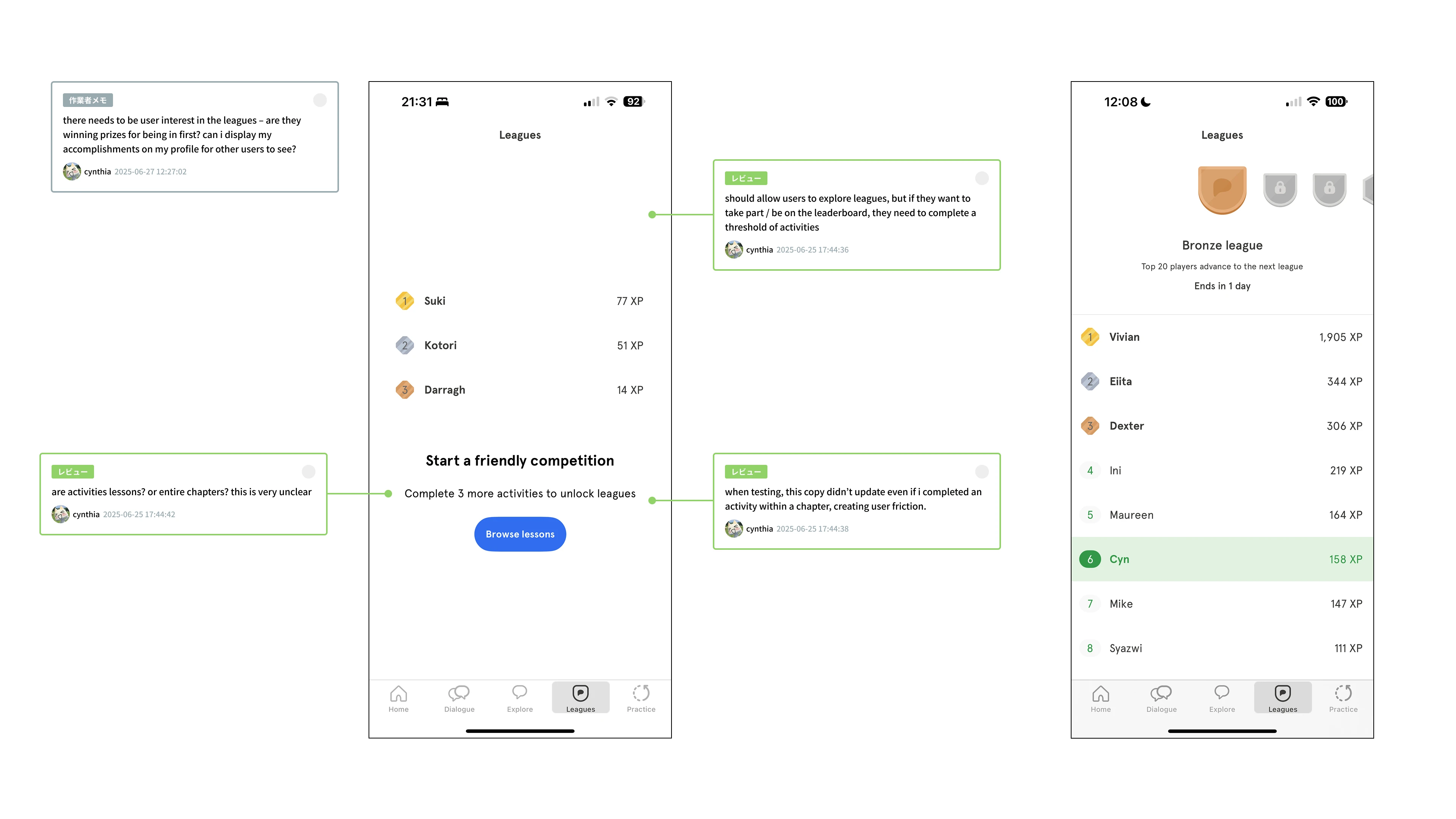
Pain Point: Unclear activity requirements and lack of feedback on progress.
Solution: Remove access barriers; allow users to explore leagues immediately.
Pain Point: No intrinsic motivation to unlock or compete in leagues.
Solution: Visual hierarchy highlights top 3 students per league, making the feature more motivating to get onto the podium.
Pain Point: Absence of meaningful rewards for high rankings.
Solution: Add rewards: coins, badges, and friend competitions to boost motivation.
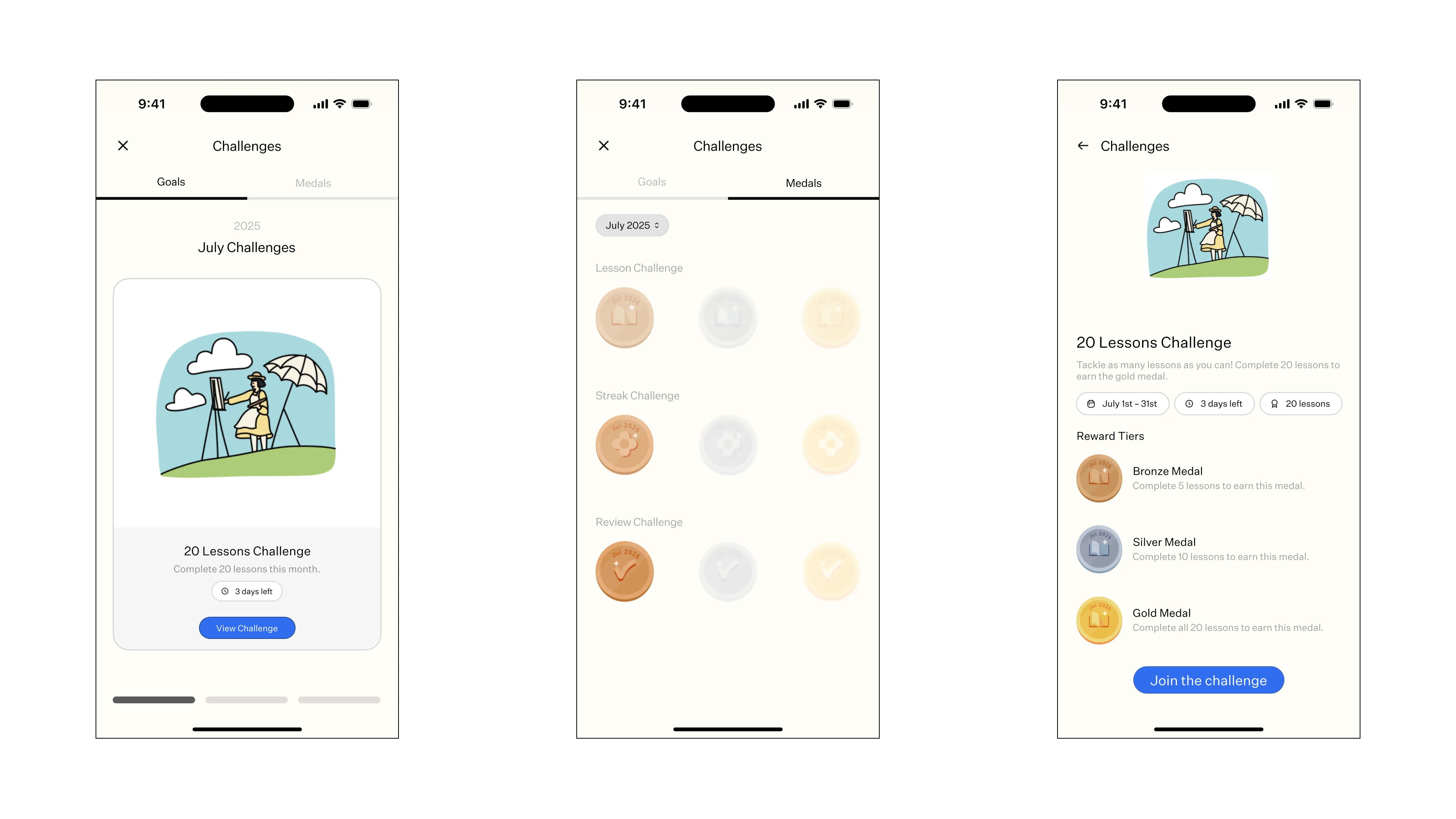
Monthly Challenges
Current State
Monthly Challenges aim to encourage consistent learning, with three challenge types.
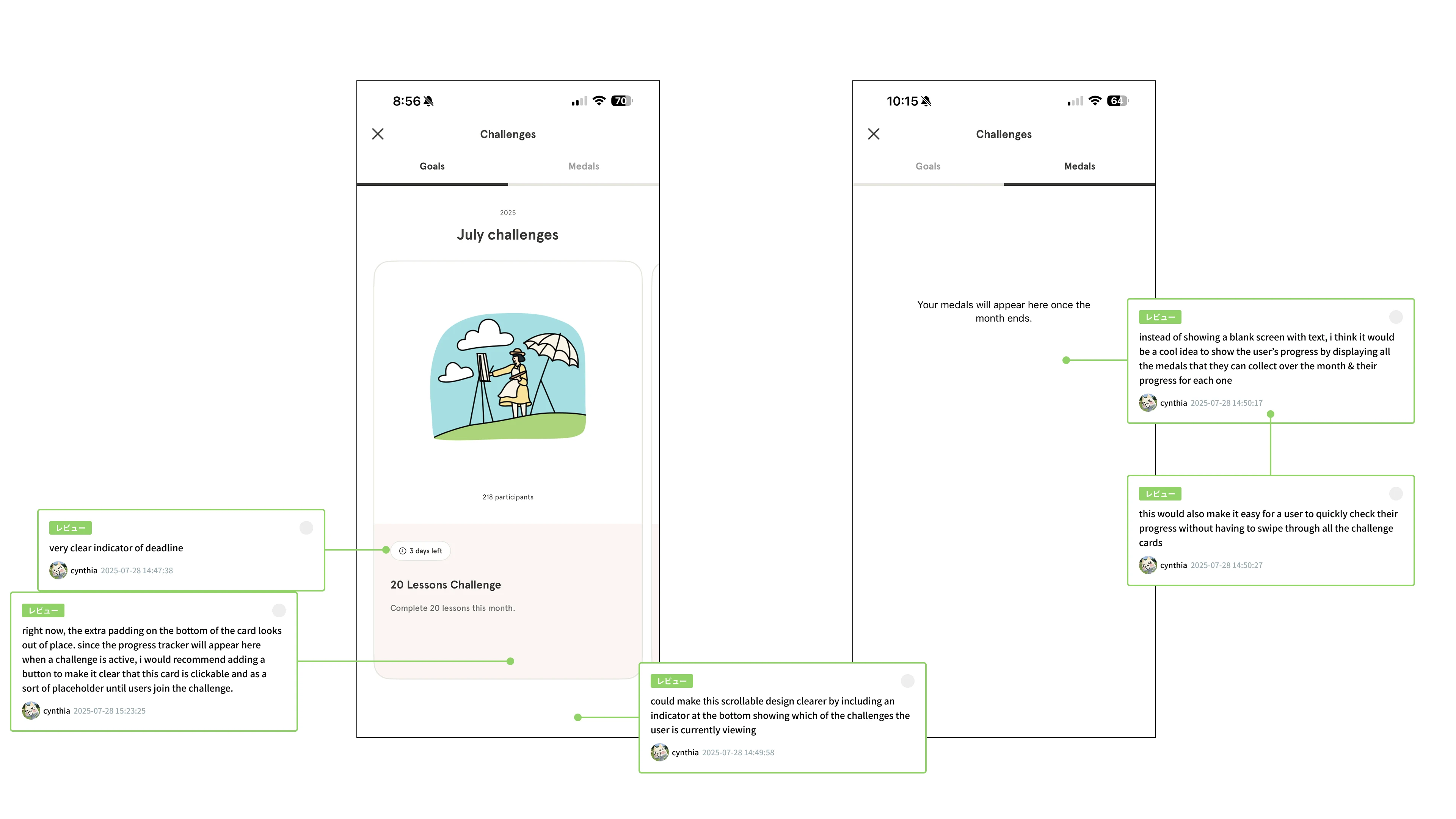

Pain Point: Carousel navigation is unclear.
Solution: Pagination replaces carousel for clearer navigation.
Pain Point: Medal collection lacks visual feedback.
Solution: Medals tab displays all possible medals for the month.
Pain Point: Challenge details are not easily scannable.
Solution: Challenge details organized into pills: date, deadlines, and requirements.
I thought that monthly challenges was a really well-designed and developed feature overall; with these changes I believe that it can become even better!
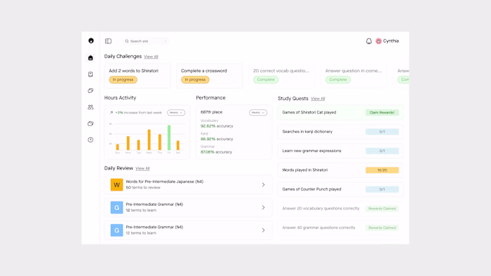
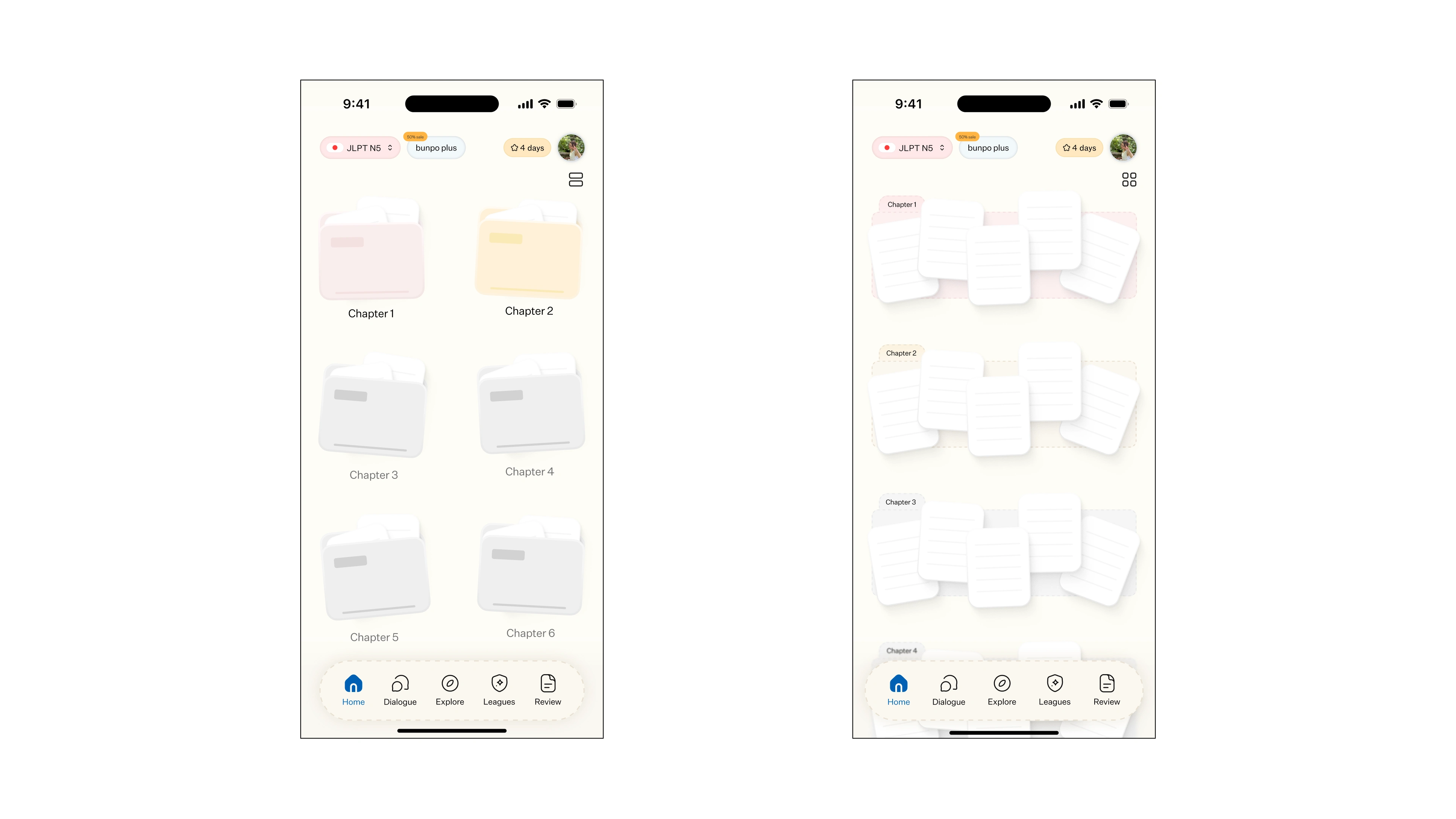
Homepage
Current State
Chapters are presented in a long, scroll-heavy list, making navigation cumbersome.
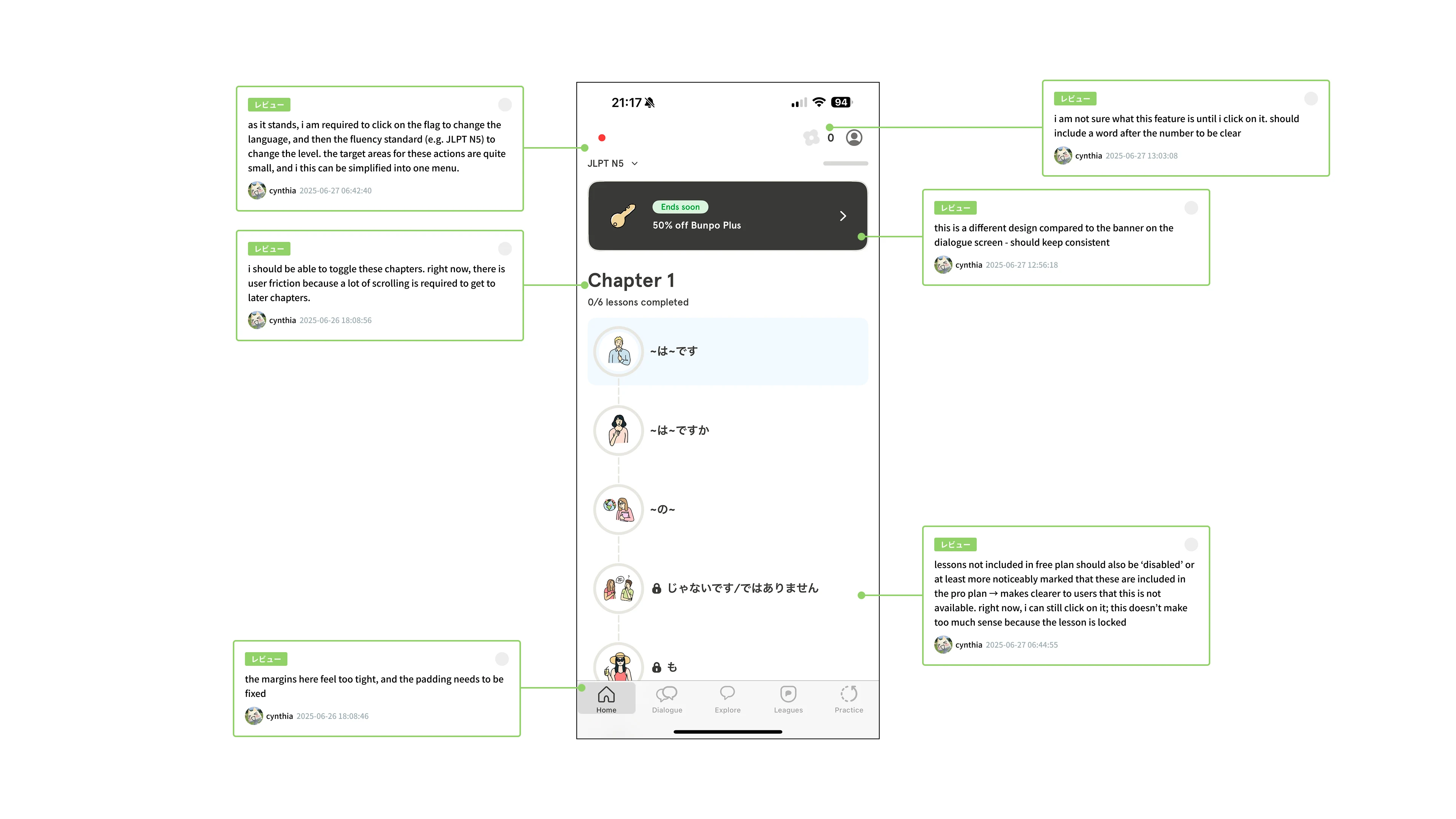
Pain Point: Inefficient chapter navigation.
Solution: A grid view of chapters, with different colours based on completion (pink), in progress (yellow), or locked (grey) easily allows users to navigate through their chapters.
Pain Point: Membership banners occupy valuable screen space.
Solution: Minimizing the bunpo membership banner allows more space for the main content on the screen.
Pain Point: Language/proficiency selection feels buried.
Solution: The new language and proficiency picker allows users to select their learning mode in a more simplified way.
Takeaways
Redesigning Bunpo's core features challenged my approach to user engagement and interface clarity. By prioritizing intuitive navigation and meaningful feedback, I aimed to make language learning more enjoyable and effective.
Like this project
Posted Oct 21, 2025
Making language learning easier!
Likes
0
Views
6