Emmayly — SaaS Marketing Website | Design & Development

Baker Hil


Emmayly — SaaS Marketing Website | Design & Development
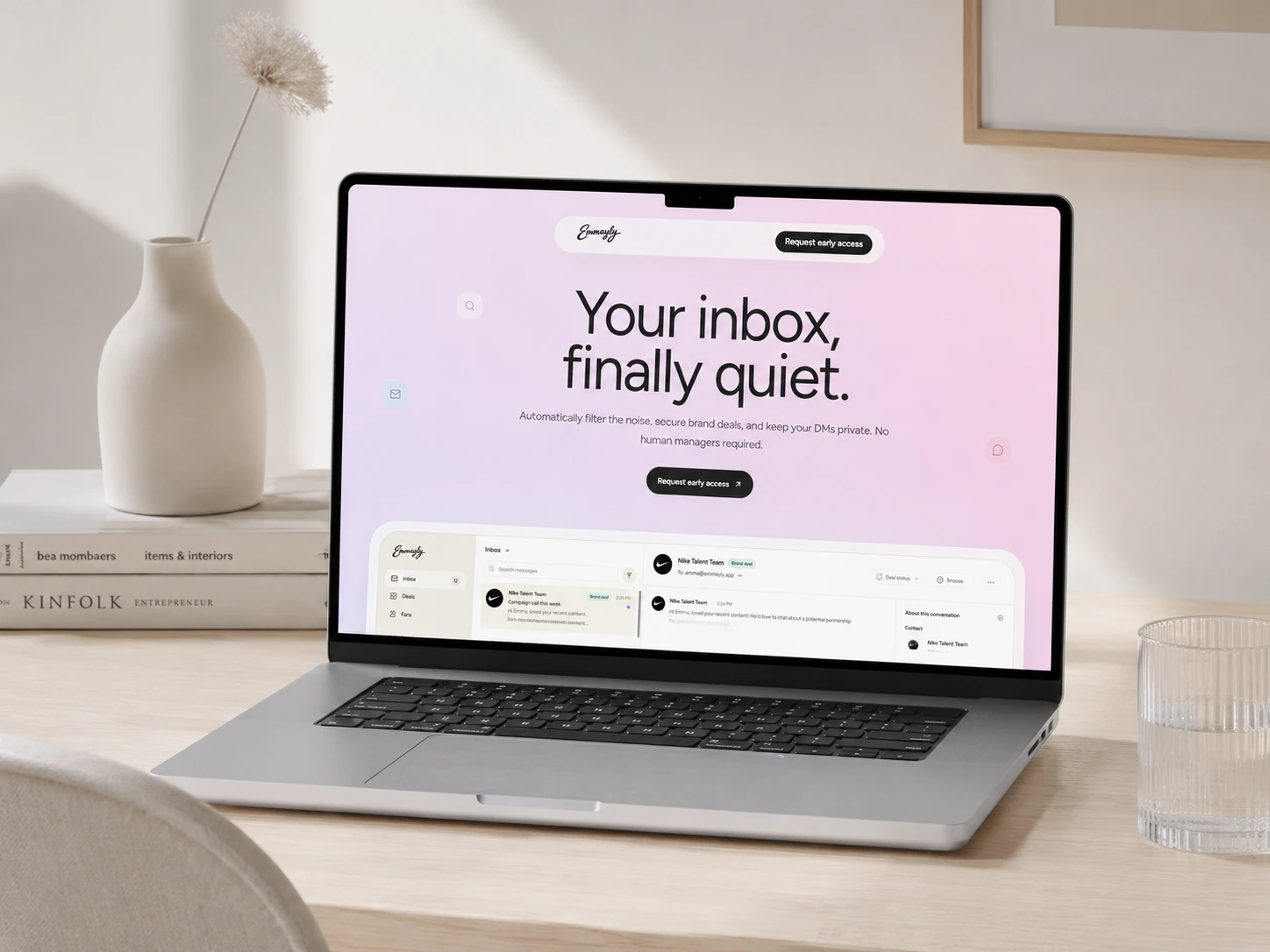
Emmayly is built around communication, so the challenge was making a busy product feel calm, expressive, and unmistakably human.
The visual system uses color with intention. Soft purples, electric blues, warm pinks, and subtle gradients give each section its own energy while keeping the experience cohesive. Color becomes part of the hierarchy, guiding attention and helping a communication-heavy product feel lighter and easier to understand.
One of the key moments is the scroll-driven product section, where an interactive phone mockup evolves as you move through the page, turning the interface into a more tangible product story.
The rest of the experience stays deliberately restrained, with gentle text reveals, subtle depth, and responsive interactions. The result is a landing page that feels polished and digital, but never cold.
Whole homepage scroll through
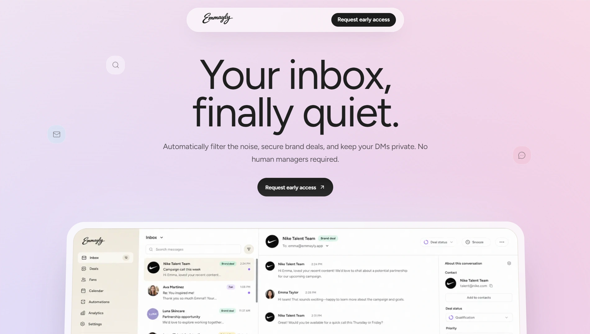
Hero section
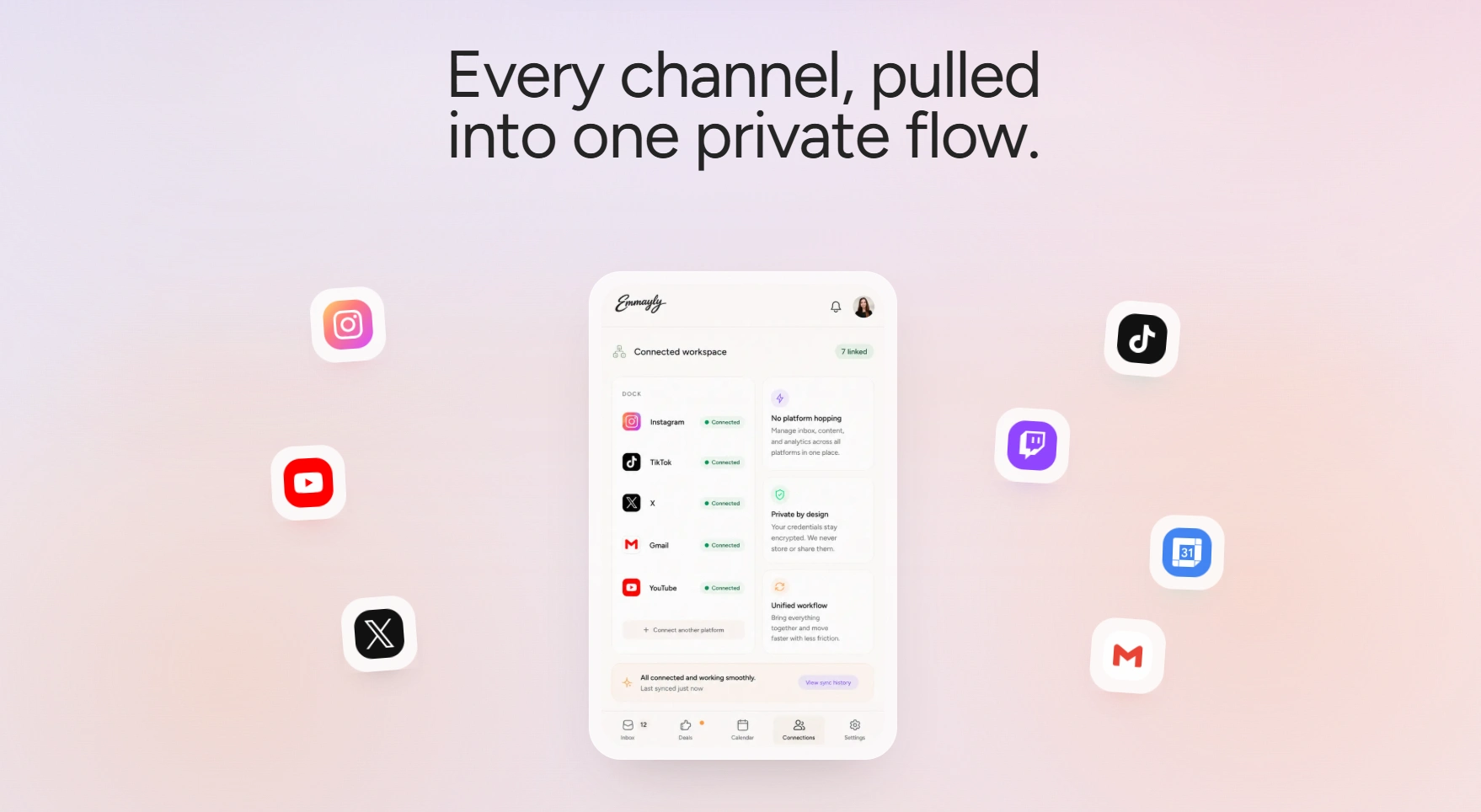
Ecosystem
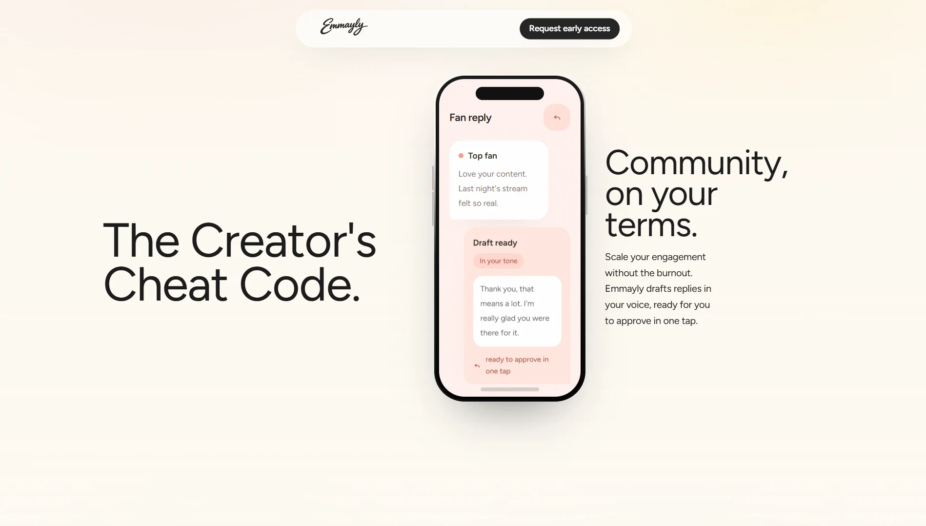
Features section
Scroll-driven product section
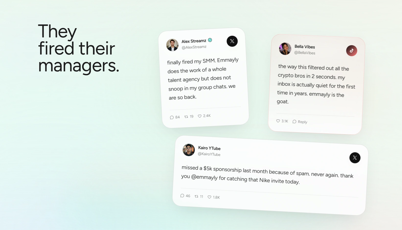
Social proof section
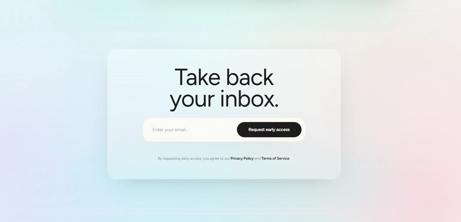
CTA
Like this project
Posted Sep 22, 2026
Design and development of a cohesive SaaS marketing website for Emmayly.