Adinkra Global

Damilola Adelaja


Adinkra Global
Website
2025
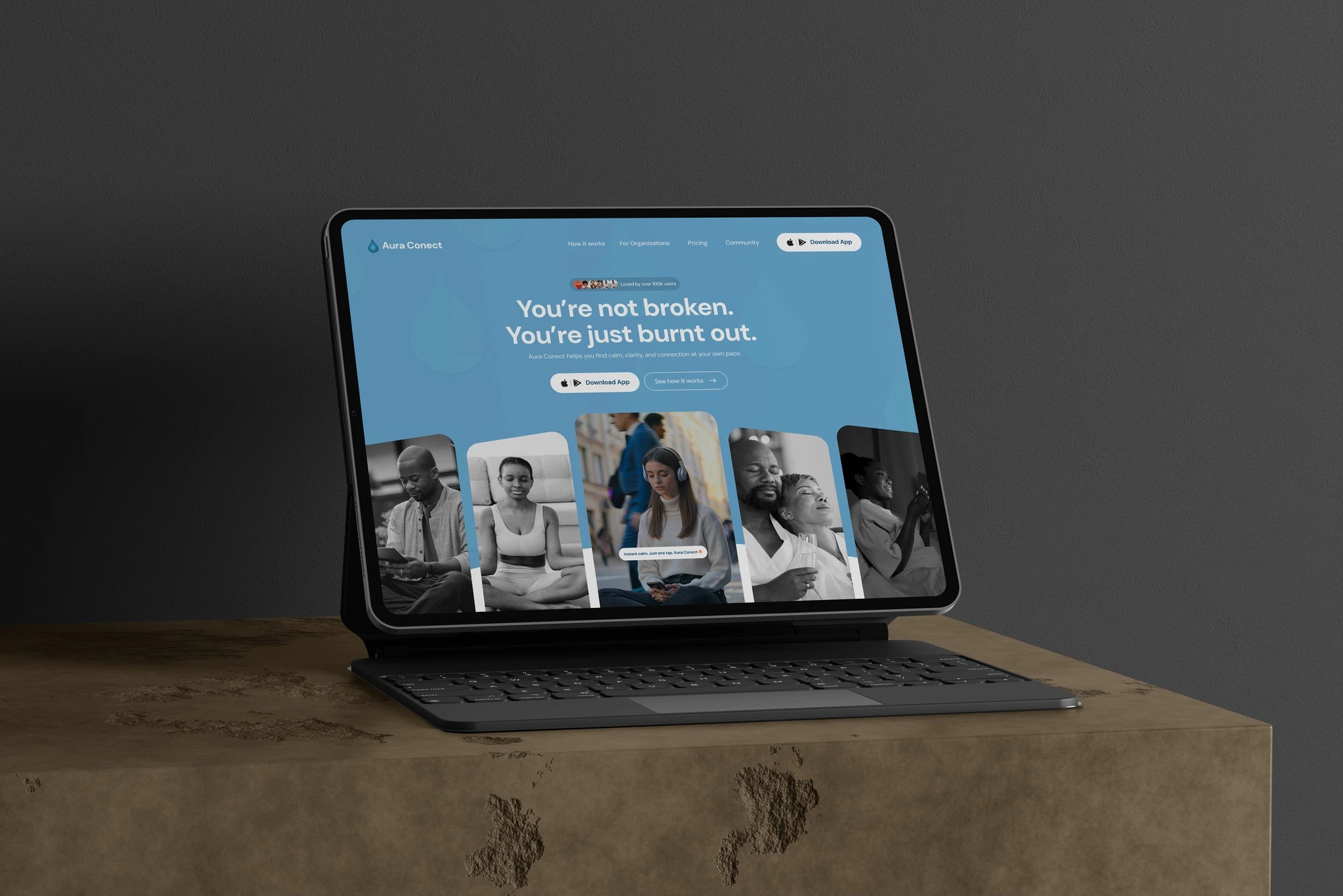
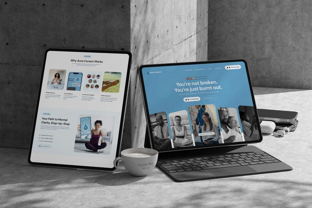
Aura Conect is a mental-wellness product whose mobile app helps users with mood tracking, guided meditations, an AI companion, and supportive communities. The website’s goal was to convert information-seekers into app downloads and waitlist signups, while clearly communicating clinical credibility (HIPAA, enterprise readiness) for organizational customers.Live site https://adinkra.global/
Primary goals
Increase App Download CTA conversions (primary KPI).
Reduce homepage bounce rate for organic traffic.
Build trust for B2B buyers via clear enterprise messaging.
Communicate product scope and value in a calm, accessible tone.
Success Metrics
App download CTA click-through rate, target: 7.5%
Homepage bounce rate, target: below 40%
Waitlist signups (pre-launch), target: 1,000+ users
Research Approach
To design the site in a way that respects mental-health sensitivities and improves behavioral outcomes (downloads) I used a mixed HCI approach:
Stakeholder interviews (product, clinical advisors, and sales) to align on clinical compliance, B2B needs, and launch priorities.
Exploratory design audit — assessed early content strategy and visual tone to ensure the messaging conveyed empathy, clarity, and trust before the first prototype was built.
User interviews & contextual inquiry with prospective users (n = 12 — recruited from waitlist and target segments) to understand motivations for using well-being apps and trust signals they value.
Competitor analysis (Calm, Headspace, Ginger, Talkspace) to map product messaging and feature patterns, then identify differentiators (AI companion + enterprise wellness angle).
Prototype testing + remote unmoderated tasks (Maze / UserTesting) measured comprehension of “how it works,” ease of finding pricing, and willingness to join the waitlist.
Analytics & heatmap baseline (Google Analytics + Hotjar) set pre-launch baselines for scroll depth, CTA click rates, and top exit points.
Key research findings (synthesis)
From synthesis (affinity mapping) I distilled 4 core insights that drove the design:
People need reassurance before they commit. Users value quick, clear trust signals (clinical compliance, testimonials, concrete features) before downloading.
Short cognitive windows. Visitors scan for 6–12 seconds, hero messaging must be clear, emotionally resonant, and action-oriented.
Different audiences, different hooks. Individual users respond to “daily calm” messaging and community features; employers/clinicians need ROI & compliance language.
AI needs framing. Users were curious about the AI companion but also cautious — they wanted clear explanations of what it does and how it keeps data private.
Design strategy & decisions
I translated the insights into concrete design decisions:
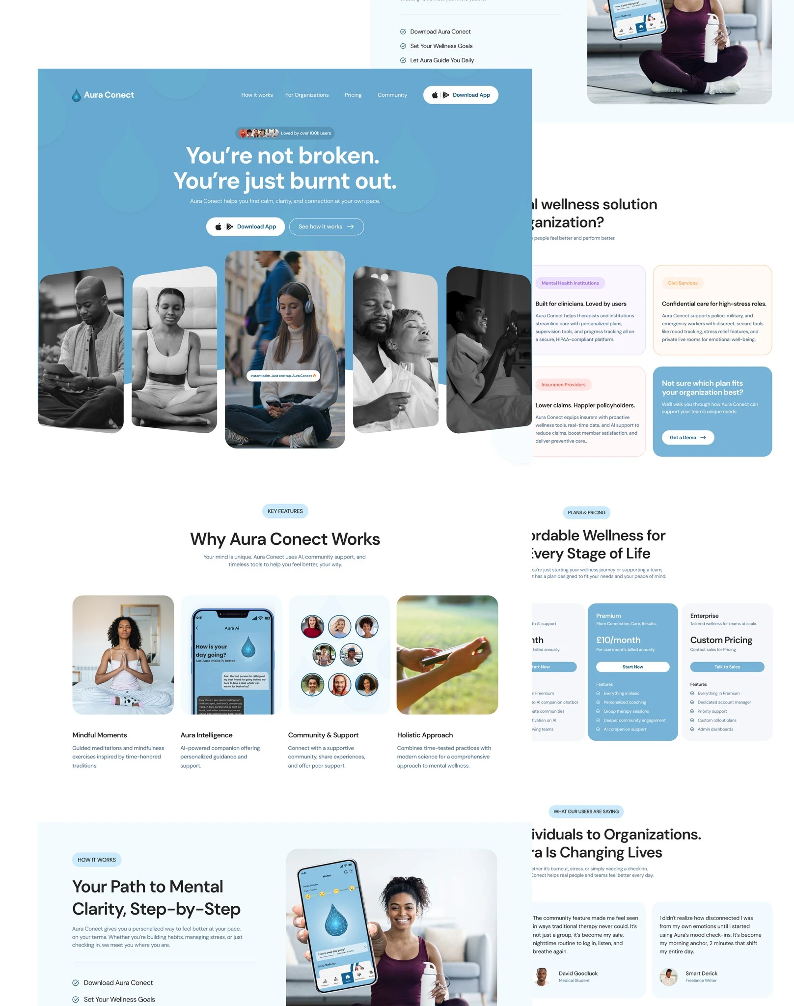
Hero copy + primary CTA: Rewrote hero to lead with empathy (“You’re not broken. You’re just burnt out.”) and immediate primary CTA (“Download App”) with secondary “See how it works”. This respects the emotional state of users and provides two action paths.
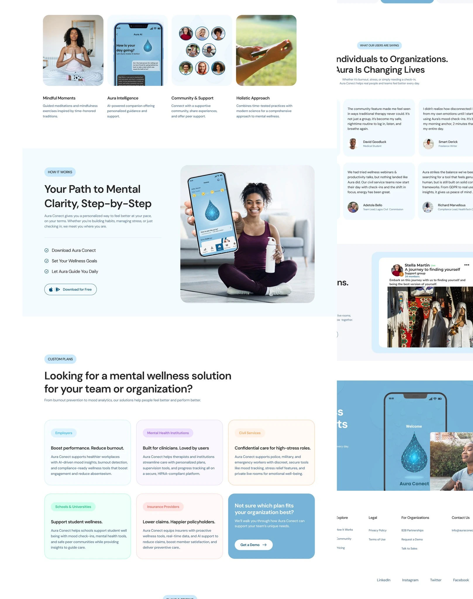
Progressive disclosure for AI: Added a short “Aura Intelligence” block that briefly explains capabilities, with a “learn more” link to address trust concerns without adding cognitive load to the hero.
Two-track information architecture: Split content pathways — Individuals (conversion flow) vs Organizations (demo & enterprise flow) — so users find relevant content fast (reduces decision friction).
Trust & credibility layer: Prominent testimonials, HIPAA / compliance language, and enterprise benefits for B2B buyers. These were placed near pricing and demo CTAs.
Pricing clarity & affordance: Clear pricing tiers and benefits for freemium → basic → premium to reduce cognitive friction for decision making.
Microcopy + tone: Tone crafted to be calm and non-pathologizing; microcopy for CTAs that reduces anxiety (e.g., “Try it free. Cancel anytime.”)
Accessibility improvements: Higher contrast CTAs, semantic headings, alt text for images, and keyboard focus order checks (WCAG basics).
Ethical & accessibility considerations
Because the product targets mental health, I included a short ethics and accessibility section on the site and in the design process:
Avoided pathologizing language; used strength-based copy.
Clear privacy & compliance language for handling sensitive data (HIPAA / GDPR mentions for enterprise pages).
Basic accessibility checks (color contrast, keyboard navigation, semantic headings); I recommend a formal WCAG 2.1 audit before full launch.
Reflection
This project deepened my understanding of how HCI research translates into business outcomes.I learned that users don’t just interact with a page they form emotional judgments within seconds.Balancing empathy, evidence, and usability became the key to success.If extended, I’d run longitudinal A/B tests to study sustained user engagement and retention over six months.
Like this project
Posted Aug 19, 2026
Website design to increase app downloads, reduce bounce, and build trust for a mental-wellness product using mixed HCI research and analytics.
Likes
6
Views
12