Lethabong SoS | Branding Design
Lethabong Math's, Science & ICT School of Specialisation
A pioneering educational institution in Pretoria, South Africa, dedicated to fostering excellence in mathematics, science, and information and communication technology. Lethabong School of Specialisation sought a new logo and fresh branding to mark the launch of their specialized school.
The existing branding did not adequately reflect the school's innovative approach and commitment to academic excellence.
Challenges
The main challenge was to design a logo that embodied the school's focus on math, science, and ICT while conveying a sense of prestige and innovation.
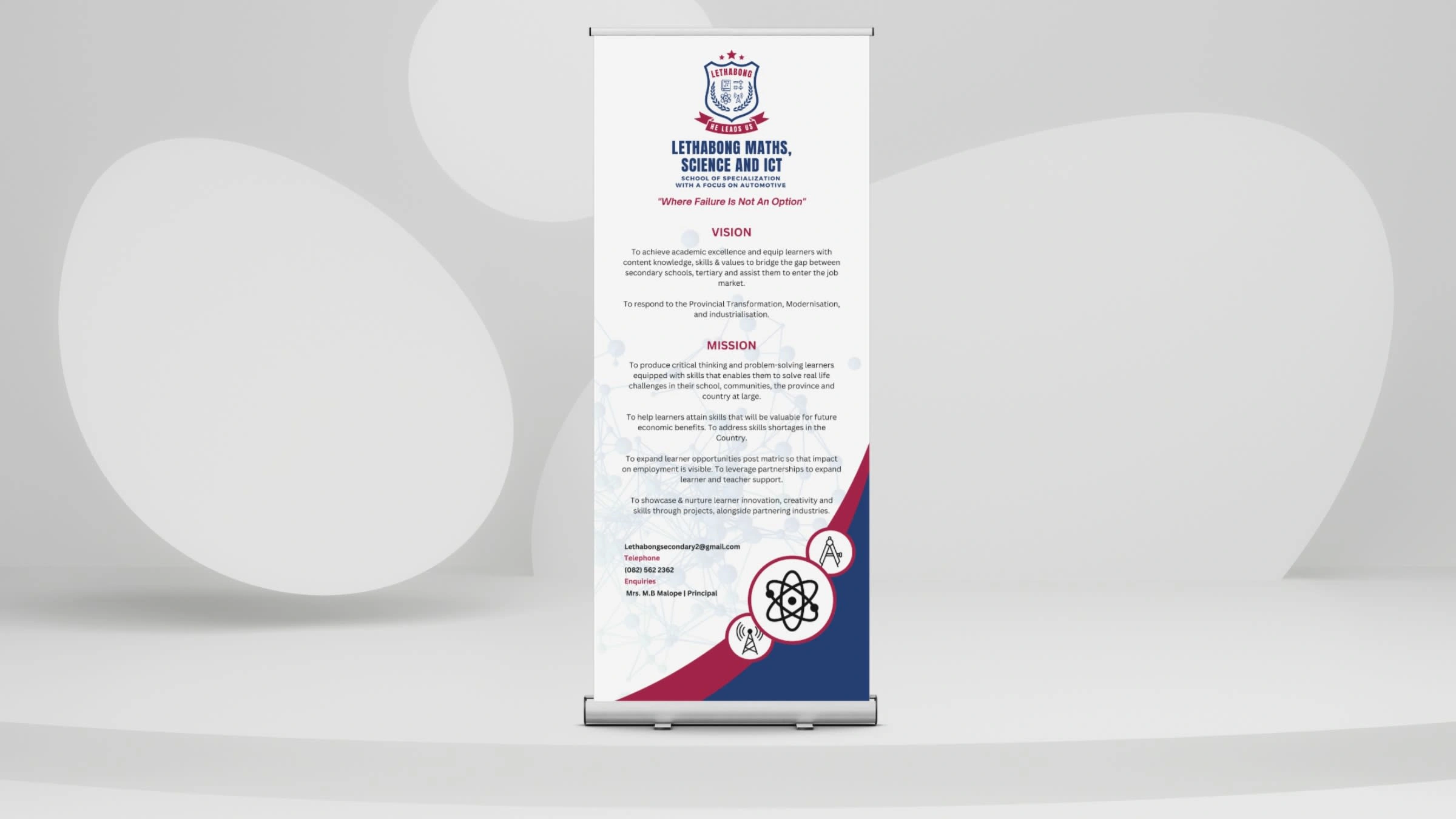
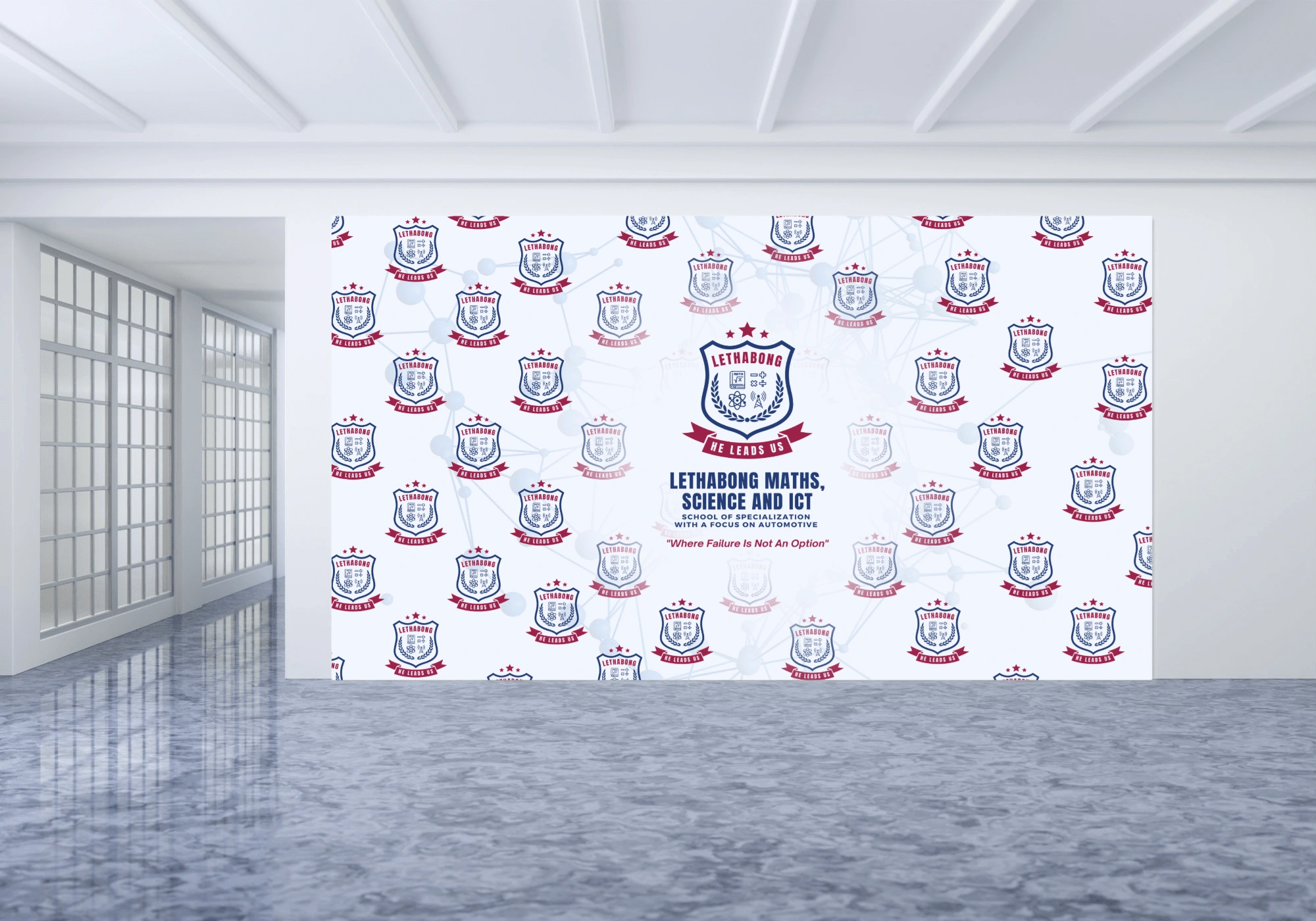
Additionally, creating a cohesive branding strategy that could be applied across various materials, from purified water bottles to posters and a press wall banners, required careful consideration.
Ensuring the new branding was versatile and adaptable to different mediums was crucial.

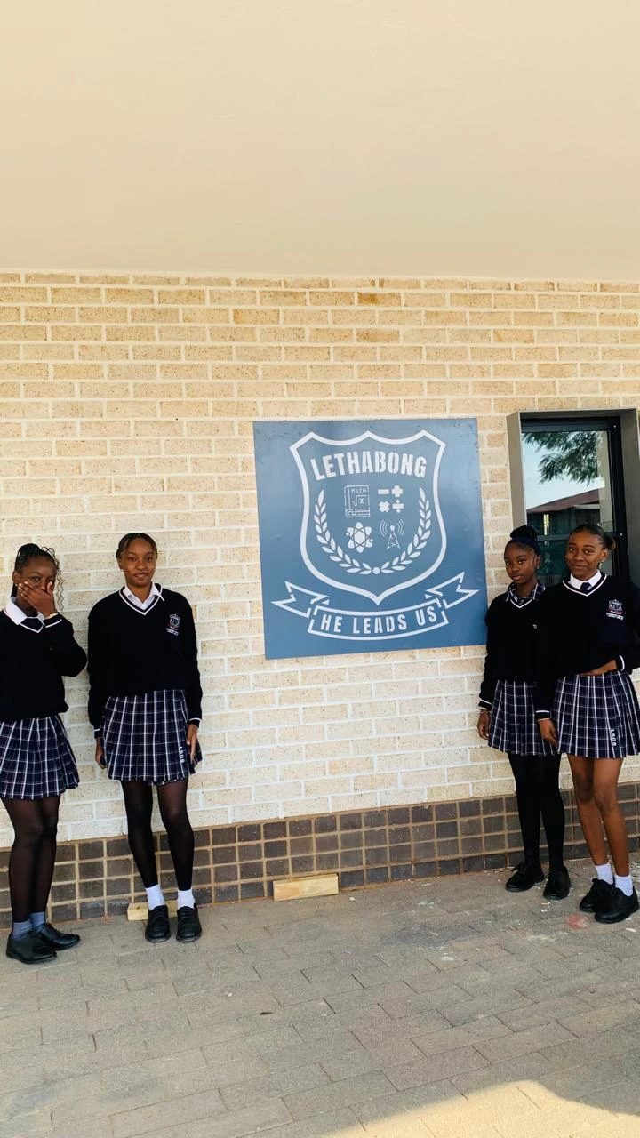
School's Old logo

School's logo pre-redesign
What I Accomplished
Conducted in-depth research to understand the school's mission, values, and target audience.
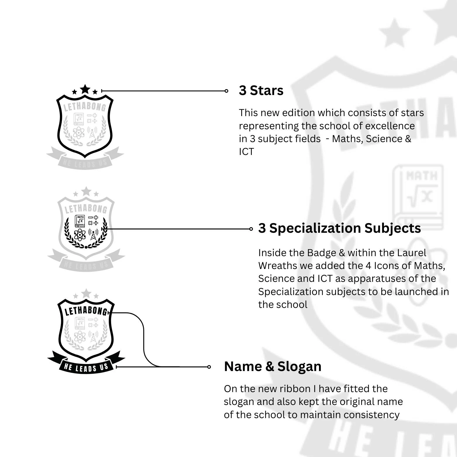
Designed a modern and sophisticated school emblem that incorporates elements symbolizing math, science, and ICT, unified by a clean and professional aesthetic.
Developed a comprehensive branding guide that included color schemes, typography, and design elements to ensure consistency across all branded materials.
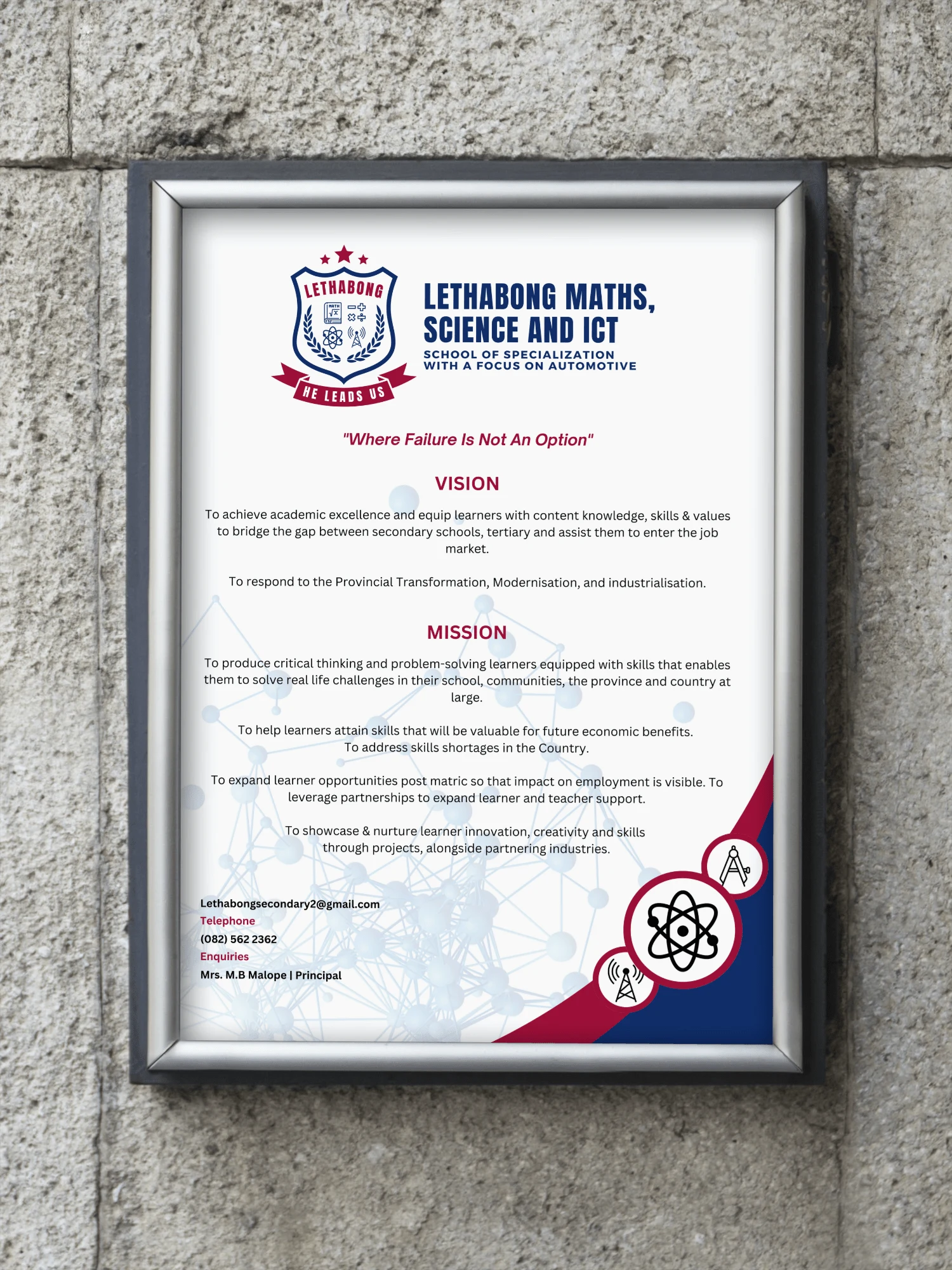
Created a range of branded items, including purified water bottles, posters, a press wall banners, T-shirts, Caps and more, that effectively communicated the school's identity and values.
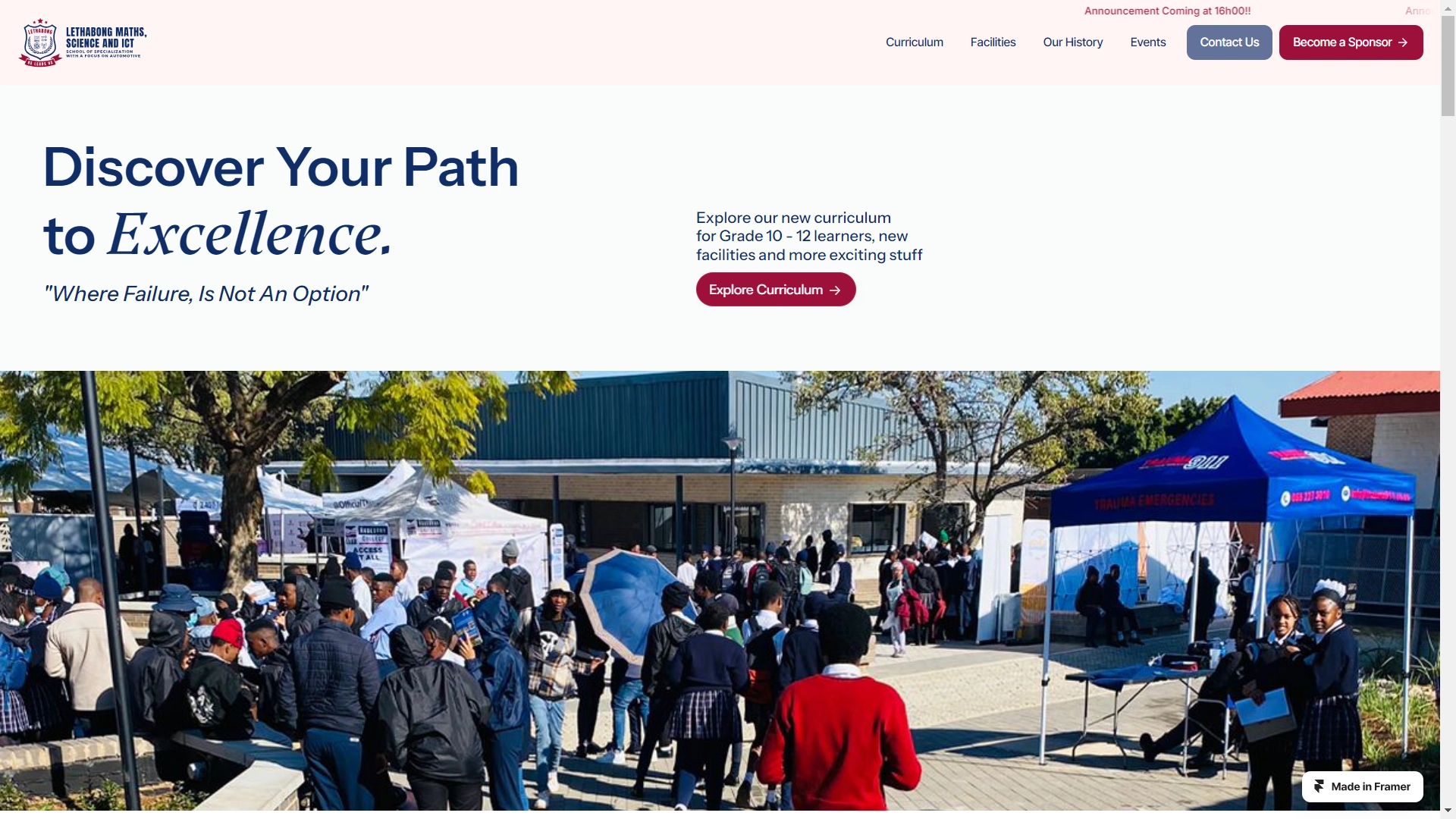
Designed and developed a user-friendly and visually appealing school website that showcased the institution's programs, achievements, and news.
Collaborated with the school's administration to ensure the new branding aligned with their vision and educational goals.


Overall Impact
The new logo and branding significantly enhanced the award winning school's image, positioning it as a leading institution for specialized education in math, science, and ICT in the Gauteng Province.
By creating a modern school emblem and comprehensive branding strategy, we achieved cohesiveness, professionalism, and consistency, enhancing the school's image and fostering a stronger sense of community.

Key Takeaways
This project emphasized the importance of understanding the client's unique educational focus and values to create a distinctive and effective brand identity. On a personal level, this broad project brought a significant growth as a designer.






Like this project
Posted Sep 9, 2024
Lethabong School of Specialisation sought a new logo and fresh branding to mark the launch of their specialized school in Gauteng.
Likes
0
Views
12

