Student Payment Platform – Web App UX/UI Redesign

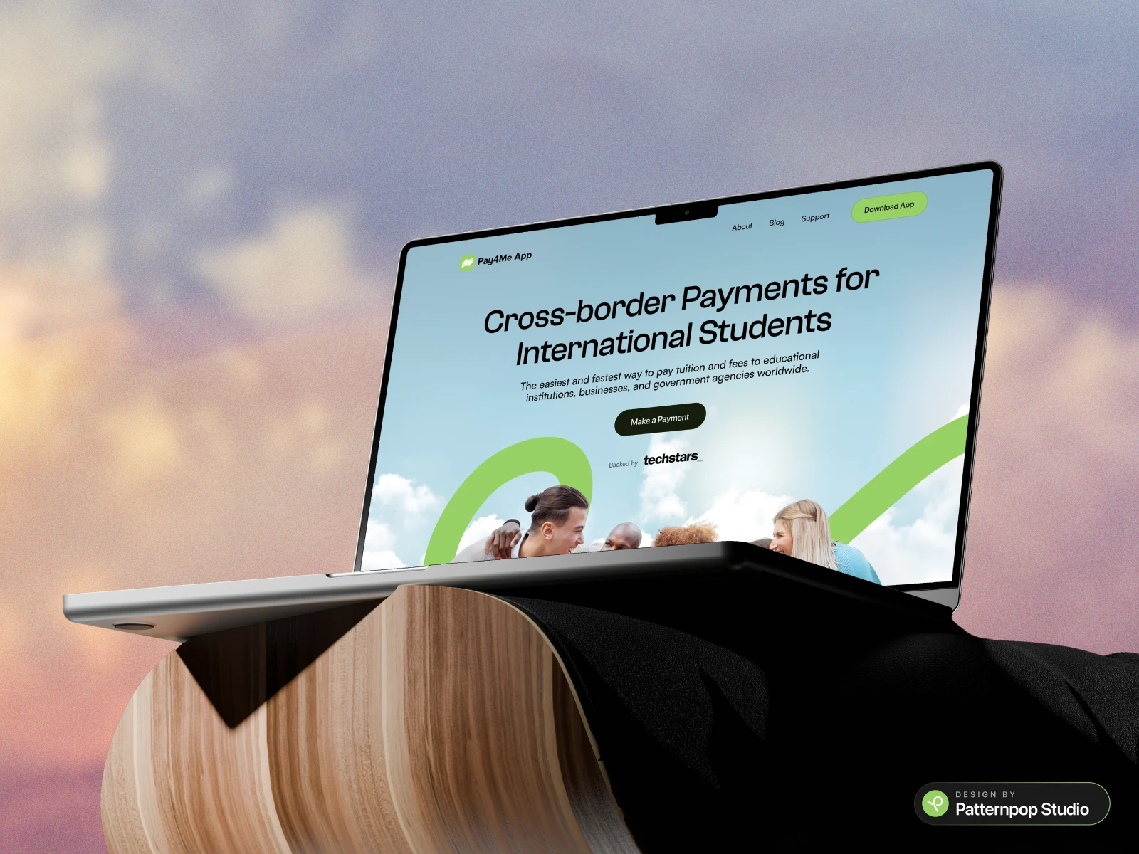
A complete UX/UI redesign concept for a student-focused cross-border payment web app, built to make tuition, visa, and relocation payments frictionless.
The design emphasizes:
🧭 Clear navigation & transparent fee breakdowns to reduce user uncertainty.
📱 Mobile-first responsiveness for on-the-go access.
🛠️ Brand-aligned typography & visuals for familiarity and trust.
💡 Conversion-focused layout using testimonials and recognizable financial logos.
While part of a design challenge, this project was approached with real-world user needs and performance goals, delivering a scalable interface ready for implementation.
💬 What do you think of the flow and layout? Would love your feedback!
––––––––––––––––––––
🎨 Designed by PatternPop Studio
🔗 Case Study live on Behance + Dribbble
📩 For collabs: Please DM

Like this project
Posted Jun 17, 2025
UX/UI redesign for a student payment platform, making tuition, visa & relocation payments simple, transparent & mobile-first. 📩 For collabs: Please DM


