Hiroes—Adaptive Website Development
Ashish Sharma
Hiroes—Lead Generation Website
Household and Lifestyle Services at Doorstep
Overview
Project Summary: Hiroes is a local services startup that needed a simple, effective website to begin capturing leads and presenting its core offerings online. The goal was to launch a website quickly, with a focus on clear communication, service discovery, and lead generation.
Client Goal: Establish an online presence to test service demand, streamline inquiries, and prepare for a full-scale website in the future.
My Role: I led the end-to-end design and development of the site using Framer, from layout planning and visual design to prototyping and live deployment. I also built a dynamic form to link with the service database and a third-party CRM to capture leads.
Webite mockup presentation of service listing page and pro service page.
Problem & Constraints
Hiroe, a newly launched local services startup, needed a quick way to go online, explain what they offer, and start receiving service inquiries. They didn’t have a brand identity, content strategy, or user insights in place — just a rough idea of the services they wanted to provide and a strong preference for WhatsApp as the main contact method.
Due to the early-stage nature of the business, there was no time or budget for in-depth user research, usability testing, or performance tracking. My design decisions were guided by competitor analysis, common UX patterns in the services space, and frequent feedback from the users and stakeholders to ensure alignment with real-world needs.
Competitor Analysis
An approach to designing a usable element of the website.
To deliver a quick yet effective solution for Hiroes, I grounded my design process in competitor analysis, focusing especially on successful Indian service platforms like Urban Company. Their website structure, service discovery flow, and visual clarity helped shape key parts of the Hiroes homepage and services experience.
Here are my key observations:
Simple interface
The interface is free from bold and lengthy text, straightforward keywords, large images, banners & icons that represent the offerings, a card-based layout, and key service details relevant for customers.
Seamless flow
Upon clicking on the category, a modal pops up that blackens out the rest screen. Modal contains simple cards that act as a guiding block. Do not ask for any input or user preference, as not even a signup prompt appears. The flow takes users straight to the services page.
Relevant key details
Services page captures user attention with service name, image, ratings, pricing, and a summarized user expectation as a small pointing. All at the center of the screen. The rest options, such as customization and details of the service, will be executed with a see more button.
Optimized for Mobile Users
Emulated mobile-friendly design standards seen on Urban Company to ensure Hiroes worked smoothly on low-end devices and smaller screens. The target audience is likely mobile users.
Design Approach
I indulge myself in an iterative design process, from doing a constant competitor analysis to shaping the website—to get feedback from the stakeholders to align with the client's needs. I followed UX logic & patterns, industry best practices, and heuristic rules to come up with a solution that feels frictionless and converts.
Version 1 of the hiroes.in homepage
Design that didn't work initially! ❌
Initially, the lander (version 1) that intended to communicate about the startup's vision, the problem in space, and how Hiroes will solve it. The lander was good for marketing, but it was not converting. The user drop rate was so high for a month. Users visit hiroes.in to scroll so fast and leave soon. Each user session was 45 seconds short. Only 1%-2% of users click on the green CTA button that leads to the service listing page.
Things we realized that are working and what is not working:
Not browser-friendly: Target users in a semi-urban or rural town are not browser-friendly. They spend most of their available time on apps like social media platforms, content streaming OTT platforms, mobile games, consumer apps, and payment apps in their daily lives. Kindly refer to “Internet in India 2024” — a comprehensive study by IAMAI and Kantar, highlighting how users—especially from rural and semi-urban areas—spend most of their time on OTT streaming, social media, gaming, and other apps, rather than browsers.
Call and chat over the website: We found that our target users prefer contacting us over the phone or through chat for inquiries and booking services. According to a Meta/Kantar survey, over 70% of Indian consumers prefer messaging (e.g., WhatsApp) businesses rather than calling or visiting websites, and 86% message at least once a week.
Users lost on lander: I conducted a small test with a few users in my vicinity to observe if the website is interpreting correctly or not.
Here are key pointers I noted:
Unfamiliar or complex new interface experience
Lack of mobile application—UX and control
The content on the homepage is not helping
Unaware of the next step and flow
Missing offerings/services on the homepage
Presentation of homepage mockup version 2 desktop
Rationale—Design that worked ✅
Based on users' observations, competitors' analysis, and industry norms, I concluded that factors favouring users to ensure the entire website is focused on conversion.
Contextual and clean design: Aim to provide limited data/content that users seek, such as offerings, pricing, imagery, in colloquial language.
Actionable sections: Rich sections with choices and guiding elements to discover services at every step for maximum user convenience and conversion.
Mobile-friendly: Adaptive mobile app experience in browsers with familiar controls and structure.
Human support: Prioritize human support for users who prefer chat & call.
I’ve covered the key design elements in this case study, and won’t be extending it further with heavy text. The same approach was applied across the remaining pages, which I may dive into in a future article.
Enjoy the mockups with limited and necessary texts.
Finale design
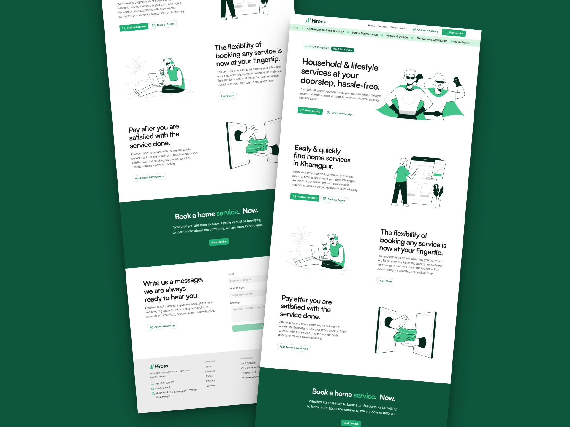
Hiroes's homepage welcomes its users with a clean and structured interface, featuring essential services at the top. On scroll, users will go through dedicated sections for most booked services, guiding them to the service listing (detailed) page to make an informed decision.
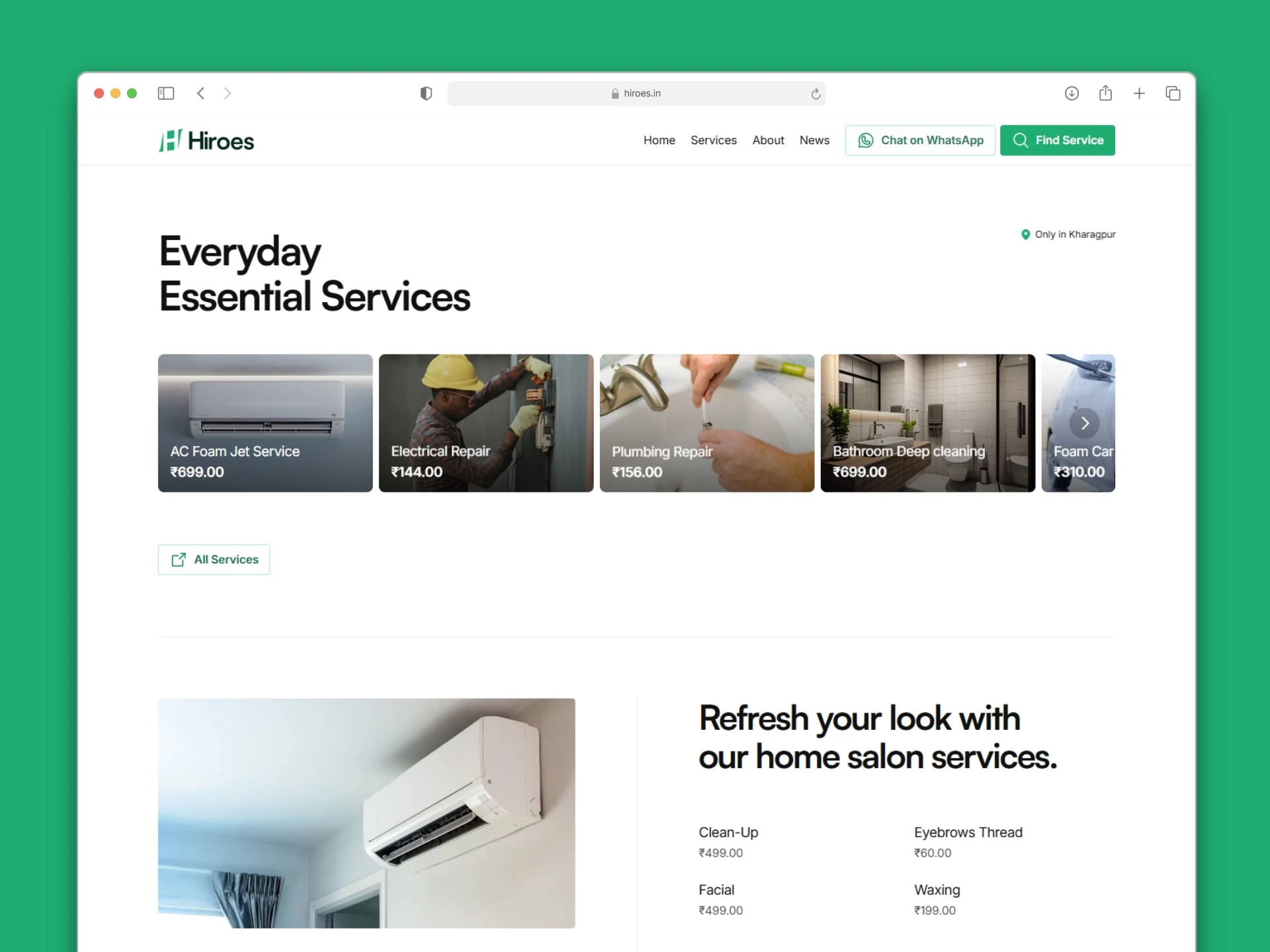
Homepage desktop v2 mockup presentation
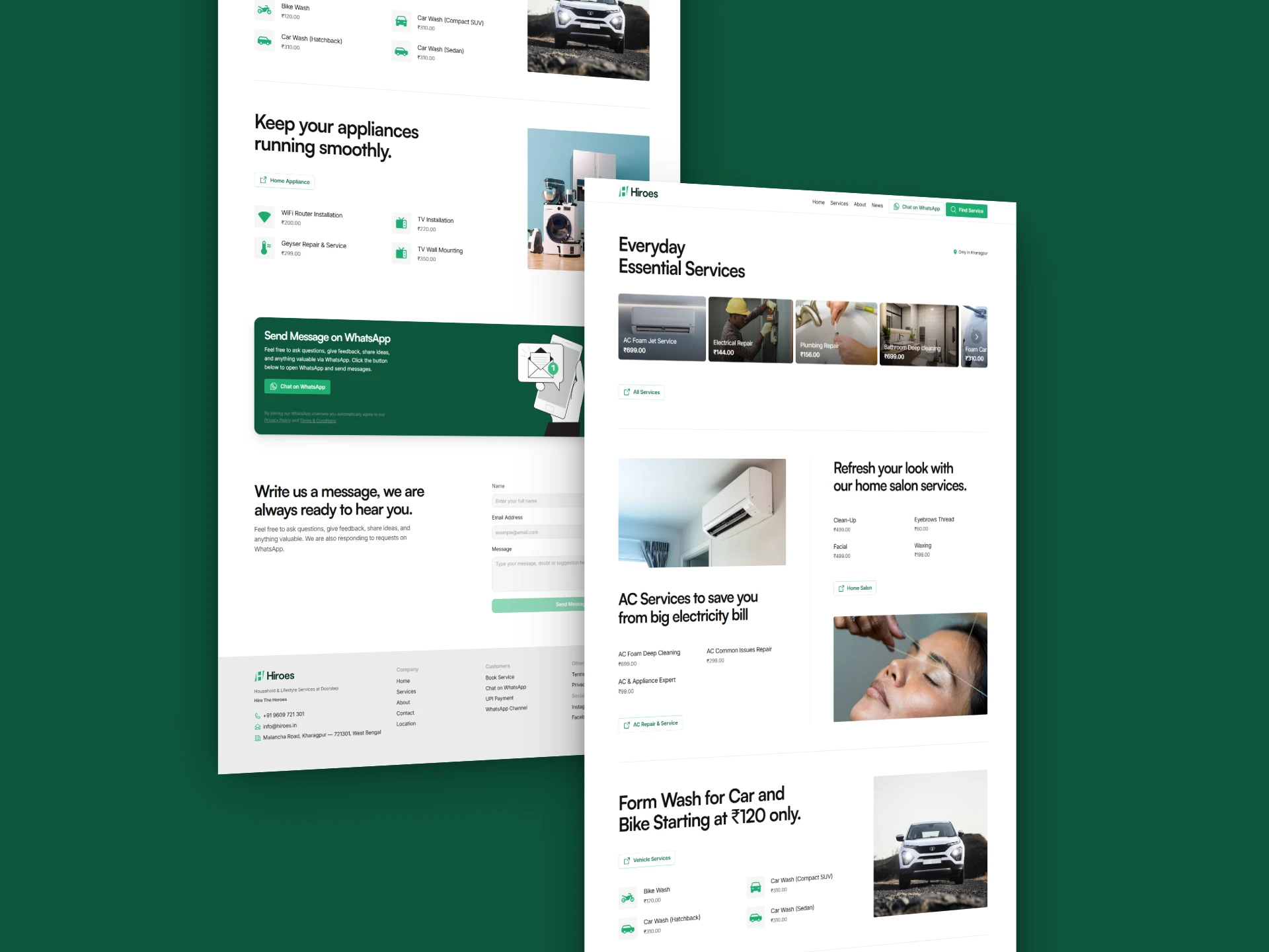
Services are neatly organized into specific categories to help users quickly find what they need for household tasks. These categories are grouped under relevant tabs — such as Handyman, Appliances, and Wellness — making it easier for users to browse, access services with minimal effort, and discover other relevant offerings.
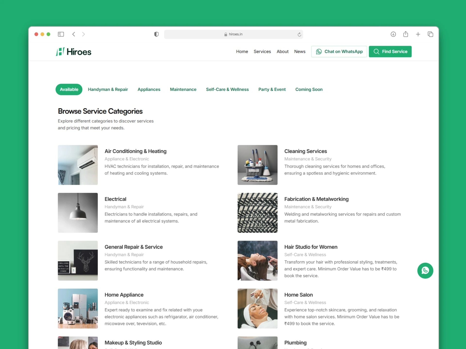
Service category page on desktop—mockup presentation
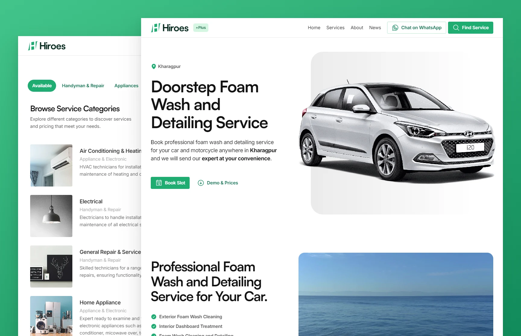
Services expand into a clean and centered detailed view of specific services, featuring clear titles and descriptions, transparent pricing, and post-service expectations. Navigating to different relevant categories and current category services is completely in the user's control and just one click away on the right side.
Those final buttons that turn visitors into customers are placed as two options to instantly book the services or initiate chat on WhatsApp for better clarification and personalization.
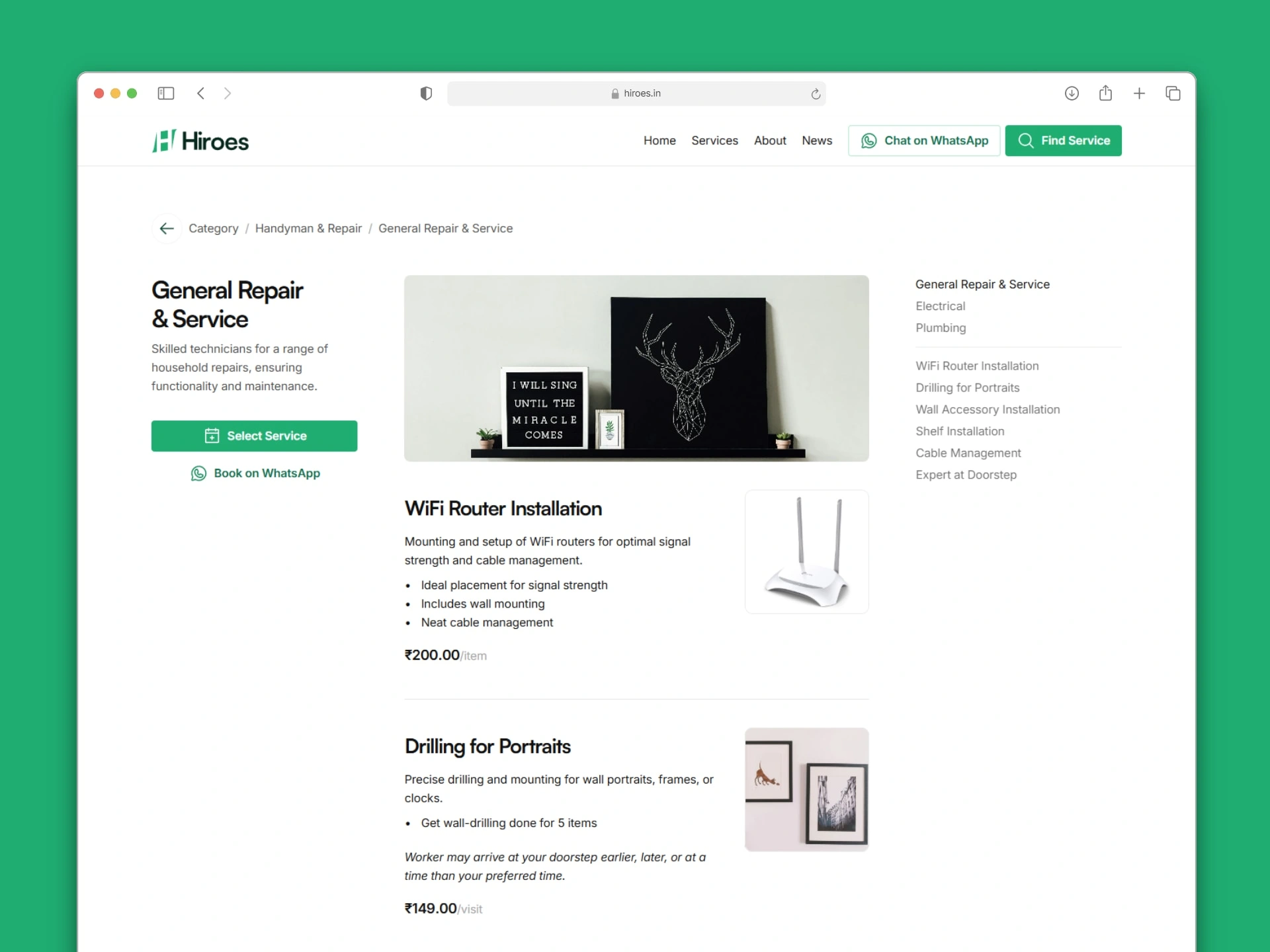
Service listing page on desktop—mockup presentation
Page ends on a dynamic CMS form that collects user requirements at their convenience. Users can select services they see and fill in other inputs required for the Hiroes team to validate availability and revert to the customer on the phone with confirmation.
Discovering & booking walkthrough video from desktop
Why don't you try the Framer website?
Please note the Framer website is currently not hosted with the company's official domain (hiroes.in) as per internal decision. They have downgraded to a traditional website and will likely go live again with this Framer site in Q4 2025.
Mobile Mockups
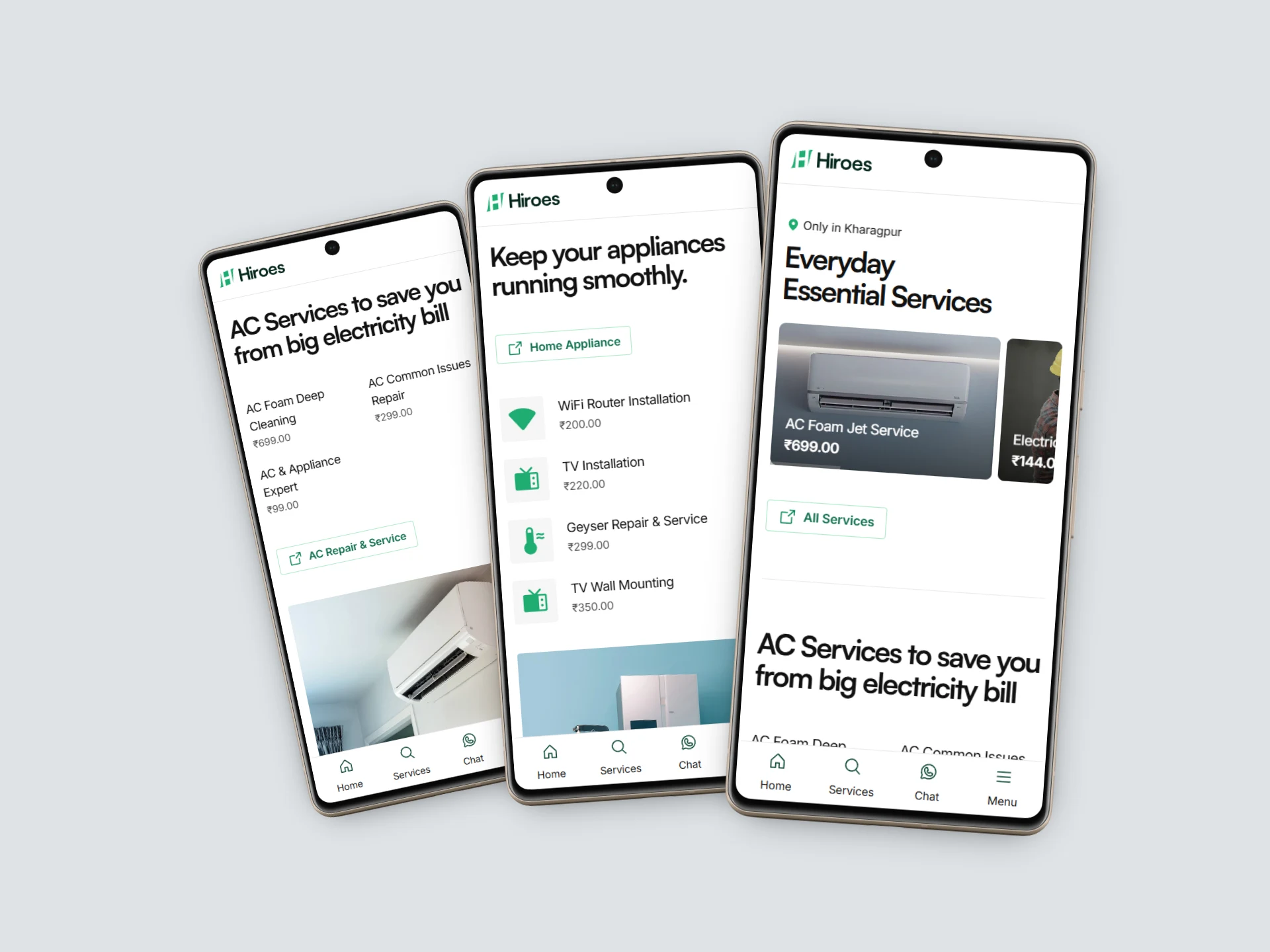
Home page view on mobile—presentation
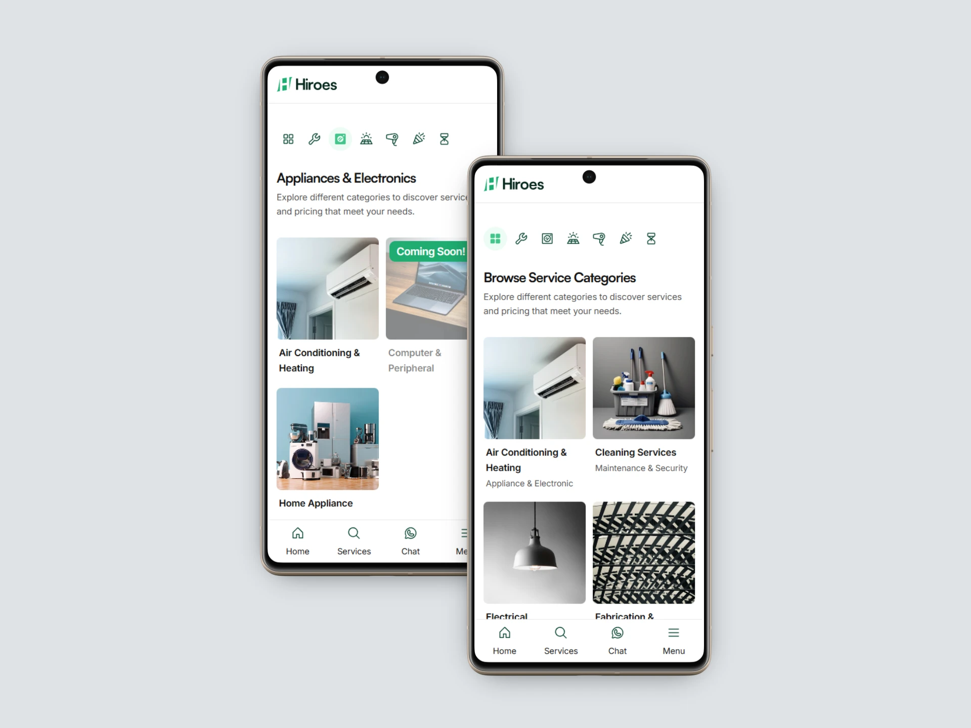
Category page view on mobile—presentation
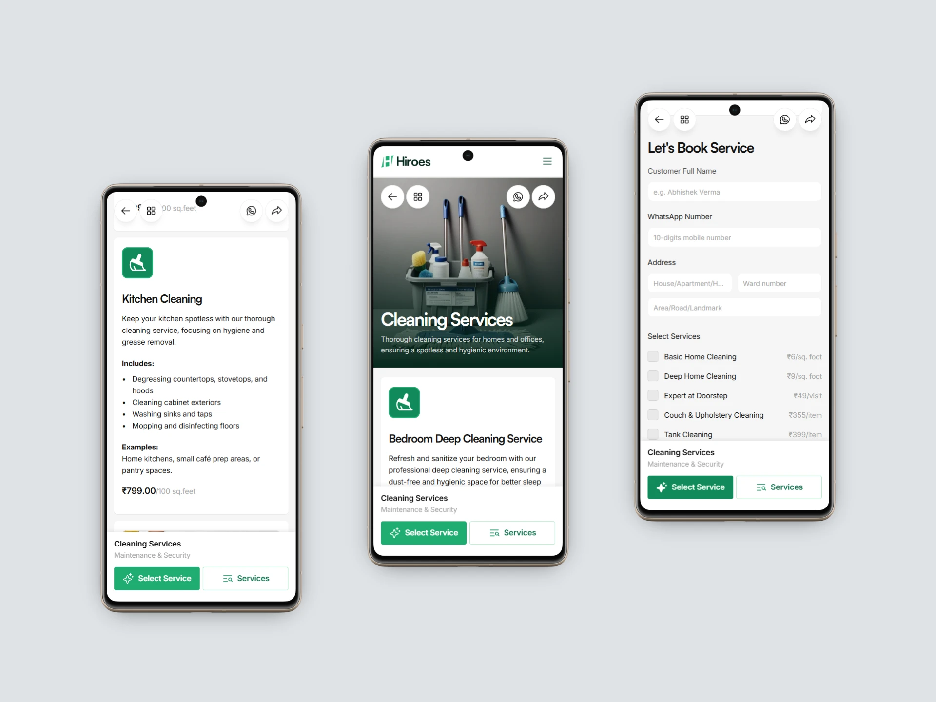
Service detail page view on mobile
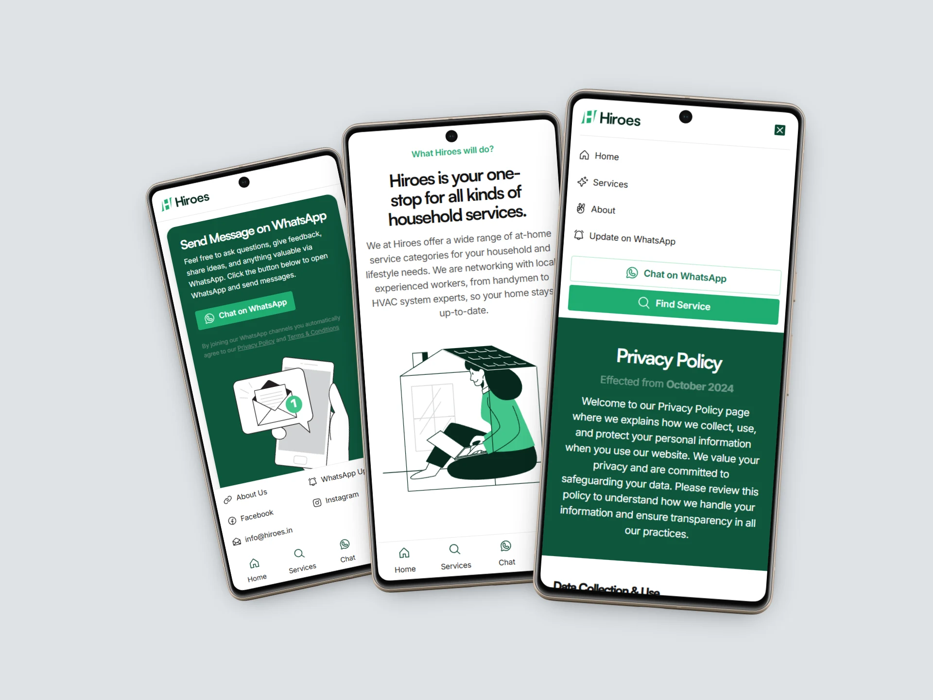
Mobile menus and controls
Thank you very much for taking the time to look at my work. You can check the other projects listed on my Contra profile and contact me to collaborate on your project. 🍻
Like this project
Posted Jul 14, 2025
Designed and developed a lead generation website for Hiroes using Framer. Hiroes is a local startup that offers professional household services.