Nomade, Vintage 2015
Abdeslam Bel Fakir
Nomade 2015 | A Journey in a Bottle
Project: Branding & Packaging Design
Client: Nomade Wines (Conceptual)
Focus: Wine Label Design, Luxury Packaging, Brand Storytelling
The Concept
For a premium 2015 vintage, the name "Nomade" was chosen to evoke the spirit of a journey. A nomad is a wanderer, one who travels through time and place. This wine represents a journey of its own: the journey of the grape from a single, exceptional harvest year (2015) to the connoisseur's glass today. The core challenge was to create a design that felt as timeless and profound as the journey itself, while appealing to a modern, discerning audience.
The brand story is not about a fixed place, but about a moment in time, an experience waiting to be discovered. It is for the modern explorer—the individual who collects experiences, not just possessions.
The Design Solution
Our approach was one of radical minimalism and tactile discovery, forcing a departure from traditional, information-heavy wine labels. We wanted the bottle itself to be an object of intrigue.
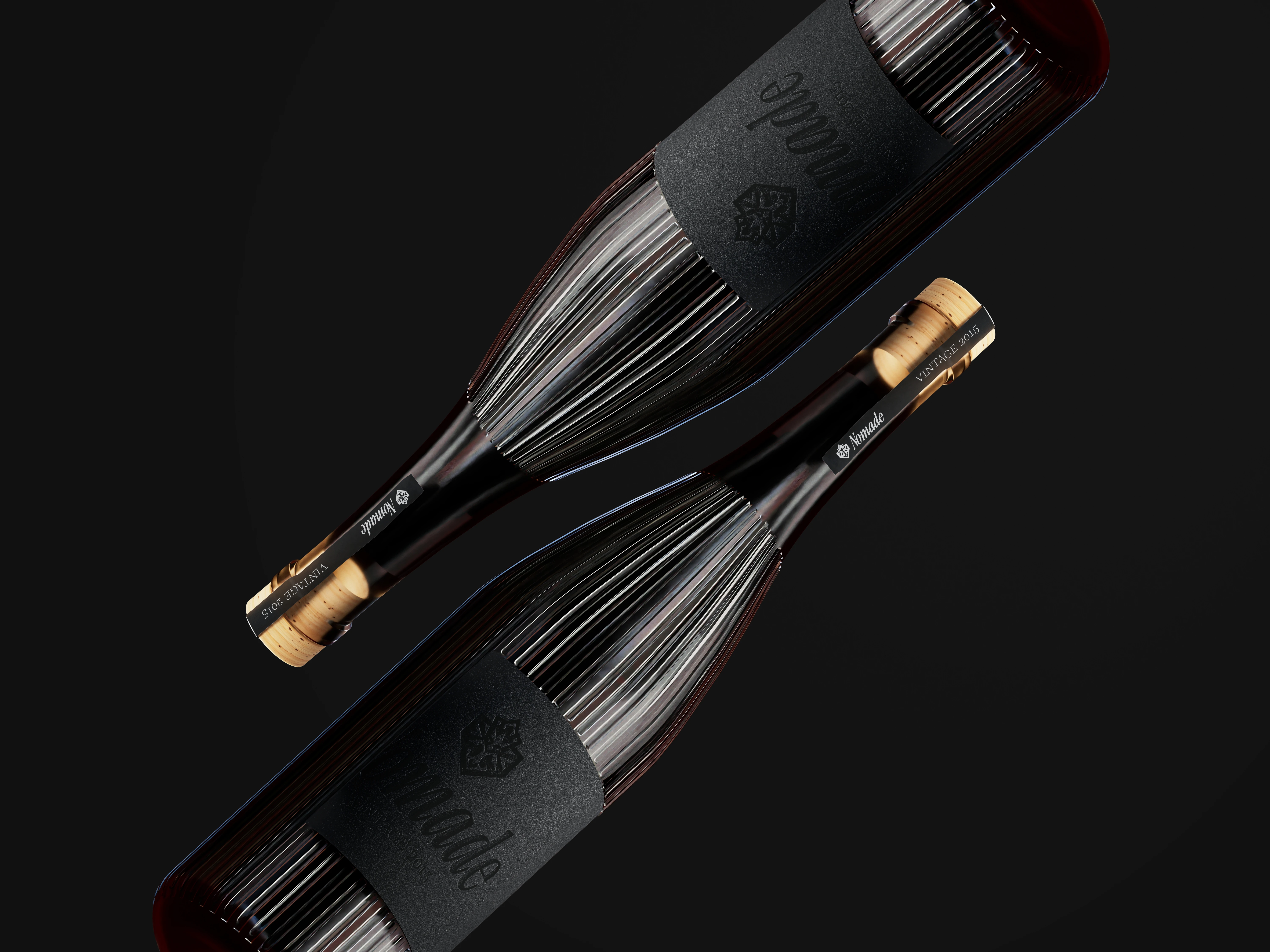
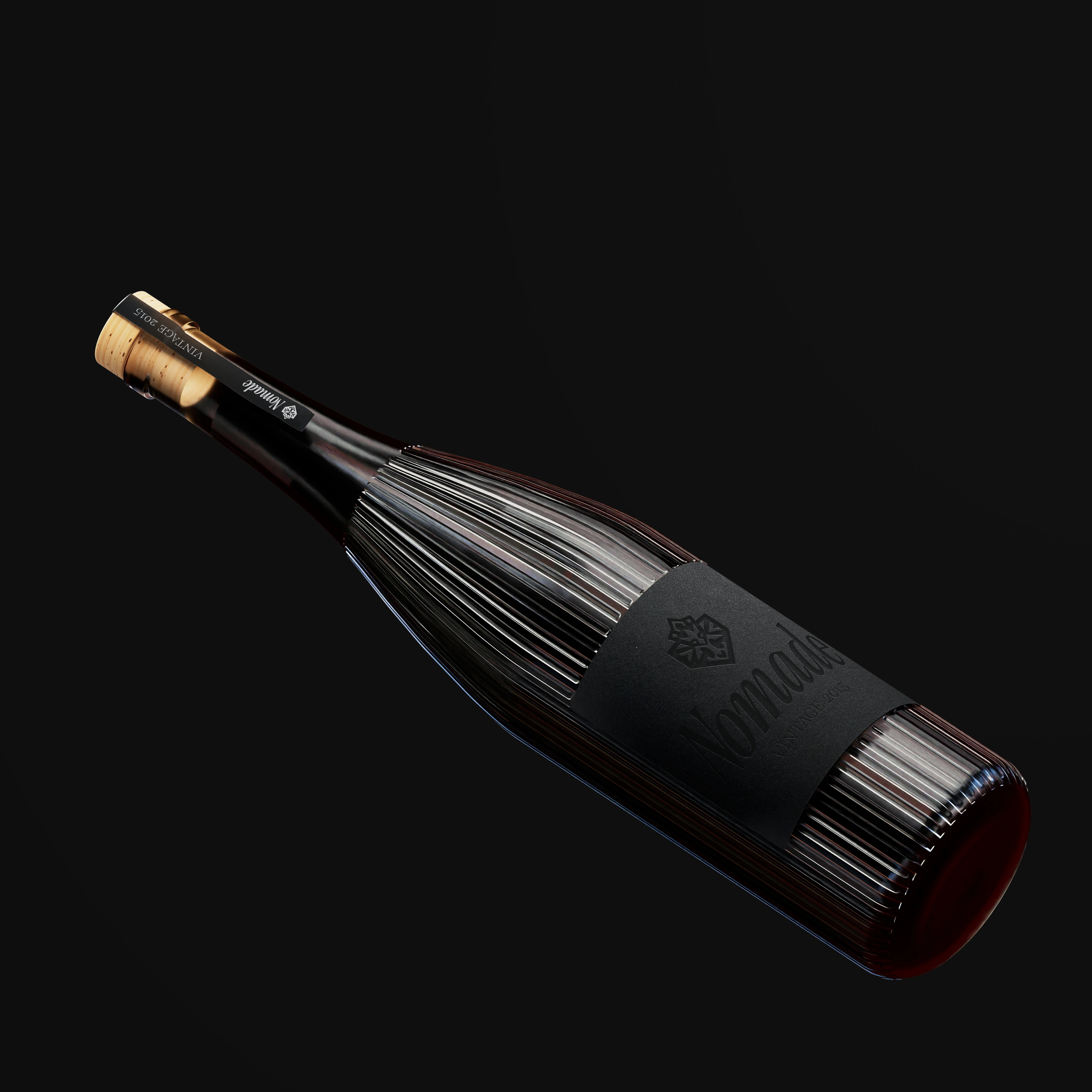
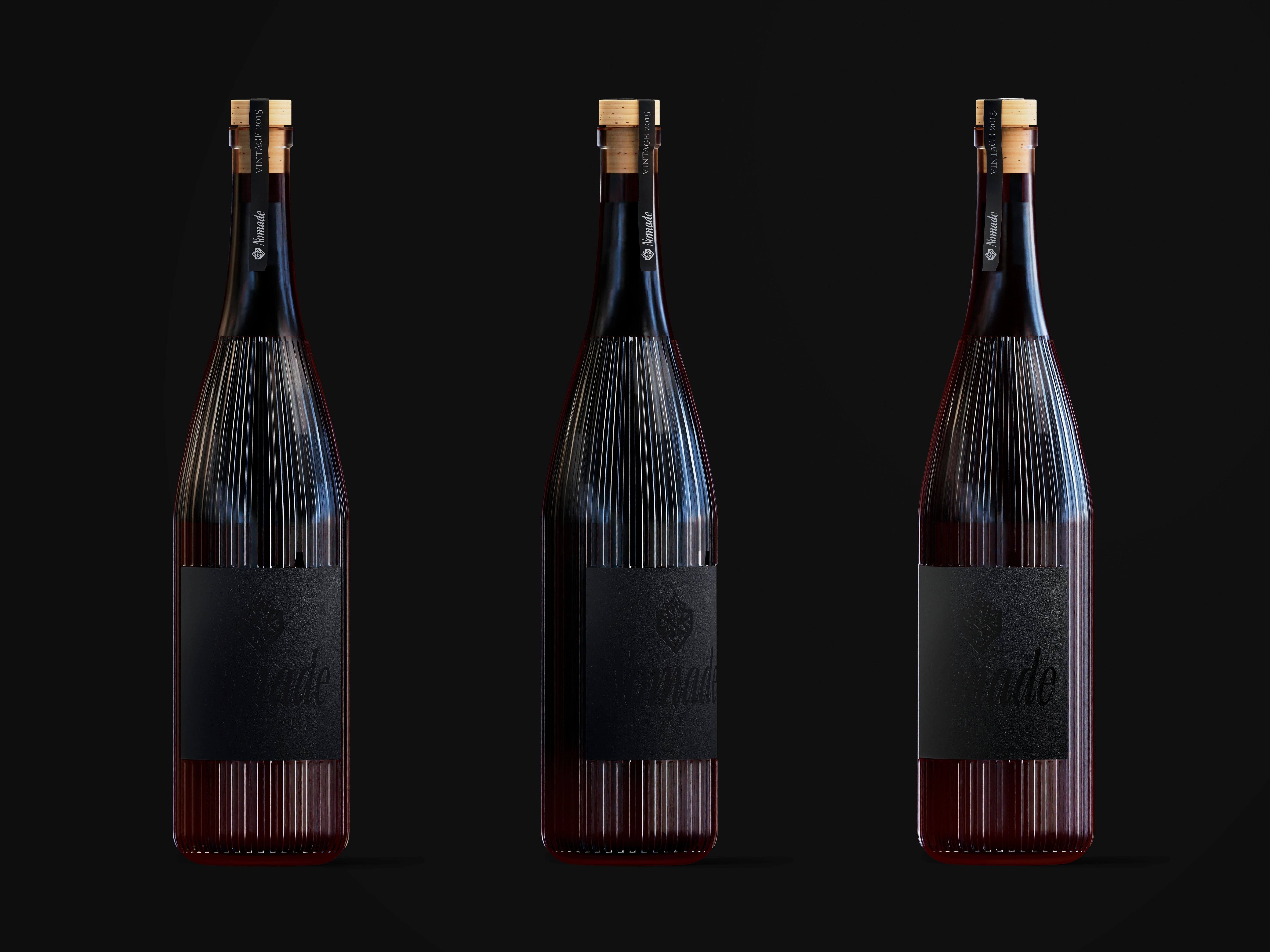
A Monolithic Presence: The design is built around a "black on black" (noir-sur-noir) aesthetic. The label, crafted from a textured, matte black stock, seamlessly integrates with the dark glass of the fluted bottle. This creates a monolithic, sculptural form that feels both ancient and futuristic. It doesn't shout for attention; it confidently holds its ground, inviting a closer look.
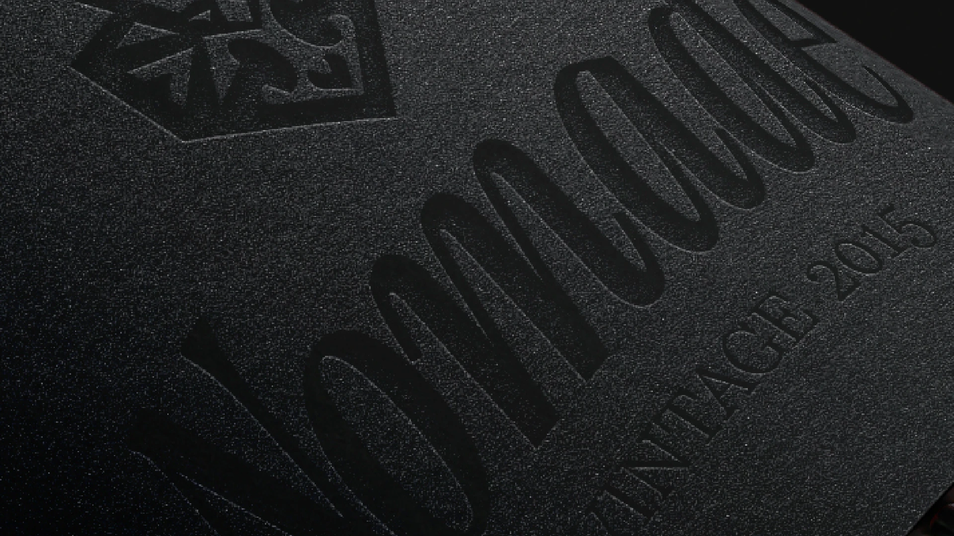
Whispers, Not Shouts: The brand name "Nomade" and the subtle crest are debossed onto the label with a faint sheen. This is intentional. From a distance, the bottle appears almost unmarked. Only upon closer inspection, as you hold it in your hands, does the name reveal itself. This act of discovery is central to the nomadic theme—the joy is in finding the path, not just being shown it.
Tactile Experience: The choice of a textured label and the vertically ridged bottle is meant to engage the sense of touch. Holding the bottle is an experience. The ridges can be seen as the many paths of a journey, or the rings of a tree marking the passage of time since 2015.
A Hint of Origin: The subtle crest above the name acts as a quiet mark of quality and origin, like a cartographer's seal on a secret map. It grounds the abstract concept of the "nomad" with a promise of exceptional craftsmanship. The delicate neck label and the premium cork stopper complete the package, ensuring every detail communicates understated luxury.
The Outcome
The final design for Nomade 2015 is more than a label; it is an invitation. It tells a story of time, travel, and taste through texture, subtlety, and form. It is a bottle for those who understand that the greatest luxury is not in what is said, but in what is left to be discovered.
Like this project
Posted Oct 27, 2025
For a premium 2015 vintage, the name "Nomade" was chosen to evoke the spirit of a journey. A nomad is a wanderer, one who travels through time and place.