For the Swoop brand identity,

Healing Hawk Studios


For the Swoop brand identity, I designed a multi-faceted mascot-driven system that bridges digital culture and lifestyle physical products. The project focuses on creating a high-impact visual mark that remains recognizable across various scales and applications.
Design Strategy:
Mascot Evolution: Developed a bold, illustrative hawk character with a focus on 'focused intensity,' ensuring the design works effectively as both a detailed digital avatar and a simplified vector icon.
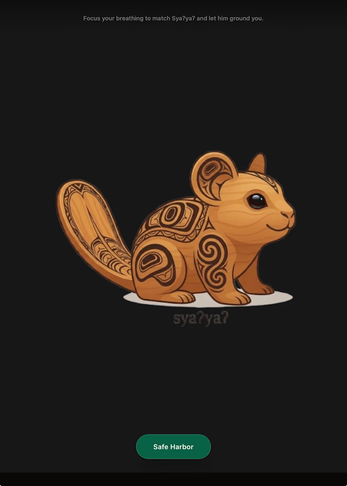
Brand Versatility: Executed a comprehensive brand system, applying the logo across disparate mediums—from high-fidelity digital app interfaces (Somatic Grounding) to tactile physical merchandise (diffusers, linen journals, and tech accessories).
Cohesive Ecosystem: Maintained a strict 'deep blue' and 'tech-focused' aesthetic palette, creating a unified brand language that ties digital wellness tools to physical lifestyle products.
Like this project
Posted Jul 4, 2026
For the Swoop brand identity, I designed a multi-faceted mascot-driven system that bridges digital culture and lifestyle physical products. The project focus...
Likes
0
Views
0