Built with Framer
Outreachify Website Development on Framer

Aryan Tanwar


A good design only shines when it’s implemented with care.
We recently helped the team at Outreachify bring their website to life on Framer, turning a strong visual concept into a fully functional, high-performing experience.
Live Link: https://outreachify.io
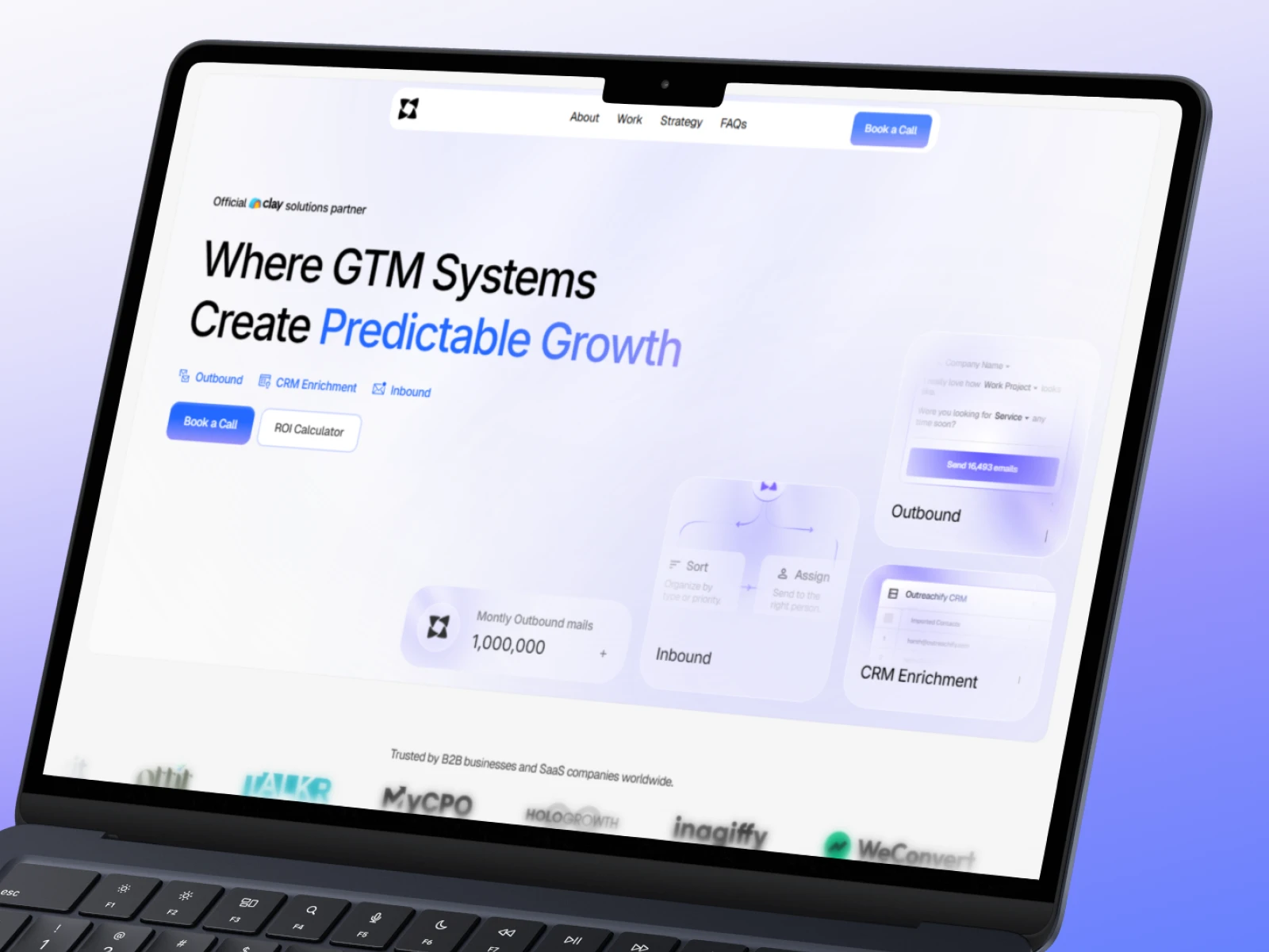
The design itself was clean, modern, and full of potential. Our focus was to make sure the build matched that same level of thoughtfulness in motion, structure, and responsiveness.
From smooth number-loading animations in the hero to the line transition in the “Who We Are” section that visually connects global locations, every detail was built to feel fluid and purposeful.
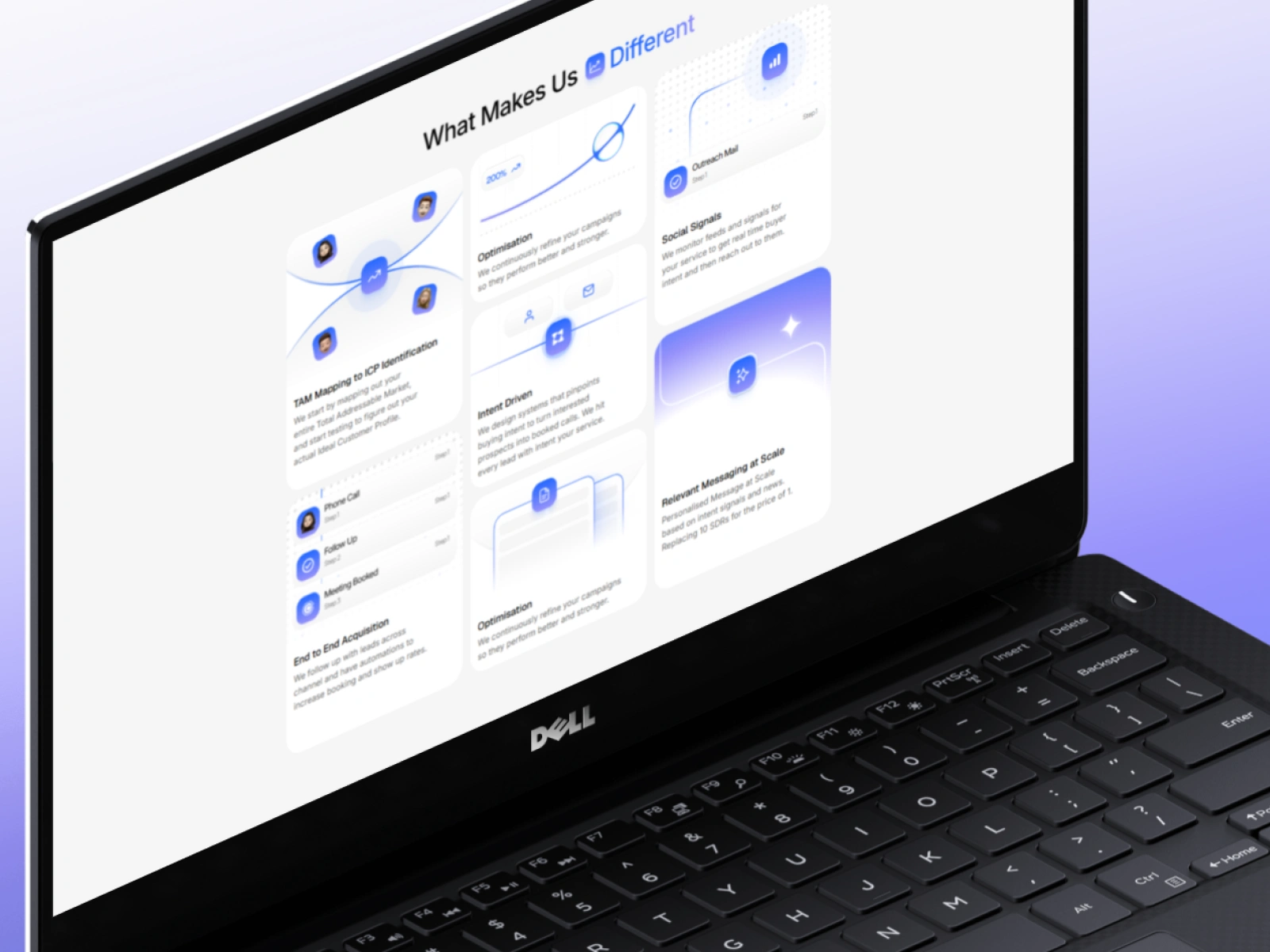
The “What Makes Us Different” section uses a pulse-like animation behind each icon, almost like a wave expanding outward. It gives a sense of motion and rhythm without overwhelming the layout.
The Recent Case Studies section functions like a mini CMS inside Framer, complete with dynamic content blocks and real dashboard visuals to make the results feel tangible.
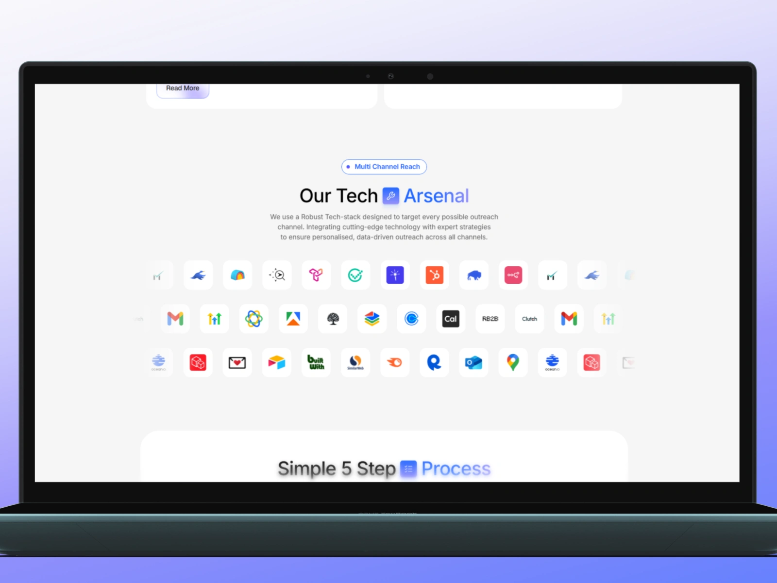
The Tech Arsenal section was built as a reusable component to showcase the tools and integrations Outreachify uses, while the 5-Step Process section uses a sticky animation stack that guides you step by step as you scroll — simple, smooth, and structured.
Every section was designed to feel connected. The goal wasn’t just to make it look good but to make it feel good, fast, consistent, and aligned with Outreachify’s positioning as a data-driven GTM systems company.
Really proud of how this project turned out. The design was already solid, but our job was to make sure it performed just as well in motion as it did in stills.
Built on Framer.
Like this project
Posted Nov 5, 2025
Built a high-performing Framer website for Outreachify. Focused on smooth interactions, clean structure, and responsive, conversion-driven execution.
Likes
1
Views
6
Timeline
Oct 18, 2025 - Oct 25, 2025