Montenegro Festival Orchestra Logo Design
Kristina Simeunovic
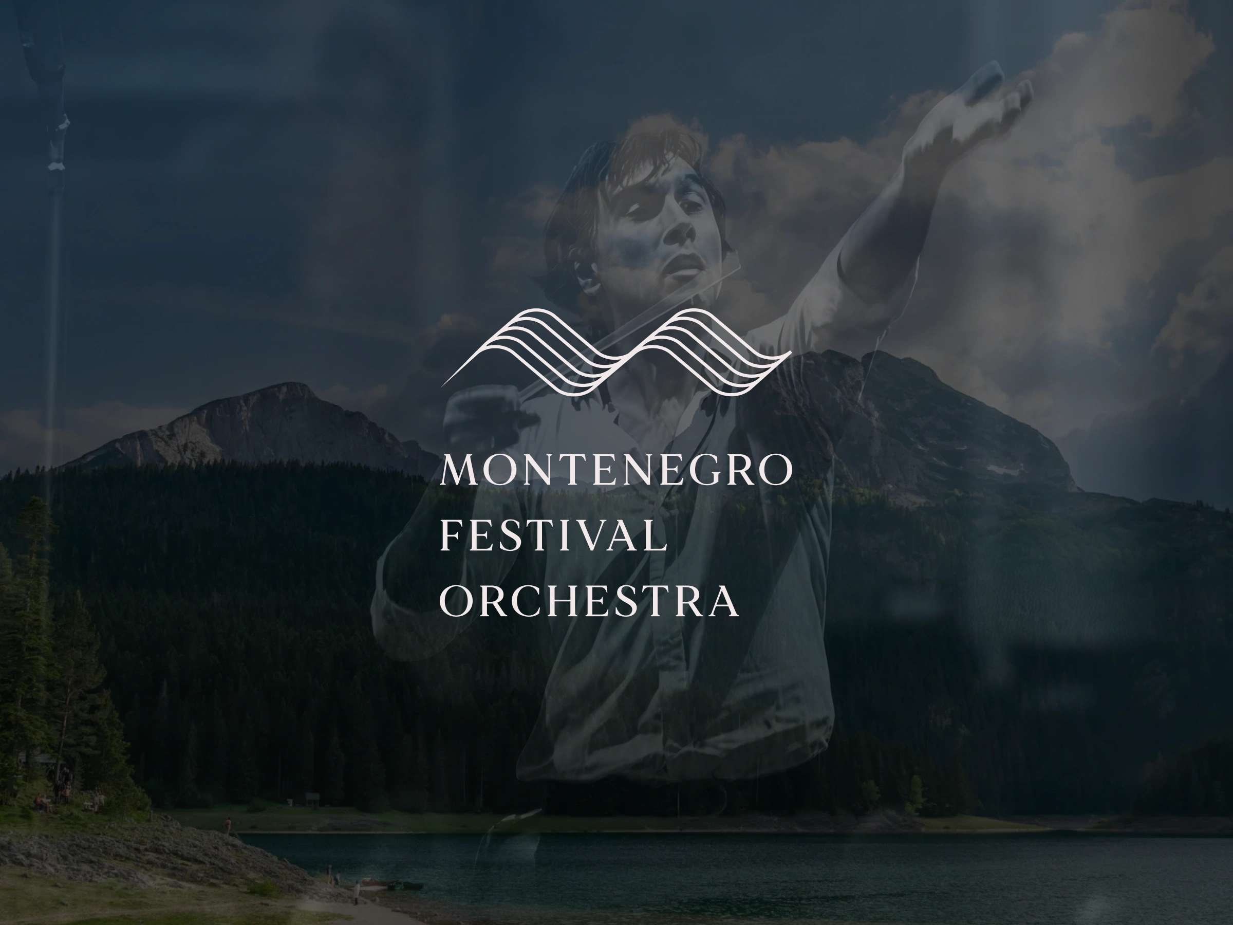
A refined and versatile brand identity that harmonizes the Montenegro Festival Orchestra’s classical elegance with the country’s heritage.
Key Elements of the Identity
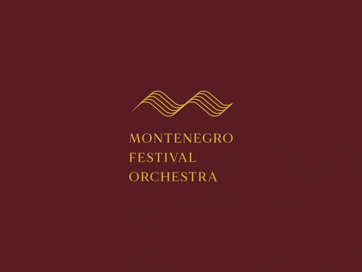
🎼 Five-line wave logo drawn from musical staff notation, echoing both notes and Montenegro’s mountain peaks
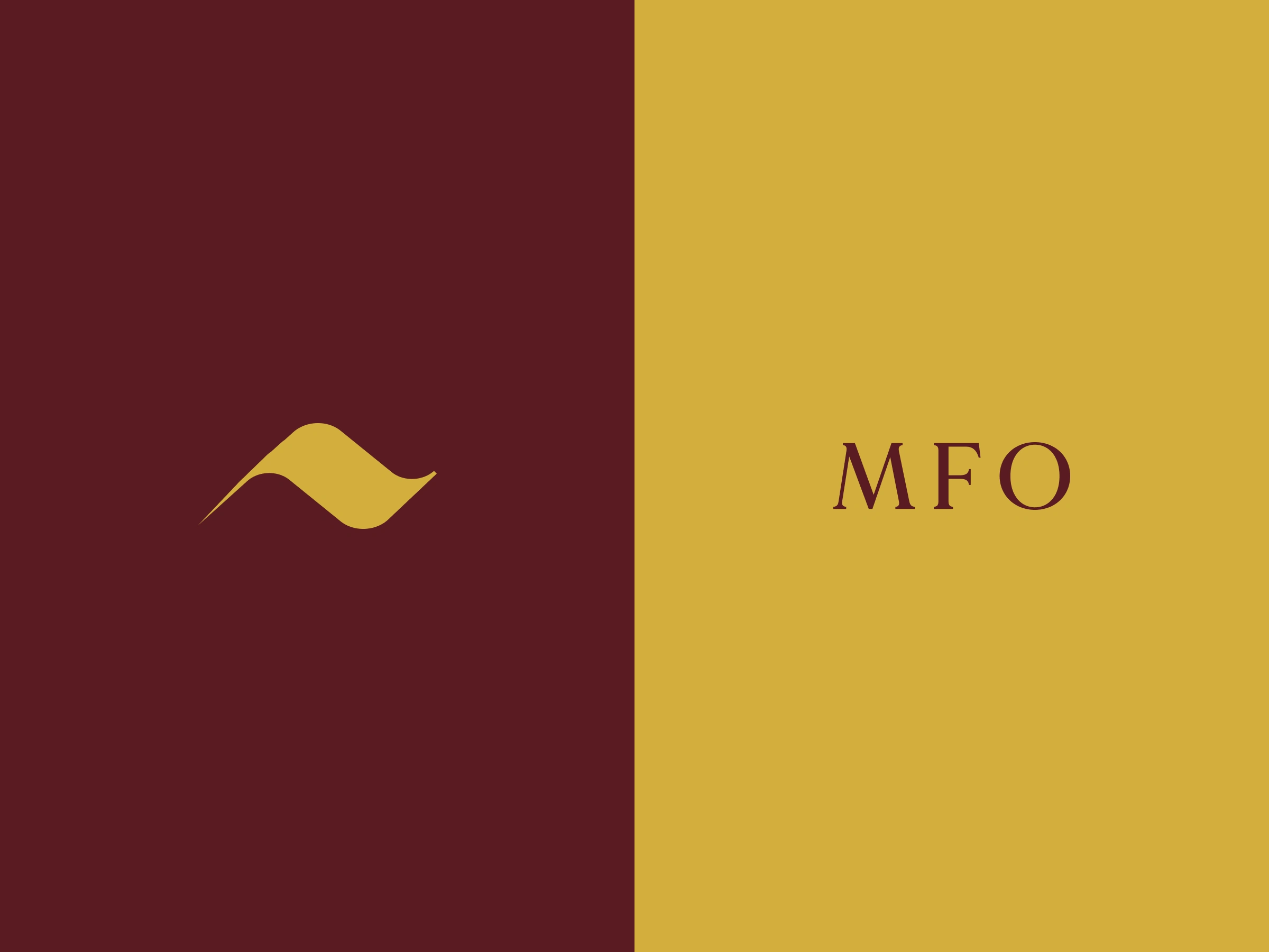
🚩 Color palette lifted from Montenegro’s flag for national resonance
🔤 Serif wordmark with generous letter-spacing for timeless readability
🎯 Design Goals
🎵 Convey both precision of orchestral performance and organic beauty of the landscape
📐 Ensure consistency and scalability across digital and print applications
📱 Create layouts that adapt seamlessly from large backdrops to mobile screens
📑 Provide clear, concise guidelines for effortless adoption by organizers
✨ End Result
A cohesive visual language that marries Montenegro’s flag-inspired palette with musical staff motifs, all rendered in a refined serif and fluid iconography. The modular design system ensures consistent typography scales, harmonious color application, and elegant spacing throughout.
Like this project
Posted Aug 4, 2025
A refined and versatile brand identity that harmonizes the Montenegro Festival Orchestra’s classical elegance with the country’s heritage.
Likes
5
Views
17