Logo Design for XYO’s Layer One
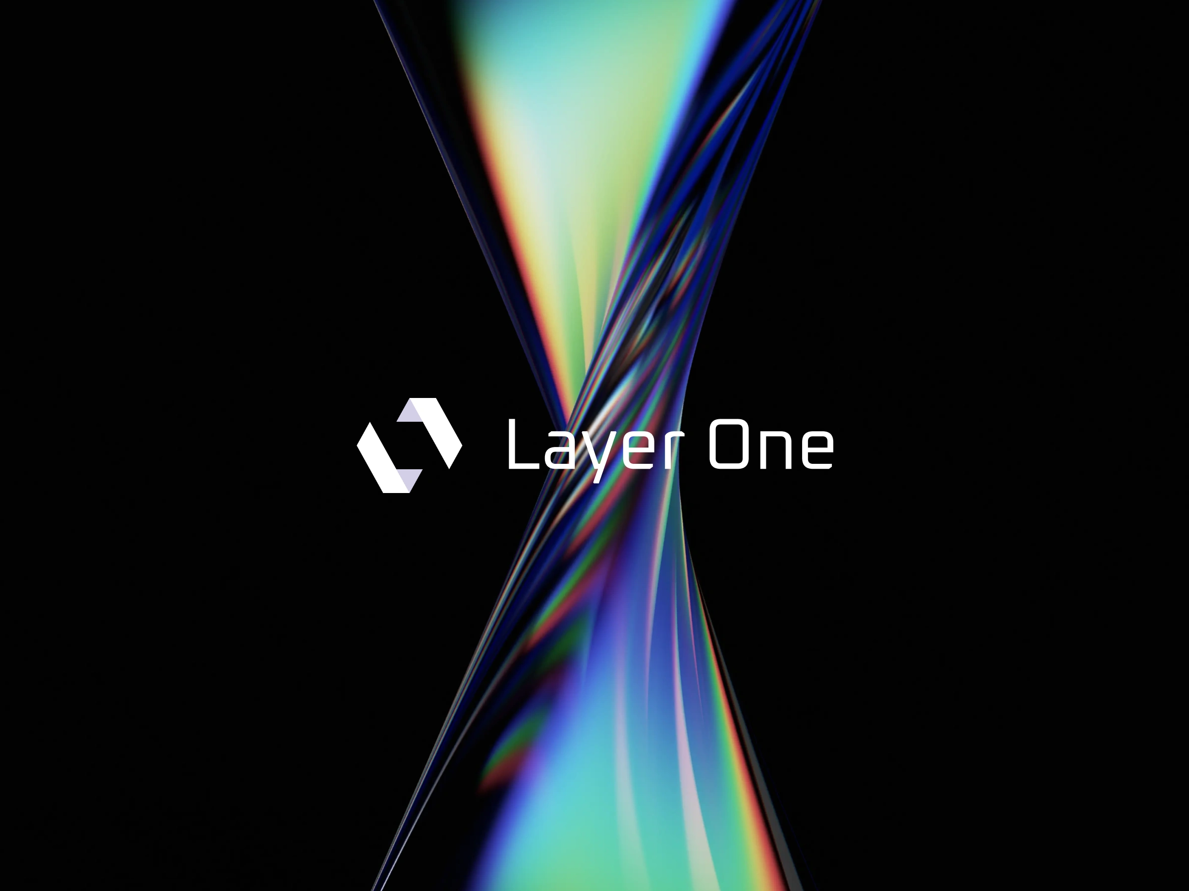
A minimal yet striking logo designed for Layer One, a monolithic platform that unifies all of XYO's technologies into one foundational product (XL1). The goal was to capture the strength, clarity, and high-tech nature of the solution through geometric precision and visual weight.
Key Visual Elements
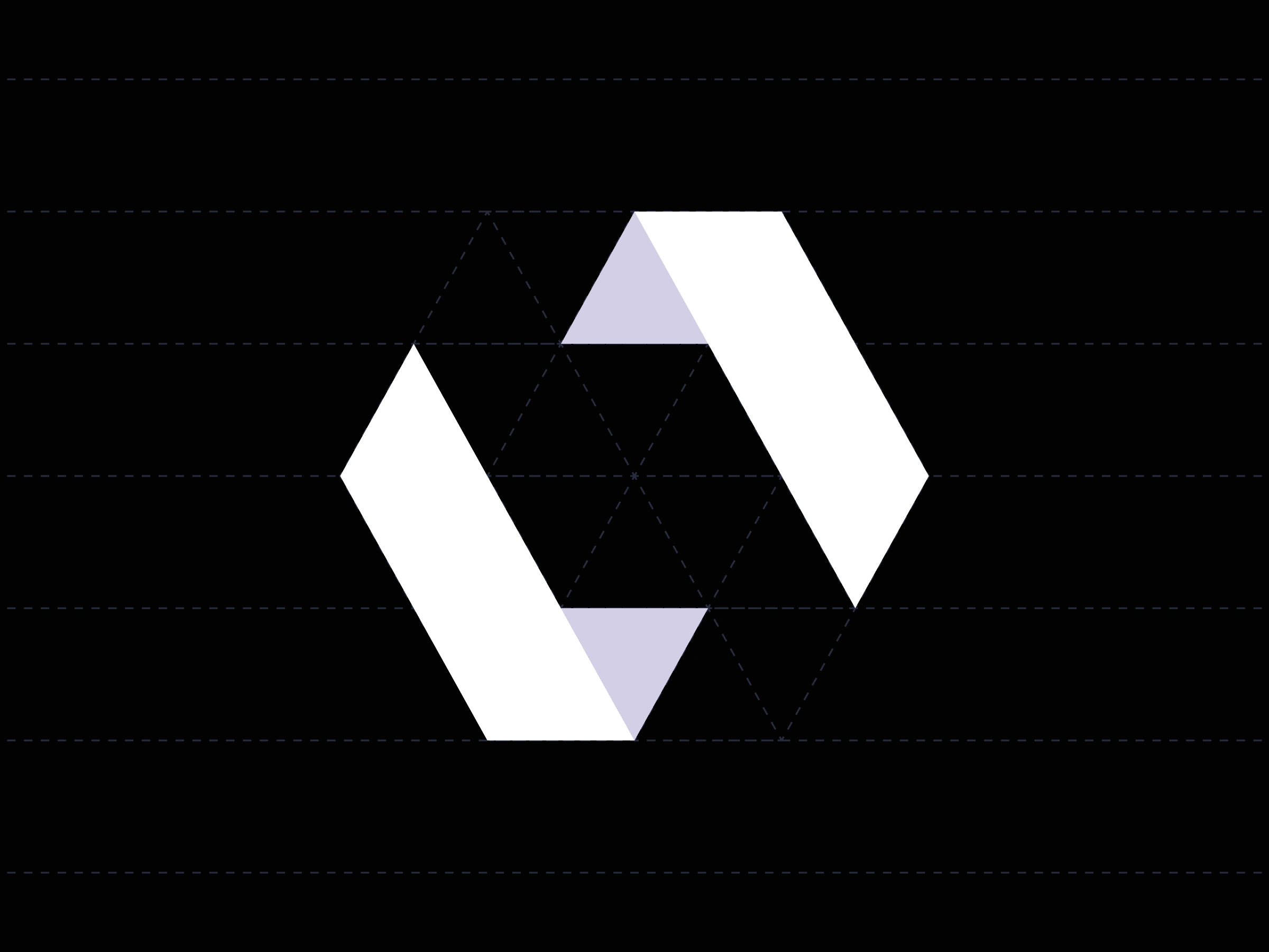
🔷 Hexagonal base structure to subtly nod to XYO’s roots
📐 Angular, interlocking forms to express modularity and unity
🌓 Light and shadow play to reflect depth, layering, and value
✏️ Custom symbol subtly representing both L1 and stacked layers
Design Goals
💡 Represent the solidification of disparate technologies
🧱 Convey usefulness, trust, and longevity with monolithic form
🌐 Feel technical, bold, and enterprise-ready
🎯 Be instantly recognizable across product tiers and applications
End Result
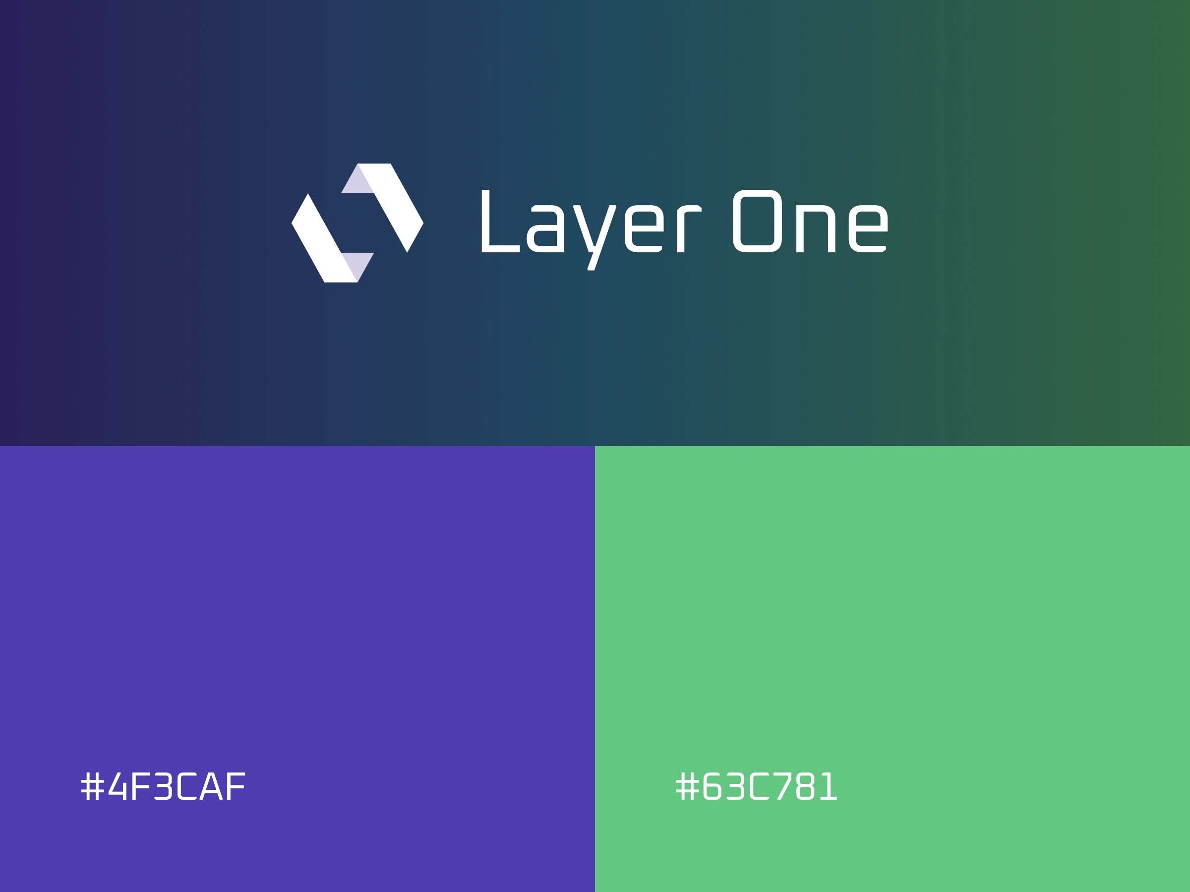
A confident, tech-forward identity that communicates the value and strength of XL1, making it feel like the core infrastructure of an ecosystem, not just a product. The custom icon blends symbolism and function, providing a scalable mark with strategic depth.
Like this project
Posted Aug 5, 2025
The Layer One logo was designed to represent a unified, monolithic product built from the diverse technologies of XYO, under the name XL1.
Likes
5
Views
21


