GIDDY: Brand Identity for a Dating App Gen Z Would Download

Isabella Guran


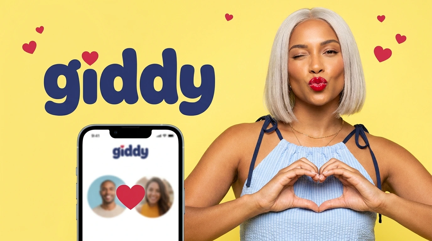
GIDDY: Brand Identity for a Dating App Gen Z Would Actually Download
A Dating App Brand That Makes Love Feel Fun Again
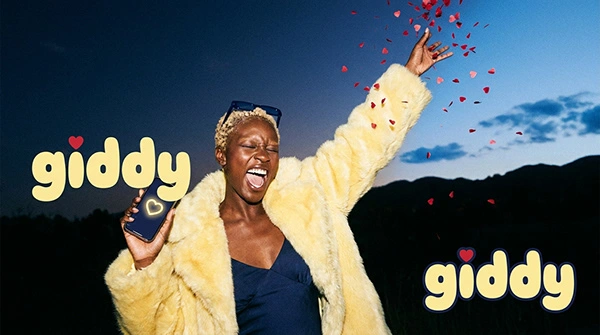
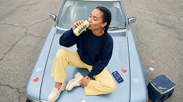
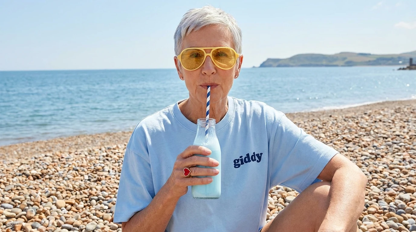
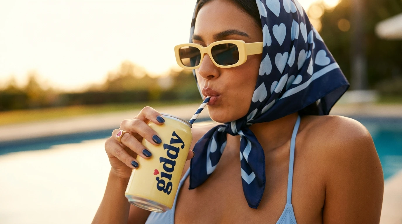
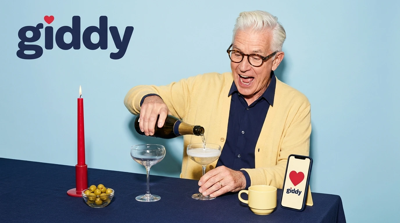
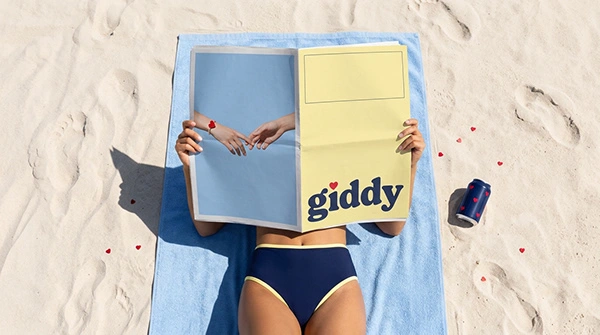
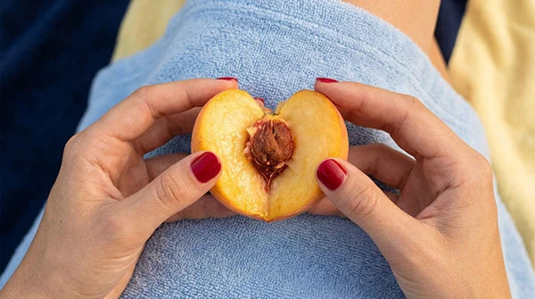
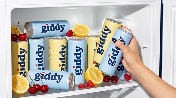
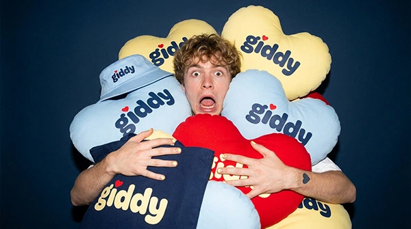
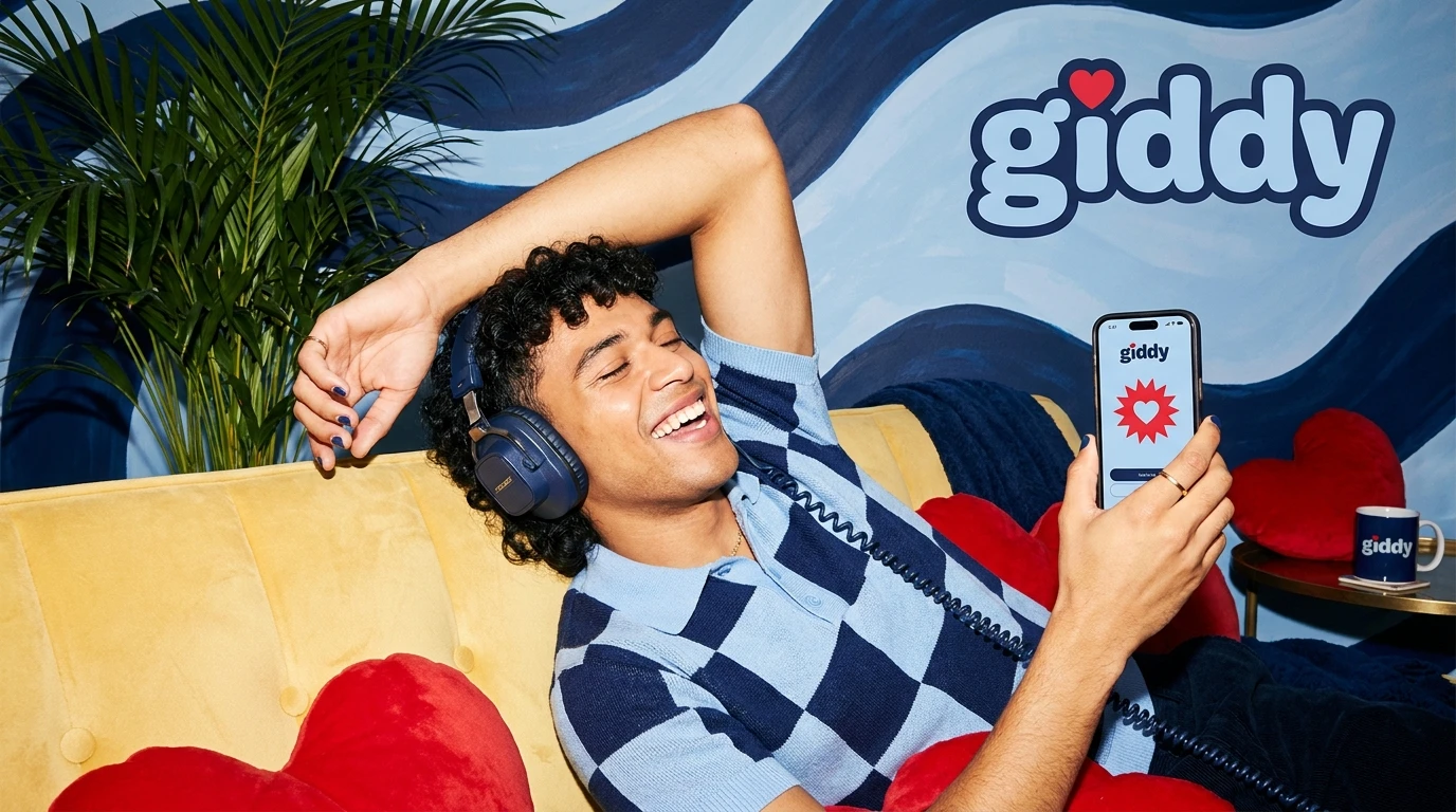
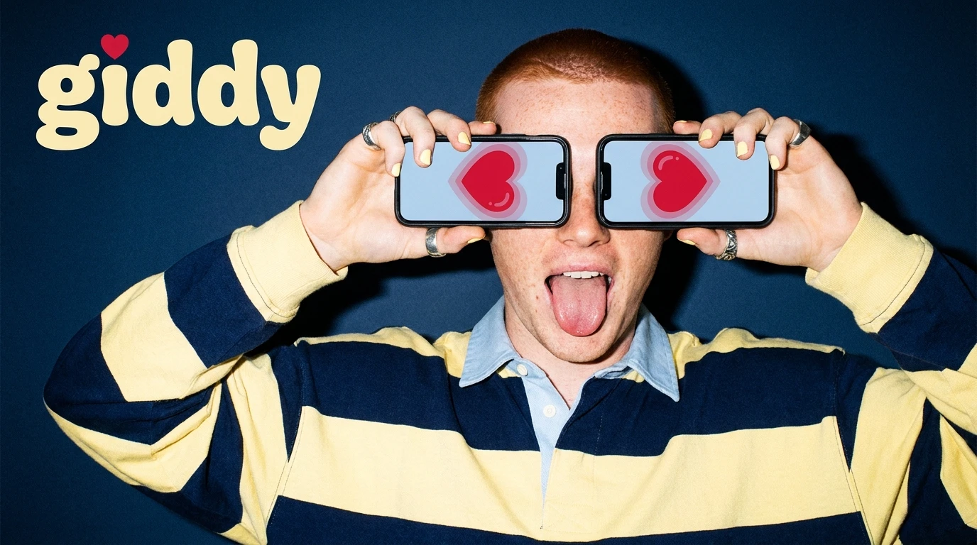
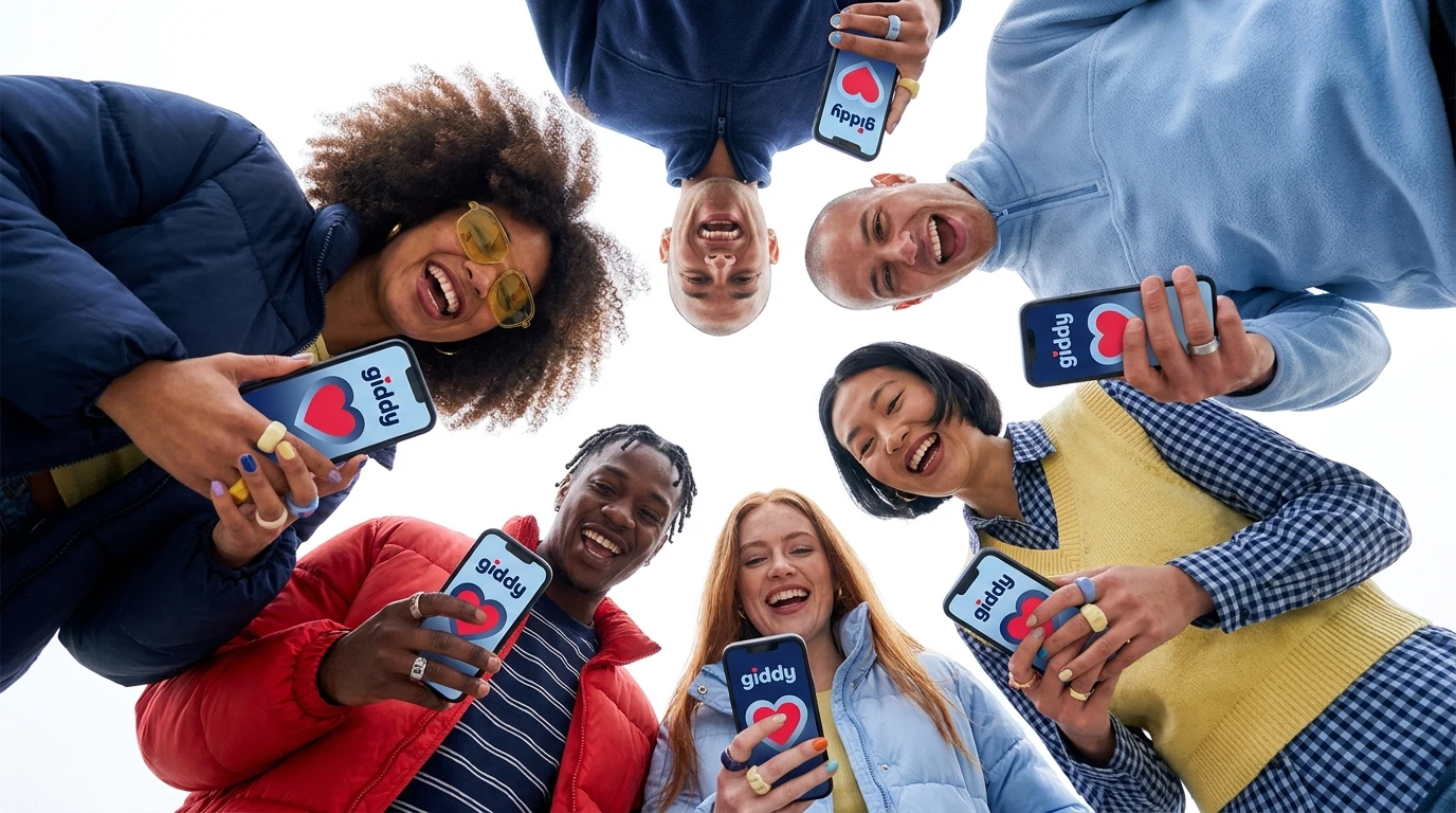
GIDDY is an original dating app brand concept built from scratch: name, palette, app direction, merch and a full launch campaign. The name captures the feeling every dating app promises but rarely delivers: that fizzy, can’t stop smiling, butterflies in your stomach feeling.
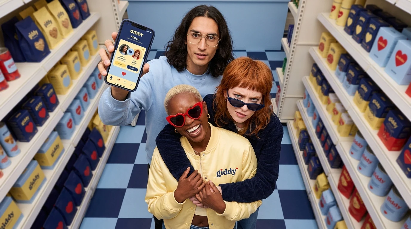
The campaign turns dating into a shopping trip. Three friends pose in a supermarket aisle stacked floor to ceiling with GIDDY boxes, each one marked with a cherry red heart, on a powder blue checkered floor. One holds up the GIDDY Match screen like a winning ticket, another laughs in heart shaped sunglasses and a yellow GIDDY bomber. Love, fully stocked and ready to pick up.
The Approach
Brand Strategy
Dating apps have become exhausting: swiping fatigue, cold interfaces and the same red and white branding everywhere. GIDDY resets the mood with warmth and humour. The palette is butter yellow, powder blue, deep navy and cherry red, retro, friendly and instantly recognisable. Positioning the brand around friendship and fun makes it feel less like a transaction and more like a night out with your favourite people.
Content Strategy
The supermarket concept gives the brand a playful, repeatable world: love on the shelves, matches in your basket, a fresh pick every day. It works across app store screenshots, launch campaigns, out of home posters, social carousels and merch drops like bombers, tote bags and packaging inspired giveaways. Showing friends together makes the campaign highly shareable and taps into the way people really date: with their group chat watching.
AI Production
Every visual was created with AI generated production and art directed for editorial energy: wide angle perspective, realistic textures on satin bombers and knitwear, glossy packaging, believable phone screens and natural, expressive faces. No location rental, no shelf stocking, no casting call. Just tight creative direction and fast iteration until every frame felt like a real campaign launch.
What You Get When You Work With Me
A brand name and story that capture an emotion, not just a product
A palette and visual world that stand out in a saturated category
Campaign concepts that turn your app into a cultural moment
App, merch and packaging direction that make the brand feel tangible
AI generated visuals ready for app stores, social, ads and out of home
Why It Works
People don’t download dating apps for features. They download them for hope. GIDDY sells that feeling with colour, humour and a concept anyone gets in one second: love, picked off the shelf. It feels joyful in a category that feels tired, and that’s exactly what makes people stop, smile and tap download.
If your app or startup needs a brand people actually fall for, let’s build it.
LET US CONNECT
Isabella DigitalHub
Creative Director. Brand identity, visual direction and AI generated production by Isabella Digital Hub. All rights reserved.
Like this project
Posted Oct 30, 2026
GIDDY, a dating app brand that makes love feel fun again. Butter yellow, powder blue, cherry hearts and AI generated campaign visuals.