HiZIA Design, Code & SEO (Marketing Agency)

Noé Schmidt
Web Designer
Web Developer
Motion Designer
Figma
Next.js
We did a complete redesign and content optimization to the website to make it look more modern and more connected to the Gen Z!
1) Moodboarding and website structure
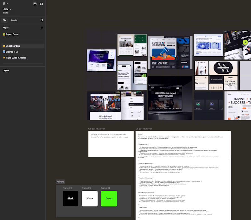
Moodboarding in the Figma file
We looked first at some inspiration from Dribbble or Behance to understand what direction we wanted to take, and what we could adapt from other to make the website shine.
2) Sitemap + User Flow
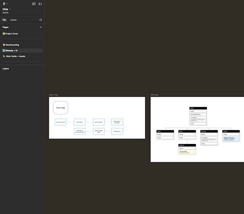
Sitemap
It's important to have a clear understanding of what we're going to add on the website and how it's going to be structured. Otherwise the design is just gonna be a mess.
3) Style guide
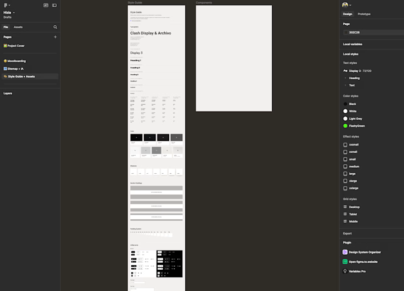
Style guide
It's great for the designers and the developers to have a clear style guide to know what variables we are going to use, which colors, etc...
It helps a lot with:
- Consistency
- Structure
- Overall look and feel
- Development
4) SEO and market research
This part is really important, it's basically how we're going to talk to the user and what action we want him to take.
We need to guide the user to a specific action "Book a call", "Shop now", etc...
For that, we need to understand, how a random person who's looking for an marketing agency is going to search for it.
It could be simply by typing "marketing agency in Switzerland" or "best marketing agency for Gen Z".
By using tools like Ahrefs or Mangools, we can understand and predict how a user is going to find HiZIA.
We understood that trust is key in the marketing agency, so you need quality backlinks, and proof !
We did exactly that when writing the content, making sure we are making HiZIA trust worthy !
5) Simple wireframing
Because of the short deadline, we had to put our priority in what really count. So we did some simple wireframing to know how we are going to structure the overall website.
6) Design
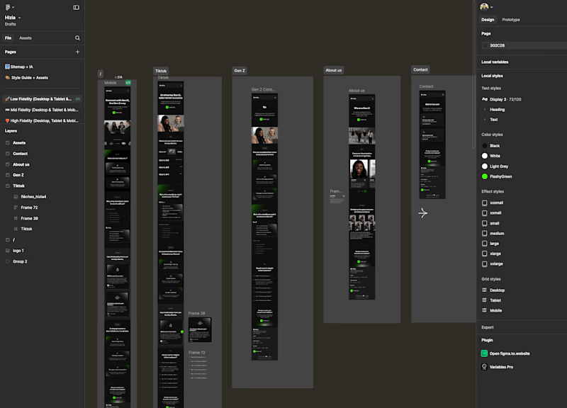
Because of the short deadline, and also we were also developing the website. We decide to put our focus in only the mobile version.
Why ?
Because scaling something is easier than to shrink !
We did exactly that, crafting and adding content on each page (Real content not lorem ipsum...).
7) Coding and launch !
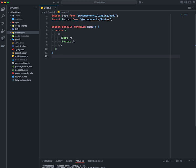
The tech stacks used is :
- Next.js
- Framer Motion
- Tailwind
- I18n for the internalization
I'm a big believer in "Simple is better". We don't need fancy things for some landing pages.
Check the website at this link :
I'm available today, let's have a chat !


