Bright Leaves — Visual Identity for Social Impact
Moew Studio
2 collaborators
Context & Challenge
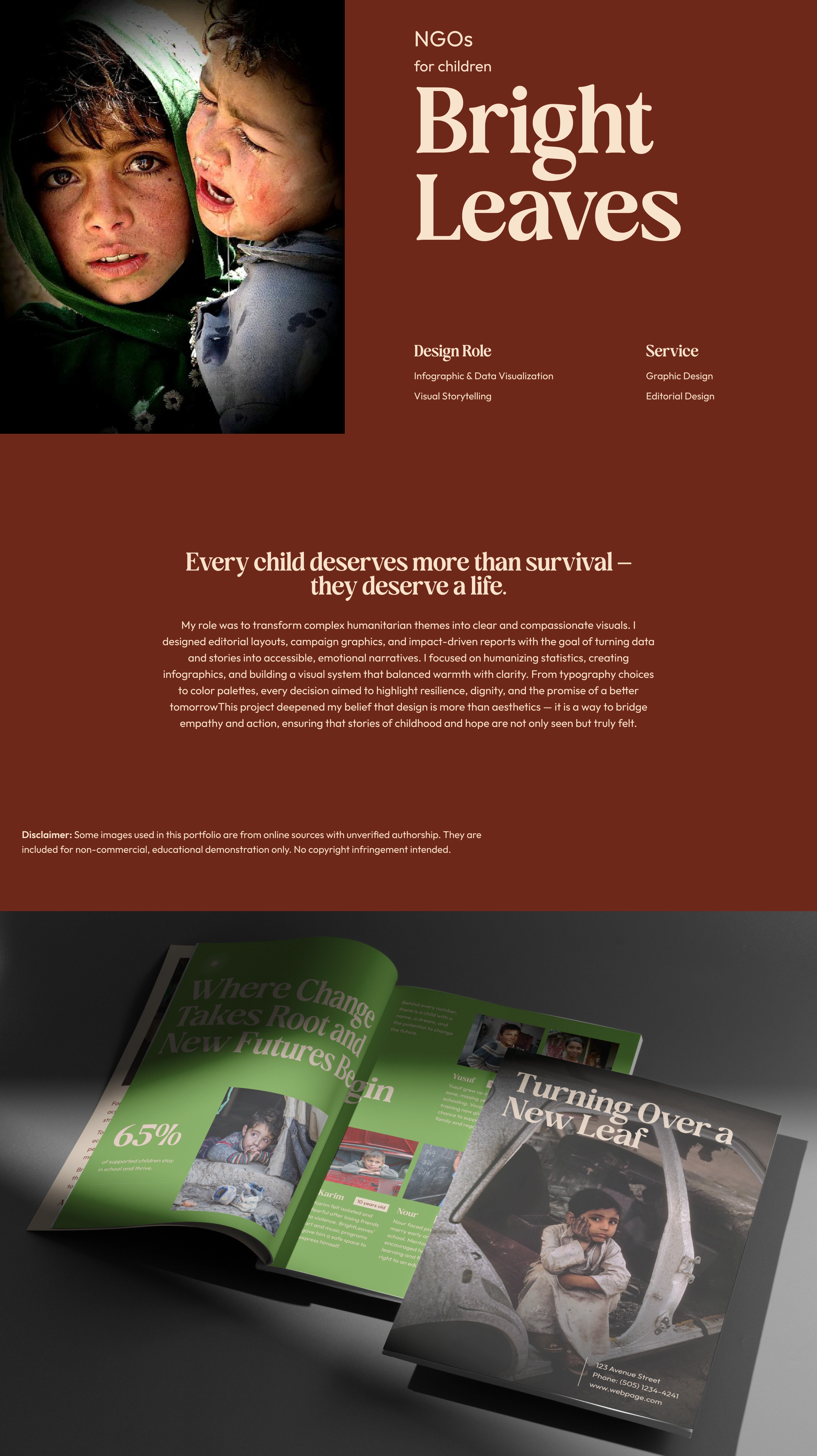
The project aimed to turn humanitarian data into an emotional, accessible story. The challenge was creating a visual language that balanced empathy with structure.
Approach & Solution
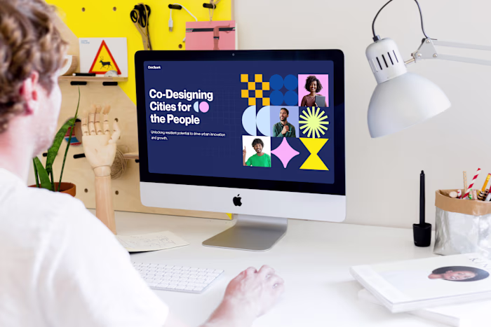
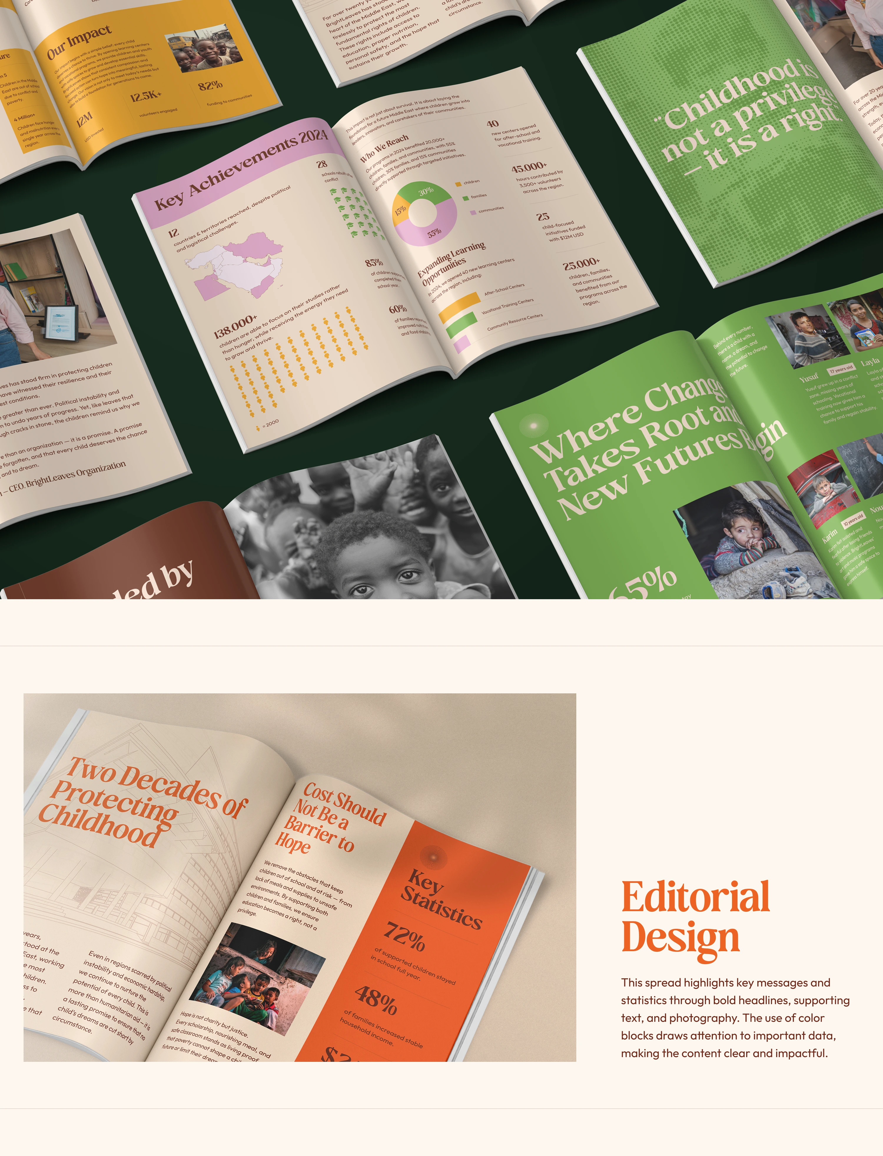
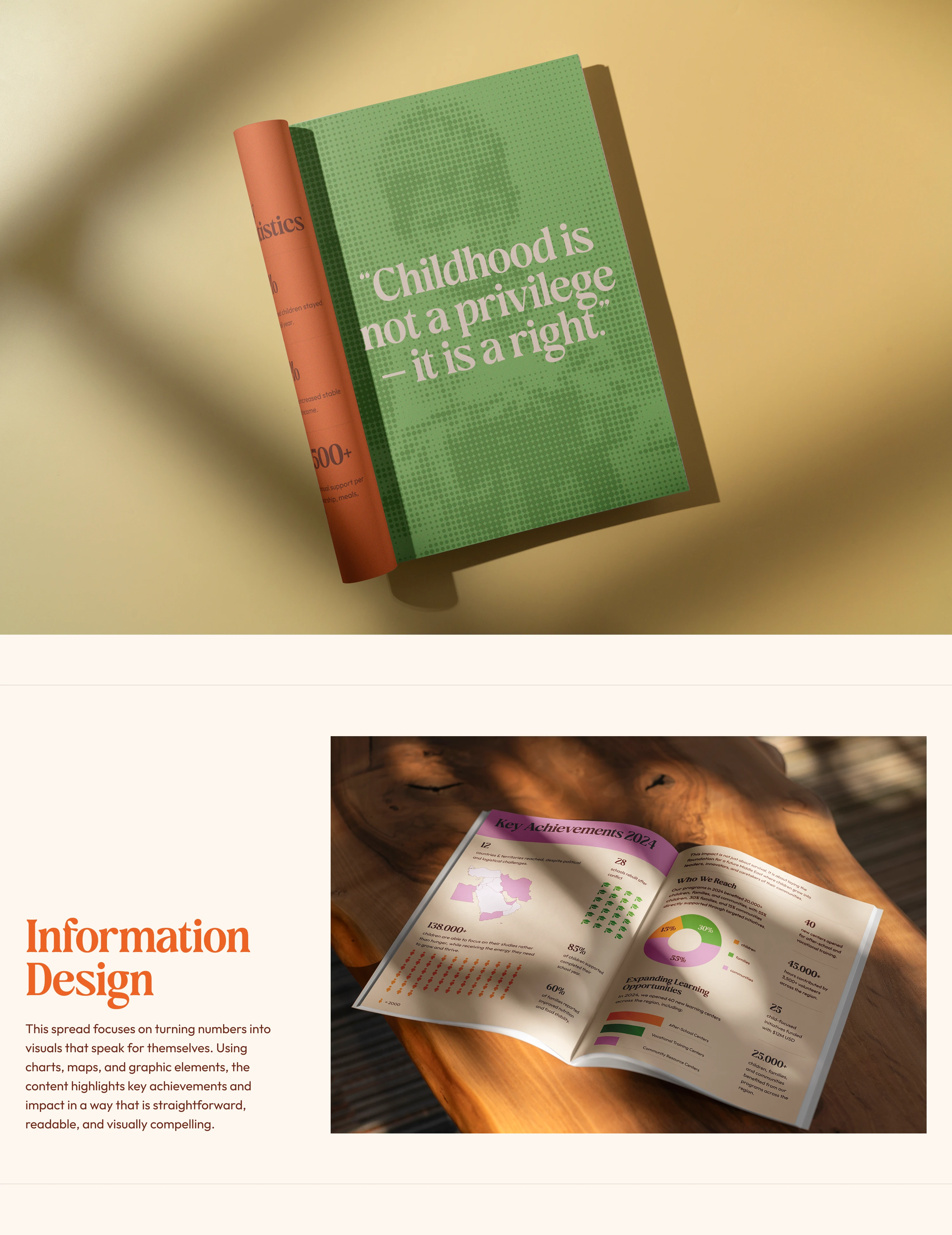
We used editorial storytelling—combining data, photography, and color to make complex issues feel human and relatable.
Design Execution
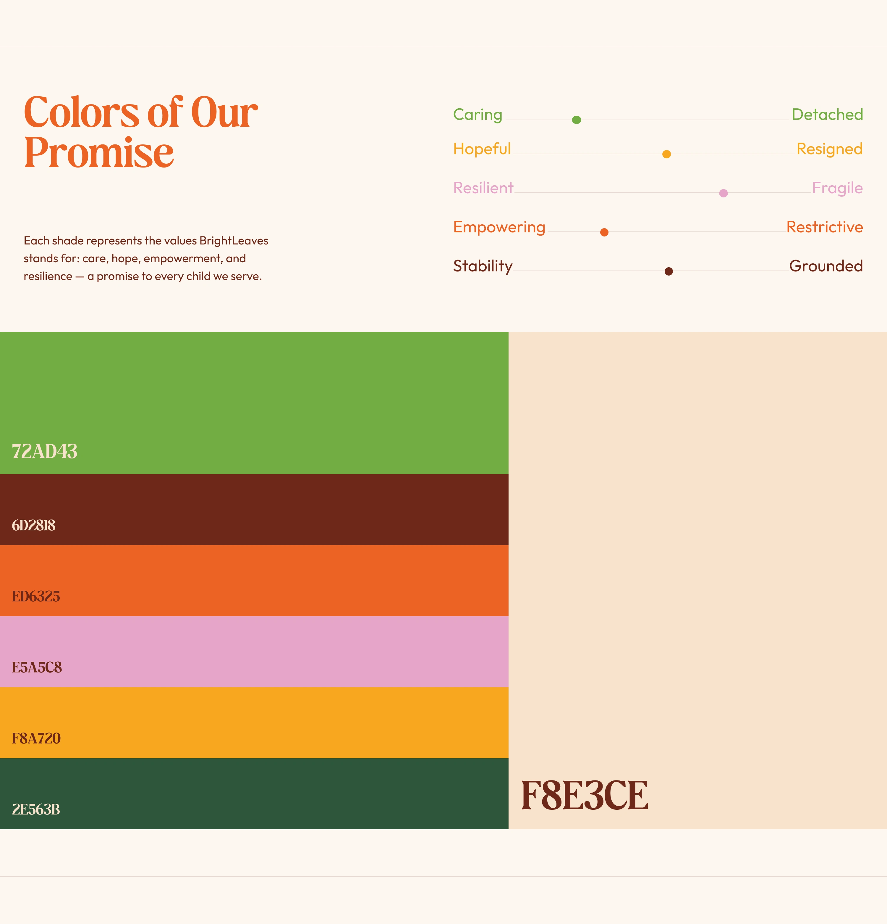
Built in Figma, the layouts feature clean grids, expressive type, and a warm palette that reflects hope and resilience.
Outcome
A cohesive visual system that humanized information and amplified the organization’s mission with clarity and compassion.
Like this project
Posted Oct 6, 2025
Visual identity and editorial system designed to translate humanitarian data into a warm, human-centered storytelling experience.
Likes
1
Views
16
Timeline
Sep 29, 2025 - Oct 5, 2025