Airline Checkout - Mobile Booking Experience
Orishina Ogunro
Airline Checkout - Mobile Booking Experience
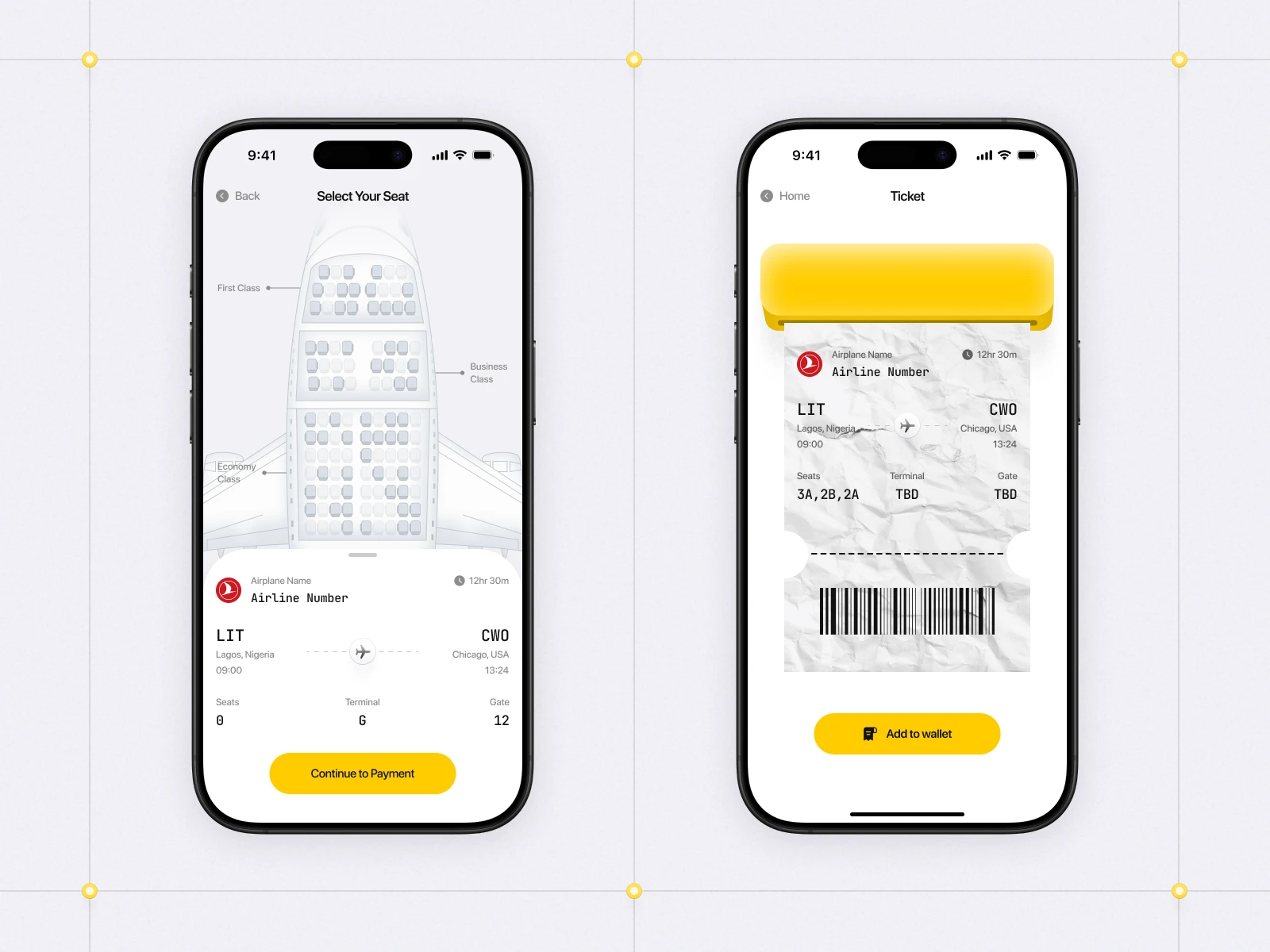
I designed a modern airline checkout experience focused on making seat selection and payment feel simpler, cleaner, and more intuitive.
The goal was to rethink the final stage of flight booking. A process that often feels visually crowded and stressful, and turn it into something calm, lightweight, and easy to navigate on mobile.
A major focus throughout the project was clarity.
The airplane seat map was intentionally simplified to make different seating classes easy to understand at a glance, while the lower checkout section was designed to keep important travel details visible without competing for attention.
The final result is a clean mobile checkout flow that feels modern, intuitive, and visually refined.
Rather than treating booking as a purely functional experience, this concept explores how airline checkout can feel smoother, calmer, and more thoughtfully designed.
Timeline:
February 5 2026 – February 19 2026 (2 Weeks)
Scope of Work
Mobile UI Design
Checkout Flow Design
UX Strategy
Design System
Visual Design
Interactive Seat Map
Prototyping
Motion & Interaction Design
Checkout Screens
Checkout Flow
Like this project
Posted May 18, 2026
A streamlined travel app that transforms booking, seat selection, and digital ticketing into a seamless mobile experience.
Likes
1
Views
3
Timeline
Feb 5, 2026 - Feb 19, 2026