App UI Re-Design
Marie Schmidtsdorf
What was conducted
Heuristic evaluation, Visual competitive analysis, Moodboard, Brand personality, Interactive Hi-fi prototype, Microinteractions.
Timeline
3 days
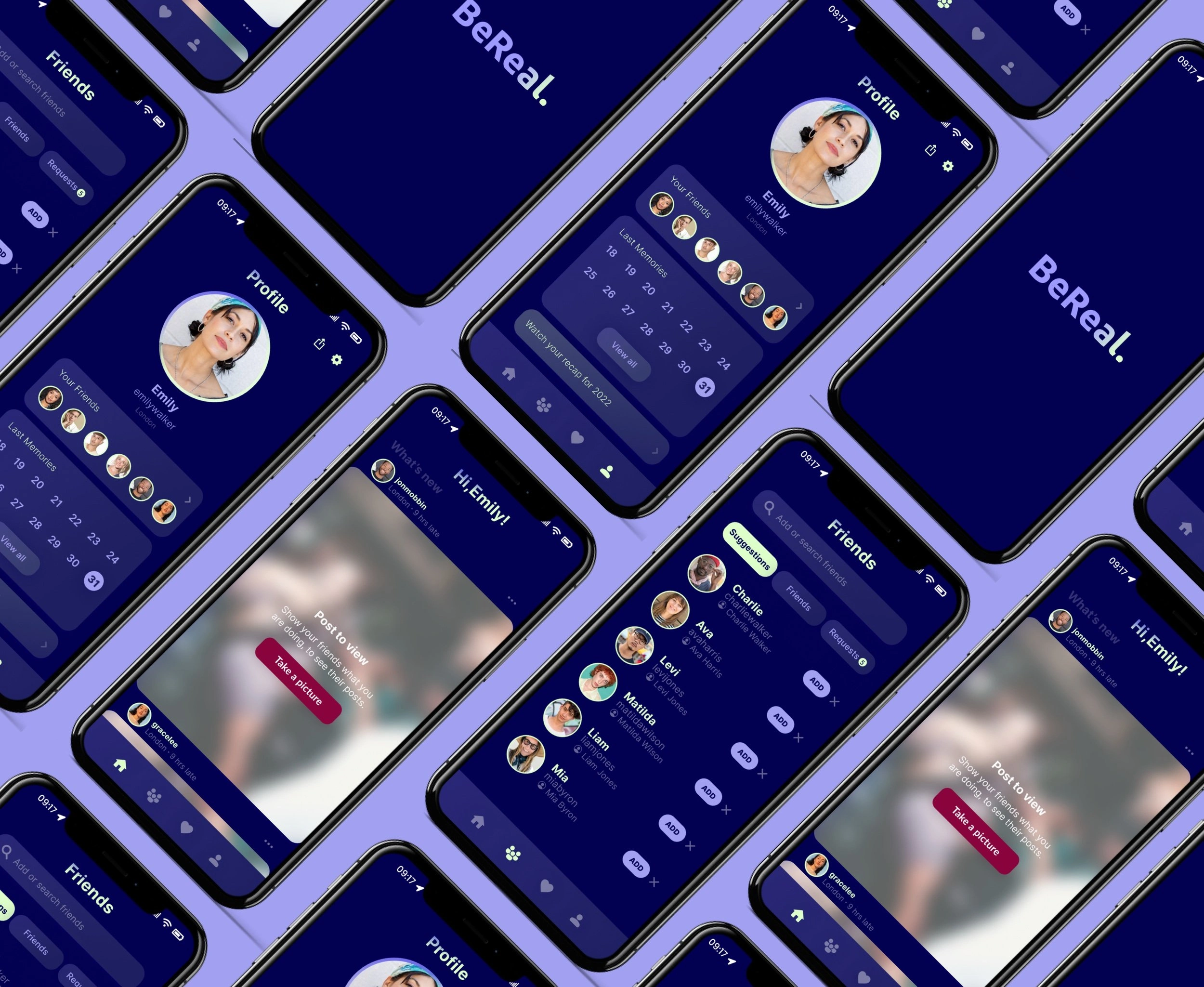
BeReal Re-design
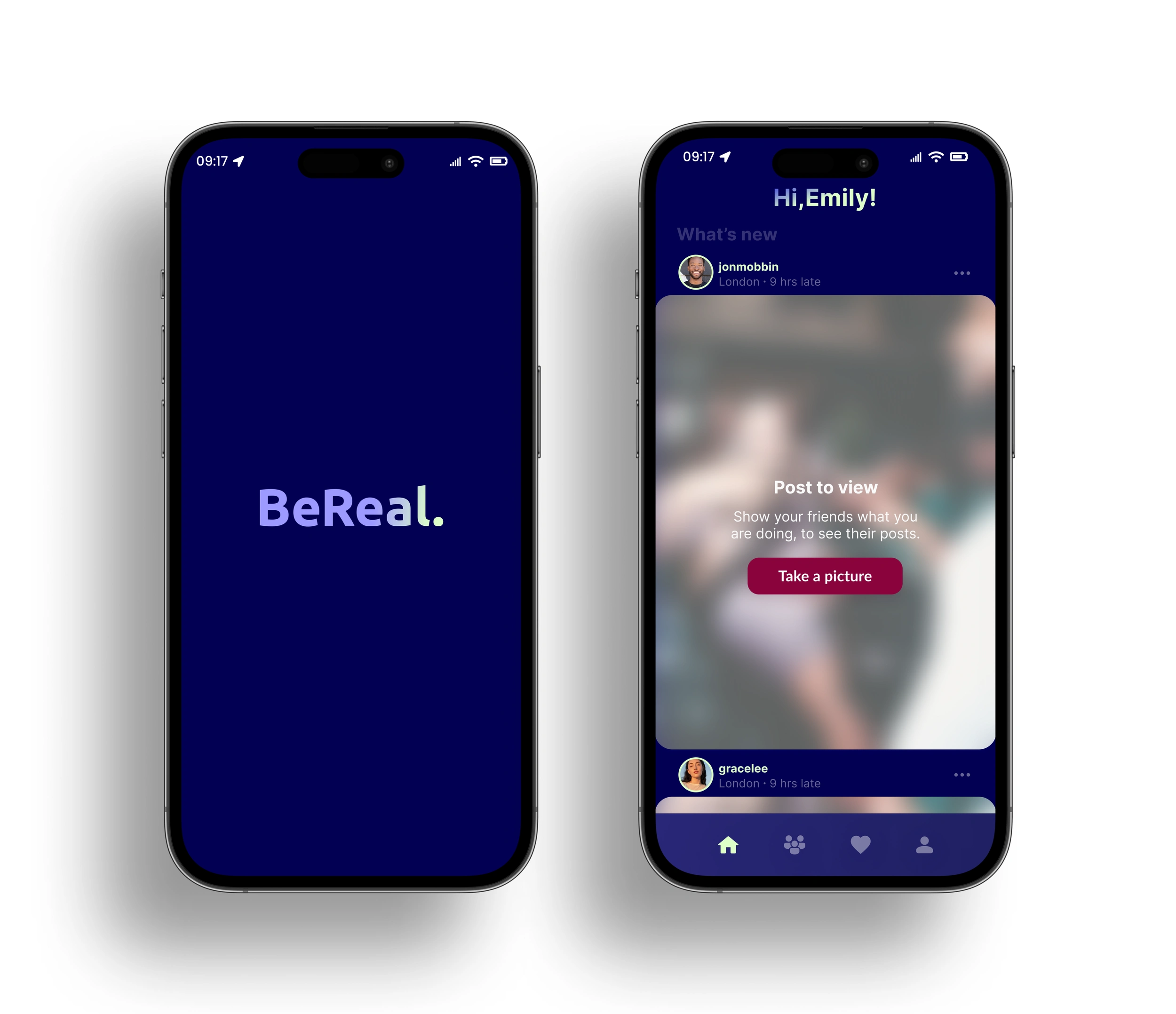
Loading and home screen
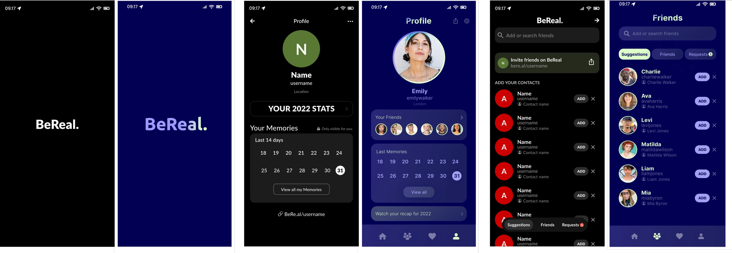
Existing Design Clone
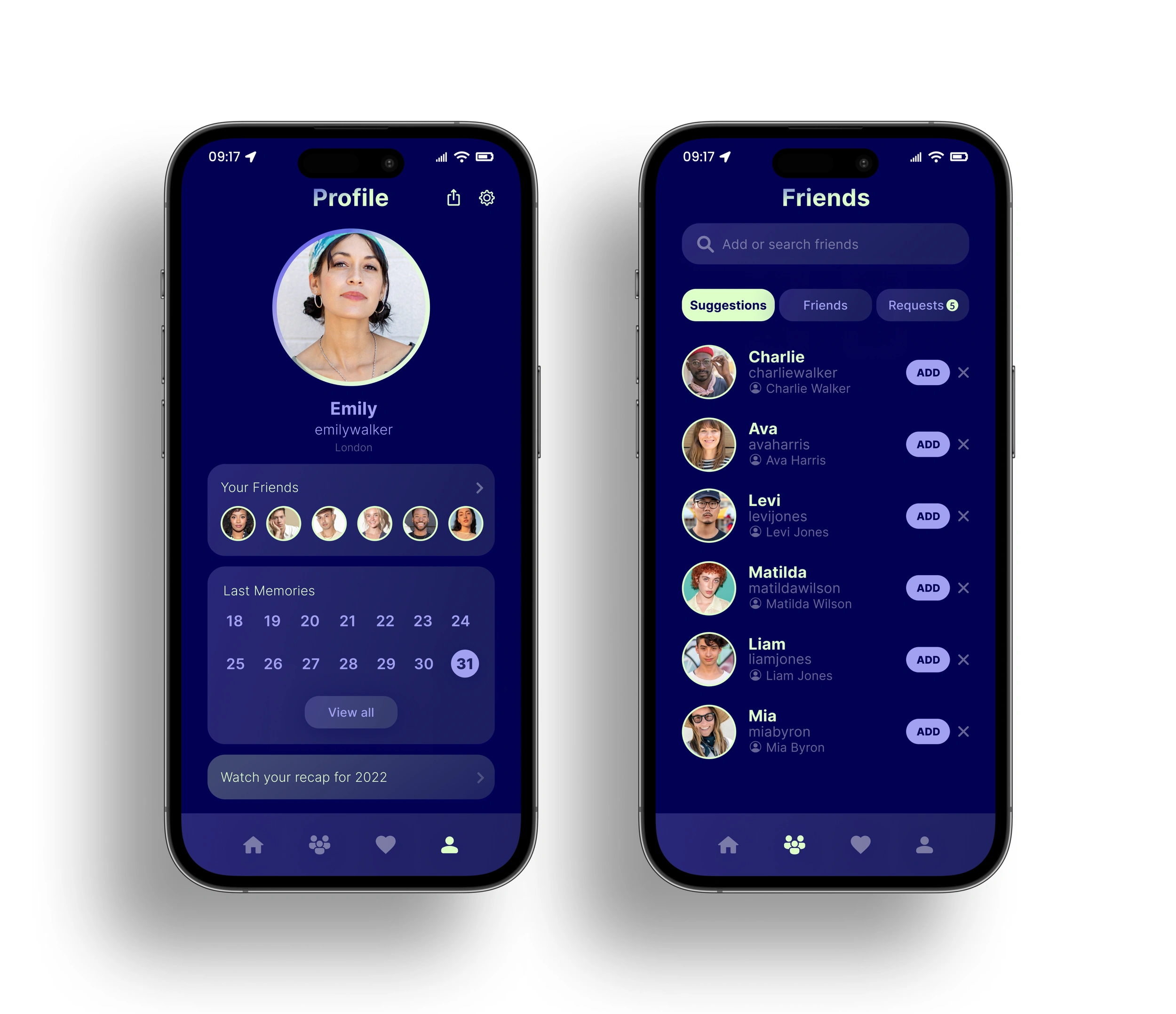
First, I had to replicate and audit the existing app. I inspected all of the elements on the screens and replicated them in Figma.
Due to time constraints, I’ve chosen to reproduce the following screens: Loading screen, Home screen, Profile screen, Friends screen.
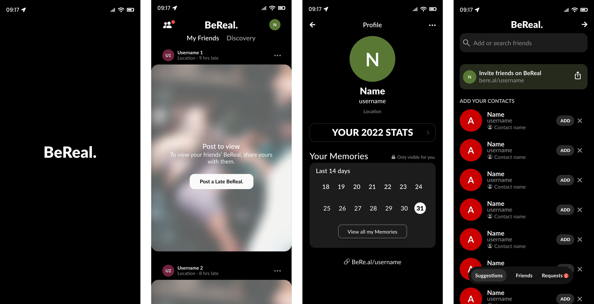
BeReal Clone design
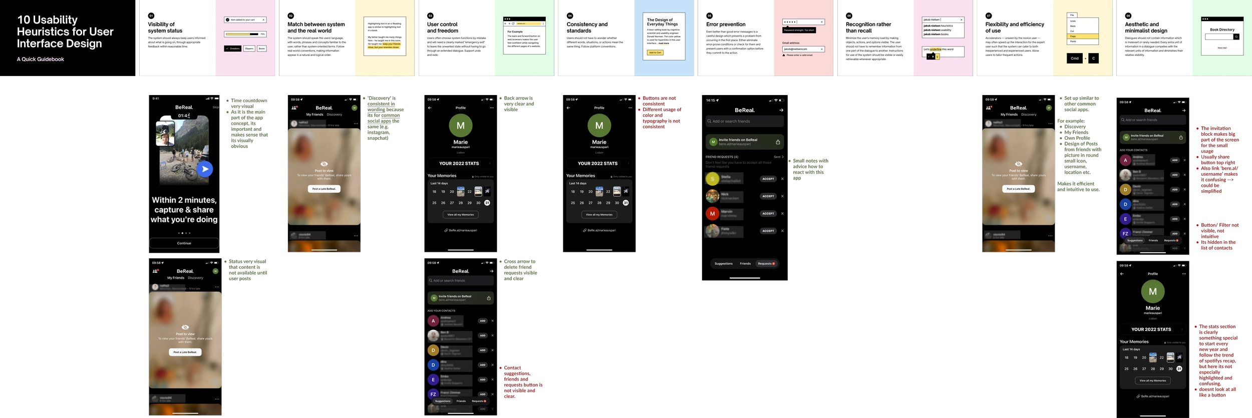
Heuristic Analysis
For the heuristic analysis, I’ve followed the 10 general principles from Jakob Nielson for interaction design. They provide a foundational framework for creating intuitive user-friendly interfaces that meet the needs of the users.
Key findings:
Inconsistencies in typography, font size and colors.
Dark background with weakly highlighted sections create readability issues.
Accent colors and a navigation bar are absent.
Certain elements are counter-intuitive positioned.
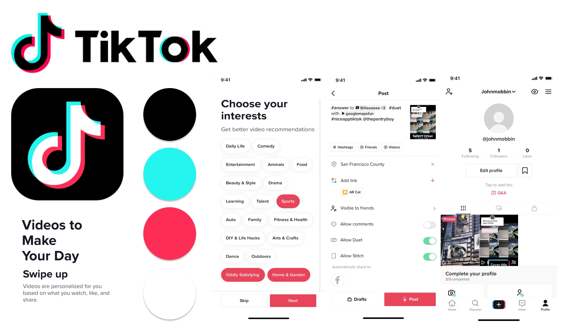
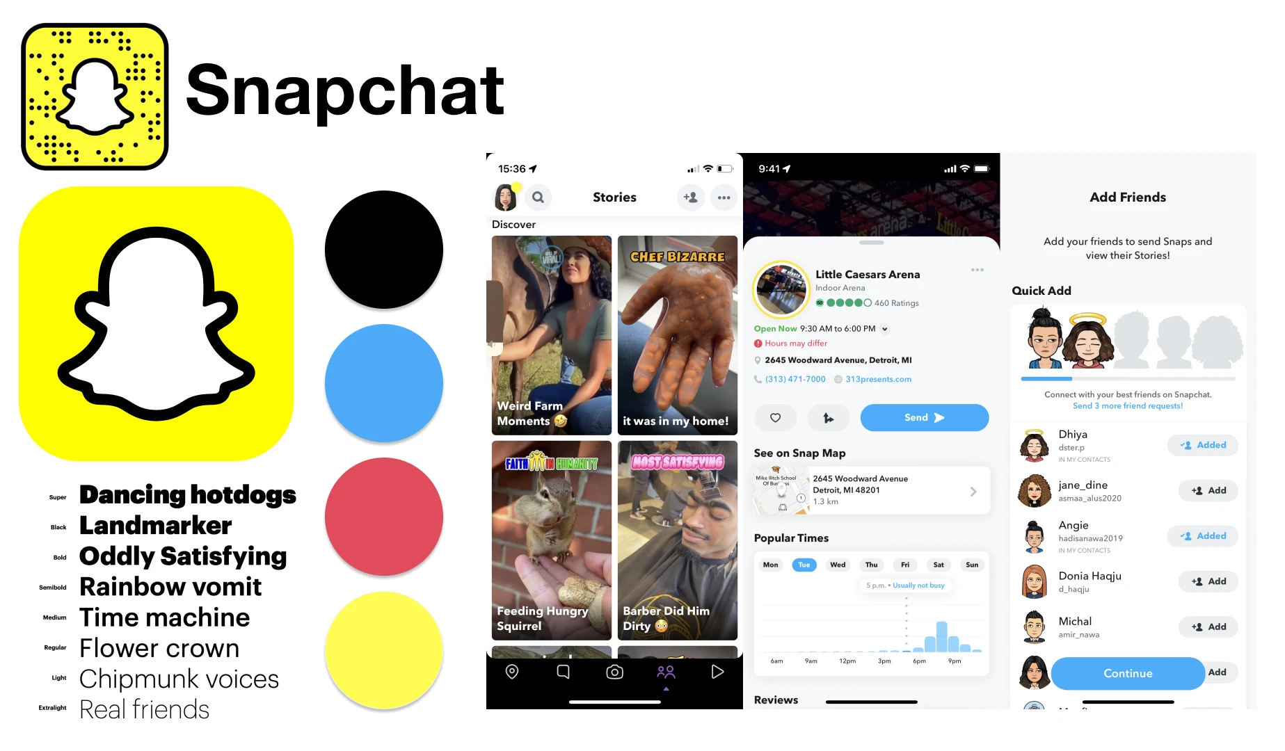
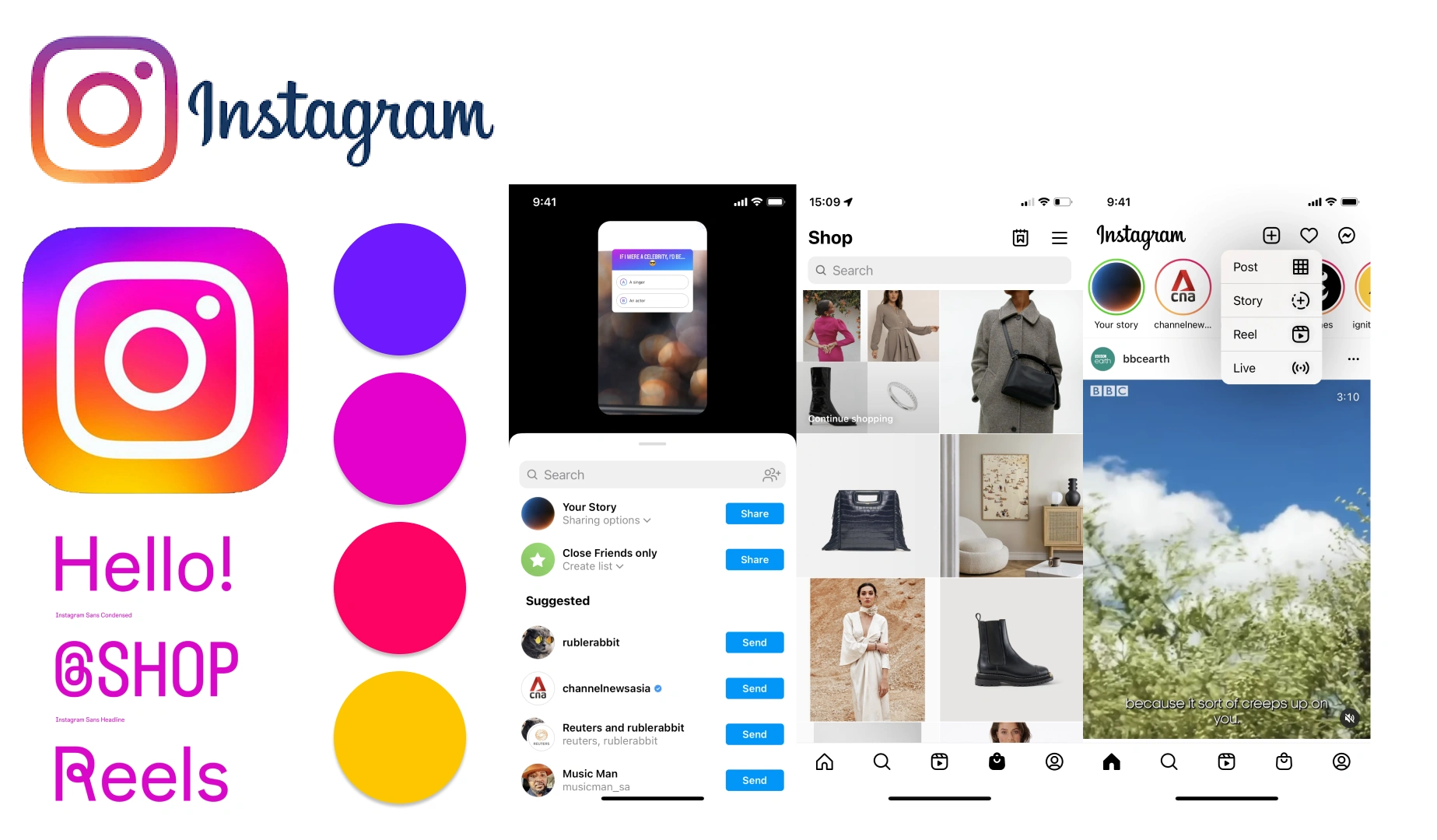
Visual Competitive Analysis
After conducting a visual competitive analysis of Instagram, Tiktok, and Snapchat, I’ve discovered the following findings:
Bright background with strong colors and brand identity
Similar usage of accent colors
Simple typography, that lets space for content
Playful colors for engaging user experience
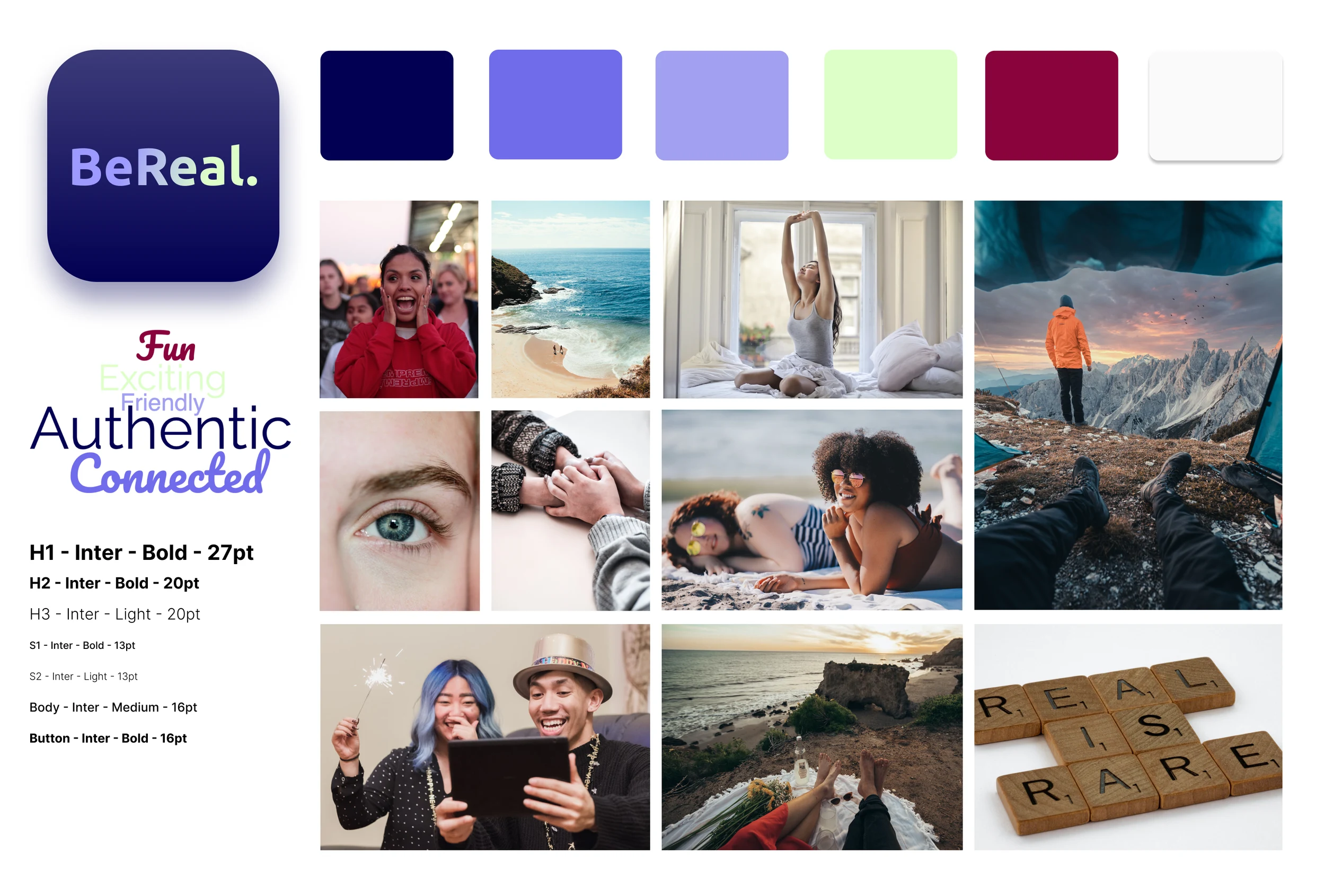
Brand Personality
I believe, such a fun and social app should have vibrant, fresh, and happy colors.
Brand Attributes:
Authentic
Connected
Exciting
Friendly
Fun
Before - After
Watch the prototype in action
Design critique
I’ve presented the final prototype during a Design Critique in our course. The color combination and micro-interactions received the most positive feedback.
My colleagues who were already familiar with BeReal enjoyed the integration of the navigation bar, better-highlighted sections, and profile improvements.
Like this project
Posted Mar 4, 2024
Giving BeReal the colorful touch it deserves
Likes
0
Views
0