Entelo
João Martins
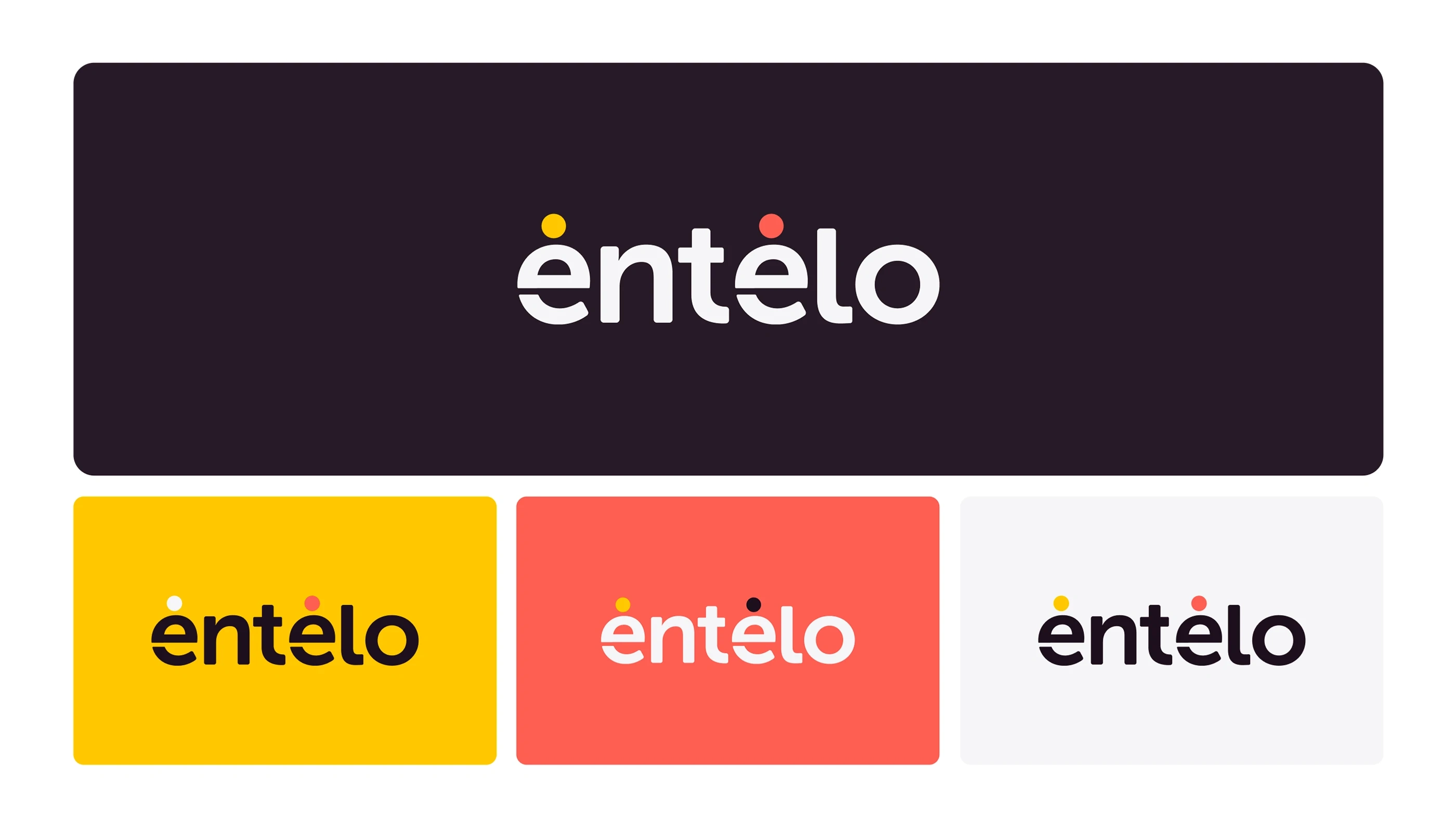
Entelo is an HR and recruitment platform that needed a refreshed identity to better reflect its values and vision. Moving beyond the typical SaaS look, the rebrand introduced a modern wordmark
and a vibrant, flexible visual system that emphasized innovation, inclusivity, and bold thinking.
Agency: Supersie | Team: João Martins, Ezequiel Chareca, Andrea Velasquez, Guilherme Lima | Year: 2022
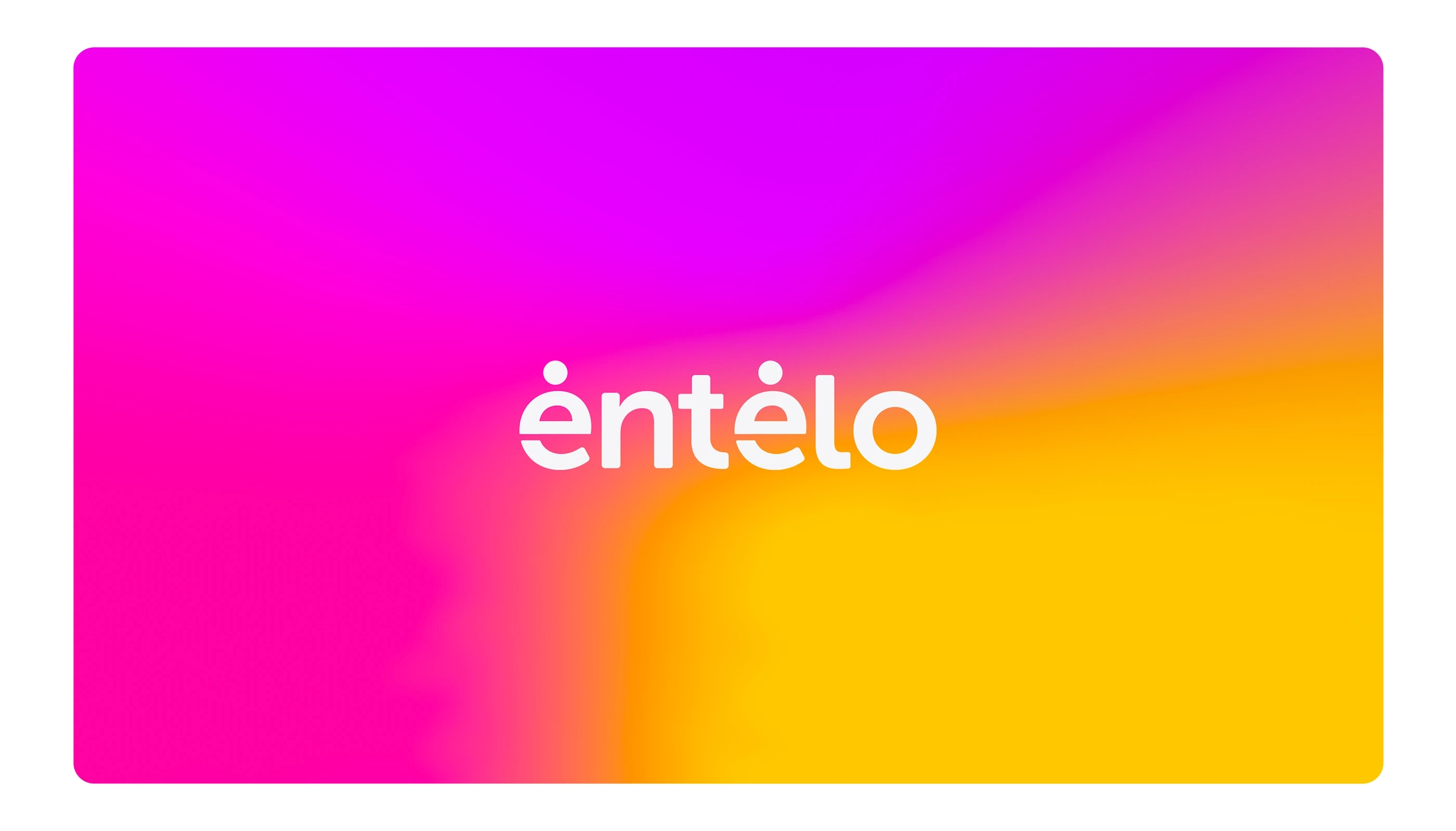
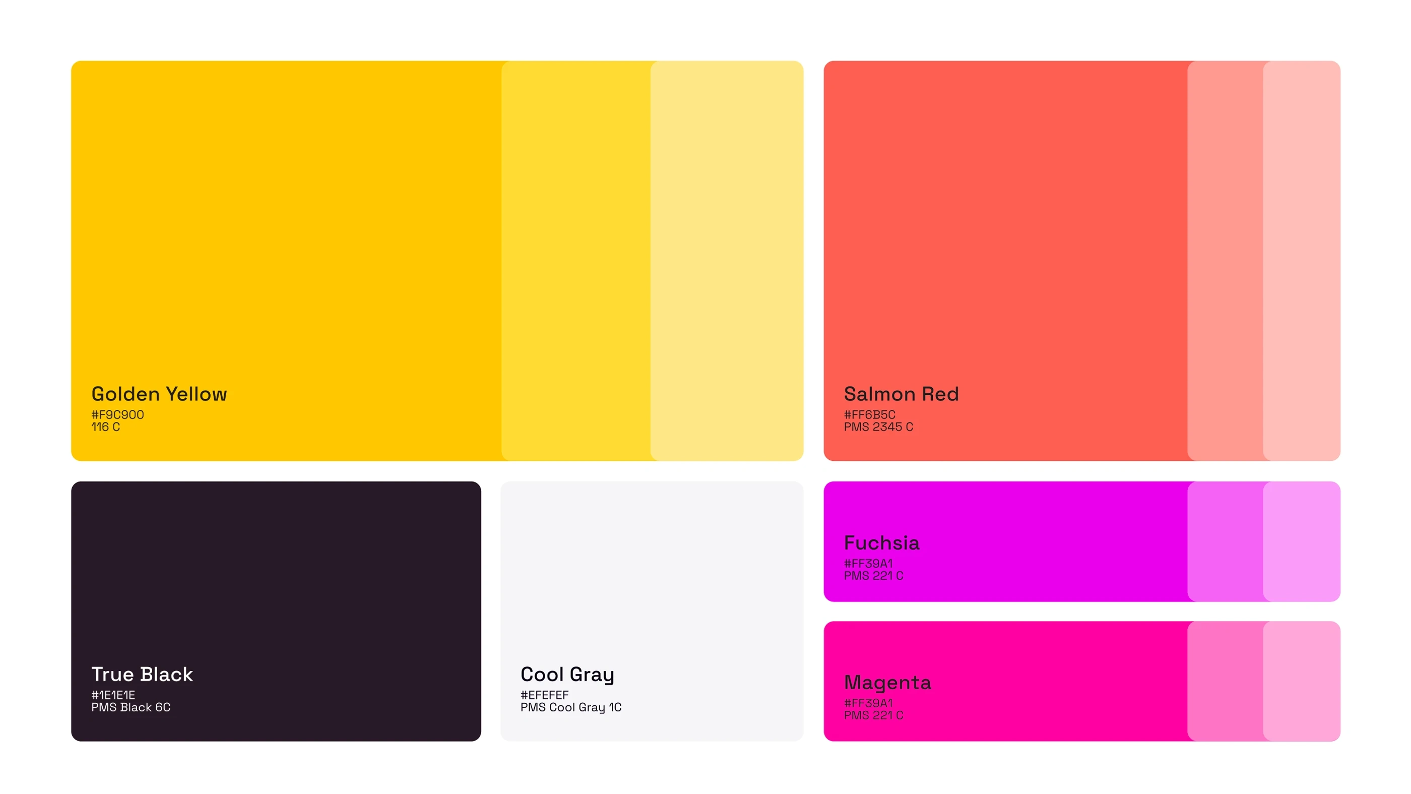
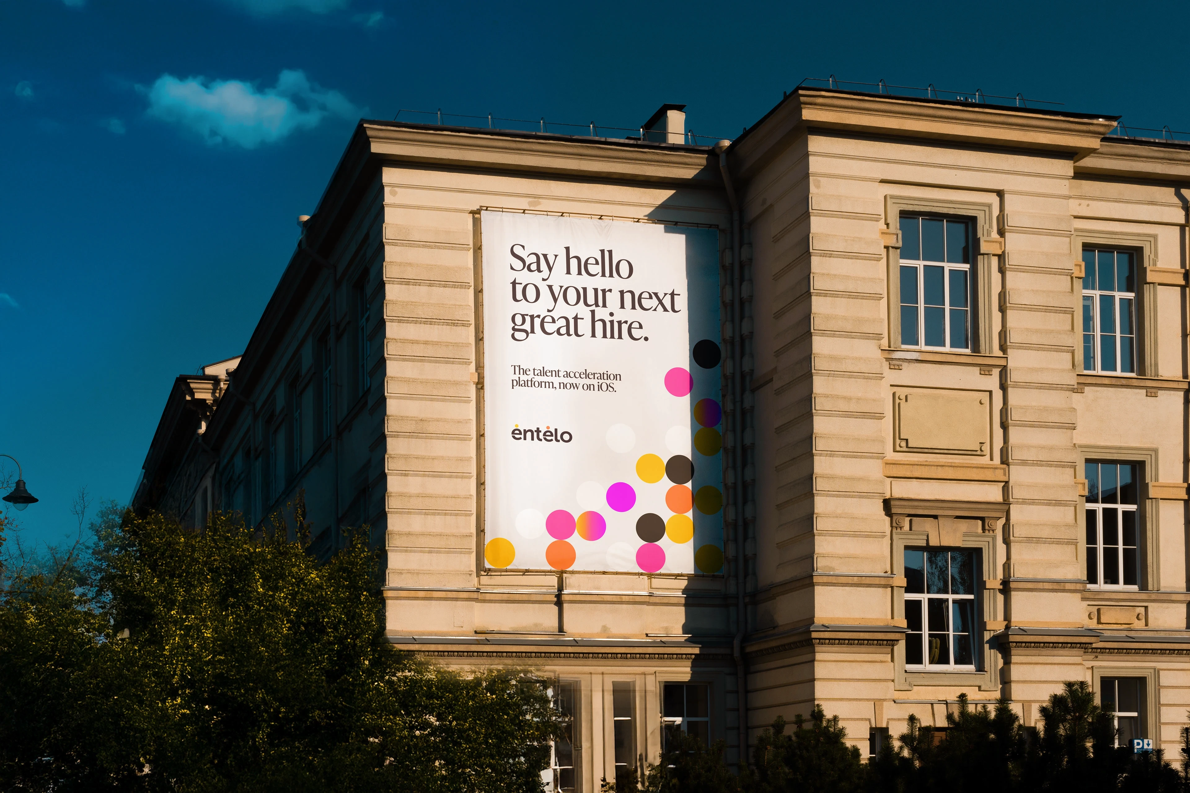
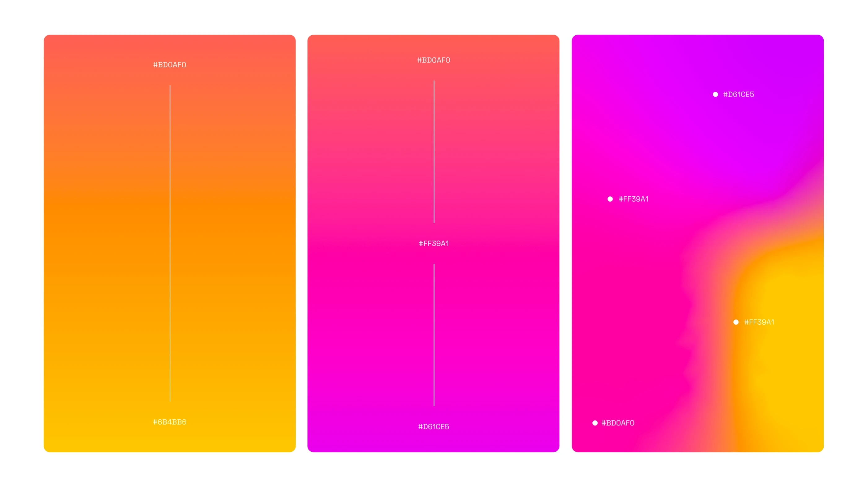
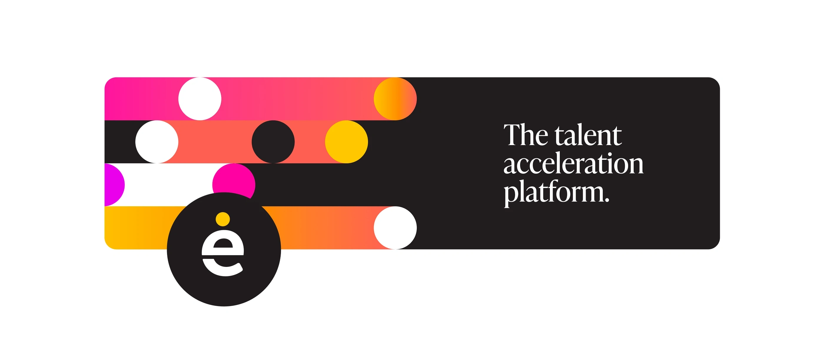
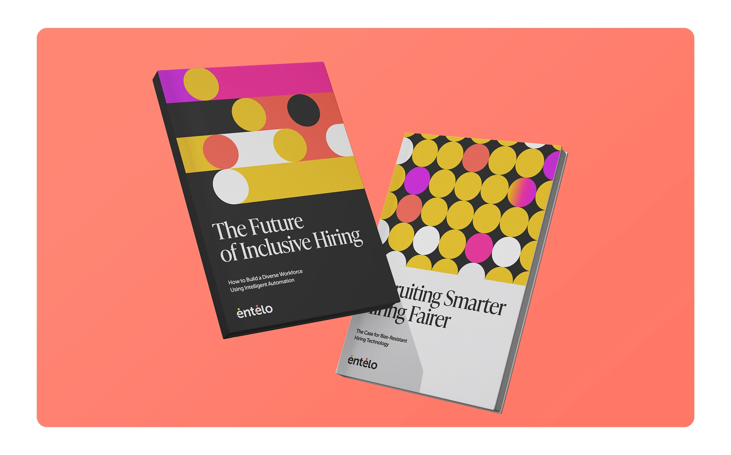
The Entelo palette pairs bold, energetic tones—like Golden Yellow and Salmon Red—with vibrant gradients of magenta and fuchsia. This combination strikes a balance between professional and approachable, while also giving the brand a fresh, inclusive energy. The flexible system adapts across digital, editorial, and event touchpoints, ensuring the brand stands out in the crowded HR and recruitment space.

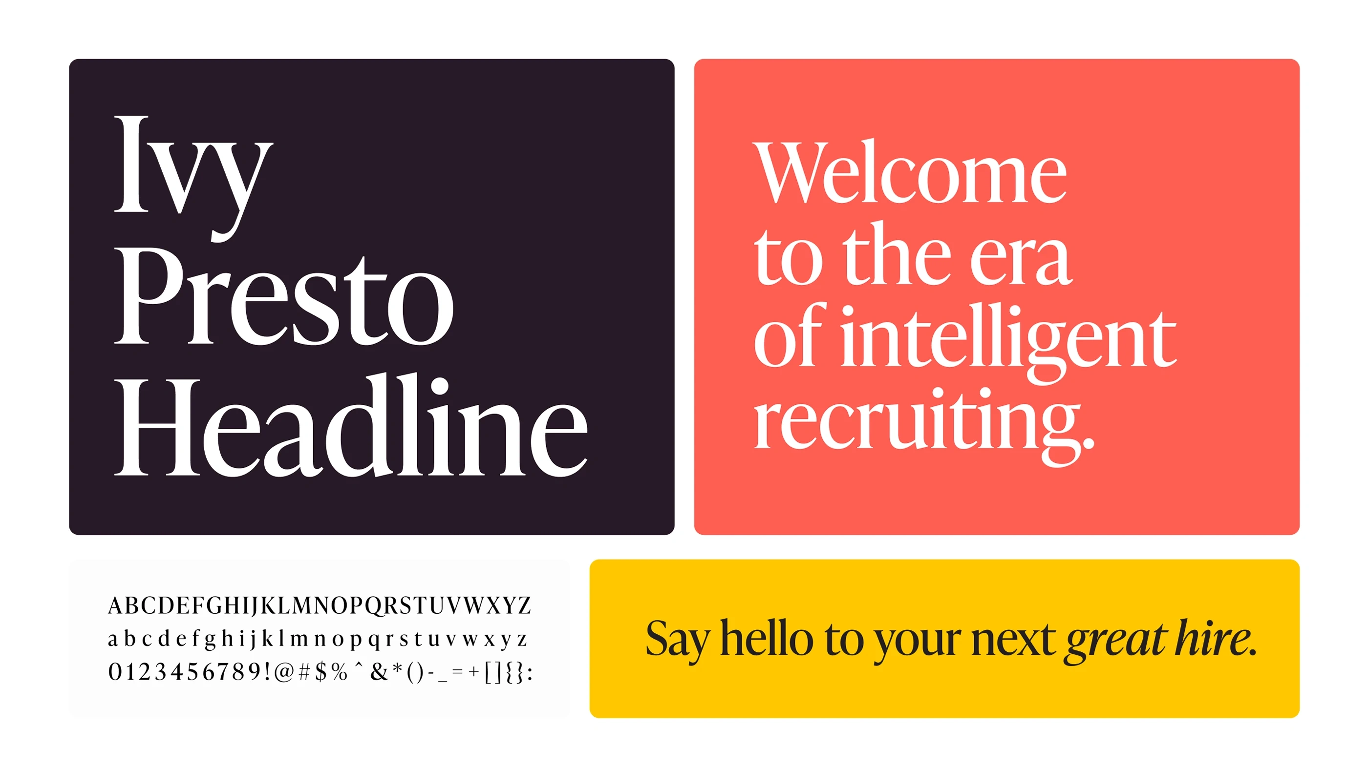
Typography plays a central role in Entelo’s refreshed identity. Ivy Presto Headline brings a sense of sophistication and editorial authority to headlines, while its sharp serifs add distinction in a competitive SaaS landscape. Paired with a clean, modern sans serif for body text, the system balances bold storytelling with clarity—helping the brand communicate both professionalism and approachability.
The graphic system extends the brand through simple geometric forms—dots, lines, and arcs—that reference people, networks, and connections. These elements bring flexibility and energy to layouts, while reinforcing Entelo’s core purpose: making meaningful connections between companies and candidates.


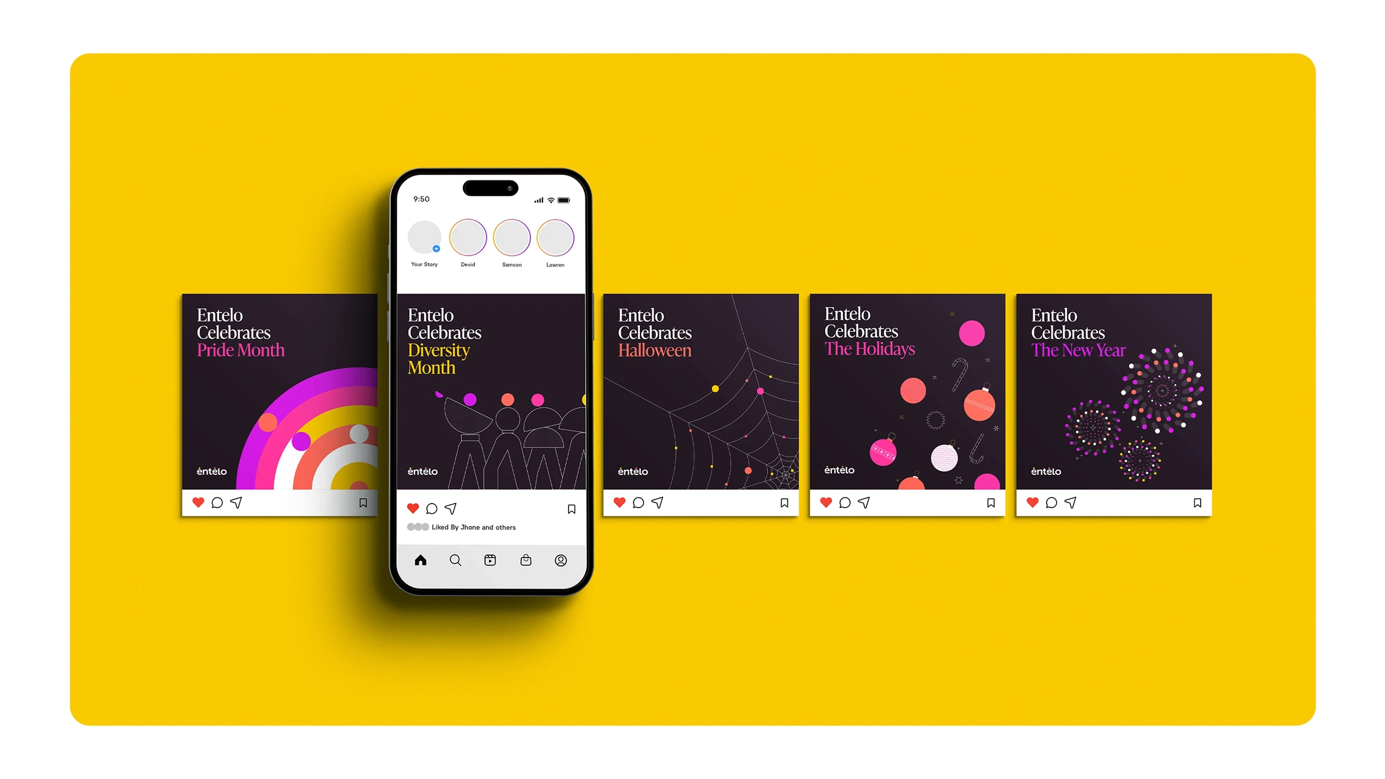
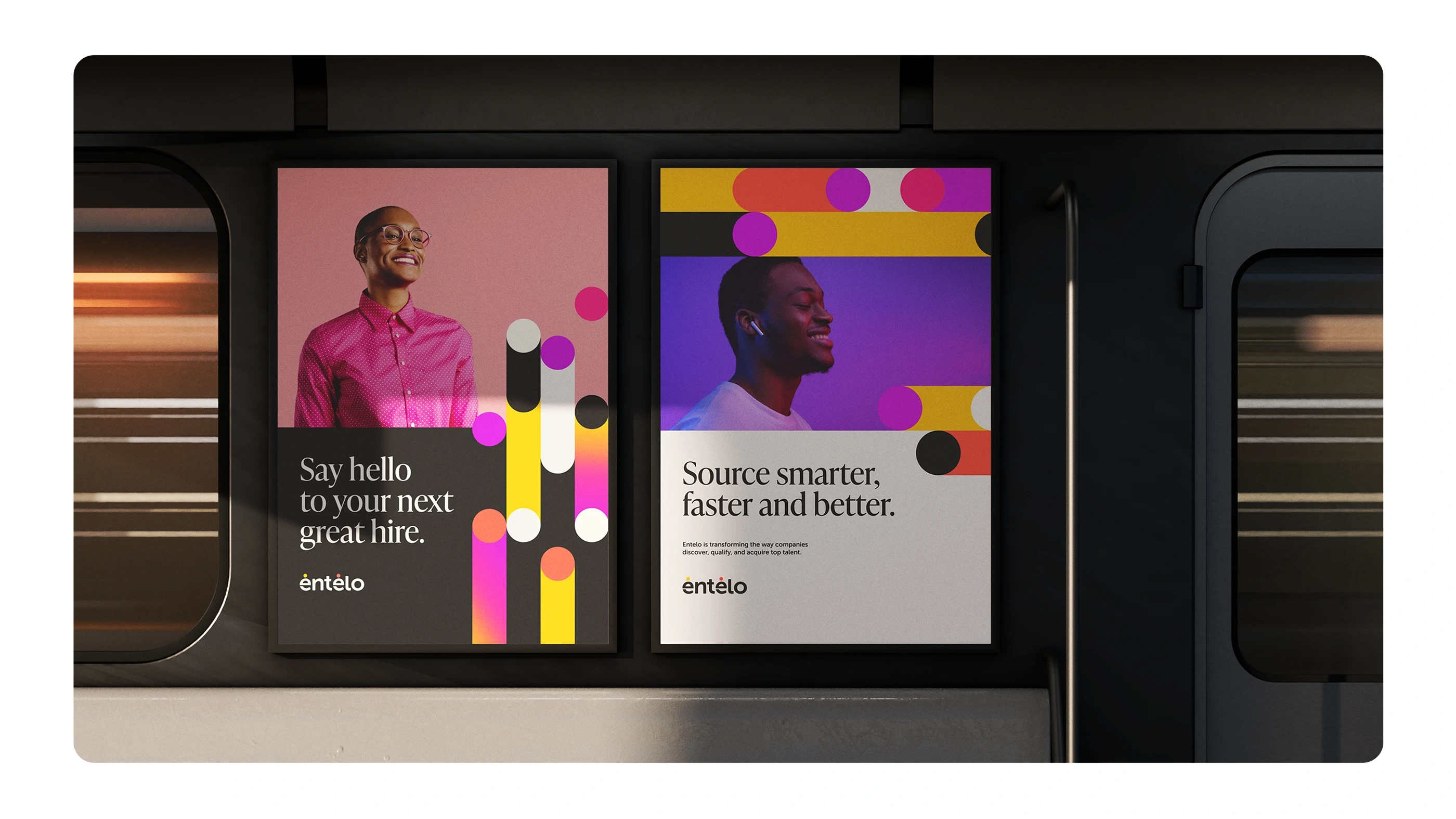
The refreshed identity translated into a wide range of applications, from outdoor campaigns and editorial reports to social media toolkits. Playful graphics and bold colors made the brand recognizable across channels, while the system’s flexibility allowed Entelo to address themes like diversity, inclusion, and celebration in a consistent voice.
Like this project
Posted Oct 9, 2025
Entelo e rebrand introduced a modern wordmark & a vibrant, flexible visual system that emphasized innovation, inclusivity, and bold thinking.
Likes
1
Views
1