ROOTS Wine | Brand Identity, Logo and Packaging Design
Olia Malish
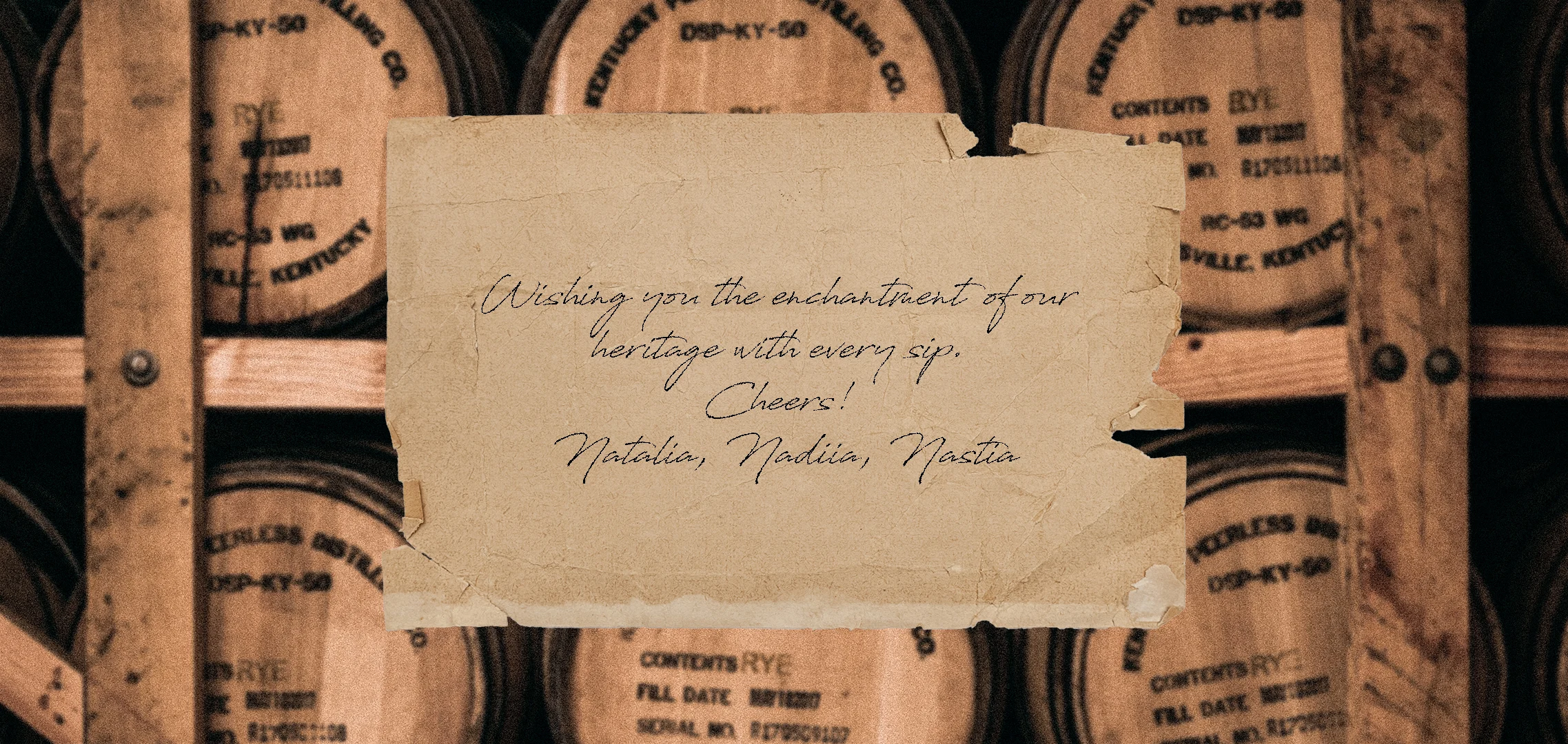
Generations of women nurturing a coastal Ukrainian vineyard.
ROOTS Wine | Brand Identity, Logo & Packaging Design
About the Brand
ROOTS Wine is a family vineyard on the sun-soaked coast of Odesa, South Ukraine, nurtured across generations of remarkable women, Grandmother Natalia, Daughter Nadiia, and Granddaughter Nastia. More than a vineyard, it is a place of heritage, care, and creativity, where wine, art, and life intertwine under the golden sun.
Challenge
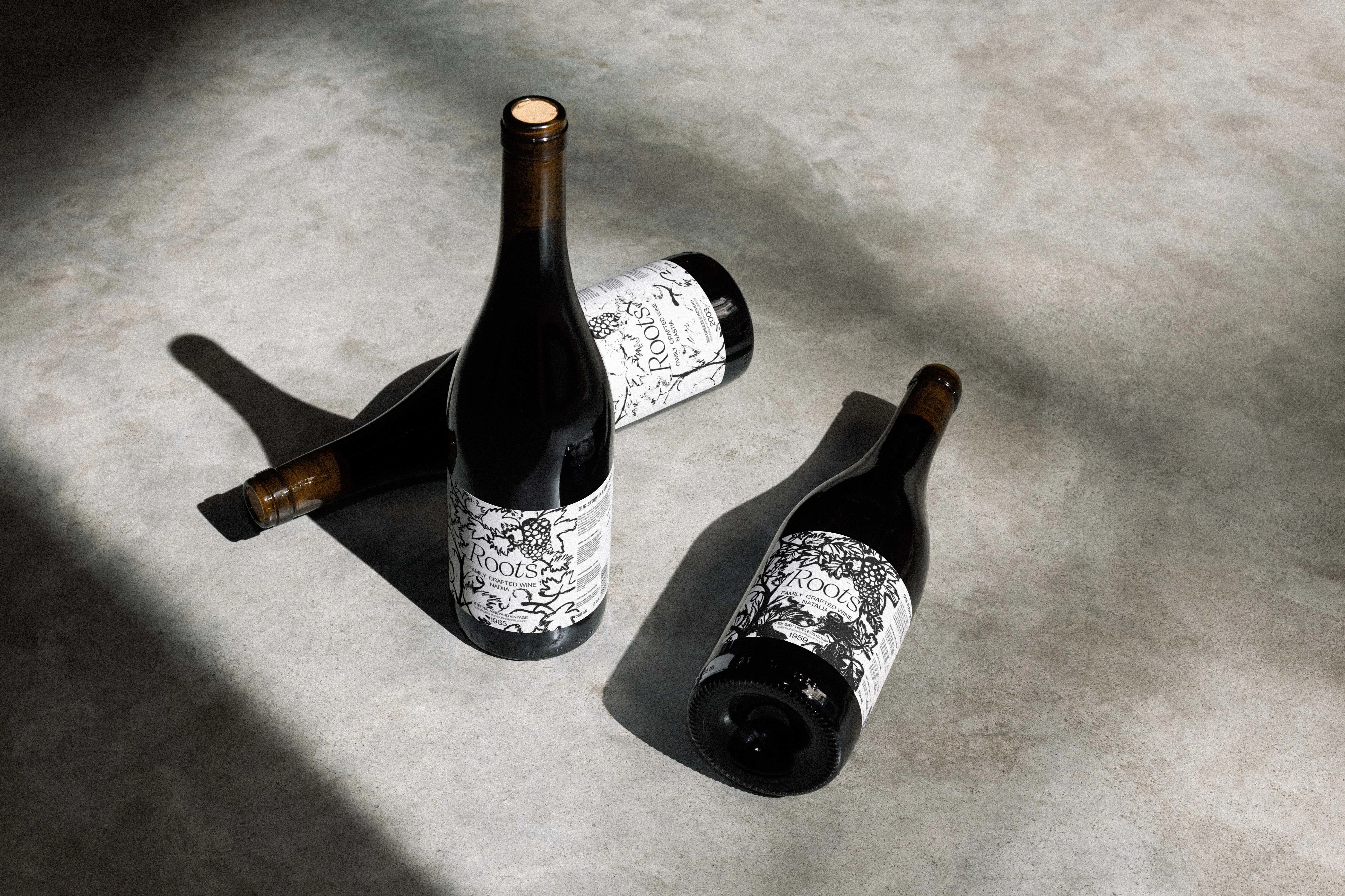
The main challenge was to show the age of each wine through the brand identity, particularly on the bottle labels. Each bottle needed to communicate its unique character, depth, and history while maintaining a personal, handcrafted feel.

Approach
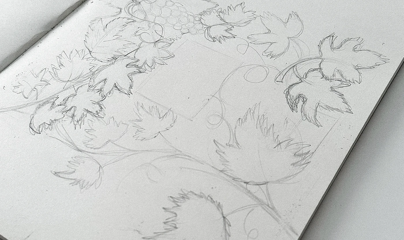
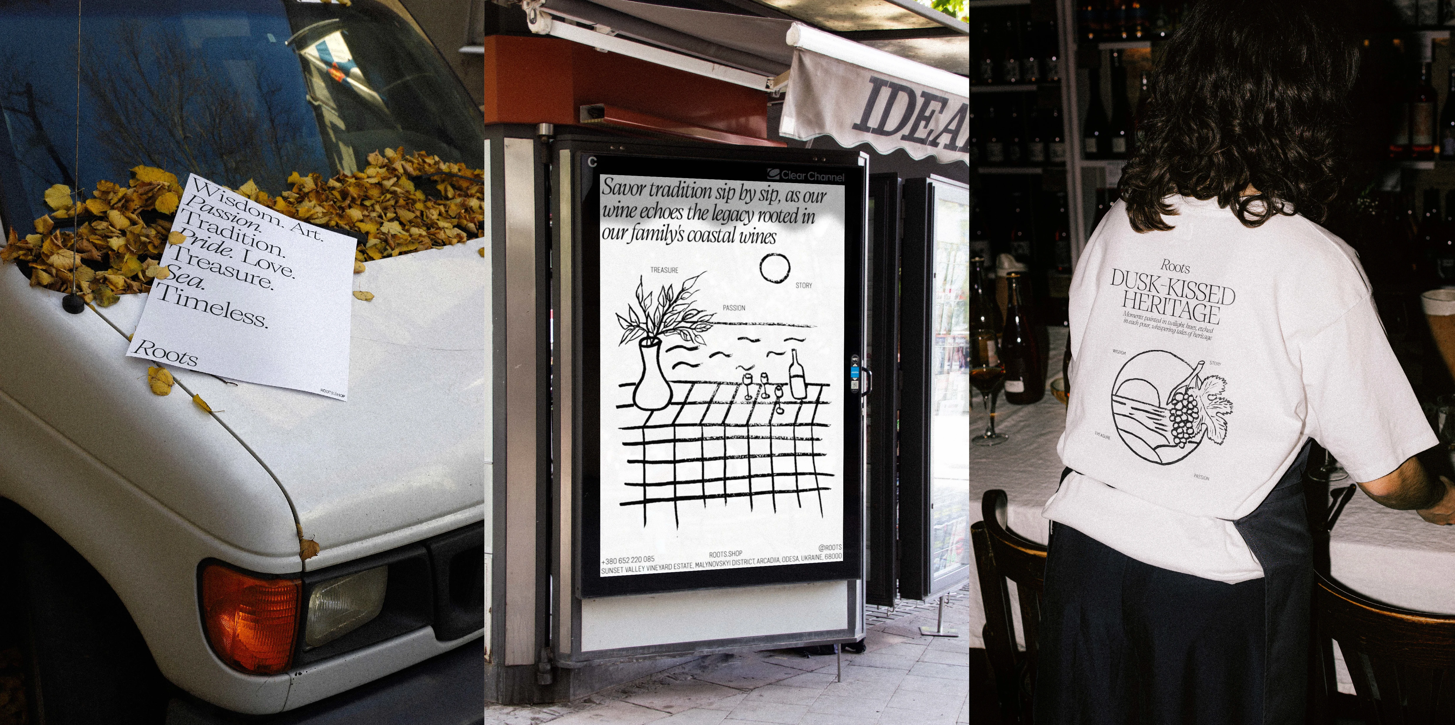
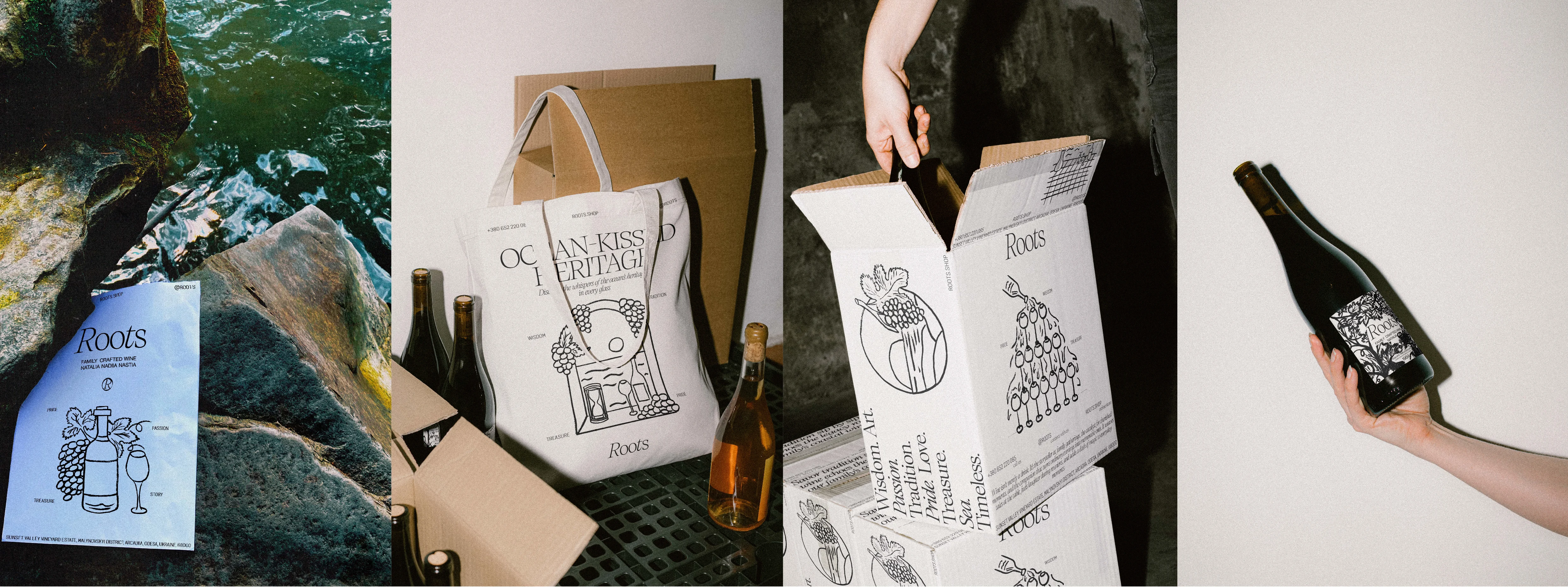
Label Illustrations: Hand-painted grapes for each bottle. Thickness and intricacy correspond to the wine’s age, with older wines having richer, denser illustrations. Sketches accompany the final art to show the creative process.
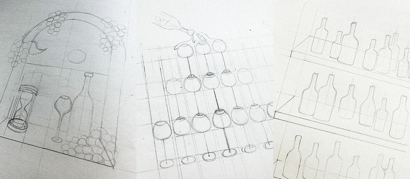
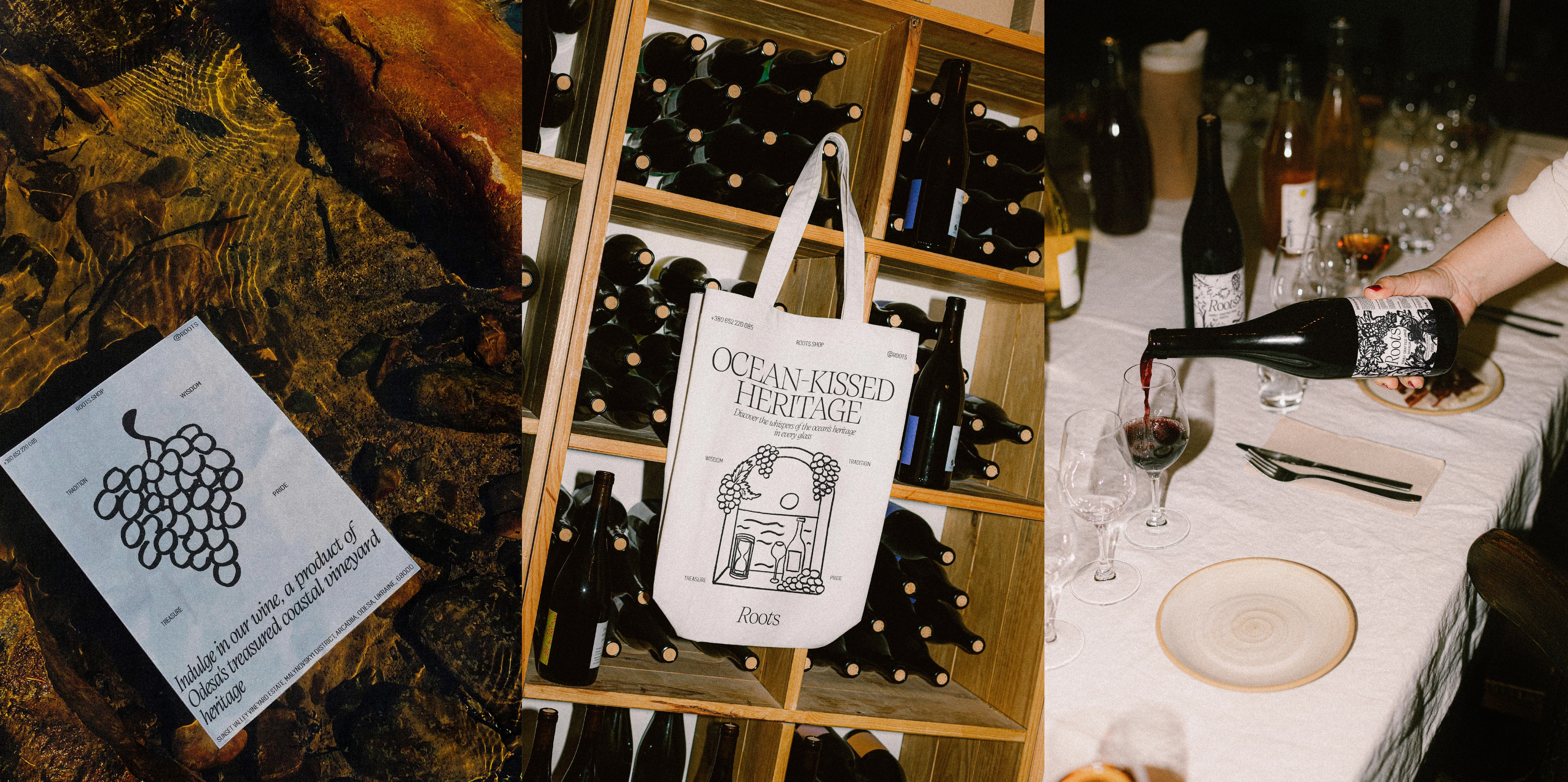
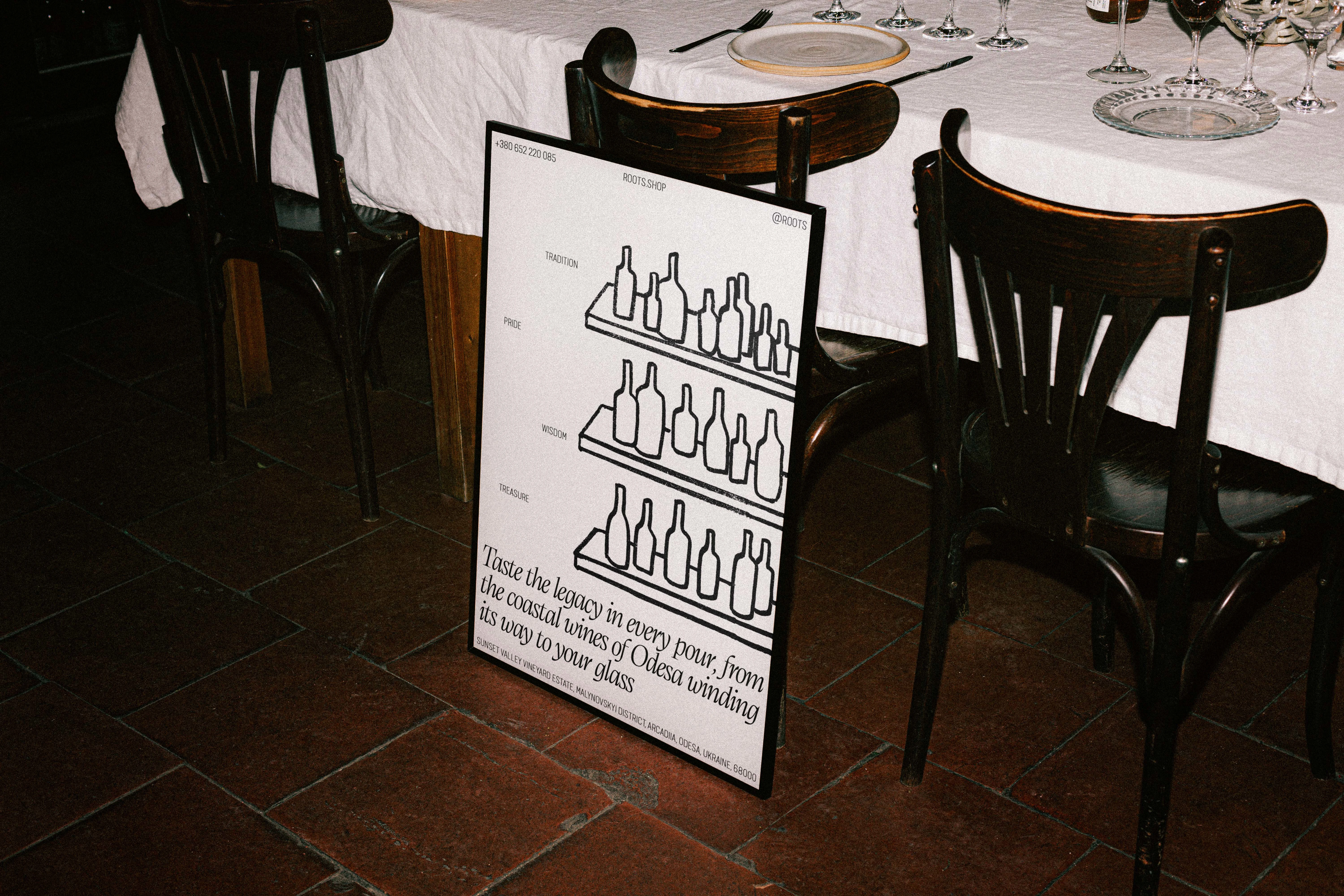
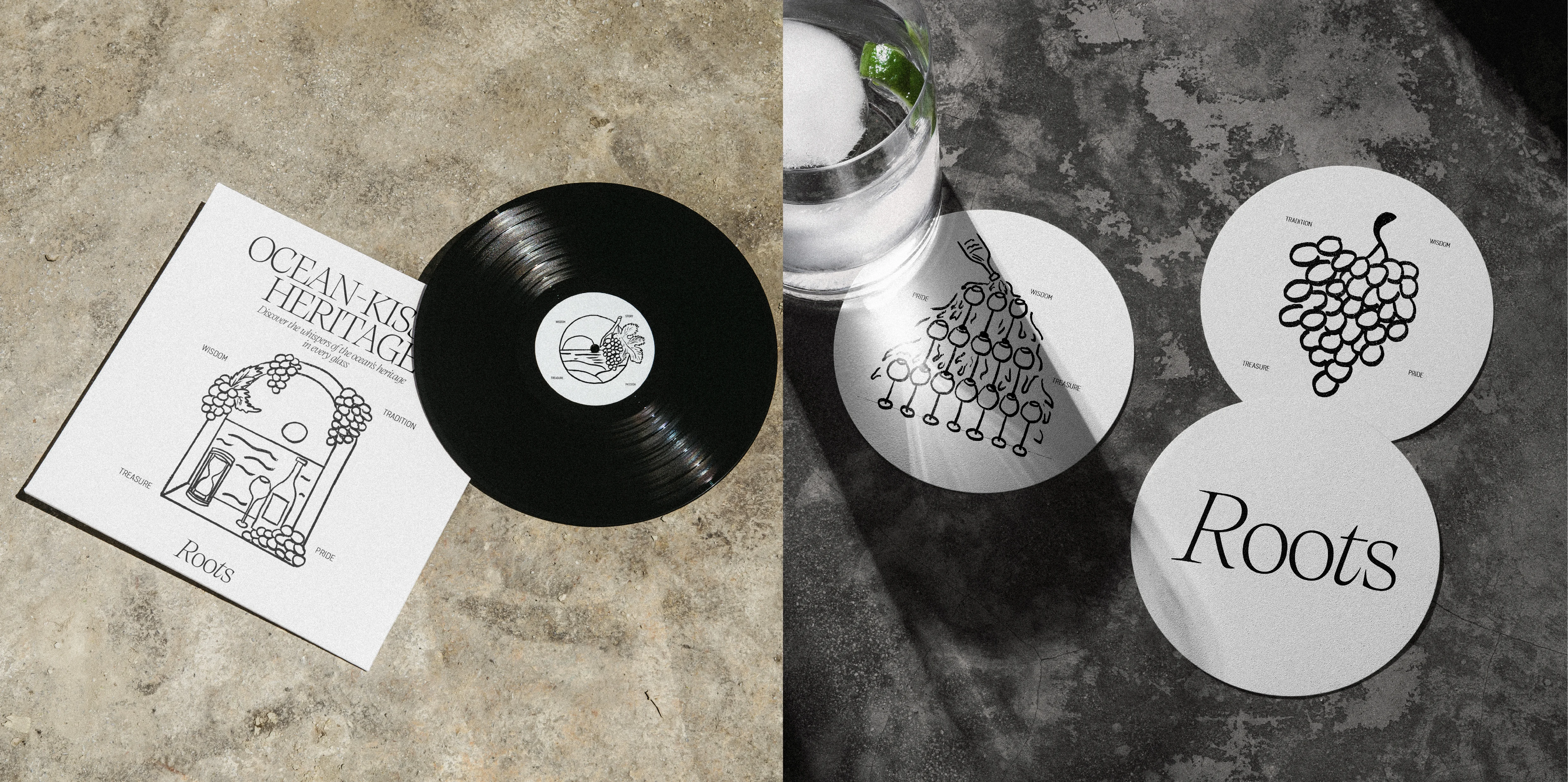
Supporting Illustrations: Additional hand-drawn illustrations of wine, sky, sea, and grapes bring a craft, artisanal feel to the brand. These add depth and personality across packaging and collateral without indicating age.
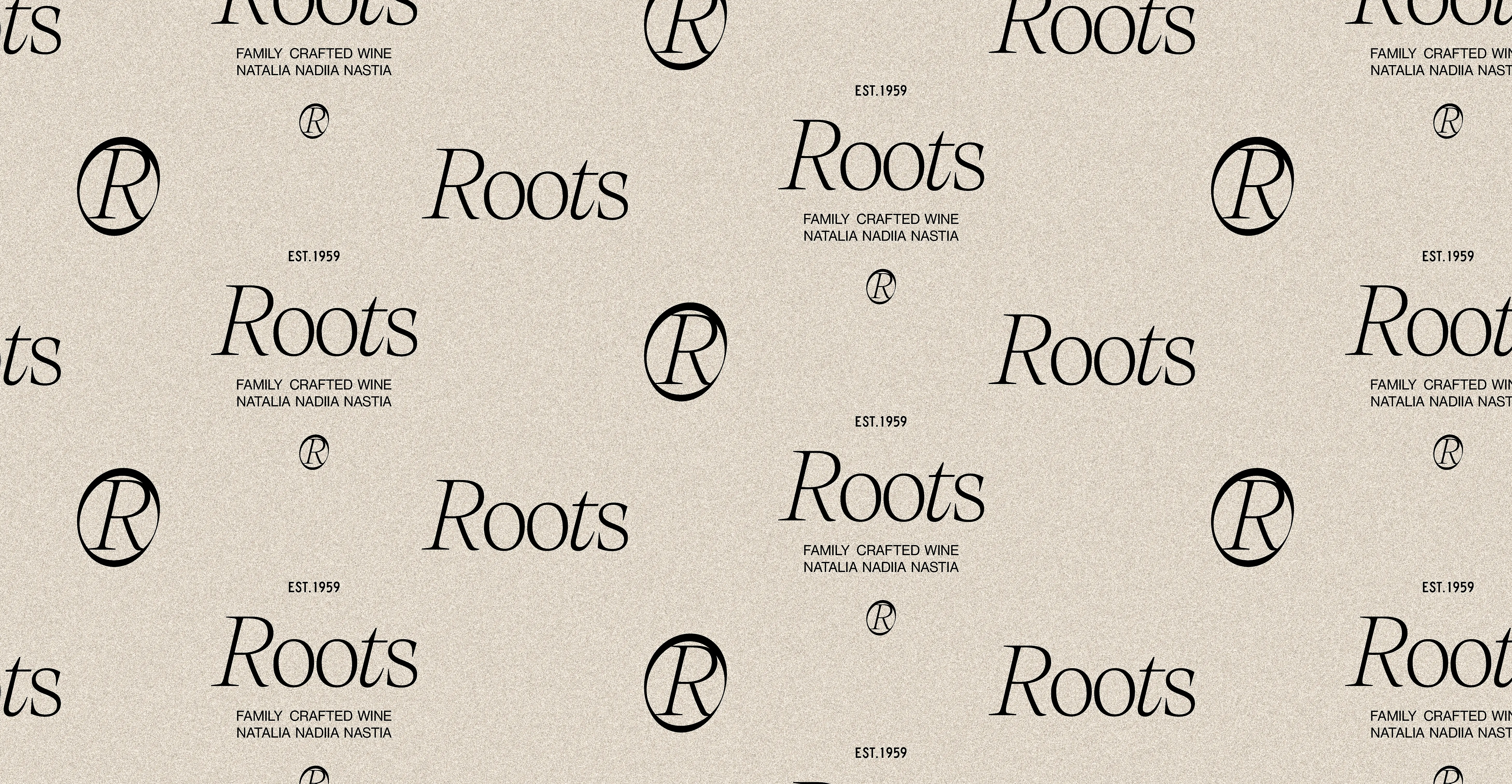
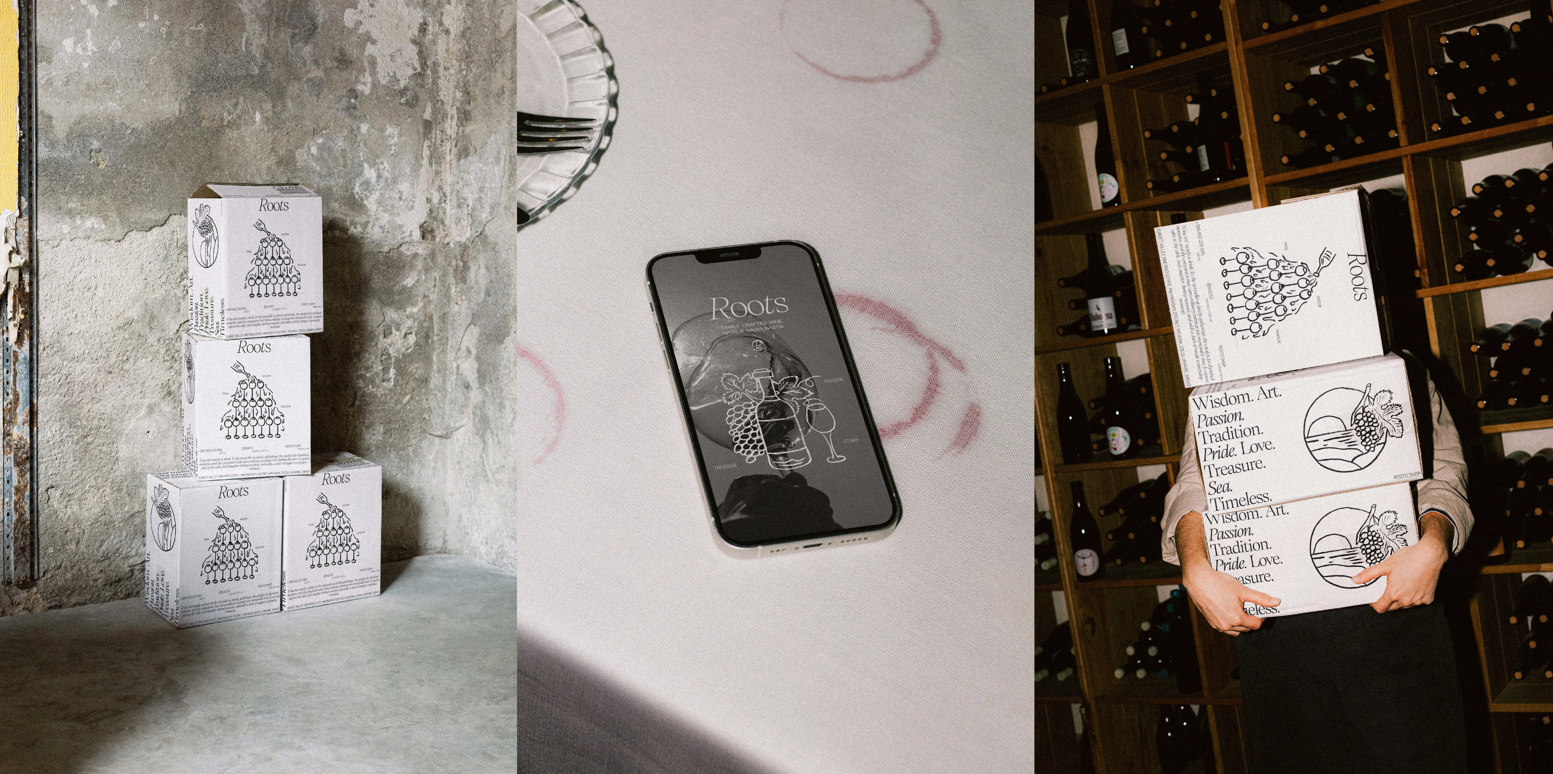
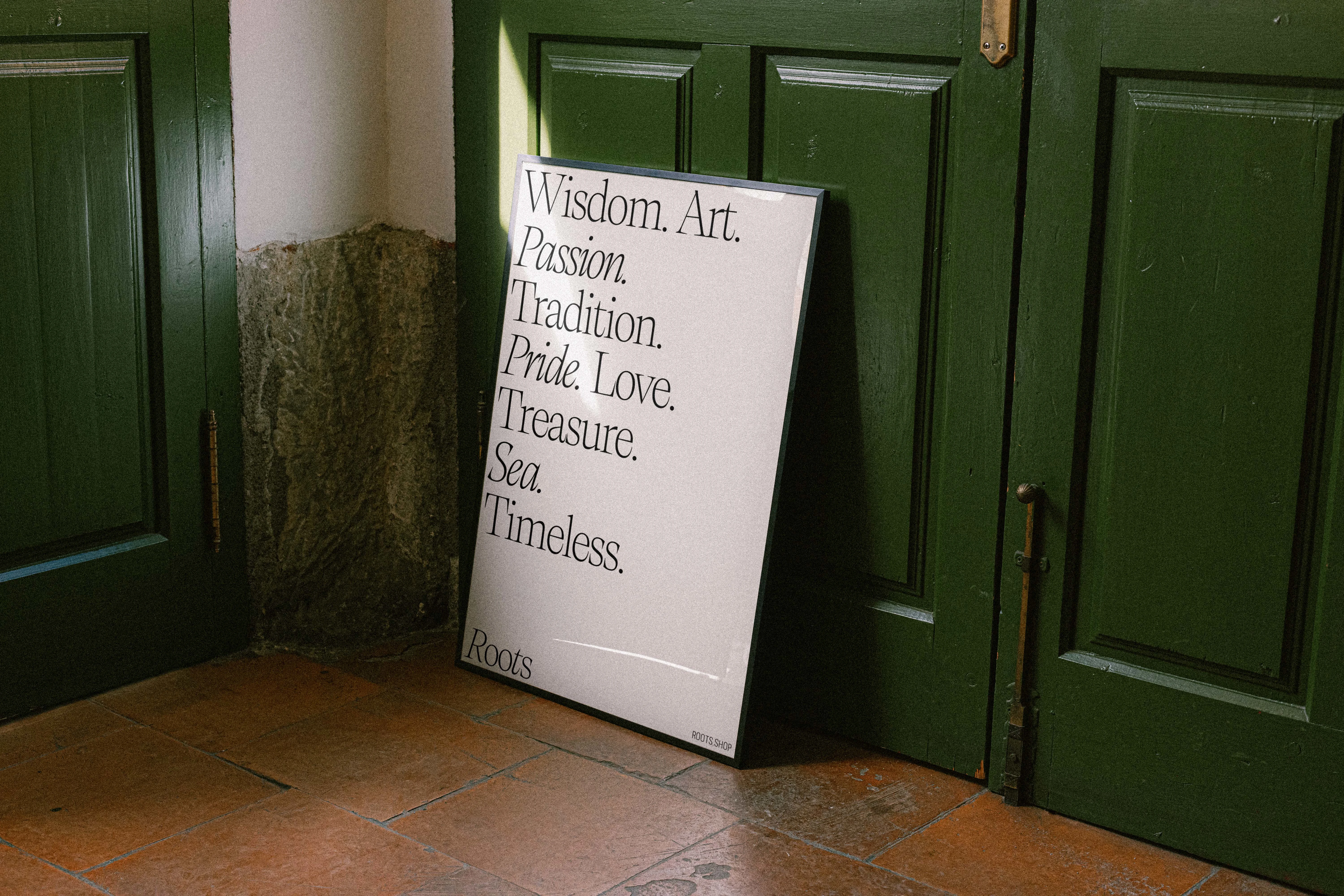
Typography: A mix of serif and handwritten fonts highlights elegance and personal touch. Key words like Passion, Tradition, Wisdom are scattered across labels and materials to communicate the vineyard’s values.
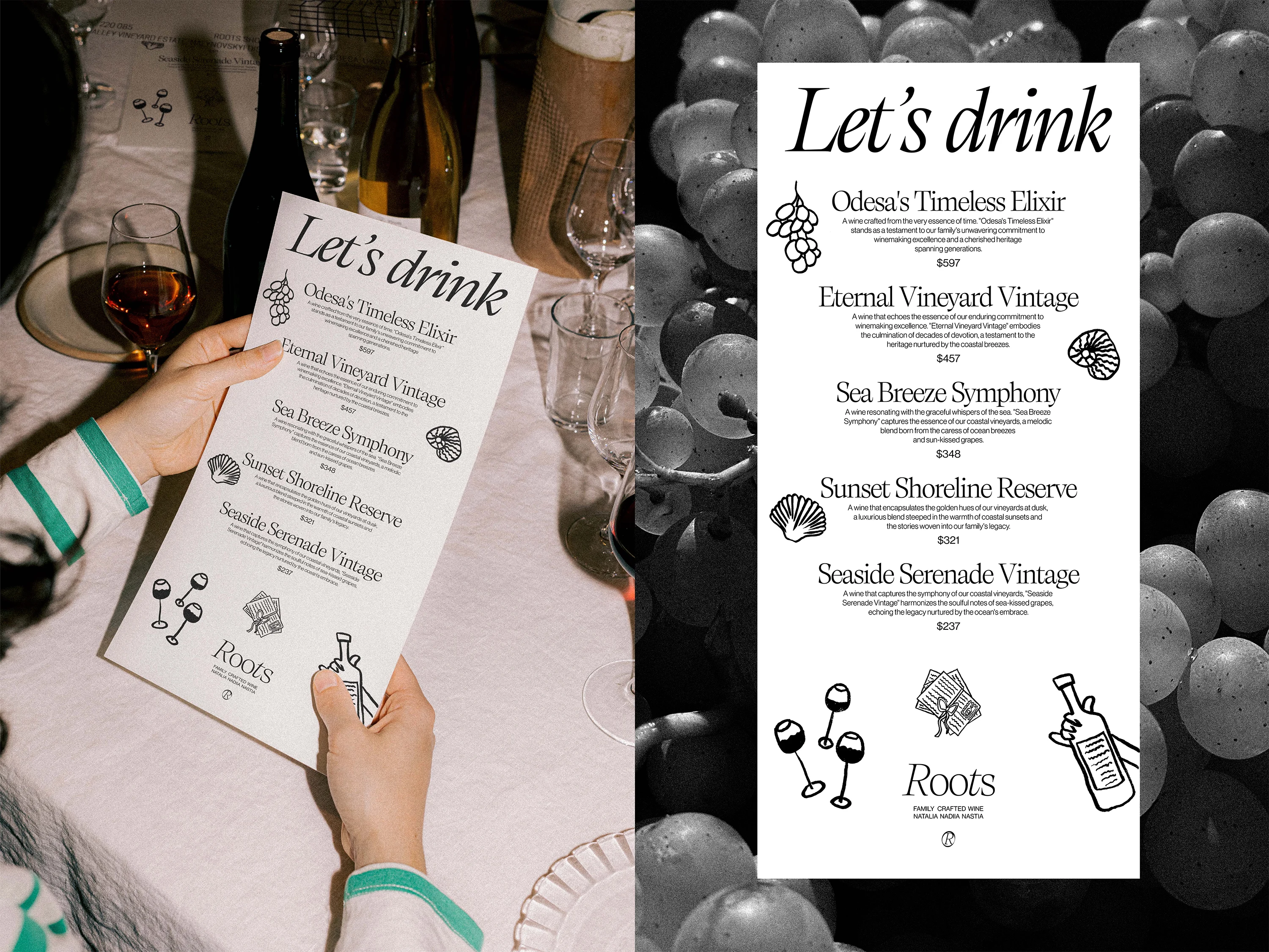
Naming & Slogans: Unique names like “Odesa’s Timeless Elixir” and “Sea Breeze Symphony” paired with evocative slogans such as “Ocean-kissed heritage” create a sense of enchantment and exclusivity.
Visual Style: Illustrations embrace subtle imperfections and handcrafted textures to reflect the authentic character of the brand.
Hand-painted grapes with thickness reflecting wine age.
Hand-drawn illustrations adding a crafted touch.
Serif and handwritten fonts highlight elegance; key values scattered across labels.


Outcome
The identity clearly communicates the age, character, and story of each wine while establishing ROOTS Wine as personal, elegant, and memorable. Customers can sense the vineyard’s heritage, care, and craftsmanship in every bottle.
This project has earned significant recognition and found its spotlight on The Dieline. It’s the world’s leading website dedicated to the global package design community. Additionally, it has been showcased on their social media platforms, including Facebook and Instagram. You can explore the article at the following link.
Outcome
The identity clearly communicates the age, character, and story of each wine while establishing ROOTS Wine as personal, elegant, and memorable. Customers can sense the vineyard’s heritage, care, and craftsmanship in every bottle.
Like this project
Posted Dec 27, 2025
ROOTS Wine: handcrafted identity and labels showing each wine’s age, heritage, and artisanal story with unique illustrations and typography.