Wire me - A Premium Fintech SaaS Template

Prem Shandilya


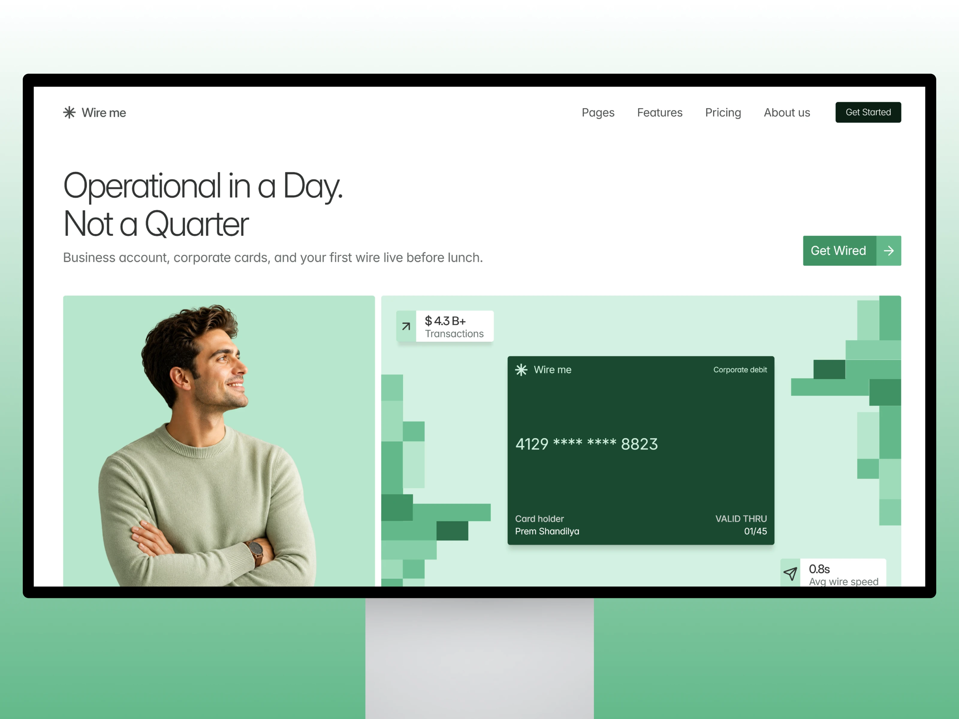
Wire me - A Premium Fintech SaaS Template
Project: Premium Framer developer for fintech and expense management SaaS
Role: Design, Framer development, Custom UI assets
Scope: Full Marketing site from 0 - 1, Home, Pricing ( 3 layouts ) about, legal, style guide
Live: wireme.framer.website
The Problem
Most fintech templates are empty shells. Generic gradients, stock dashboard screenshots, headlines like "streamline your finances" that could sell anything. The founder still has to do the hard part: making a visitor believe the product exists. Wire Me does that part for them.
The approach
Show the product, not adjectives
Every feature section is built around a working UI card: a corporate debit card, a live expense chart, a bill automation panel, a savings intelligence breakdown. The visitor sees what the product does before reading a word.
A style guide built in.
Wire Me ships with a full style guide page: type scale, colors, buttons, cards, all in one place. Change a value there and it carries through the whole site. It's the difference between a template you fight and one you rebrand in an afternoon.
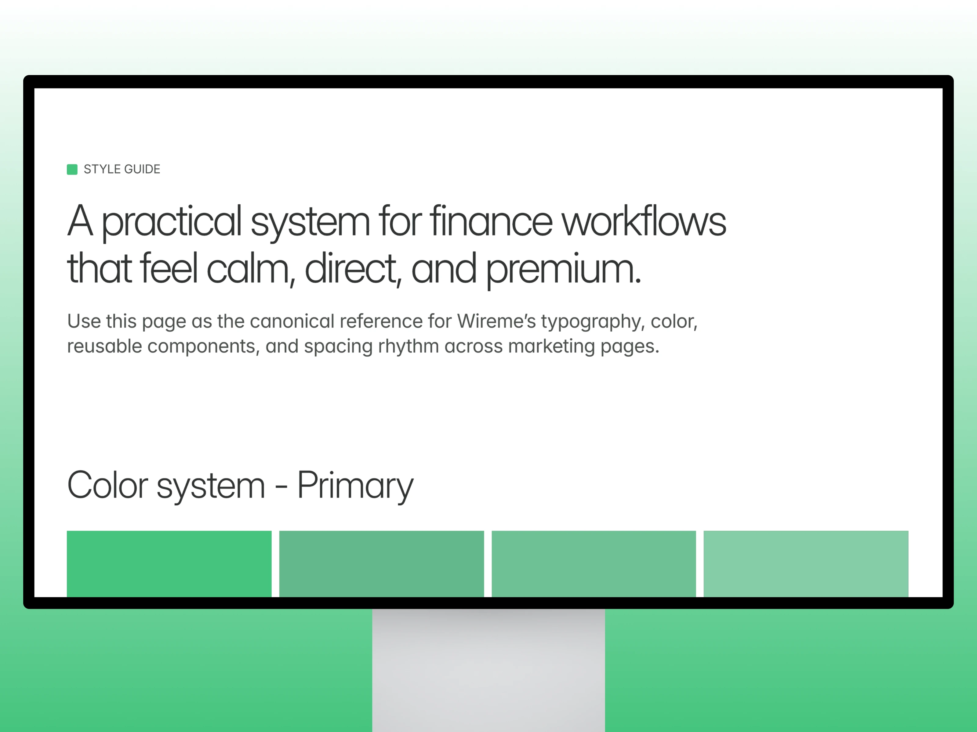
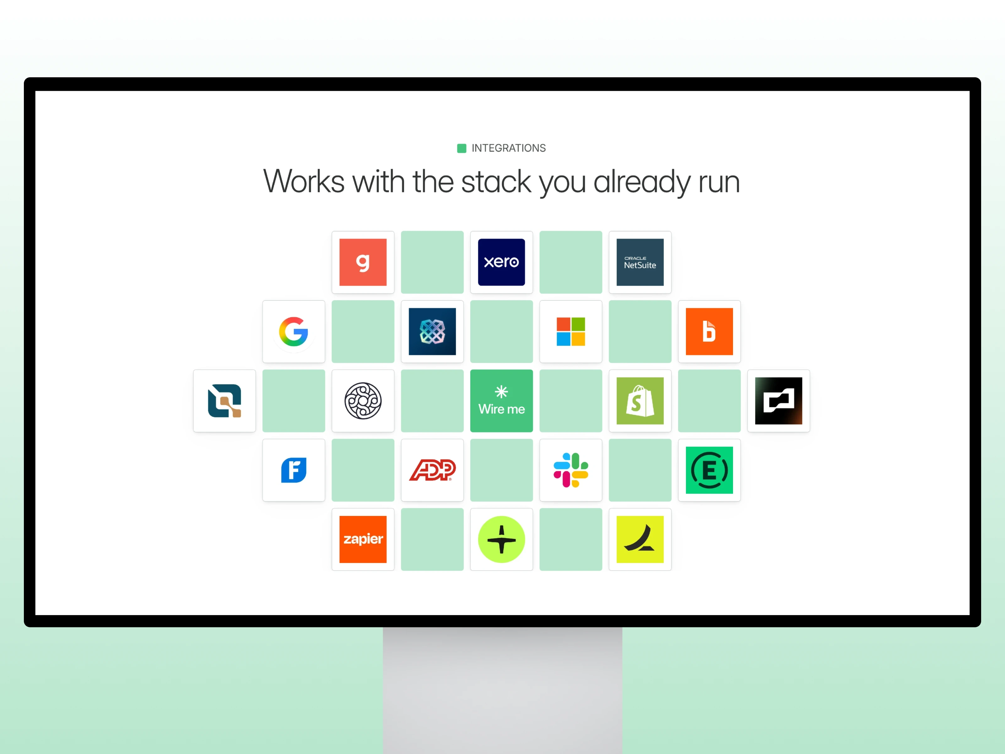
Designed from Scratch, no stock
Take the integrations section. Most templates handle it the lazy way: grab some logos off Google, drop them in a grid, done. In Wire Me, I built every integration card by hand in Framer so it sits in the design like it belongs there. Part of the product, not a badge wall. And that's the standard across the whole template. If you zoom in anywhere, you'll find a decision, not a placeholder.
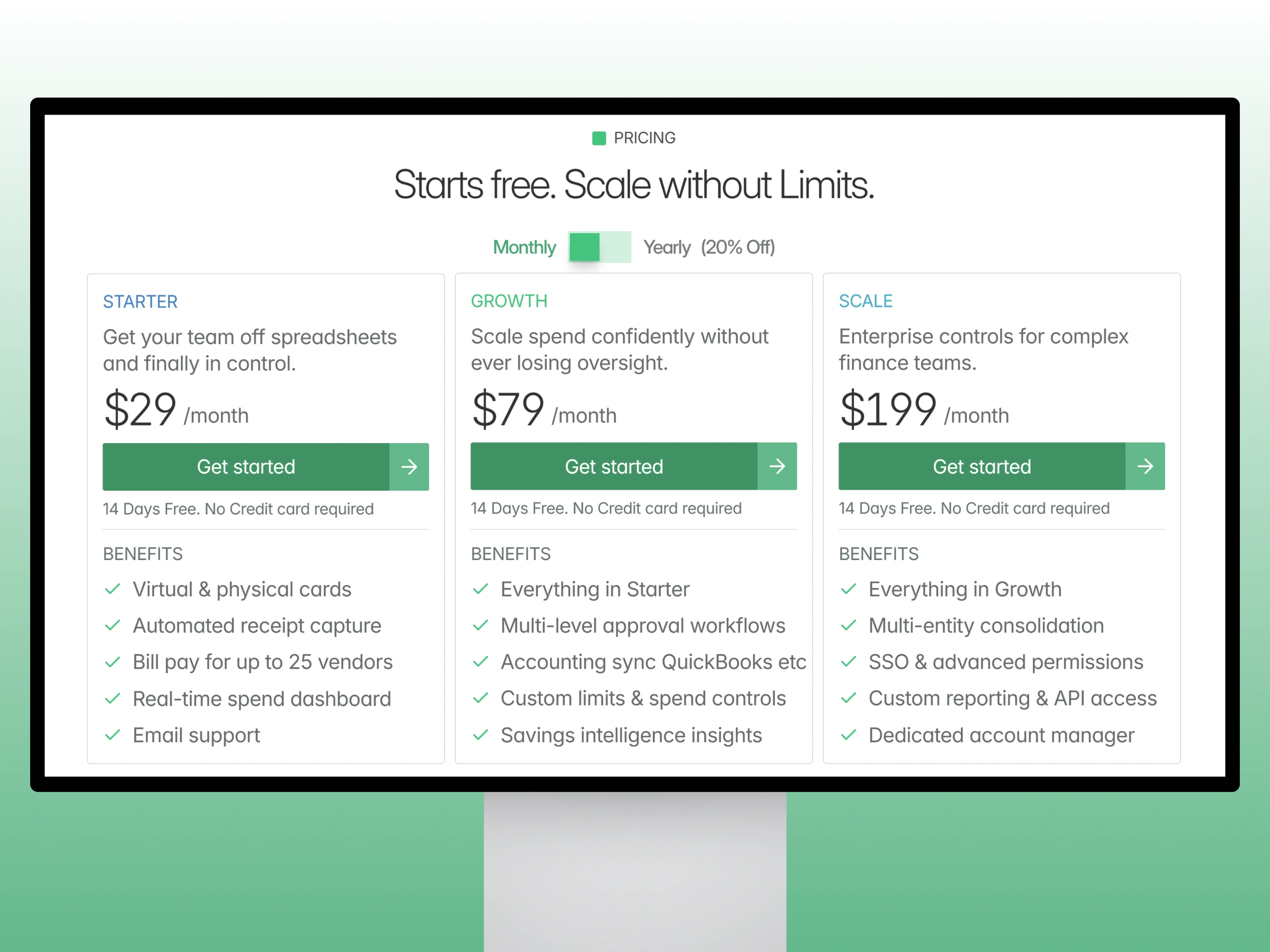
Build to be edited
Three pricing page layouts and cleanly organized components mean a buyer can restructure without touching anything fragile.
Thanks For Watching :)
Closer
Want a custom version of this for your product? Let's talk.
Like this project
Posted Sep 3, 2024
Premium Framer template for fintech SaaS. Hand-built UI cards, a full style guide page, two pricing layouts. Launch-ready in days.
Likes
0
Views
18