UX Redesign of Give Donation Platform

Ali Ezzati


Designing Trust — The UX Behind a Donation Platform People Actually Use
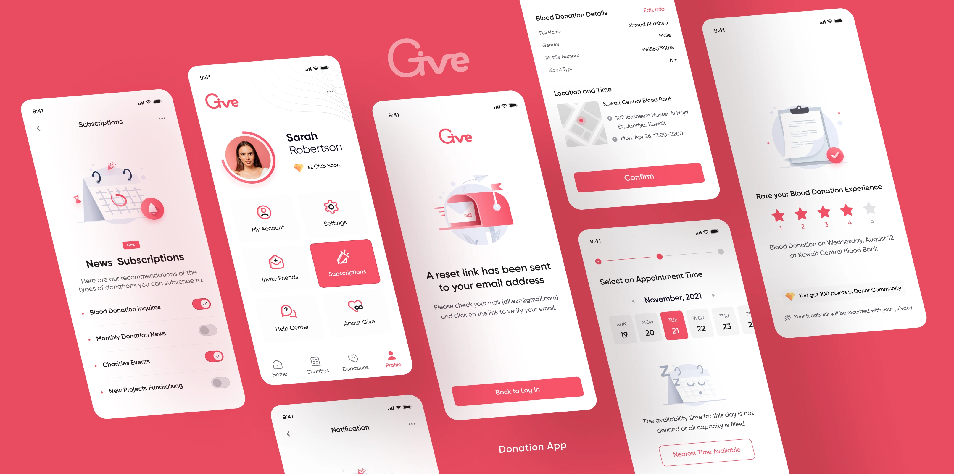
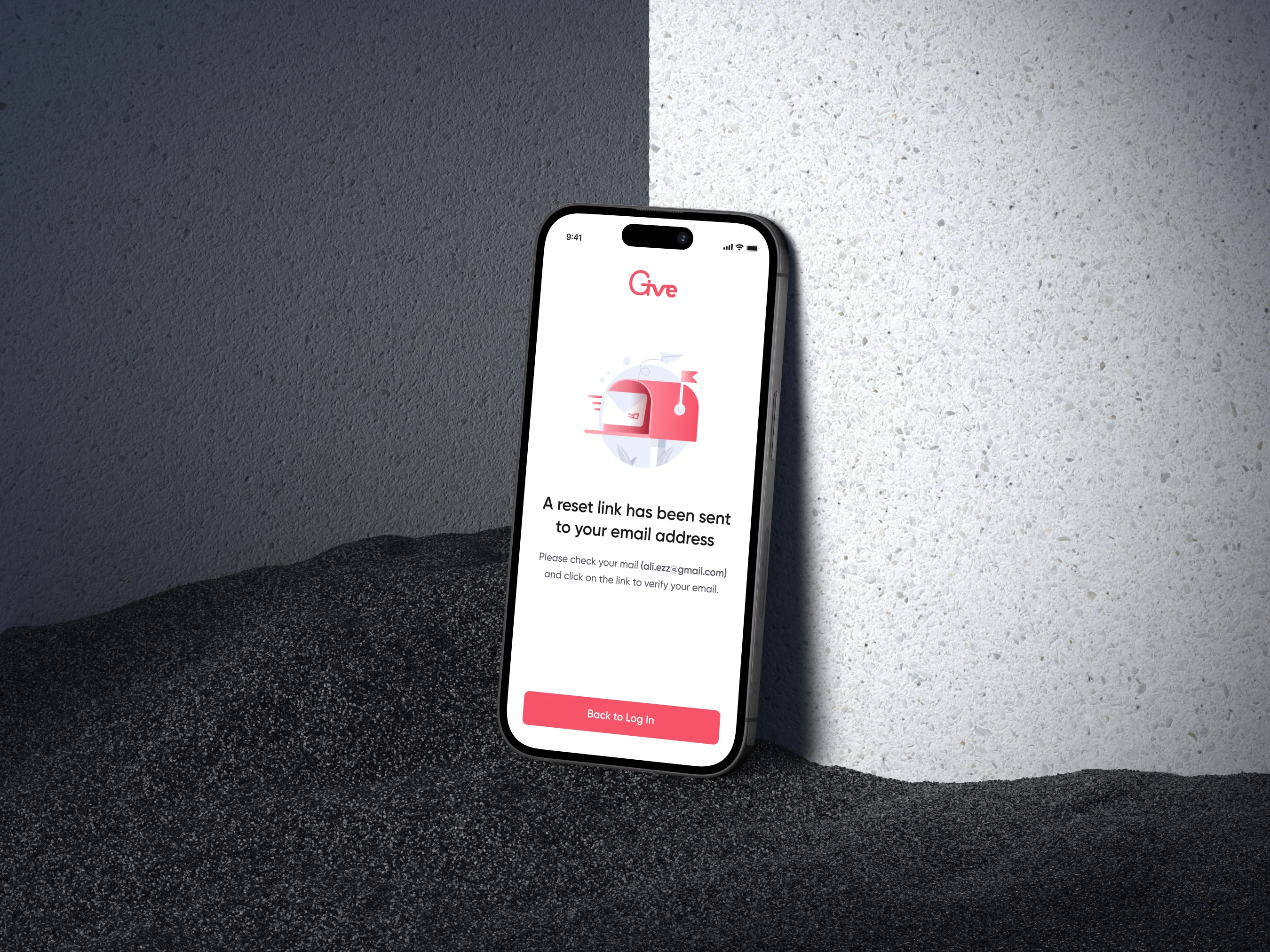
Screenshots from the Give app
People want to do good, but friction often gets in the way. Give is a Kuwait-based non-profit platform designed to facilitate charitable donations, increase transparency, and help users discover meaningful causes.
As the sole Product Designer, I was tasked with an end-to-end redesign of the Give app. My goal was simple but ambitious: remove the friction from generosity. By overhauling the core user flows, establishing a scalable design system, and fundamentally rethinking the app’s information architecture, I transformed a confusing interface into a trusted, seamless experience.
A platform built on trust, held back by UX
Trust is the currency of any donation platform. Users need to feel confident that their money is going exactly where they intend. However, despite Give’s noble mission and registered charity status, the platform’s interface wasn't communicating that trustworthiness.
When I joined as the sole product designer, I inherited an app that worked technically. But the experience? It felt like trying to give generously through a form from 2015.
"The product's mission was trust and transparency. The experience communicated neither."
My goal was clear: redesign the end-to-end experience — from information architecture and navigation to visual identity and developer-ready design specifications — while maintaining the depth of features users relied on.
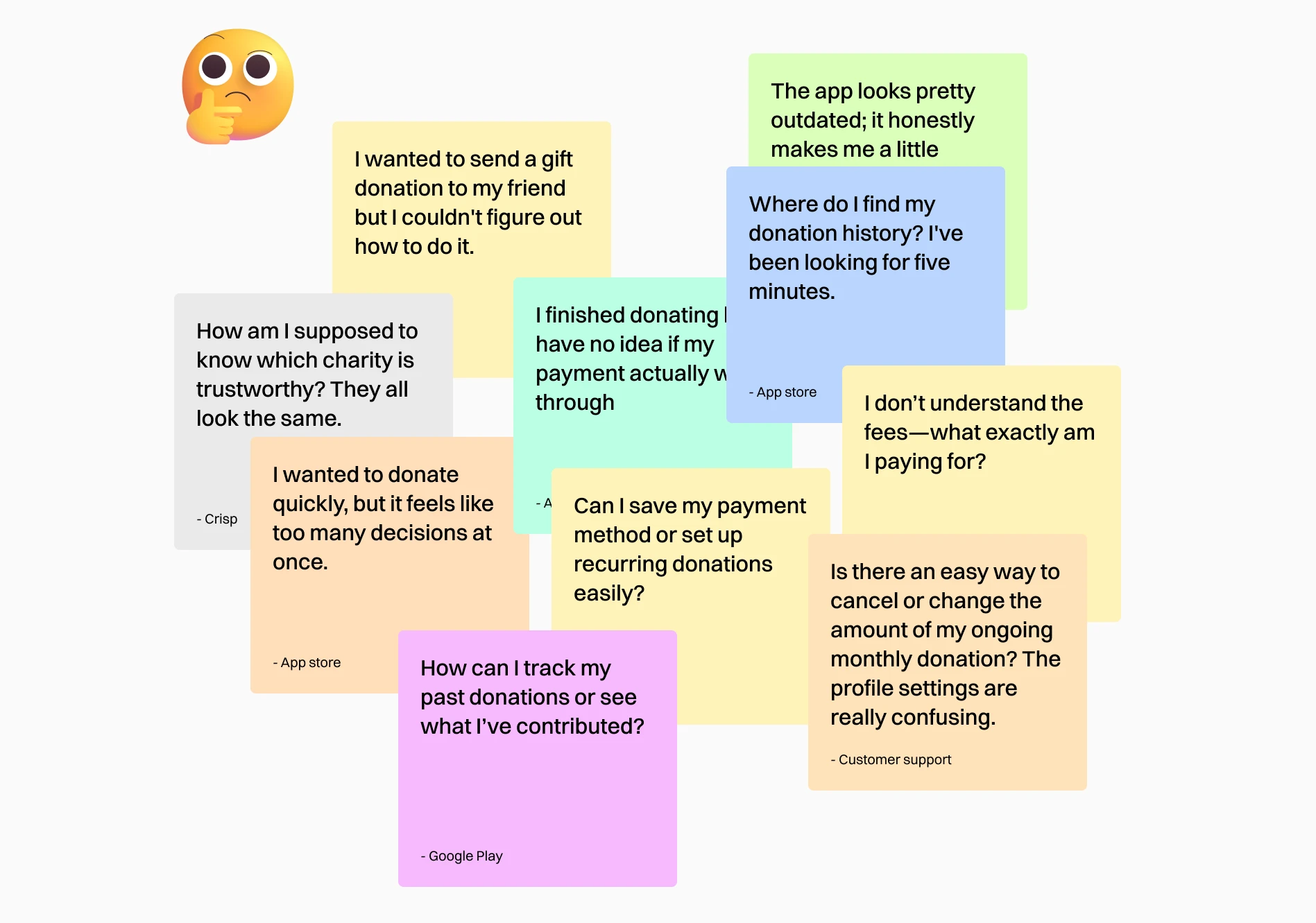
Reviewing feedback items from different sources
Where users struggled — and why
Before touching a single frame, I conducted a UX audit and heuristic evaluation across all primary flows. The patterns were consistent and damning.
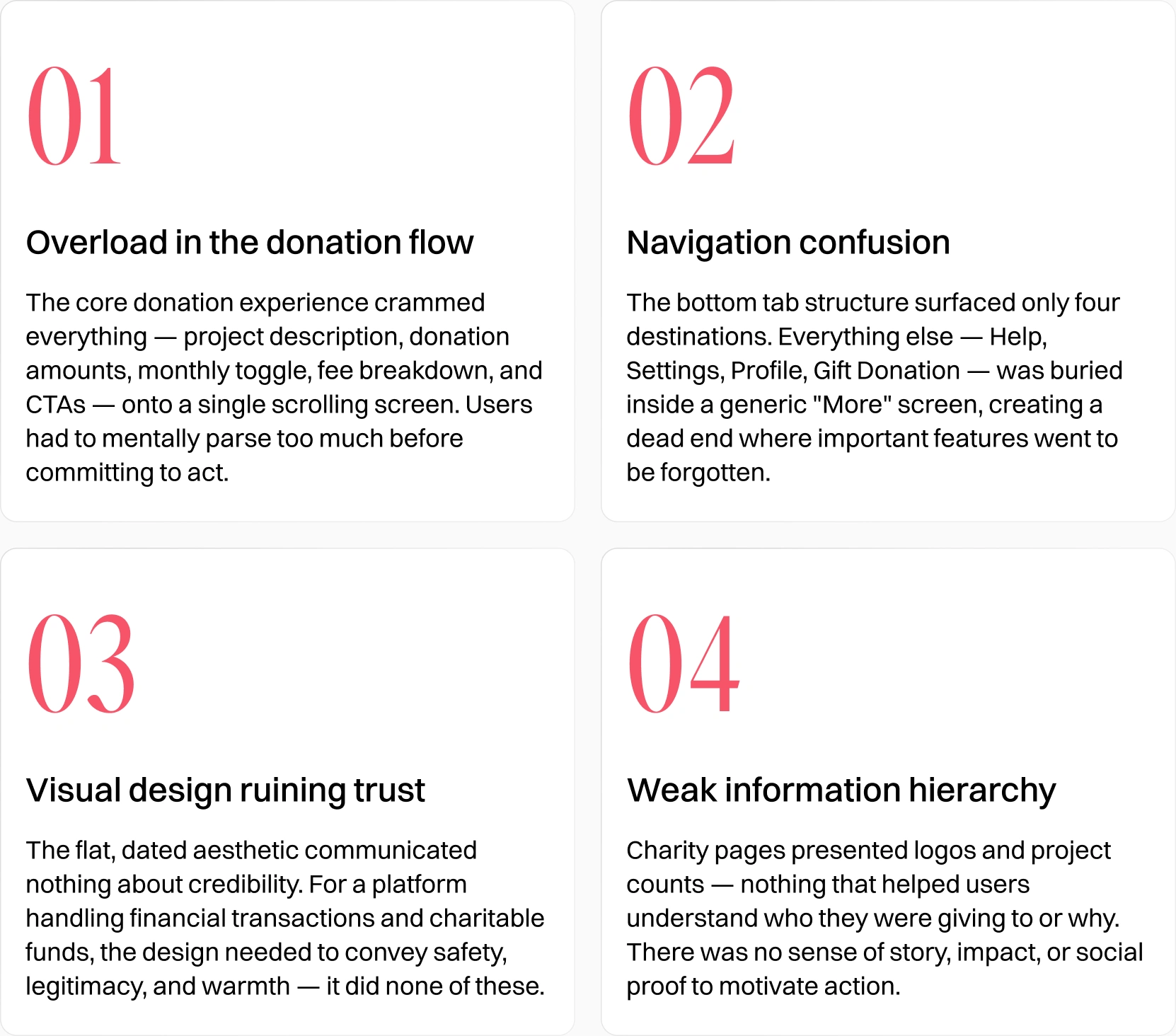
Four main patterns found
The heuristic evaluation flagged violations across visibility of system status, match with the real world, error prevention, and recognition over recall. These weren't cosmetic problems — they were architectural ones baked into the product's structure.
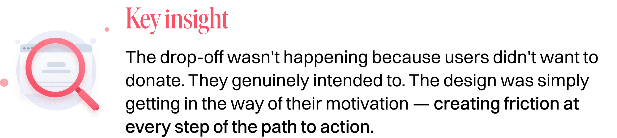
Turning complexity into clarity
The redesign wasn't just a visual refresh. I approached it as a structural rethink — one that started with navigation, then flows, then surface-level polish. Every decision had a rationale rooted in behavioural design principles.
Wireframes as decision-making tools
Before touching color or type, I mapped every key flow in low-fidelity wireframes. This let me stress-test navigation logic, validate information hierarchy, and align with engineers on what was technically feasible — without the distractions of visual polish. Wireframes became a shared language rather than deliverables for their own sake.
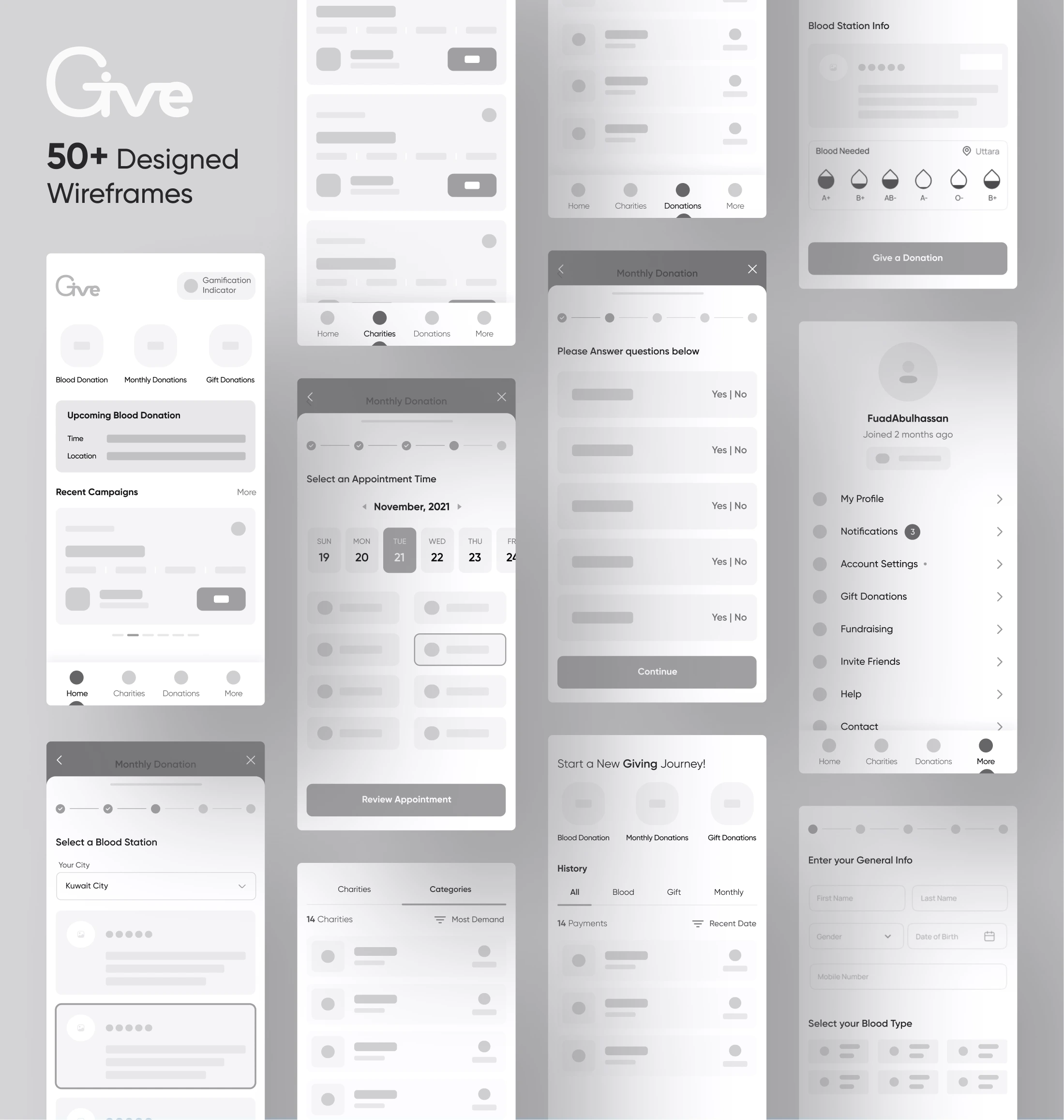
The wireframes designed after the research phase
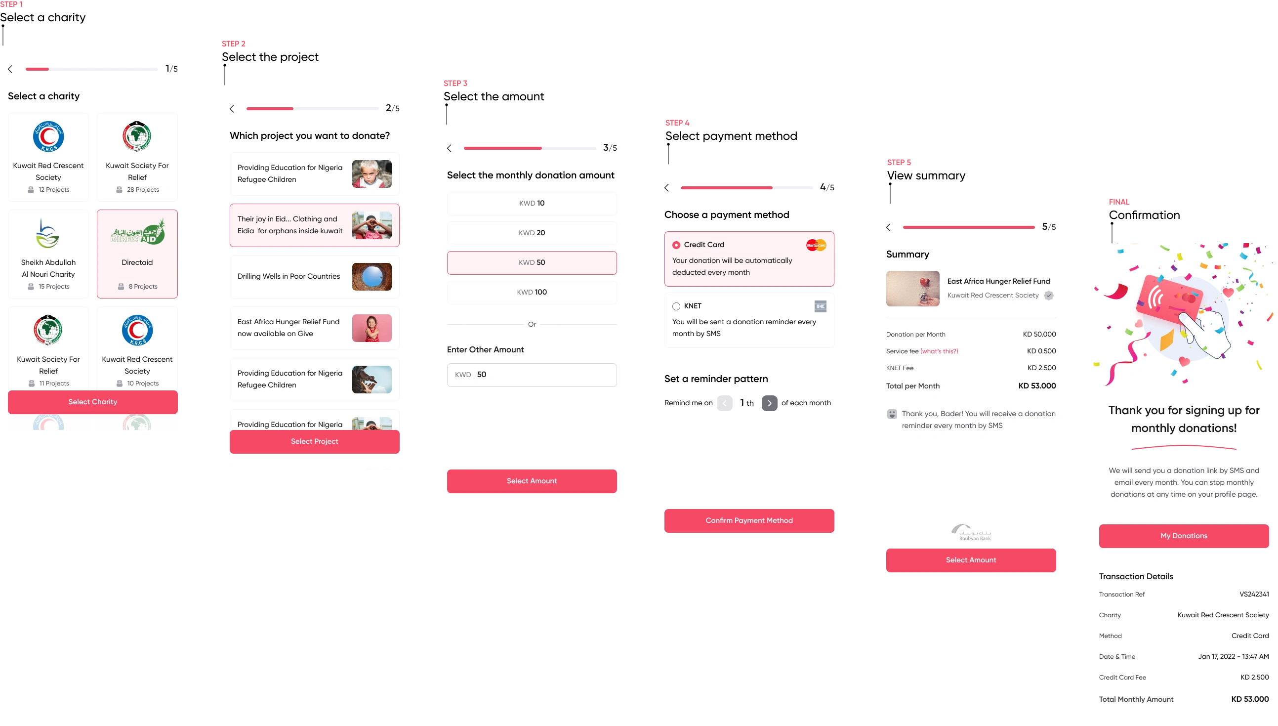
Decomposing the donation flow
One of the impactful changes I made was breaking the single-page donation experience into a clear, multi-step flow. Instead of showing everything at once, the redesigned flow guides users through one decision at a time:
Select Project & Amount: Pre-set denomination buttons (KD 1, 5, 10, 20, 50, 100) plus a custom field. Visually prominent, one decision per screen. Progress indicator shows where users are in the journey.
Choose Payment: Clear payment method selection — credit card, Apple Pay, KNET — presented without jargon. Fee transparency built in so there are no surprises at checkout.
Confirm & Done: A celebratory confirmation state with full transaction details. Success feels earned. Error states are equally designed — clear, human, and actionable rather than generic red error messages.
Restructuring navigation
Navigation should reflect how users think about a product, not how the product was built internally. Moving Search into the tab bar, replacing "Monthly Donation" as a nav destination, and transforming "More" from a dead-end into a personalized account hub were all decisions rooted in the same idea — every tap should feel intentional and rewarding. The new bottom nav — Home, Search, Charities, More — maps to genuine user intentions rather than internal product categories. The bottom navigation was reorganized to reflect user mental models, with a persistent home screen that acts as a personalized dashboard rather than a static list.
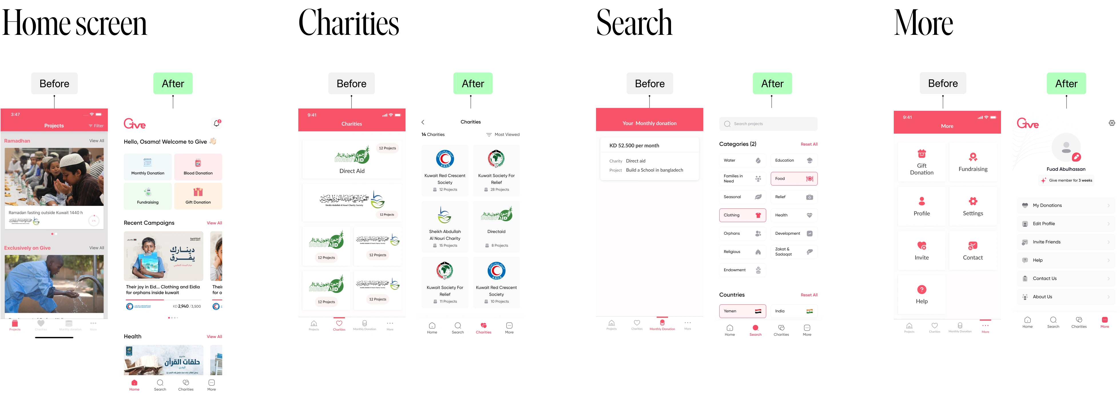
New Restructured navigation
Designing for trust and action
With the structure validated, I focused on the visual layer. I applied the Aesthetic-Usability Effect—the psychological principle that users perceive more aesthetically pleasing designs as more intuitive and trustworthy.
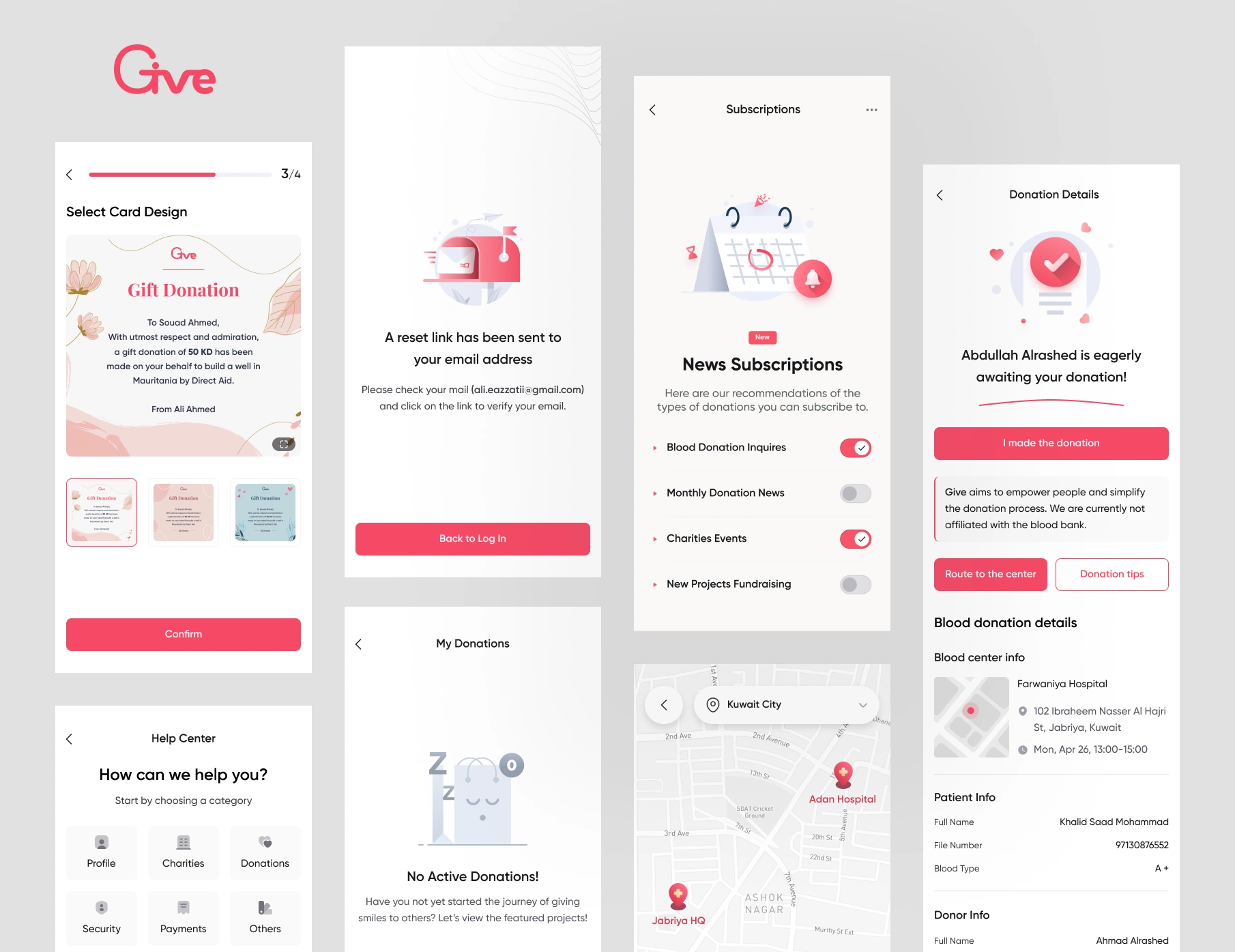
Elevating the Visual Language: I introduced a cleaner, modern interface with a modernized color palette, utilizing ample whitespace to let content breathe. This cleaner look was applied across the Home screen, Profile, and the newly refined Gift Cards section.
Enhancing Transparency: Donors want to know their impact. I restructured the charity and project detail pages to prioritize transparency. I surfaced key information—like charity registration numbers, project milestones, and clear descriptions—higher up in the visual hierarchy to build immediate trust.
Meaningful Feature Enhancements: To make the app more holistic, I designed interfaces for new and improved features:
Blood Donation Flow: A seamless way for users to register as blood donors.
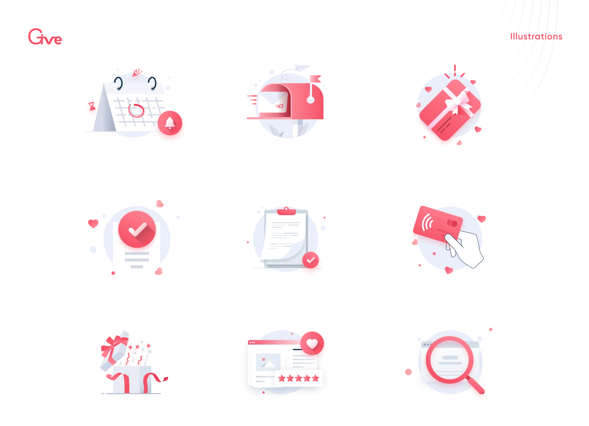
Branded Empty States: Instead of dead ends, empty states (like "No past donations") were populated with custom illustrations guiding users to discover new causes.
Social Proof: Added shareable donation success screens to encourage viral giving loops.
Building consistency behind the scenes
A redesign is only as good as its implementation. As a solo designer, I couldn't afford to let ambiguity slow down the engineering team.
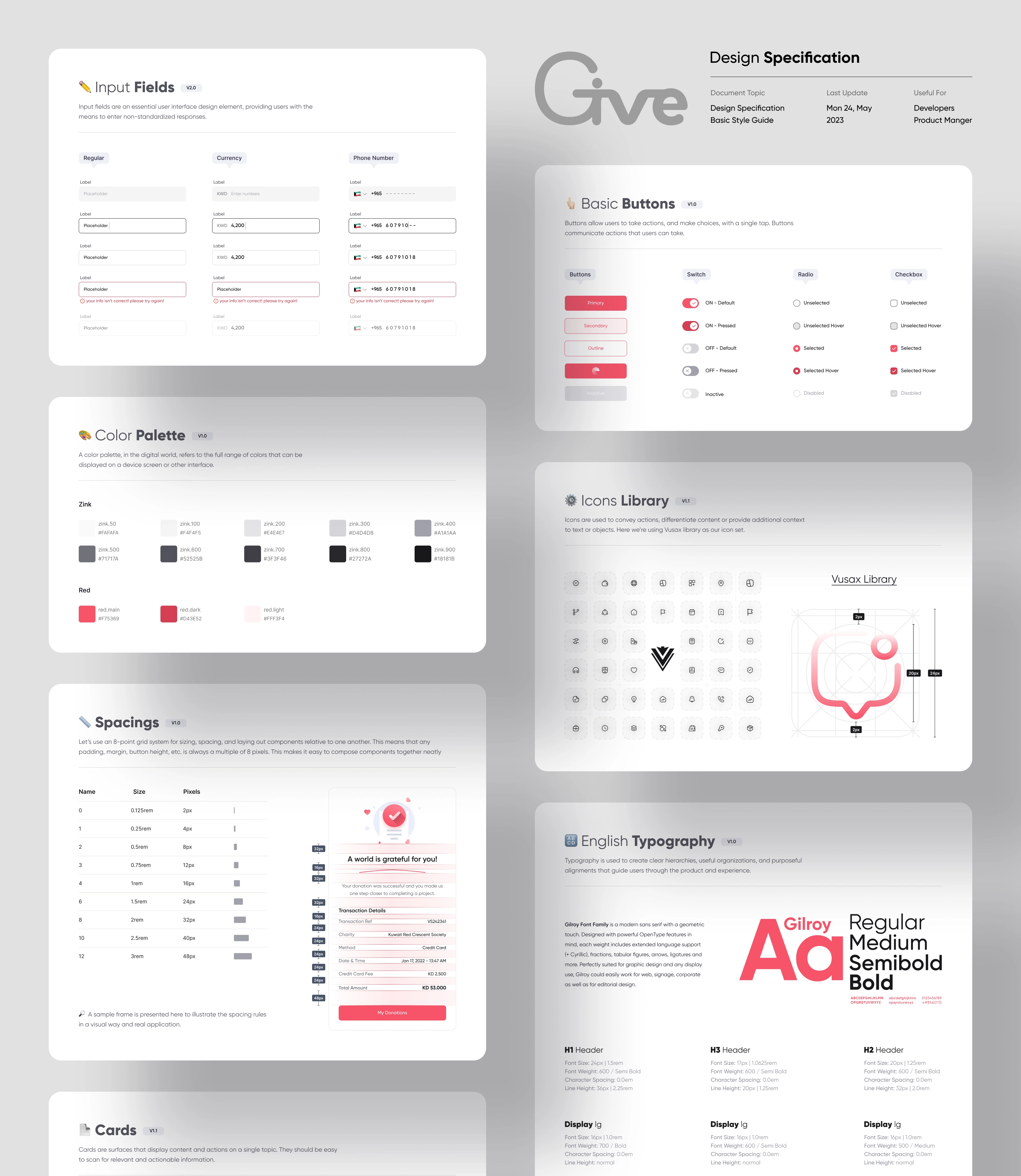
I established a foundational Design Specification from scratch. This wasn't just a UI kit; it was a shared language between design and engineering.
The specification system included:
Standardized typography and spacing tokens.
A scalable component library (buttons, input fields, cards, bottom sheets).
A custom, consistent icon library.
Clearly defined interaction rules and component states (hover, active, disabled, error).
Developer Handoff: I provided meticulously documented design specifications. By removing the guesswork around spacing, behavior, and visual styles, we drastically reduced back-and-forth alignment meetings and accelerated implementation speed.
What changed for users and the business
The redesign shifted Give from a functional utility to an empathetic, user-centric platform. By focusing on reducing cognitive load and building trust, the impact was immediately measurable following the launch.
Quantitative Impact:
📈 +19% Increase in Donation Completion Rate: The multi-step flow successfully removed the primary bottleneck.
⏱ -25% Time to Complete Donation: Despite having more screens, the clearer choices allowed users to move through the process significantly faster.
Qualitative Impact:
Increased Perceived Trust: User feedback post-launch frequently highlighted that the app felt "safer," "more official," and "much easier to use."
Reduced Support Tickets: The new Help Center and clearer error states reduced user confusion.
What I learned
Being the sole product designer on a project with such a meaningful mission was both challenging and incredibly rewarding.
Complexity is the enemy of conversion. I learned firsthand how deeply a cluttered interface can impact a business metric. Breaking a complex task into smaller, digestible chunks is one of the most powerful tools a designer has.
Systems save sanity. Investing time early in building a robust design system and writing clear developer documentation paid dividends during the handoff phase. It allowed me to scale my output as a solo designer without compromising on quality.
Design is an exercise in empathy. Designing a donation app requires a delicate tone. You are asking people to part with their money for nothing tangible in return. Every pixel, microcopy, and color choice must be optimized to foster trust and validate their generosity.
"The best design in a charitable platform is the kind that gets out of the way — so the act of giving can speak for itself."
Give was a product with the right mission and the wrong execution. The redesign was about closing that gap — aligning how the platform looked and felt with what it was trying to do in the world. I'm proud that the work moved real metrics, but I'm equally proud that it made the experience of giving feel as meaningful as the act itself.
Like this project
Posted Sep 15, 2026
End-to-end UX redesign of Give app to enhance trust and usability for donations.
Likes
2
Views
9
Timeline
Sep 19, 2022 - Sep 25, 2023
Clients
Give