Built with Framer
TokenMarketHub Web3 Onboarding Site Design
Alex Prokhorov
$1K+ earned
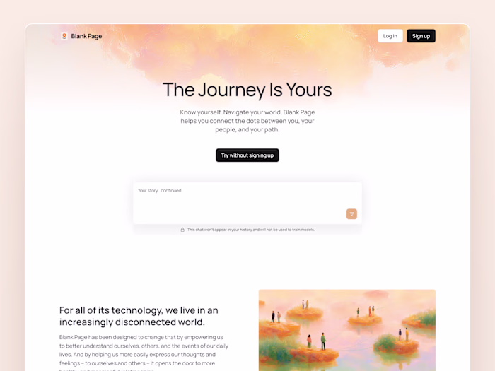
TokenMarketHub – Designed in Framer
TokenMarketHub is a project focused on helping Web2 users enter the world of Web3 with clarity and confidence. The crypto space can be intimidating, especially for tech-savvy people who want to explore but worry about scams, noise, and complexity. The goal was to build a site that felt modern, educational, and trustworthy — a safe place to get started.
I designed and built the site in Framer, combining a clean visual language with subtle interactions. The result is a fast, responsive site that balances clarity with engaging motion.
Blog Card Hover – Interactive Learning Experience
The blog section plays a key role in the onboarding process. It’s where users begin learning the fundamentals of crypto, so I wanted it to feel inviting and intuitive. I designed a hover interaction where each blog card lifts gently, the title slides up, and supporting info fades in with a smooth delay.
This interaction adds energy without distraction. It creates a rhythm of discovery as users explore the content. The goal was to make the learning experience feel active and approachable, turning basic blog browsing into something more engaging and confident.
ETH Coin Animation – A Familiar Anchor
In a section focused on token education, I introduced a looping ETH coin animation. It spins slowly with soft easing, catching attention just enough to create curiosity. It’s a small detail, but it helps ground the experience in the real mechanics of Web3.
Rather than overwhelming users with unfamiliar symbols or flashy visuals, the animation adds a single, steady reference point. It suggests that yes, this is crypto — but in a calm, human, and approachable way.
CTA Section – Soft Motion That Builds Trust
At the bottom of the page, the main call-to-action needed to feel like a natural next step, not a hard sell. I created a background with animated tokens that gently shift and float based on cursor movement. This gives the section a sense of motion without demanding attention.
The CTA button itself has a subtle scale and blur effect on hover, reinforcing the sense of responsiveness and quality. Everything in this section was designed to convey momentum — but calmly. It invites users to take the next step while still feeling in control.
Final Thoughts
TokenMarketHub is not about hype. It’s about clarity, education, and trust. My approach was to reflect that through every element — from layout and typography to motion and interaction. Framer made it possible to keep everything in one environment, from initial concept to the final responsive build.
Each piece was crafted to help users feel welcomed, informed, and ready to take their first steps into Web3 — without the noise.
Like this project
Posted Jun 11, 2025
A Framer site designed to help Web2 users explore Web3 safely, with smooth interactions, subtle animations, and a focus on clarity and trust.
Likes
14
Views
345
Earned
$1K+
Timeline
May 21, 2025 - Jun 10, 2025