Casa De Ele - Brand Identity
Hardik
Like this project
Posted Jun 12, 2026
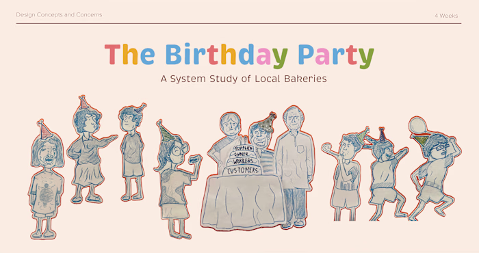
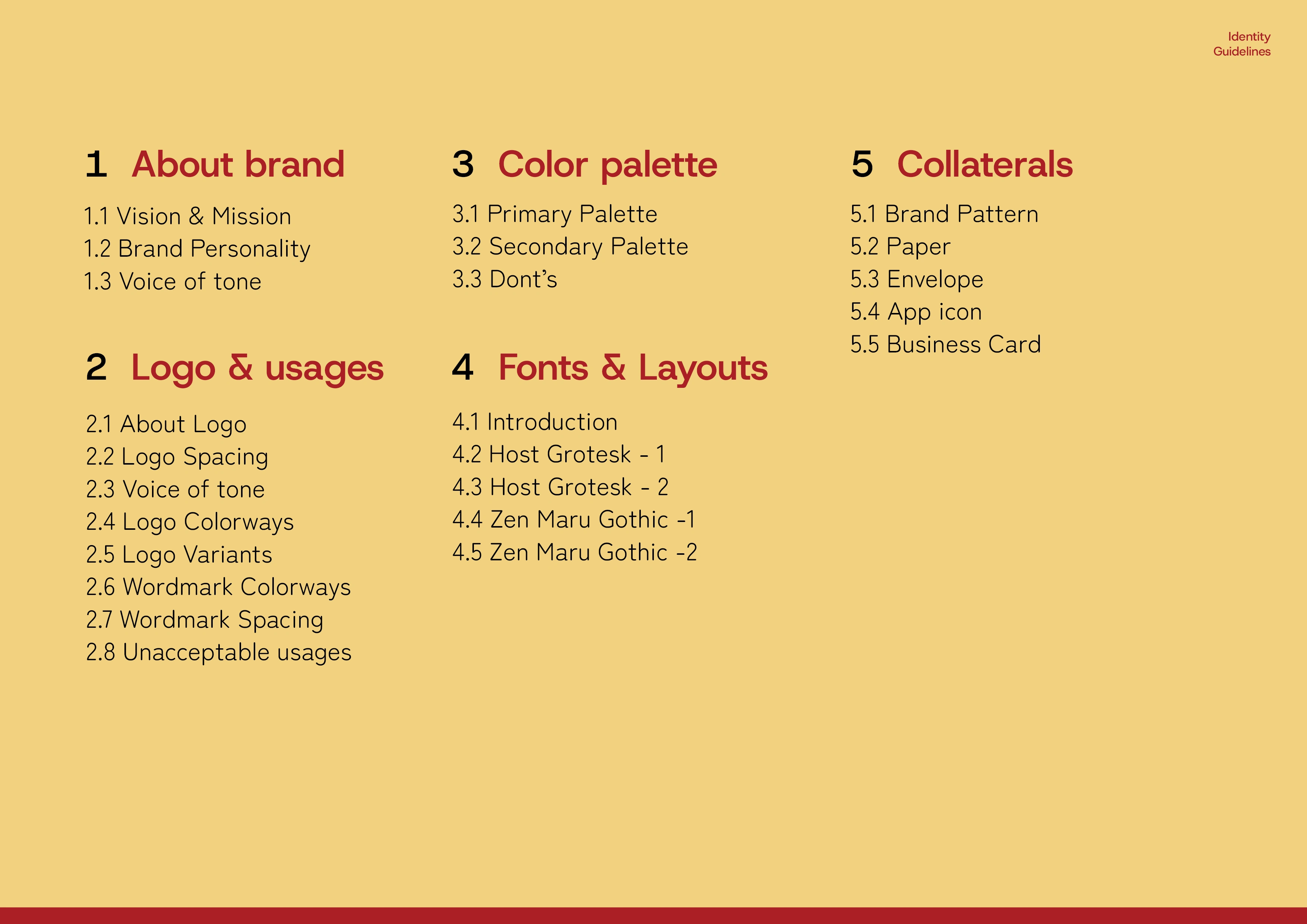
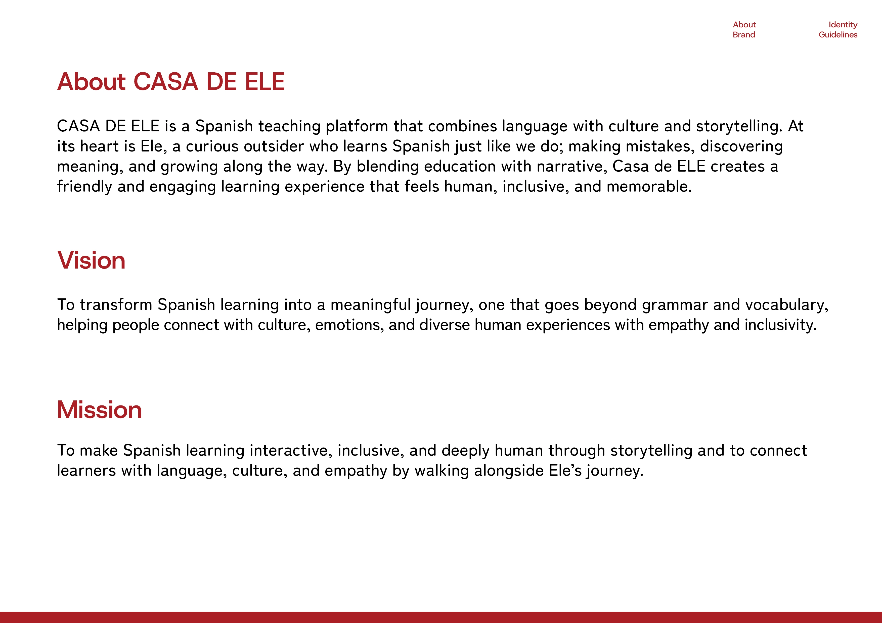
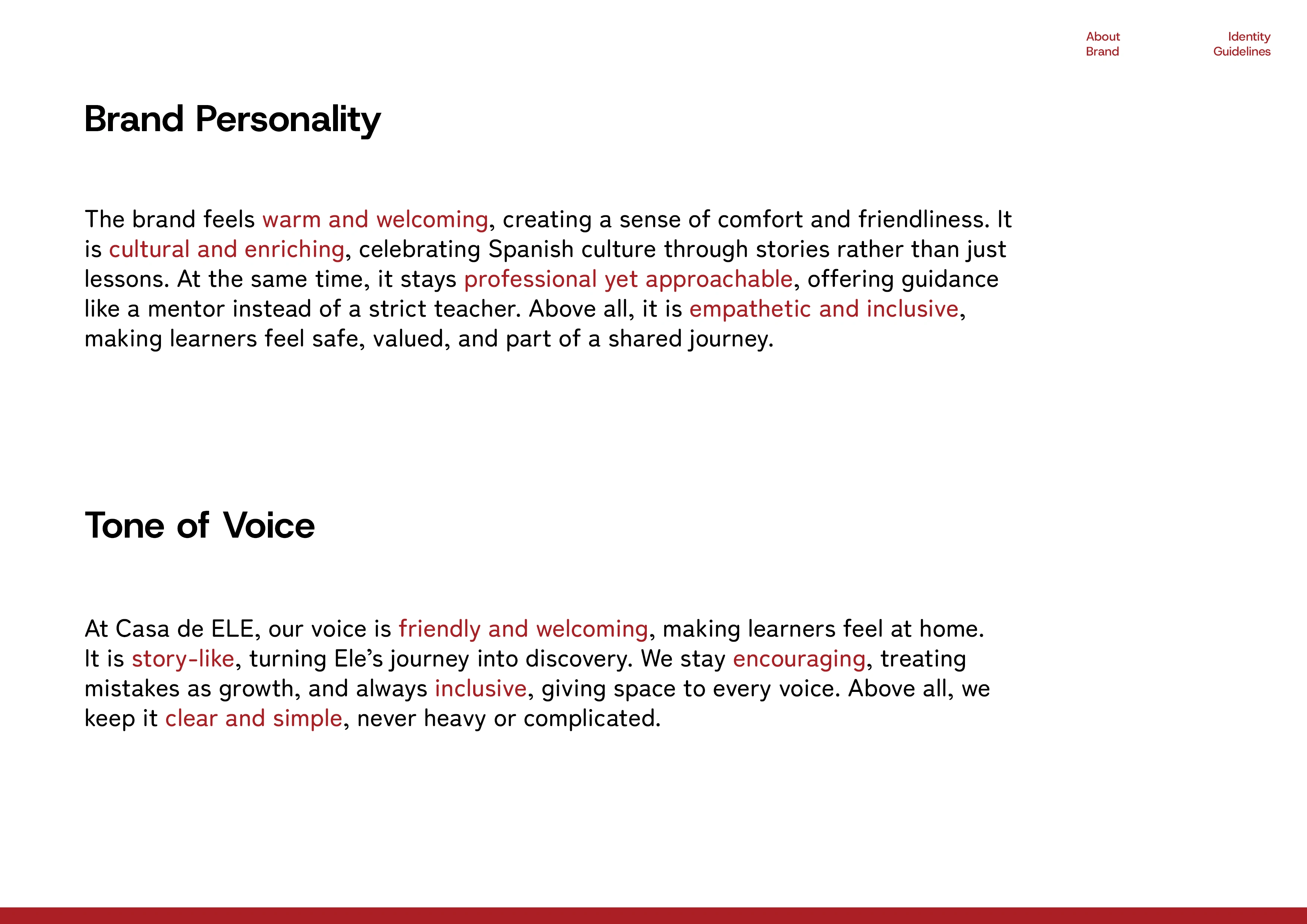
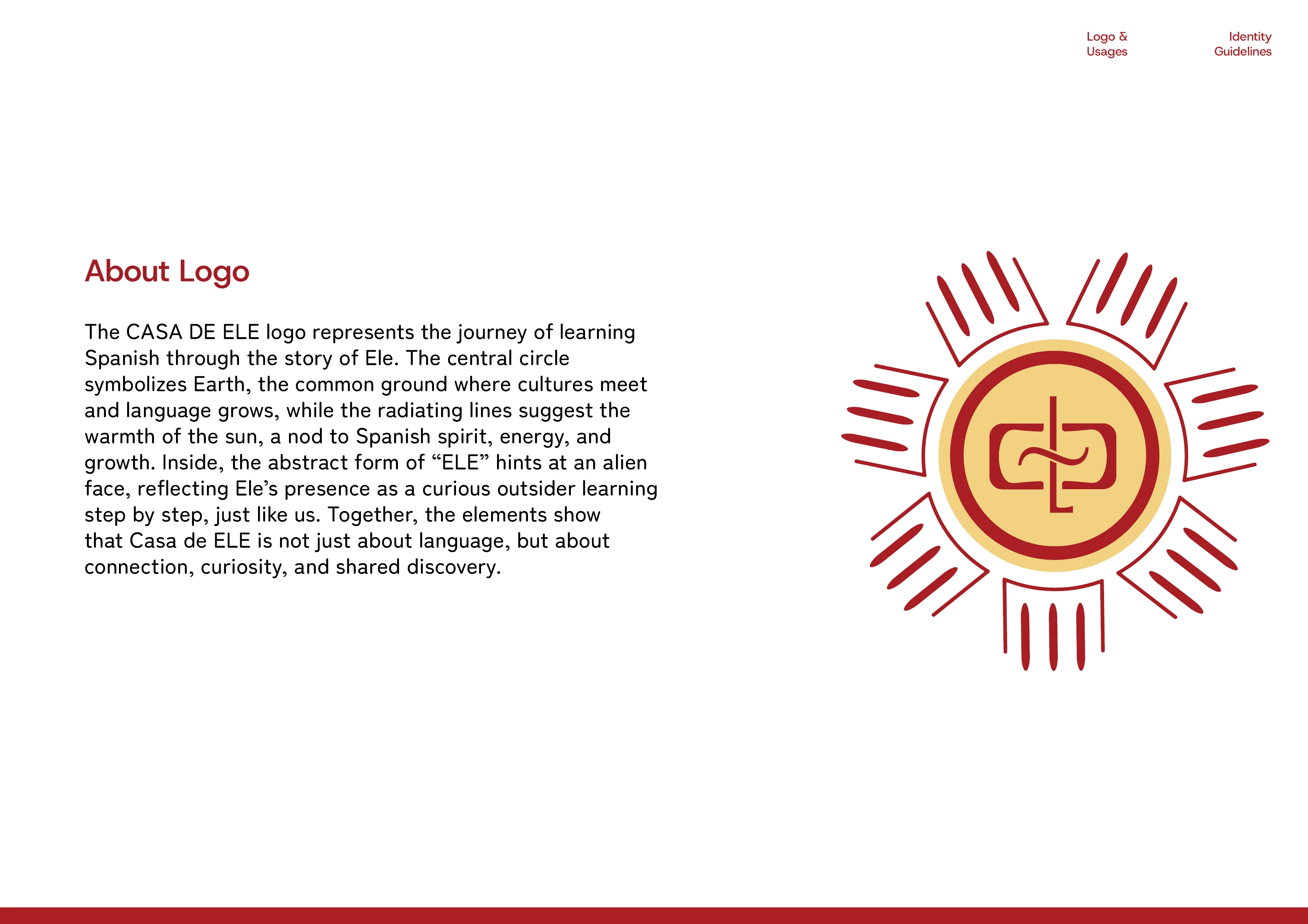
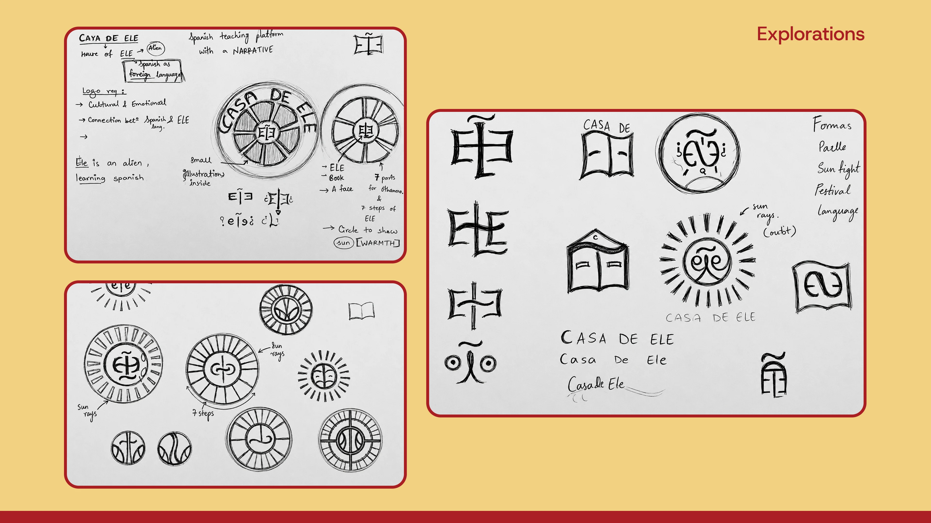
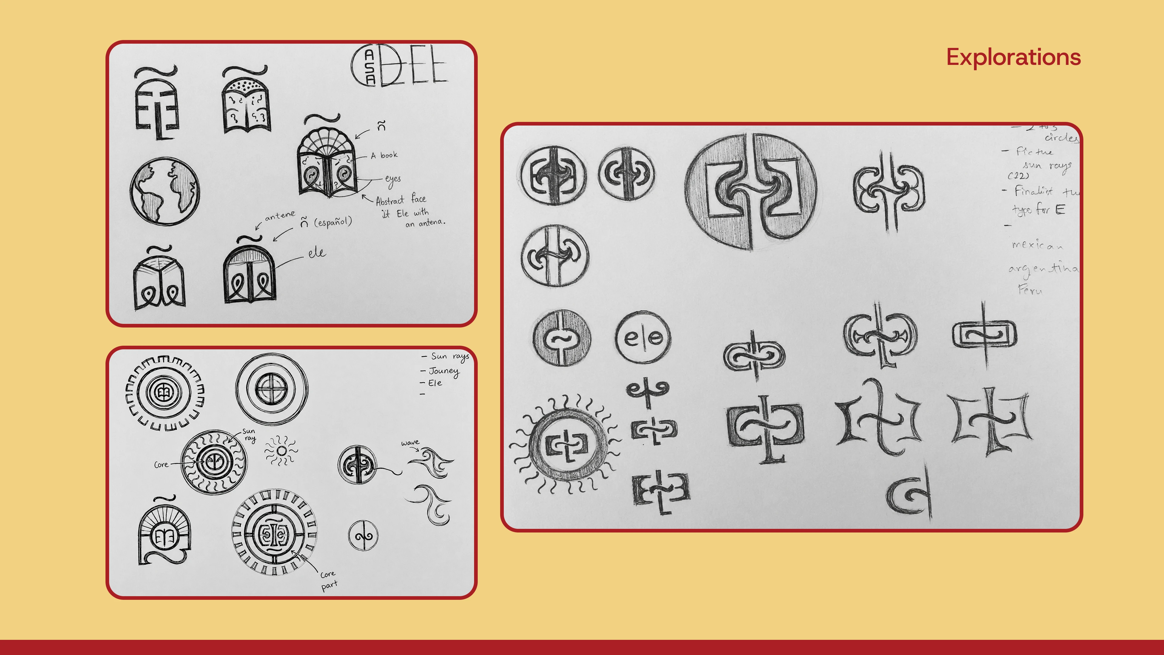
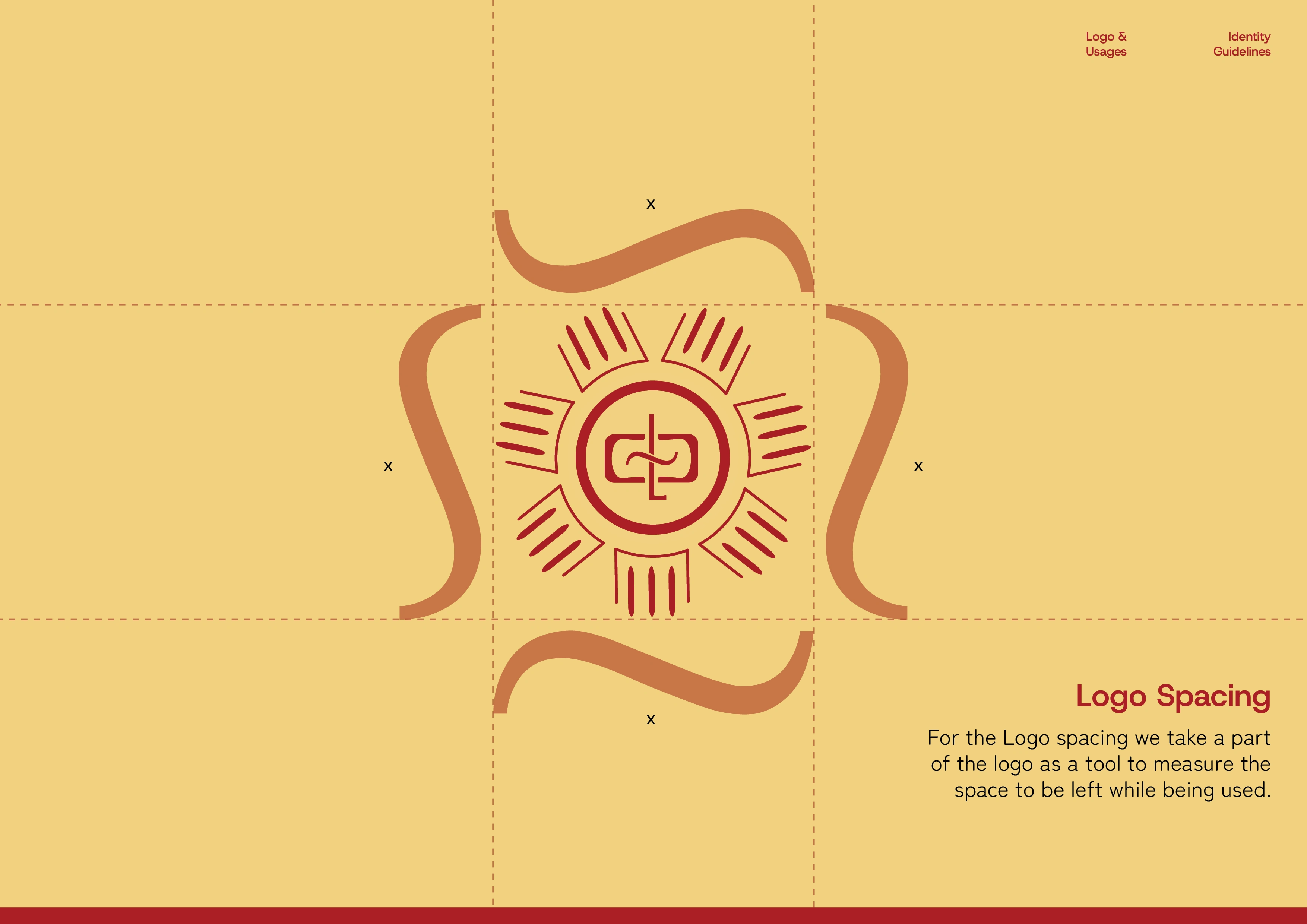
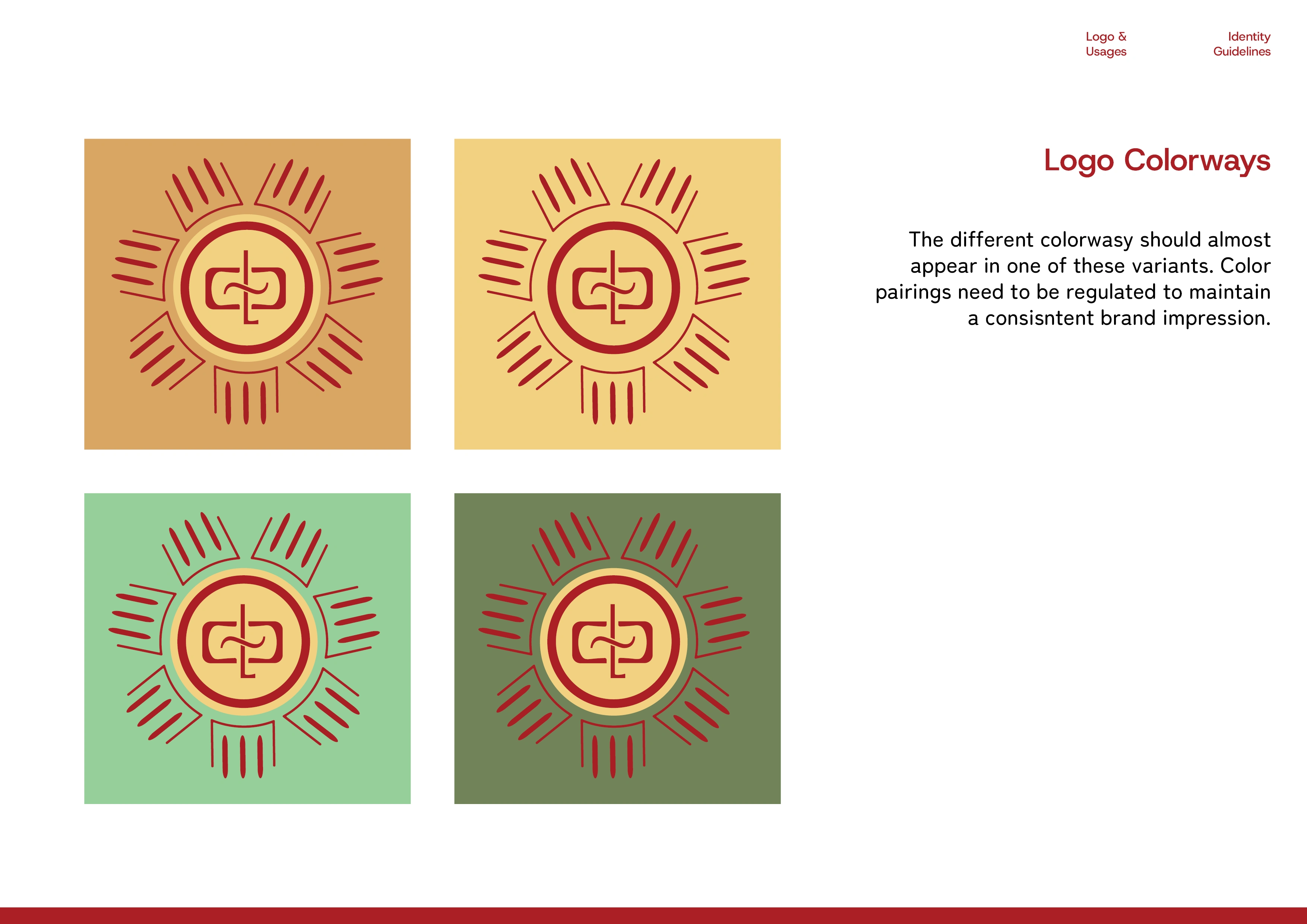
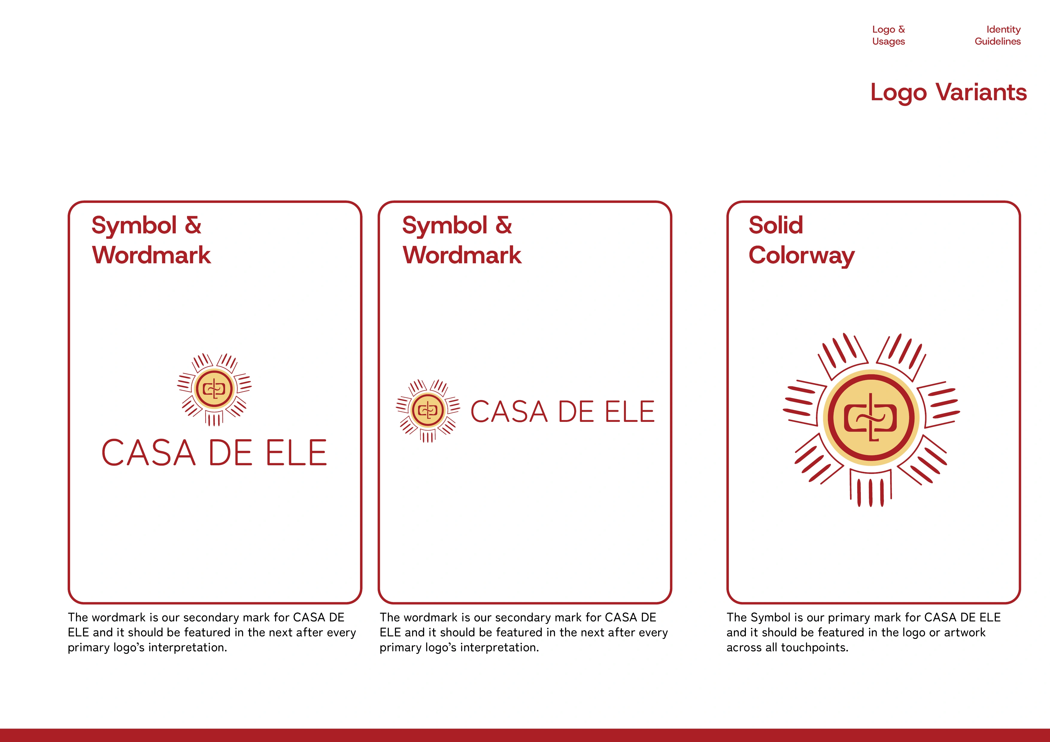
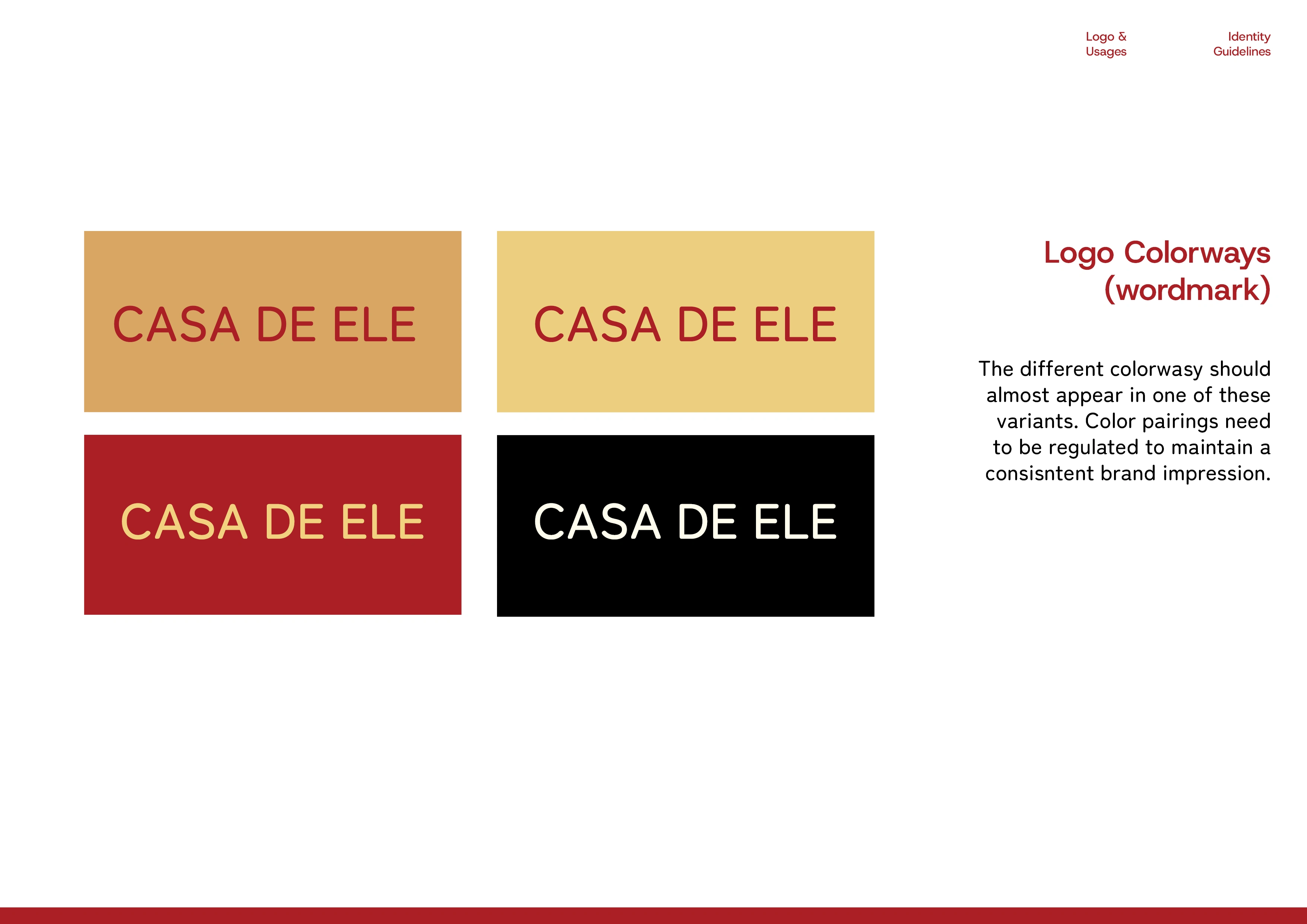
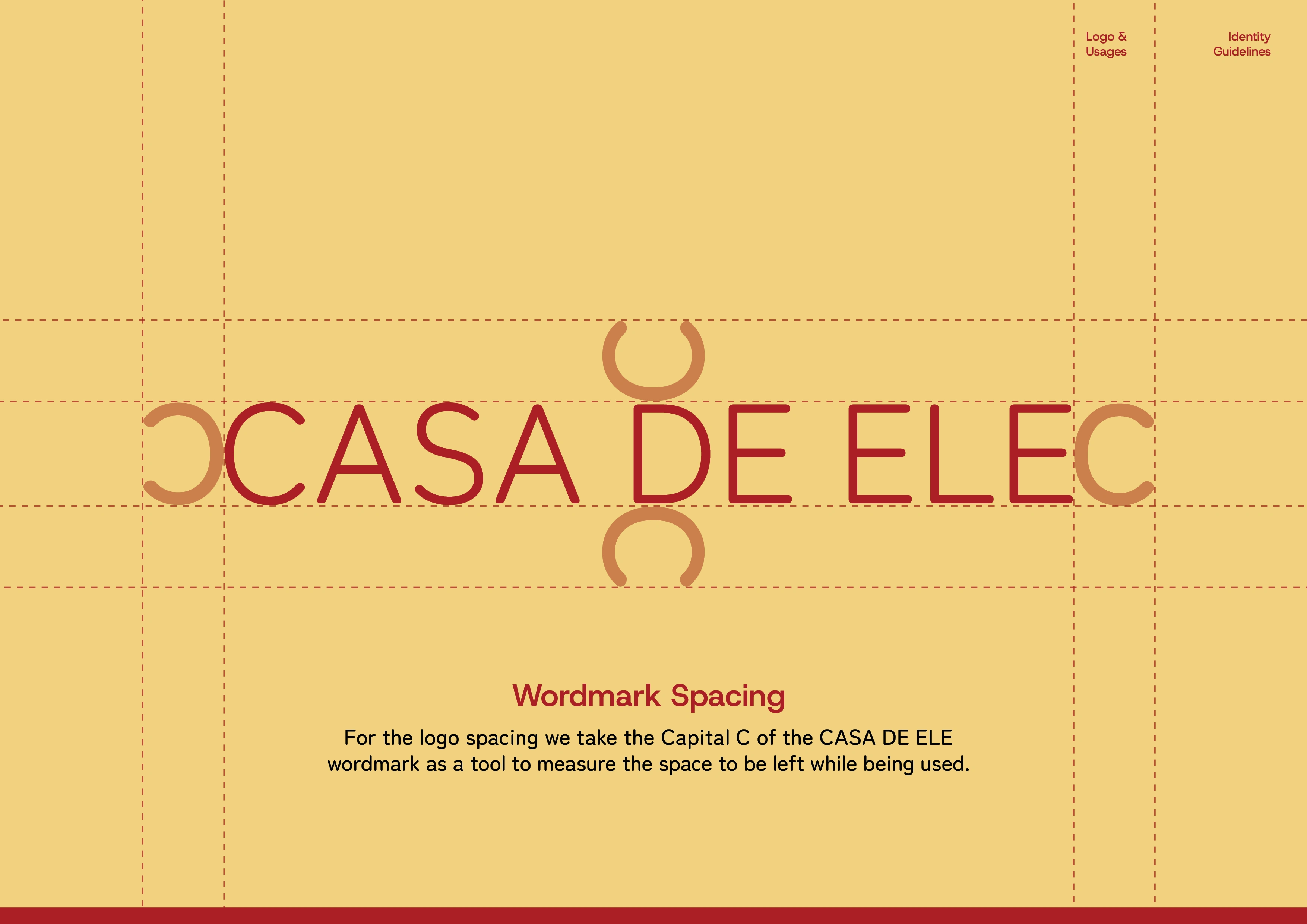
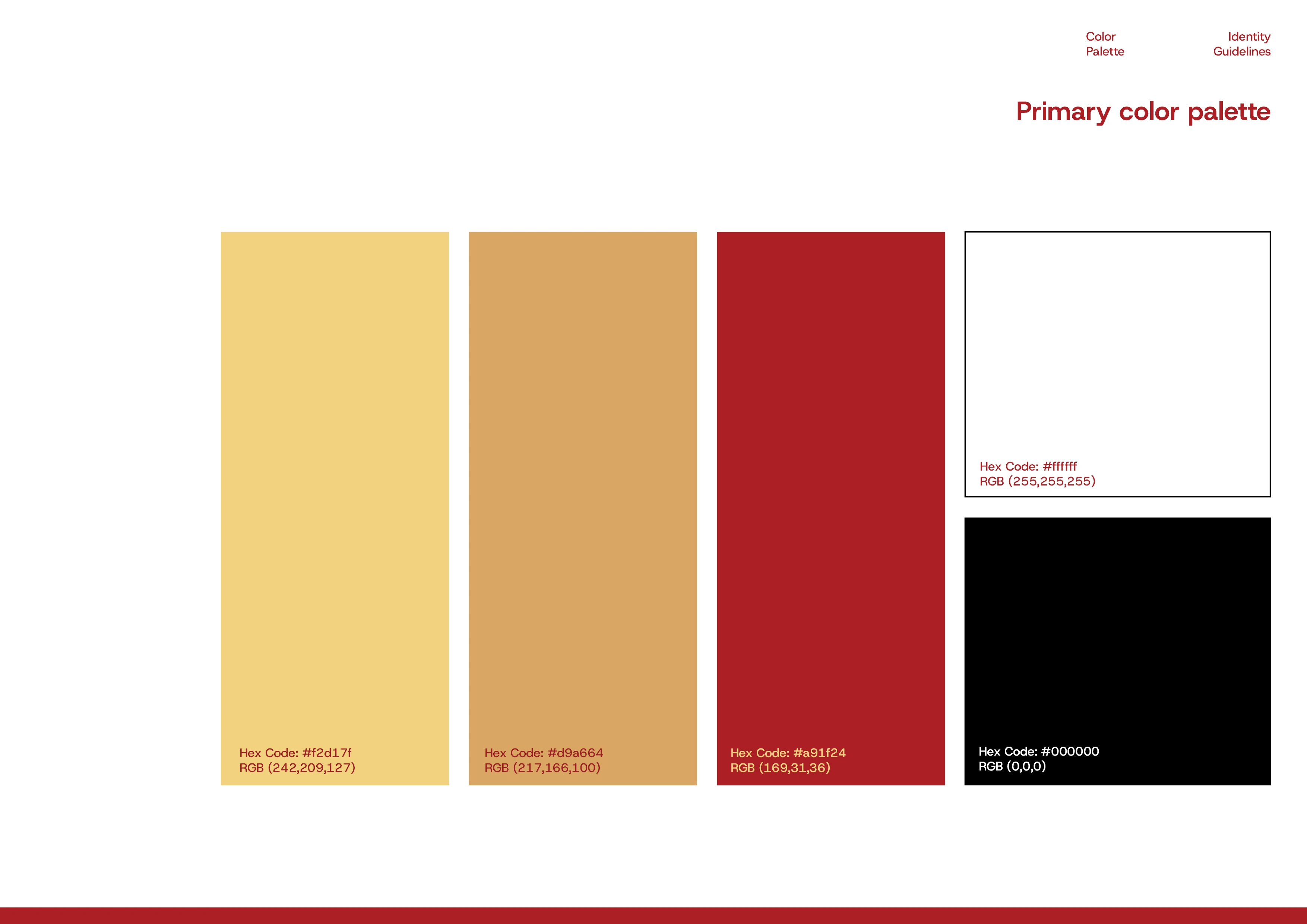
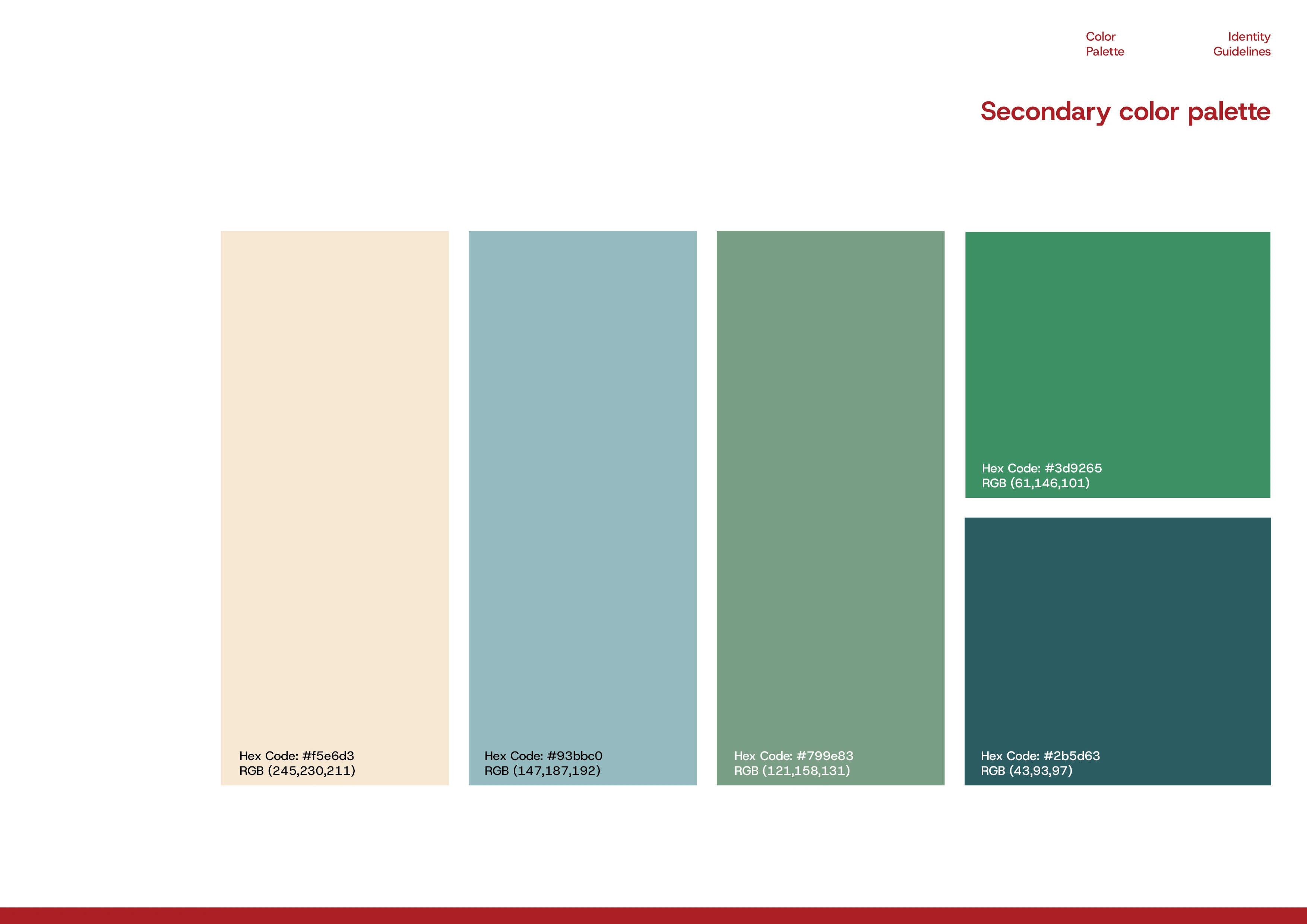
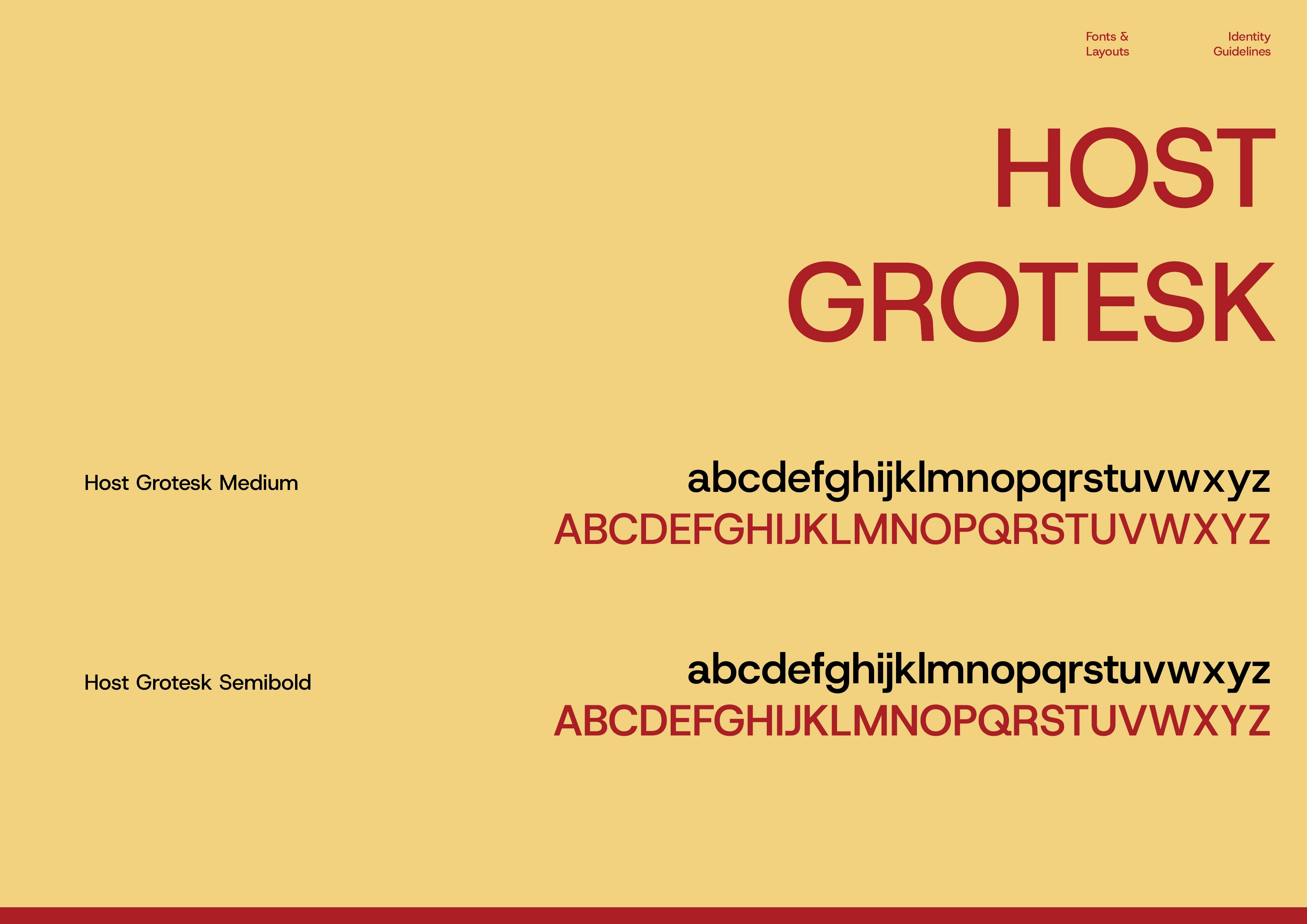
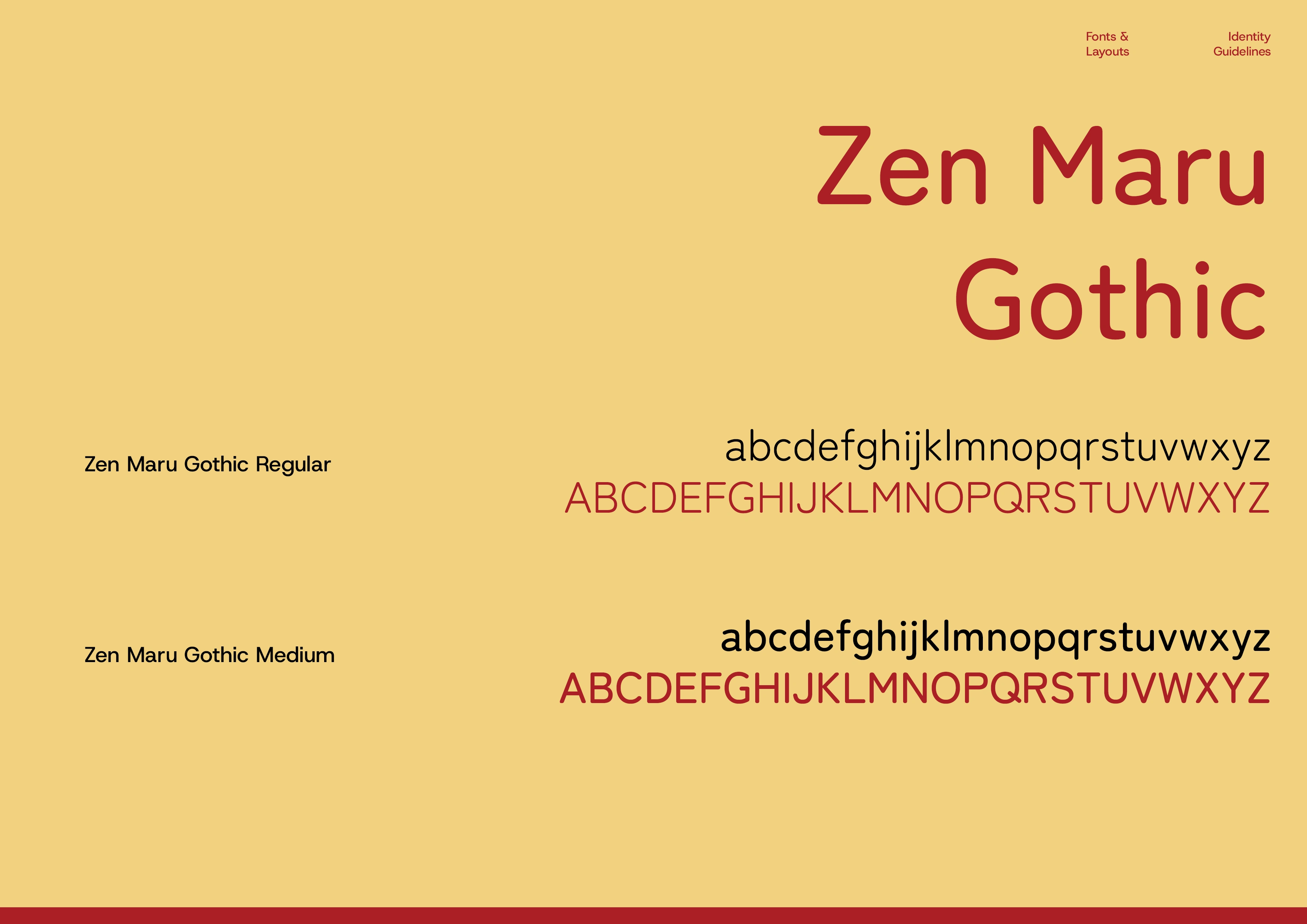
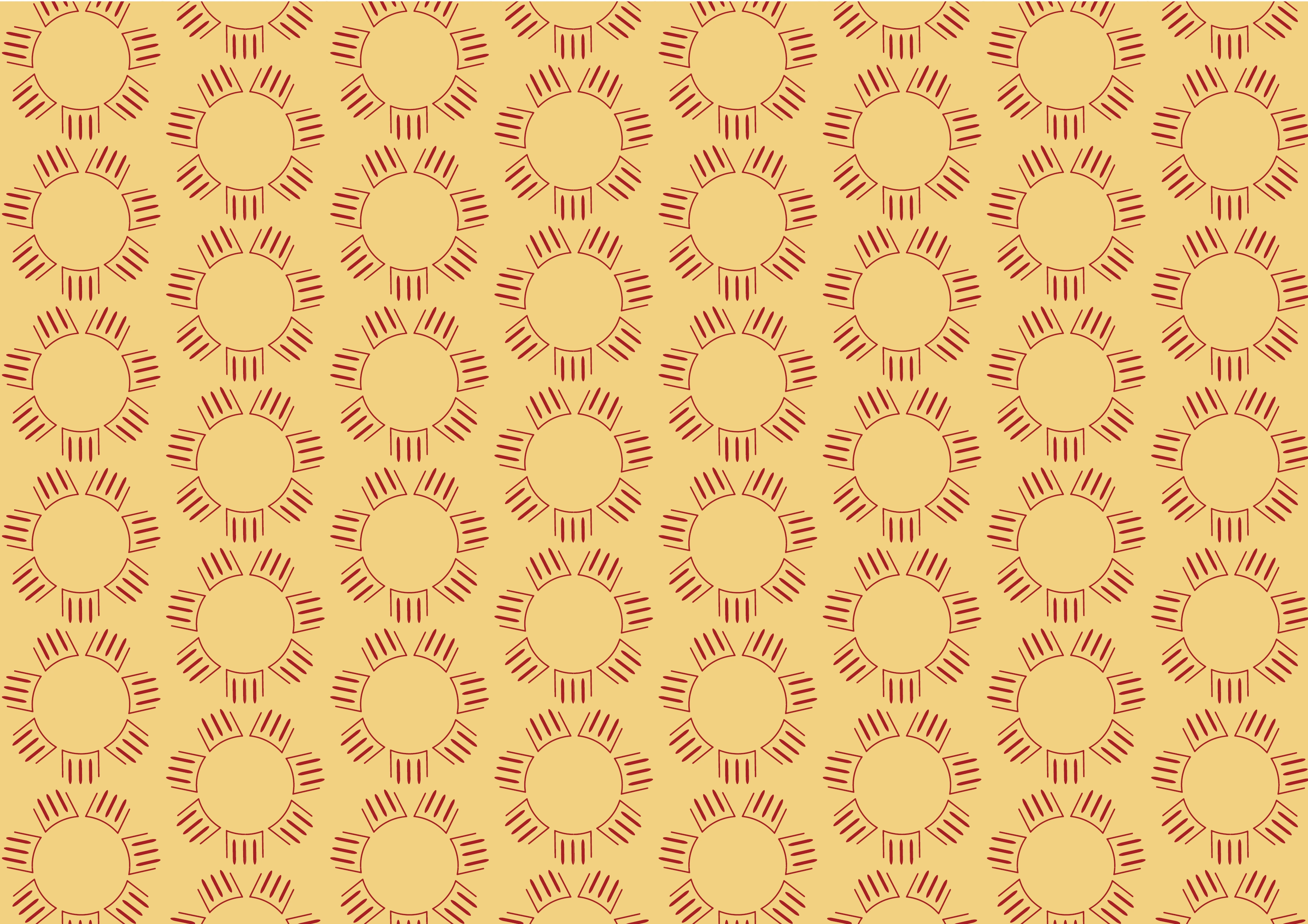
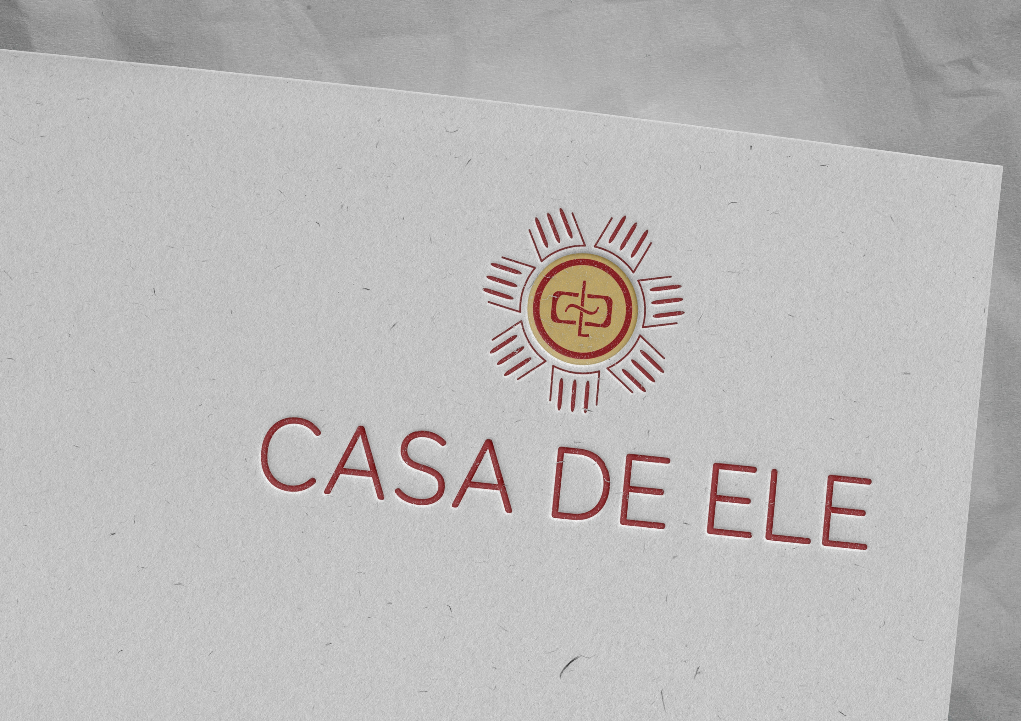
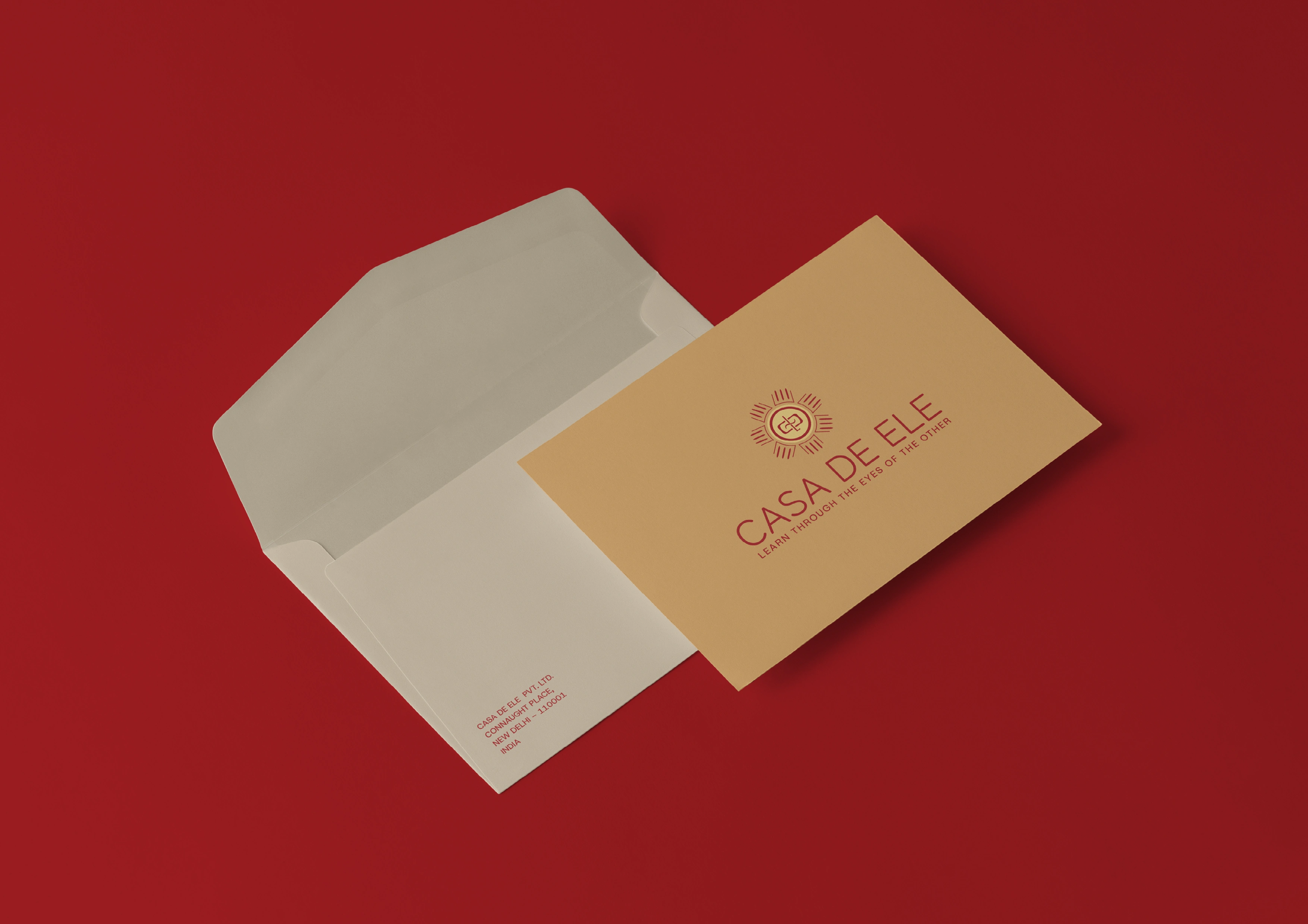
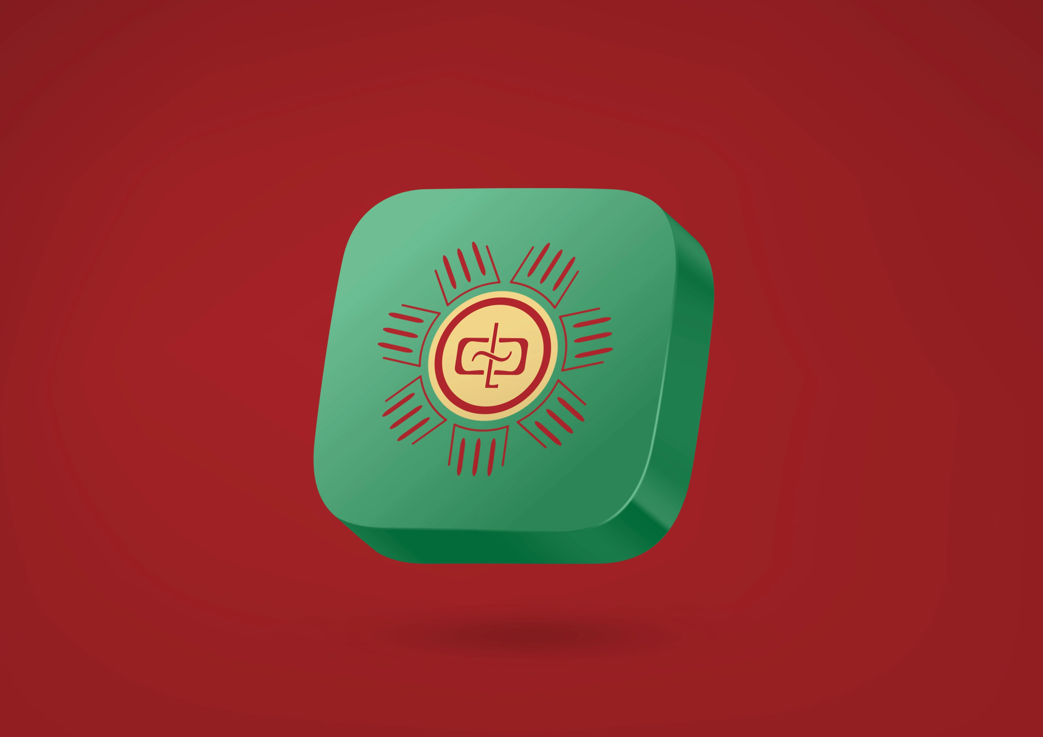
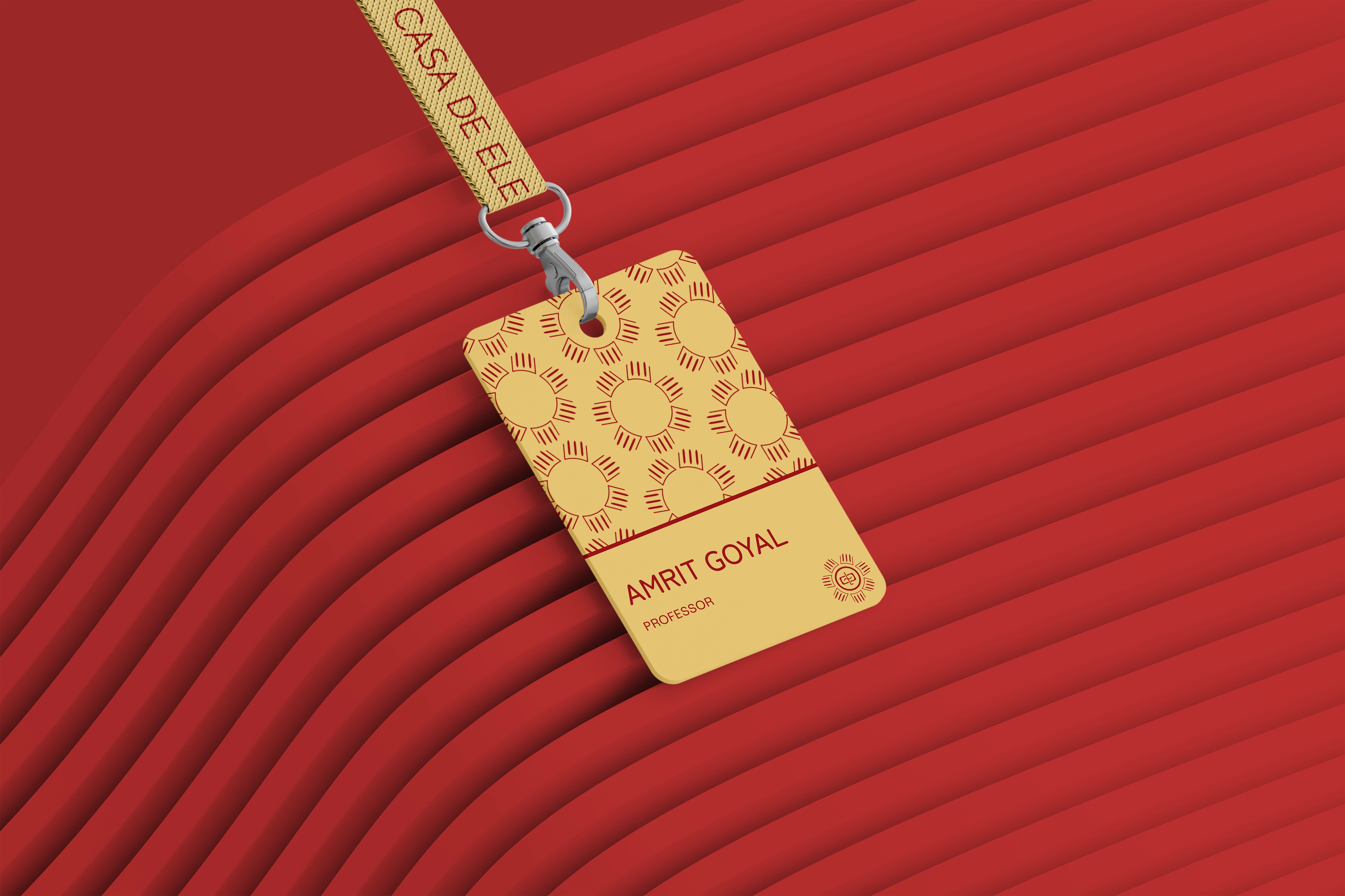
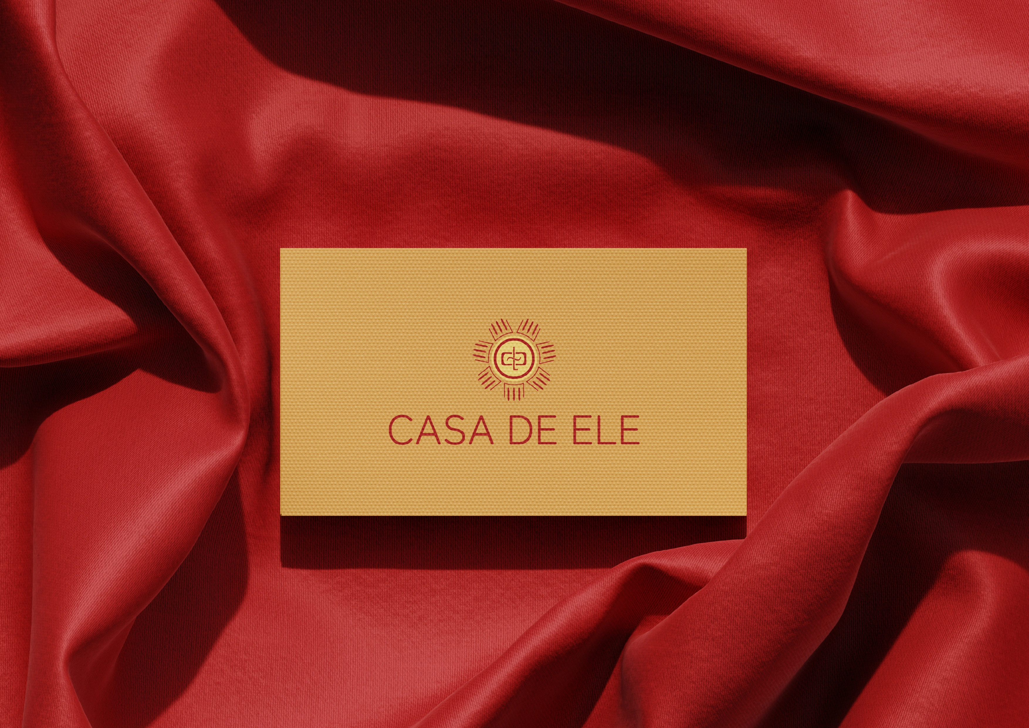
Casa De Ele began with a simple question - what should the brand feel like at first glance? The identity was designed to communicate warmth, trust, and handcrafted authenticity through a symbol-led approach. Built around a circular form representing unity and radiating lines symbolizing sunlight and openness, the mark extends into a cohesive visual system with a warm color palette, repeating motifs, and practical applications. The project reflects a balance of storytelling and structure, resulting in a brand identity that feels rooted, expressive, and functional.