UX Design Enhancements for Opptimse LMS
Megha Kashyap
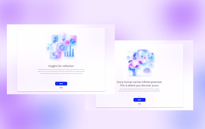
Designing for an LMS platform is challenging, especially when the core experience demands significant time from users. Opptimse set out to build a product that tackled this head-on. Their solution was a three-part system designed to help users understand themselves and improve their learning journey. First, users complete a 30-question self-assessment. They then invite five people from their network to answer the same set of questions, creating a 360-degree view of their personality and behaviours. Once all responses are collected, the system generates a personalised report and, from that, a tailored learning model. This model helps users identify opportunities for growth and guides them on how to improve specific aspects of their personal and professional lives.
Target Audience
The primary users of this product are busy corporate and business professionals. Alongside their demanding day-to-day responsibilities, they’re also expected to invest time in the platform to support their long-term personal and professional growth.
Problem
A key challenge emerges from this reality: users already operate under intense schedules, so any additional task, especially one that feels lengthy or effort-heavy, can easily become a point of friction. This makes sustained engagement difficult and increases the likelihood of drop-off during critical steps of the product flow.Think of it this way: you’re part of a team of ten working professionals. It’s mandatory for everyone to use the platform. You begin by assessing yourself, then send your assessment to five teammates to review you. Naturally, most people choose to include their team lead, since that’s the person evaluating them professionally.
Now imagine this happening across the entire team. That’s forty internal invitations being sent out. If each person receives three, four, or even five invitations, that quickly becomes 90 or 120 or even 150 questions they’re expected to answer. And the manager? They’re sitting on ten assessments from ten different people, 30 questions each which adds up to a staggering 300 questions for a single busy manager to get through.
And this is only for a team of ten. Scale that to a team of fifteen or twenty, and the cognitive load becomes overwhelming. Users quickly hit overload paralysis.
Also, yes I know this is starting to sound like a maths problem, but bear with me hahaha.
Non Negotiables
After several discussions, we aligned on a few non-negotiables. First, the assessment itself could not be changed, it was built on over 30 years of psychological research, and its structure was integral to its accuracy. Second, the assessment had to remain intentionally unstructured, with a mix of positive and negative statements. This design choice ensured that both self-assessors and peer reviewers engaged thoughtfully, rather than rushing through the questions just to complete the task.
Second, we had no control over team size or whom users chose to send their invitations to. The system allowed full flexibility, meaning the volume of assessments and therefore the workload could vary widely.
can a UX solution fix this problem?
I began by exploring ways to ensure that assessors provide thoughtful, unbiased feedback — without altering the core assessment itself. The goal was to design supporting features that reduced cognitive load, encouraged meaningful participation, and prevented users from feeling overwhelmed.
Some of the solutions explored included:
There were already a few ideas I explored to ensure that the assessors provide unbiased and consistent reports. This included thinking about how to reduce fatigue, encourage timely participation, and maintain the quality of their evaluations.
One approach was to introduce a limit on how many assessments a user can take at a given time, preventing overload and ensuring each evaluation receives focused attention.
Another idea was to design a motivational guide that nudges users to complete assessments regularly rather than letting them accumulate, helping reduce procrastination and stress.
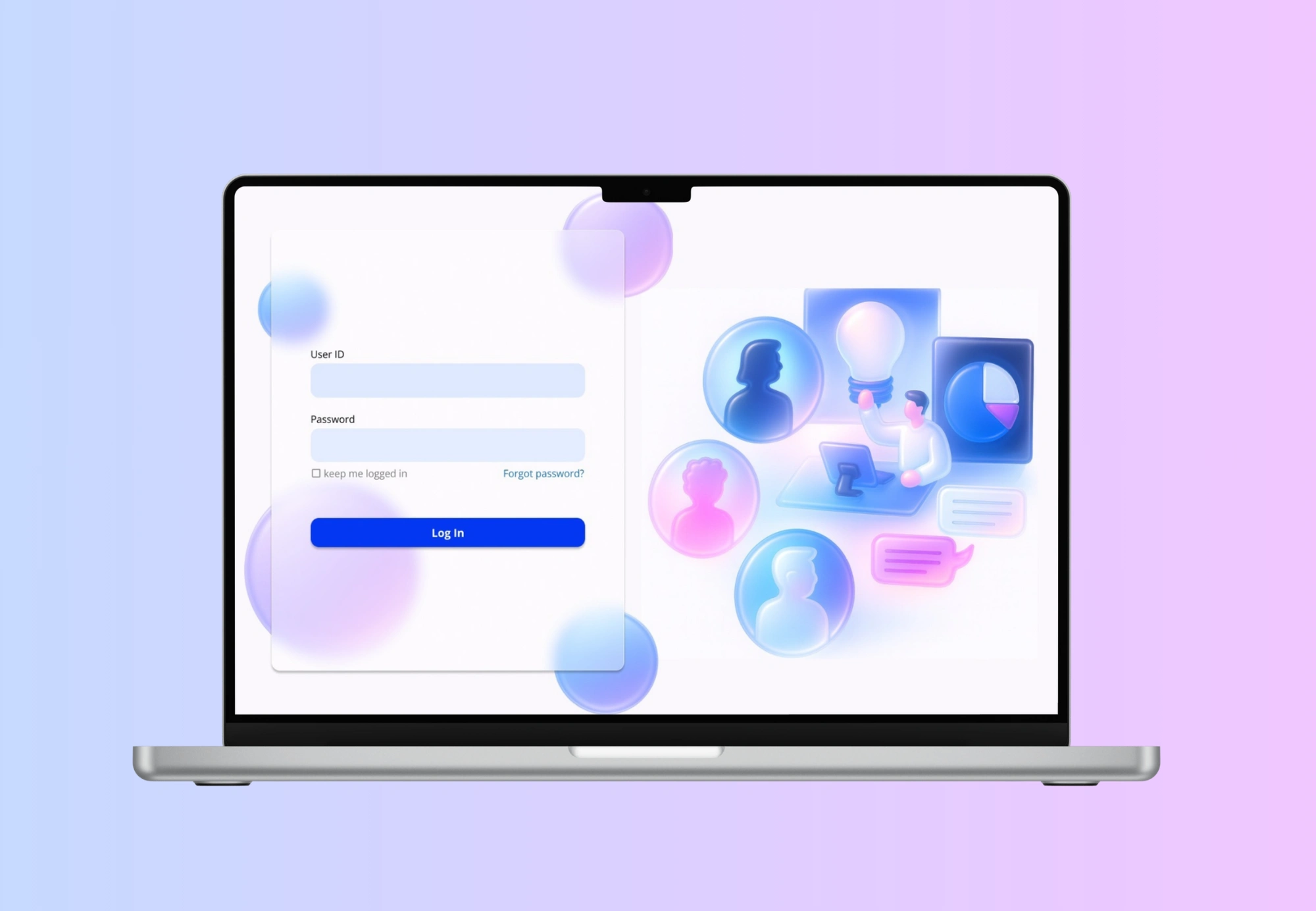
Additionally, I considered adding a persistent progress bar paired with motivational prompts, allowing users to see their progress in real time and feel supported as they move through each step.
But the client raised an important question: even if we cap assessments, for example, allowing users to assess only two people a day or within a five-hour window, they would still need to get through 60 questions each time. So the real challenge became: can we design features that make time feel faster?
The Solution
At first, it sounded impossible. How could I alter someone’s sense of time? I’m not god.
But as I dug deeper, I found that certain UI/UX decisions can actually influence how users perceive time.
Through research, I came across the basics of time perception (source: “The Illusion of Fast Function”):
the more eventless an experience is, the longer it feels
the more eventful it is, the shorter it feels
emotionally positive experiences feel shorter
emotionally negative experiences feel longer
the waiting time of an unwanted event can be shortened
A simple example of this is micro-animations on loading screens. Without them, users stare at a blank screen, and the waiting time feels painfully long. But with subtle motion, the same wait feels shorter and less frustrating.
So the question became: how do I translate this into an assessment?
The goal was to make sure the user never felt “stuck” or stagnant during the process, but without distracting them from the actual questions. It required a balance between motion and focus.
A few features I implemented:
A few ideas that I implemented were - a subtle moving background to ensure that the screen isn’t stagnant. I introduced a very light, slow-moving background animation. The goal was not to entertain the user, but to break the visual “stagnation” of a static screen.
Why this matters:
When a screen is completely still, especially during repetitive tasks, time feels slower because the brain receives no sensory variation.
A gentle animated background:
adds micro-events that compress perceived time
prevents the interface from feeling “frozen”
gives a sense of flow and movement
reduces monotony without demanding attention
It’s essentially giving the interface a pulse—just enough motion for the subconscious mind to perceive progress.
Another idea was haptics. A research showed that a satisfying click or a sound engages the user. Considering this as an event, the user would feel like time is moving faster and plus get’s more engaged into the assessment as they progress. So a combination of all the above.
Another idea I explored was the use of haptic feedback or subtle click sounds when a user selects an answer. Research shows that tactile or auditory confirmation creates a small sense of satisfaction, similar to pressing a real physical button.
These micro-rewards act as event markers, which are crucial in reducing perceived duration.
Why this matters:
Each click becomes a tiny “event,” breaking the monotony of repetitive questions.
These micro-events keep the brain stimulated but not distracted, helping the experience feel more active.
Haptic or sound feedback gives users a reassuring sense of completion after each question.
This reinforcement increases engagement, which naturally makes time feel like it’s passing more quickly.
The tactile experience makes digital interactions feel more tangible and satisfying, holding attention for longer.
In other words, every answer becomes a small moment of progress, which reduces the feeling of stagnation, one of the biggest contributors to “slow time” perception.
Like this project
Posted Jan 12, 2026
Developed UI/UX solutions to enhance engagement and reduce perceived task duration on an LMS platform.