LAEME
Carolina Ferdkin
LA EME Logo and Brand Manual
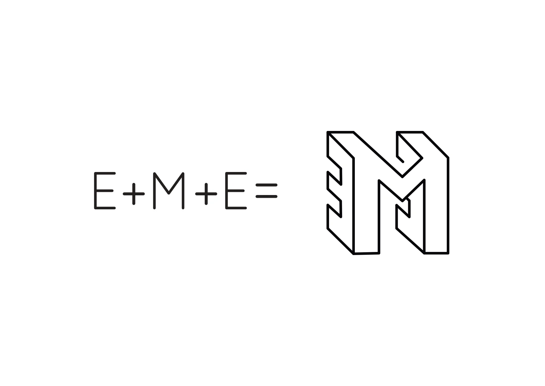
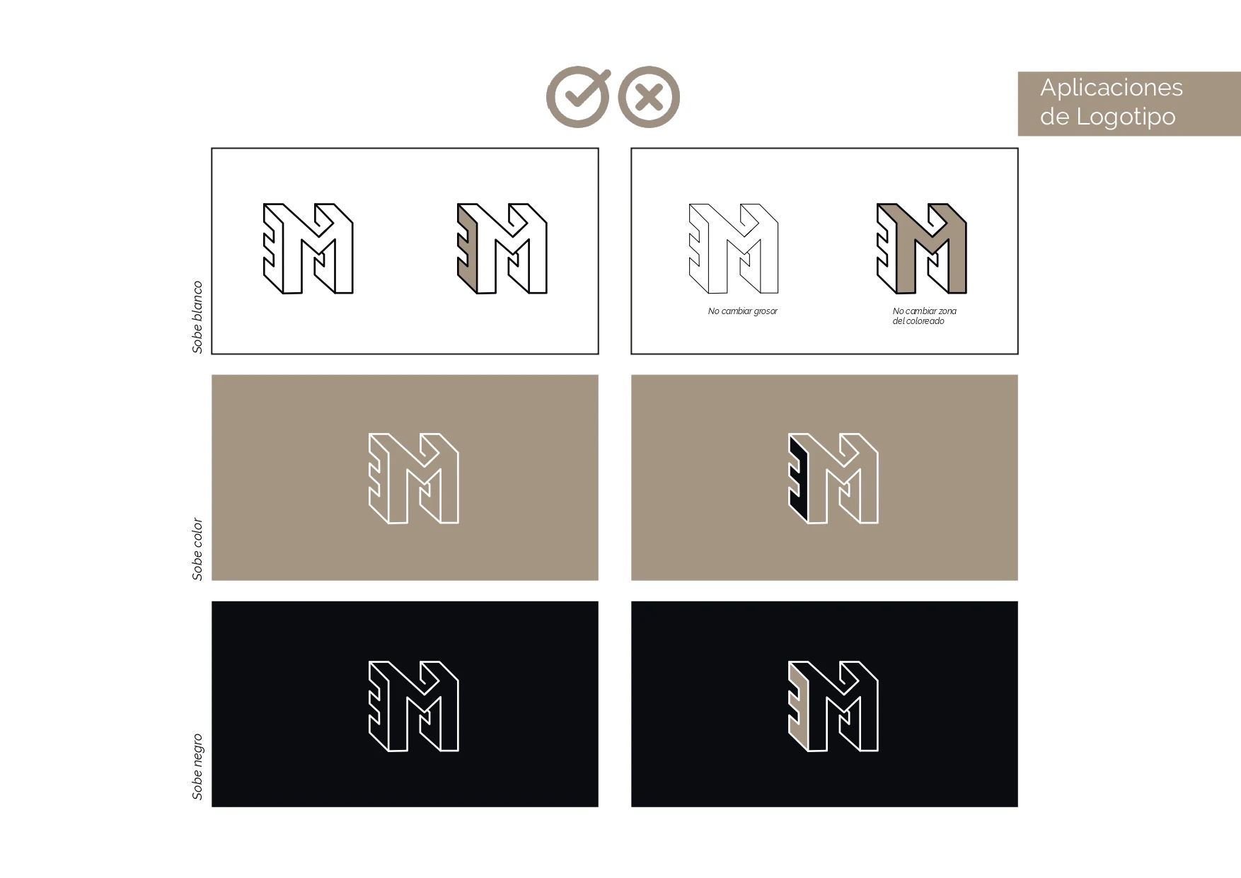
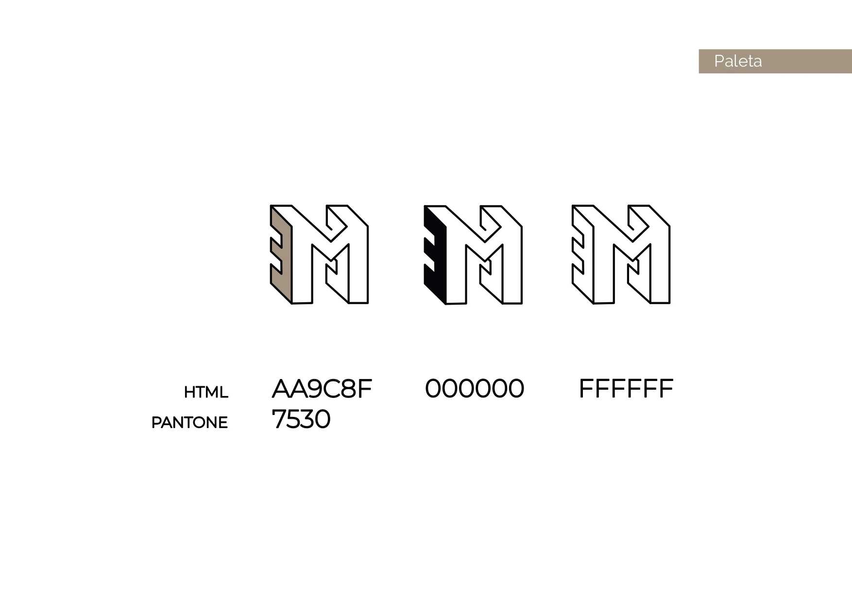
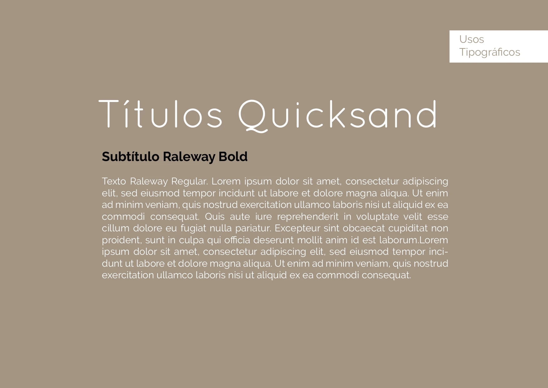
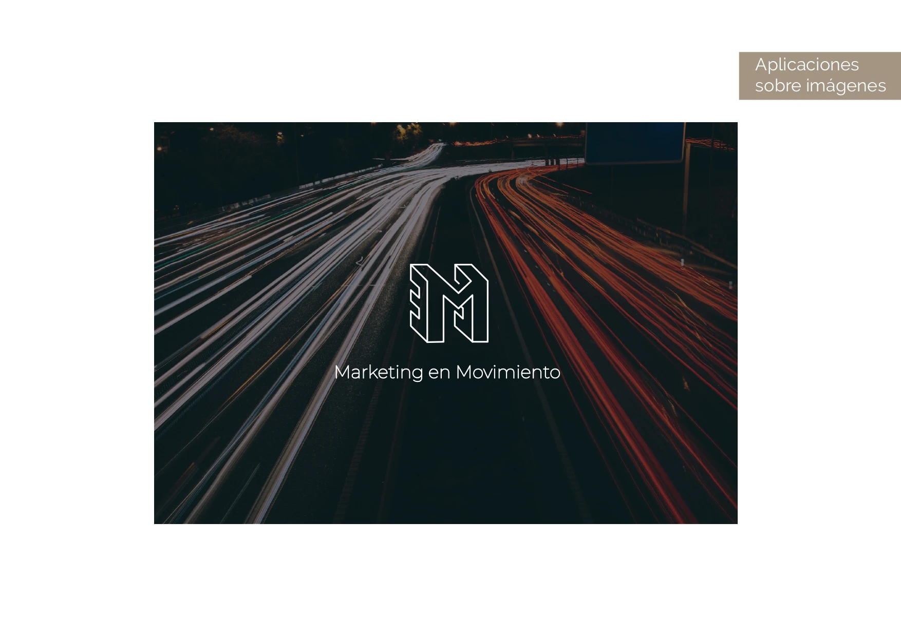
A design that speaks for itself loud and clear – communicating simplicity, and dynamism, intricacy, and sophistication representing the agency in a more contemporary, stylistic way.
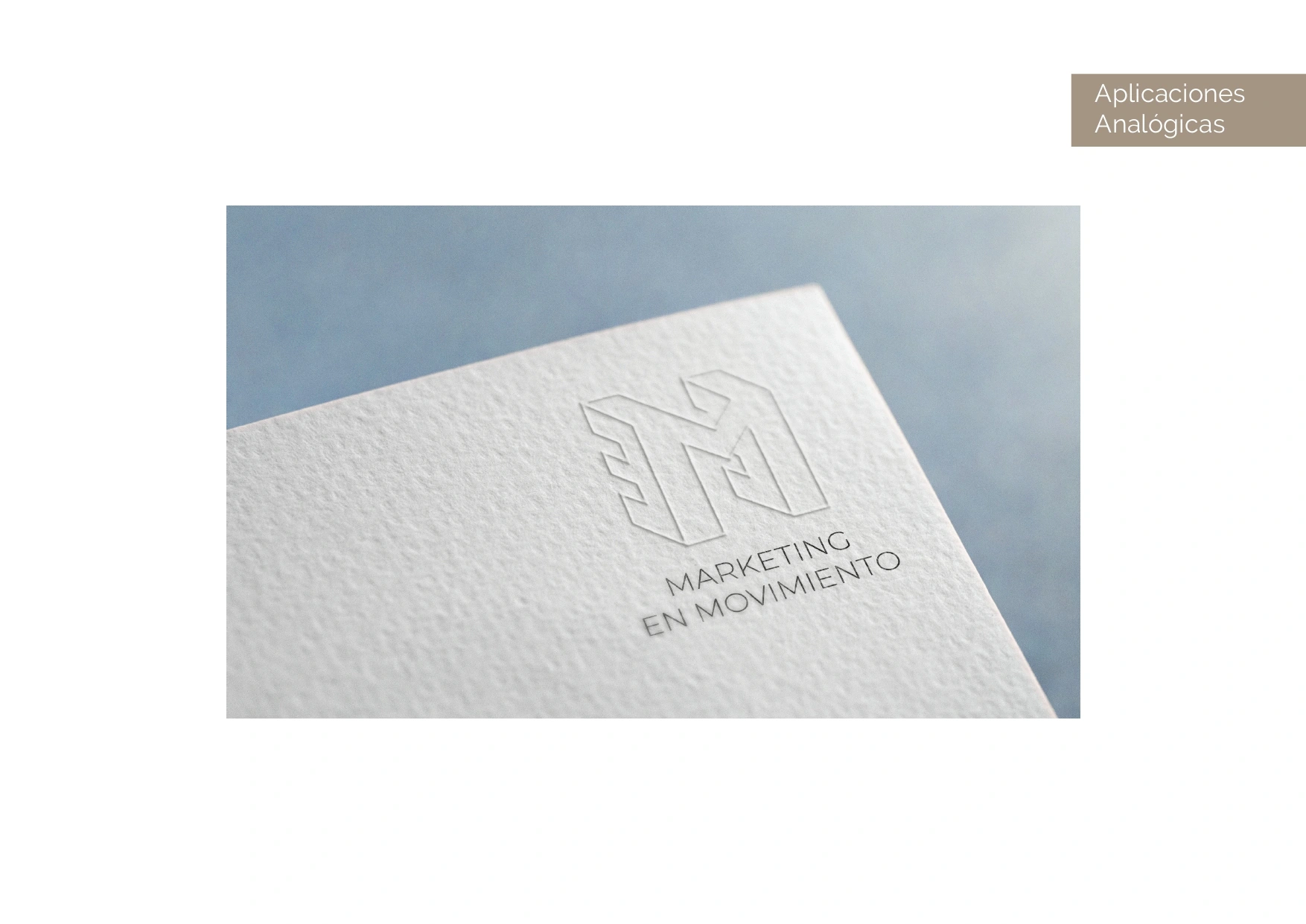
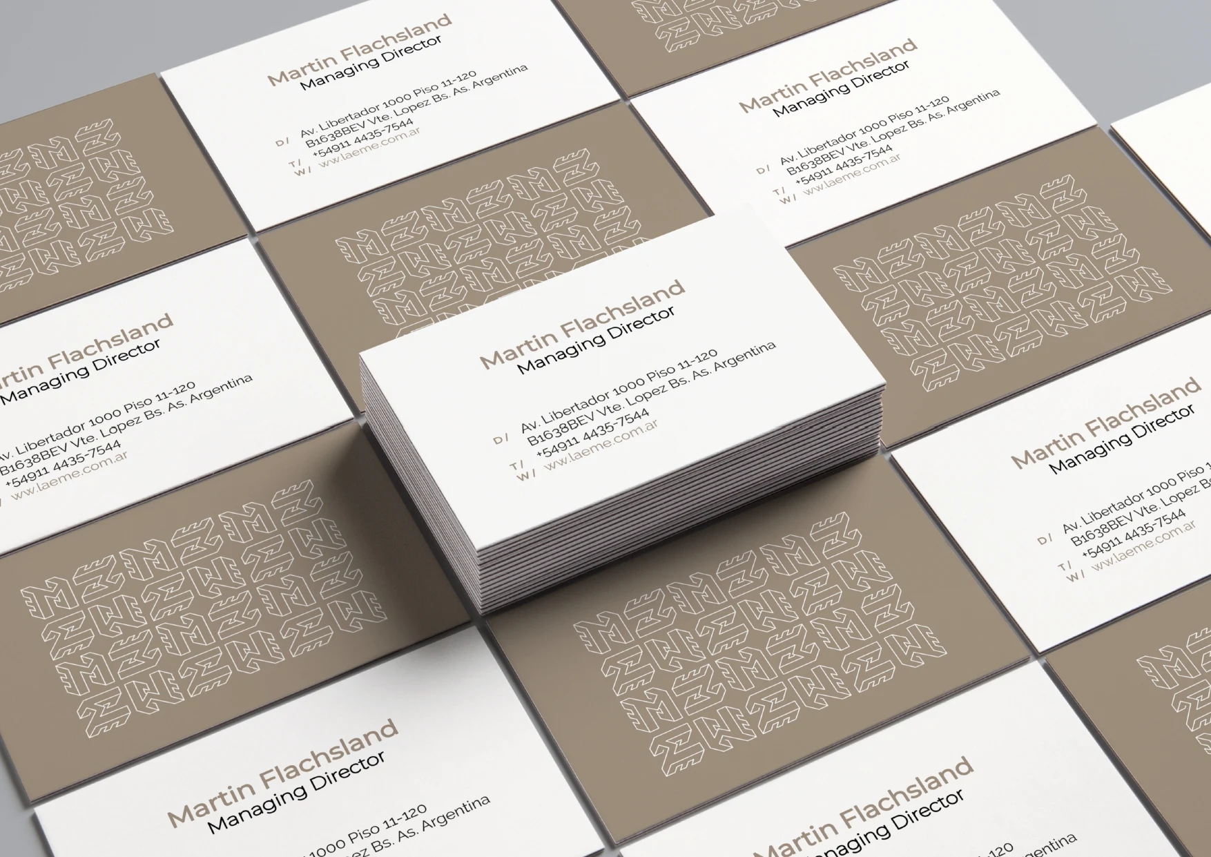
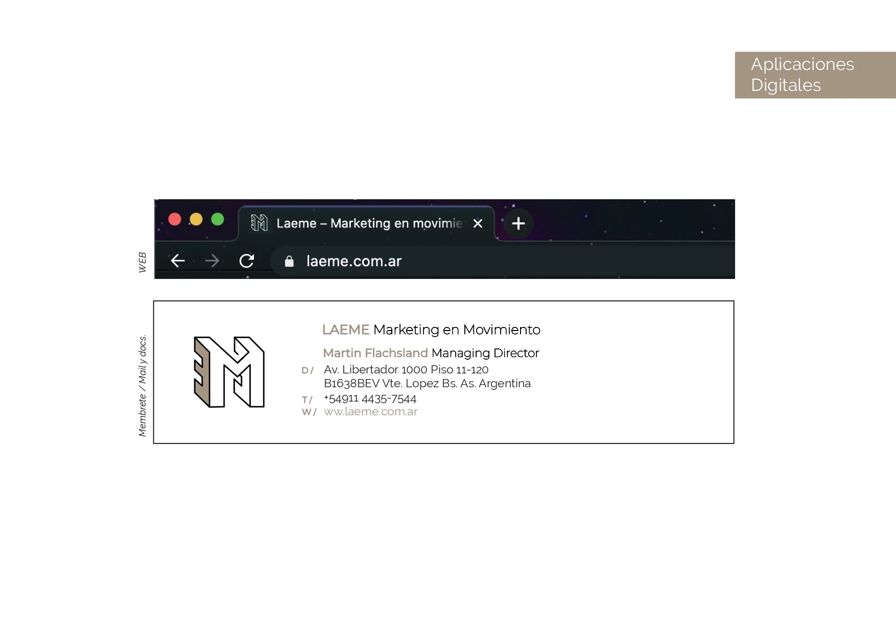
Taking into account the slogan "Marketing in motion" it was decided to design the letter "M" as moving forward and, by leaving its wake, to be able to read as "EME". This typographic logo is a design that personifies perfection and leave a mark on the beholder instantly.


Like this project
Posted Apr 20, 2021
With the new brand design we seek to communicate simplicity, dynamism and represent the agency in a more contemporary way. Taking into account the slogan "Marke
Likes
0
Views
44
Clients
LAEME