Leafy Kindred Plant Co. Identity
Tim Jurgensen
A challenge for smaller nurseries in competition with large, national brands is cultivating a loyal customer base. They typically can’t compete on price, so they have to go over and above on service, knowledge, and a sense of community.
Leafy Kindred’s brand seeks to attract a new 30-something demographic and continue to serve an older audience as well. In such a fast-paced, screen-driven world, their ideal customer wants to take time to “touch grass” and contribute to the slow growth of something beautiful.
The logo and visuals are designed to evoke a neo-nostalgic look that feels welcoming across the target market. The tag line reflects the desire to connect over growing plants and pause to notice the lovely little things in life.
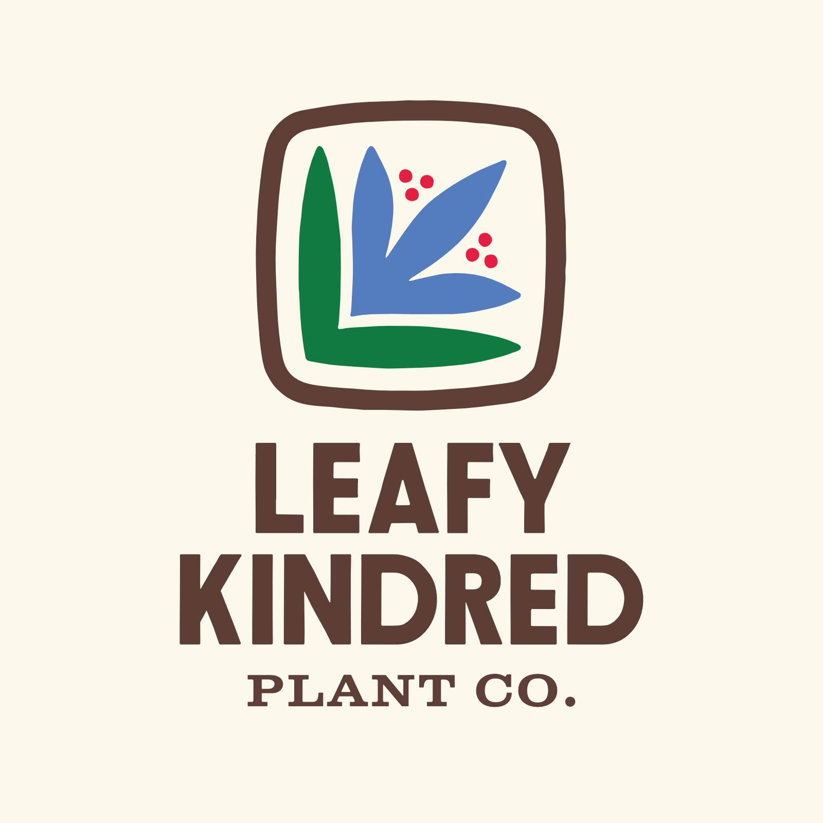
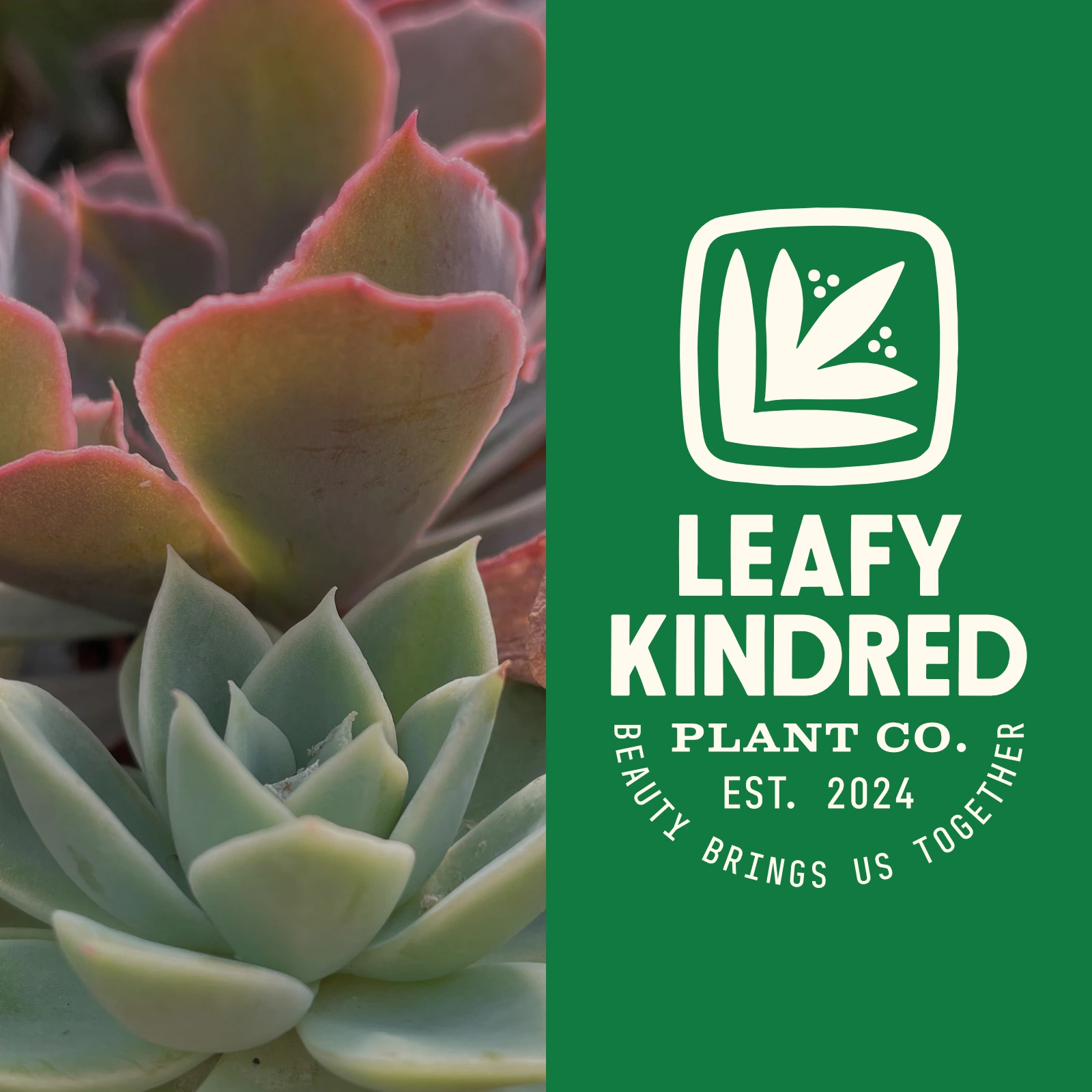
A stylized “L” and “K” form the base of Leafy Kindred’s flower icon.
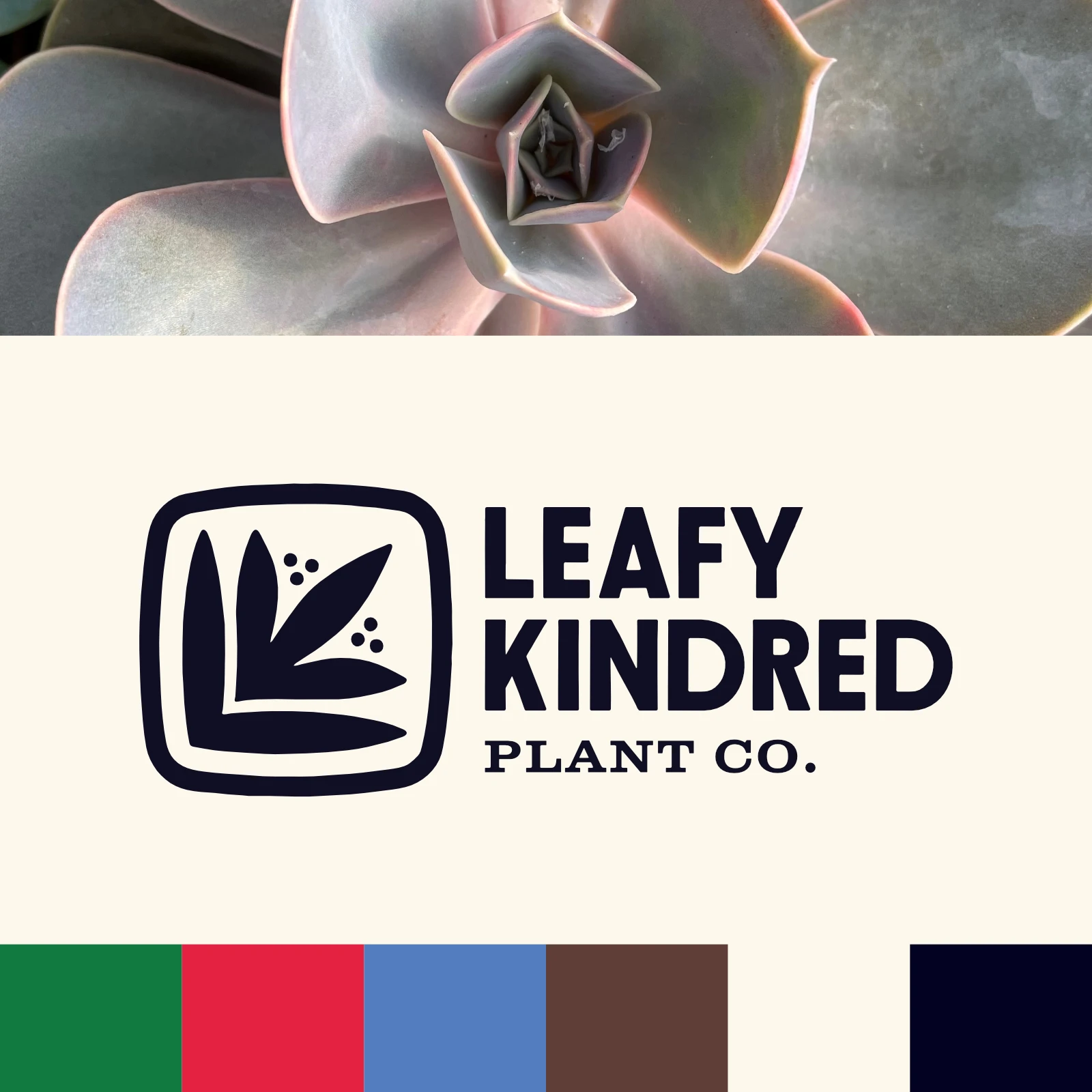
Black and white logo variation and brand colors.
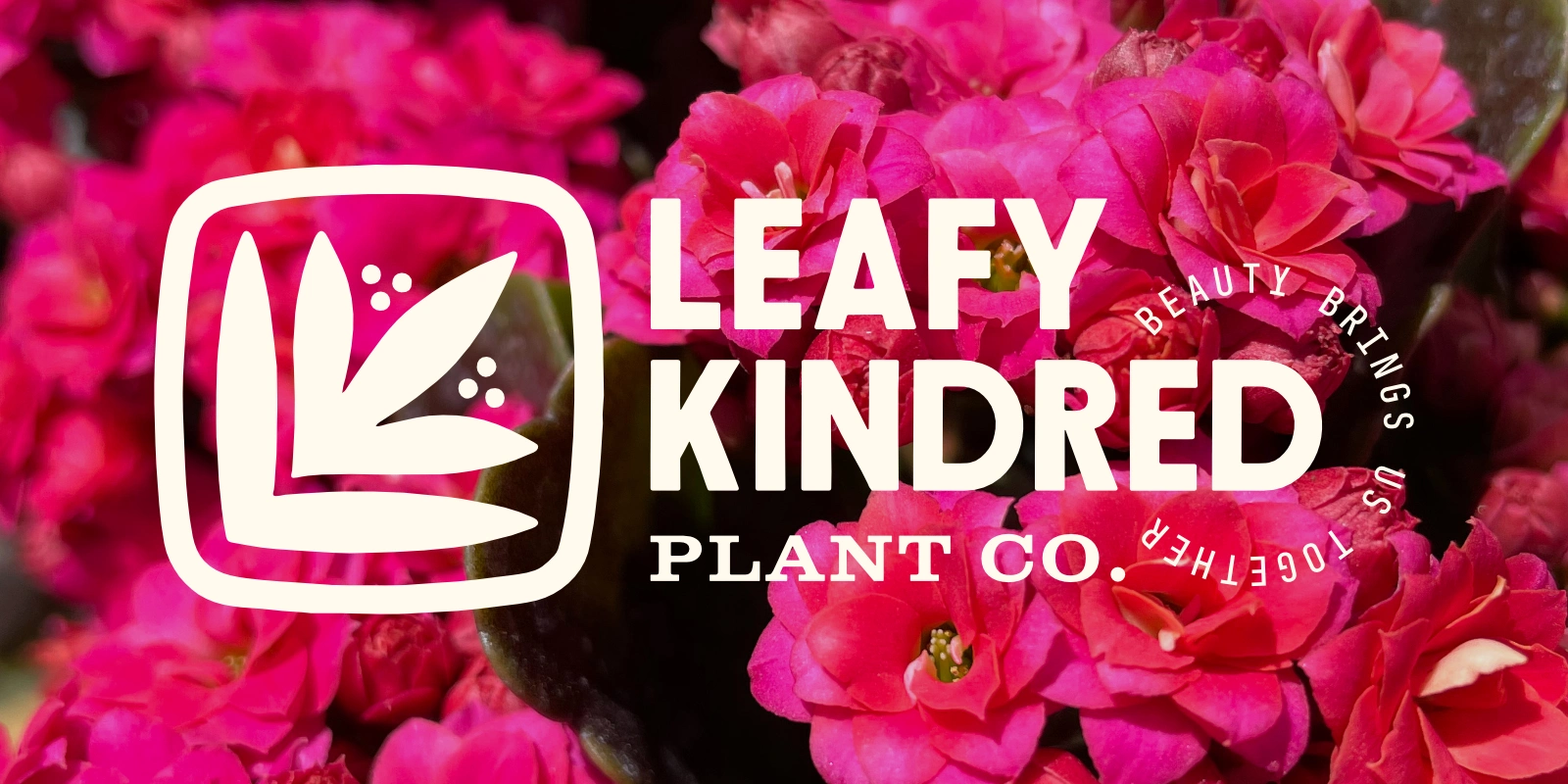
Logo variation with tag line.
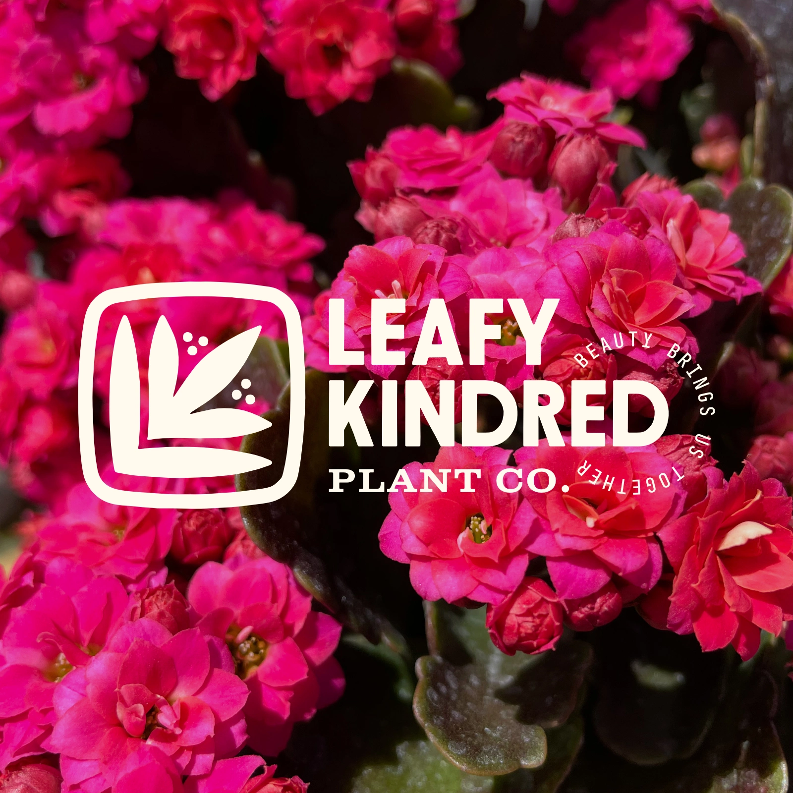
Logo variation with tag line.
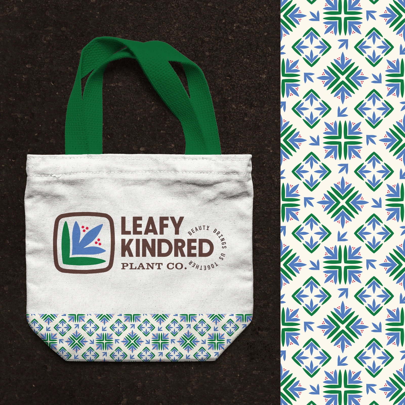
Tote and pattern design.

Tshirt design.
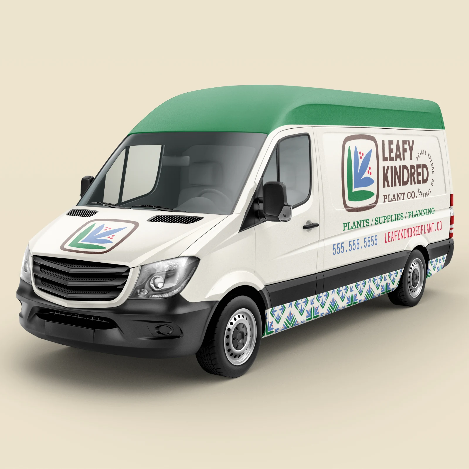
Delivery truck wrap.
Like this project
Posted Sep 4, 2024
Leafy Kindred is a boutique nursery and gardening supply store. I art directed and designed this self-initiated project, including writing the tag line.