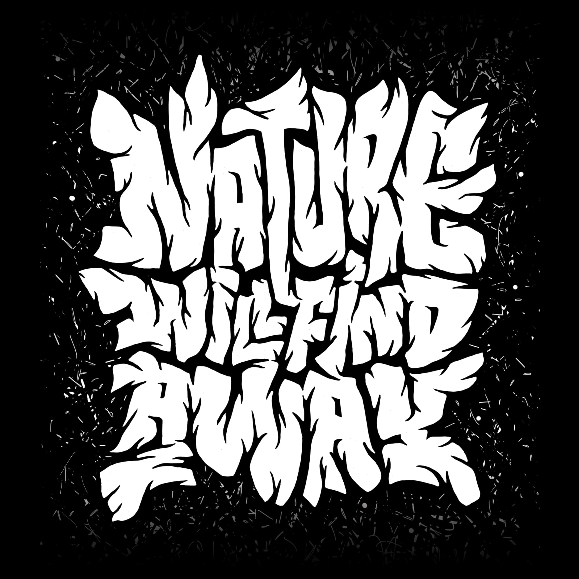
Nature will find a way
Viktoria Stalybka
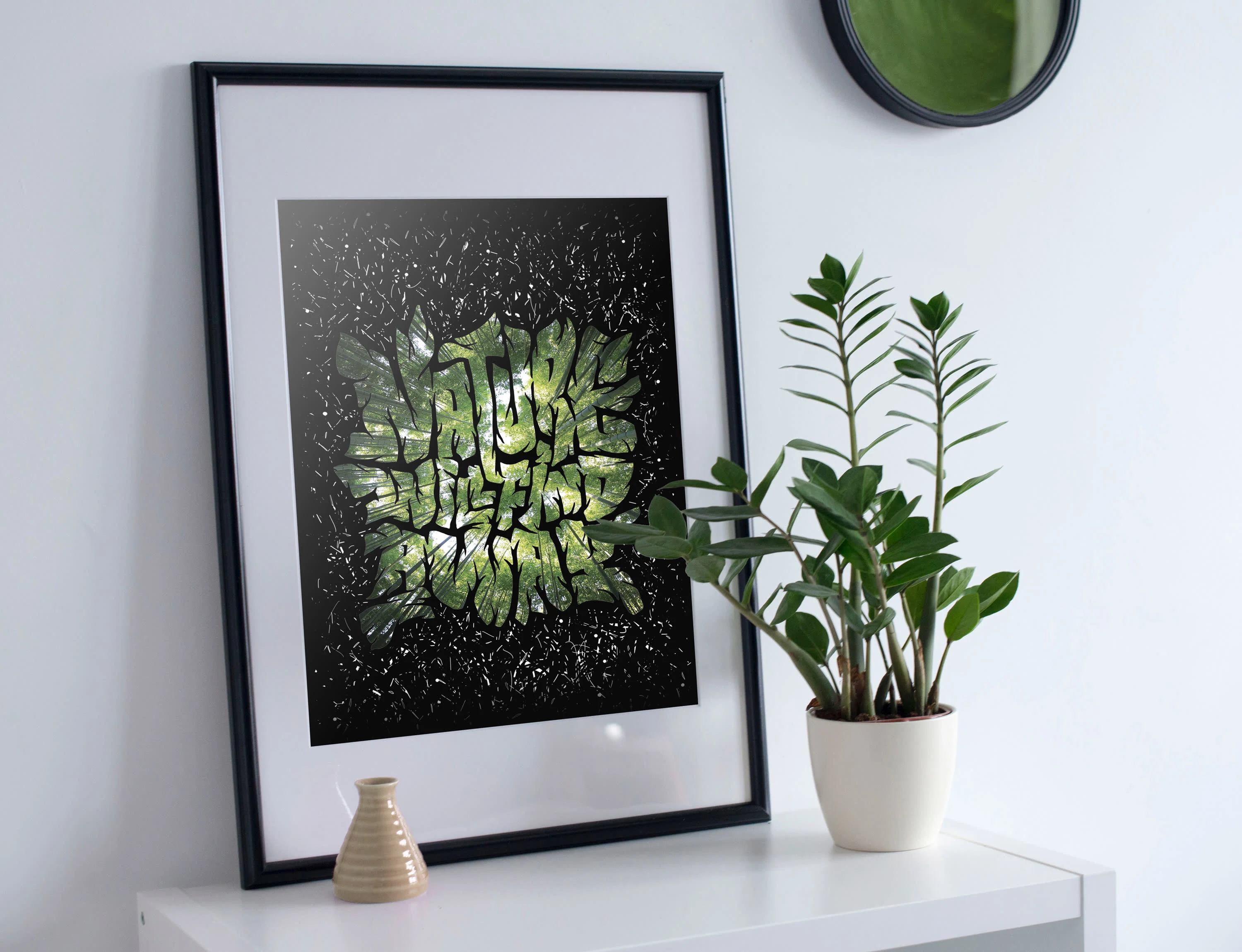
Nature will find a way
This piece started as an exercise of how far I can push legibility in a rather tight lettering composition. But in the process of creating it I've uncovered a more interesting concept. I've noticed that negative space between the letters looked a lot like tree branches, so I've decided to emphasize it.
It resulted in truly alive composition with letters and work well with each other and combine together in a neat composition with an easter egg of branch-like negative space.
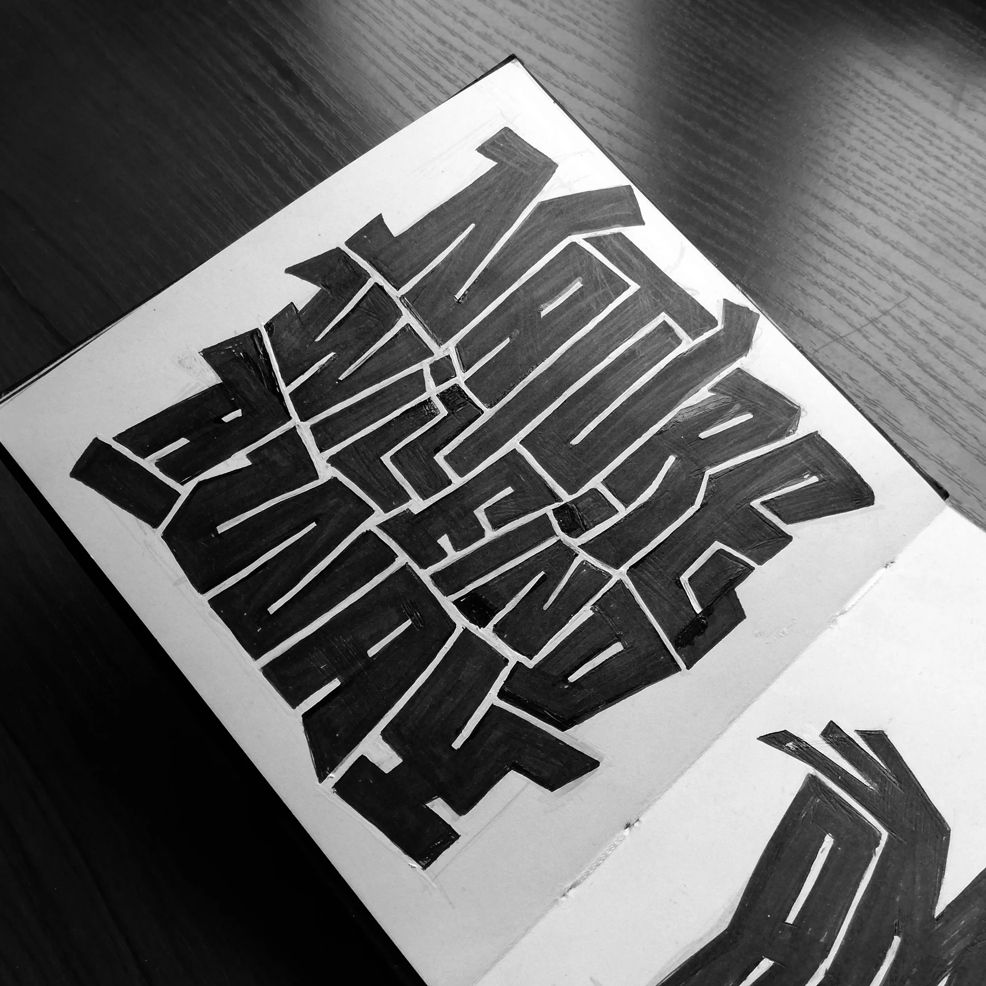
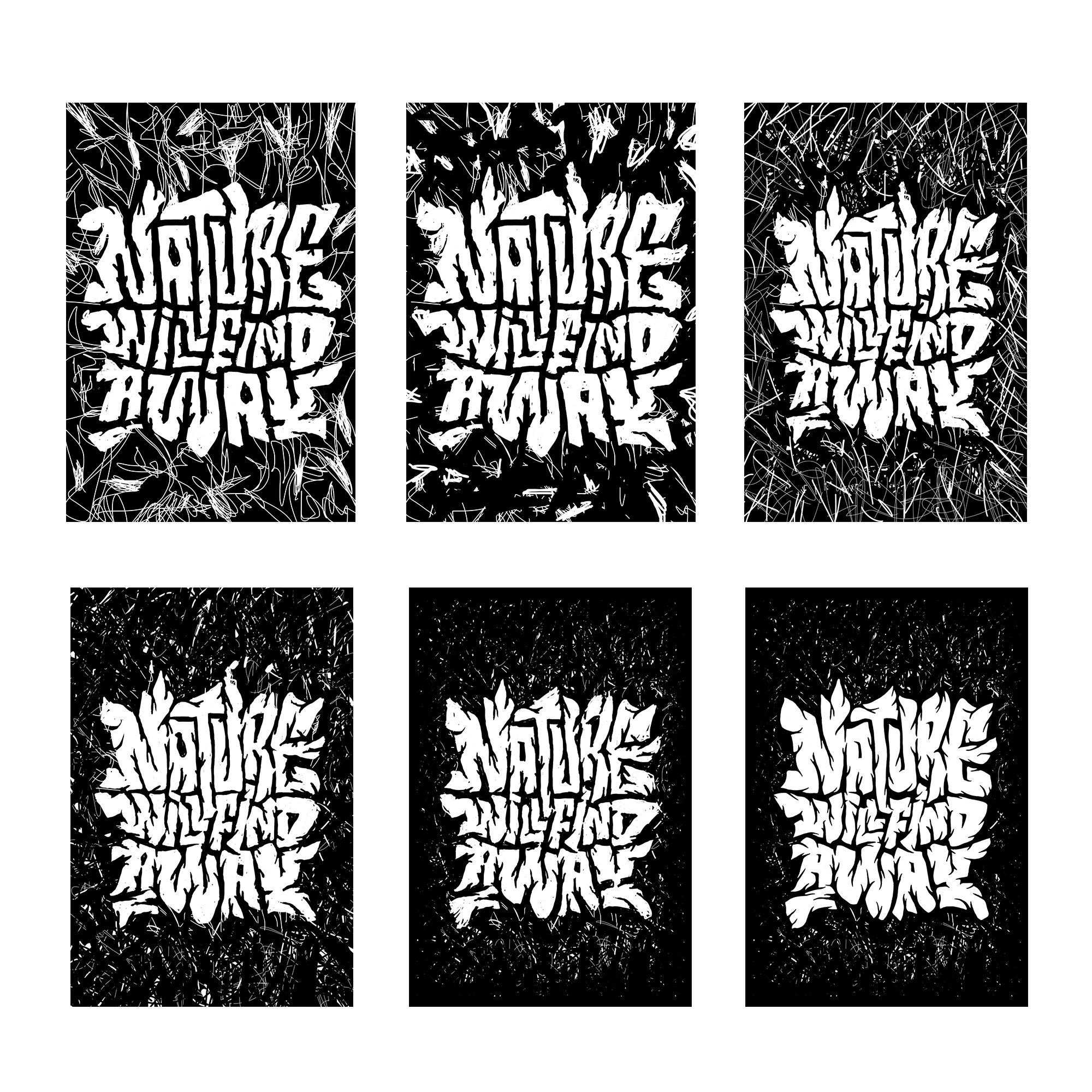
the process from initial sketch to the final composition
Like this project
Posted Nov 3, 2025
Creative nature-inspired lettering with playful negative space
Likes
0
Views
2