Tour & Travel Agent Website UI
A Modern and Relaxing Design for Tour & Travel Experiences
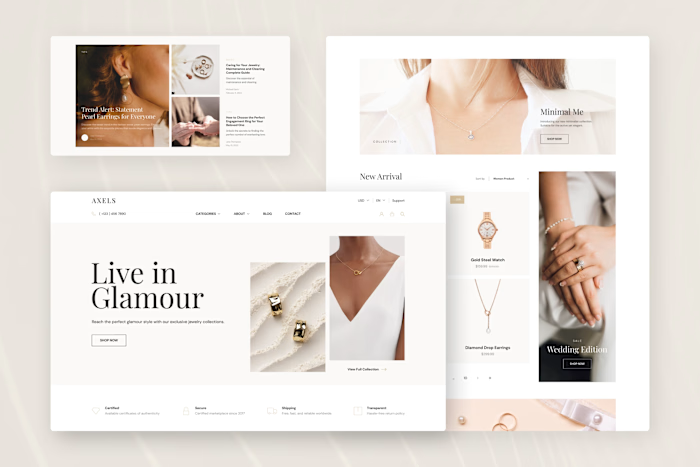
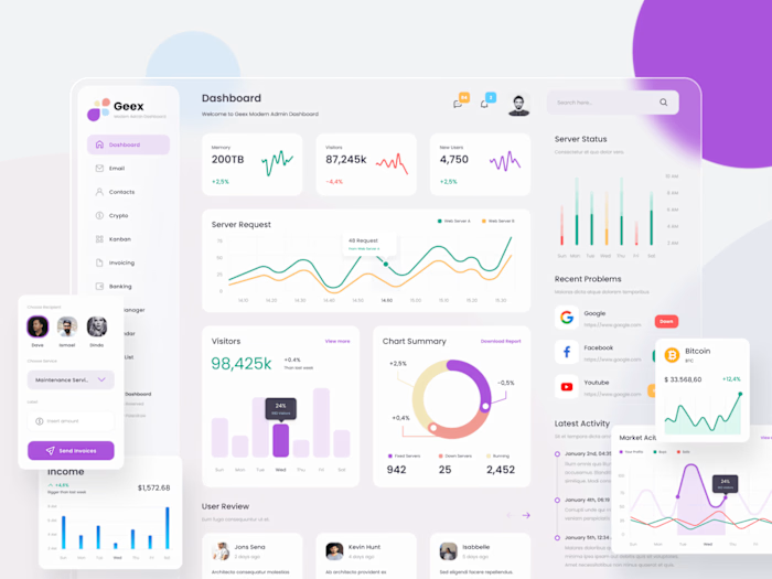
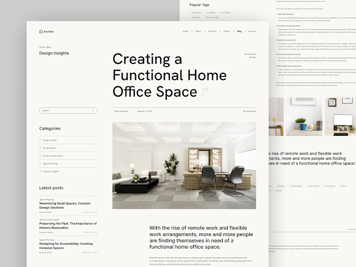
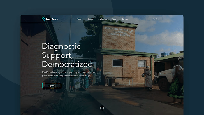
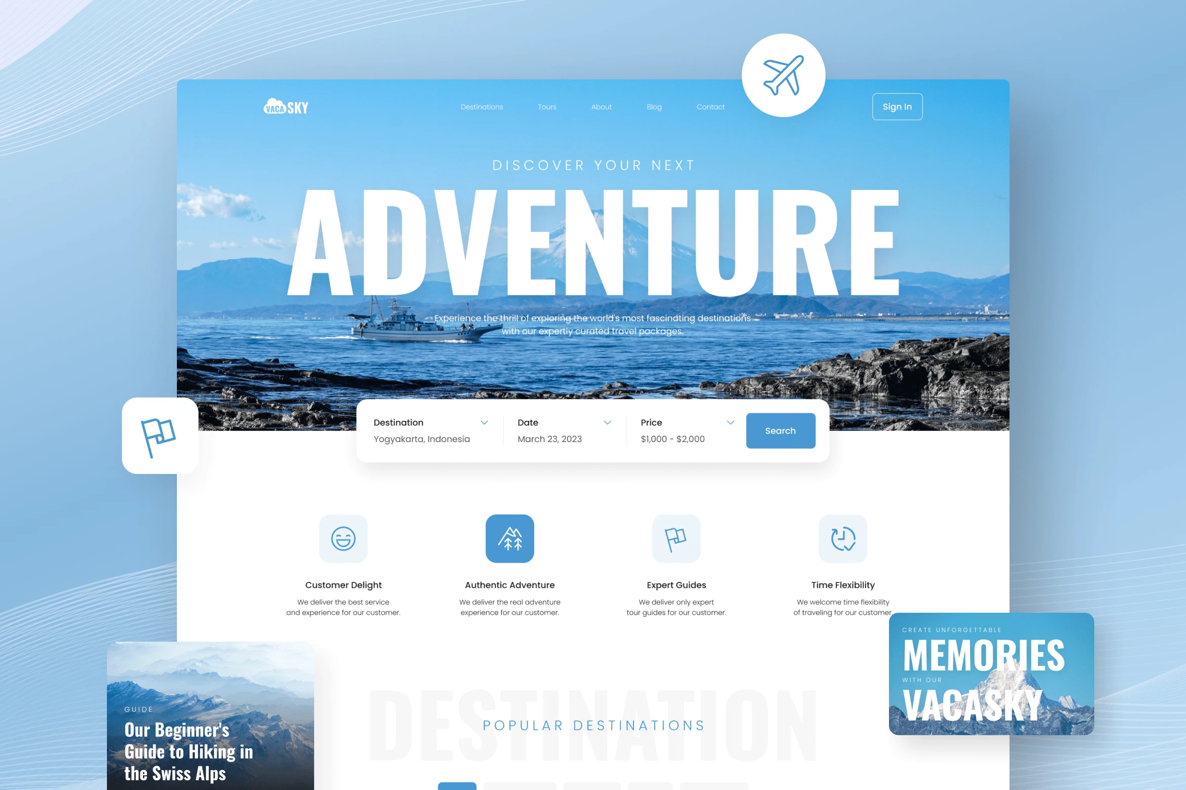
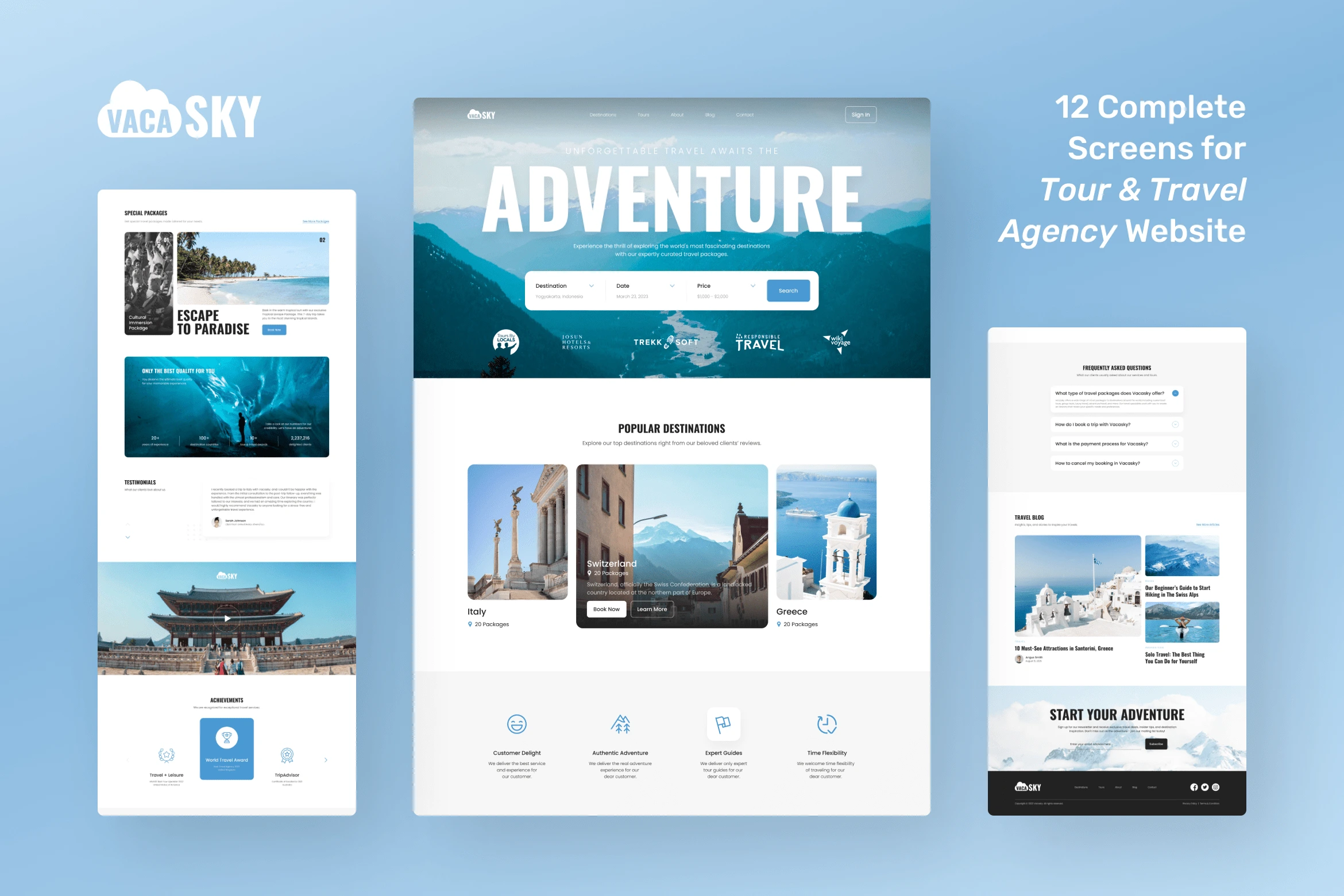
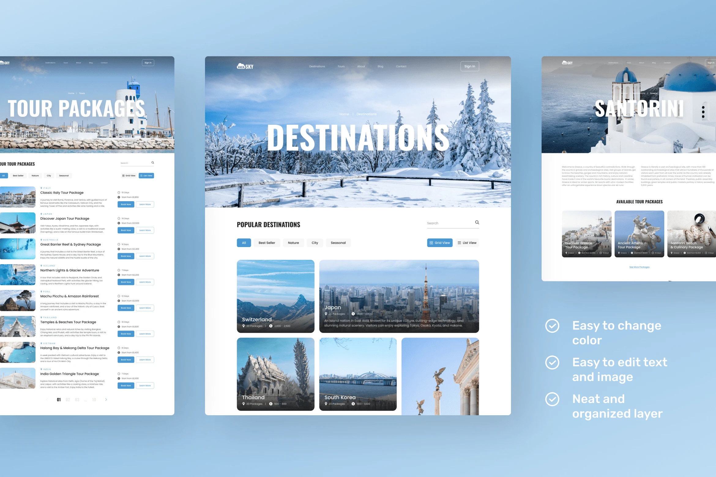
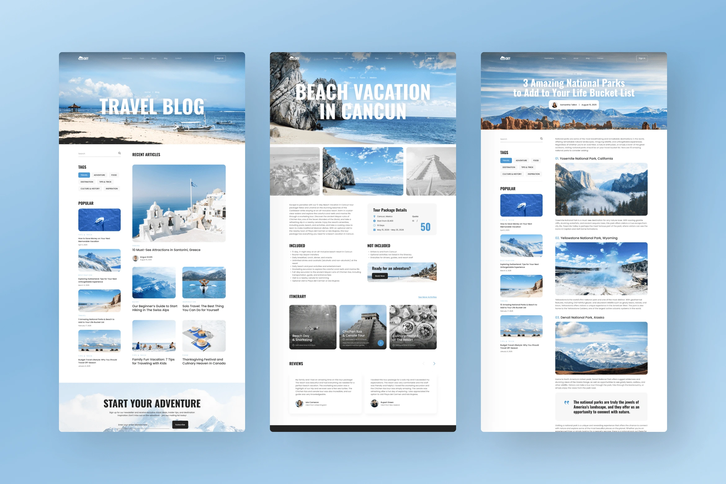
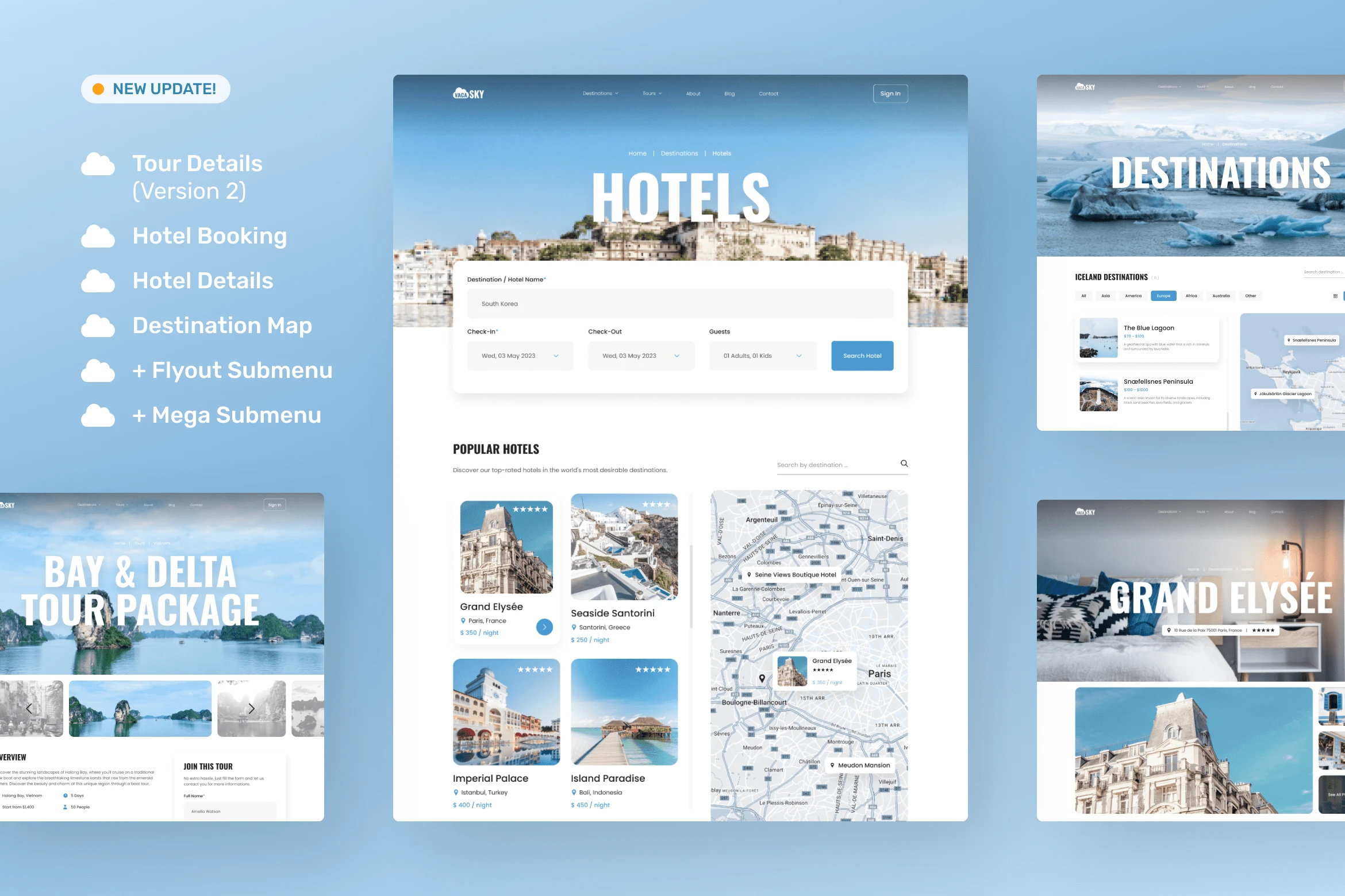
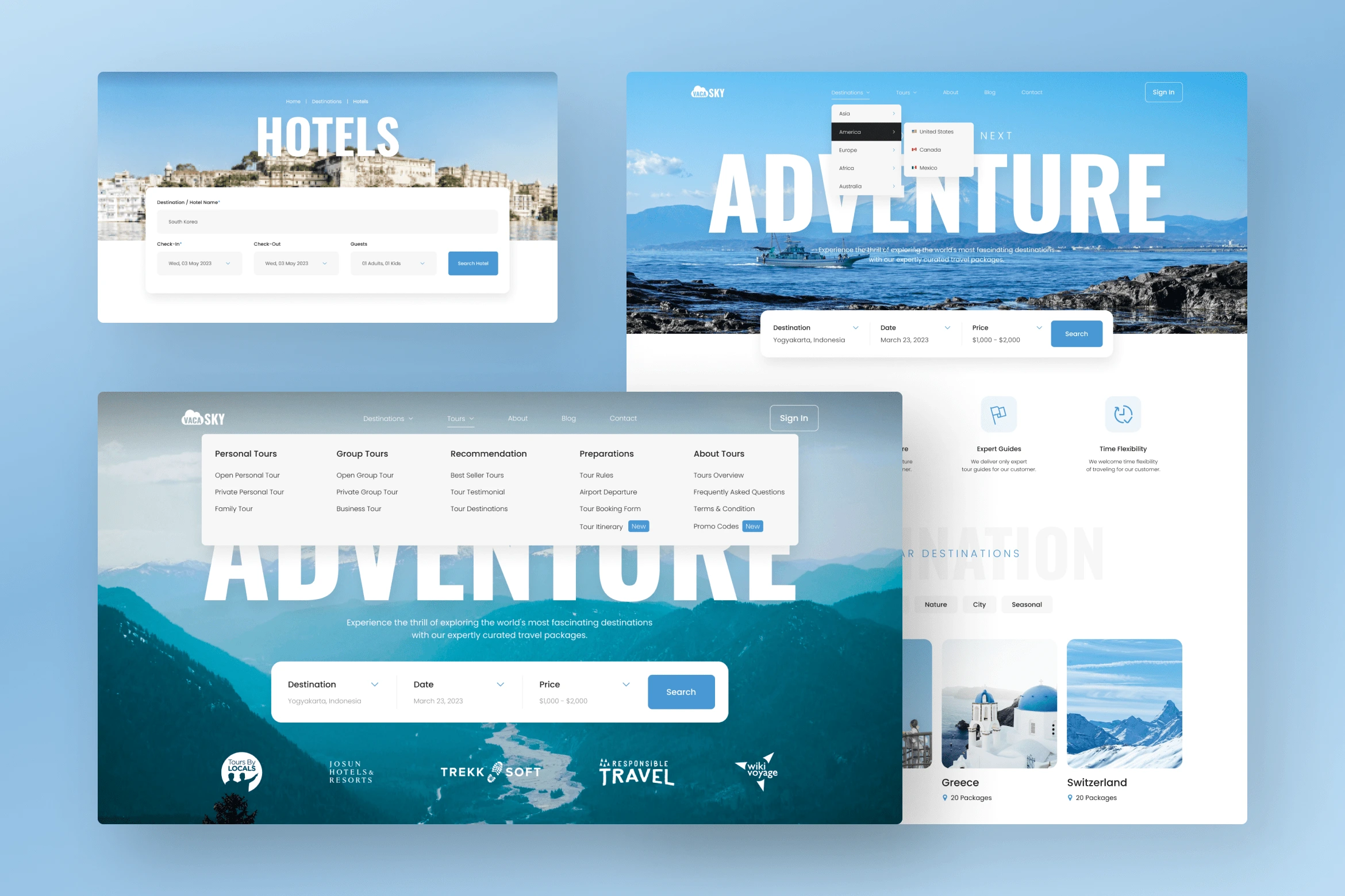
This design exploration for VacaSky was created to bring a sophisticated and minimalist approach to tour and travel websites. With 12 essential screens, the design aims to provide a seamless user experience for travelers exploring destinations, booking tours, and reading travel insights. The combination of blue and white colors creates a calming, inviting atmosphere, aligning with the aspirations of travelers seeking both adventure and relaxation.
Challenges:
Designing unique layouts across various pages to maintain user engagement while ensuring consistency in style.
Balancing visually rich photo selections with a minimalist approach, creates an appealing yet uncluttered look.
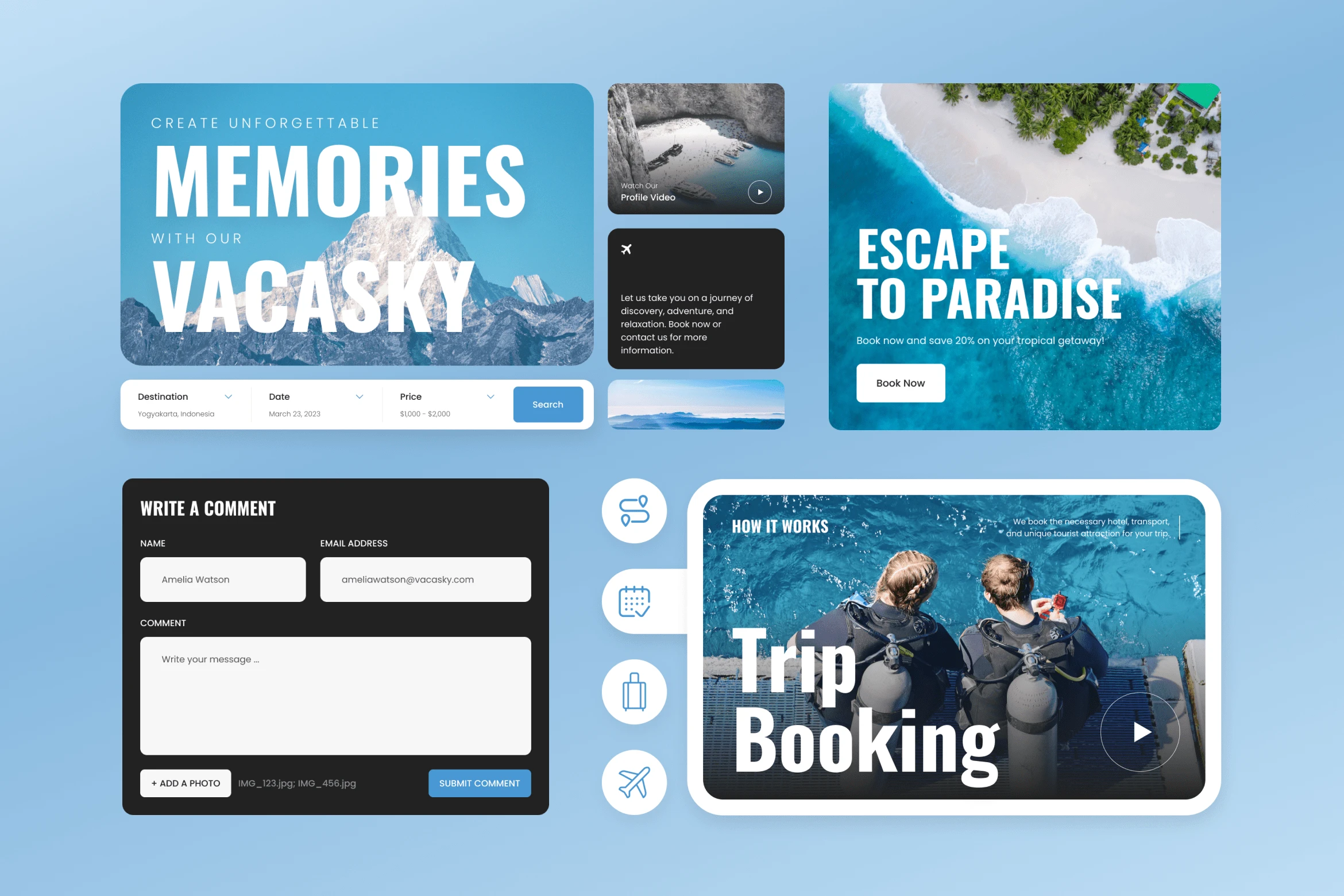
Incorporating both informational and interactive elements across multiple screens, including destination details, booking options, and blog sections.
Results:
The final design delivers a sophisticated, user-friendly experience that is both relaxing and engaging. With its blue and white color palette and modern layout, the template offers a cohesive, high-quality look across all pages. VacaSky’s design successfully enhances the browsing experience, making it easy for users to discover destinations, book tours, and enjoy travel content in a visually pleasing and functional environment.

Do you have a project in mind?
Let's get in touch!
---
Email: hello@peterdraw.co
Website: peterdraw.co
Instagram: @peterdraw.co
Like this project
Posted Aug 2, 2023
We are pleased to present our design exploration, a modern travel website design that enhances exploration and booking experiences for adventure-seekers.
Likes
2
Views
70

