Pitt Stop Vending
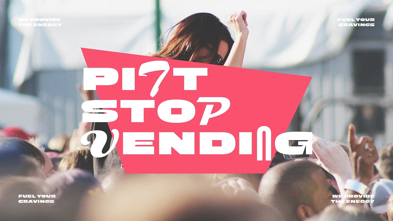
Supplying the energy at festivals through vending machines.
Pitt Stop Vending provide a vending machine service supplying drinks and snacks at festivals. From the pain of queuing for food and beverages at festivals, Pitt Stop Vending is inspired by the efficiency and convenience of 20th Century American Diners that provided a pit stop for commuters to refuel on their journey. Pitt Stop Vending now refuels their customers at festivals so they can party for longer.
Services
Brand research, Brand strategy, Brand identity, Design system, Logo design, Motion design & Implementation.
Brand strategy
Pitt Stop Vending’s vision is to refuel customers and provide the energy at festivals so they can party for longer. The brand ensures festival goers can fuel their cravings by making food and beverage purchases conveniently from their vending machines without having to que for an unnecessary periods of time. Pitt Stop Vending brings the efficiency and convenience of 20th Century American Diners to festivals to refuel customers in an energetic and fun manner.
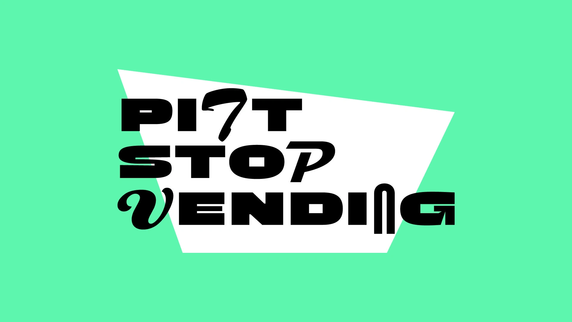
Logo design
The Pitt Stop Vending logotype captures the energetic and fun characteristics of the brand. Combining modern sans serif type with traditional type used in old American Diner signage enforces the brand strategy in the logo design.
Visual Identity
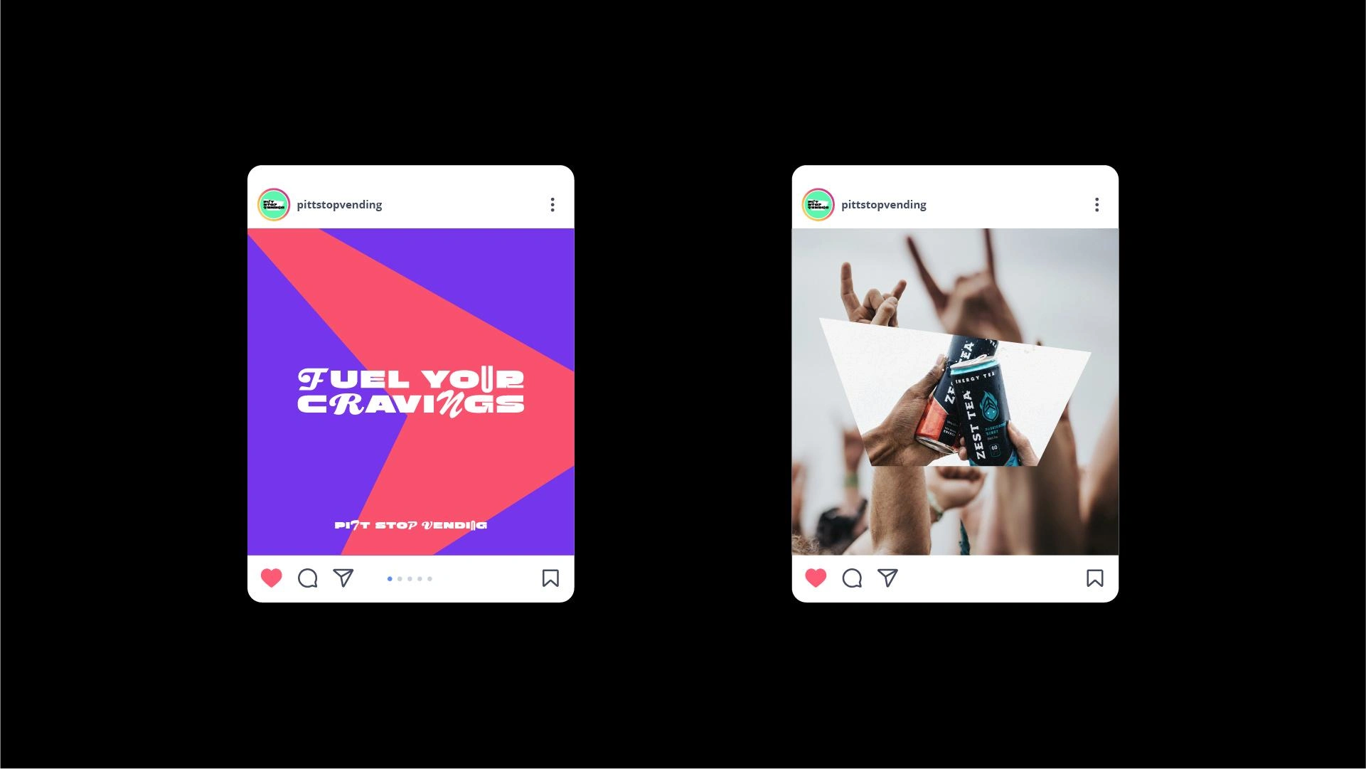
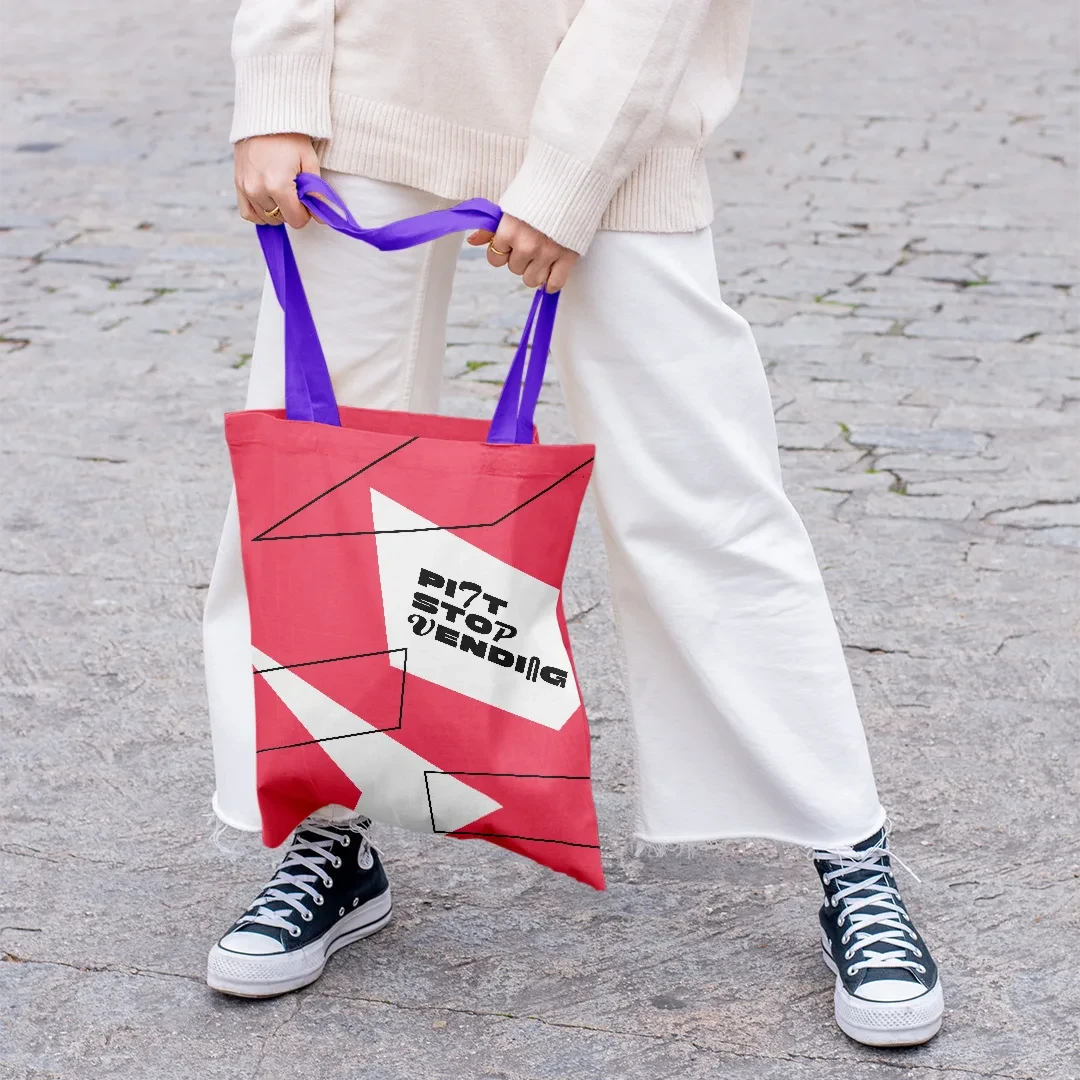
Pitt Stop Vending’s visual identity is a reflection of the brand strategy. The brand copy uses the same energetic type treatment that’s seen in the logo, alongside a bright and energetic colour palette to match the energy generated at festivals. The four sided geometric shapes used in the identity are inspired from the shapes used in old American Diner signage. These graphic shapes are used to communicate through, but also adapted to represent the food and beverages that Pitt Stop Vending offers.
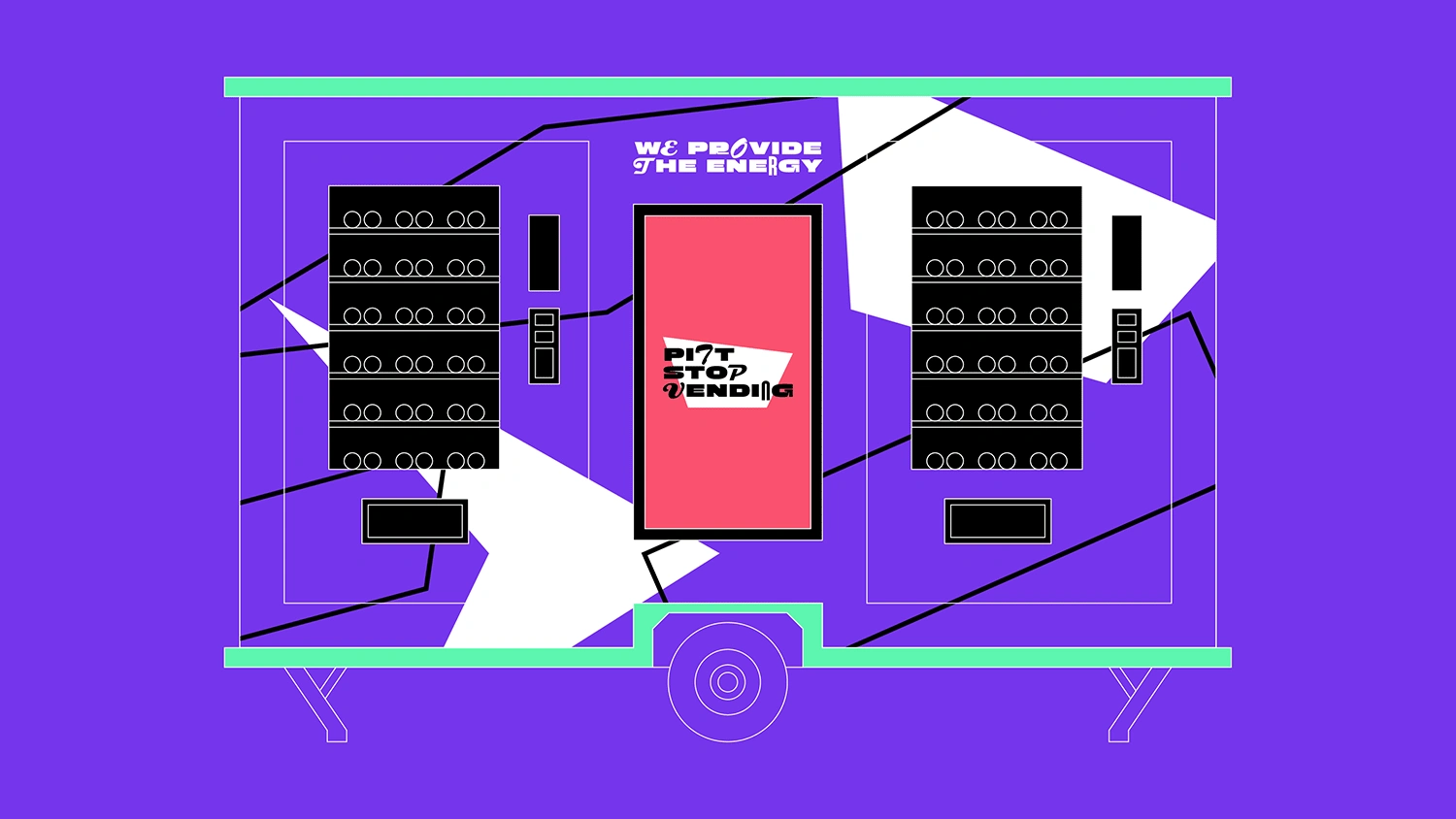
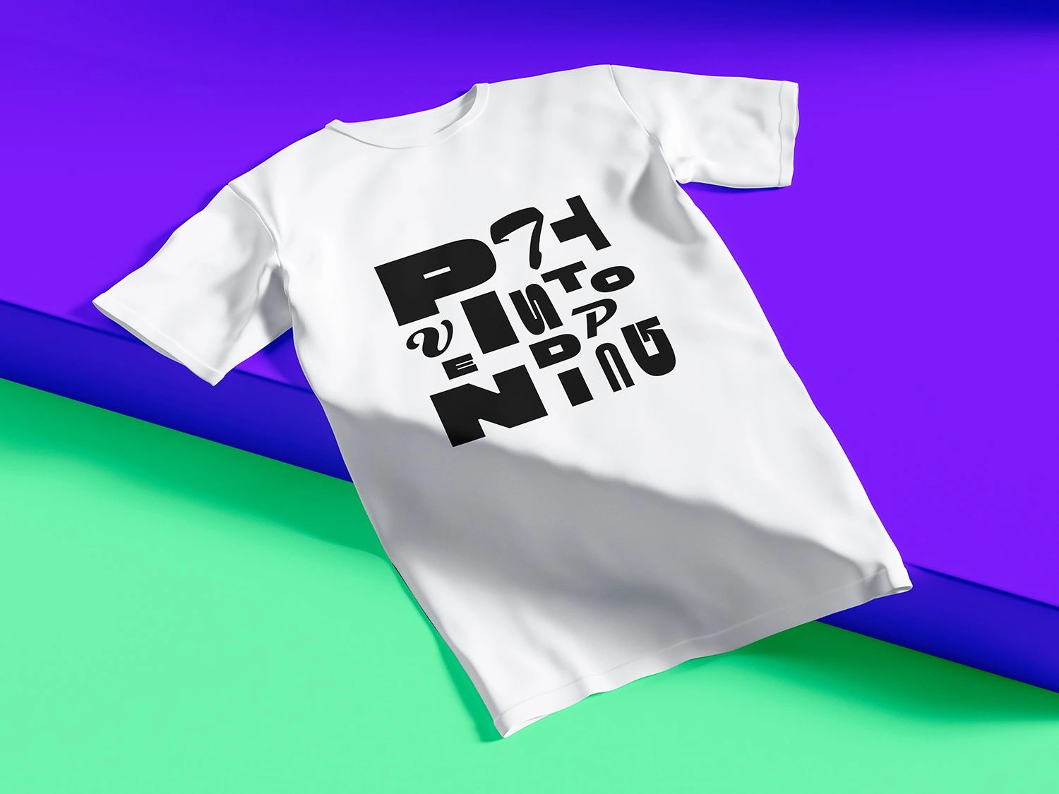
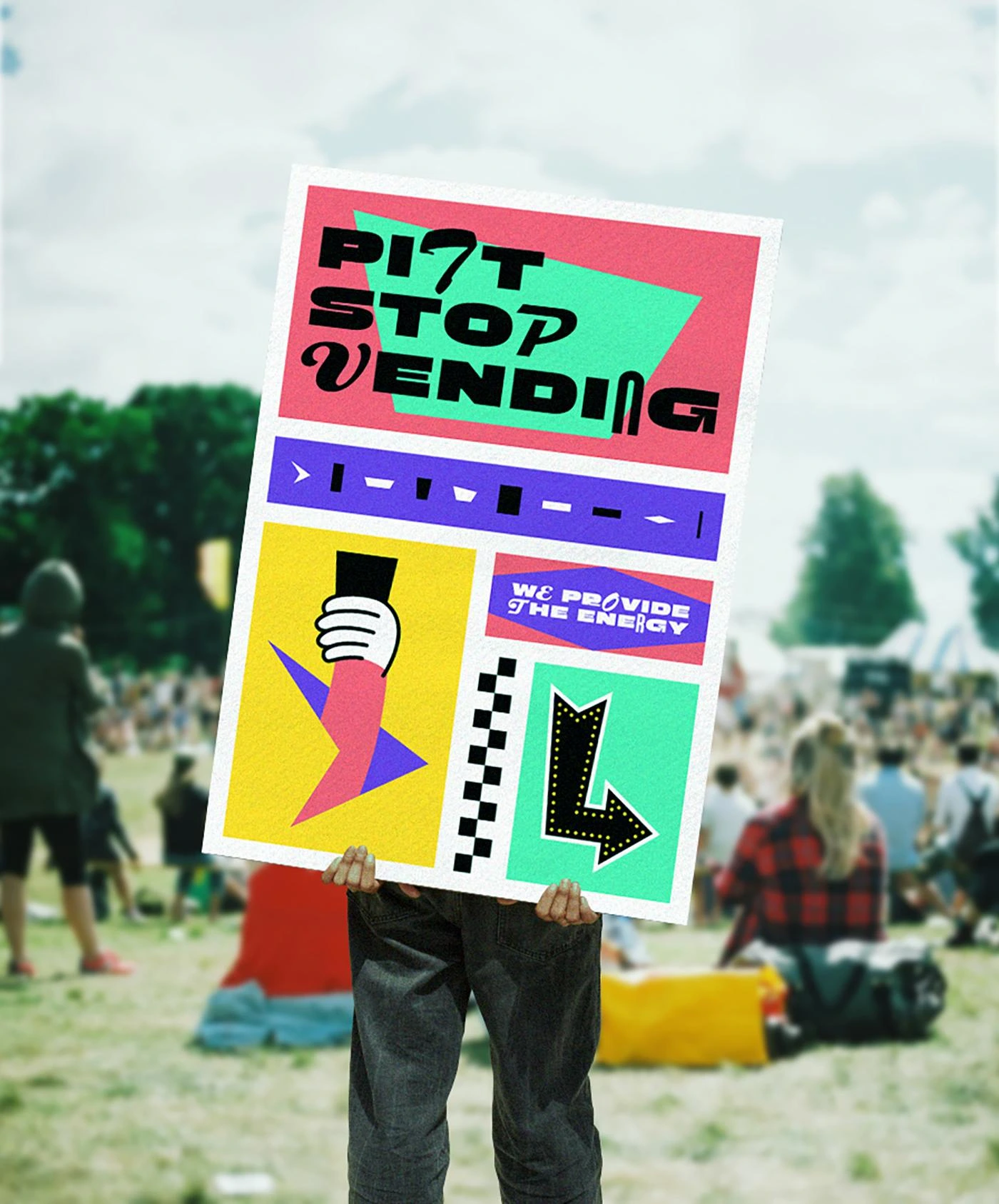
Implementation
The Pitt Stop Vending brand is rolled out to a range of touch points including signage, merchandise and social.
See project in more detail at https://finke.studio/pitt-stop-vending/
Like this project
Posted Jul 7, 2024
Brand identity design for Pitt Stop Vending, supplying the energy at festivals through vending machines.

