Designing for intent: reimagining mobile UX with AI
Gábor Balogh
In this speculative concept, I explored how a mobile OS could be redesigned around user intent rather than static apps. Instead of navigating folders or multitasking views, users land on screens tailored to what they want to do — whether that's starting a workout, calling a friend, or getting focused.
The interface reduces friction by making system-level actions available through contextual cards. Each screen prioritizes clarity, emotional tone, and speed, while letting the user stay in control.
From the flow logic to the visual design, everything was built to test how AI can enable less cluttered, more intuitive mobile experiences.
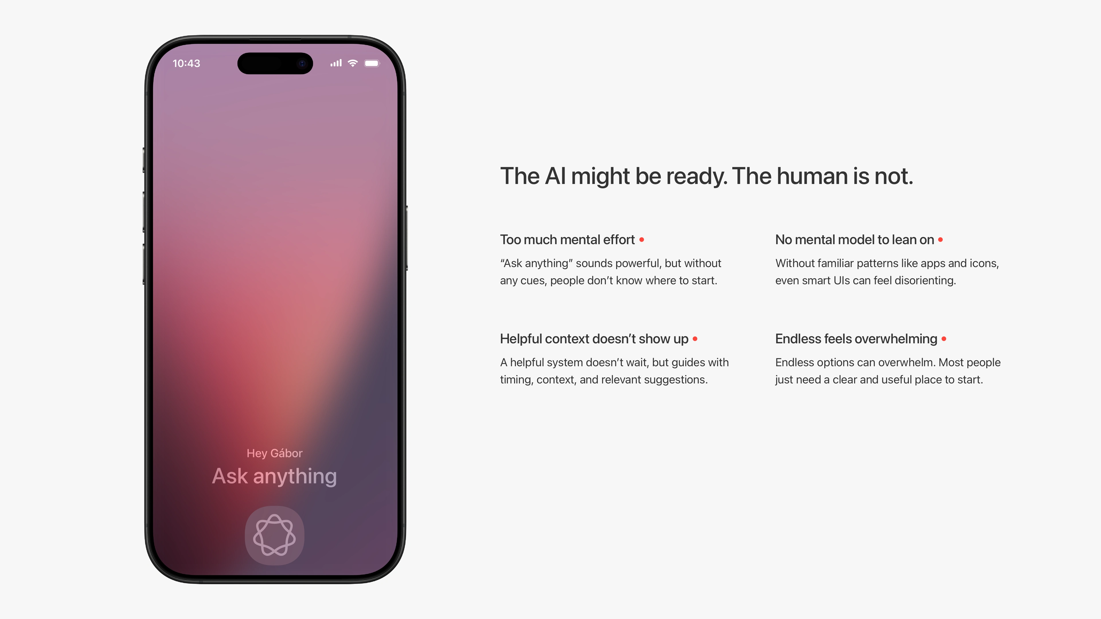
Most AI UIs say “ask anything,” but leave people wondering where to start.
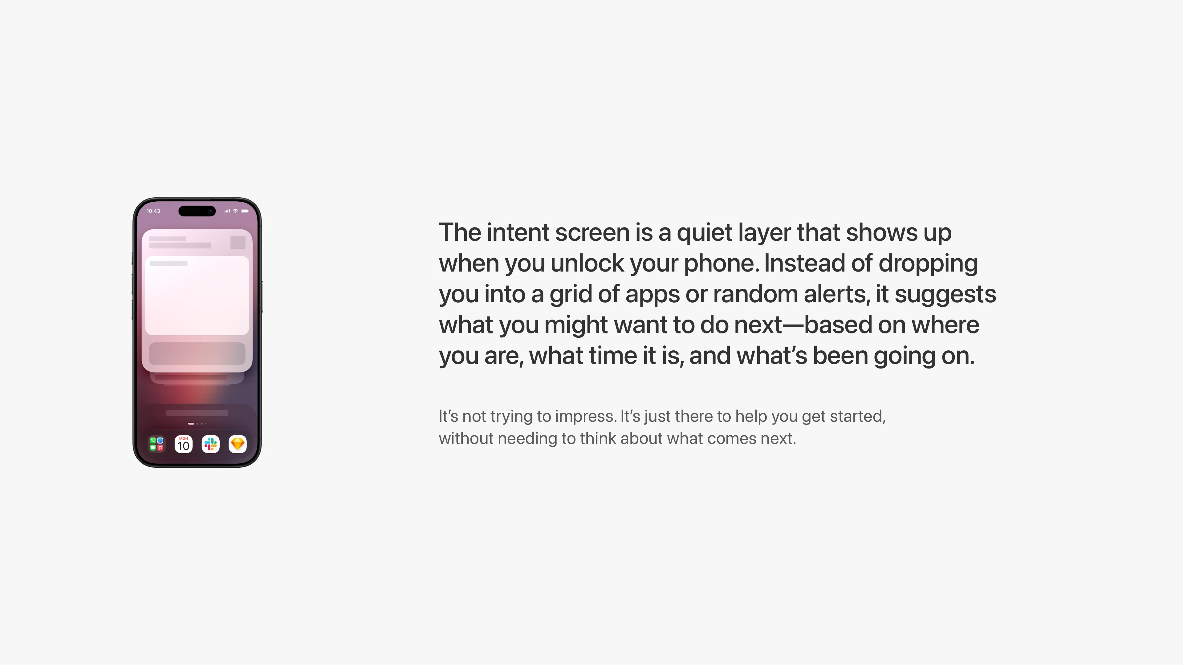
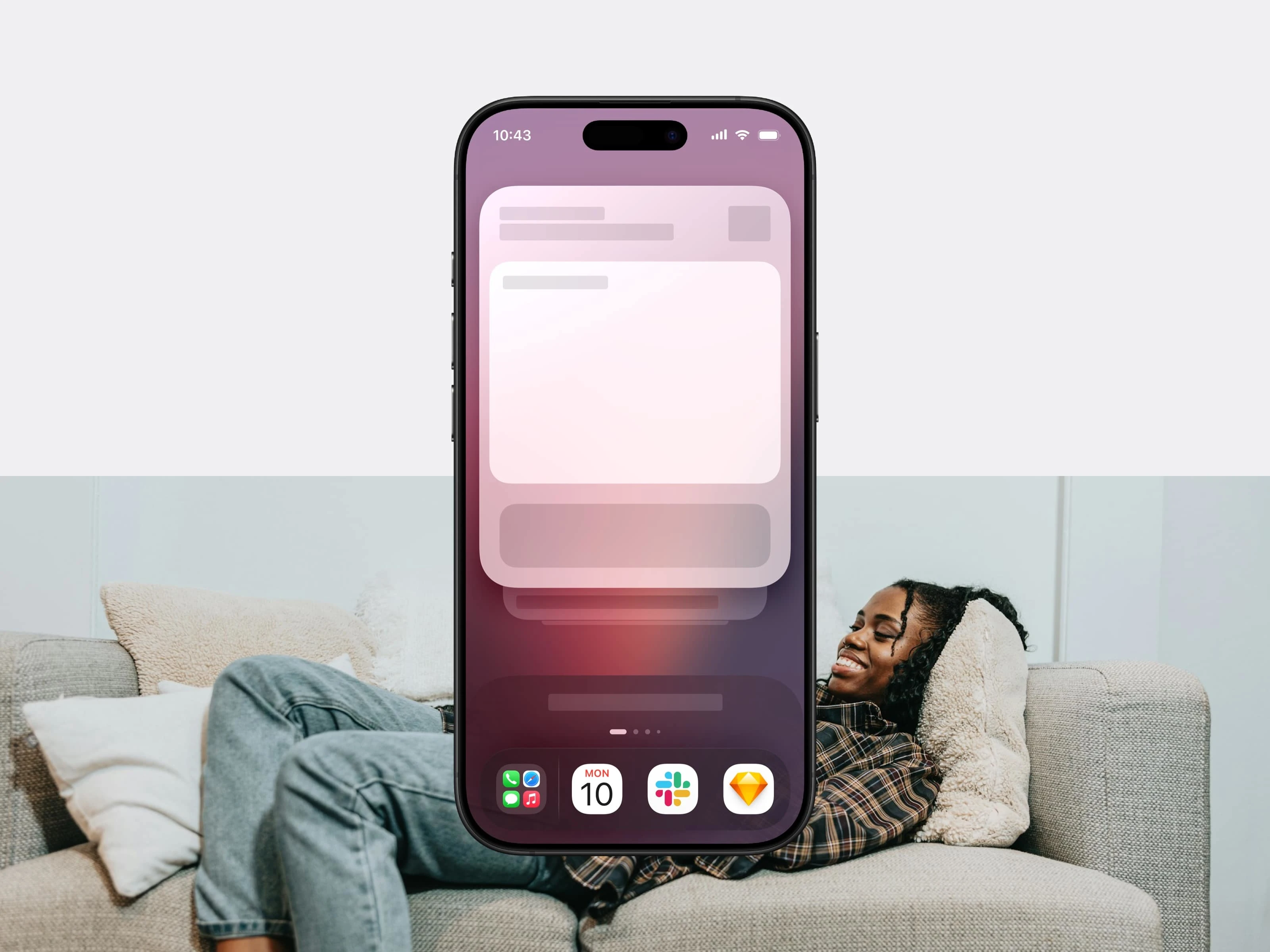
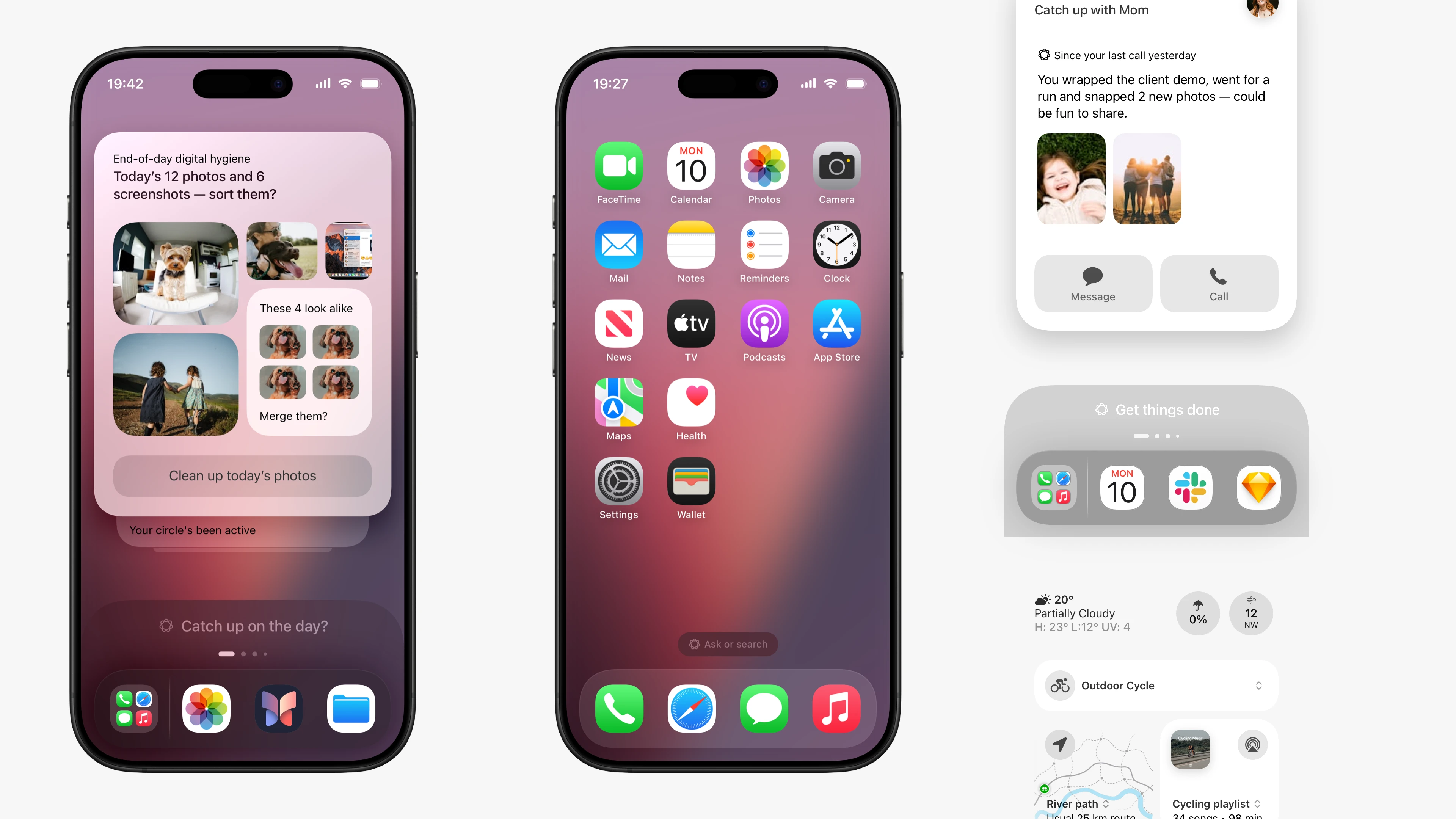
No popups, no distractions. Just a calm suggestion when you unlock your phone.
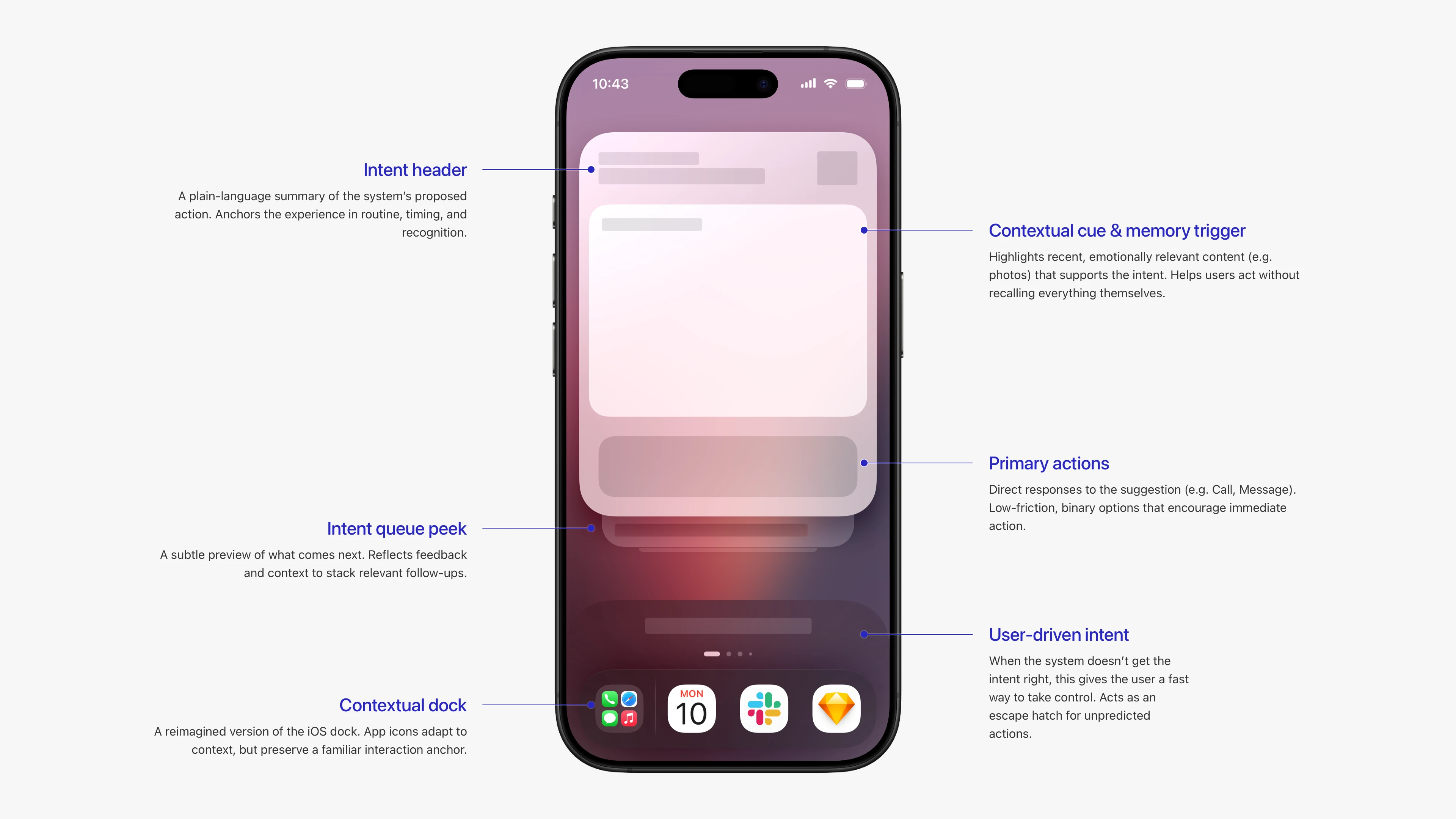
A breakdown of the intent screen components designed to offer context, timing, and action in one glance.
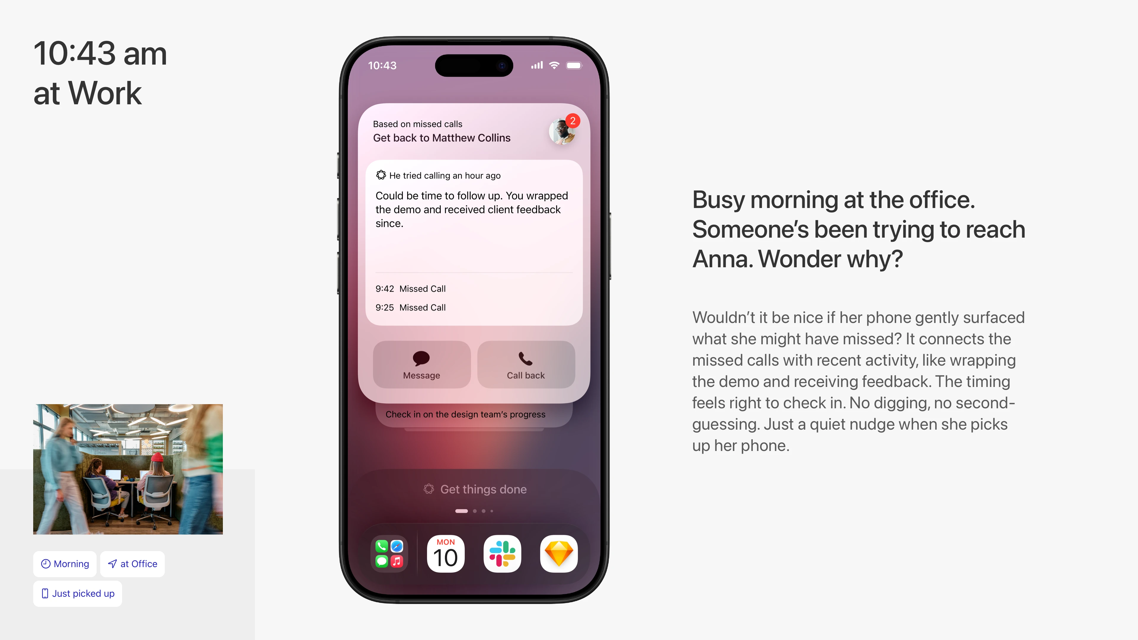
Connects the dots between missed calls and what you might have forgotten to follow up on.
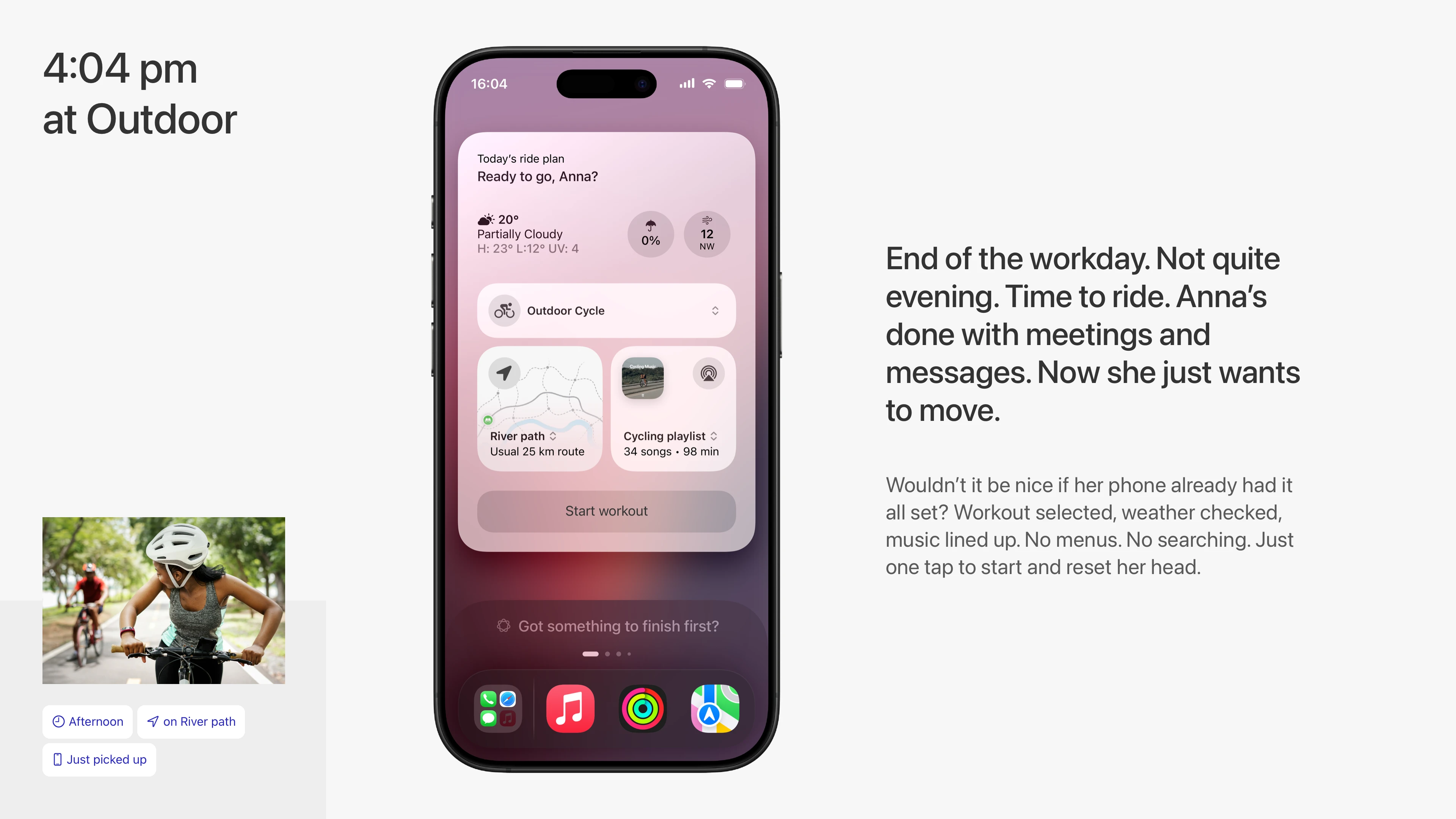
Knows when you're done for the day and sets up your workout, so you can just hit play and move.
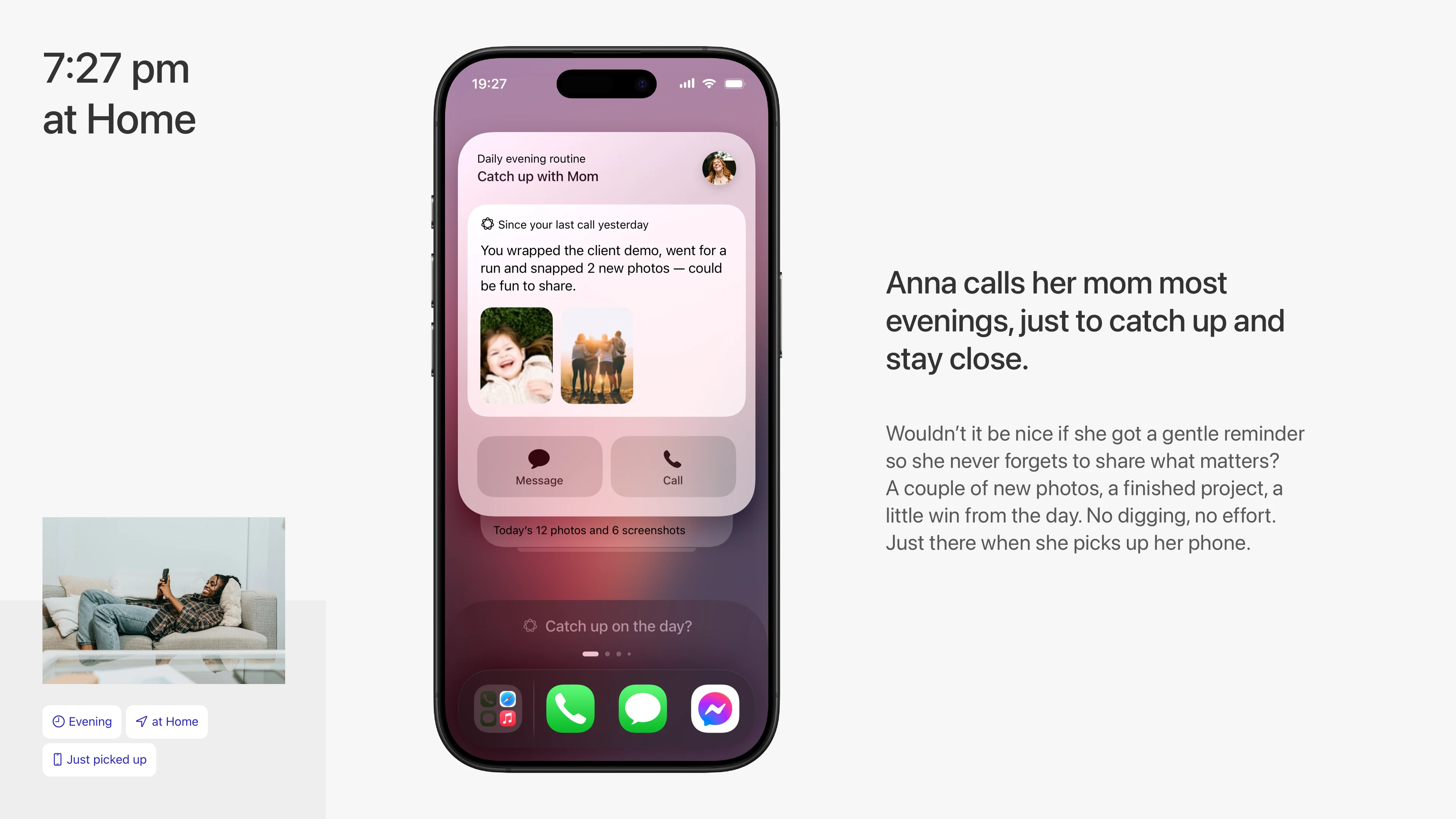
A gentle nudge to stay in touch, based on context and cues you already left behind.
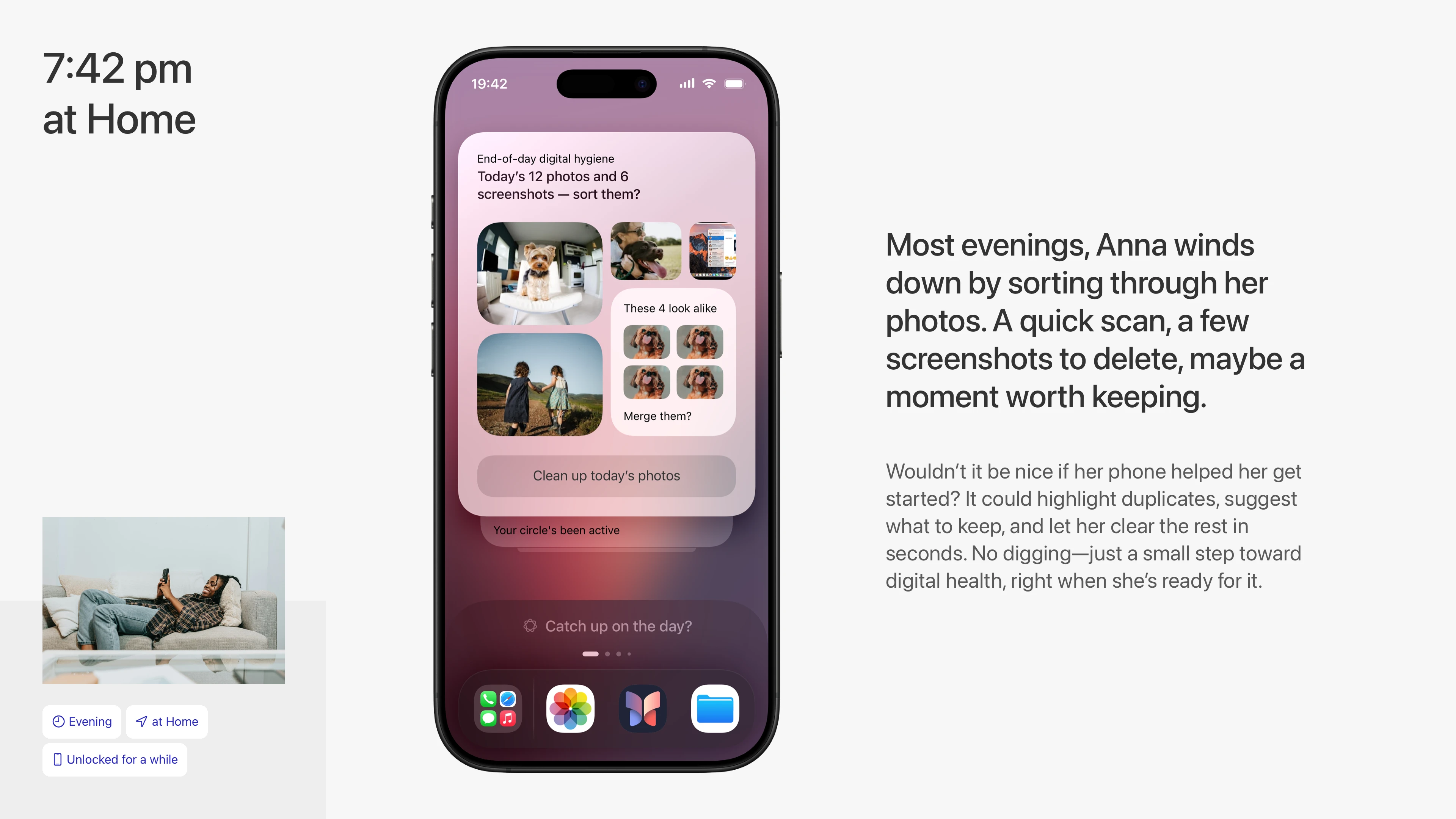
Helps you clean up your day’s photos with no digging. Just a small moment of digital hygiene.
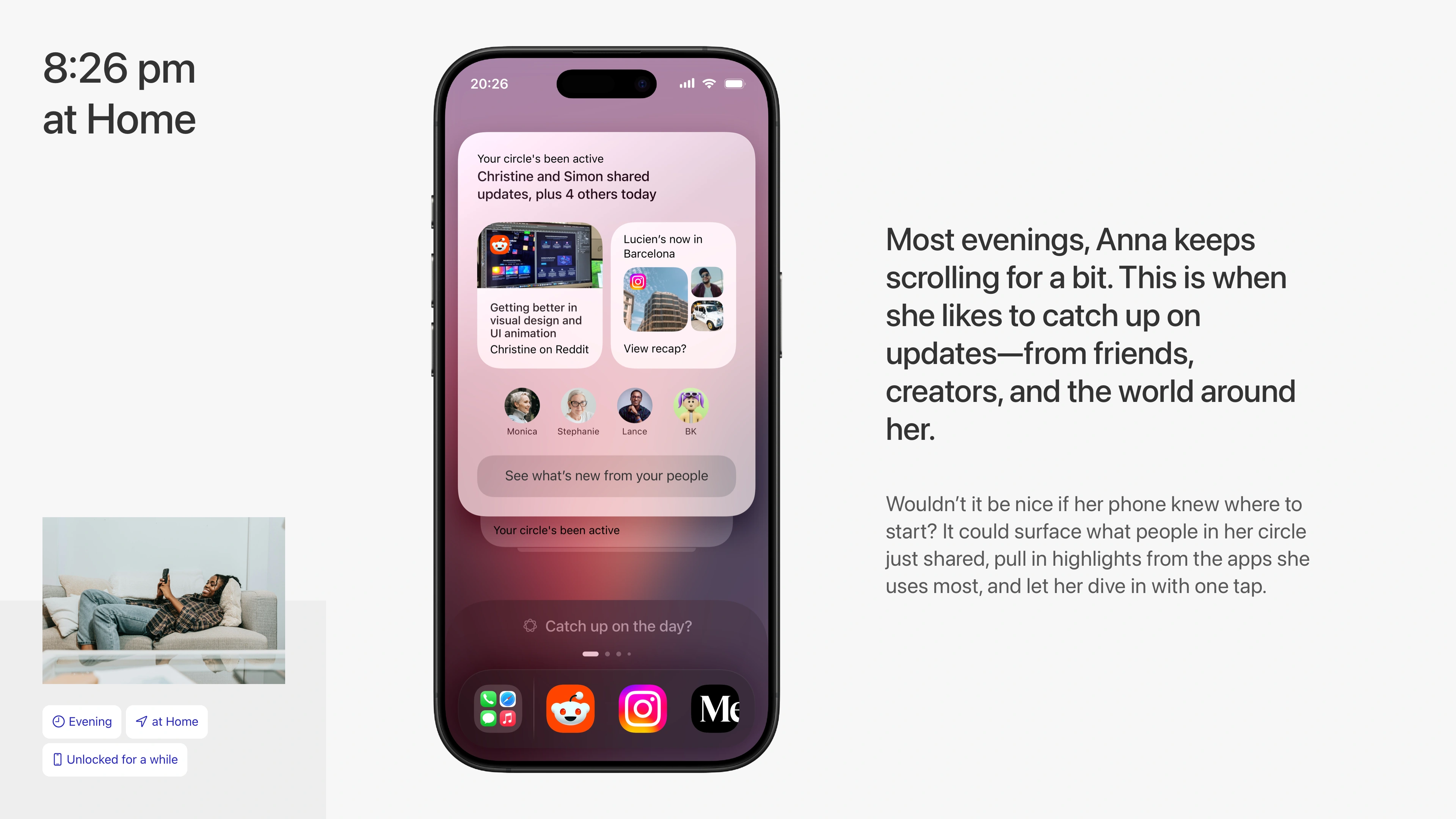
Surfaces what matters—shared updates from friends and creators—when you’re in the mood to scroll.
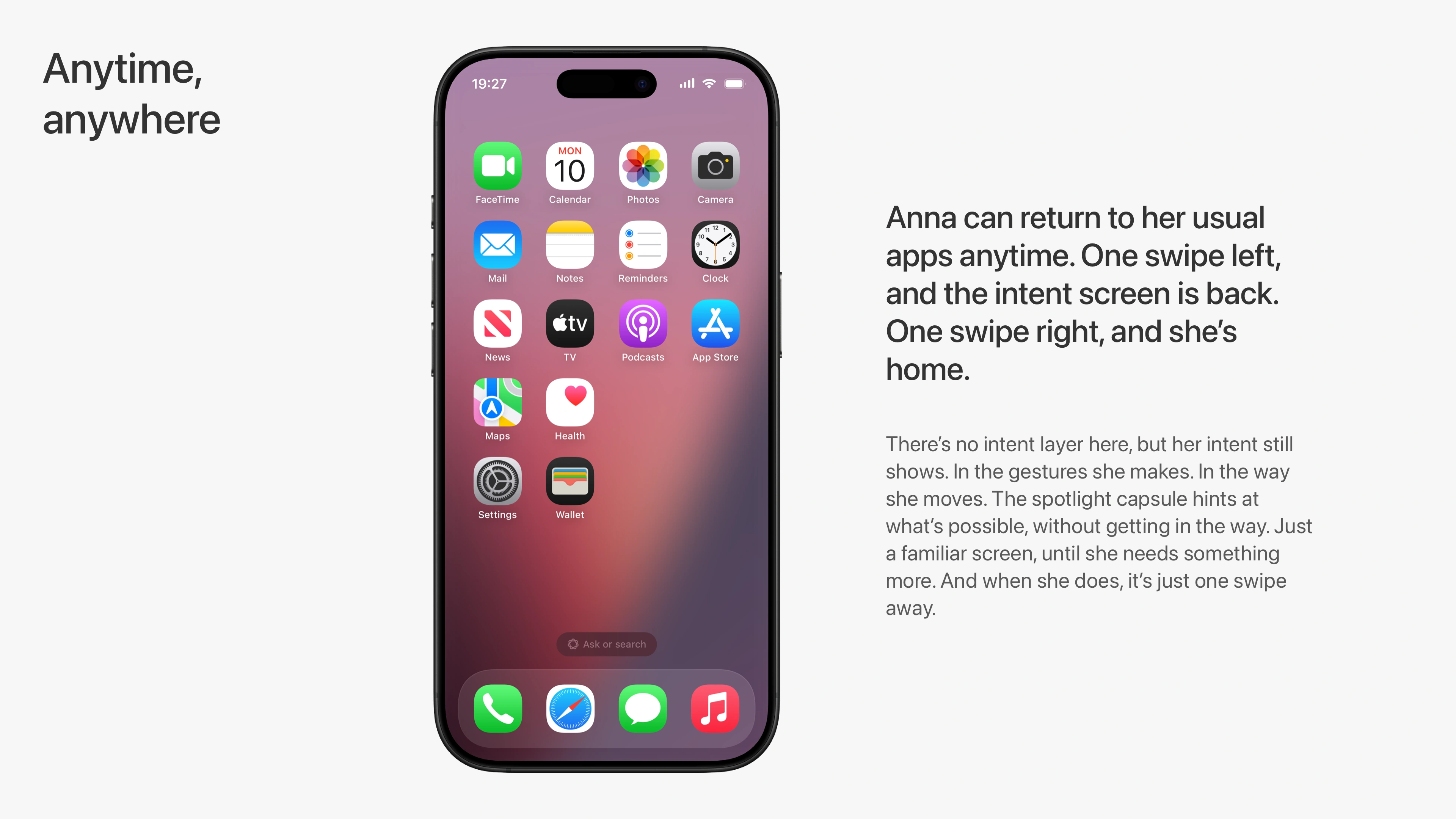
The familiar home screen stays. One swipe brings the intent layer, one swipe takes you back.
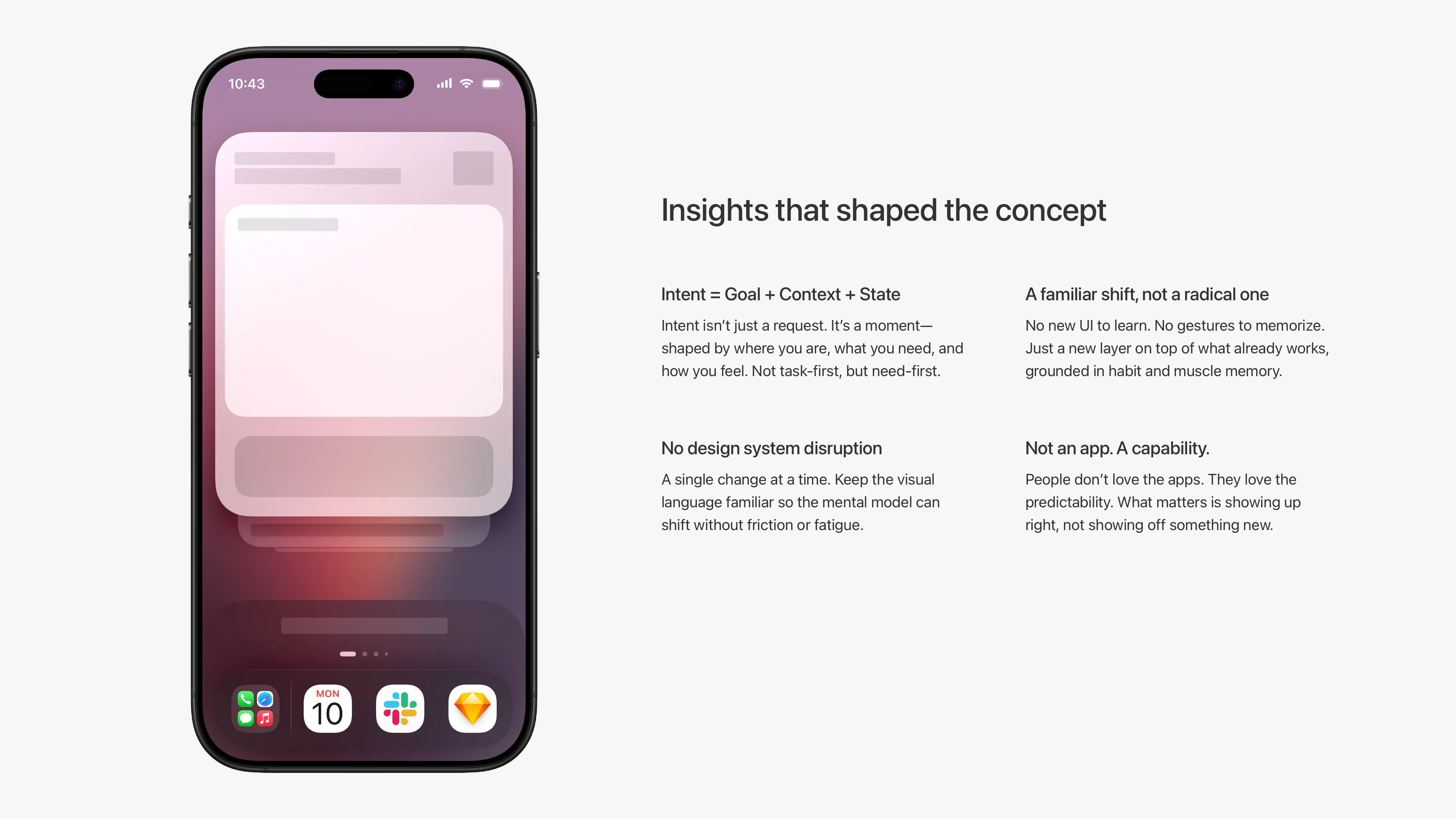
Intent is not just input. It’s what you might want to do next, based on your state and routine.
This is part of my ongoing research into better AI UI and UX. If you're building interfaces that need to feel smart but stay human, let’s talk.
Like this project
Posted Jun 4, 2025
An AI-first mobile OS concept that replaces apps with intent-based screens simplifying everyday tasks while keeping users in control.