IBGO Branding & Logo

Alech Peter


Posted May 13, 2026
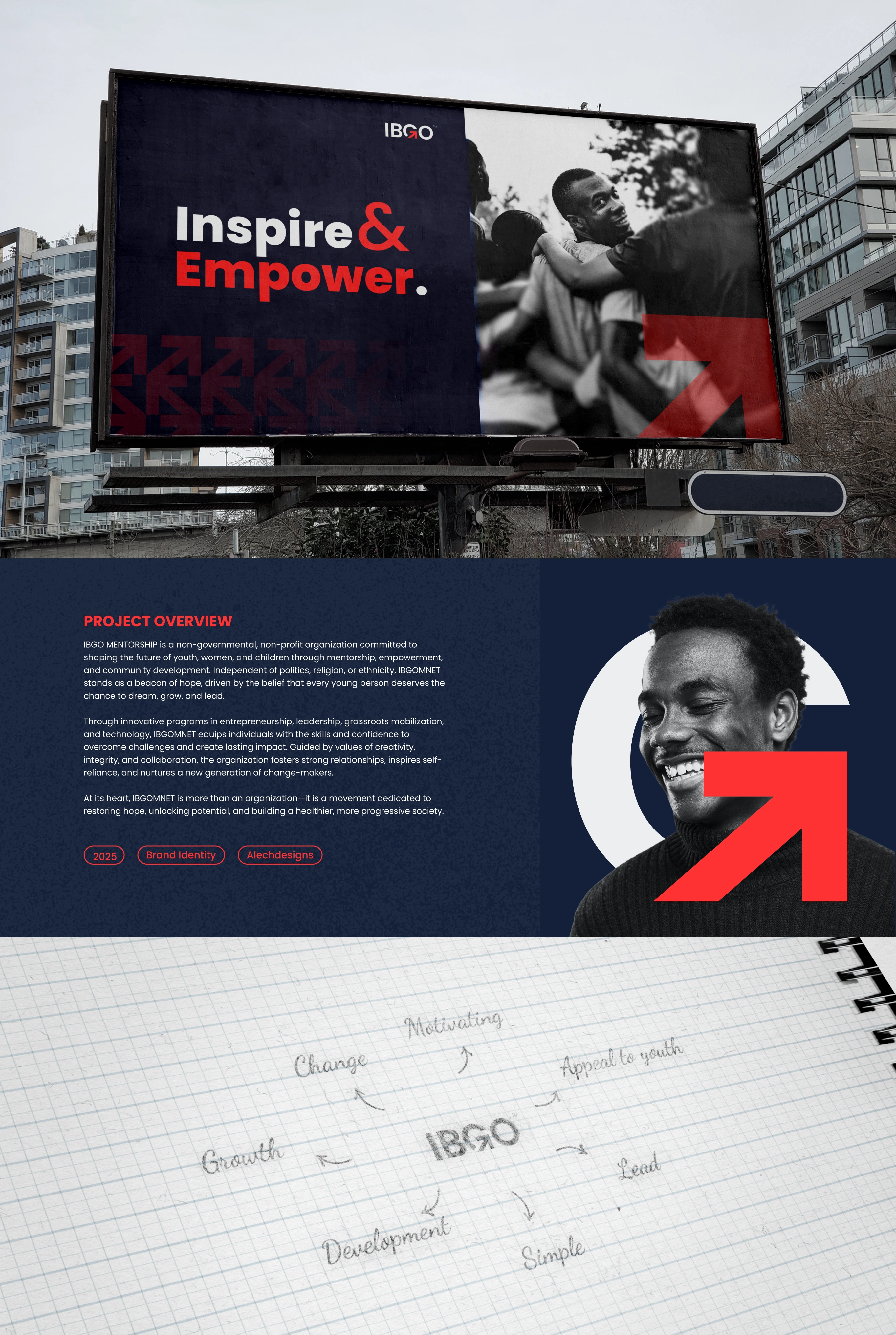
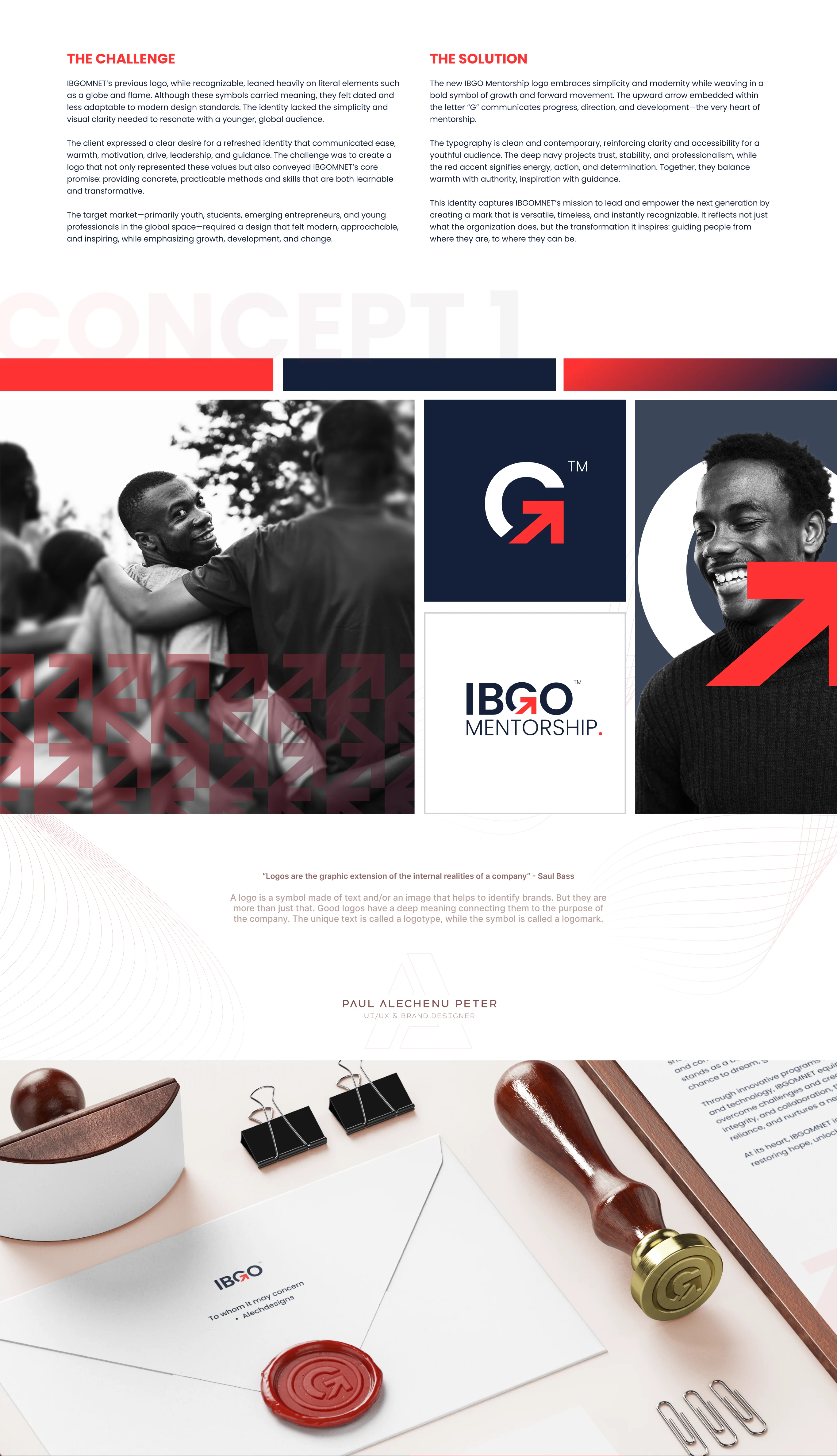
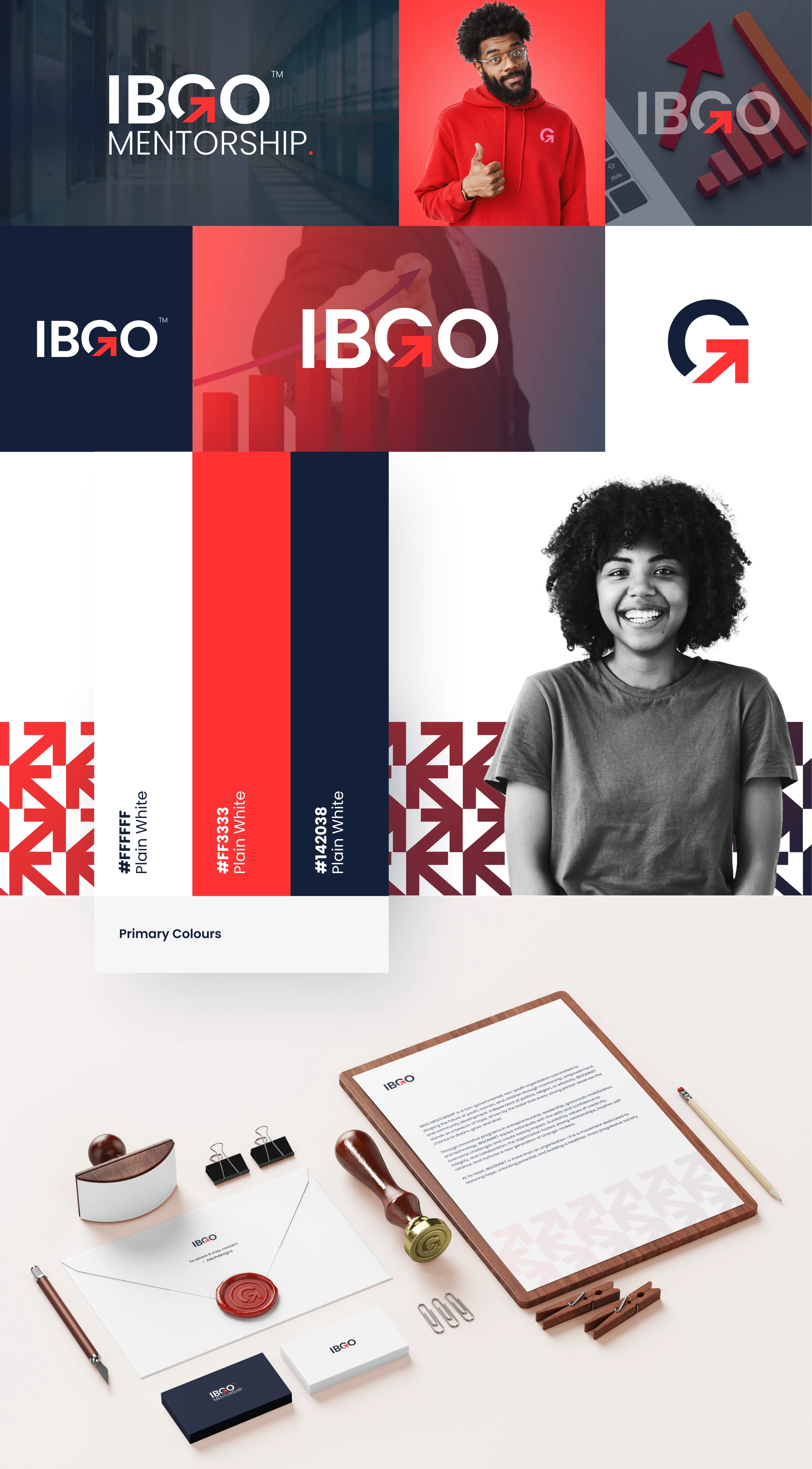
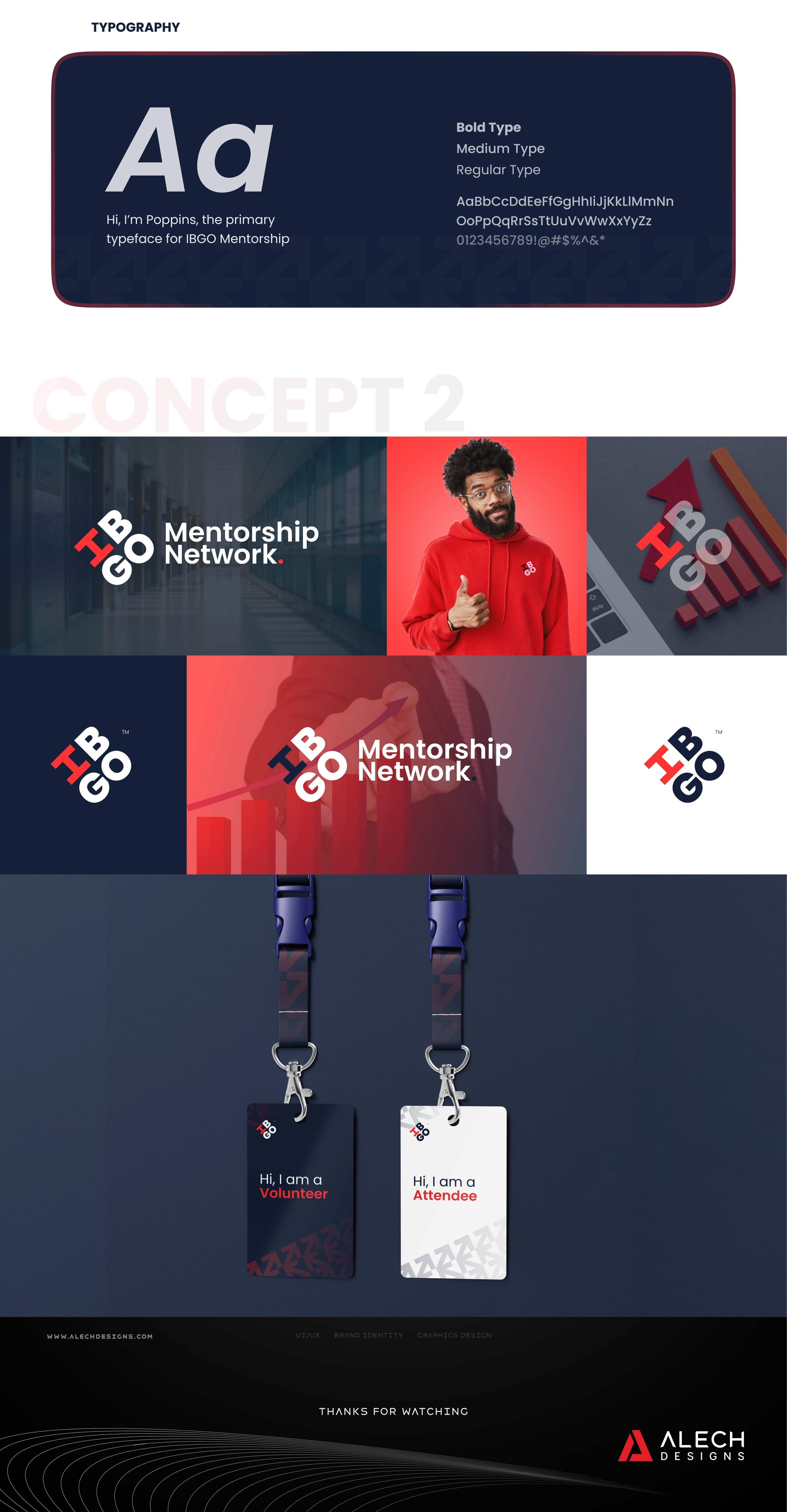
The new IBGO Mentorship logo embraces simplicity and modernity while weaving in a bold symbol of growth and forward movement. The upward arrow embedded within the letter “G” communicates progress, direction, and development—the very heart of mentorship. The typography is clean and contemporary, reinforcing clarity and accessibility for a youthful audience. The deep navy projects trust, stability, and professionalism, while the red accent signifies energy, action, and determination. Together, they balance warmth with authority, inspiration with guidance. This identity captures IBGOMNET’s mission to lead and empower the next generation by creating a mark that is versatile, timeless, and instantly recognizable. It reflects not just what the organization does, but the transformation it inspires: guiding people from where they are, to where they can be.