Wano - Simplifying Crypto Commerce
Overview
Wano is a web3 platform that enables online merchants to accept cryptocurrency payments. Though initially designed for early adopters, we learned merchants needed more intuitive experiences as their business scaled.
While Wano offered crypto payment capabilities, adoption lags due to usability issues like complex onboarding, confusing wallet connections, and unintuitive interfaces.
Result? Decreased payment flow clicks by 43%.
The design was validated by winning a Consensys Not Another Virtual Hackathon bounty, judged by industry experts.
Role
UX, Product Designer
Responsibilities
Product thinking, UX Design, Secondary & User Research, Market Analysis, Project Management, Pitch Presentation
Team
Stanley Akpama (FullStack Engineer) - GitHub
Ufuoma Oghenechovwe (Frontend Developer) - GitHub
Destiny Ofie (Frontend Developer) - GitHub
Timeline
Jul - Sep 2023
Design Solution
Leveraging research insights, I drove a human-centric redesign approach.
Payment Widget
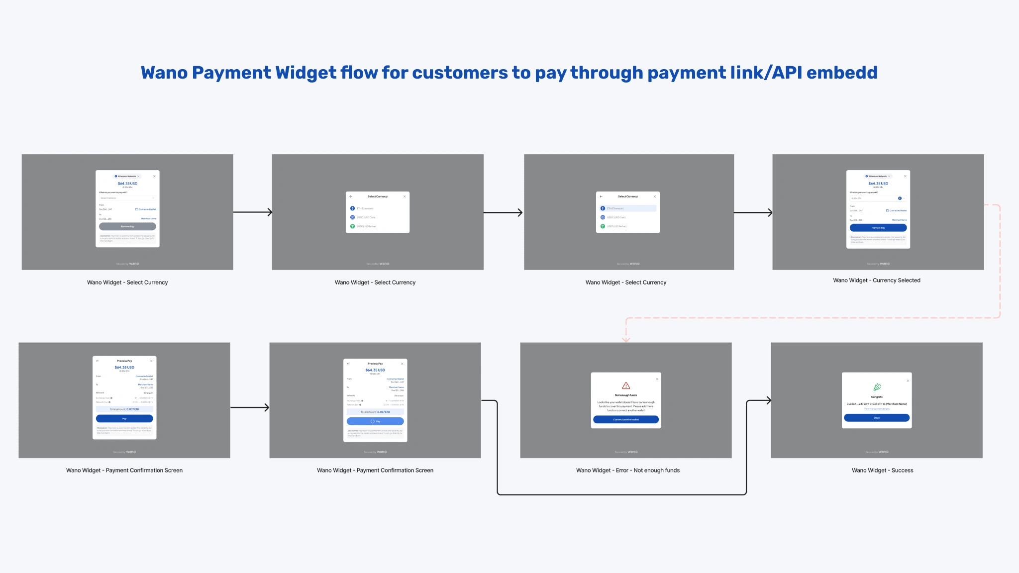
A payment widget demo that simplifies the crypto checkout process for users, reducing the number of steps required to complete a transaction.
No extra wallet's, just connect your Metamask and pay in one-click.
Dashboard & Recent Transactions
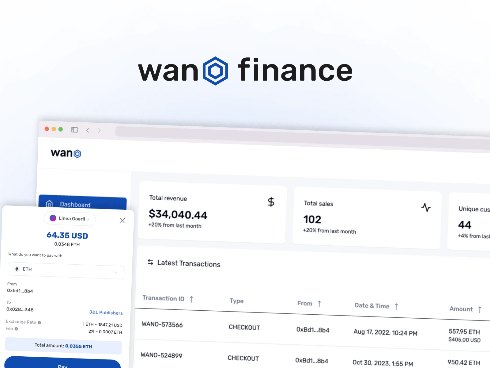
A dashboard that enables businesses to manage crypto transactions effortlessly. Giving them an overall view of their sales and transactions.
View your transactions, how much you made, and get back it back in the fiat of your choice.
Payment Link Creation
Businesses have the ability to create payment links for increased efficiency in the payment process, saving time for both users and businesses. Able to settle in a stable token of choice, customers pay token of choice.
Developer Documentation for API integration
With the developer user persona, documentation for an embedded API that allows businesses to effortlessly integrate crypto payment capabilities into their systems.
Need help understanding how to embed the payment widget? Documentation on Gitbook has you covered.
Research Approach
When it comes to accepting crypto, businesses and crypto users struggle with long check out process, poor ux, and the lack of multi-chain support.
Making a crypto payment takes way too many clicks for such a simple user goal.
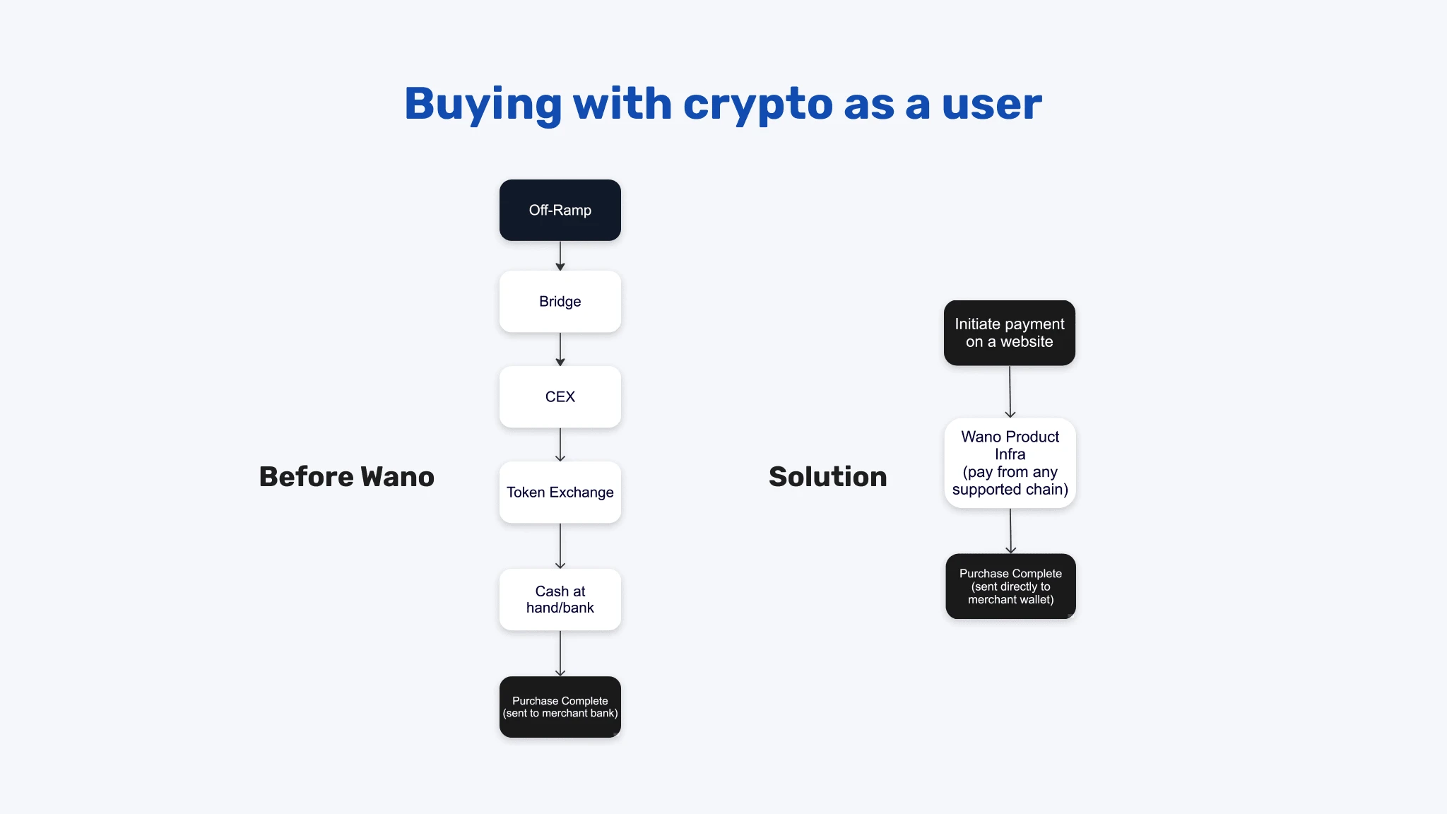
To understand user needs, I conducted one-on-one interviews uncovering usability barriers:
Difficult onboarding prevented getting started
Unclear wallet and payment connections
Expected user experience like Stripe or PayPal
More education needed on crypto transactions
I translated findings into goals using the Jobs To Be Done framework to identify core merchant requirements.

Iterated on flows and UI to meet merchant and user needs, overcoming backend constraints.
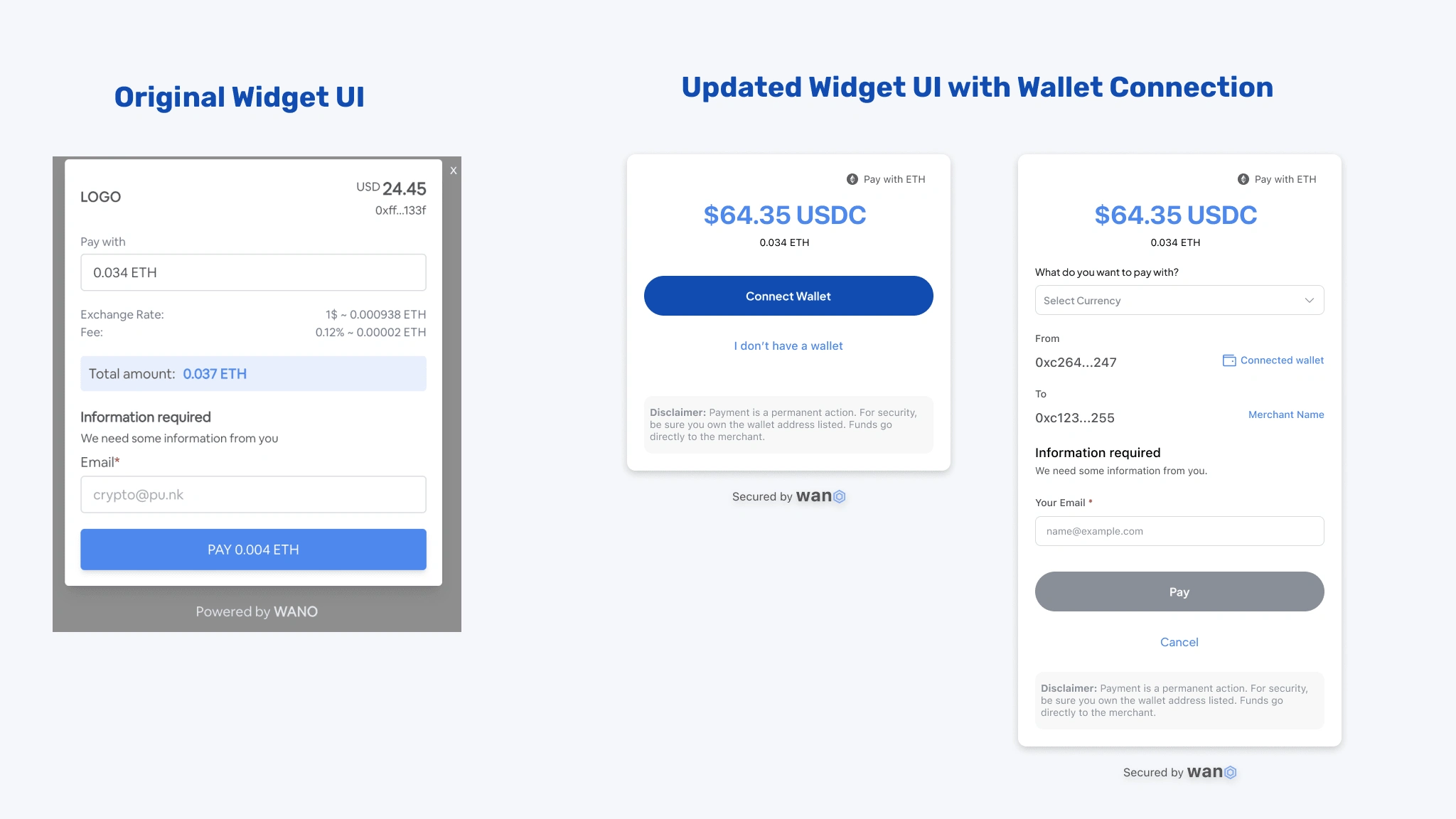
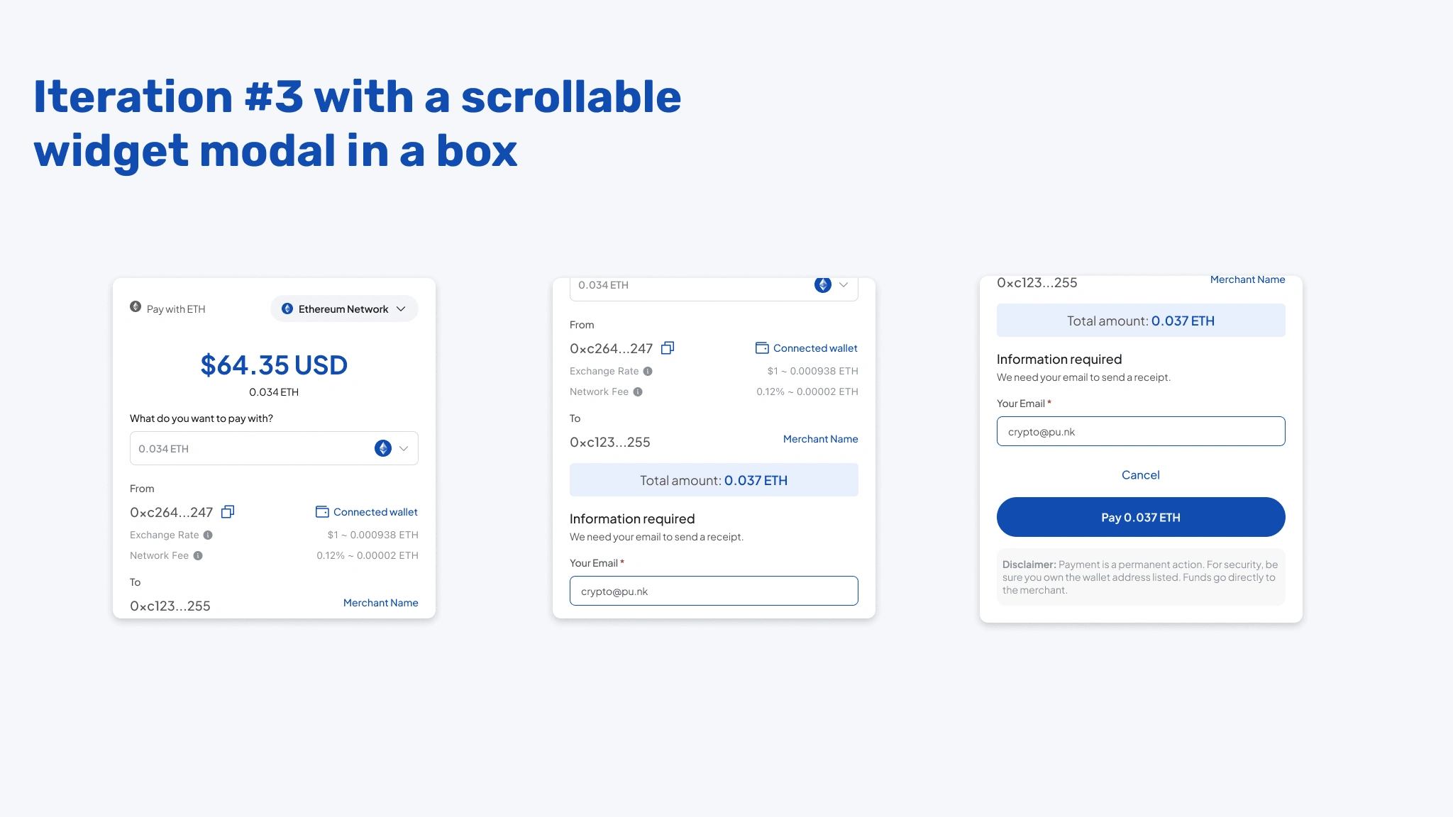
Results
Tested original payment flow to newly developed, resulting in a 43% decrease in payment touch-points.
Reflection
Web3 brings unique usability challenges, but it also offers exciting opportunities.
Payments relate deeply to issues of identity and wallets that anchor so many web3 experiences. This experience provided hands-on insight into the many user personas a product like this has to encounter, and I'm excited to continue improving usability in blockchain's future.
Want to learn more about this project?
Get in touch hello@apeaircreative.co or Connect with me on LinkedIn
Like this project
Posted Sep 16, 2023
UX and UI Design, Product Design, User Research, Market Analysis, Project Management, Pitch Presentation
Likes
0
Views
224

