Branding for Fresh Choice International Limited
Sebastian Kosmin
The Brief:
In 2017, the international wholesaler, Florex International, embarked on a venture to establish a new brand known as Fresh Choice International Limited. This company's primary focus is the exportation of fresh flowers, herbs, fruits, and vegetables sourced from Israel, Africa, Europe, and South America to destinations worldwide.
The Solution:
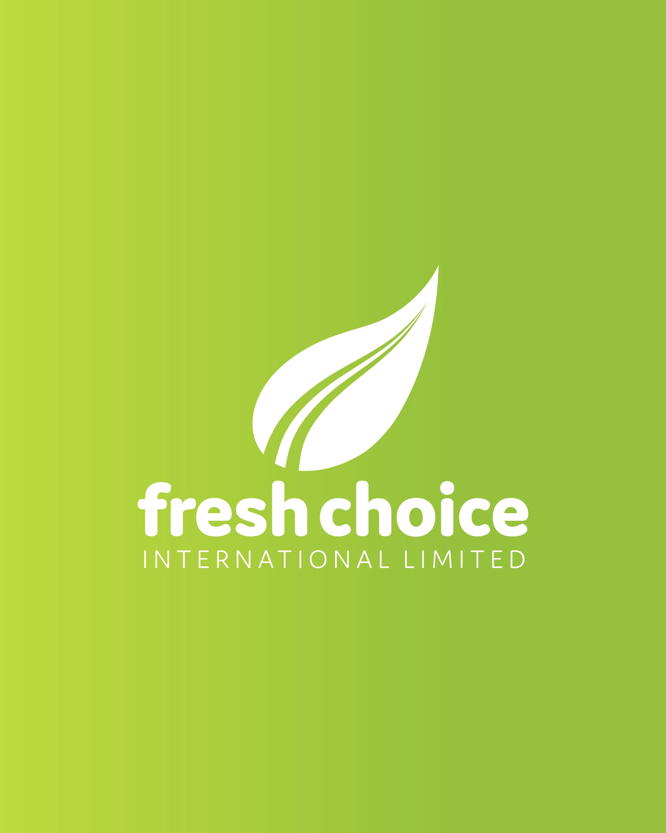
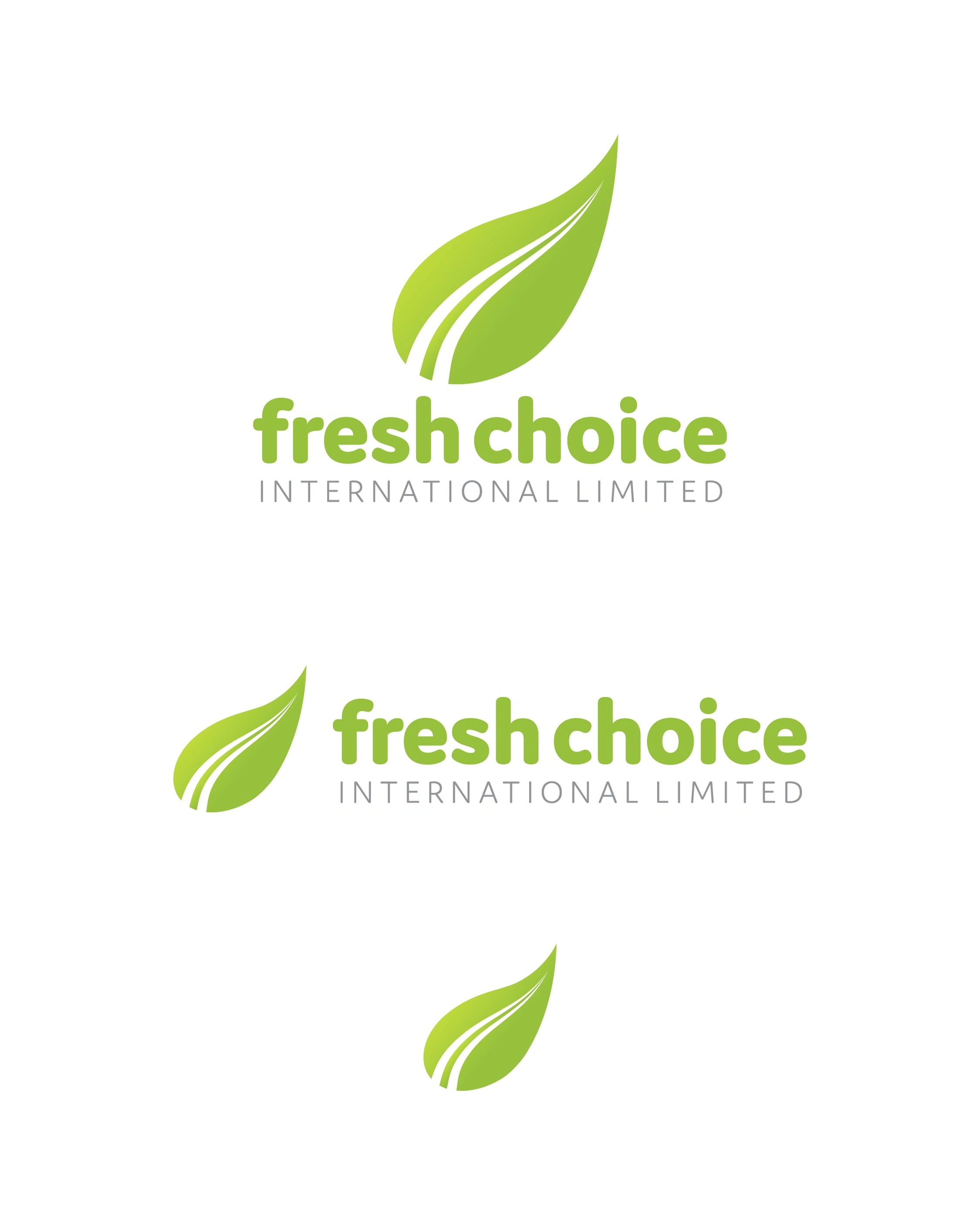
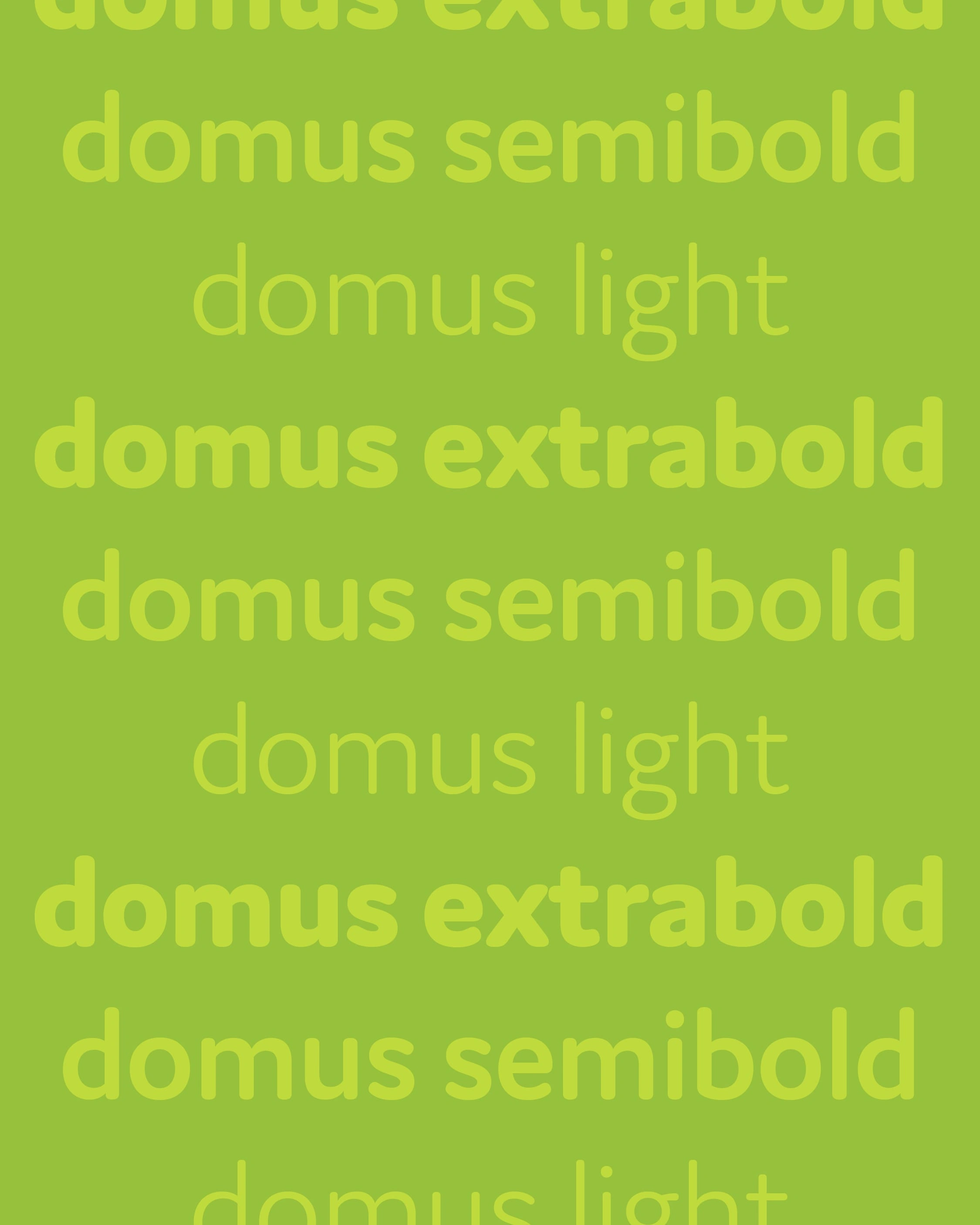
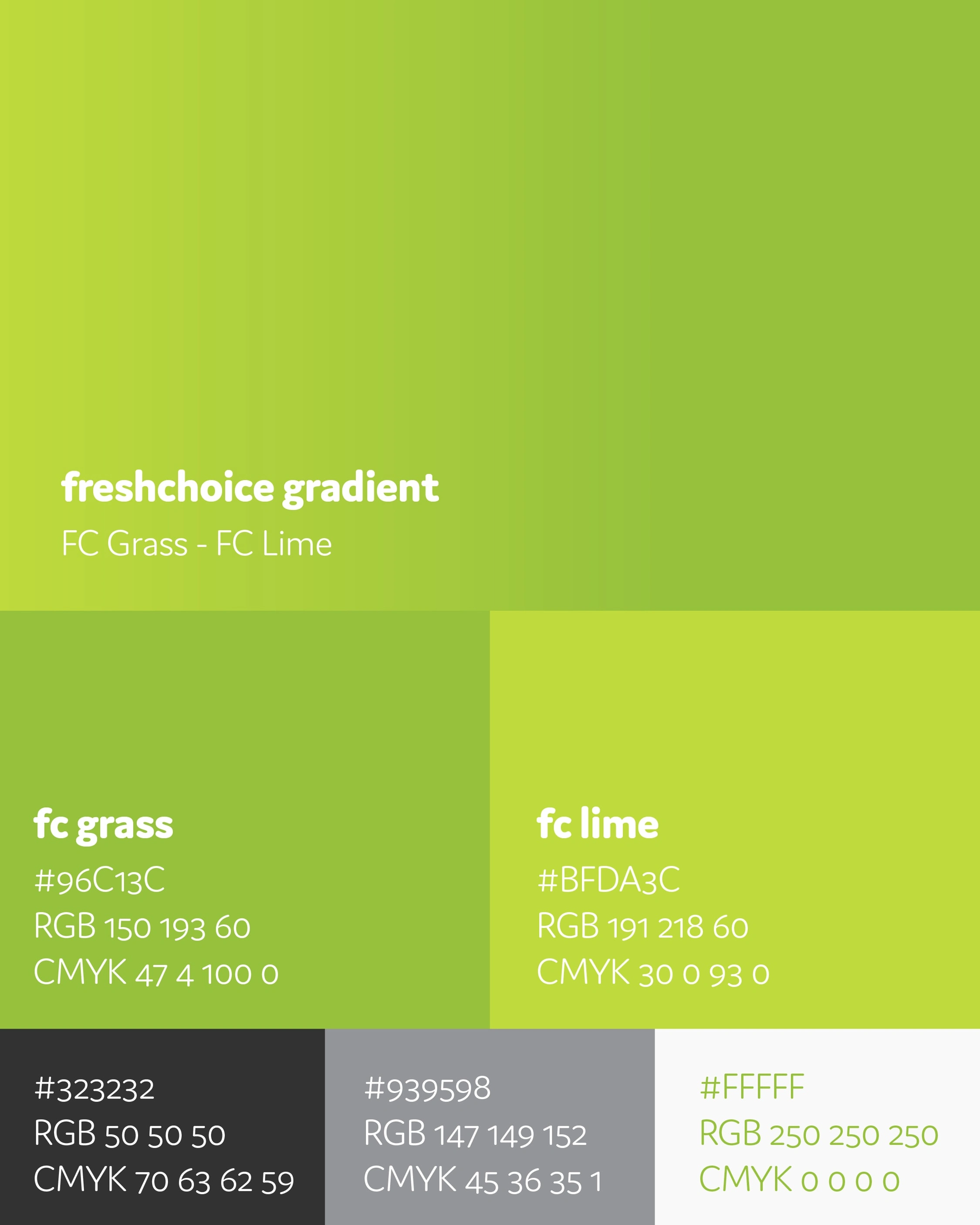
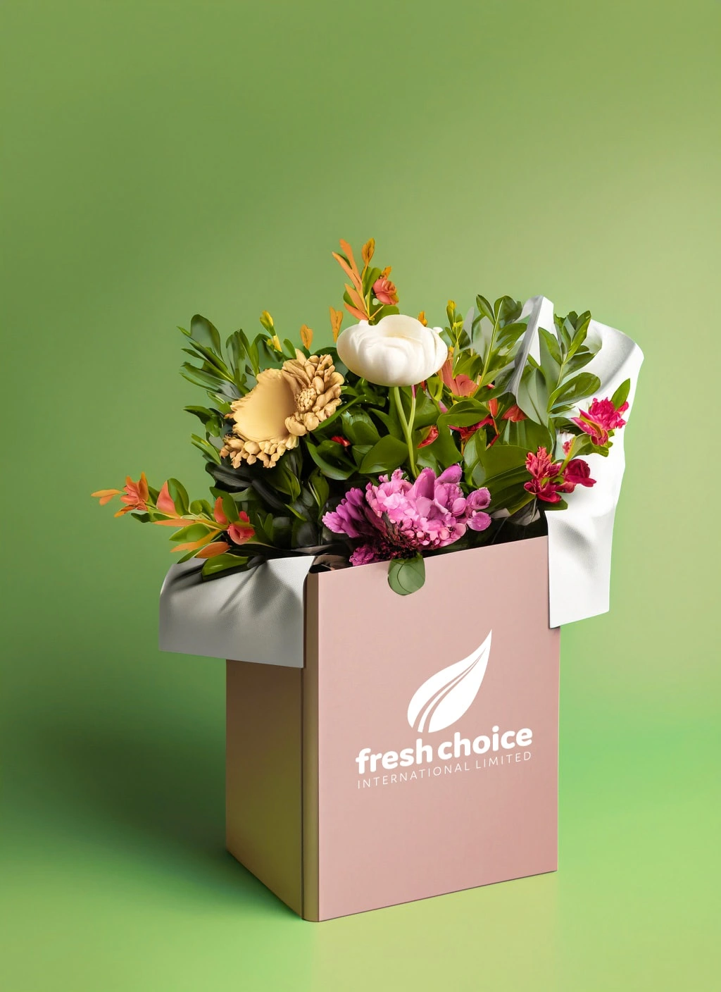
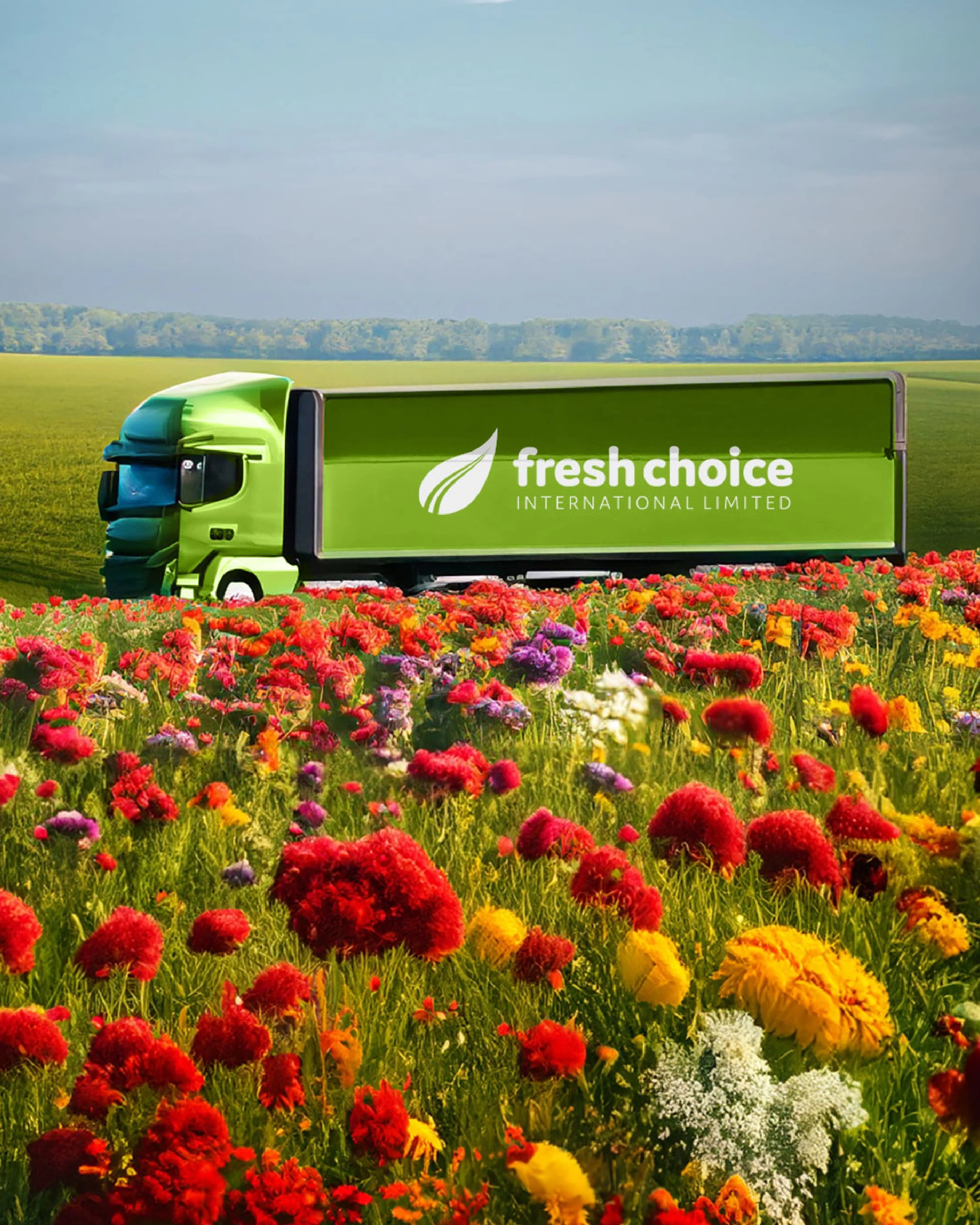
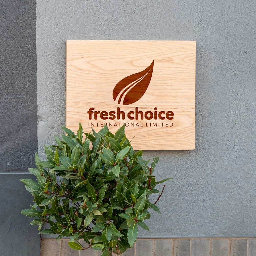
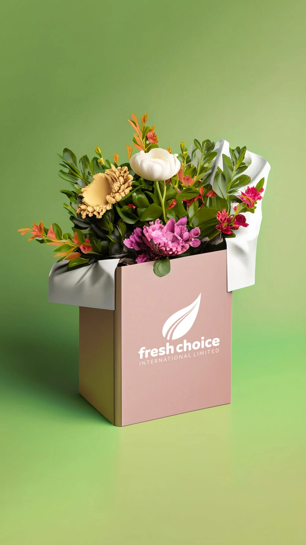
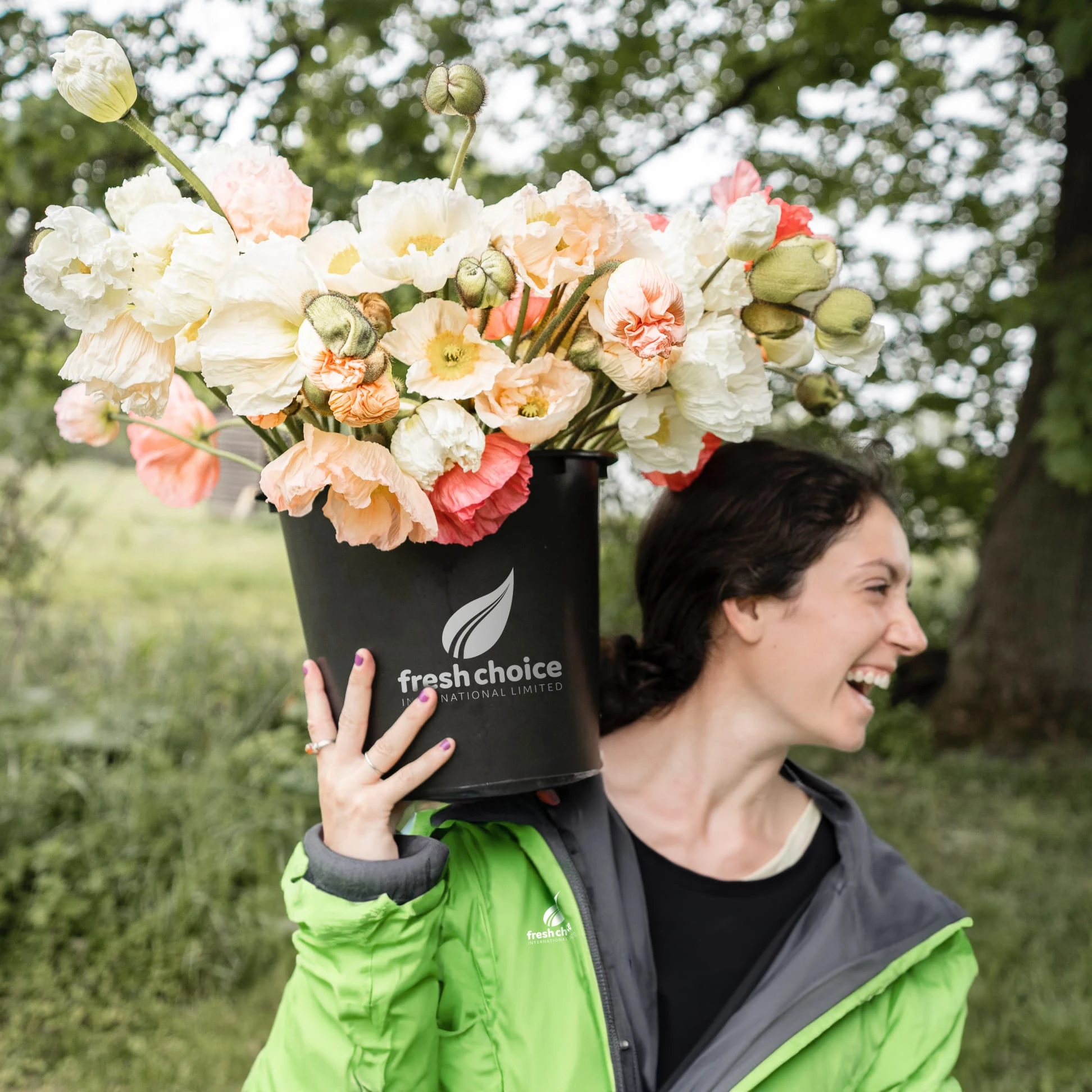
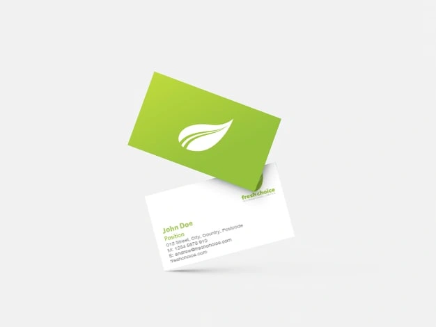
For this design, my approach centred around integrating a leaf motif as a prominent visual element. This leaf motif is a common feature found on all their products, and is complemented by negative space lines extending towards the tip, symbolising various forms of movement like road lines, jet streams, or ocean waves. The chosen color palette embodies freshness and positivity, featuring a lush grassy green and vibrant lime. As for the typeface, I opted for Domus, a rounded, friendly, and playful sans-serif font.
Like this project
Posted Nov 27, 2023
Logo and branding for Florex International, latest venture, Fresh Choice International Limited.