Scrims Esport Gaming Center Rebrand
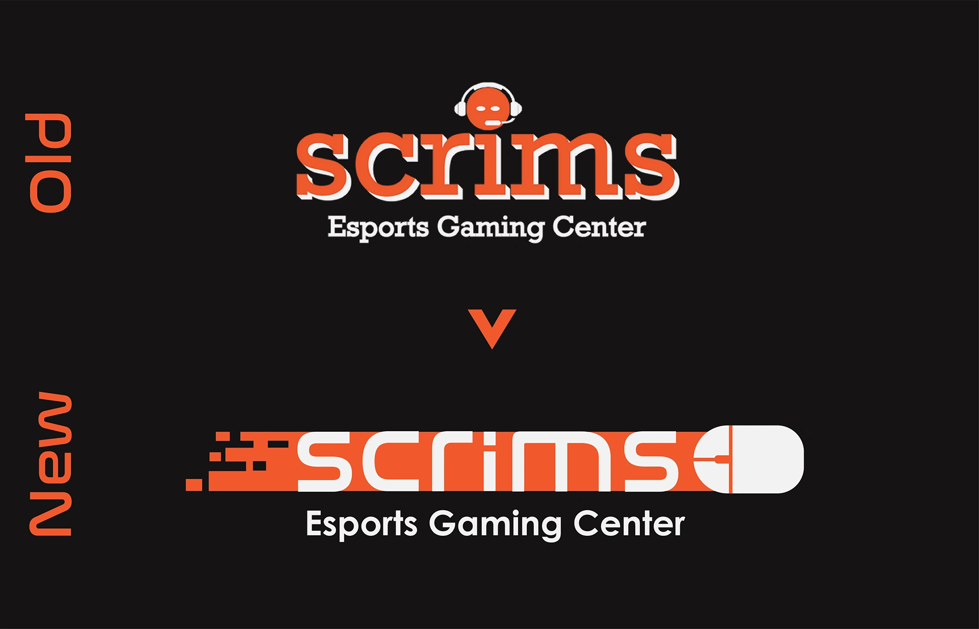
A personal project where I decided to rebrand Scrims Esport Gaming Center with a new logo that would fit their image more successfully than their current one.
Scrims is an Esport Gaming Center that has a mix of high end gaming PCs and consoles. Scrims welcomes any type of gamer whether they are a casual gamer looking to enjoy the atmosphere, or a competitive gamer who likes to take part in exclusive leagues and live local tournament.
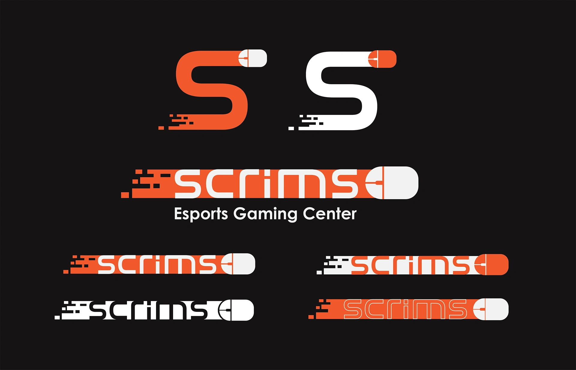
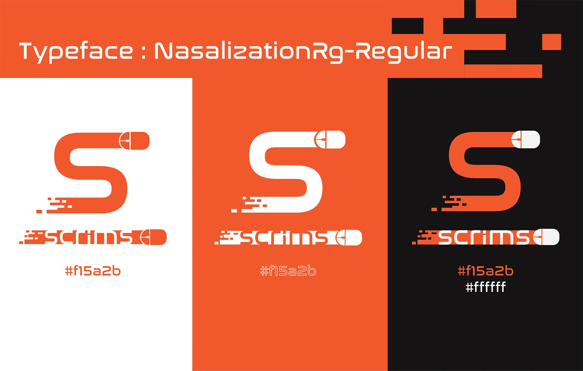
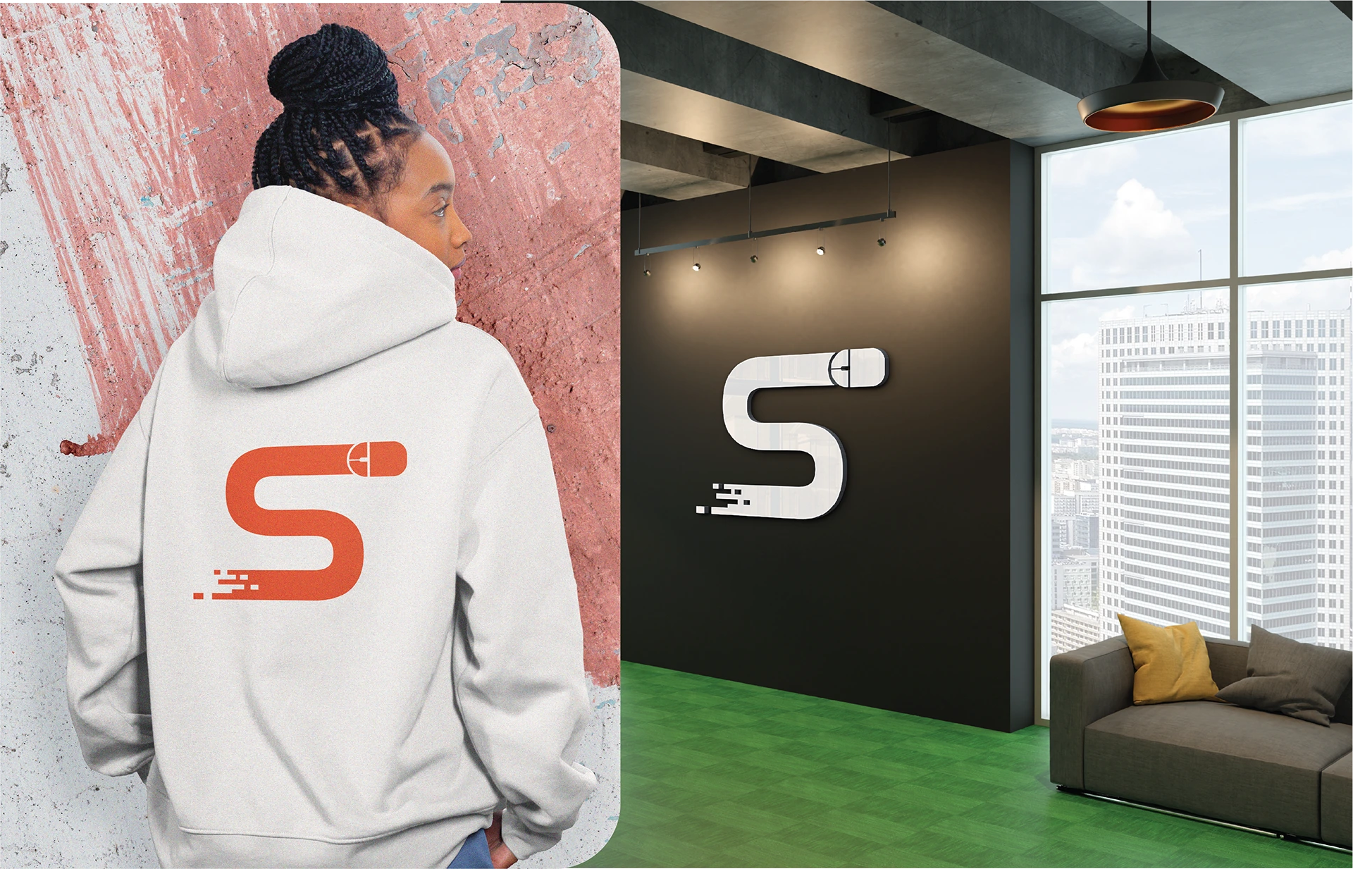
As a designer I felt that Scrims deserved a more attractive logo to fit into todays modern standards. The new rebranded logo indicates a sense of movement from the slide of the mouse, alongside the glitch effect to show that the path of the mouse is dissipating like a characters foot steps in a video game. The improvement of the logo should appeal to audiences by making them feel that this is an up to date, modern, and trendy Esport Gaming Center that is worthy of their time and money.


Like this project
Posted Oct 17, 2023
A personal project where I decided to rebrand Scrims Esport Gaming Center with a new logo that would fit their image more successfully than their current one.

