Versapay

01 Overview
VERSAPAY
Versapay is the leader in Collaborative Accounts Receivable. They are the first to proved a solution that bridges the gap between suppliers and buyers through a shared, digital experience. Versapay’s accounts receivable (AR) automation solutions and next-generation B2B payments network make billing and payments easier for enterprises, increasing efficiencies, accelerating cash flow, and dramatically improving the customer experience.
Founded in 2006, the company has grown into a global network of 9,000+ clients and 1,000,000+ users handling 40+ million new invoices and driving $60+ billion in global payment volume annually.
However that wasn’t always the case, though the company has been around for over 15 years it was stagnant for some time, marketing was underperforming, the product was not reaching to the right people, and the brand was lagging behind. To get to where they are now Versapay went through a complete Rebrand and a Refresh, with synonymous 360 campaigns, a completely new marketing site and editorial site, and more. This case study explores in detail Versapay’s leap into the big leagues, how they realized their potential, and what they did to solidified themselves as a leader in their industry.
Logo | Branding | Web & UI/UX Design | Production | Photography | Typography | Illustration | Animation | Art-Direction | Print | Marketing Design


02 Brand Guidebook
THE FOUNDATION
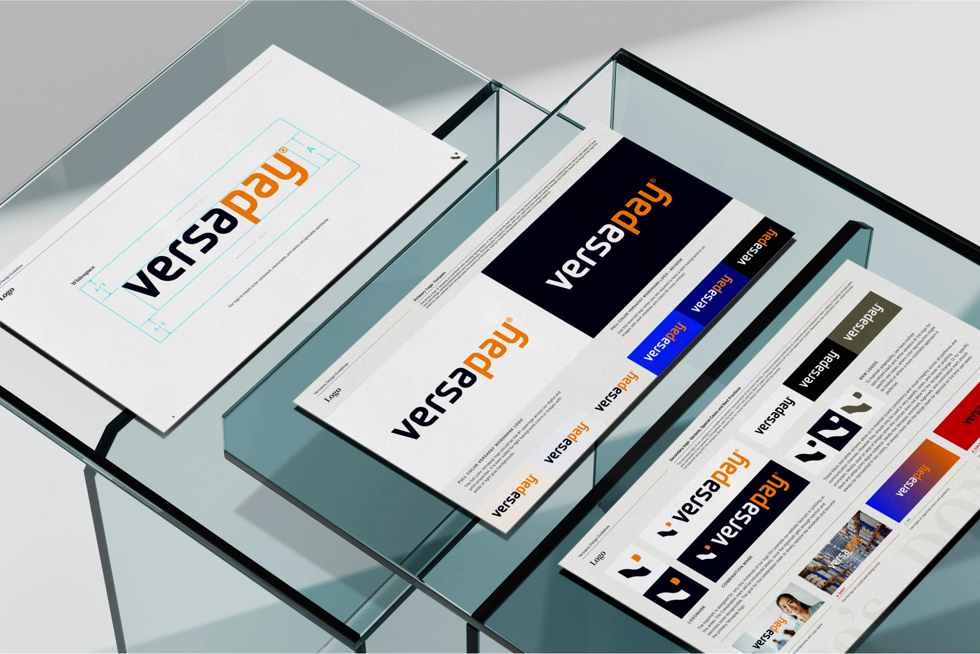
The original Versapay brand was outdated, overwhelmingly orange, did not align with its values, potential or size; overall it did not exude confidence in the users. So rather than fixing what’s broken (which would have taken an exorbitant amount of time) the first phase was to leave that all behind, and fix all those issues with a complete Rebrand.
The Rebrand gave Versapay the ability to stand behind their values, and shoulder to shoulder with its highest piers. In phase 2, The Brand Refresh is where it was able to stand above, and achieve total cohesiveness.
The primary targets for Versapay are CEOs and CFOs of companies that produce a range of 5000 to 20,000 invoices per month. The new brand now exudes that gravitas that is required to get the attention of the leaders of such organizations.
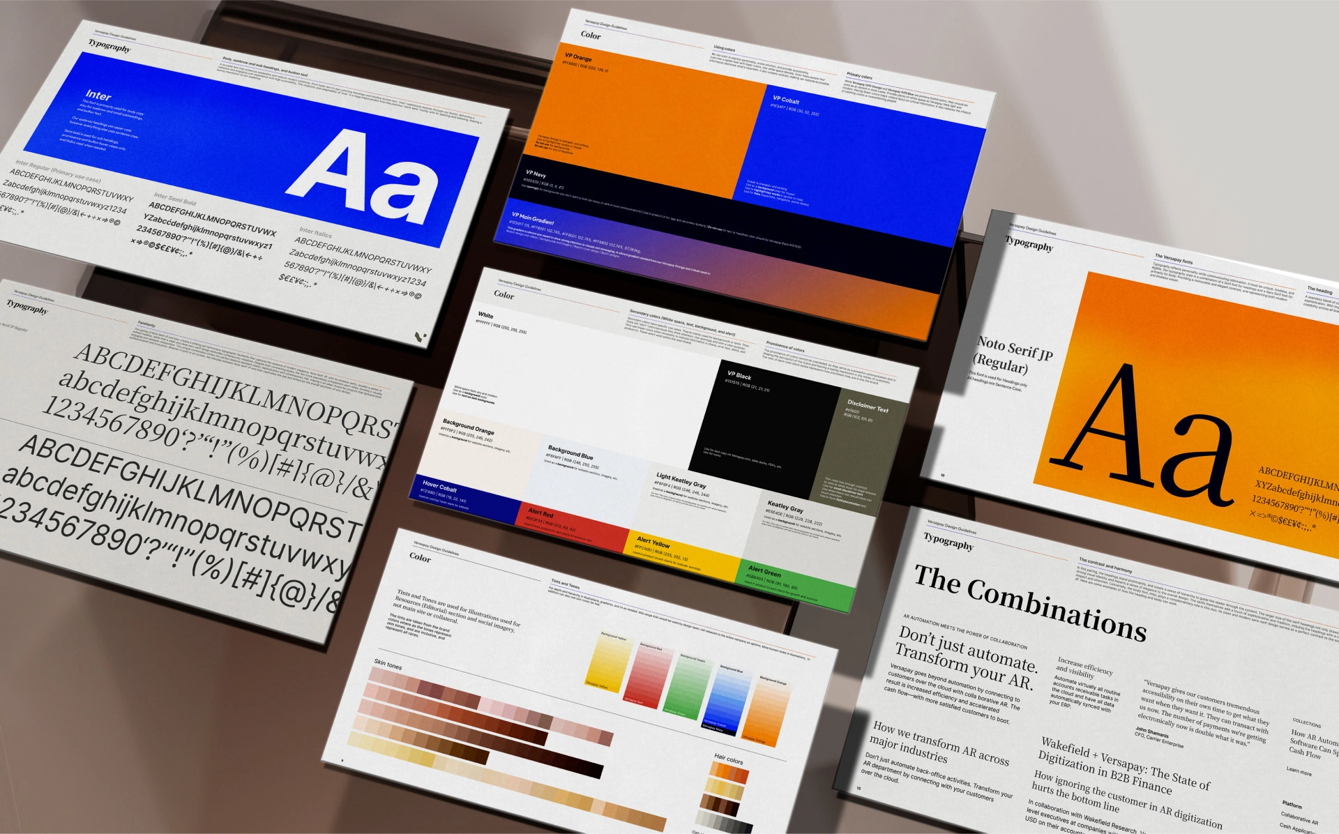
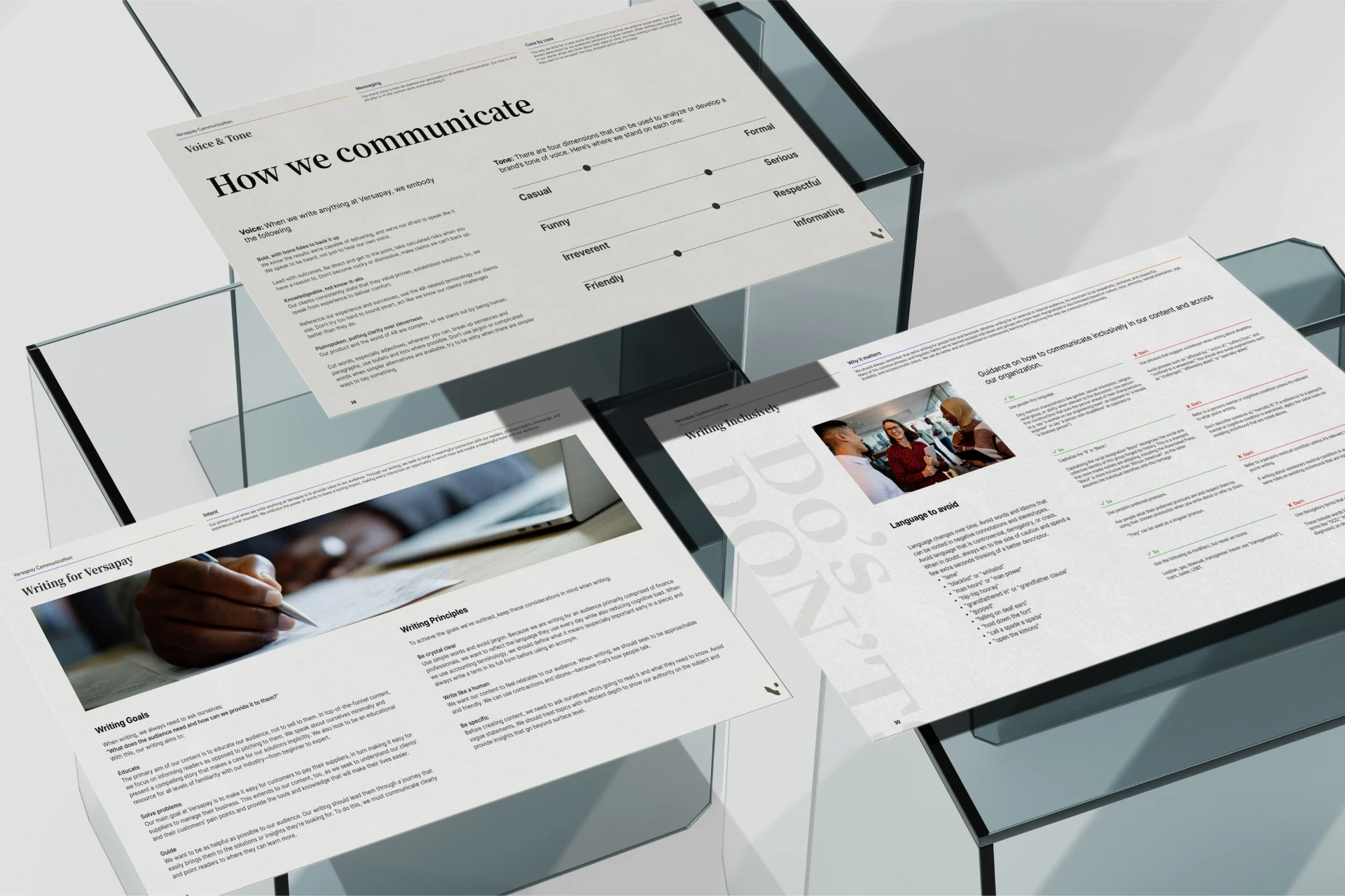
The Brand Guidebook below was created to explain in detail the who, where, what, when and how’s of the Brand Values, Logo, Color Palette, Typography, Photography, Visual Patterns & Imagery, Iconography, and Voice & Tone. Every aspect of the brand is chosen with intent and tested, driven by data from strong market research to provide quantifiable results.



03 The Marketing Website
STANDING ABOVE THE REST
The Rebrand worked hand in hand with stripping down the old clogged up, confusing, early 2000’s site, and built a completely new, modern, clean, SaaS website, with essential, familiar components that are easy to build and use, which also simplified the CMS.
A site for a company this size is a huge marketing tool to gather leads and to convert. Every section is an enticing opportunity to “learn more” and direct journeys that eventually ushers users towards that “Get a demo” button. The Rebrand did just that.
The Refresh built on the essentials, and removed the cookie cutter feel of component blocks and refined the user journeys by making it more unique to each user type. Implementing the new look and feel simplified and upgraded the UI, improved the rhythm, increased the contrast; making the brand more accessible and increased visibility to what is important.
Overall it became a site that took care of everyone’s need in the company, and became something that everyone is proud to share. With also the data showing it performing at a much higher rate, the Refresh accomplished its goal by creating a site that is superior to its peers, and became comparable to other high end Fin-Tech companies.


04 The Resource Library
GIVING BEFORE RECEIVING
The Versapay Resource Library is home to thousands of pieces of editorial content with Guides, E-books, Reports, Templates, Podcasts, Videos, and mainly Blogs. 90% of the content is ungated, and with the content team pumping out new blogs 3 times a week in addition to the weekly Guides, monthly E-books, Quarterly Reports and more, it is a SEO goldmine, but it wasn’t utilized as such.
In order to take full advantage of the Library, it was completely restructured. Each user flows were funneled to specific curated content instead of a free for all. The flow focused on outside searches to Editorial, then to Sub Topics, then to Parent Topics and finally to the Resource Library rather than through the site. Content was primarily organized by topics, instead of type (though that still exists). It was a major lift from the ground up and was a huge success.
By restructuring, the Google rankings went through the roof, and Versapay is now the authoritative leaders of each topic. And more importantly, the users can get what they want and discover related content much faster, making them very happy. The whole Library was rebuilt with completely new components and visuals, and then finessed to fit in with the Brand Refresh. Though it is part of the main site, it works as its own entity, and with the rebuild, it is now able to focus solely on its own duty and become a trusted source, increase engagement, leads, and conversions.


05 Design System
BUILDING BLOCKS
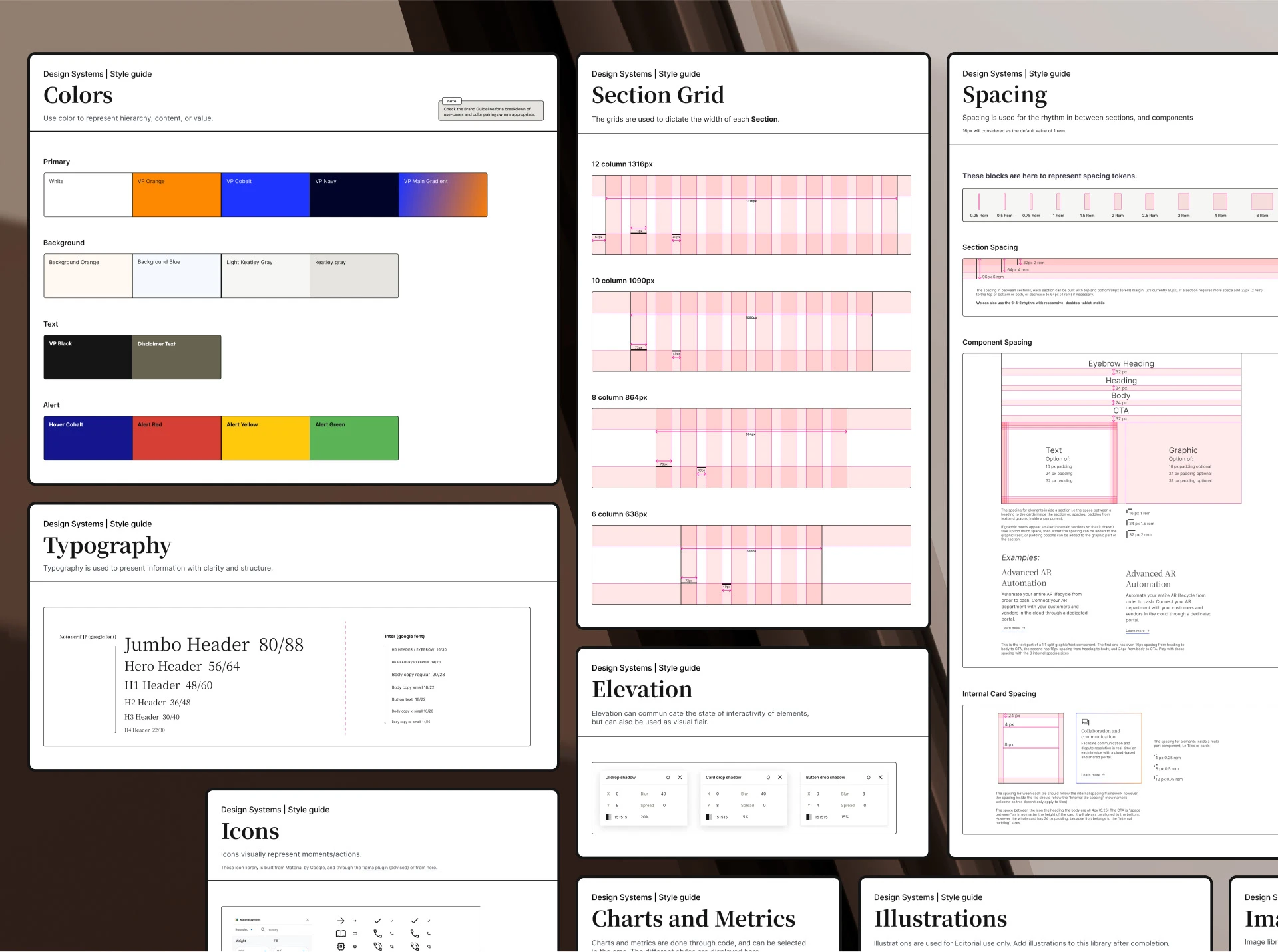
With the Marketing Site and the Resource Library going through a rebuild it was the perfect time to implement a Design system to organize, create reusable components, scale, and have Design and Engineering speak the same language. A well crafted Design system is a necessary integration for a site of this size where new landing and ad pages are created daily, along with re structuring/ re building existing pages with different components.
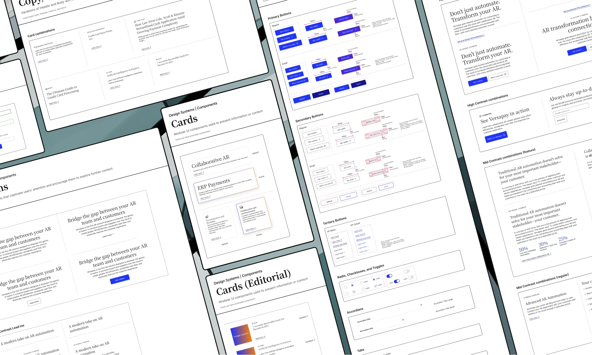
In addition to applying the new look and feel from the Refresh, functionalities of components and Sections were also improved during this process. Similar elements were merged into one with required elements with optional add-ons so that it can morph from simple to more complex, while keeping an easy to scale library and a clean CMS. The naming was simplified and became more fluid and easy to understand, this allowed for more general components and eliminated redundancies, and provided stronger intent.
The Idea was simple, if the base is well thought out and structured everything else will work. With the help of the Design System, Designers, Engineers, others using the CMS, and stakeholders, all understood the intuitive and straightforward system and thus it eliminated confusions, work flows became significantly efficient and easy to plan, and it built a strong foundation for the future.
05-A STYLE GUIDE
05-B COMPONENTS
05-C SECTIONS (MARKETING SITE)
05-D SECTIONS (EDITORIAL SITE)
06 Reports, E-Books, Guides
SOMETHING TO HOLD
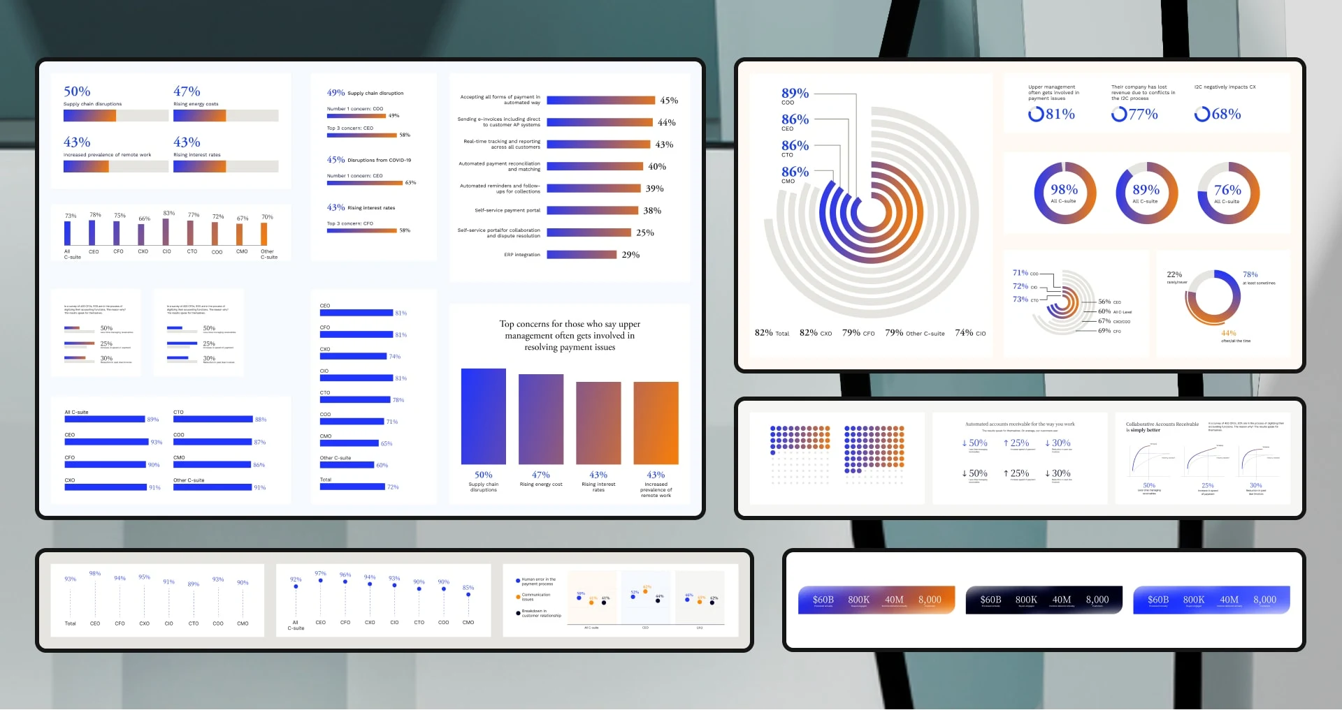
A variety of Reports, E-Books, Guides etc. are created for Versapay, explaining different topics such as the different features of the Versapay product, market research findings, projections, explainers and more. The goal of these resources are to provide more sophisticated, premium, and unique information, sought after by Versapay’s clientele. They are leagues above the average blog, sometimes 100s of thousands of dollars are spent on the market research to produce these resources.
As such a lot of these resources are gated with a simple subscribe first to download concept. Originally designs of these editorials were outsourced, and only the covers were designed in house to provide a sense of cohesion. However once the refresh was complete this was an opportunity to provide an unified front and match the premium content of the resources.
Full designs of these resources meant designing 20-40 page editorials. The brand extended its metrics in order to keep the data visualization fresh. They designs now fitting to the new look and feel of the brand became a much higher commodity, and elevated the brand to a newer level. PR now had an opportunity to share these resources with media outlets, landing pages were created for them, they had big reveals in social media and ads for their launch, and even printed copies were created. By expanding the design onto the full editorial, Versapay showed full ownership of its content.



07 360 Campaign
OUT IN THE WORLD
A big part of Versapay’s leads come from trade shows. From tech summits to accounting conferences; Versapay attended many medium to large events such as Suiteworld, Dynamics Summit, Sage Transform, Gartner Summit and more. 360 campaigns were created annually to build hype and awareness.
At first the campaigns were outsourced and created for the events, they were isolated, flashy but did not fully represent Versapay, and was very costly. The in house design was there mostly for layouts and production, and as expected things were a bit disjointed.
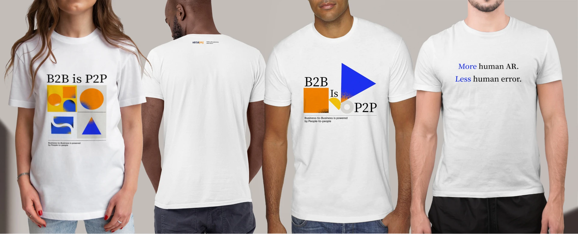
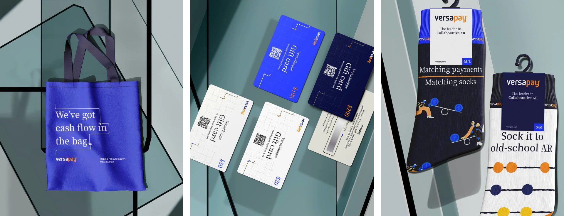
With the Brand Refresh Versapay launched the “More Human” campaign. It wasn’t just for events it, it integrated into Versapay’s messaging and overall branding. The new visuals and the messaging for More Human campaign blended in seamlessly to produce a unified, scaled campaign that can work with event booths, billboards, swag, social media campaigns, banner ads and everything else a 360 campaign would require. The branding was open ended and versatile enough to stretch over everything and still remain fresh and unique. It generated huge trade show interest, and overall was a big win.


08 Synopsis
2022
To work in shaping a company the size of Versapay is amazing enough on its own, however taking that large company and bringing them up even higher to a place where they can compete with other first rate tech companies is a completely different feeling. I can see my touch, my influences, my molds, my systems etc. onto giant billboards, to the smallest display ads. Recreating their website, and fully configuring the Editorial structure of such proportions taught me valuable lessons, sharpened my critical thinking, and gave me the ability to scale simple structures and still maintain its uniqueness.
THANK YOU FOR VIEWING!
Like this project
Posted Sep 11, 2023
Full Brand Guide, Marketing Website, Editorial Site, Design System, Editorials, and 360 campaign for a Fin Tech Company
Likes
0
Views
38
Clients
Versapay


