Kodak | Rebranding concept
Kodak - Rebranding Concept
Brand identity, Illustration, Art direction
Kodak was one of the world's largest film and camera manufacturers during all the 20th century. Yet, the iconic brand has not been able to reinvent itself in the digital era.

Goal
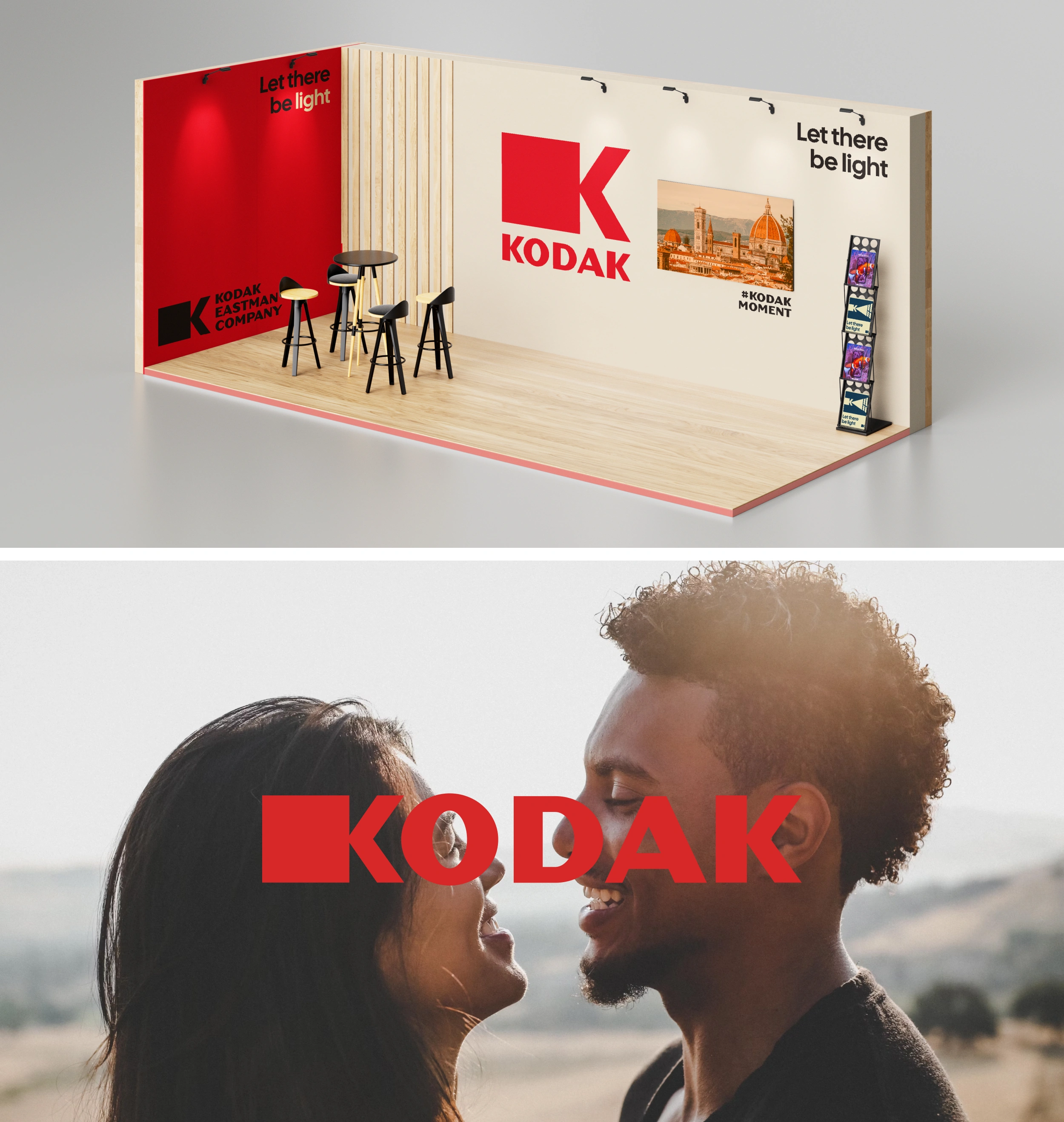
The goal of the project was to modernize Kodak's branding, making its message less connected to analog photography, and more connected to projecting technological innovation.
This perception of a "brand from the past" makes it less attractive.
That’s why I wanted to target a younger audience.

Logotype
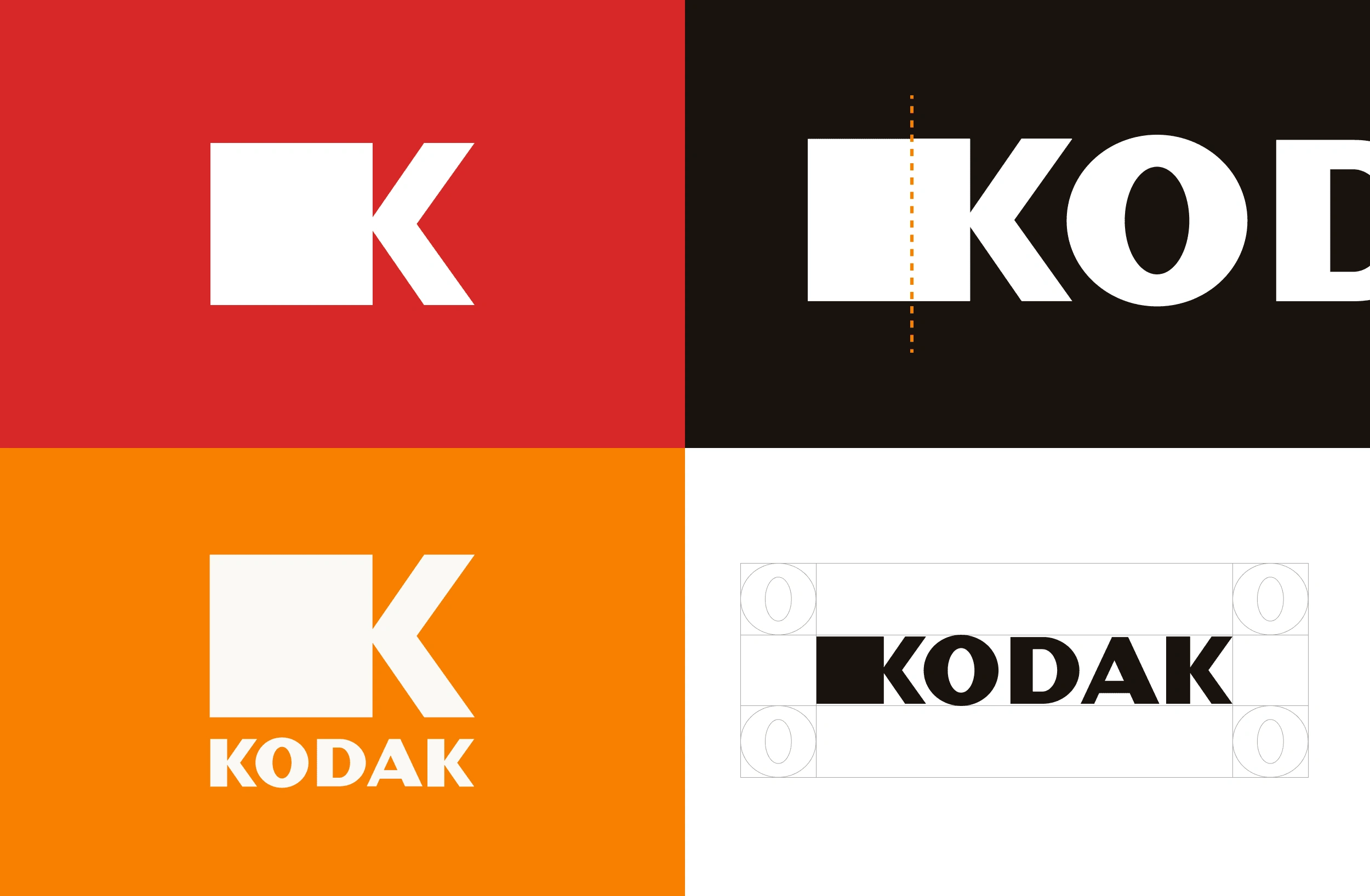
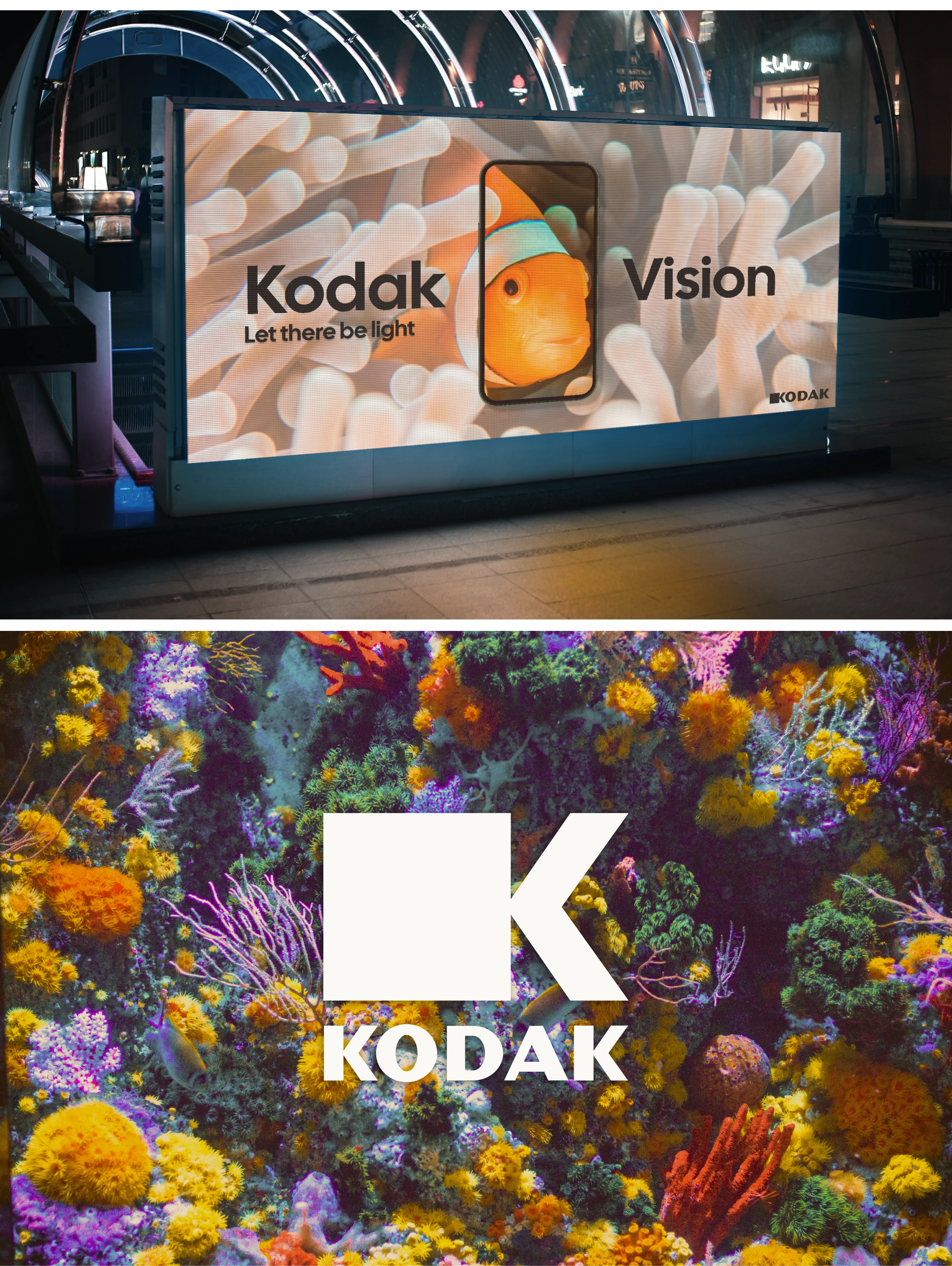
The word mark is written in Dogma OT. Dogma OT style make logotype look more modern, clean and legible. The first K represents a modern video camera 📹, in this way the change of the company would be the first thing to be noticed. The second K also has some minor tweaks.
Colors
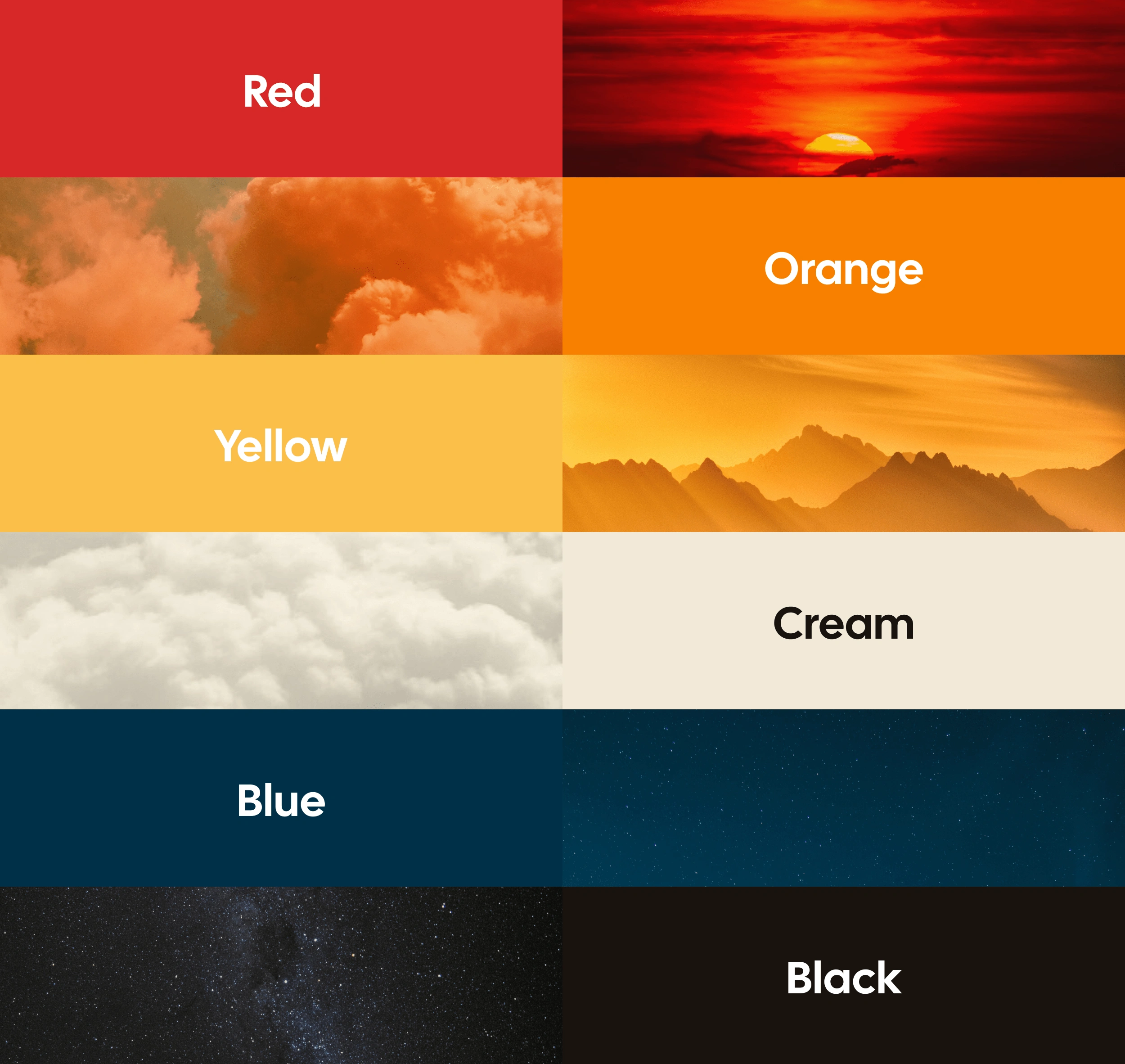
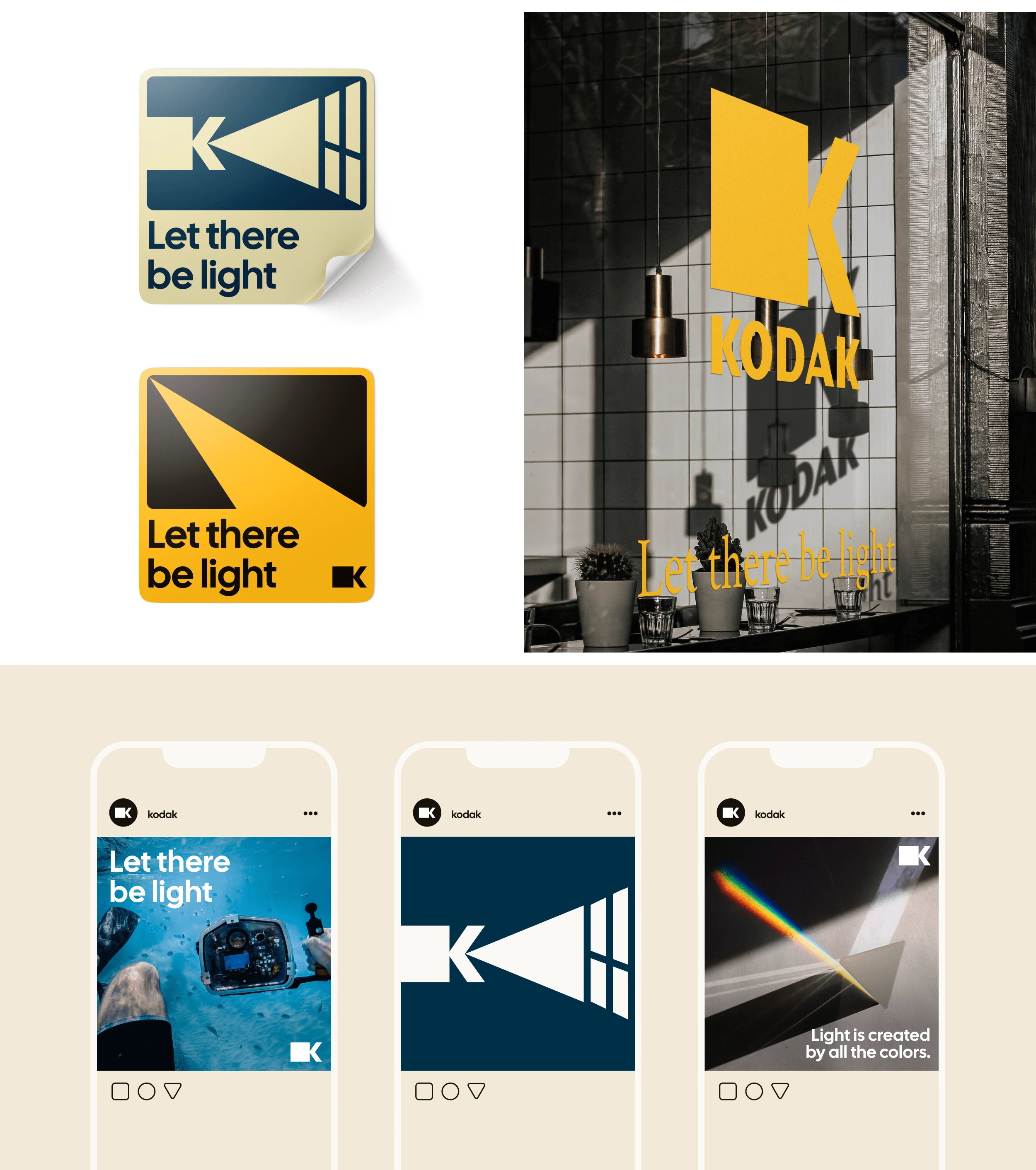
The previous colors connected too much with their beginnings in photography, leaving little room for innovation. I chose a combination that evokes the sky and light ☀️, which makes the existence of cameras possible. And ultimately, what allows us to exist and see.
The entire brand revolves around light and colors.
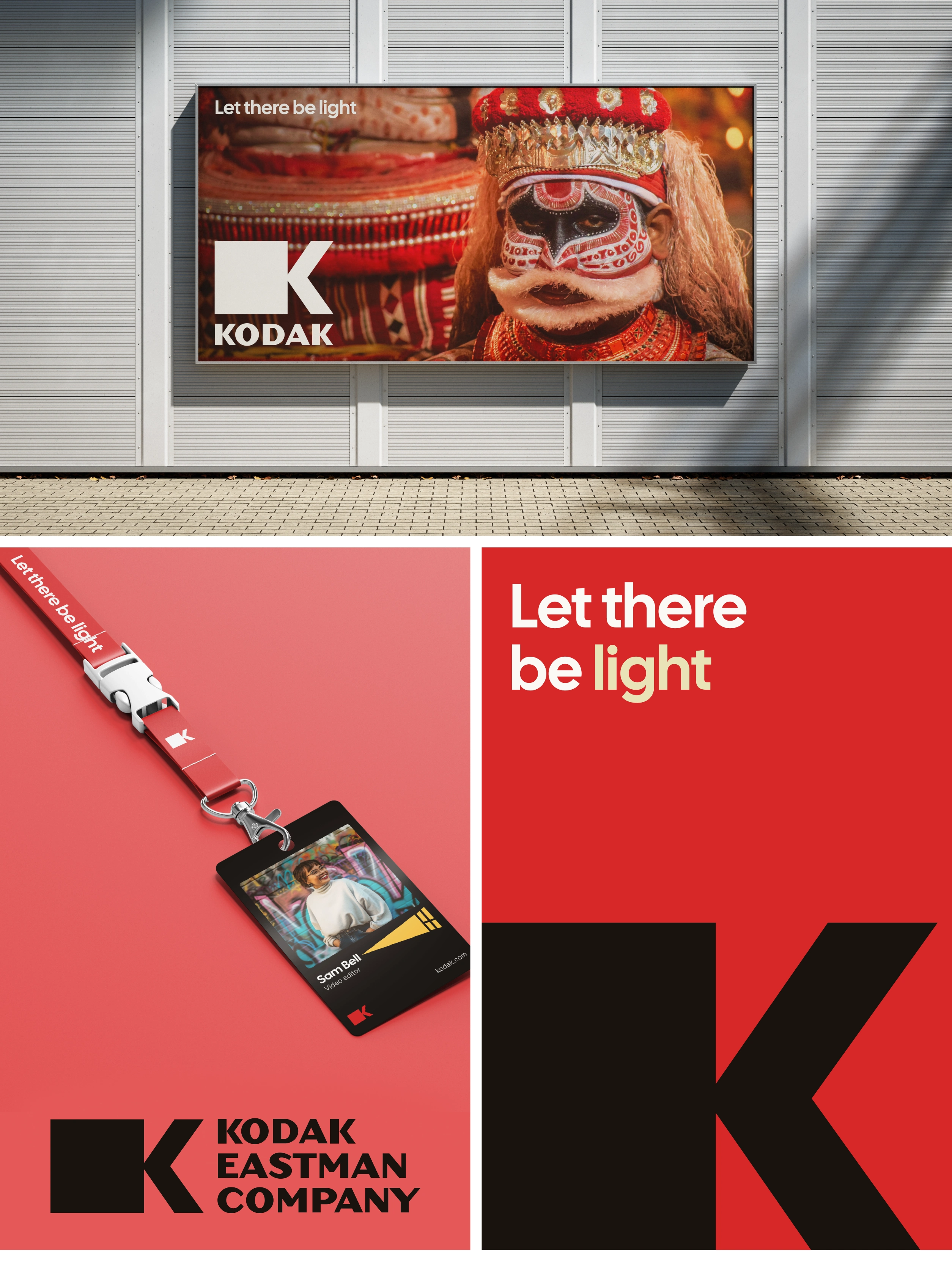
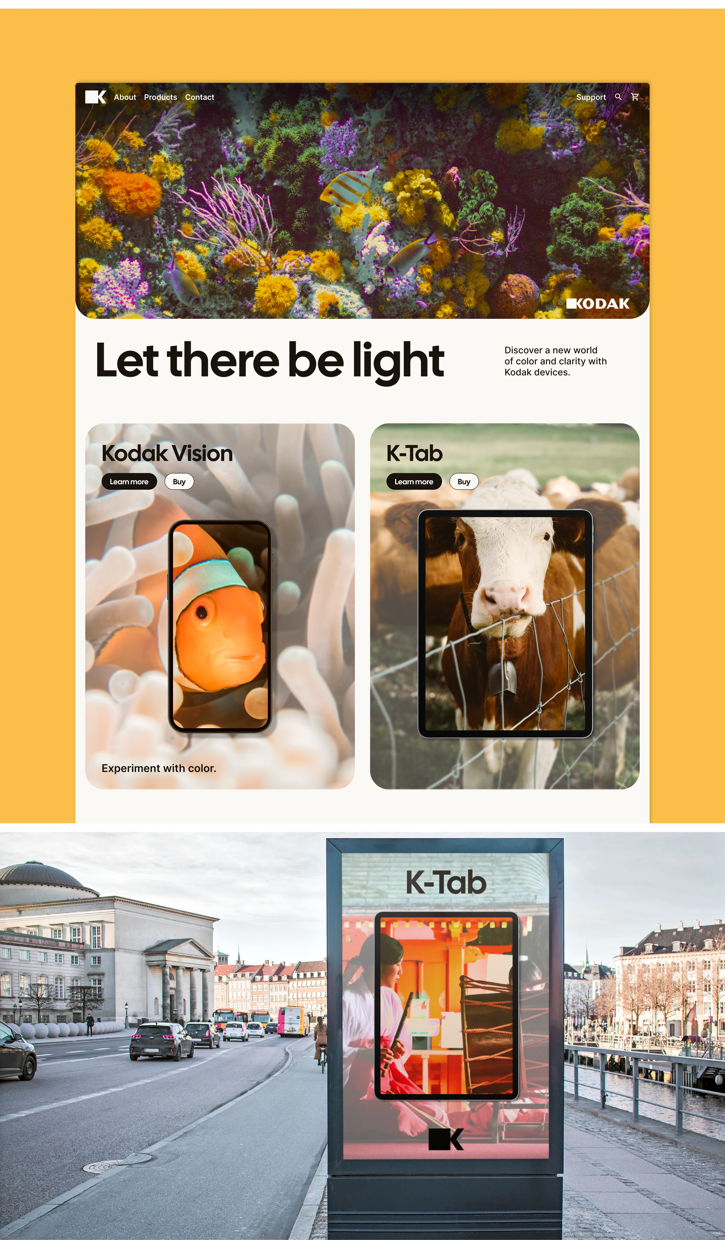
A new Kodak that sells electronic devices 📱📹. A new Kodak that finds a way to stand out among the fierce competition by showcasing real and colorful experiences.
All the other brands are full of graphics and visuals, but many have simply forgotten to share what's real.

👩🏻💻 👨🏻💻
Branding and UX/UI Design for your projects. From brands, websites and apps - to posters, book covers, infographics and illustrations.
Schedule a call here!
or email me to daraayape@gmail.com
Like this project
Posted Aug 24, 2024
What would Kodak look like if it had modernized to fit into the digital age? 🎥


