
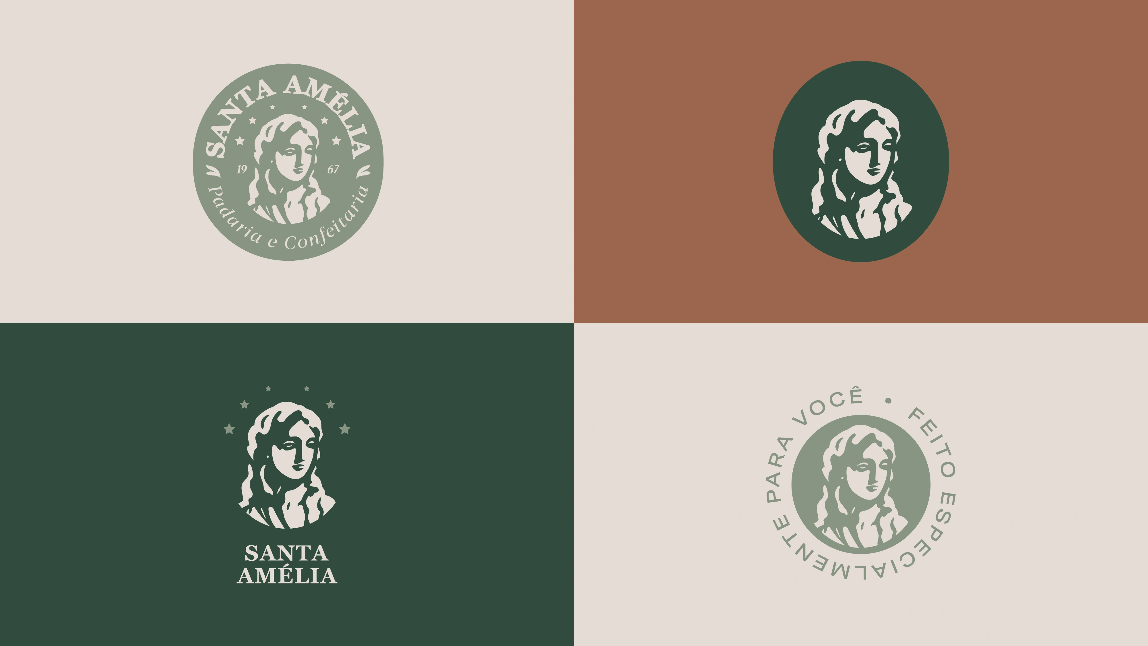
Padaria Santa Amélia is a traditional bakery and patisserie in Jacarezinho, Brazil, founded in 1967 by six siblings. The brief was to modernize the old logo while honoring its history, so the new identity is built around the portrait of a saint, a classic serif wordmark and a warm palette of forest green, terracotta and blush pink.
Old vs. new
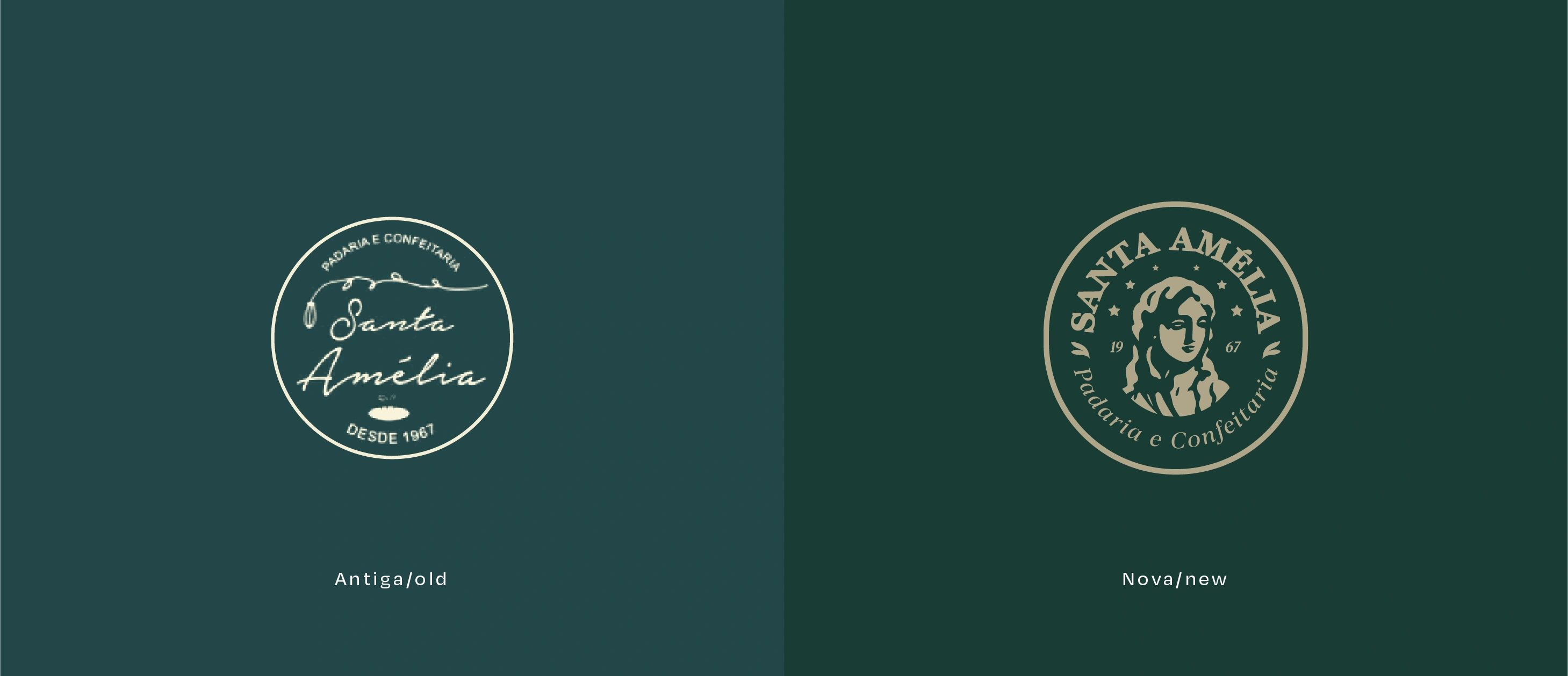
The previous script logo gave way to an illustrated seal: the saint's portrait, the founding year and a serif that brings warmth and tradition.
Patterns
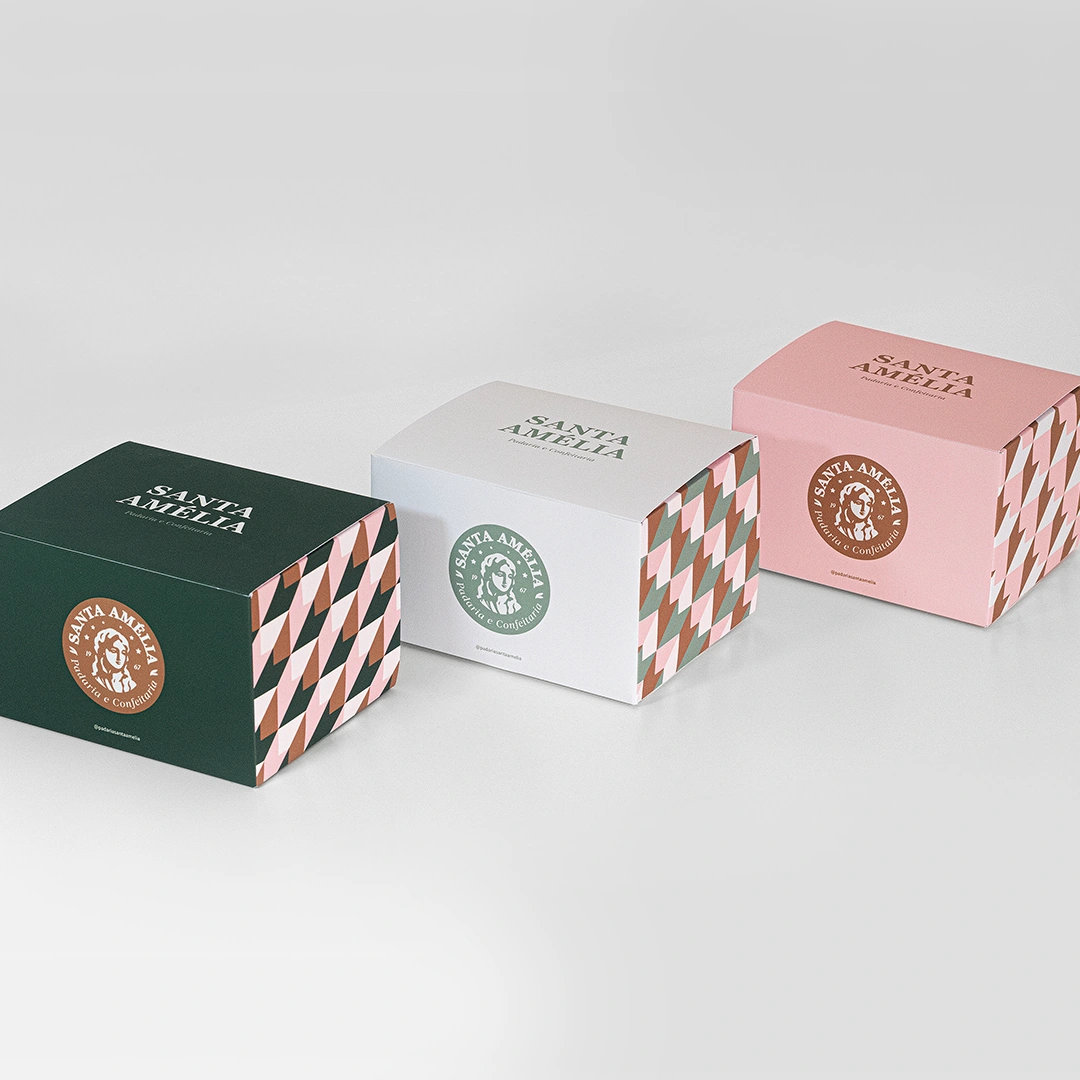
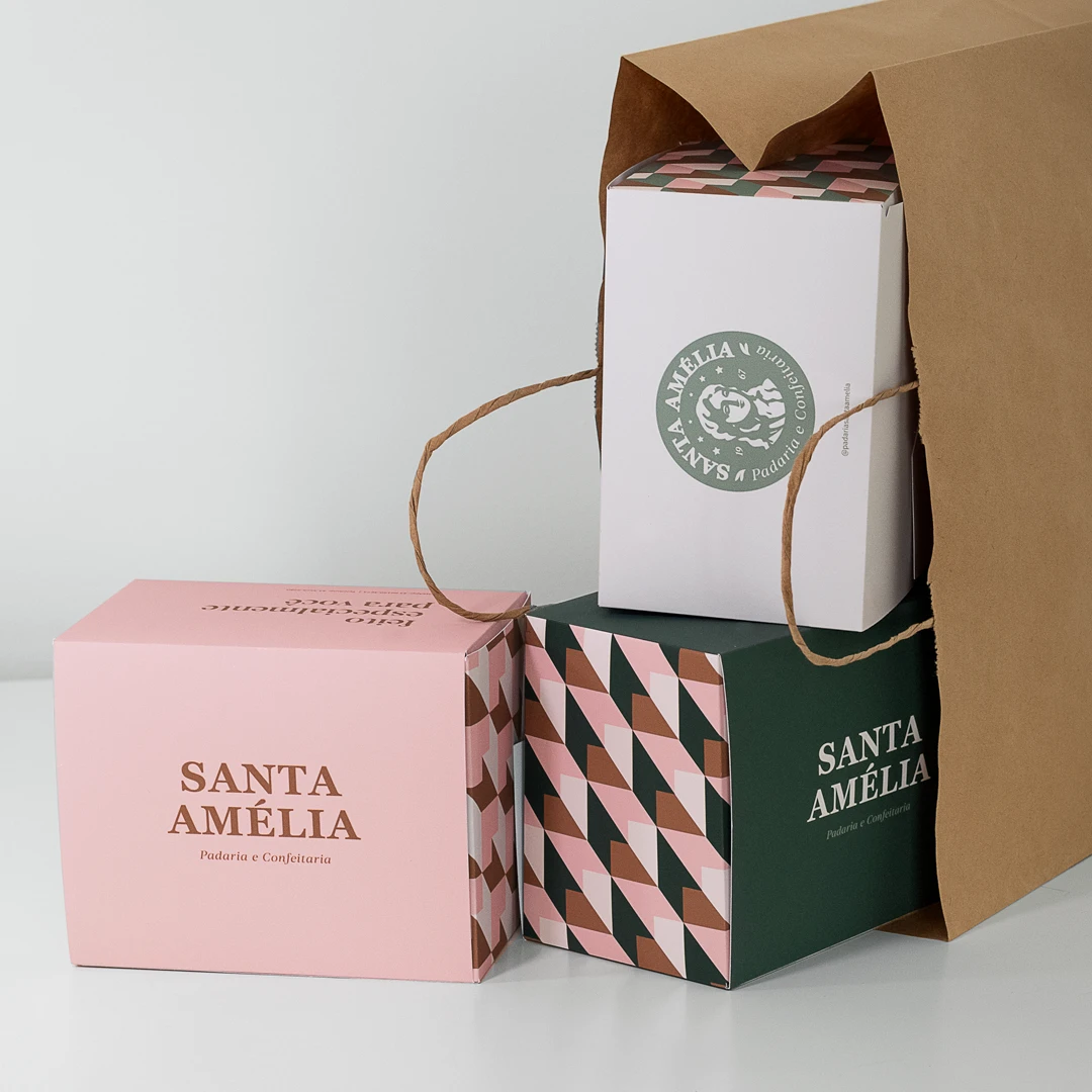
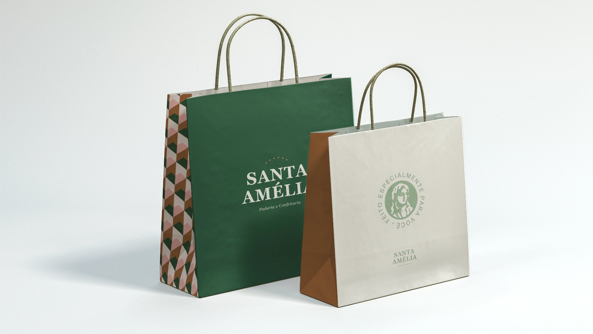
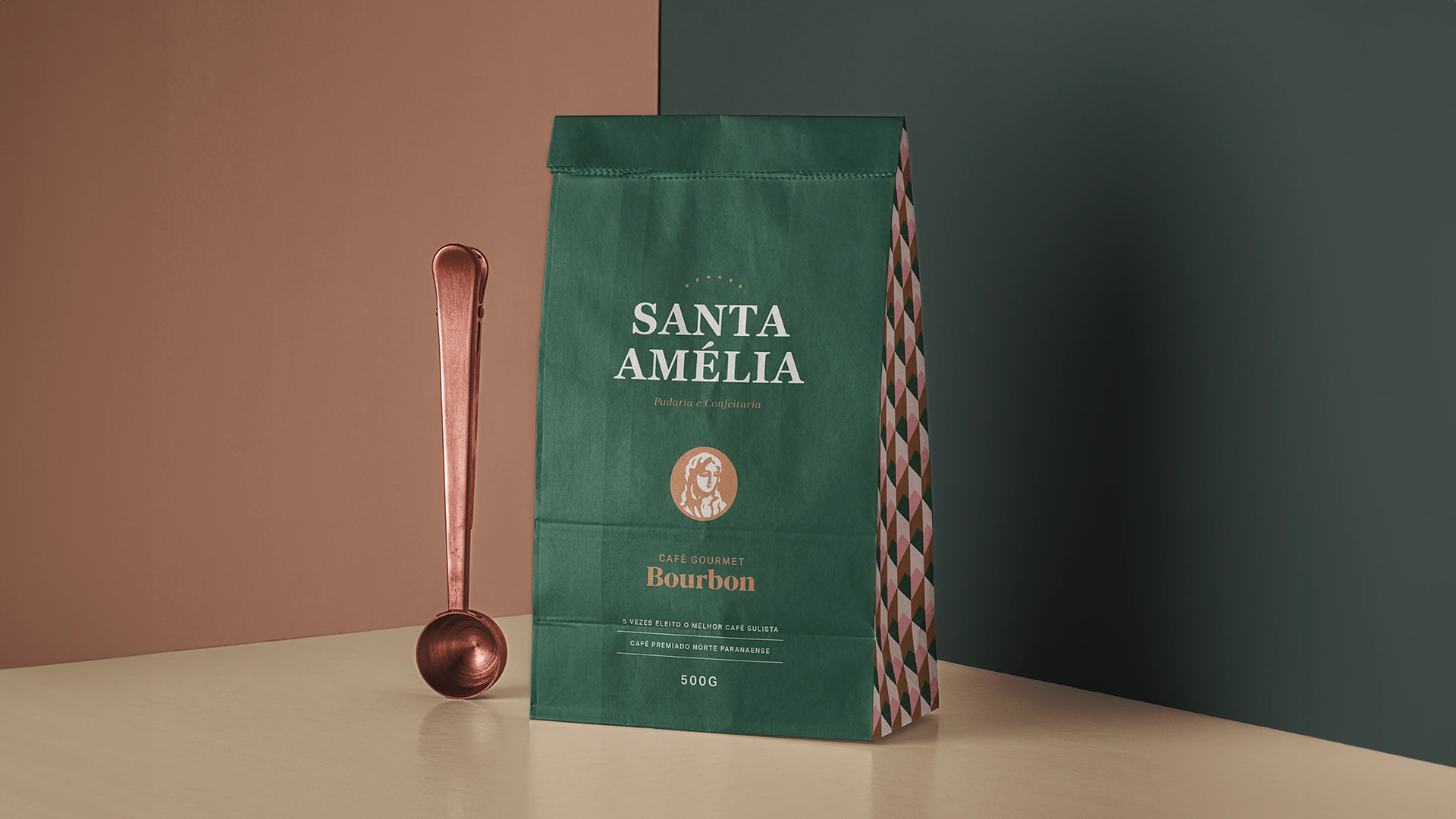
A bold geometric pattern in the brand palette wraps the packaging, while a delicate leaf-and-star motif supports the quieter applications.


Packaging
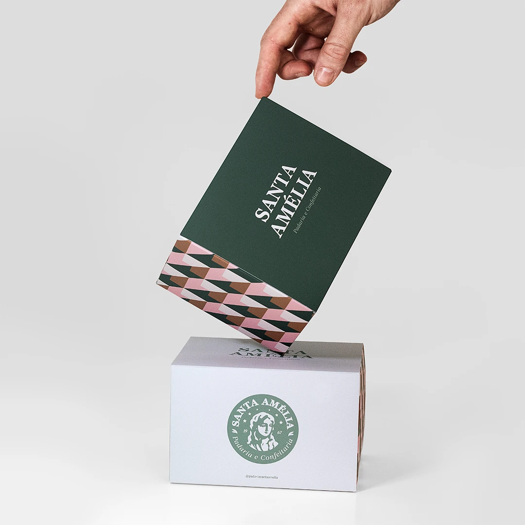
A family of boxes in green, white and pink, each with its own seal color and the pattern running along the sides.
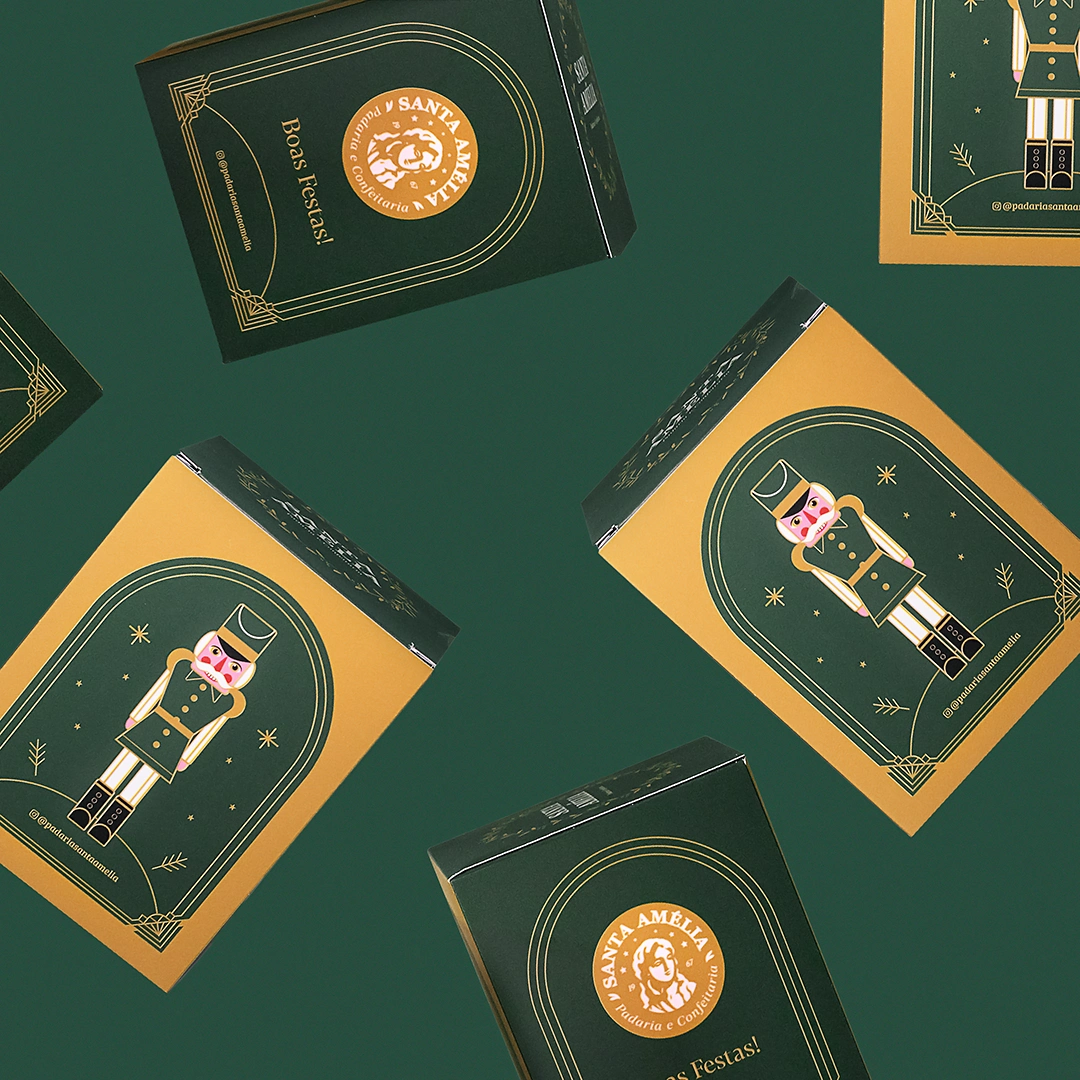
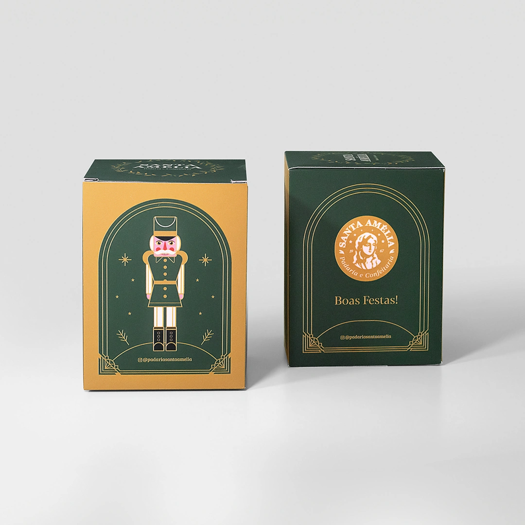
Holiday edition
A Christmas panettone box with an illustrated nutcracker in green and gold.

Credits
Brand identity, packaging and illustration: Pedro Vieira at Capina Design Studio
0 likes · 0 views · Nov 16, 2026
Rebrand and packaging for Padaria Santa Amélia, a family bakery founded in 1967.

