Built with Webflow
Klein Kitchen (Branding + website)
🧗♂️ The Challenge
KleinKitchen is a culinary matchmaking service that pairs you with the perfect private chef, for every occasion.
The client had no previous brand material and had been originally operating out of Instagram and direct email, phone calls requests, and capturing all the information on spreadsheets between airtable and google sheets.
So the challenge was to create a simple and elegant branding and have one source of truth for all contacts and requests as well as a place where users' questions could be answered.
💡 The Logo
Klein Kitchen initially was going to be named "The Chef Collective" because their goal is to build a community where private chefs can thrive by collaborating and supporting one another.
In the initial discovery phase, we captured the feelings and keywords that resonated the most with the client's vision and the brand.

main keywords/initial feelings
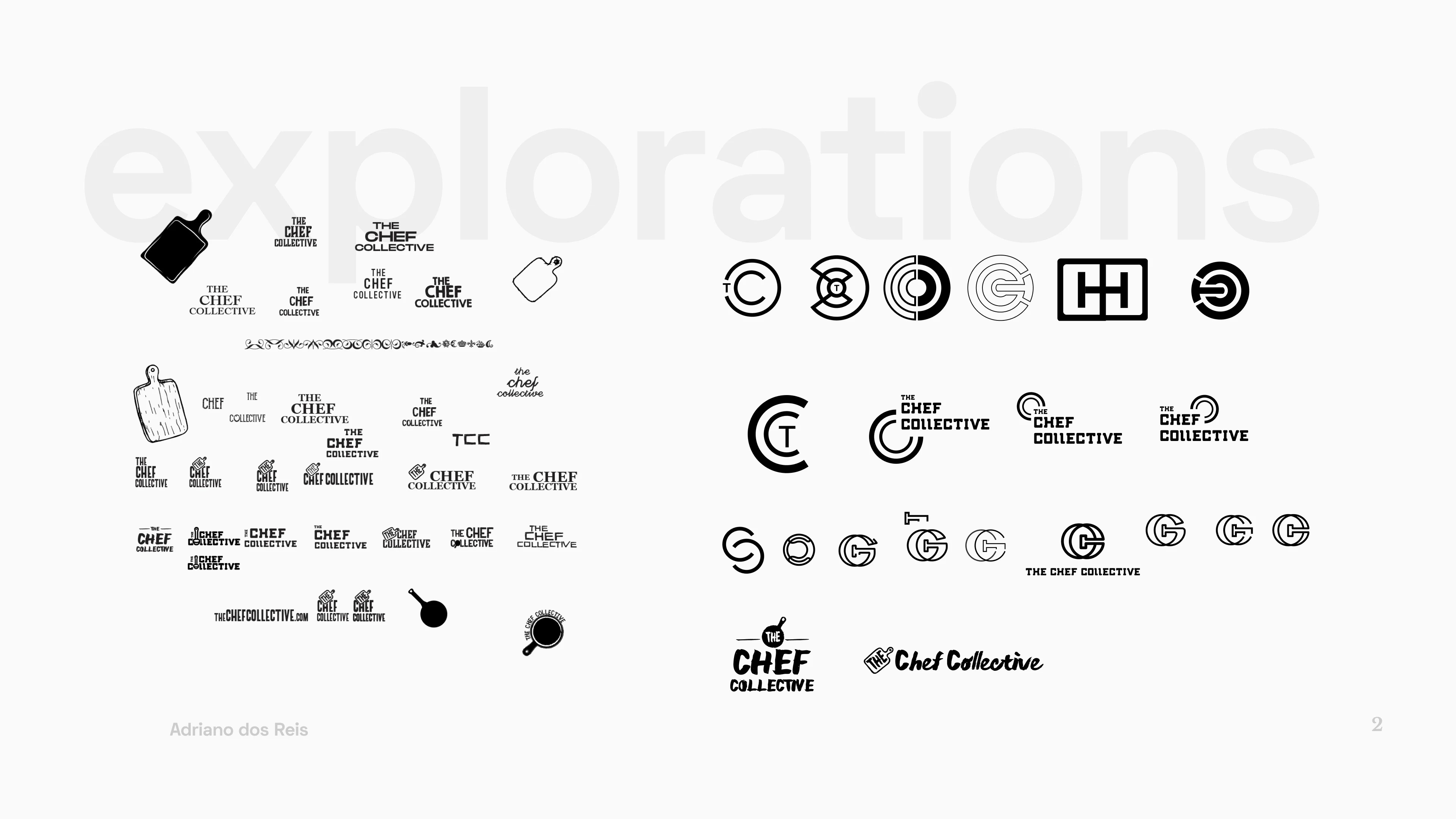
a collection of a few very rough first logo drafts
The client liked the initial direction but it wasn't quite hitting it, so we dug deeper into the roots of Klein Kitchen (or "The Chef Collective" at the time). Things they loved, valued, the impact they want to have in the chef community, their background, etc...
After more explorations, the meaning of the pomegranate fruit and its origins resonated strongly with the client's values. In short, it represents their background(Middle East), Togetherness(their love for the community), Love, and Beauty.
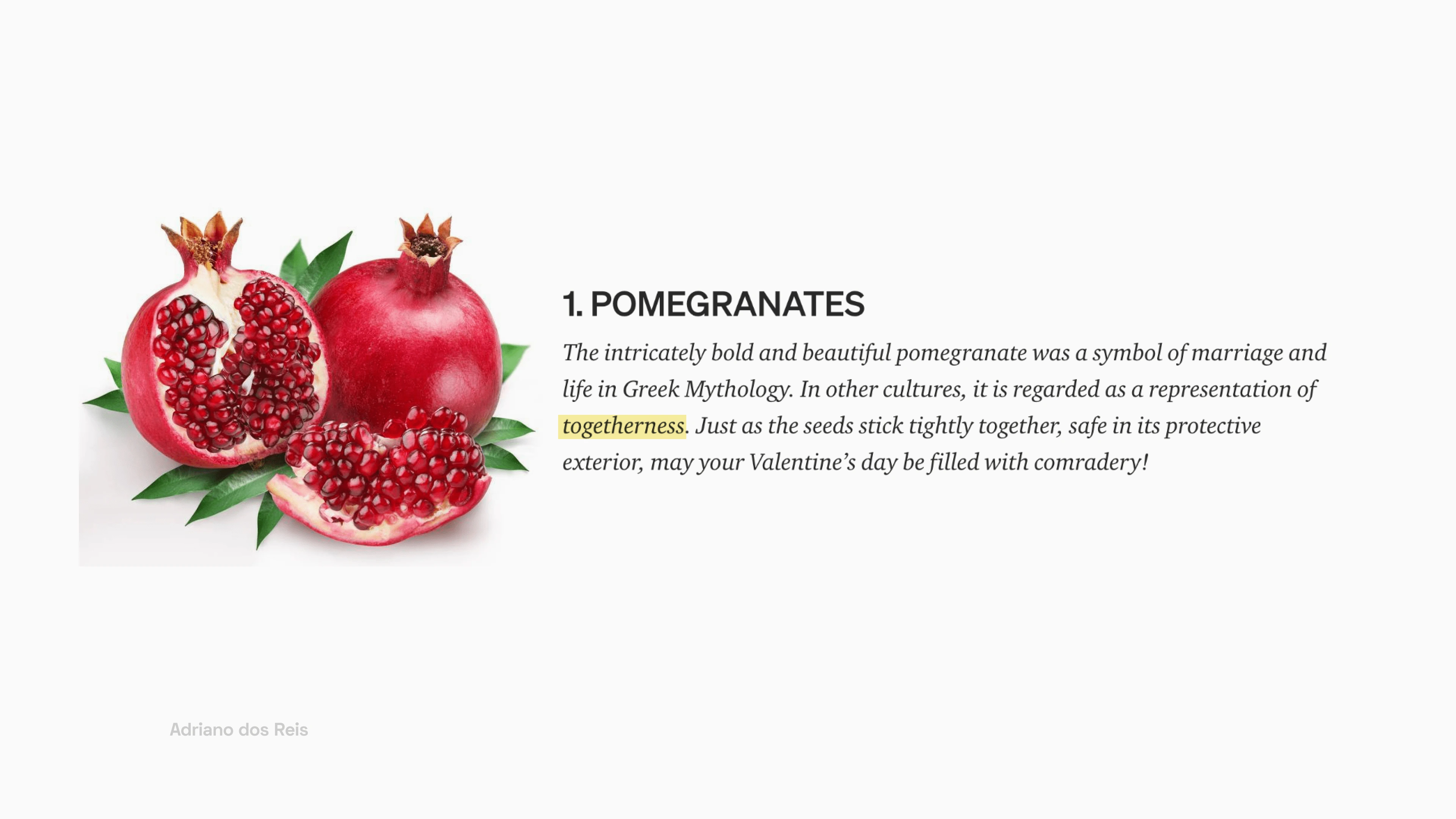
What pomegranates represent

Breakdown of the pomegranate fruit into the formation of the C
The result was something that spoke directly to what Klein Kitchen (then "the chef collective") represents.
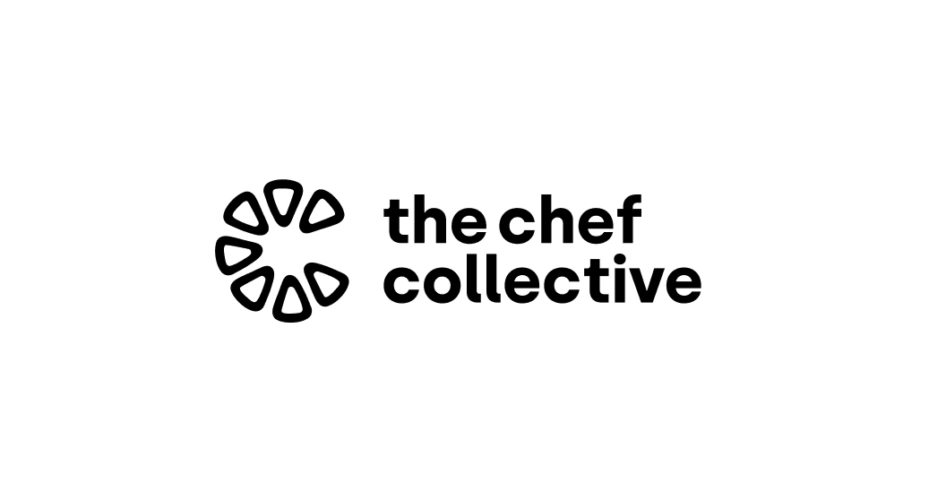
the chef collective logo
the chef collective → Klein Kitchen ✨
Although the client loved their new logo something about it was still bothering them, which was the name, they found that the name didn't sound approachable or organic enough. So we decided to go more personal and used their last name.
Meet Klein Kitchen 👋
Brand Book Pages 👇
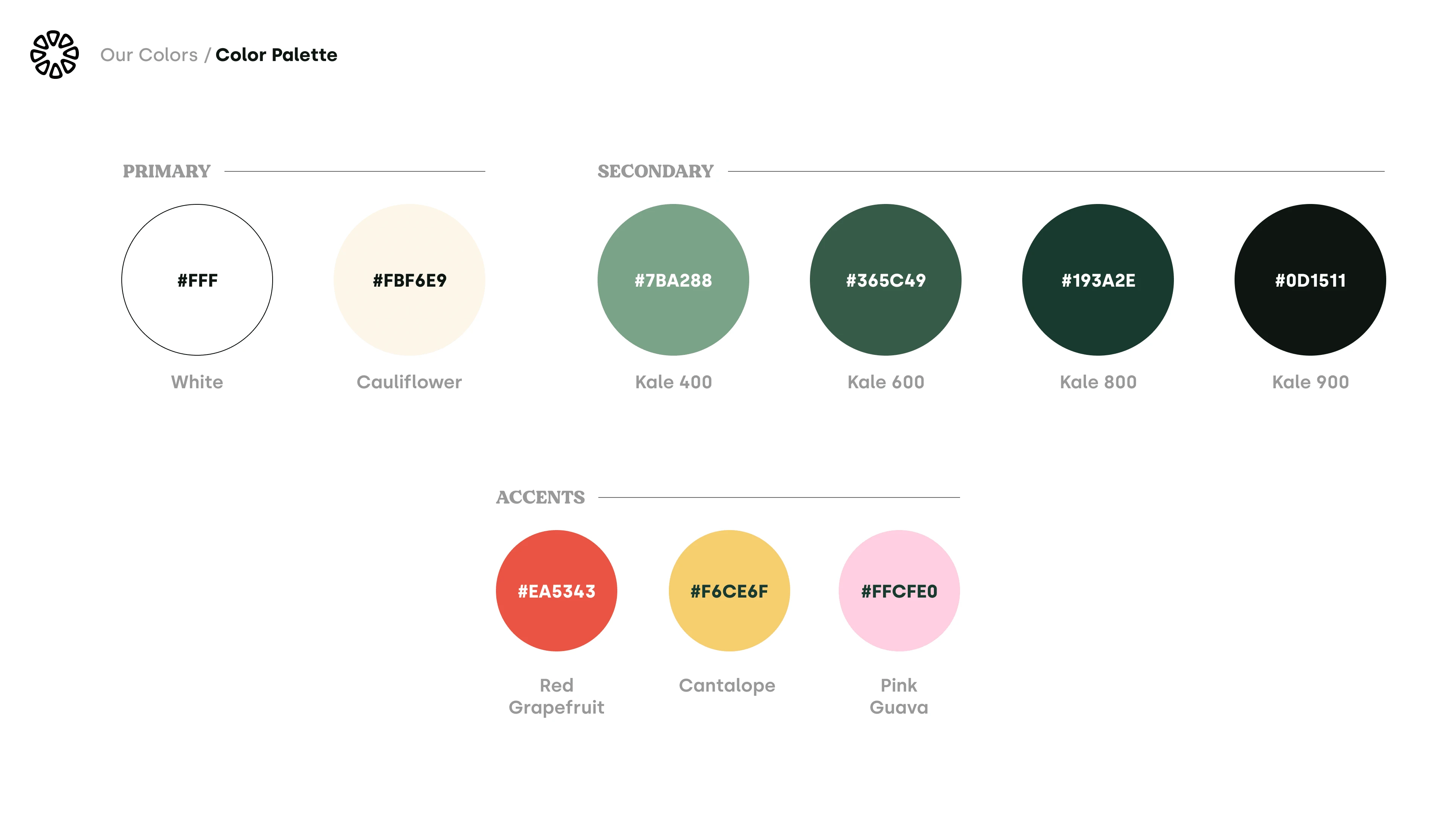
🎨 Color Palette
We also decided to name the brand colors after fruits and vegetables (very on-brand, I know) 🥬🥬🥬
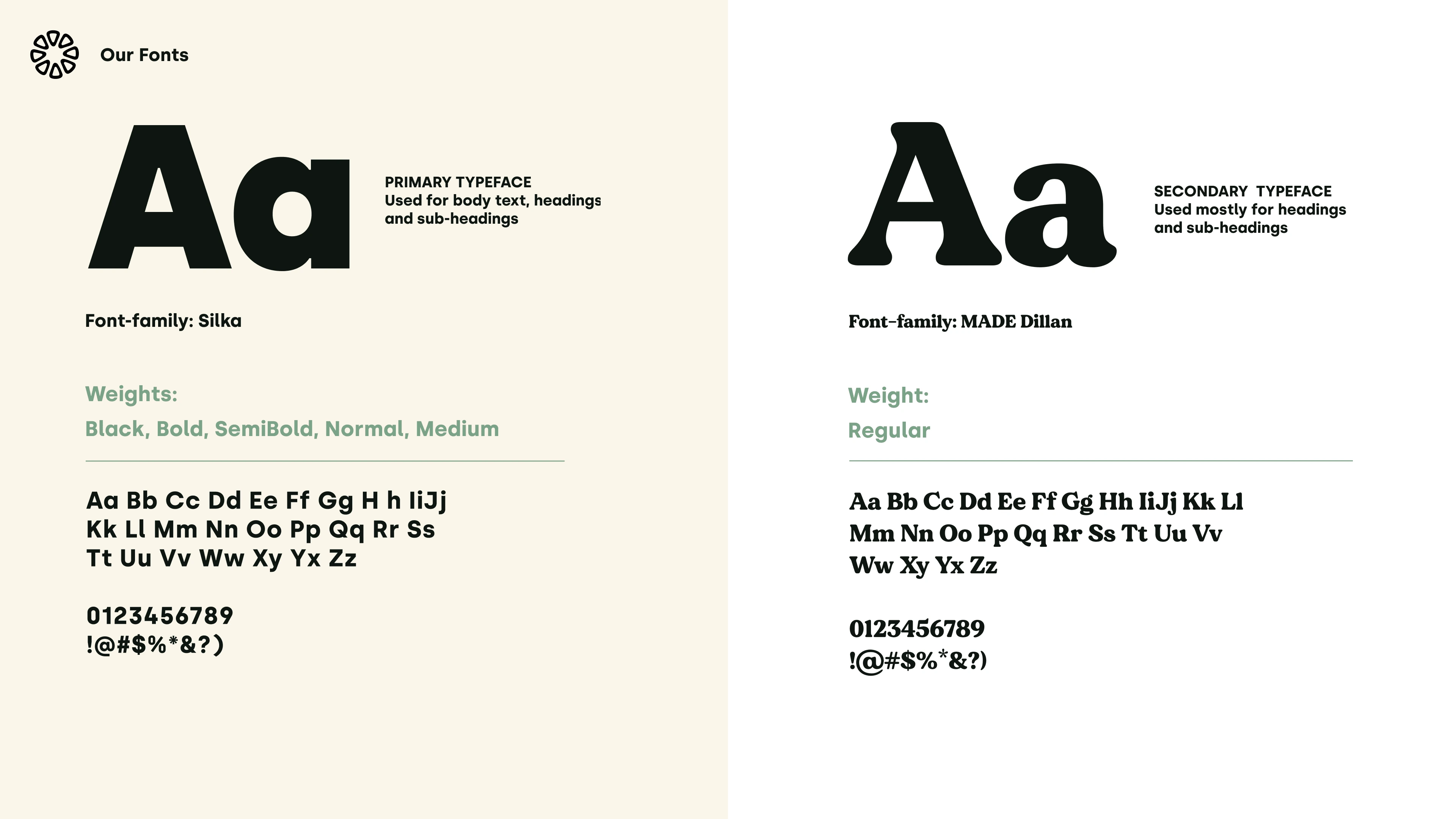
🔤 Fonts
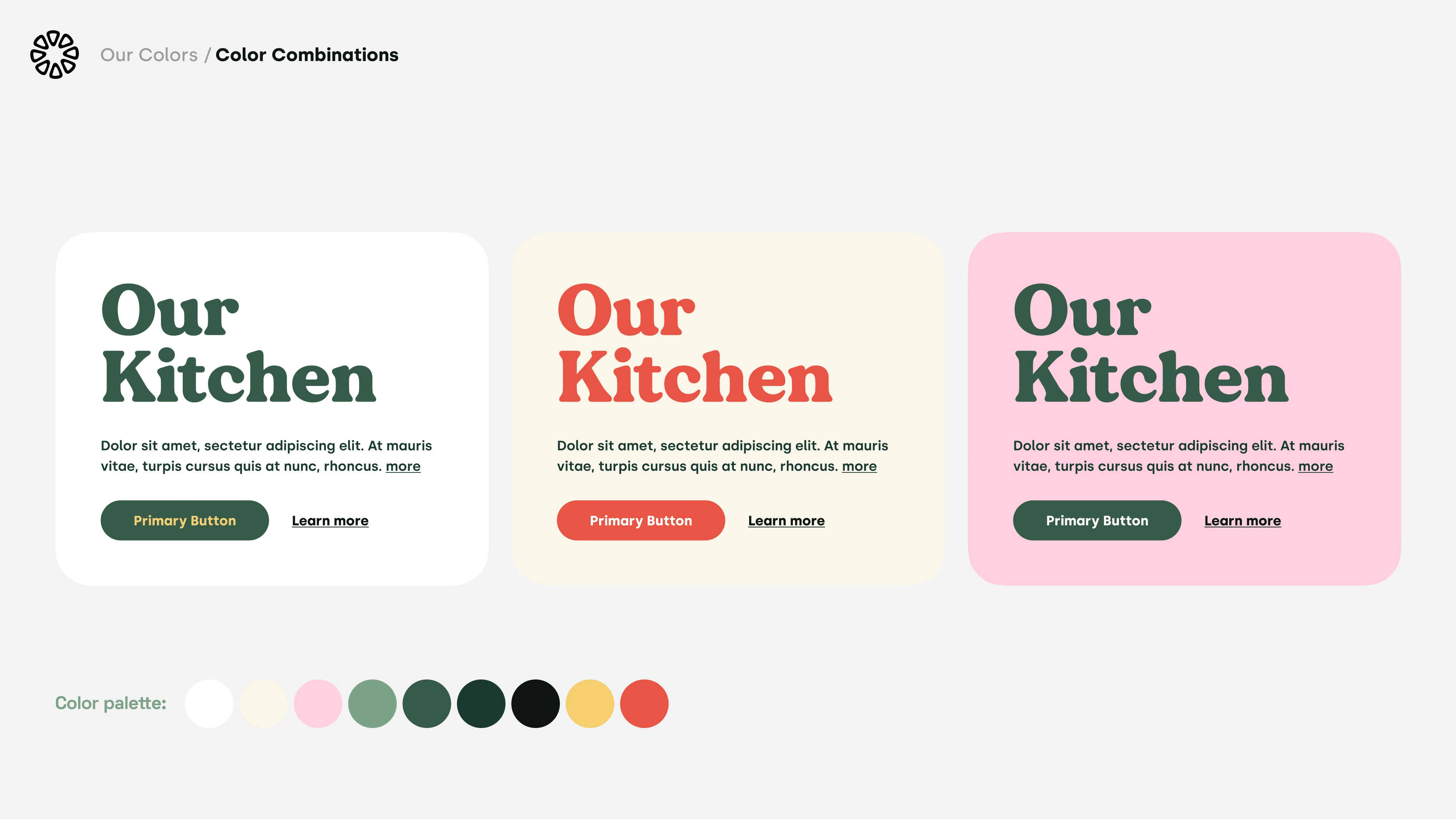
Font pairings and color combinations
🖥 Website (to be added)
SO... it takes time to do write-ups 😅 so I decided to publish the WIP version rather than wait until it's complete before showing. Good is better than perfect, am I right? Meanwhile, you can see the live site here kleinkitchen.com
Website Copywriting by Kate Mountz
Like this project
Posted Nov 2, 2021
Website and logo design + No-code development for Klein Kitchen, a culinary matchmaking service 🧑🍳
Likes
56
Views
3.4K

