Patrick's Smart Shopper Grocery App

Ivori Rayale

The Challenge
Grocery shopping is deceptively complex. The average trip takes 43 minutes, with nearly a quarter of that time spent just searching for items. 68% of shoppers forget things from their mental lists. Consumers miss an average of $12 in applicable discounts per trip. And checkout lines eat up 31% of total shopping time.
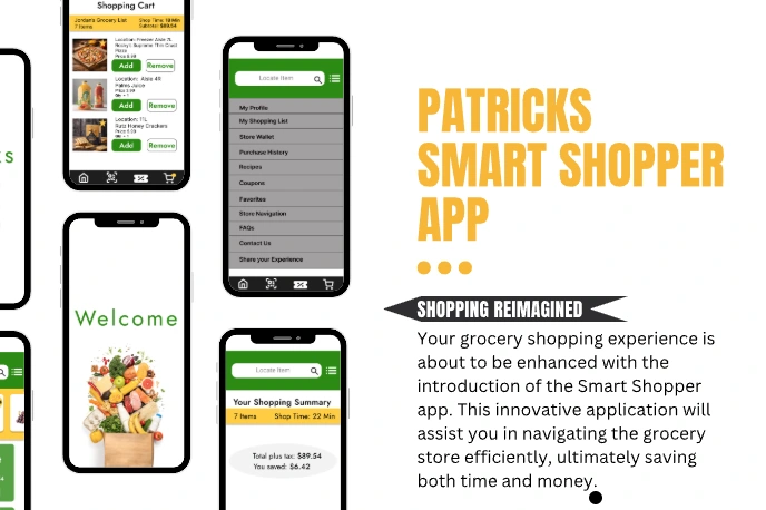
Patrick's needed a mobile app that addressed all of this — a unified experience that helps shoppers plan smarter, navigate faster, save more, and check out without the wait.
Research Phase
Market Analysis
The US grocery market sits at $682B, with mobile commerce growing at 15.3% annually. I analyzed five major competitors (Instacart, Amazon Fresh, Walmart Grocery, Kroger, Target) and found consistent gaps: poor in-store navigation, missed personalization opportunities, fragmented checkout experiences, and limited real-time inventory integration.
User Research
I conducted 15 user interviews (ages 25-55, mixed shopping frequency), 8 in-store observational studies, 11 survey responses for problem validation, competitive analysis across 5 platforms, and card sorting to validate information architecture.
Key Findings
78% of users forget items despite having lists
65% struggle to find items in unfamiliar stores
82% miss relevant deals and promotions
71% find checkout lines frustrating during peak hours
Empathy Mapping
The empathy maps revealed things analytics couldn't. Busy parents aren't worried about app speed — they're terrified of forgetting something and having to drag tired kids back to the store. Budget-conscious shoppers feel anxiety with every purchase decision, not just annoyance at high prices. Grocery shopping isn't really about groceries. It's about fitting one more overwhelming task into an already packed day.
That insight shaped everything: the app needed to solve emotional problems, not just functional ones.
Design Process
Information Architecture
I structured the app around four core pillars:
Smart Lists — AI-powered shopping lists with recipe integration, organized by category to prevent forgotten items
Savings Hub — centralized deals, coupons, and price comparisons in one place
Store Navigator — interactive maps and item location services for faster trips
Express Checkout — streamlined mobile payment, digital receipts, and pickup options
User Flow
The app supports multiple entry points into the shopping experience: recipe-based shopping, list-based shopping, discount browsing, and general search. All paths converge at a centralized cart and checkout, keeping the experience flexible without adding complexity.
Wireframing & Prototyping
I started with paper sketches focused on core navigation and task flows, tested basic concepts with 12 users through guerrilla testing, then developed high-fidelity prototypes with micro-interactions and real content for final validation.
Responsive Journey
The design bridges digital and physical shopping — supporting planning before the trip, decision-making inside the store, and confidence during checkout. Every feature was evaluated against whether it actually reduced friction in the real-world shopping journey.
Testing & Validation
Usability testing with 7 participants achieved a 94% task success rate across key flows: list creation, coupon discovery, store navigation, recipe integration, and mobile checkout.
Testing confirmed that users valued simple labels, fewer steps, visible savings, and clear guidance throughout the journey. These insights drove refinements to screen hierarchy, information architecture, and the overall experience.
Key Iterations
Simplified labels and reduced steps in the checkout flow
Improved visual hierarchy so savings and product details were immediately scannable
Strengthened the connection between digital list planning and in-store navigation
Refined the recipe-to-cart flow based on user feedback
The Result
The validated prototype demonstrated a clear path from planning to purchase that users found intuitive and efficient. Store navigation, digital coupons, and list-building tested as the most valuable features. Users consistently noted that the app made grocery shopping feel less overwhelming — exactly the emotional outcome the research pointed toward.
The project also reinforced that features like coupons, recipes, maps, and mobile checkout are only useful when they feel easy to access and naturally connected to the shopping journey. Complexity without clarity is just noise.
Like this project
Posted Jul 3, 2026
A mobile grocery app designed to make shopping faster, smarter, and less stressful — with smart lists, personalized savings, store navigation, and express checkout.
Likes
0
Views
5