Avant Luxury Real Estate Brand Identity Design

next mahamud

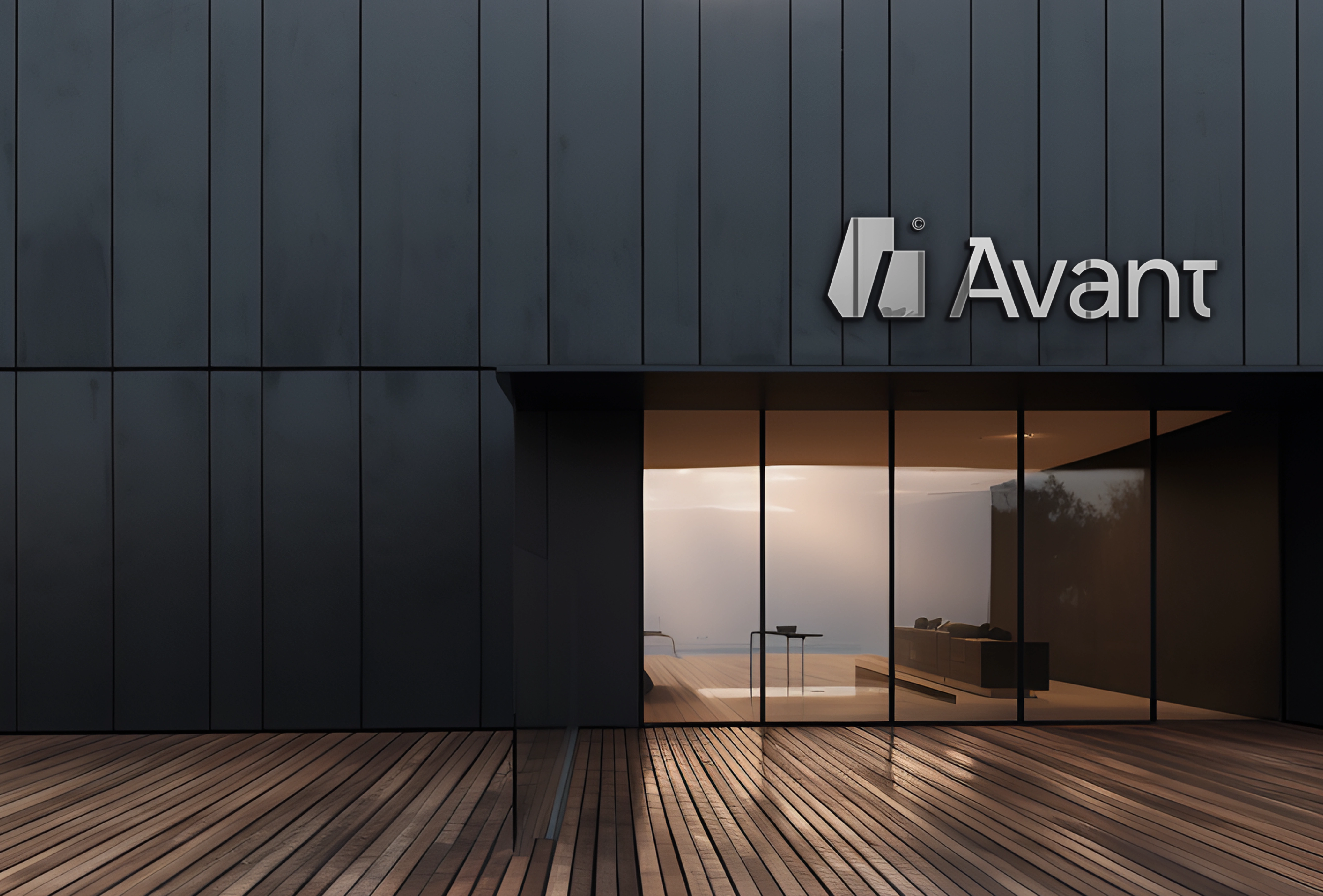
Avant©
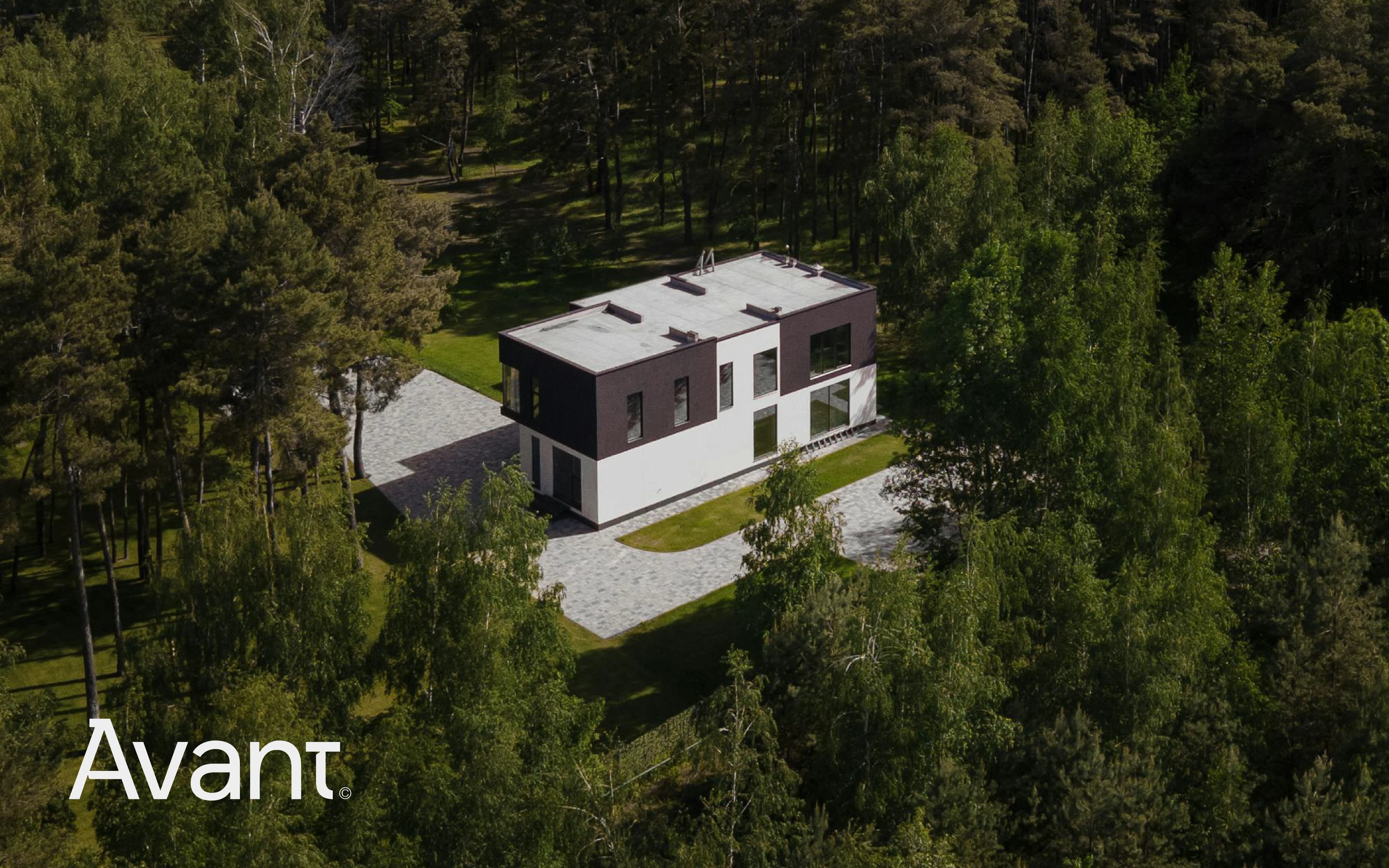
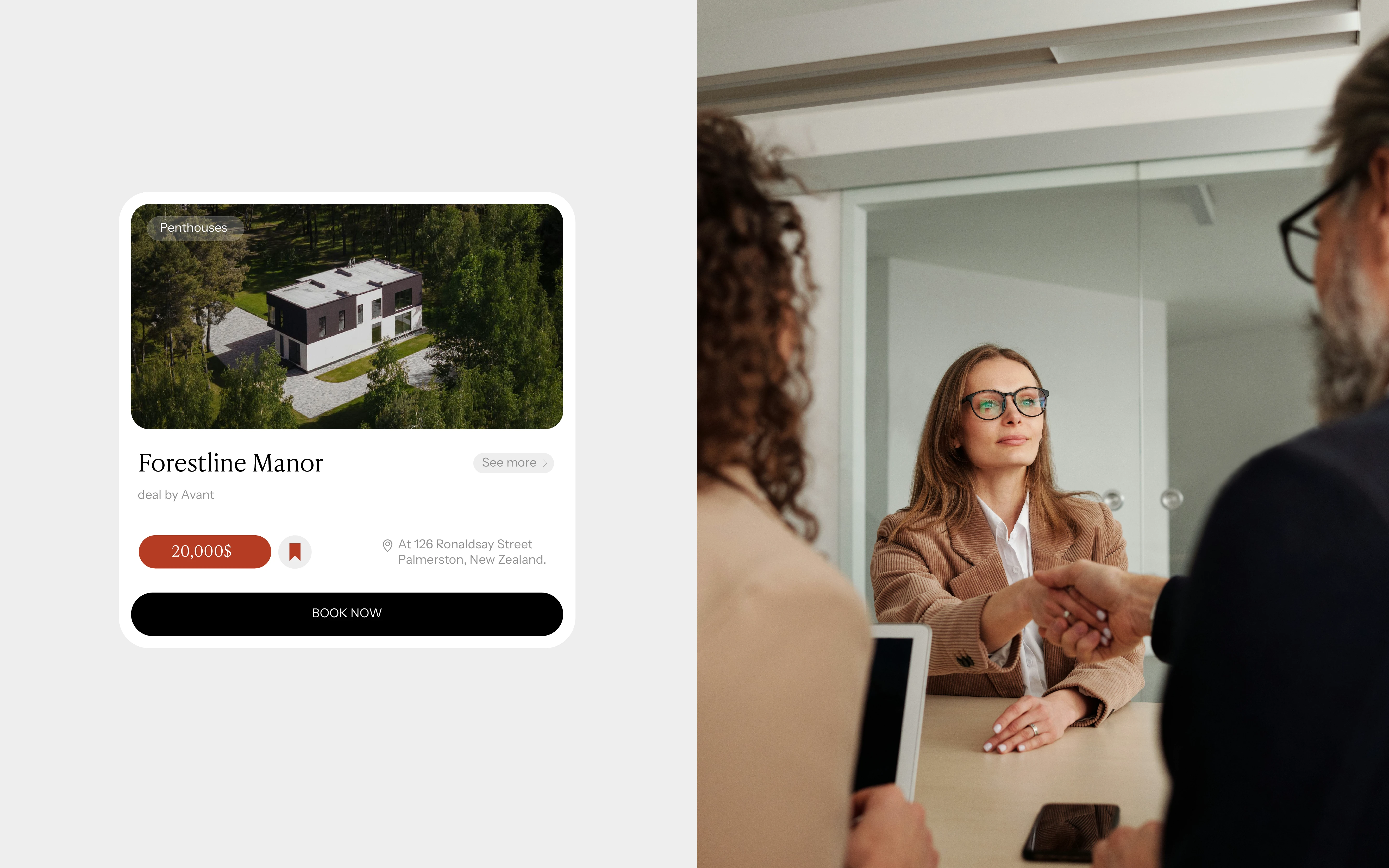
Avant is a luxury real estate brand that creates one-of-a-kind homes designed to be as unique as the people who live in them. They combine timeless style, modern innovation, and exceptional craftsmanship to build spaces that are beautiful, functional, and truly personal.
Alongside building luxury homes, Avant offers a full range of real estate services, including buying, selling, developing, and advising—making the entire process smooth, seamless, and tailored to each client’s needs.
Design Direction:
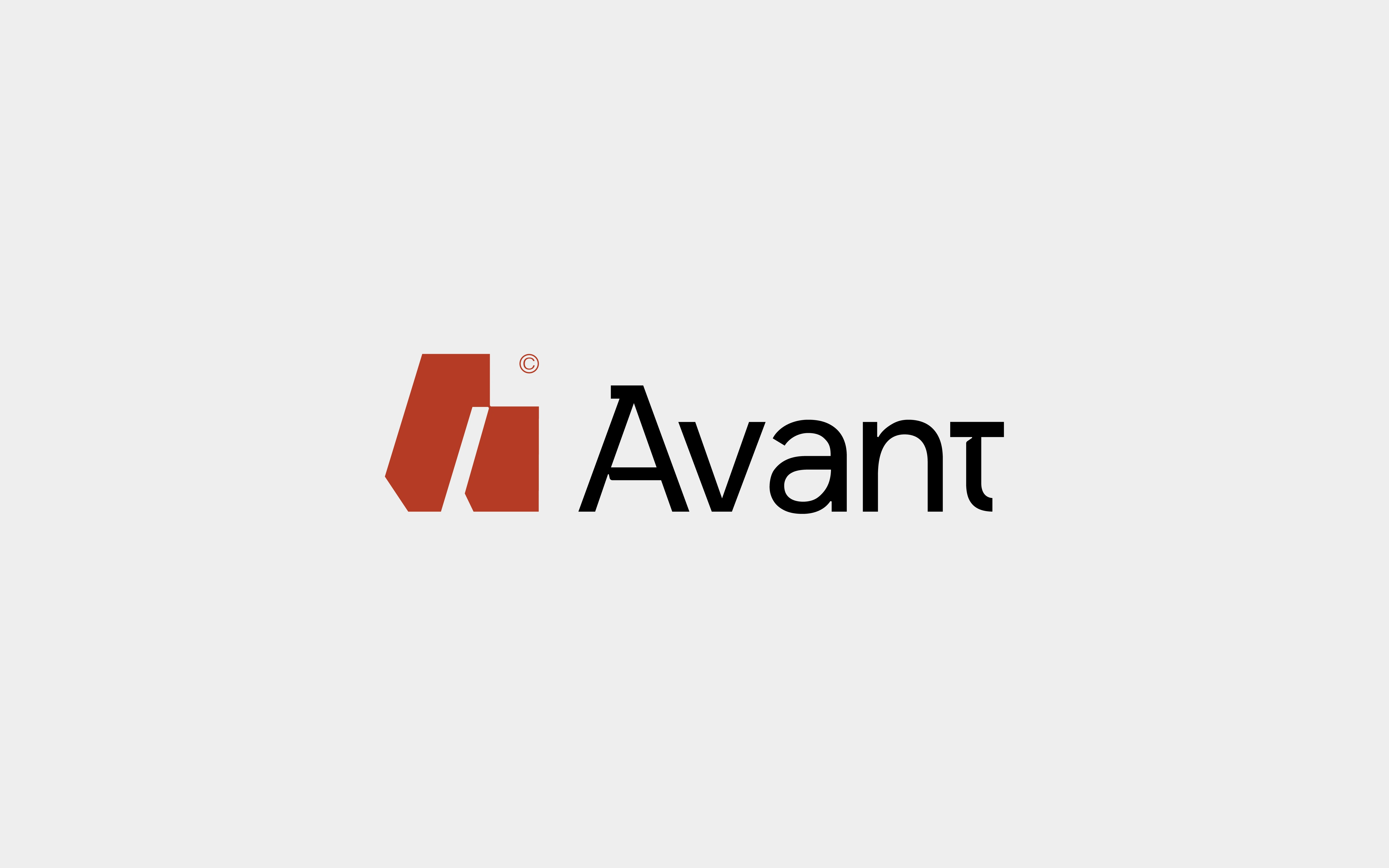
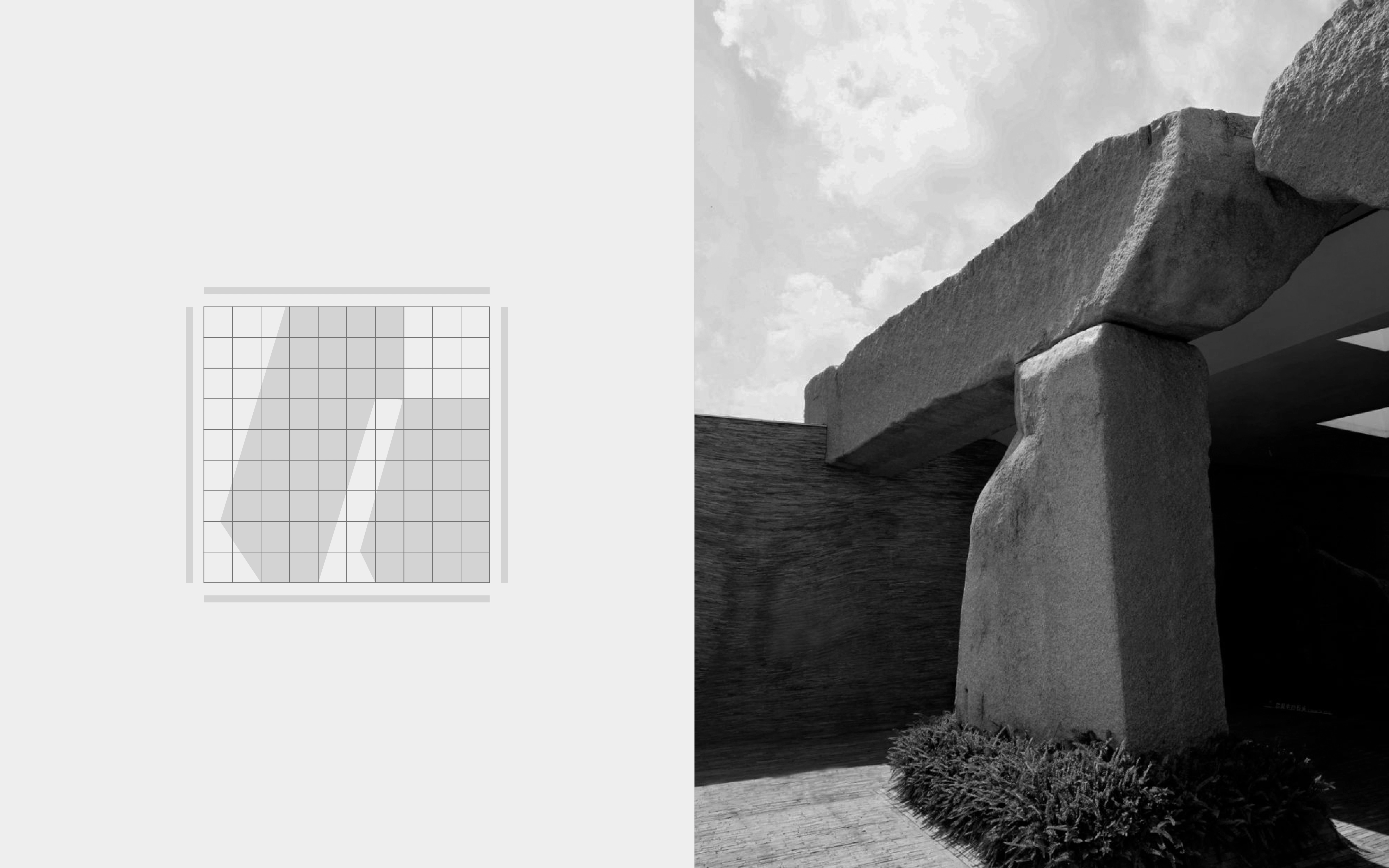
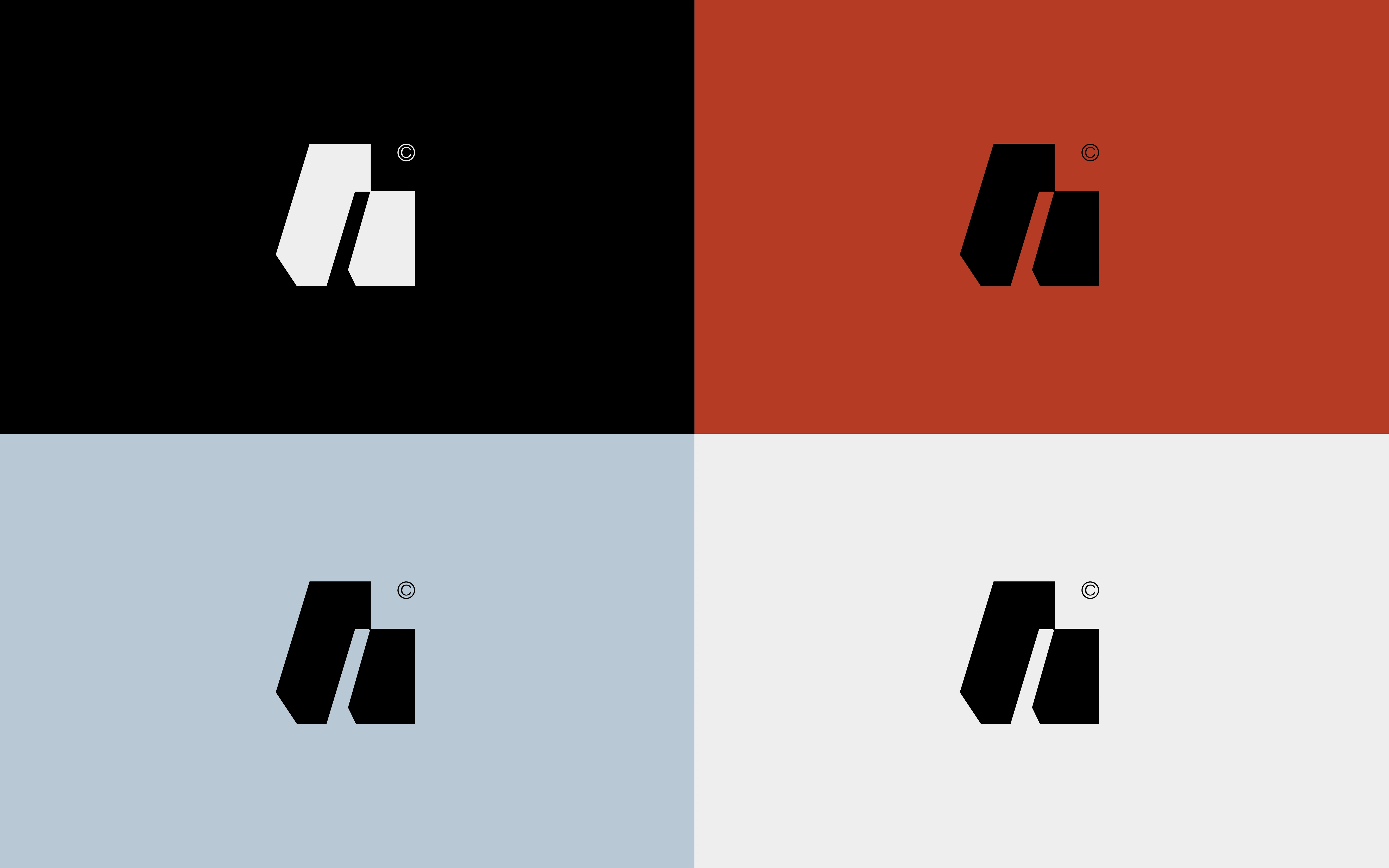
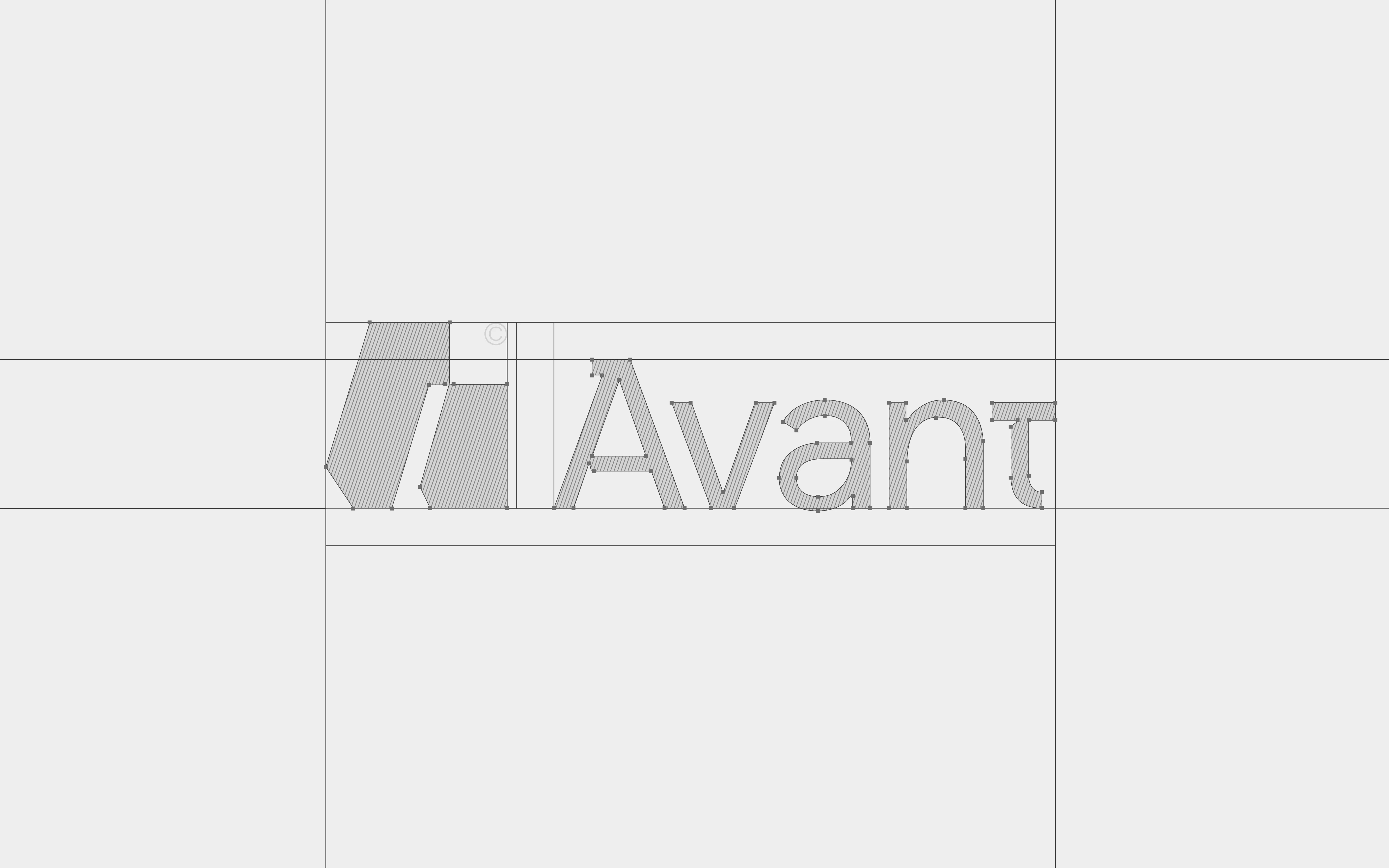
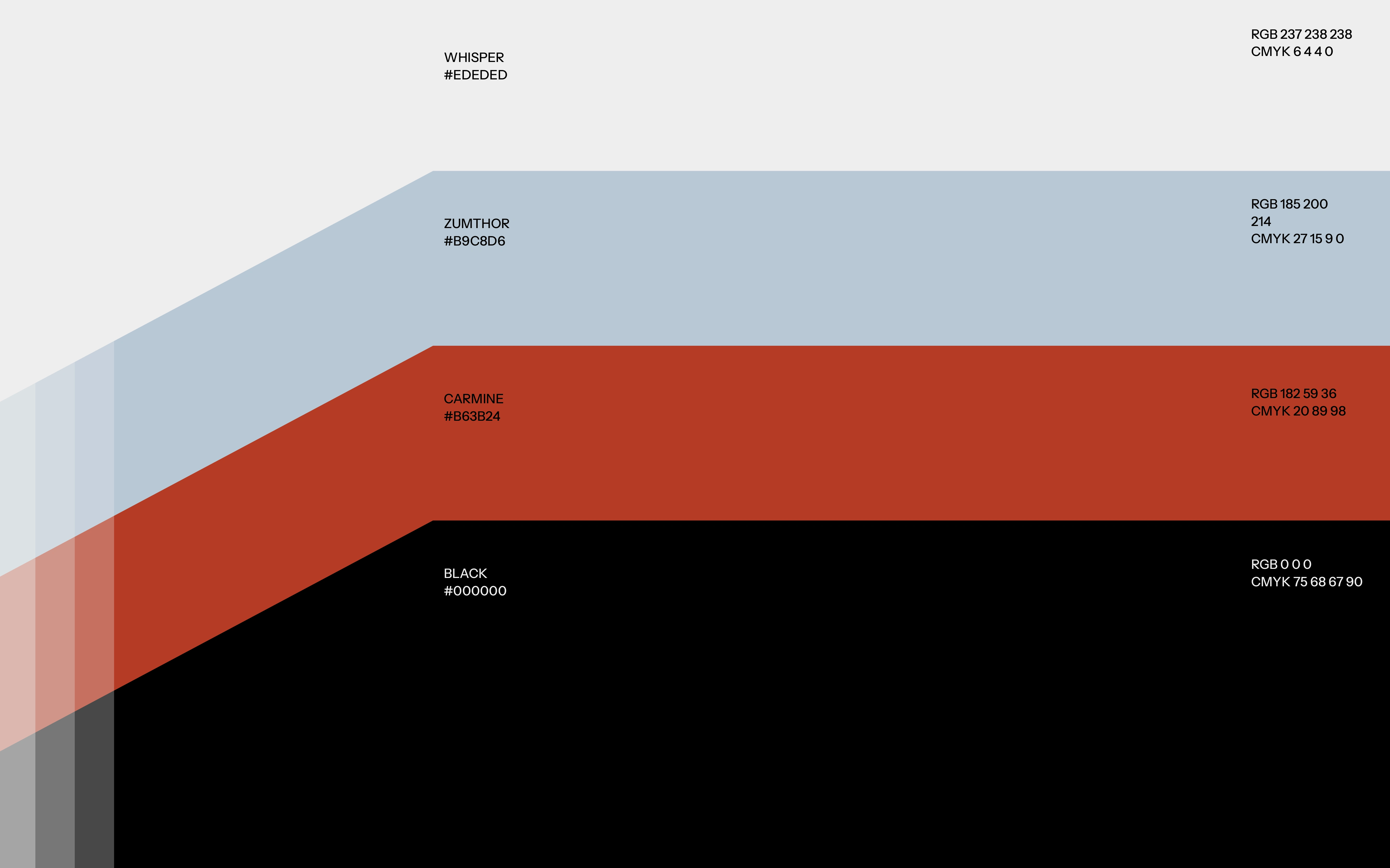
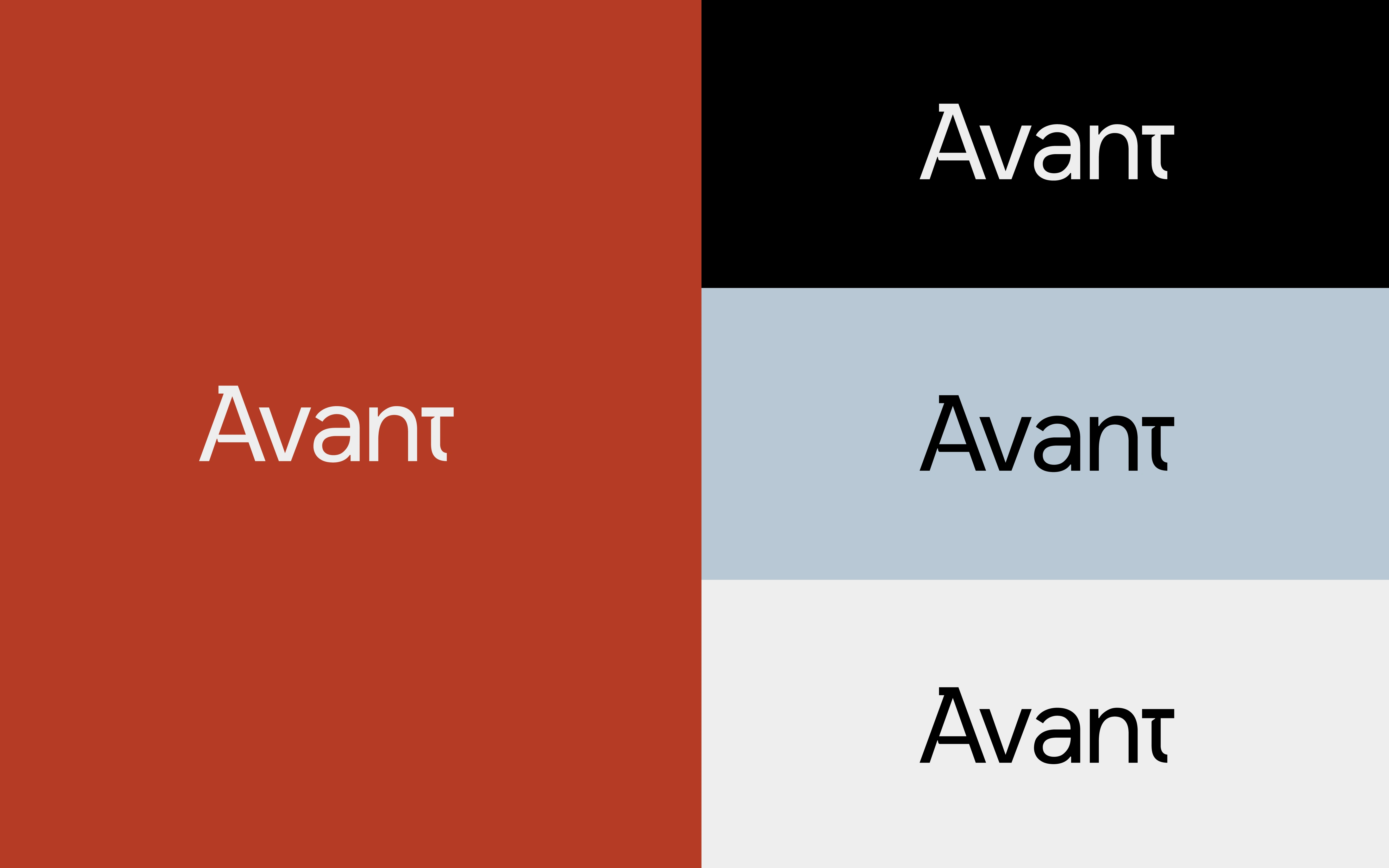
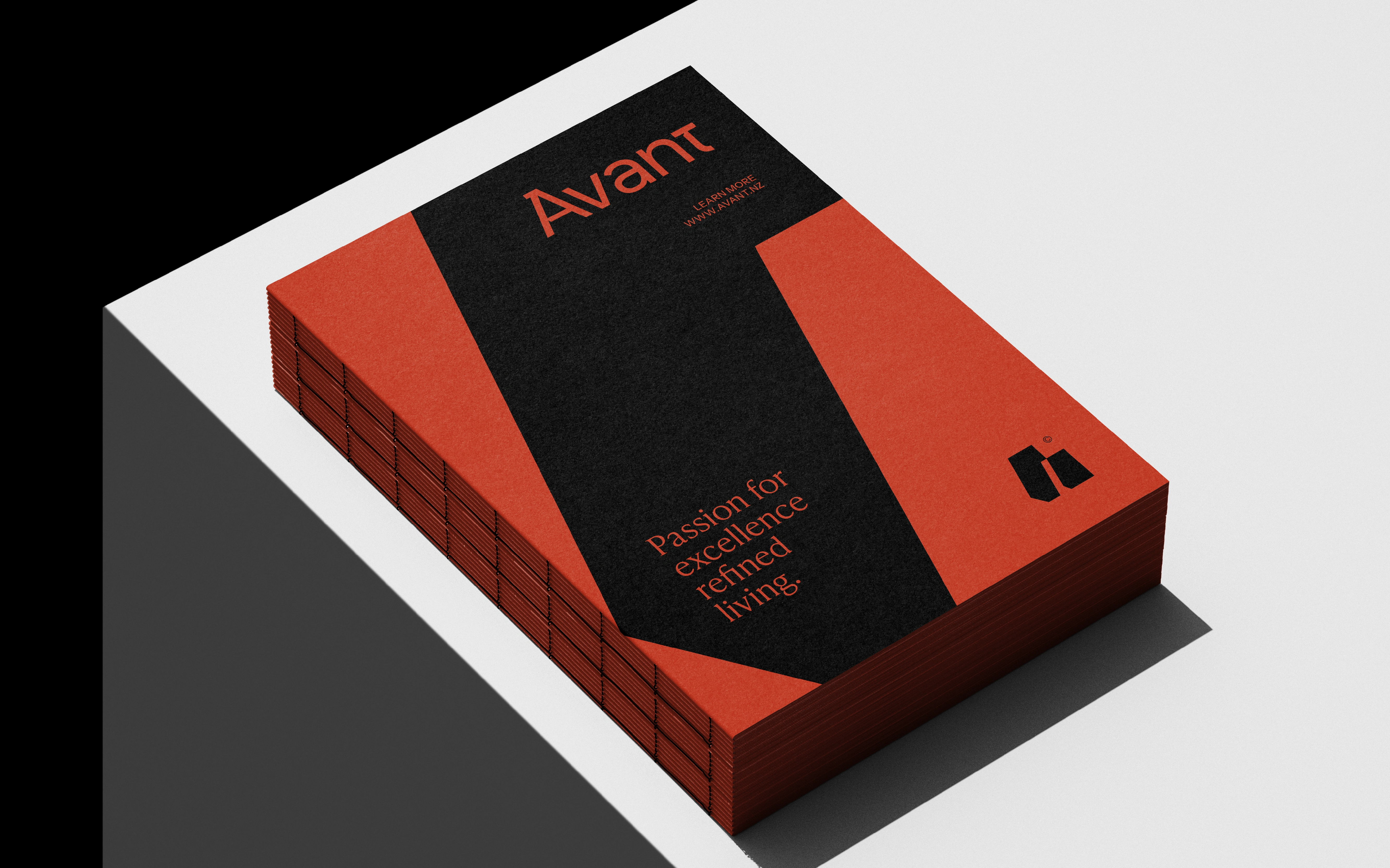
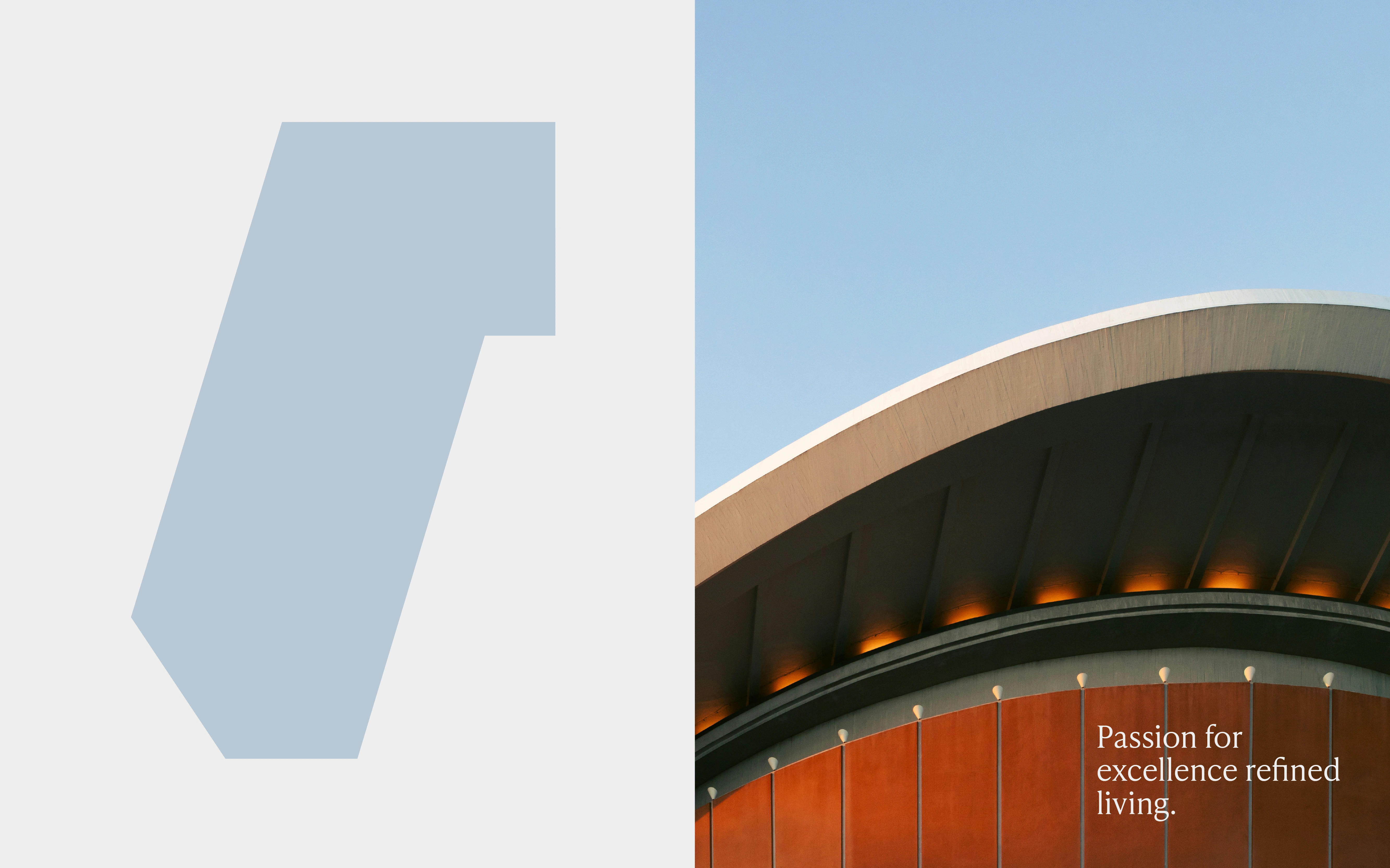
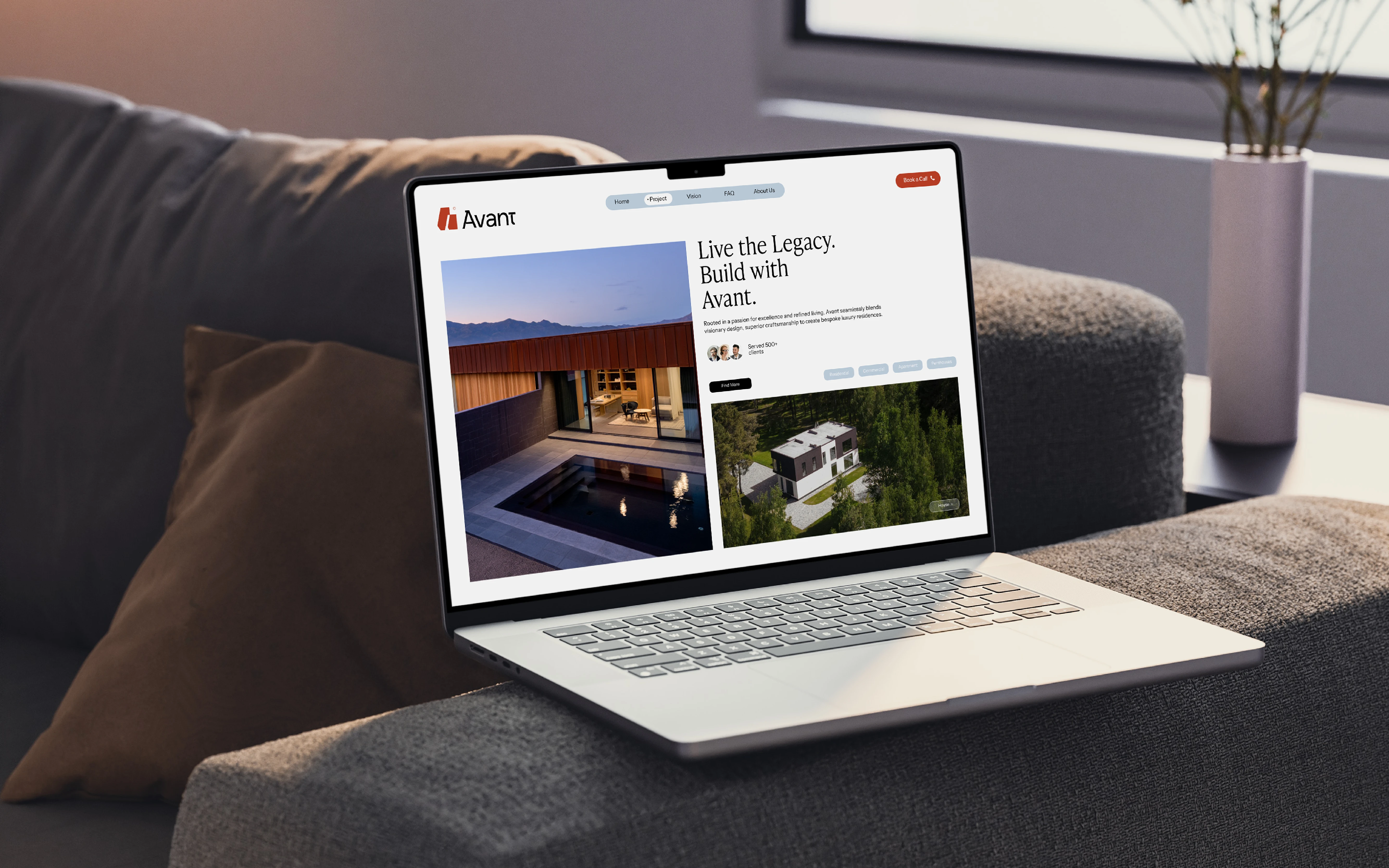
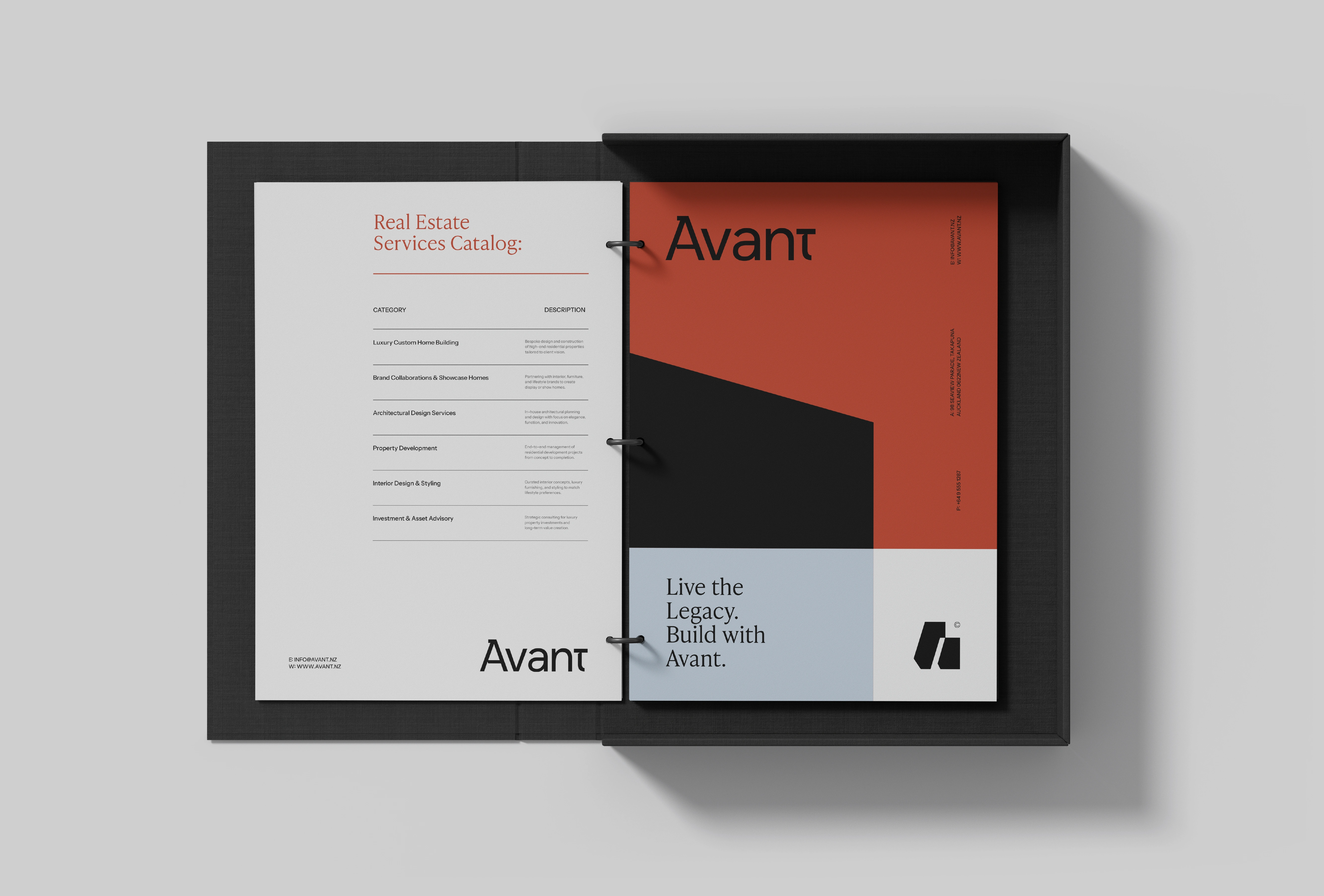
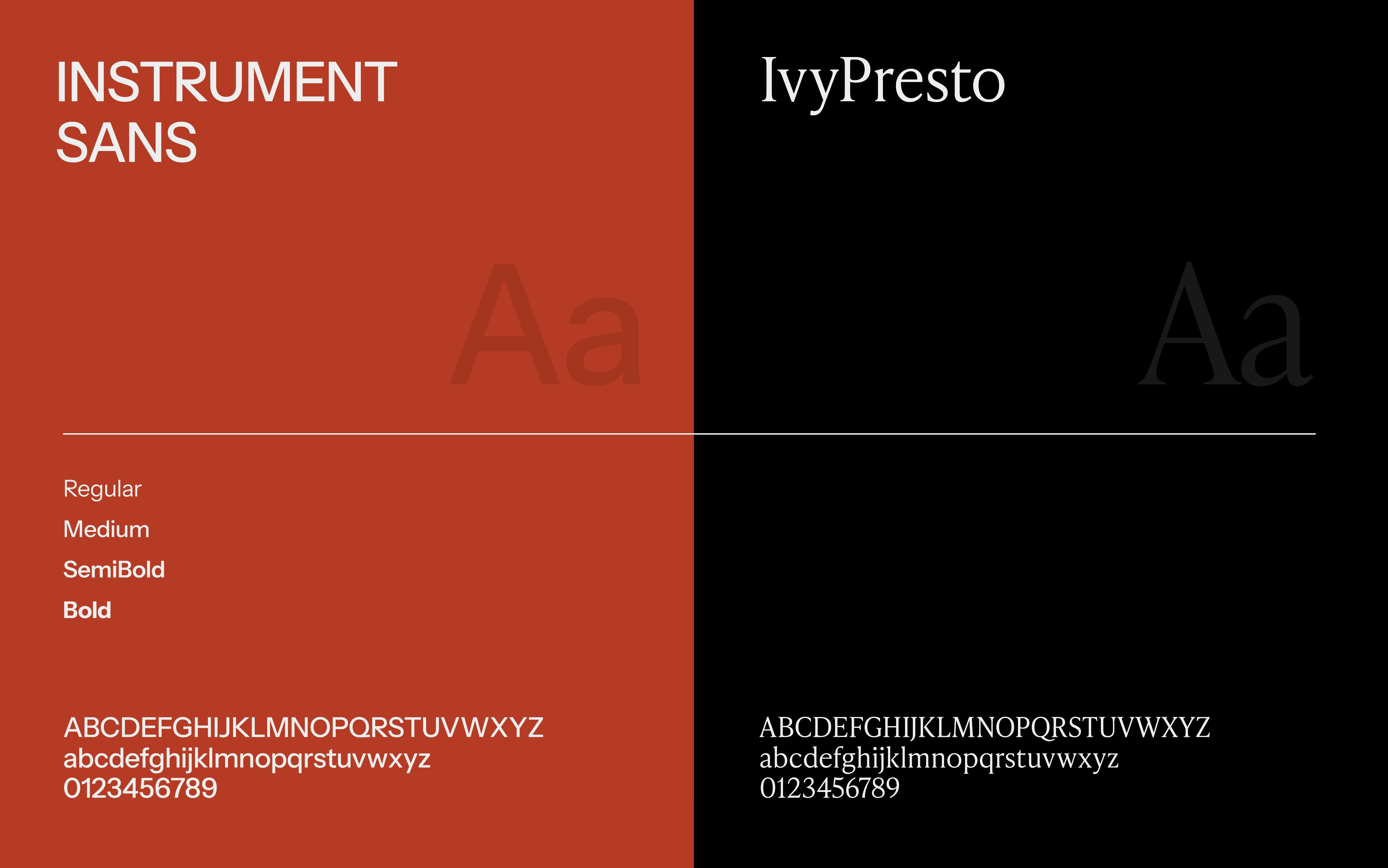
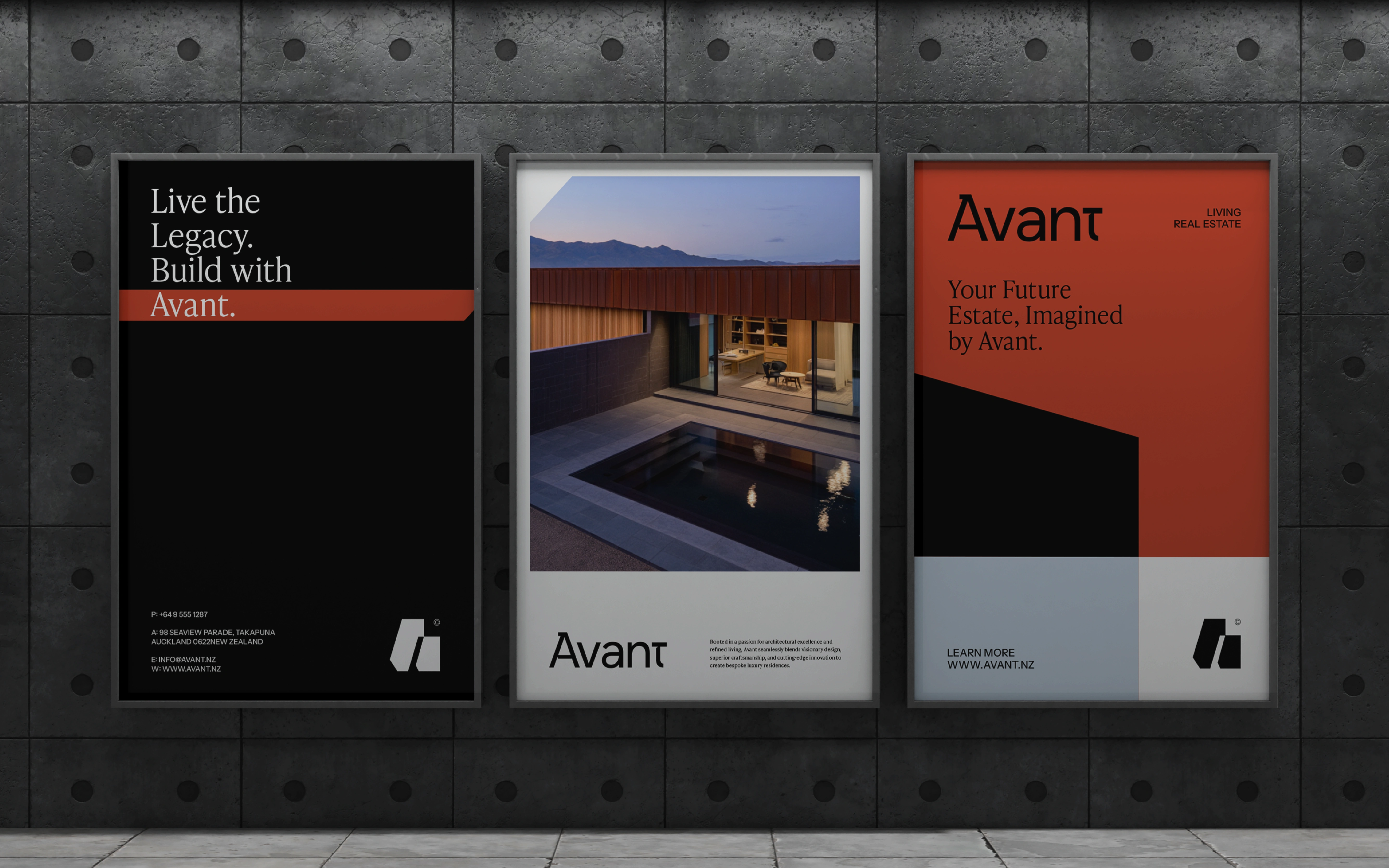
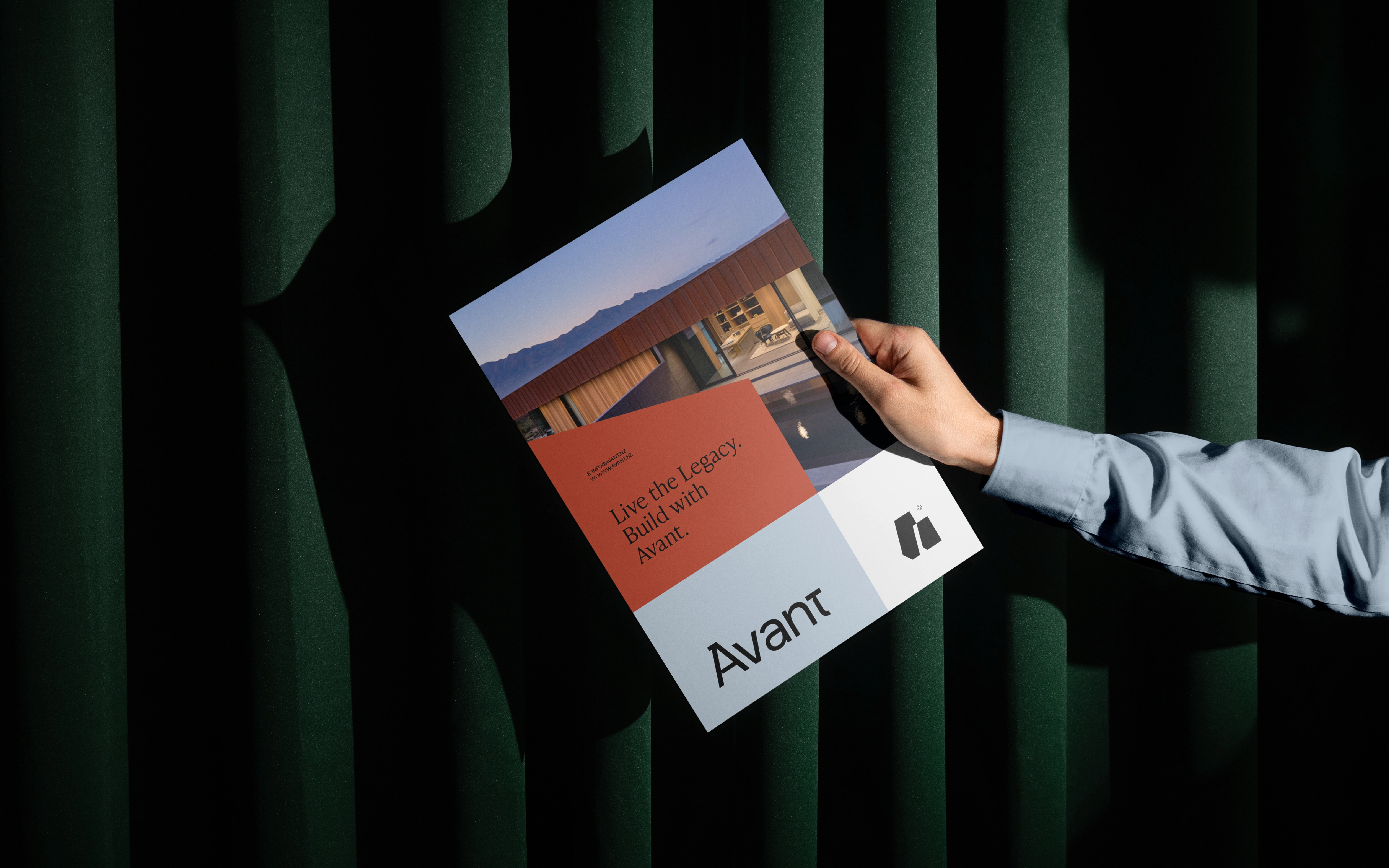
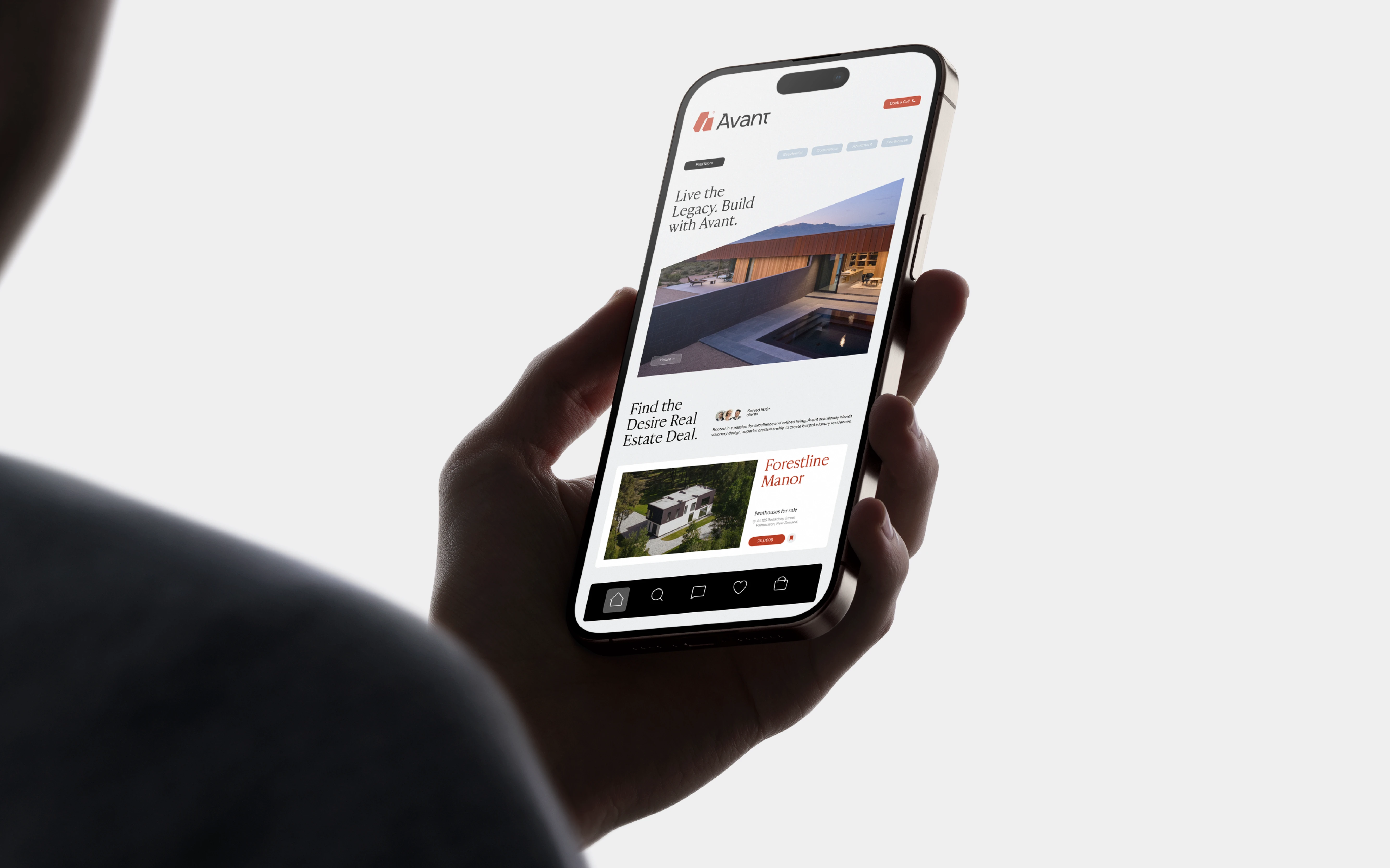
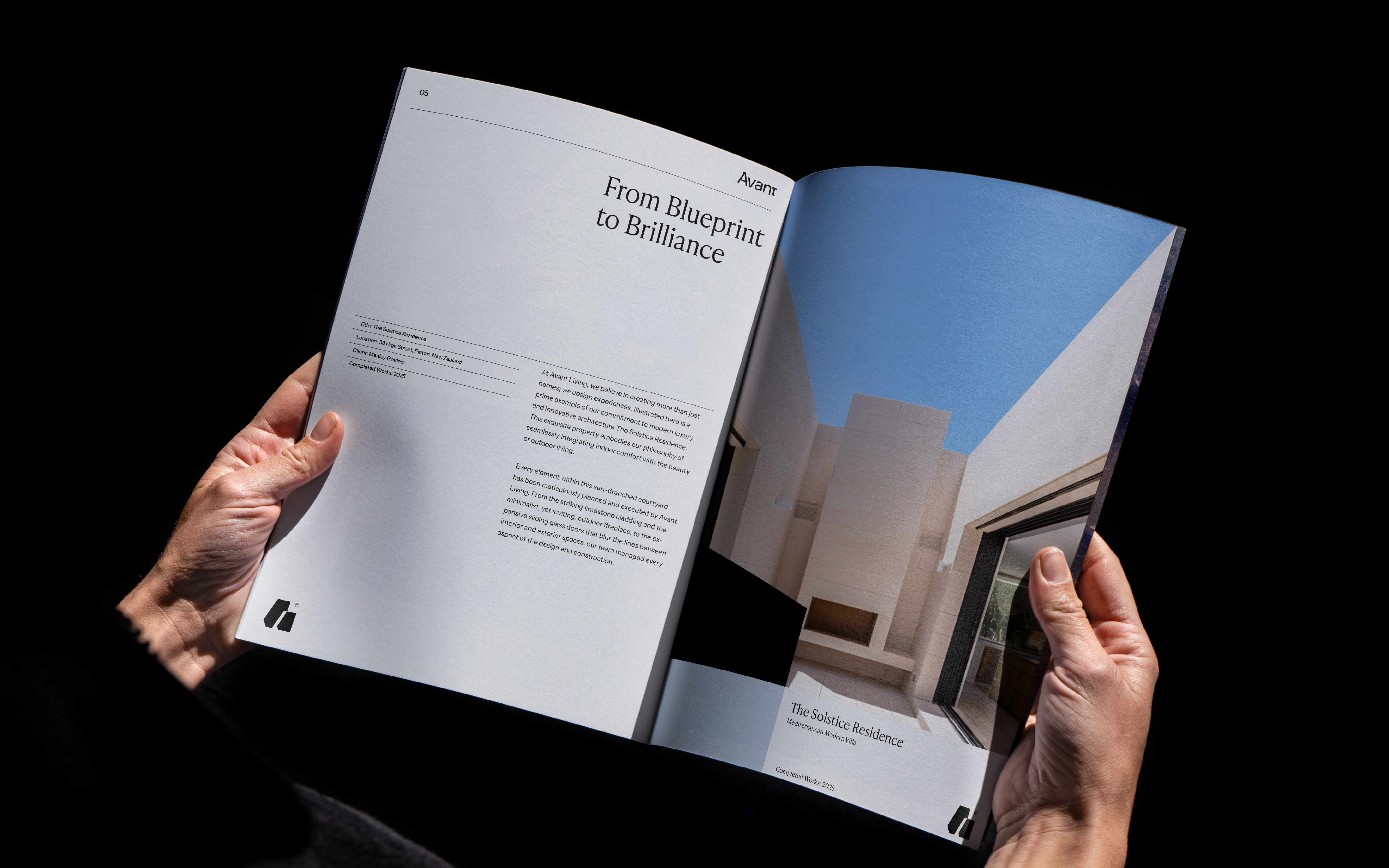
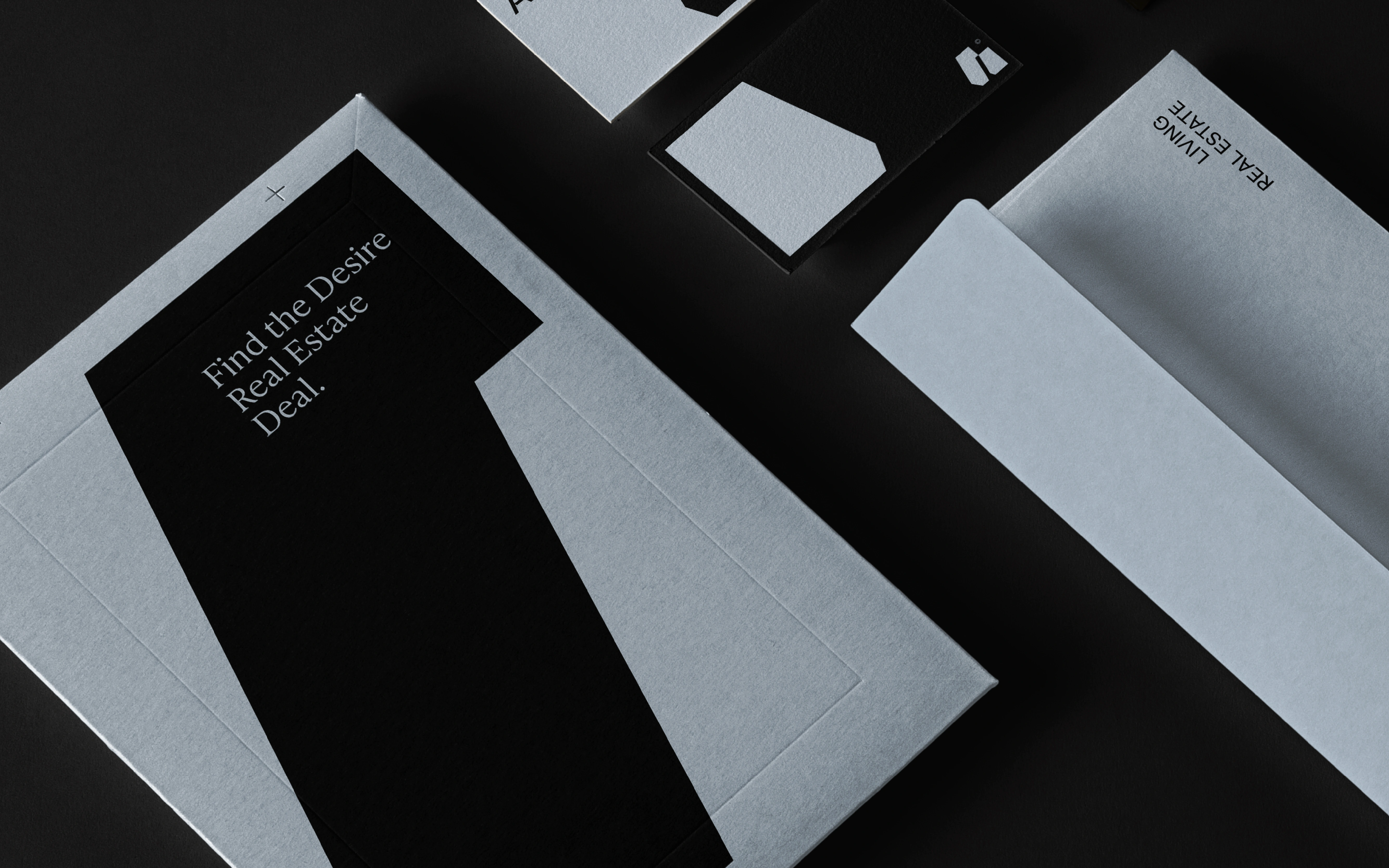
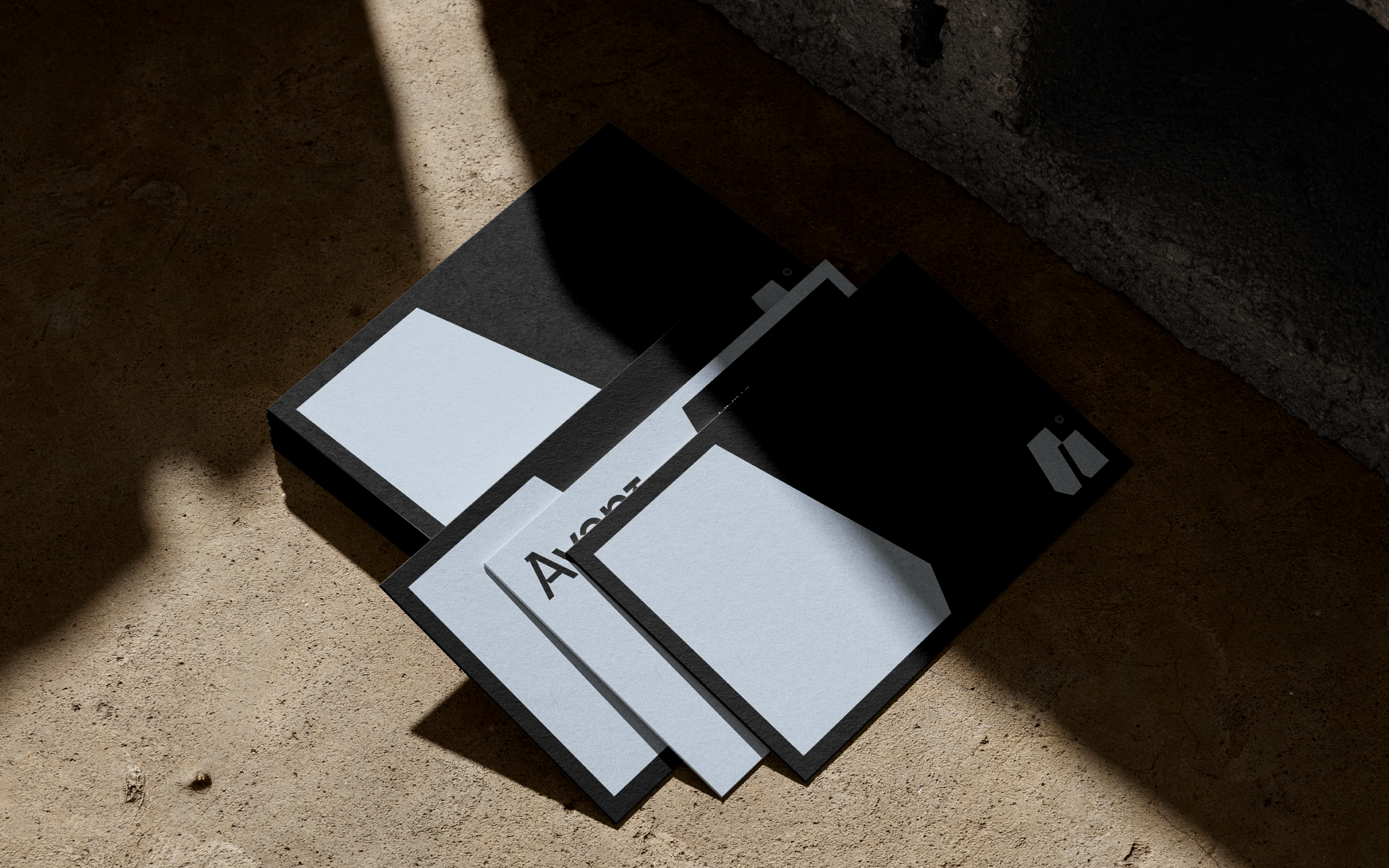
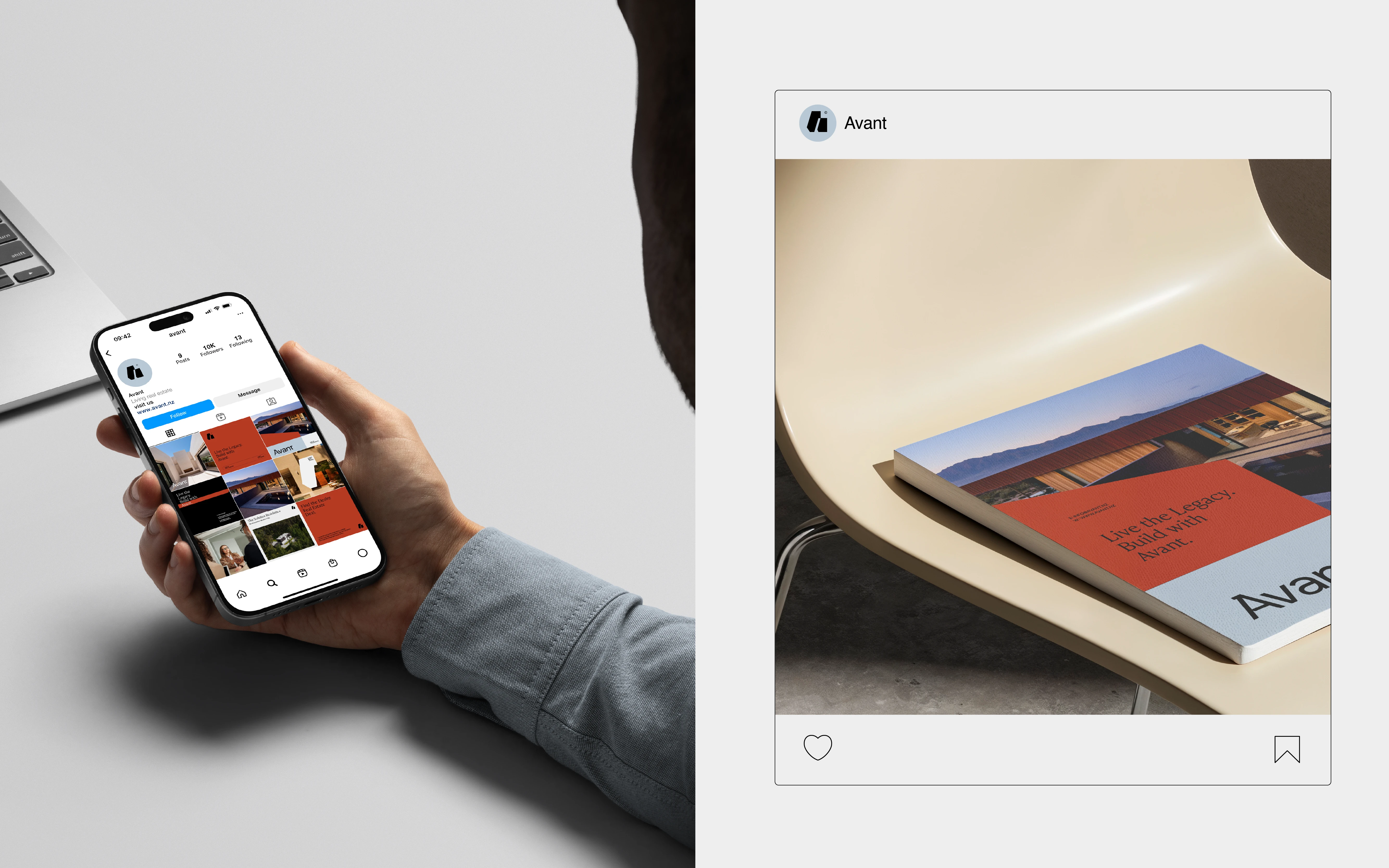
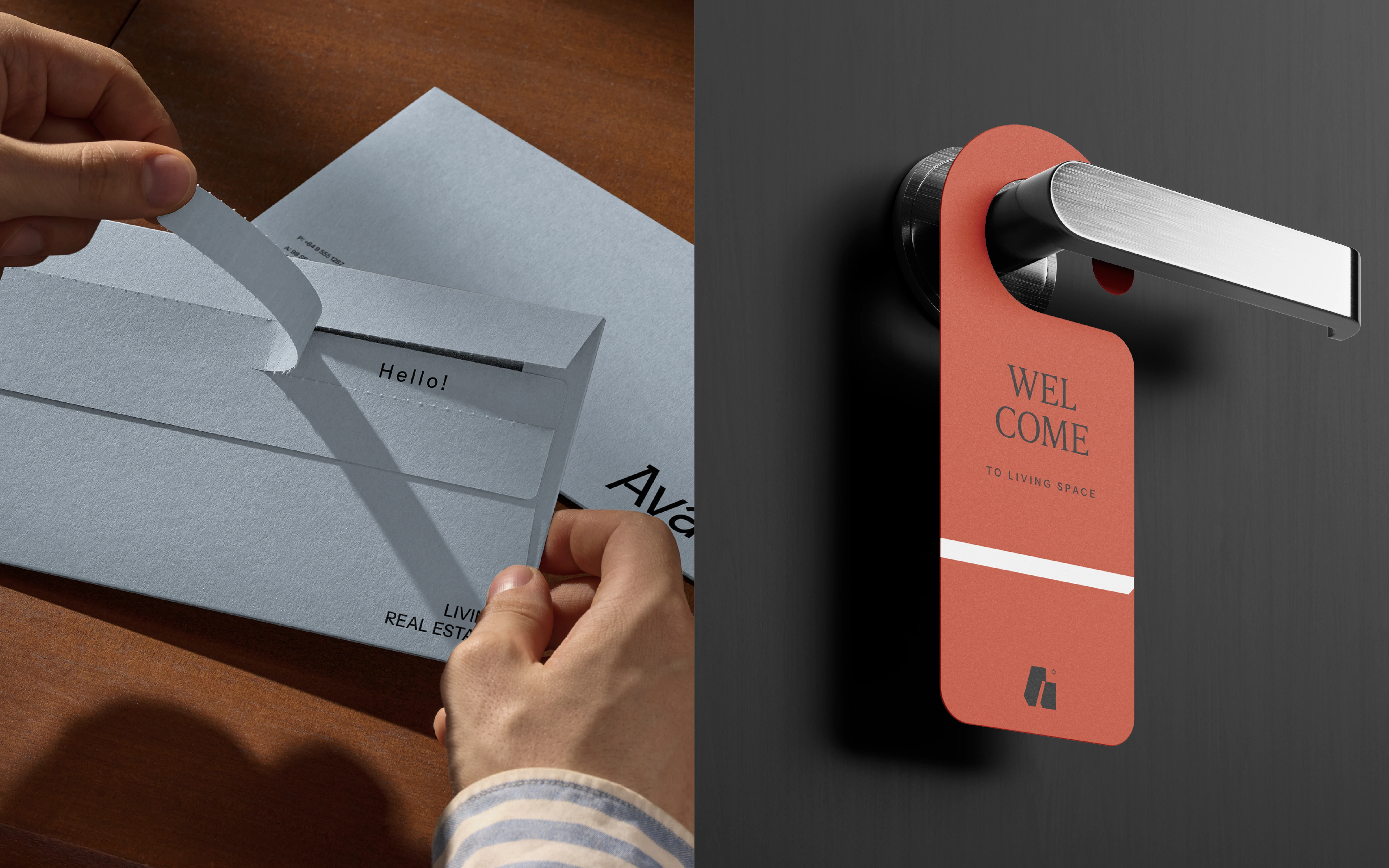
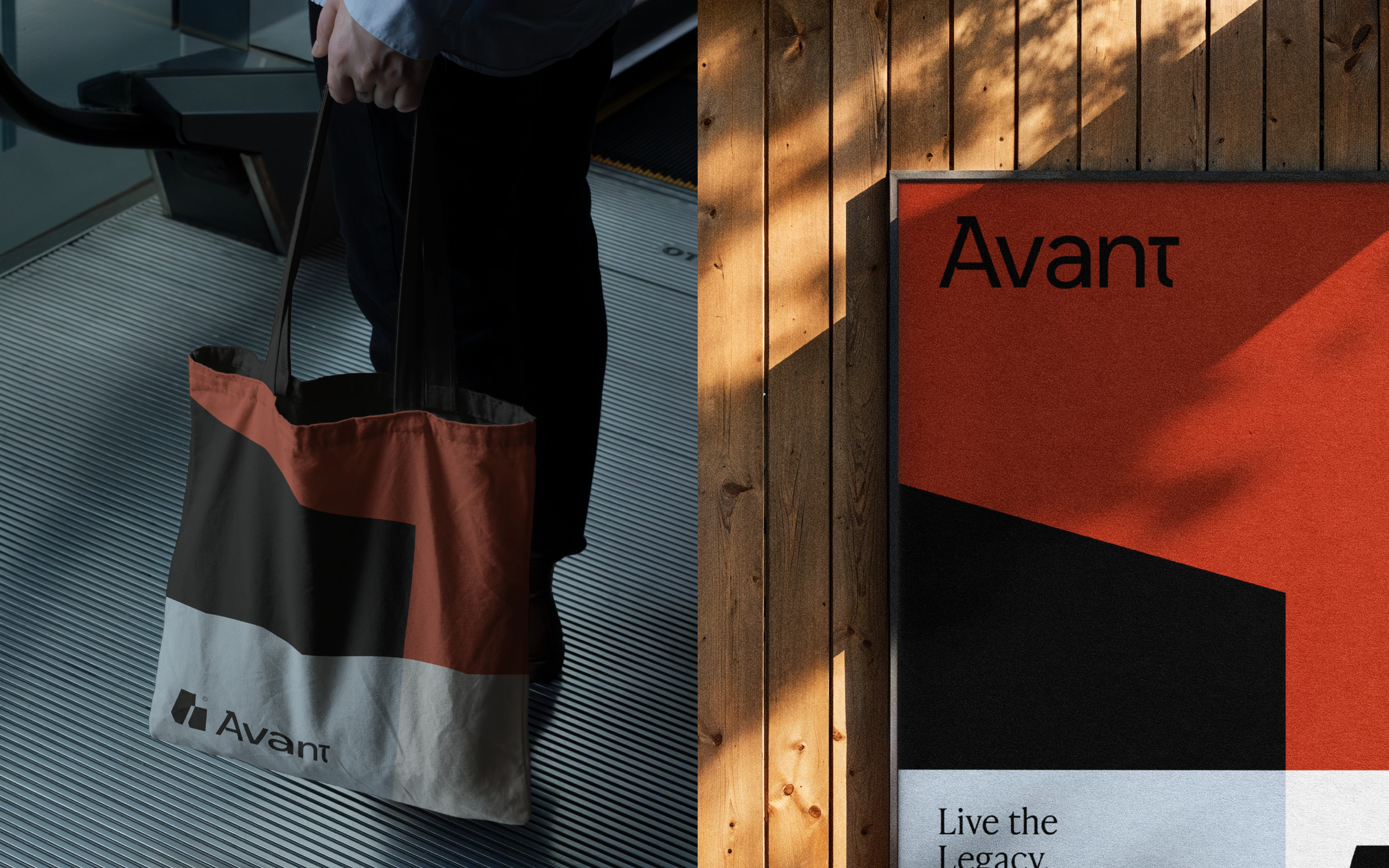
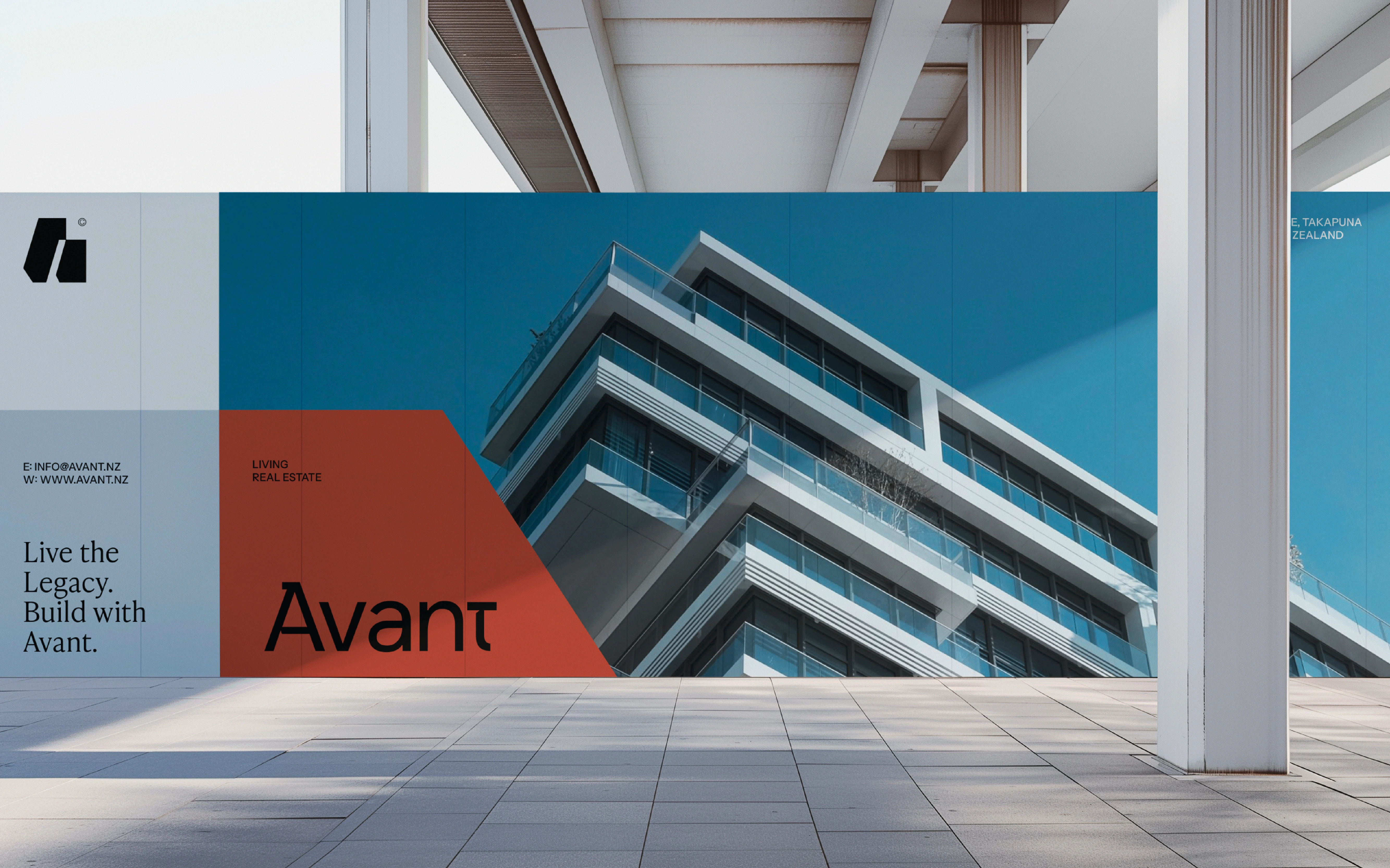
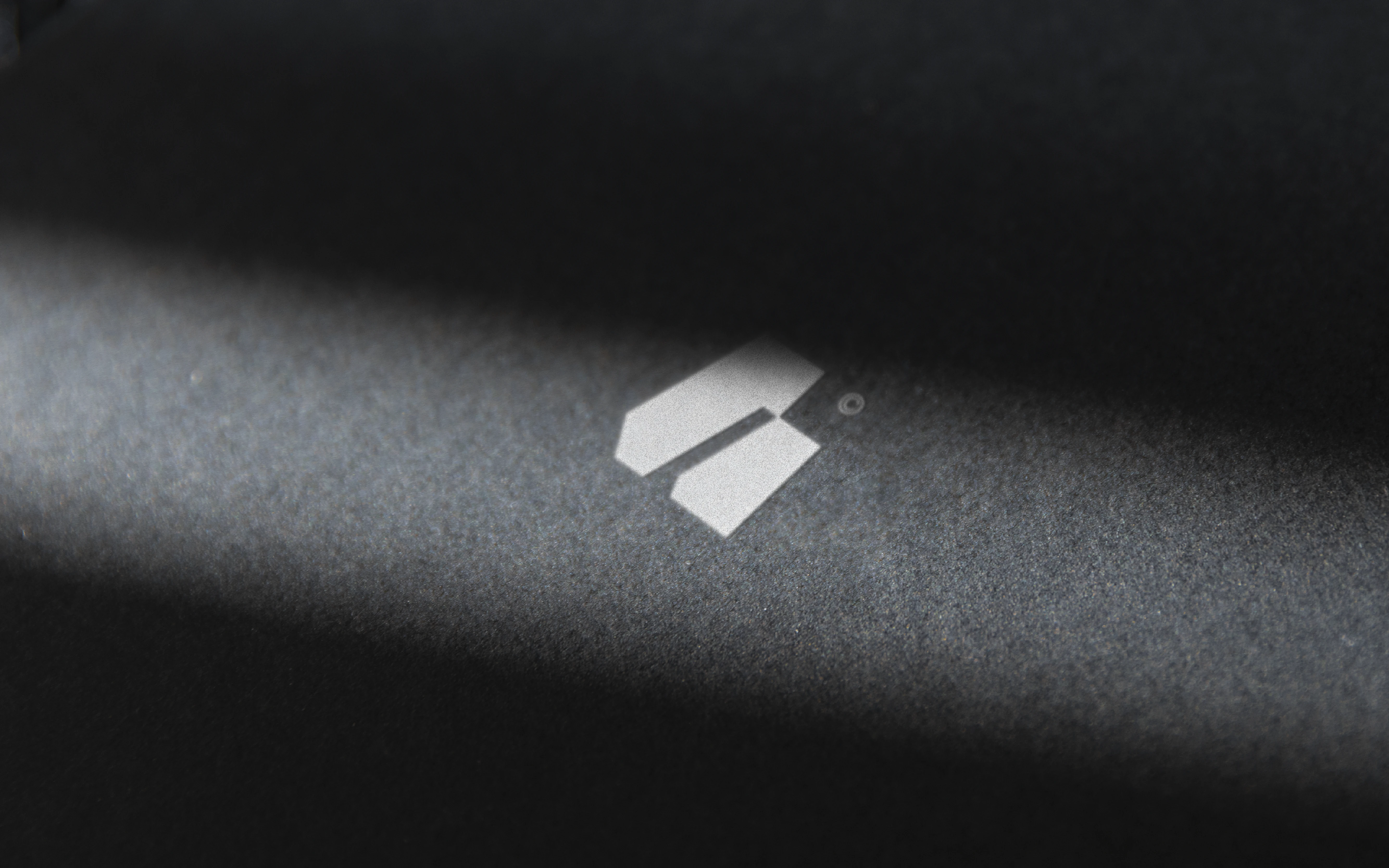
We have decided to elevate the brand approach towards unique & meaningful directions. The Avant direction drives on combines elegance, structure, and modern sophistication to reflect its position in the luxury real estate market. The refined serif logotype with its distinctive “t” conveys precision inspired by Japanese traditional type form. Bold geometric “A” logomark captures an architectural essence, symbolizing strength and craftsmanship. The identity system perceives what stands out from the competitor, it adopts from the logomark & type personality. These elements form a cohesive, high-end identity that mirrors Avant’s core values—bespoke design, meticulous execution, and a legacy of luxury living.

DESIGNED BY NEXTMAHAMUD
GET IN TOUCH
Like this project
Posted Oct 13, 2026
Avant is a luxury real estate firm that connects buyers, sellers, renters, and developers through insight, innovation, and integrity.